Metal Typography in Context
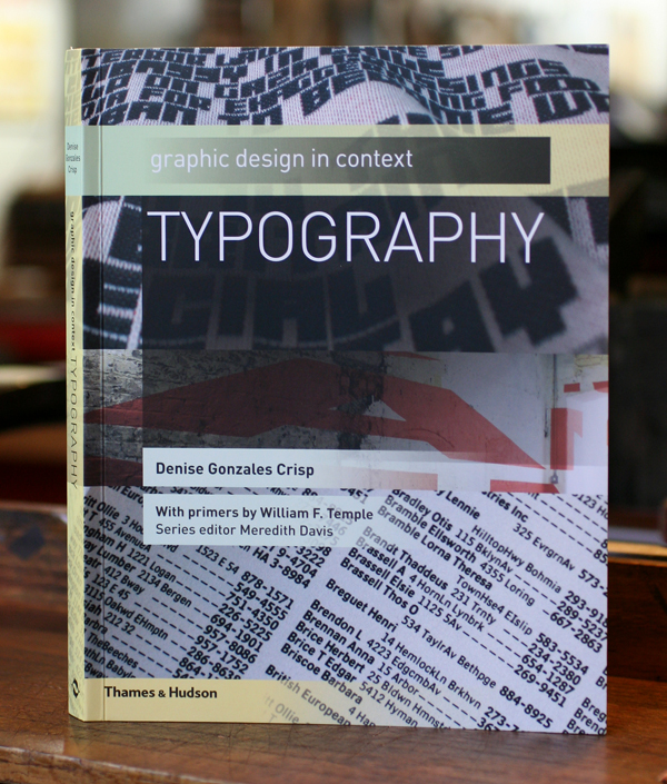
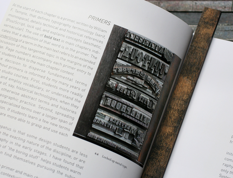
I recently acquired a copy of the new textbook, Graphic Design in Context: Typography, as a photo of one of our type forms appears in the book. 
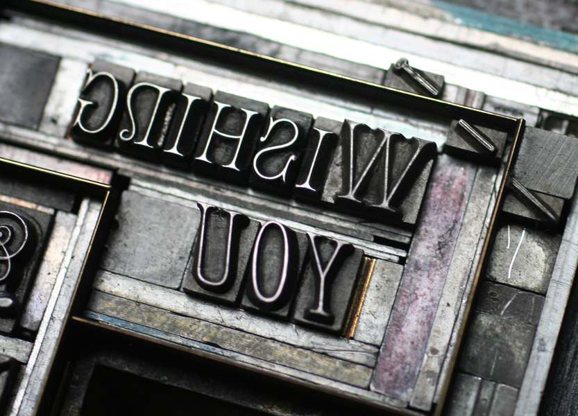
This was a piece I put together 2 years ago to showcase many of the victorian typefaces in the studio for the purpose of photographing them. Forms are so lovely and architectural, and we've endeavored to include process shots on our site, the flickr letterpress forme group as well as this blog to share. Here's the full photo:
And after taking the care to build this, I decided to print a number of copies of it so the actual type could be seen as it was originally intended. It's available on our etsy site.
Just this week I assembled a similarly complex form with more of our 19th century type for a birthday card, which you can see here. The best bit is the little pin set in the corner that requires careful setting in order to line it up correctly.
There'll be more on this card coming soon... In the meantime, if you have any interest in the study of type, check out Typography. It's thoughtfully laid out, very concise and offers a unique perspective on how type functions in the real world. I can't put it down.


