Our Theatrically Corrupt Chicago
One of the most popular design themes at Starshaped is the City of Big Ornaments, where we literally build little cityscapes from ornaments, borders and miscellaneous type in the collection. And so when it came time to put together the studio's next self-promotional print, it was a no-brainer to turn attention to our beautiful city of Chicago, celebrating its 175th anniversary this year. I'm in the process of designing and printing four distinct broadsides that will be packaged together to represent the best of what the studio has to offer, as well as the particular processes we use to create our work. The first piece about the Titanic was extremely well received and focused on 19th century typography. The ornamental cityscape prints offer a chance to work in a more mid-century style, so that was the focus of the choices on this latest piece. The quote also fell into place easily, as it made sense to borrow from my favorite and very much missed Chicagoan, Studs Terkel.
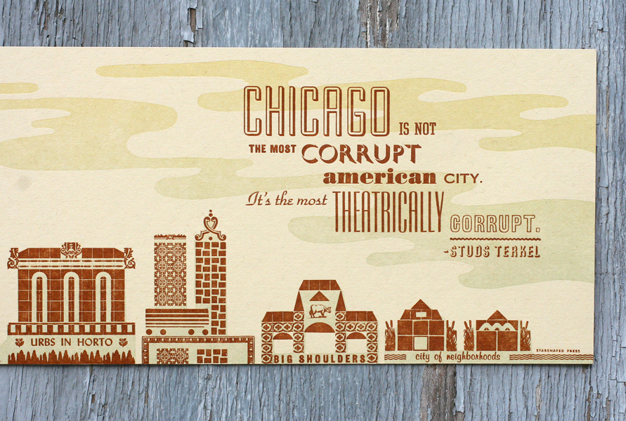
Chicago is very near and dear to me, given its hard working history, and 'the city that works' is one of my favorite taglines. I wanted the print to show elements of the city that are obviously key to its recognition, and pointed to the lives of those that live here. So it begins with the Sears Tower, the Shubert Theater, Marina City and the Harold Washington Library, then rolls into the Union Stockyards and representatives of the bungalows that surround the city. Here is the final print:
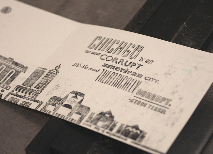
After sketching out approximately what the image will look like, and then finding type to represent the buildings, I pulled a carbon proof of the type to quickly determine the overall feel without having to ink up the presses.
After determining that the layout looks great, I photographed the forme (the entire set up of type and ornaments) to be offset printed on the backside. All of the studio self-promotional pieces have this feature so that everyone can see exactly what went into creating it. We have this work done at Accucolor Plus, Inc. here in Chicago, because Gary's work, both offset and letterpress, is topnotch. Here is a close up of the back side of the print, which was printed in one muted orange color. The type is just as sexy as the final printed piece!
To give the piece a little atmosphere, I planned a linoleum cut to beef up the buildings and create a sky. This was printed as a split fountain, so that the color could fade from wheat yellow to muted green.
I printed two-on-a-sheet, with a whopping run of about 750 broadsides. Thankfully, it was only two colors!
Overall, I couldn't be happier with the turnout and the civic pride that swelled throughout the designing and printing process. We'll be selling these at the Renegade Craft Fair this coming weekend, and will then post some on our etsy site.


