We spend a lot of time in hospitals. A lot. As I type this I’m recovering from another 6-hour stint in the ER, a relatively short visit because we’re champs at timing and prep. The ER should not have been our destination. For a month we’ve been reaching out to docs about an issue that could have been addressed via virtual appointment (the medical equivalent of ‘this meeting could have been an email’). But these days, go to the ER is the stock response and the buck is passed to docs that aren’t the specialists we need. It’s more strain on patients and ERs that are increasingly overloaded with visitors not in emergency situations.
For many months I’ve joked with Jo, my wonderful teen at the heart of this situation, about how we’d change the system to be patient and caregiver focused. It is NOT, and don’t let any glossy hospital flyers, commercials or slick insurance companies glad-handing you while stripping away benefits say otherwise. I suggested a class called Humanity 101 for med school, where students must go through the system as a patient. We are always surrounded by the healthiest people I’ve ever seen when in a hospital and I question if they can truly empathize with what chronic illness does to you, physically and emotionally.
Since I apparently don’t have the power or credentials to add a class to med schools, my frustrations turned to writing, which has resulted in a new book entitled An Open Letter to Doctors.

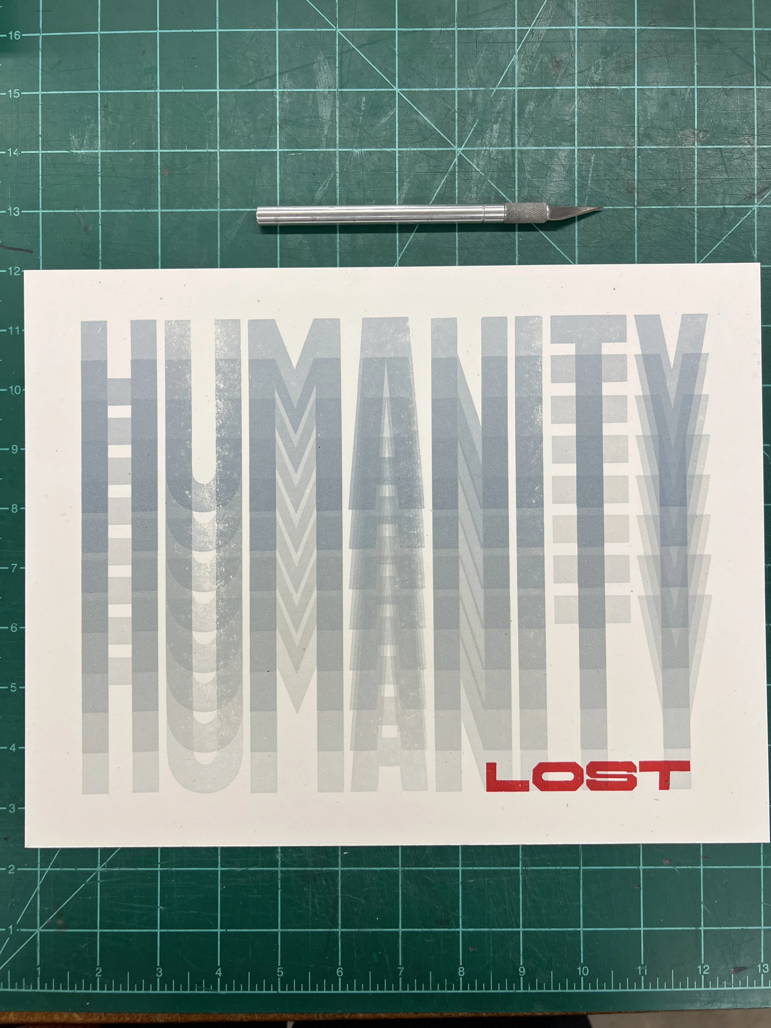
Across many notebooks and mountains of paperwork, I’ve scribbled notes to remember healthcare interactions that could have been better or more effective. I compiled all of these into ten points of reference that by no means encompass all of the details but they’re a solid summary. It would be easy to have a list of things like don’t send patients to ERs when the meeting could be an email and will we ever stop treating female bodies as riddled with anxiety instead of illness and would my kid get better care if I was a single dad instead of a single mom but that list is an ever-moving target. Instead, I went for basic concepts and in a color palette that might register attention (scrubs, anyone?)


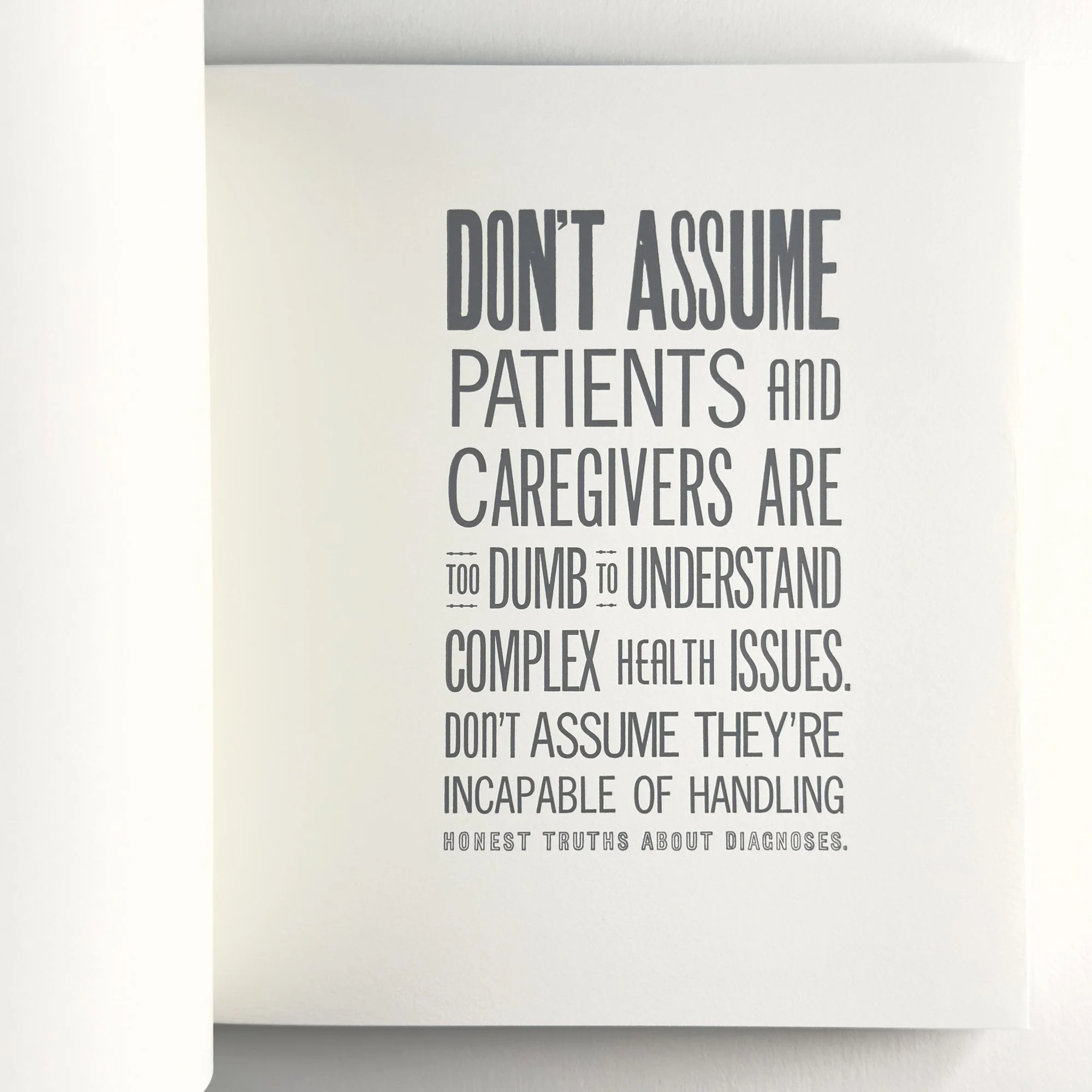


Each block of text is printed recto-only on folded sheets of text weight paper reminiscent of EKG papers that fold after printing. I printed them on oversized sheets on the Vandercook press so they could be trimmed as collated sets. Thankfully, I was able to typeset most of the forms in their entirety, with just a few needing to wait for the letters of an already-printed form to complete the text block. Typesetting took a few days, given the design was laid out ahead of time; of course there are always changes when faced with type in its physical form in front of you. It’s not unlike reading about a patient in a book vs. seeing them in real life.


Each page starts with the boldest and biggest type and descends from there, much like our expectations when first reaching out for help and then getting beat down by the system. The forced justification isn’t just traditional book typesetting, but a nod to being forced into boxes known as ‘standard protocol’ in a healthcare setting. It’s uncomfortable and limiting.


Everything written in this book is an experience we’ve had. I can practically point you to the date, time, location and provider if needed. And the text isn’t meant to be an exposé or call out; again, if I could design a class that makes potential and existing doctors consider what it looks like from the patient and caregiver side of the relationship, I would.


But here’s the thing. As the socialists say, another world is possible! We’ve had a few truly remarkable doctors who inherently understand that dealing with one’s healthcare is exhausting, before even getting to the complications of paying for it, missing work, and adjusting your self-expectations of maneuvering through life. I have wept for the care of certain practitioners who get it, like you, Dr. Lorraine Canham, oncologist at UChicago Medicine. This is for you. How many times have we joked that we wish cancer was the biggest problem so we’d have a doctor who gets the human side of medicine so deeply and profoundly that we feel safe and seen.


On to technical details. The book is square (like a gauze pad) and sewn with antique cotton surgical thread. The slip cover is inspired by tegaderm patches and the string and button closure is grommeted over a printed representation of a steri-strip. The title and colophon sandwich the ten pages within. There are 60 copies in the edition. A printed prospectus is available by request.


As someone who must creatively solve problems every day, I’m often shocked at how little creative problem solving seems to exist in the medical field at patient-level. When a paper I love is out of stock but a project needs completed asap, I find a new paper. If type is damaged, I find a different typeface to work with, even if it wasn’t the first or perfect choice for a print. Progress dictates moving forward. So often we are faced with this won’t work so we won’t try, or it can’t be that so we won’t look for it and after all of these comments, there’s nothing left from the pros, not even hope, while we stare down life-altering illness. I hear you doesn’t mean that we’re actually being heard and considered, especially in regards to quality of life.
I joke about an art school education in the grand scheme of the world, but it did teach me to look for other solutions, even when they seem nuts. That there’s always a way to move forward, even if you fail the first five attempts. A window always opens when a door shuts, you just have to feel around for it in the dark. That, as the people know, Hope Dies Last, and Another World is Possible. I understand our healthcare system is big business and not built to actually care for illness. But if the meekest of us can march and crawl and roll to demand care, then doctors can step up, too.
None of my frustration applies to nurses. Nurses are a gift and should be protected at all costs. They should run the world but only if they want to.