
I have this thing about ships. Often the ones that met untimely ends at the bottom of an ocean or through fire. My home library includes accounts of the Andrea Doria, the Lusitania, Walter Lord’s thorough accounts of the Titanic and lists of Great Lakes shipping disasters. Maybe there’s metaphor in it, considering I’ve likened navigating loss, single parenting, health insurance and a small business to steering a ship through icebergs. Maybe it’s my passion for the work of skilled craftspersons who labor for years to create something that carries people from shore to shore, and is then lost in moments. Maybe it’s the beautiful architecture and technology of these vessels that inspires me to be a more thoughtful designer.
One ship I adore that escaped the fate of those in my library is the SS United States, which made its record-breaking maiden voyage across the Atlantic on July 3rd, 1952. It is a stunning piece of American innovation and her architect, William Gibbs, famously touted her as unsinkable, inflammable and unmatched in speed. By design or circumstance, he was correct.
On May 31st, 1954, my grandmother set sail on the United States, destined for a few weeks with my grandfather, then stationed overseas in the Air Force. Here she is on the stern, in personal photos shared with me.


I’m certain my grandfather’s penchant for ephemera was the impetus for saving the souvenir program and menu from this trip and I couldn’t be happier about it. The incomparable Lester Beall designed these pieces, making them important artifacts for both ship and mid-century design lovers.

One of my own exciting finds is this postcard featuring a beautiful illustration of the ship just prior to her launch. And even better, the card was sent by a representative of Mergenthaler Linotype, whose machine was present to cast lines of type used for shipboard printing. Two of ‘my things’ on one little card!


Below is my grandmother’s menu from her first night on the ship as a Cabin Class passenger. This is the kind of thing that would be cast on the Linotype (similar to the slug I am holding at the bottom) and then printed for that day’s meals.

In June I had the honor of being invited to spend a week at John Horn’s Shooting Star Press in Little Rock, Arkansas, alongside other printers I greatly admire. If this is hell, I’d like to spend eternity there.

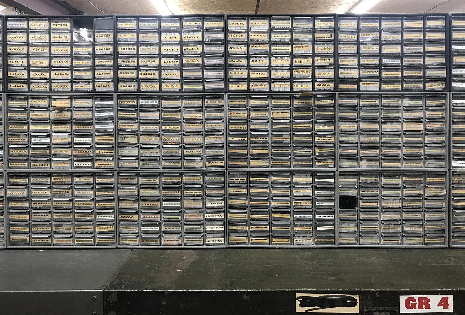
This sounds snobby, but I’ve spent 20 years building a collection of metal type and ornament and it is extensive and designed for the kind of work I do. It’s rare for me to be in the presence of another collection that inspires me to the level of, or in this case, well beyond, that which I’ve lovingly built. John’s print shop is so well-appointed, well-organized and well-loved that I nearly fell to my knees to praise the printing gods.

These boxes store diverse typefaces that span decades, styles and sizes and I opened every one. John has multiple systems to find, identify and label his collection, making it easy to waltz in with a plan and out with a print.


One section of the shop is purely ornament, with little treasures painstakingly labeled and organized, sometimes even by size and style. These photos represent only a small portion of what is there.

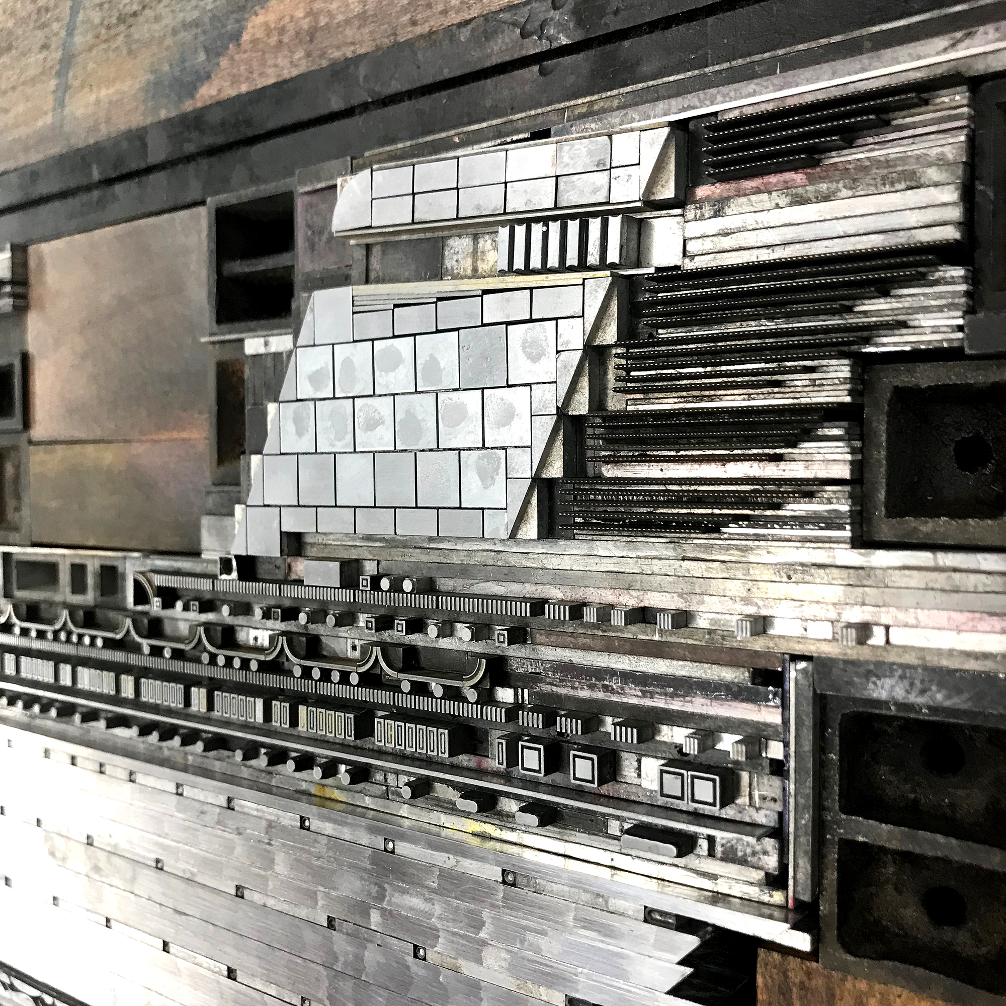
I had it in my head that it might be possible to create a print that would pay homage to the SS United States, in all its streamlined and luxurious glory. And printing at John’s place gave me access to a massive collection of ornaments I don’t have as well as a press that would allow me to print a sheet that’s 25” long. I started sketching potential solutions for the design on my pica paper so that I could easily find ornaments and rule that work with this typographic grid. It didn’t take long to realize the image would be more successful if I didn’t include the entire length of the ship, and instead focused on detail in a loose, illustrative style. The ship is still the fastest cruise ship ever built, so I considered ways to represent her speed.

These images show the slow progression over two days of starting with a letterpress ‘dry dock’ in which I could piece together elements to form the ship.
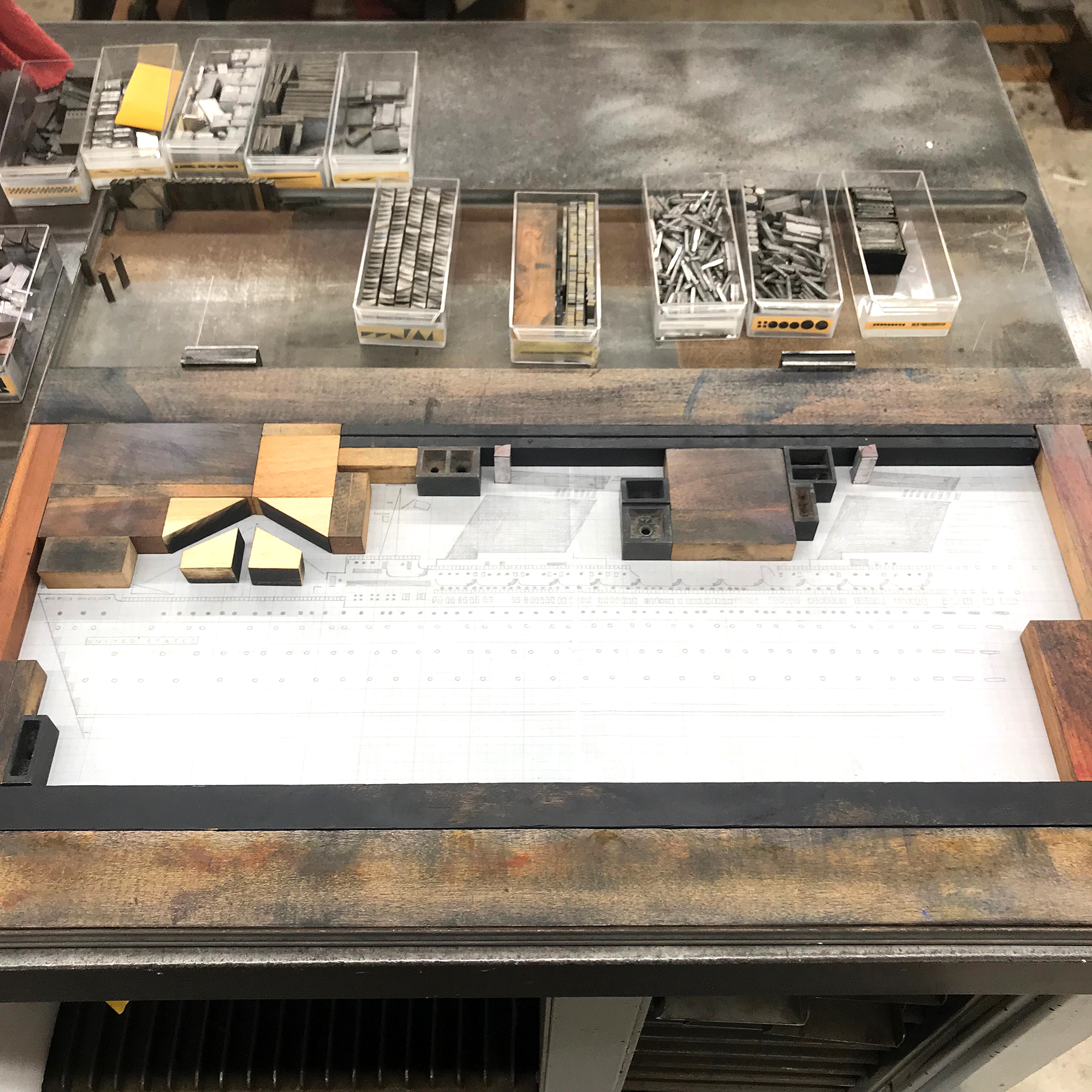
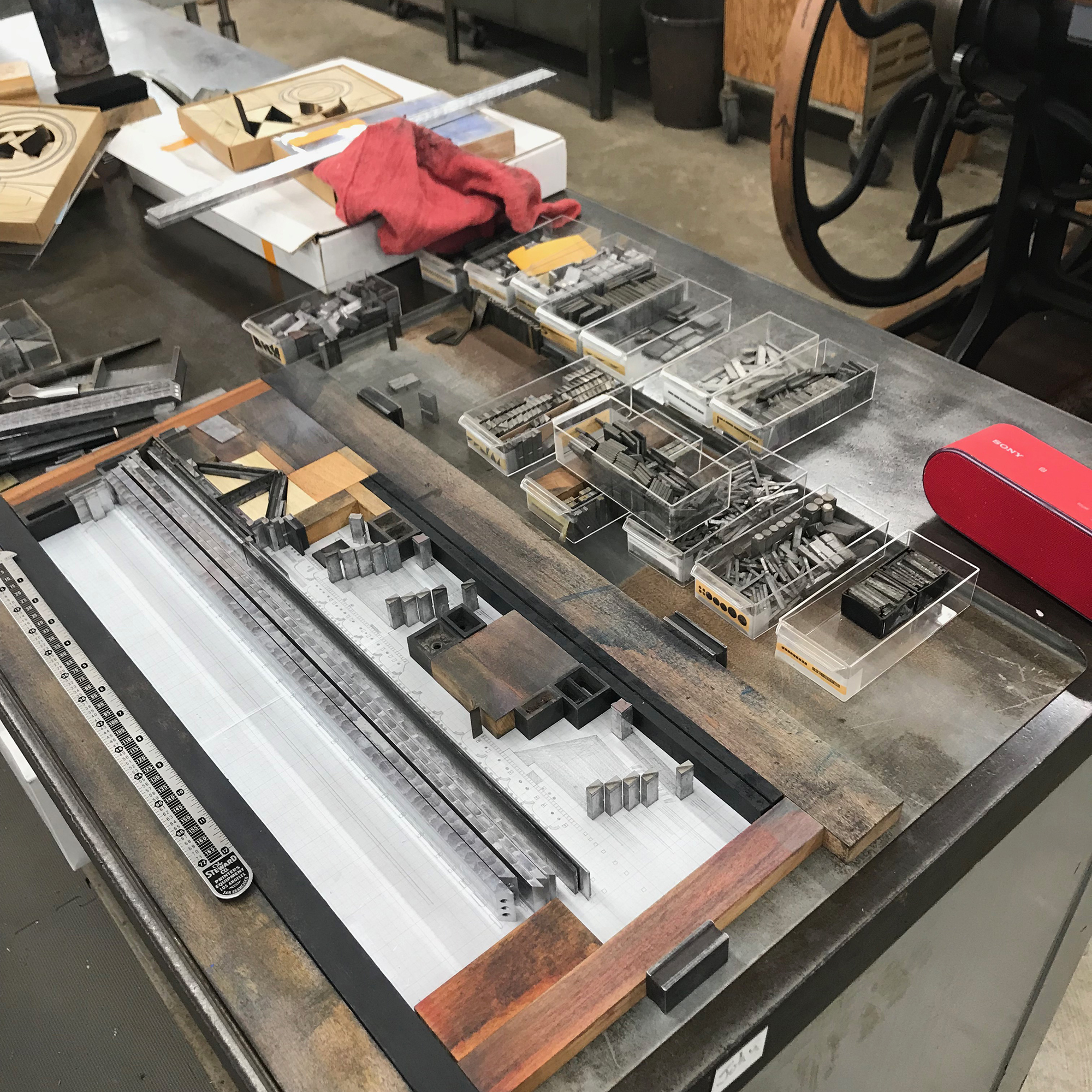
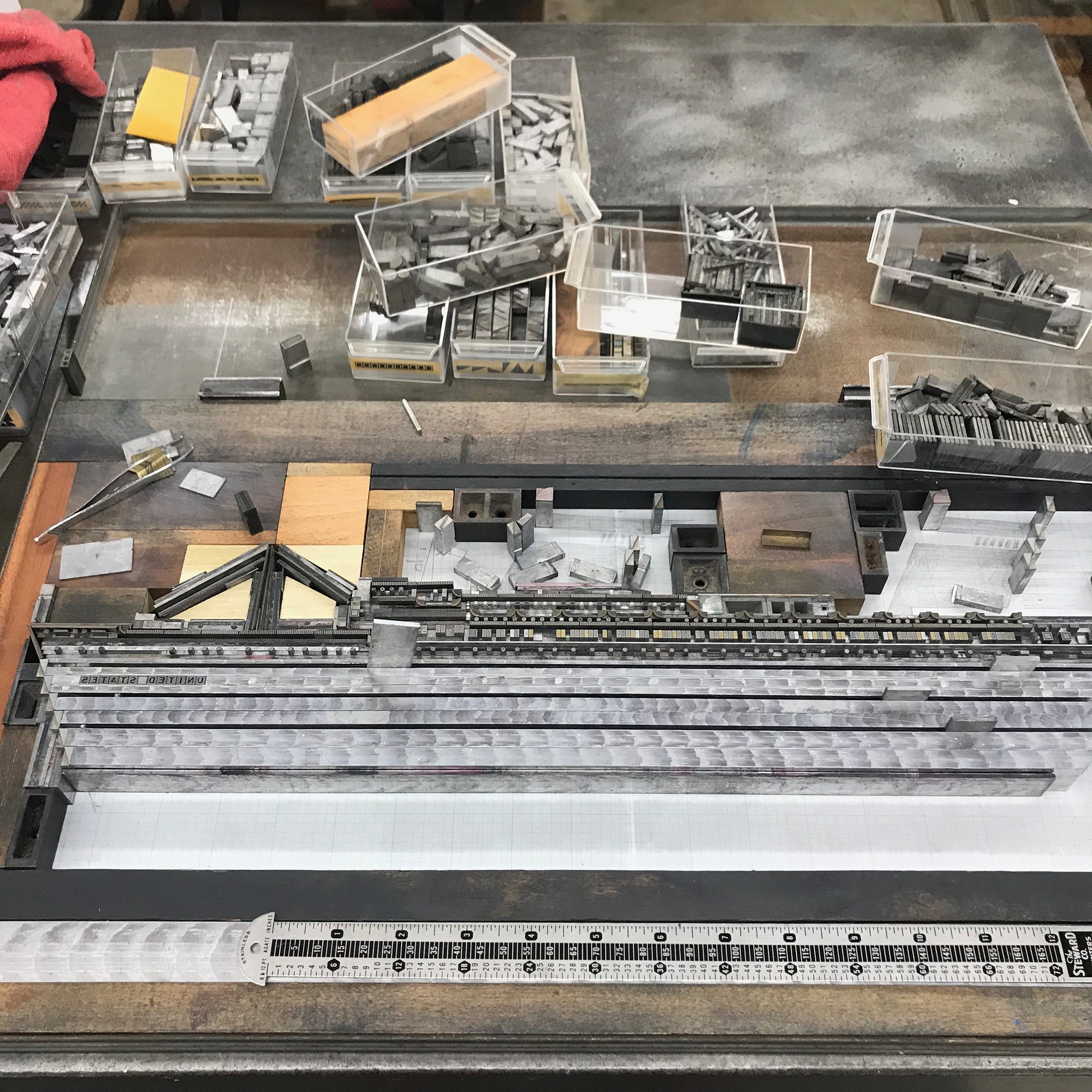
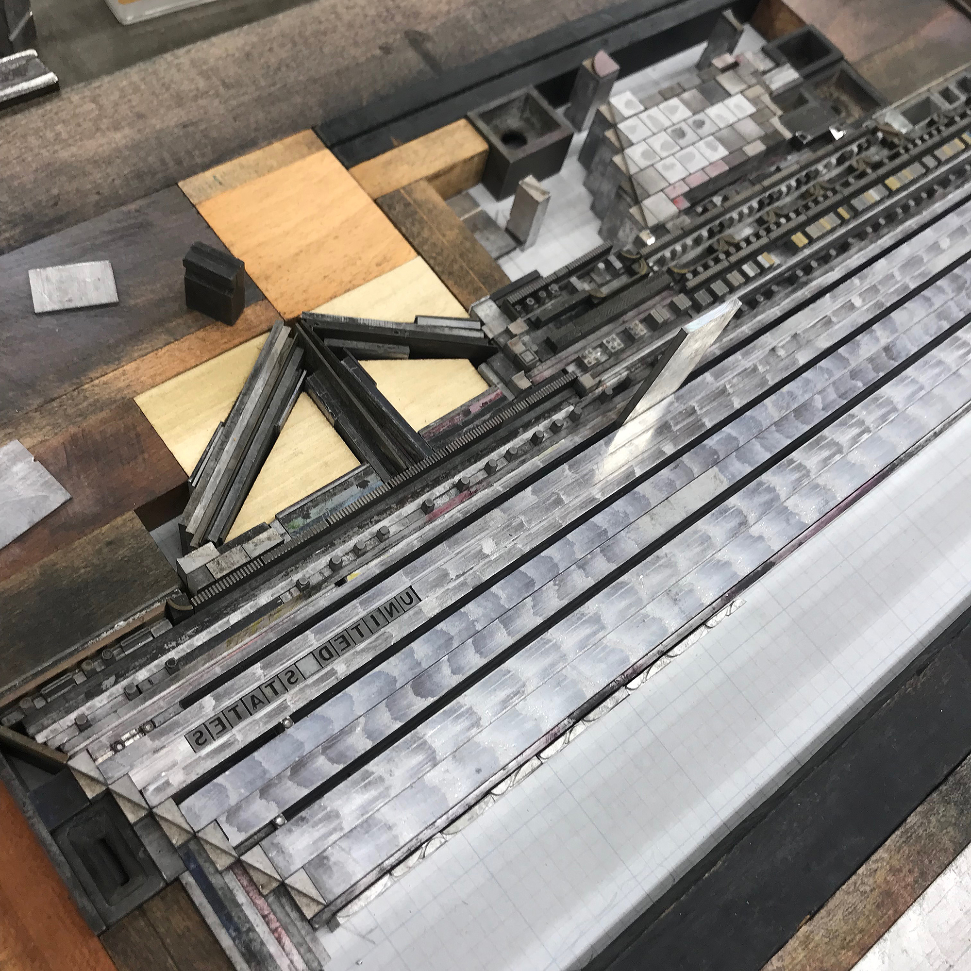
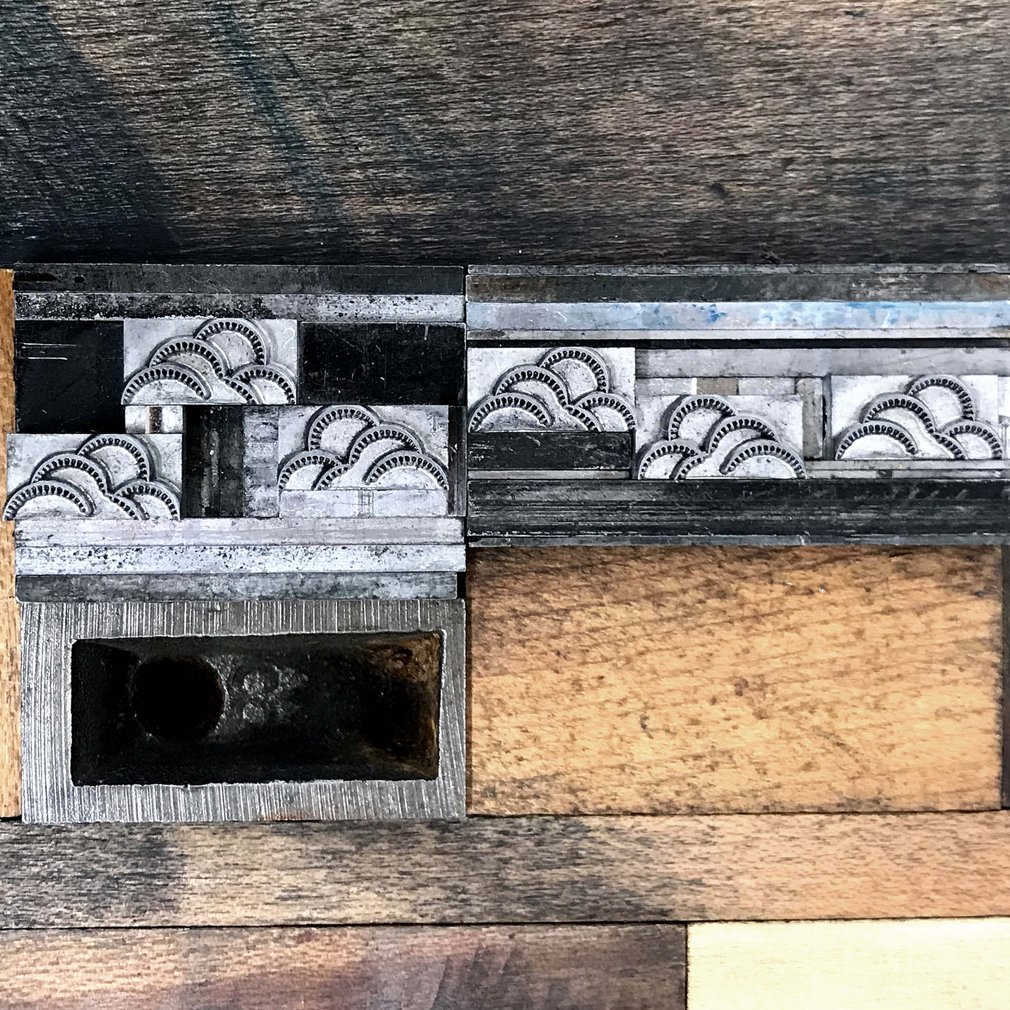
The distinctive funnels have dotted brass rule trailing behind for ‘speed lines’ and I mitered the ship’s body, made from thick metal rule, and included wave-length ornaments to hint at how it cut through the ocean. While fast, it wasn’t quite fast enough to relieve my poor grandmother from 5 days of seasickness.
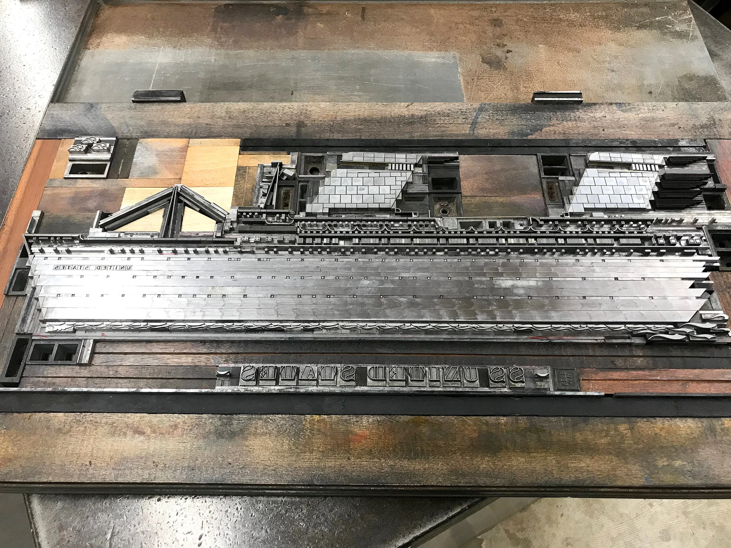
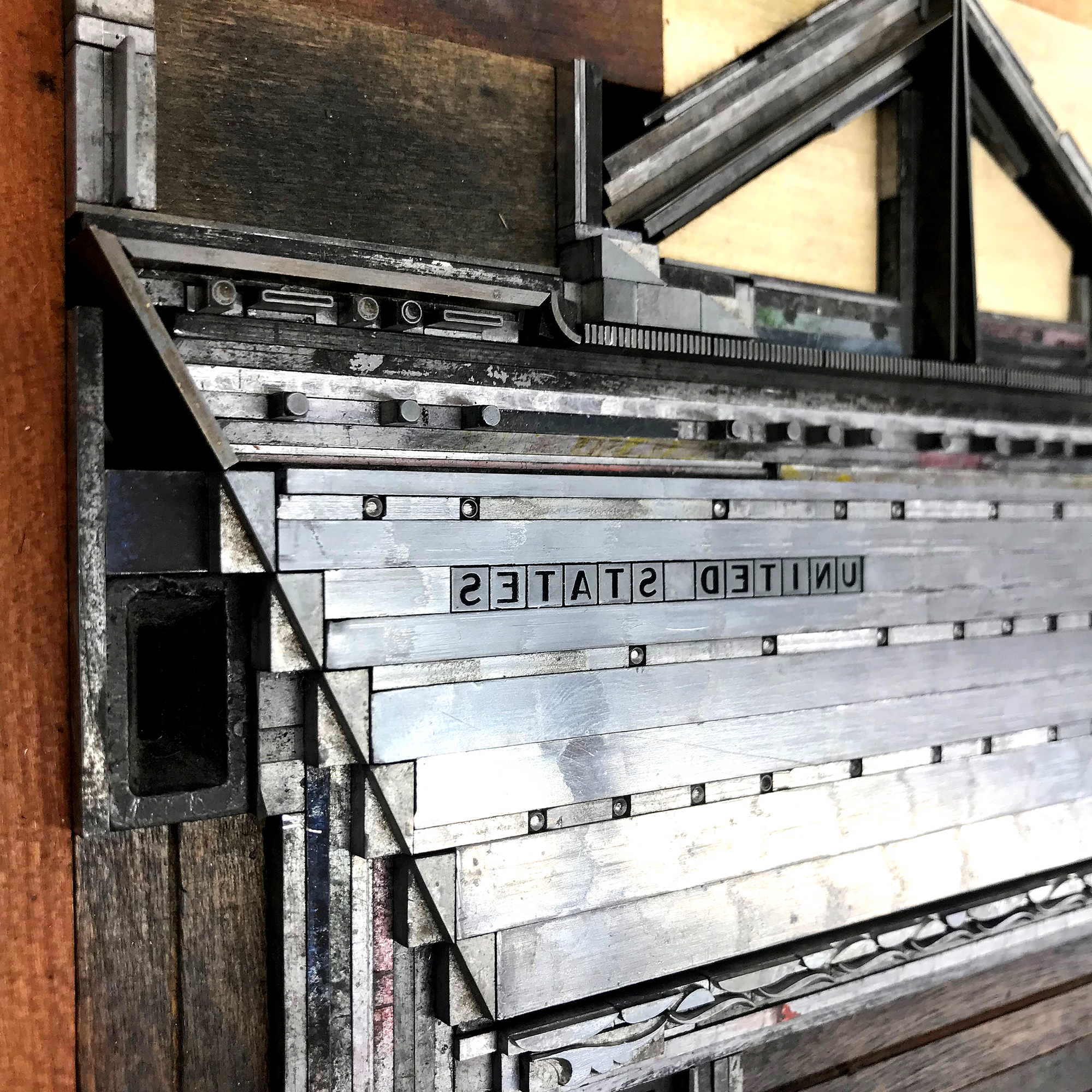
My original form included small, 6 point open circles as portholes in what would be the black sides of the ship. These were nearly impossible to print correctly once on press and I scrapped the idea given the limited time I had to work with. I also added more of the wonderful clouds and changed the ornaments framing the name at the bottom to be more in keeping with its style. Major thanks to Jessica Spring for the suggestions on both of these.


Together John and I carried the giant form to the Vandercook Universal III, and here it sits, awaiting its proper lock down for ‘sea trials.’

Usually with multicolored projects, I first pull a proof of the entire form, then mark which colors must be removed to print the first color, then replaced, with the finished color then coming out (repeat for each color.) It’s complicated. But printing this one was not unlike a reduction linoleum cut in that it would be extremely difficult, or impossible, to replace elements once they’d been removed. So I tackled the gray first, as this was the most detailed. Below is how it looked with the red, blue and black removed.

And this is the final print, on Stonehenge white and soft white cotton paper, measuring 25x11”.

The details… I wanted the idea of the ship versus an exact replica and this approach to working with metal type is always the most successful. If I wanted absolute realism, I’d get out the colored pencils instead. So the lifeboats are 1/4 circles in two different weights with a little rule between them. And the funnels are squares, rectangles and rules to fill the solid color area.
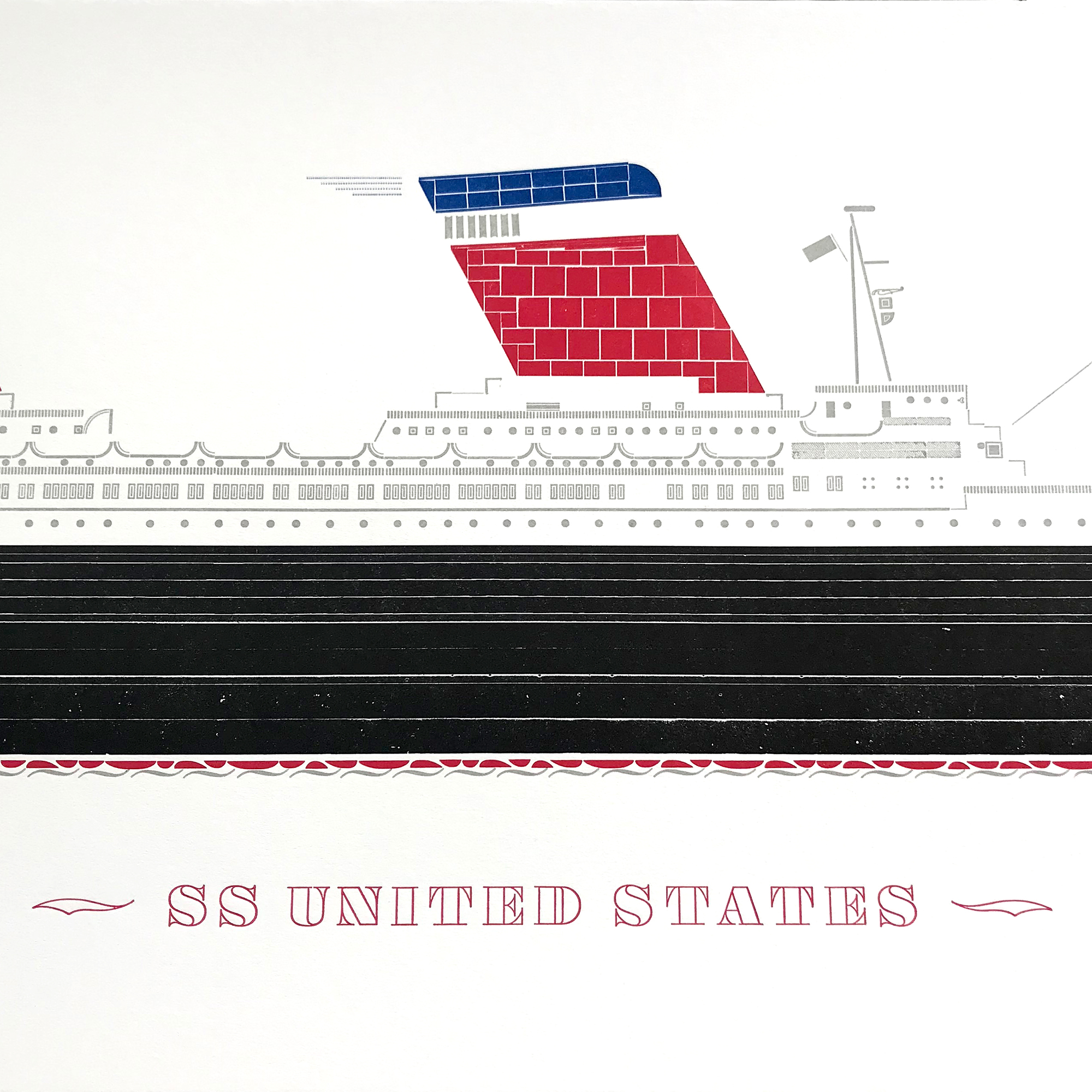
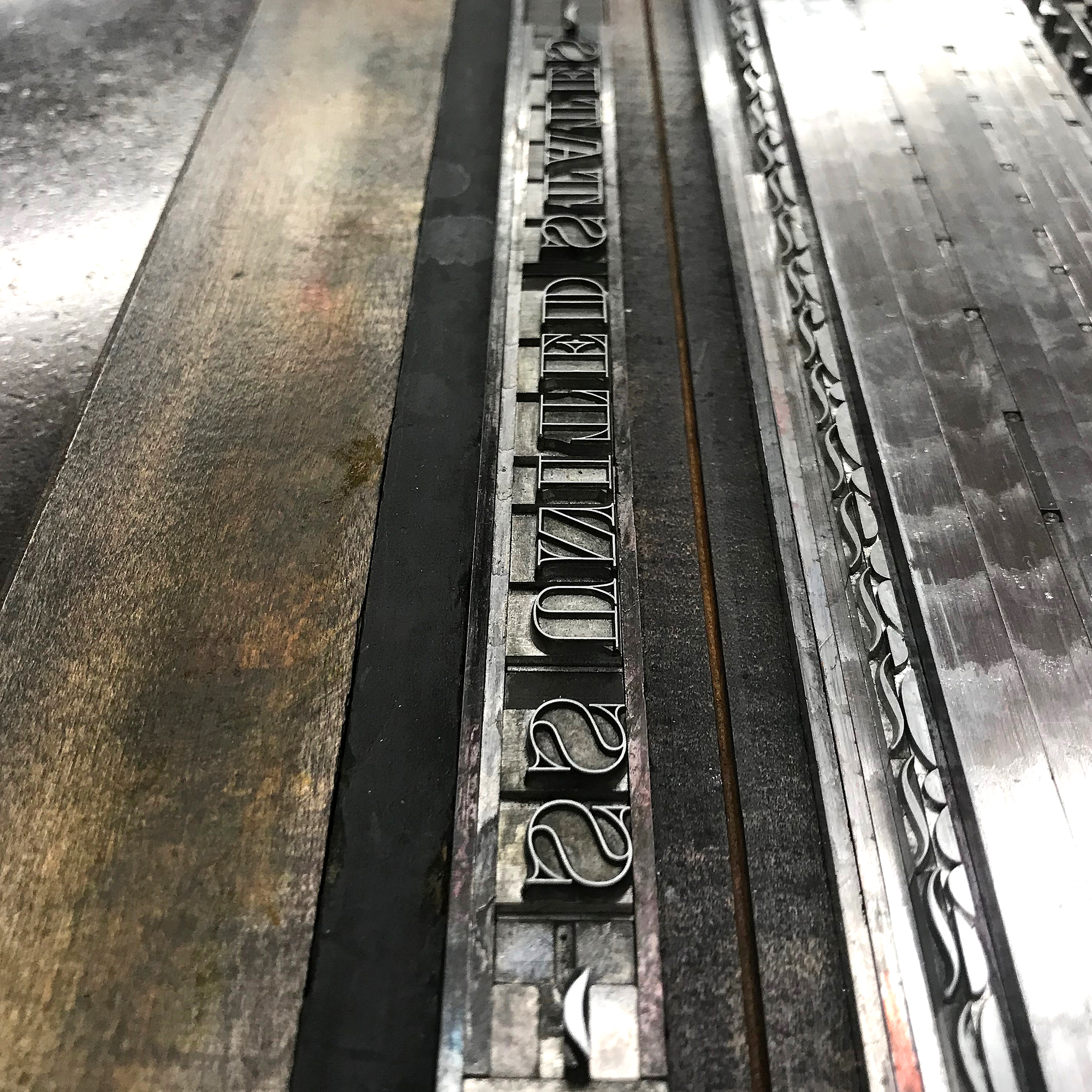
Luckily John had the perfect reverse gothic type for the name.


The limited set of prints are now available here. I’m so pleased with the turnout, especially given the time I had. If there was a Blue Riband for typesetting, I would have run away with it.
I’m so grateful for the opportunity to work at Shooting Star Press and it would take another lifetime to fully take advantage of what exists there. John’s unwavering support of my work over the years gave me the confidence to build the ship of my dreams when I wasn’t sure it was a good or even possible idea. It challenged me to look at ornaments in a new way and gave me the scary ‘this could certainly fail BIG’ feeling that pushes me forward.
The SS United States still exists and currently resides in Philadelphia, though the burgeoning airline industry killed her career in the 60s. I can’t bear to post any images of the state she is currently in and her future is not secure. If my print becomes merely a memorial and the familial ephemera just memories, I’ll take that.
