It's not often these days that we have an opportunity to build an entire stationery identity, so it was a delight when Jeff Story called in need of pieces to represent his new law practice. He loved the simple red and black sans serifs often used to represent the work of poet Kenneth Patchen and sent this image for inspiration:

Here are the three pieces we created, printed on lovely Oxford textured paper from Neenah.
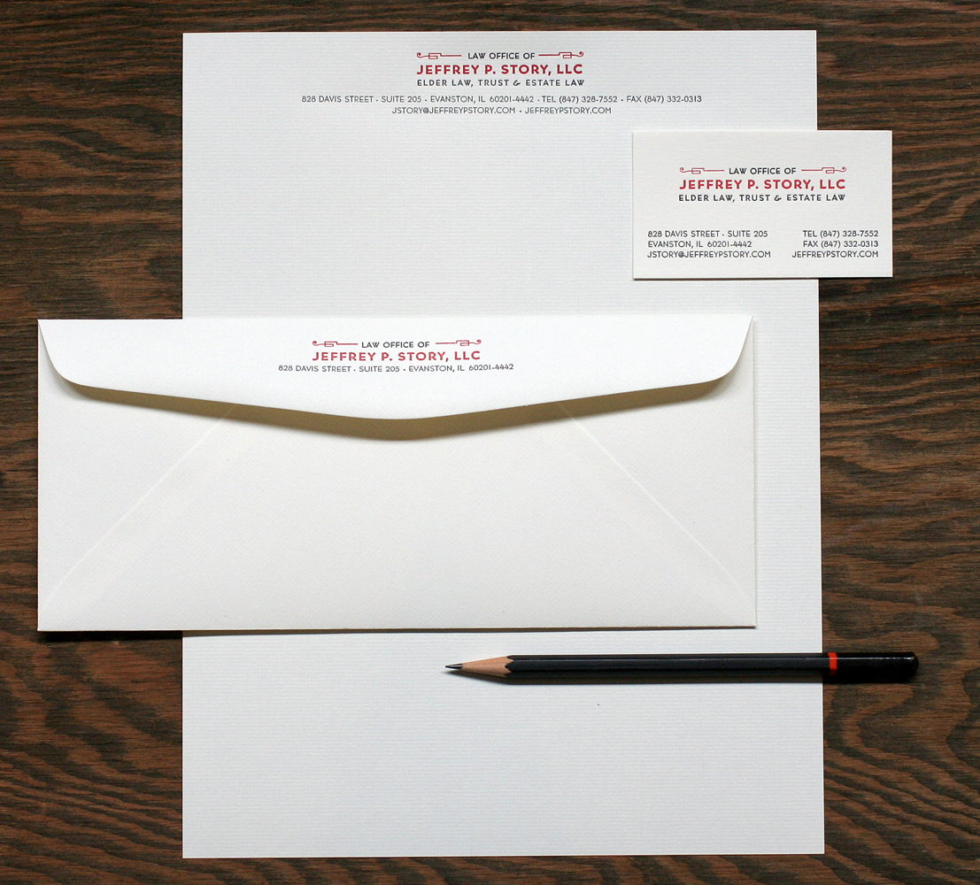
 Bernhard Gothic is the typeface that played a big role in this design, in various weights. I often refer to this as the 'house' typeface at Starshaped, as there is a large run of it in the studio. It was a favorite back at Fireproof Press as well.

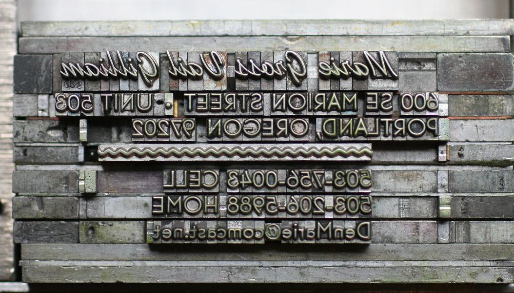
The disappointing part of this project was that we were one 'L' short of setting Jeffrey's full name in this particular size. We played around with similar options but none seemed quite right, so we had to bite the bullet and order a magnesium plate. Hopefully we'll have more of this particular font the next time we're printing this job! I love this image which shows the mashup of new technology (the plate) and a very old (19th century) set of ornaments. In this photo, the ornament appears to be in pretty rough shape; it actually prints quite well despite its age!

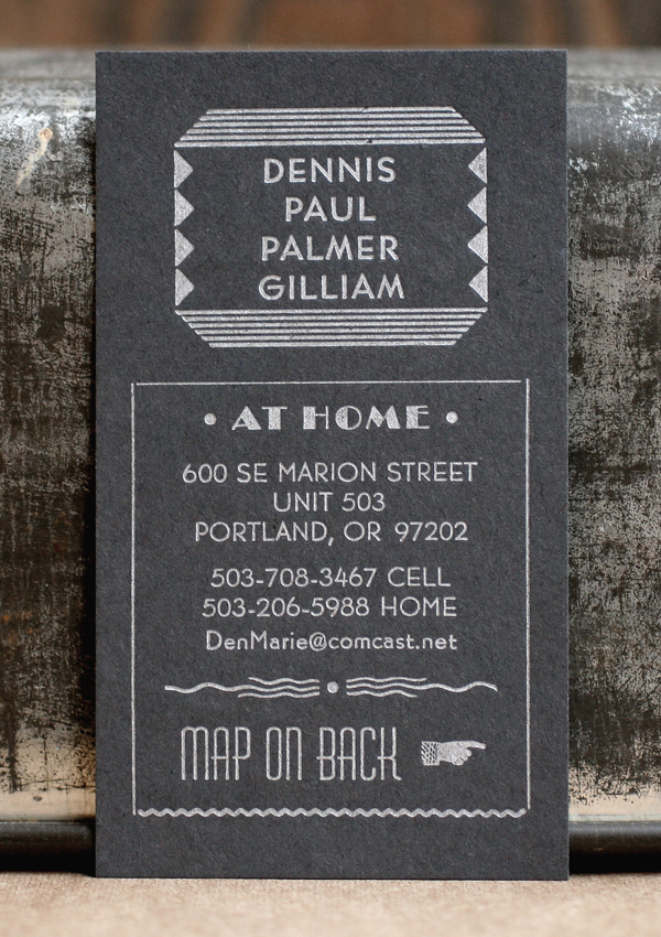
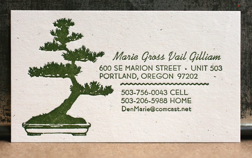
 I find really traditional cards printed in the studio to be particularly enjoyable as they blur the lines of the time period in which they were created; these could have been done last month, or 50 years ago. Clean lines are always in style!