The Letterpress Trail 2015 part 2: Bloodier Than Blood

Renegade was devastatingly bad. If we'd had a 'bad' Chicago show, we still would have made enough money to cover the bulk of our entire trip. As it stood, we broke even. This meant throwing everything (and Jo) into the car right after the show ended Sunday night and white knuckling it to Lake Tahoe to sleep before moving on. I had to figure out how to move money around to cover the next week, how to make the car function as so little product sold and it was packed (now with sand dollars and crab legs) and how to not sob continuously in front of Jo. We found a Motel 6 at 11pm and I tried to settle into sleeping before Monday's 12 hour drive. I won't lie; I felt pretty desperate and angry and trapped on the wrong side of the country. IMG_1369

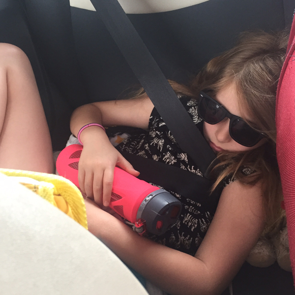
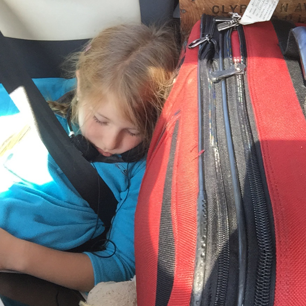
I left each morning as early as possible so that Jo would fall asleep in her tiny back seat. It made the ride faster for her and gave me a few hours to think and listen to angry songs. The angry songs gave way to acceptance, and by the time Kegler sent Endless Grey Ribbon I mustered the patience and sense of purpose to get through the rest of the morning.

IMG_1370

We spent quite a bit of time on 50, grabbing gas wherever we could just to be prepared. That said, our mouse of a car gets extremely good mileage and it was my own paranoia that made me stop every time we saw GASOLINE. This route is the traditional Pony Express route and there are many tiny towns that haven't aged in 100 years. I don't have pictures of these; while the worn, hand painted signs and once-stately buildings hold a definite charm, the unfortunate deterioration of an economy to support the humans trying to manage them is not. We soaked up what we could to avoid partaking in 'ruin porn'.

IMG_1371

DJ Jen's Musical Interlude: Plenty Times, Wide Eyes, Box Elder, Mother of God

When Jo woke in time to enjoy southern Utah (and it was beautiful) she was ready to rock the rest of the afternoon.

DJ Jo's Musical Interlude: The Party Line, No Cities to Love (this one always makes you feel better, Mom), Nanny Nanny Boo Boo, Stars 4-Ever, Your Cover's Blown

IMG_1372

Right about when we stopped for a break and shot this photo, a rock hit us hard. When we got to Grand Junction we had a cracked iPad, iPhone and now windshield. The Sound of Breaking Glass is very expensive. I had the phone repaired in Denver as it was a lifeline for navigation.

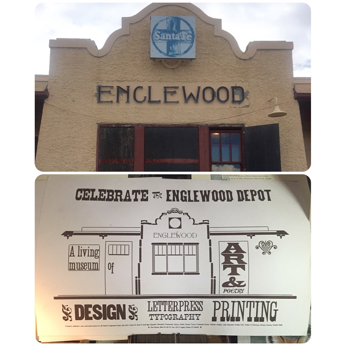
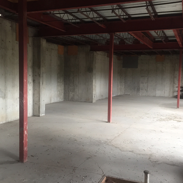
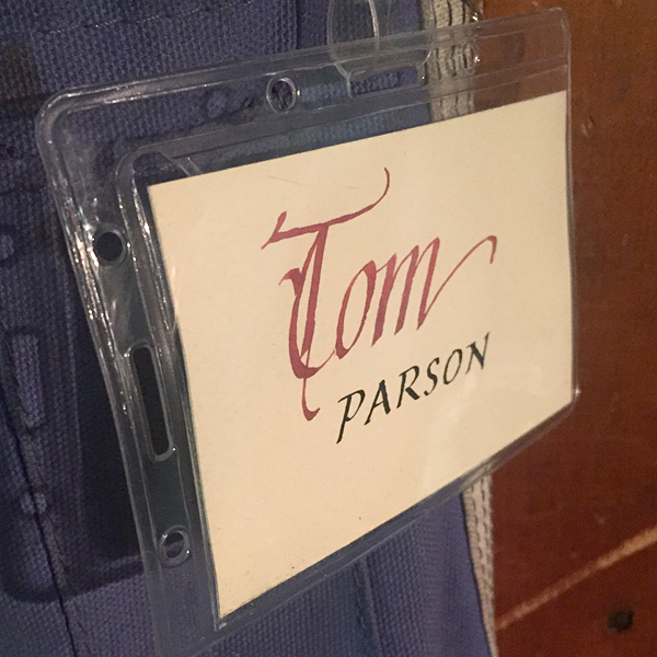
We met up with kind and welcoming Tom Parson who toured us around the Englewood Depot, a former train station he's turning into what will be a fantastic print and book arts center. While in its early, rough stages, there is a full basement with easy access to what will be garage doors for loading in presses and an upstairs for small presses, a library and workspace.

IMG_1420

IMG_1378

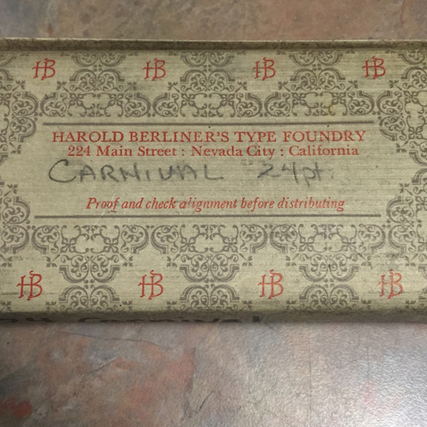
Then we visited his home and were blown away by his collection of books and everything related to printing.

IMG_1381

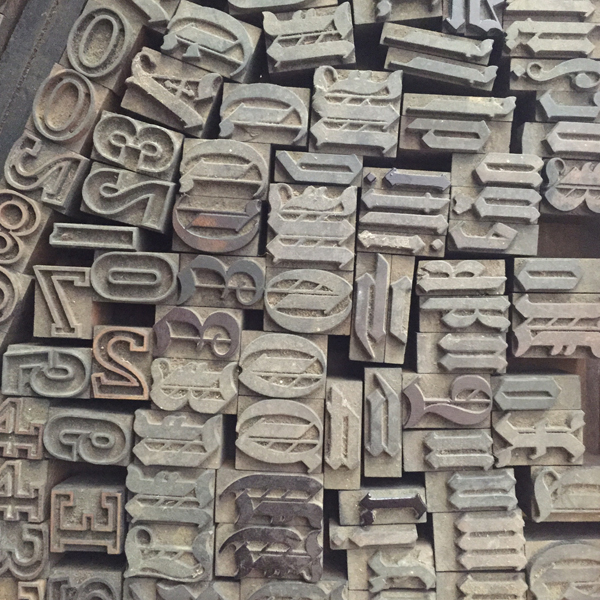
A slightly trepidatious Jo heads into the garage to check out the print shop. Every square inch of this place is covered, mostly with type.

IMG_1382

IMG_1405

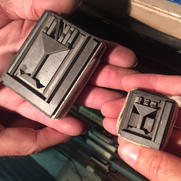
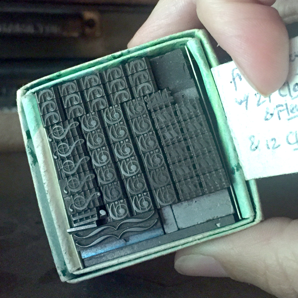
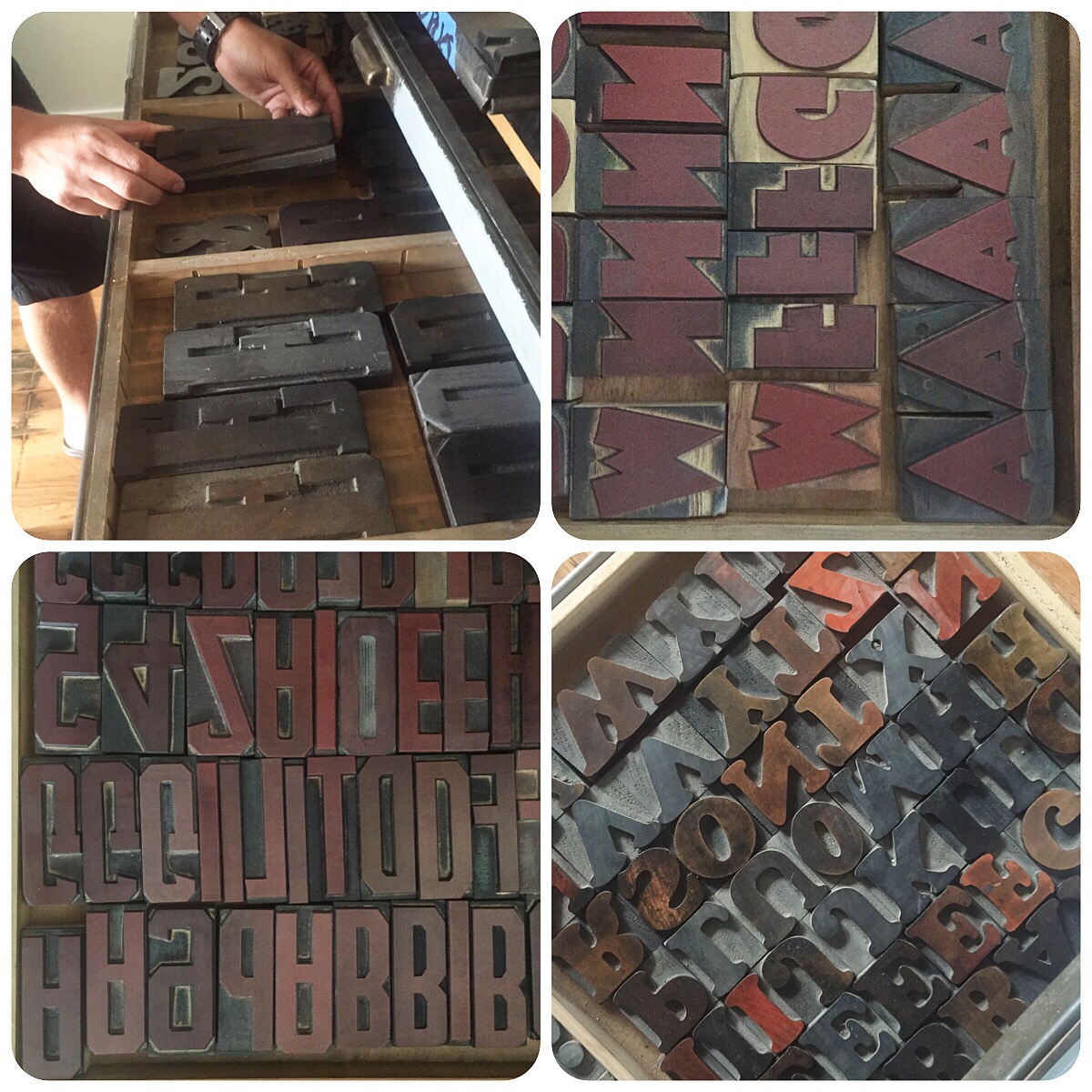
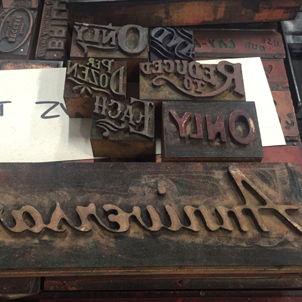
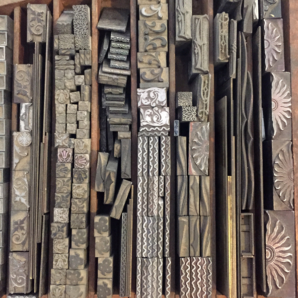
Tom pulled out a lot of treasures to share.

IMG_1395

IMG_1390

IMG_1384

IMG_1385

IMG_1391

IMG_1392

IMG_1399  IMG_1402

IMG_1403

He's been slowly proofing and cataloging his extensive collection in a few ring bound booklets to keep track of what's there. He's excellent at making notes about whatever he can learn of the type, as well as where he found/purchased it.

IMG_1421 IMG_1422 IMG_1423

IMG_1398

I am coveting these things:

IMG_1406

IMG_1407

Then we rode over to visit Jason Wedekind at Genghis Kern, who has just acquired a building he is setting up as a co-working space. This place is right next door.

IMG_1408

The print shop is in the back of the new space and is really coming along.

IMG_1417

IMG_1411

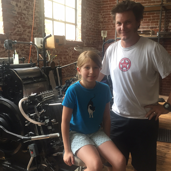
Visiting print shops can get old when you're eight, but the payoff was worth it; Jason taught Jo how to always win at tic tac toe. I only wish we'd had room to bring some Old Style.

IMG_1416

IMG_1424

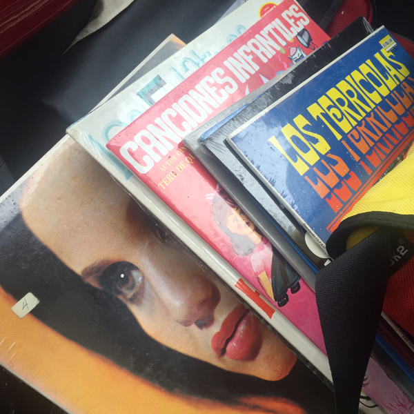
There were a few (and by few I mean hundreds) of records left from the former store next to the co-working space which Jason snagged. No longer lonely LPs, these were headed to good homes, including mine.

IMG_1418

From there we went to the home of a former Chicago friend and librarian I had the pleasure to work with a long time ago. It was wonderful to meet little Bea, born about a year after Jo following their move to Denver. Getting a chance to relax, we reminisced over wine and revisited a birth announcement I did for Will. Charles, the older boy on the announcement, celebrated his 15th birthday the day we were there.

IMG_1425

IMG_1419

Off again to Kansas City, Missouri.

IMG_1426

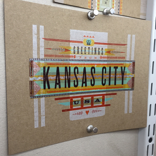
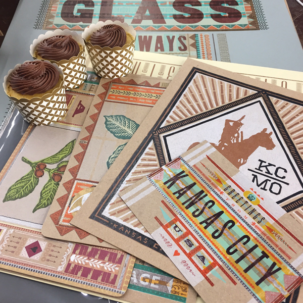
Being welcomed in KCMO with a set of gorgeous Hammerpress prints and cupcakes was a real treat in every sense. We chatted a LOT about the state of running letterpress-based businesses and shared stories. I knew there would be a lot of ornamental eye candy to enjoy here.
IMG_1437

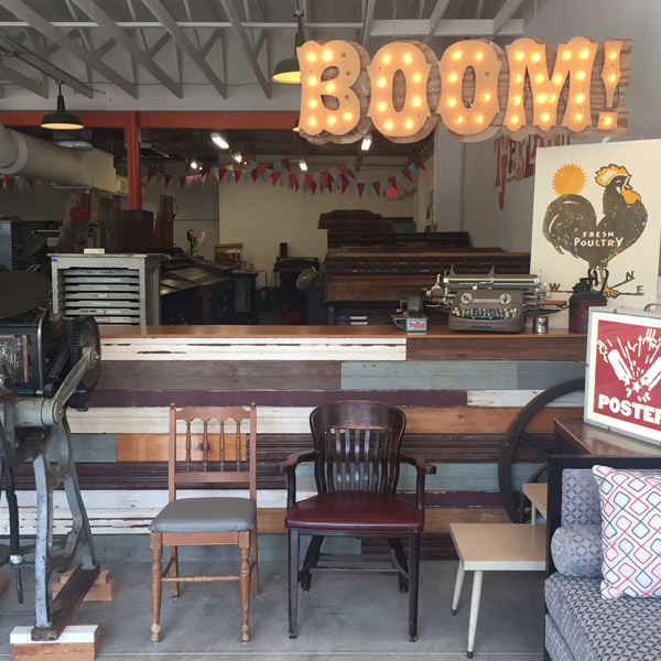
IMG_1442Their new retail space is nothing short of stunning.

IMG_1444

IMG_1443Matt, Brady and Kate. Unbelievably great to see them all.

IMG_1427

IMG_1428

IMG_1429

IMG_1431

IMG_1432

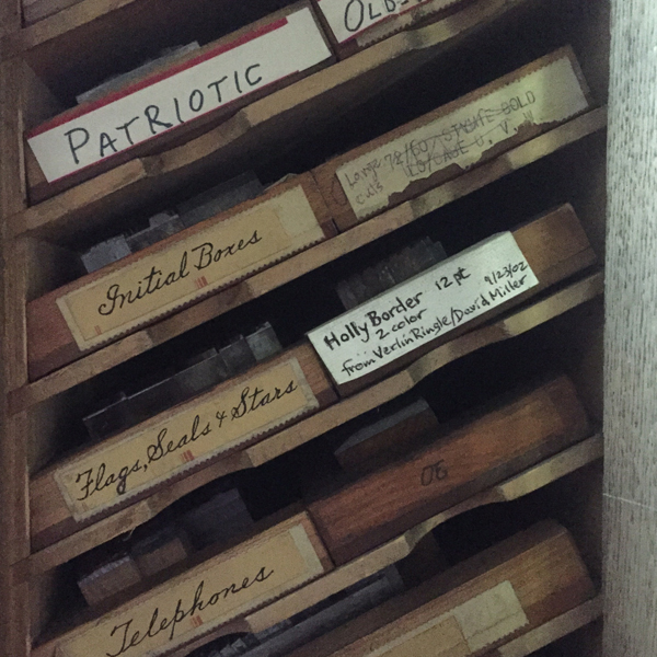
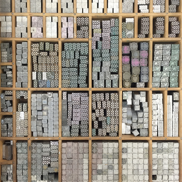
IMG_1438Top notch storage system.

IMG_1434

IMG_1439

IMG_1440The ink drum corps.

IMG_1433

IMG_1445

IMG_1441

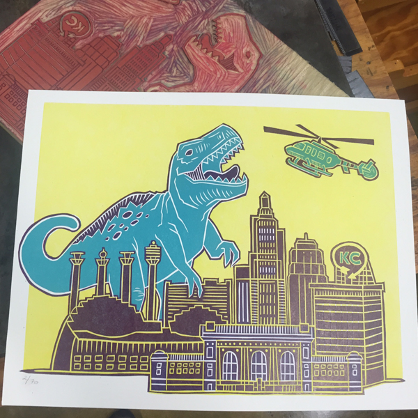
From there we headed to Two Tone Press to soak up the talent of these ladies. Their prints and linoleum cutting ability are out of this world. Sometimes, literally.

IMG_1455

IMG_1447

IMG_1452

IMG_1451

IMG_1450

IMG_1453

Huge thanks to Michelle and Angie for welcoming us and sharing their work!

Best Western is Jo's idea of extreme luxury (in-room jacuzzi and the Disney Channel), so we slept well in KC. The next morning we hit Little Freshie and made our way to St. Louis.

IMG_1457

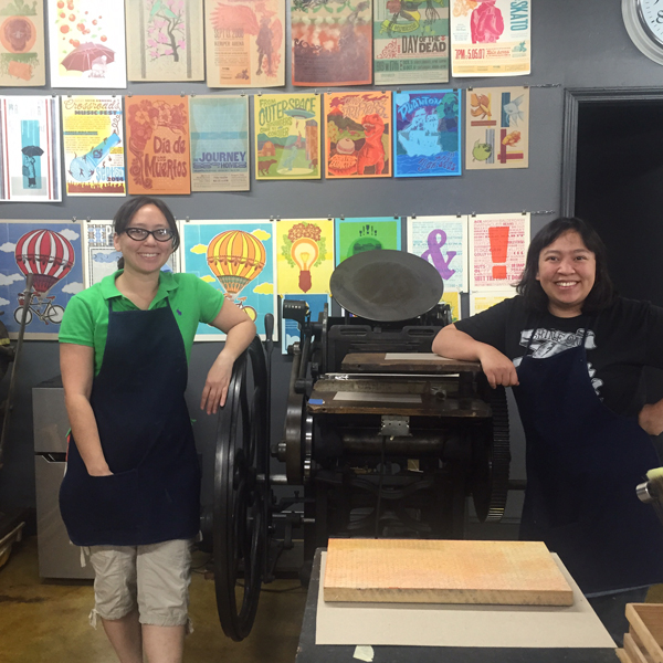
This is the home of Firecracker Press, Central Print and the Alpha Beta Club. We got in early enough to park ourselves there for the day and catch up on computer work. Greeted by the sweet sounds of Sam & Dave, this was the perfect, soul-filled balm for a long drive.

Firecracker sits on one side of the building, Central Print on the other and the Alpha Beta Club in the middle. We set up shop there in the middle to be able to see and enjoy everything that happened around us.

IMG_1471

IMG_1472

IMG_1458

IMG_1460

IMG_1459

IMG_1465

IMG_1464

IMG_1470

IMG_1468

IMG_1461

IMG_1462

IMG_1463

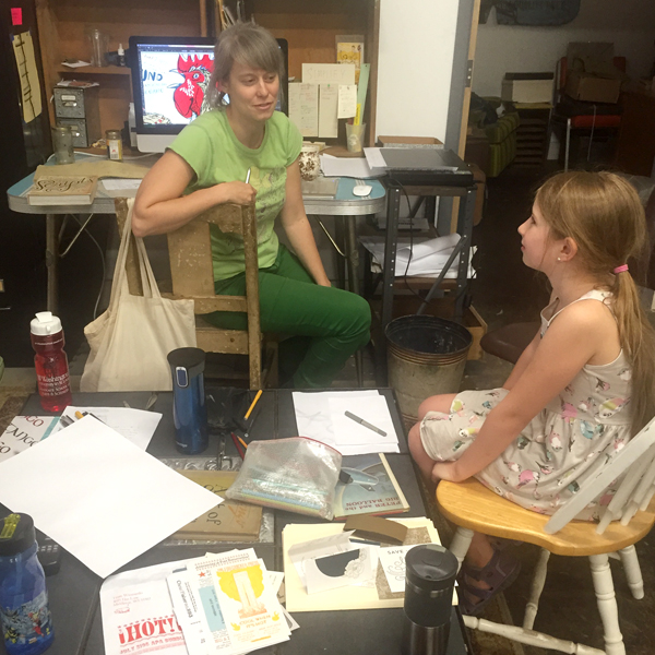
Deep into discussion with Kristina about designing and making zines.

IMG_1477

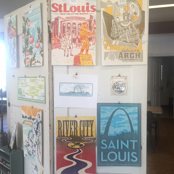
Central Print hosts summer workshops for teens and these prints are the result of one that involved pressure printing.

IMG_1473

The CP side also sells cards and prints. It's a dangerous section to be in.

IMG_1474

IMG_1475

IMG_1476

Our office for the day.

IMG_1478

Firecracker initiated the Letterpress Trail map a few years ago (so maybe this traveling around is their fault?). Eric nearly finished ours off as only he would be allowed to, with a giant sticker. You can still get these prints and collect stamps in all the shops you visit.

IMG_1480

We left with some real gems.

IMG_1481

Huge thanks to this great gang for welcoming us and letting us be a part of the atmosphere for a day.

IMG_1482

That night we went to Perennial for a benefit where Jo and Eric's daughter made some clever cork boards and jewelry.

IMG_1489

At First Light we headed out to Columbus. This sign was almost too much. So desperate for Chicago, it was all I could do to turn towards Indianapolis.

IMG_1490

But our time in Columbus at the home of Roni and Scott Moore always feels like home. Jo got quality time at the community pool and the impressive zoo while I went at it making wood type under the patient guidance of Scott.

IMG_1491

So many patterns, so little time.

IMG_1493

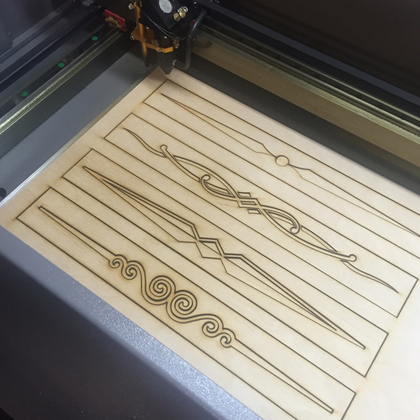
Scott has added a laser cutter to his wood type making toolbox and it was fascinating to see it in action, cutting 'new' patterns.

IMG_1494

Here are the patterns for the snowflakes we collaborated on last Fall, as well as some of the laser cut versions.

IMG_1495

IMG_1504

I settled on this ornament and set out to make two.

IMG_1497

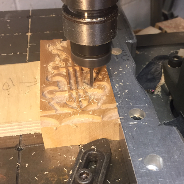
For these we started with the fine cutting before moving to the rough cut. It's a slow, methodical process that's very easy to mess up. You have to carefully trace the pattern while the cutting side takes care of business.

IMG_1501

IMG_1502

Here are the final two. Not bad!

IMG_1503

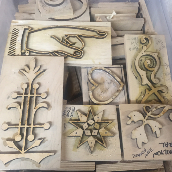
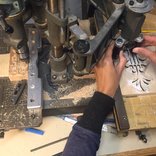
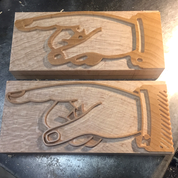
Then I moved on to the manicules as I don't have any large sets. The patterns can be used to create any size you desire with adjustments on the pantograph. I opted for a set that is 30 picas long (about 5 inches).

IMG_1505

I started with the rough cut on these as you can see on the top piece. The bottom shows the addition of the finer cut, but not the hand finishing that needs to happen to complete the job. Did I mention this is *really* a process?

IMG_1506

I made two sets so I could share one with Matt at Virgin as well as sneaking in some sunsets.

IMG_1507

We hit a huge and scary pothole on the way into Columbus that severely damaged a front tire and we needed to replace both. Of all the places for this to happen, Columbus was the best possible location. I was grateful for Scott's 'dad mode' kicking in as he found a location that could replace the tires immediately. We had to be in Buffalo the next day so our window was small. Scott and Roni are the most gracious hosts and staying with them is always a comforting pleasure. But it was time to move on again. We found a much needed Car Wash on the way to New York and we were off for the last leg Jo and I would share together.

The Letterpress Trail 2015 part one

The Letterpress Trail 2015 part three

Just Add Color. And Linoleum.

Within most letterpress shops you will find both small and large collections of what's affectionately coined 'job shop gothic'. These basic sans serif faces pull a lot of weight and often see quite a bit more action than the most decorative, fanciful wood type faces because of their versatility. At Starshaped, we have a ton of great examples of gothic type, ranging from the worn but well made Hamilton variety, to the less-than-perfect mid-century styles made for basic sign presses. I've been thinking for a while about how to dress up these gothics, and have had some success with past greeting cards. Looking at the run of condensed 15-line type in the studio, I started sketching ideas for adding a layer of ornamentation or texture. Here are the four final cards.

finalcompiledsmallMy first step was to proof the actual type that would be the base layer. These are basic carbon paper proofs of the type, with notes about leading for future reference and reprints. Down and dirty, carbon proofs are an easy way to get a glimpse into how the type looks without spending the time of inking up the press.

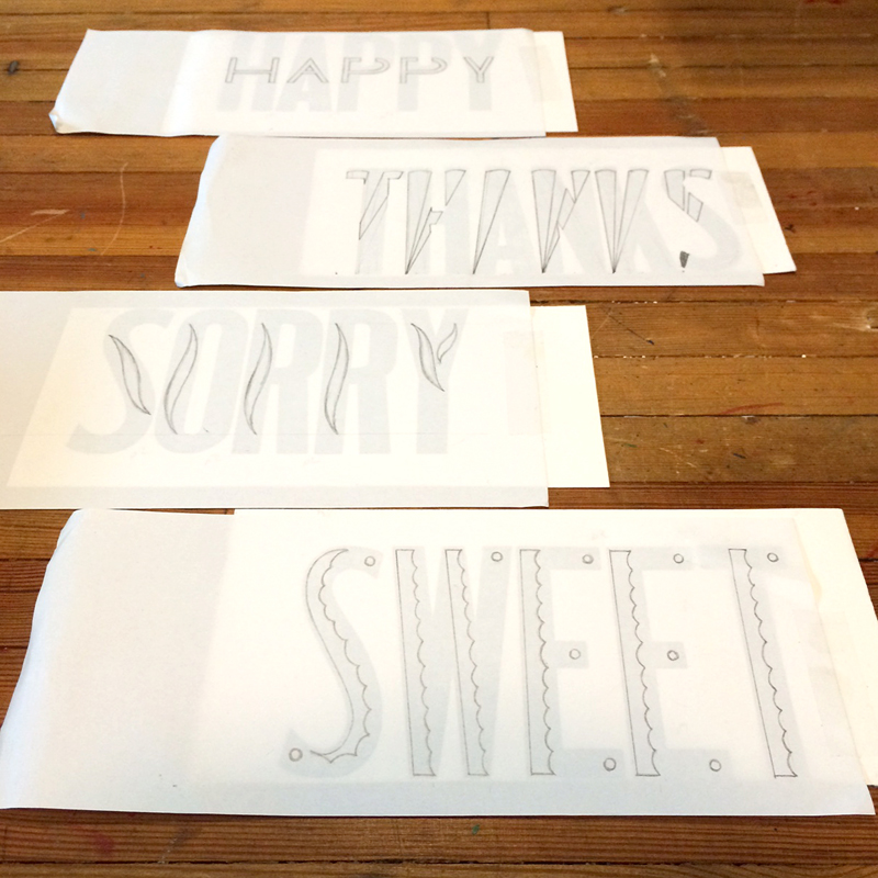
proof1After that, I laid a thin sheet of marker paper on top of the proofs to start sketching ideas on how to add something to the type. I looked at a lot of Deco-era type treatments for inspiration.

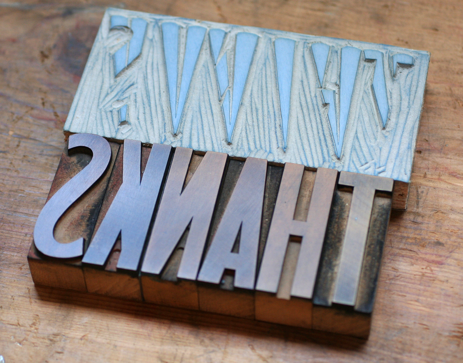
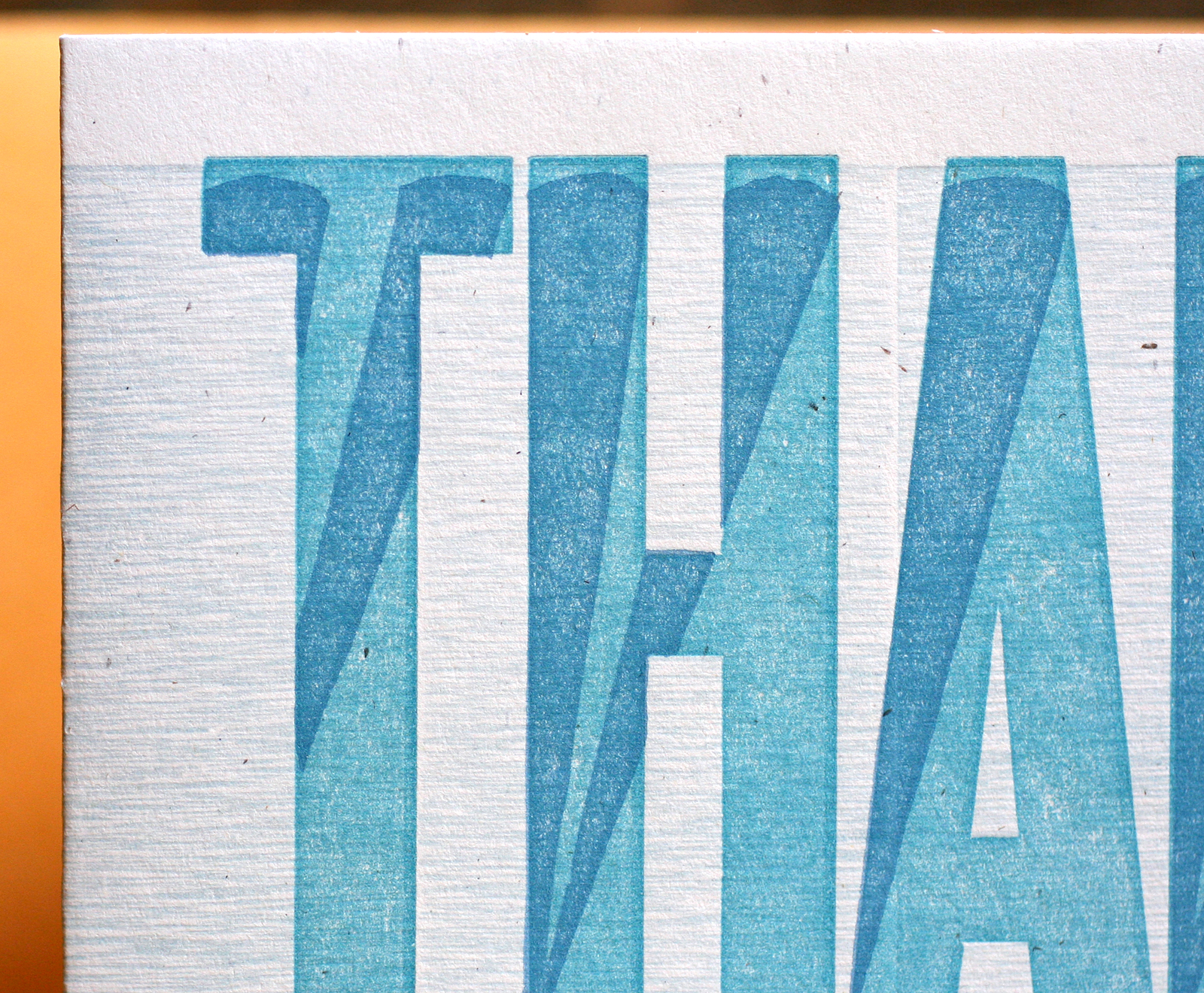
proof2For 'Thanks', I played off of little spotlights in the bottom corner of each letter and how they would look projected upwards.

proof4Each image was then flipped and carved in linoleum. I like to work this way instead of having a printing plate made, as it hones my carving skills and gives the final image an imperfect look. This is perfect for these cards, as I wanted all of the layers to have texture and quirkiness.

TthanksAs you can see here, I also printed a background texture, which was simply the back side of 15-line wood type.

thanks3Seemed like 'Sweet' should have a candy shop feel, hence the scalloped detail and bubble gum pink.

proof3

Tsweet

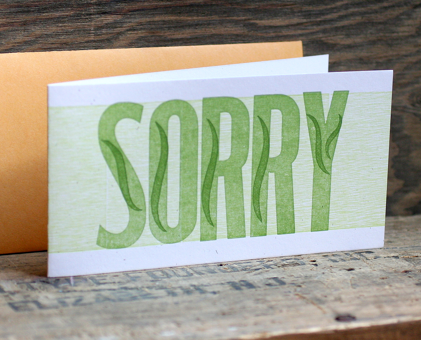
sweet2'Sorry' was a simpler affair, and I opted for a subtle wave in each letter.

Tsorry

sorry2'Happy' has twice as much happy, as I worked a squat gothic version into the larger one. I really love the orange on this one.

Thappy

happy3All of the cards are now available in our etsy shop; each comes with a coin envelope for a slightly vintage feel. If you need a little color, look no further than our jazzed up gothic workhorses.

compiledinsta

The APA Goose 2014

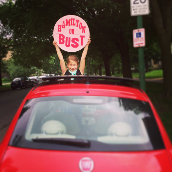
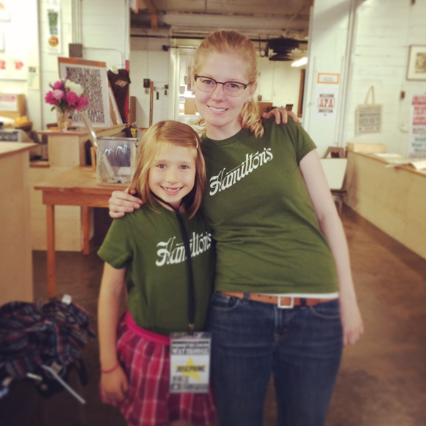
It's always a treat to drive up to Hamilton for a visit, especially when it involves seeing our print and type friends from the Amalgamated Printers Association, a group I've been a part of for 10+ years. After cutting school early, Jo and I hit the road. If this shot doesn't ring a bell, maybe this image from a favorite album will hint at our inspiration. Our little fiat is well traveled. hamiltonorbustAfter checking in (and yes, Jo gets a pretty special badge), we found our friend Scott from Moore Wood Type already at it, cutting type and doing demos for onlookers. He also brought a lot of his patterns for people to see so they could learn about the process of pantograph cut wood type.

badges

scott

patterns2Love these star patterns. You can see the 6 pointed Chicago style star (which Scott named 'Jo's star') down in the corner.

patterns3We found our friend Jason of Genghis Kern trying his hand at the pantograph.

jasonpantographAnother workshop about wood engraving was also going on, and everyone there carved into blocks that were ultimately cut as letters for Wayzgoose 2014.

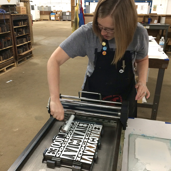
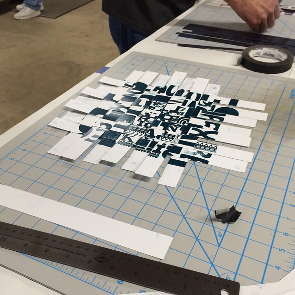
woodengravingFriday I finally got the opportunity to teach a workshop with a longtime friend and talented printer, Jessica Spring of Springtide Press. We worked with our class on two projects: the first was to contribute a page to a meander book and the second was to print type as pattern to then cut and weave. Jessica led the way on the book, setting up the form on press and then demonstrating how to cut and fold the single sheet into a book.

ws4

ws2Here are a few of the serious ladies pulling type for the print and paper weaving.

ws7Here's our good friend Erin of Inky Winke trying her hand at a little opaque white ink.

ws5Our prints were a bit wet, but we were able to trim them down to start weaving together. This creates an entirely new kind of print that can be trimmed to a smaller, square size, functioning as a piece of art in its own right.
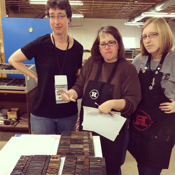
ws1Mary Alice used a few different sheets of paper for her prints (and some attendees swapped with each other), and ended up with a very patriotic weave.

ws6Rich from P22 (and also responsible for spearheading the digitization of Hamilton's type for the HWTF) was there, showcasing his latest project. Borrowing the Cloister Initial matrices from RIT's Cary Collection, he worked with Greg Walters in Ohio to cast whopping 120 point versions of the beautiful initials. Bringing a set to Hamilton to share, he also printed a broadside with all of them; you can see a snippet of it below with the S and P we came home with.

rich

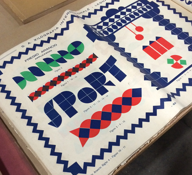
cloisterFriday night, Greg Walters (who cast the above initials) gave a talk about foreign type specimen books and brought a large selection from his personal collection. Below are just a few shots of the pages I found incredibly inspiring, including these magnificent brass rules printed in multiple colors.

spec1Greg mentioned many trends, including the predominance of art nouveau faces, which all but escaped American type founders. There were also many thick and heavy, multi-color patterns and borders.

spec2

spec4

spec5After the conference, I realized I didn't get any full shots of the group. Luckily, an APA group photo is always taken, and hopefully we'll see that soon. There's been a sea change in the APA. Can you guess what it is?

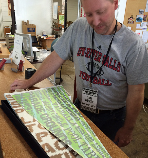
husbandcalledBefore checking out for the weekend, we got a little sneak peek at Tom Walker's incredible series of baseball-inspired pennant prints. Incredible and detailed work, with a hand built box to boot.

tomwalkerAs always, we had a great weekend in Two Rivers, and look forward to November when we're back again. And next year the APA Goose will be in Chicago, and it'll be incredible so mark your calendars.

Matching type nerds!

jostephtwins

Lost Type... and Found

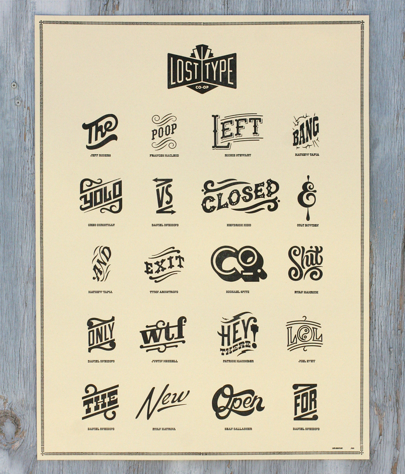
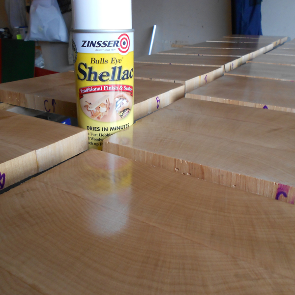
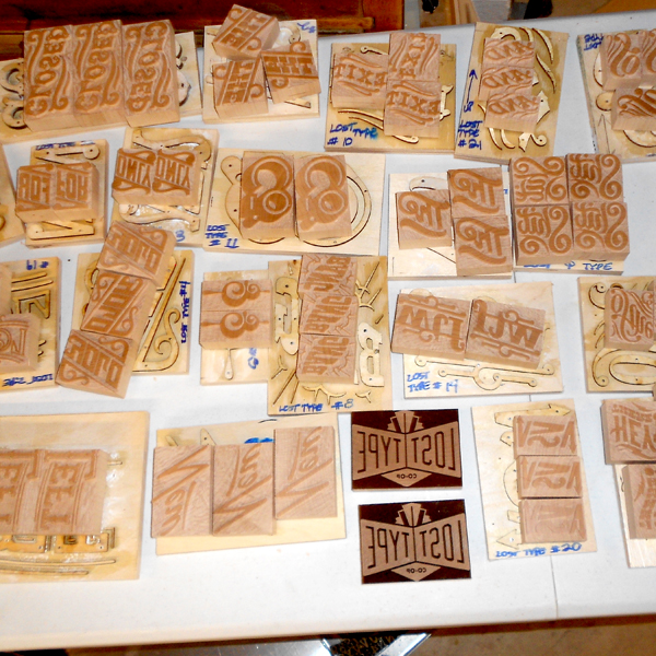
Working in a studio alone most days means that it's important to make time for collaboration. Luckily, this happens pretty regularly and these posters for Lost Type are a great example. Working with Dan Gneiding, the designer of Dude Hank along with friend Scott Moore of Moore Wood Type, the poster showcases a set of fabulous new catchphrases designed as digital fonts but cut as wood type, too, as they were traditionally produced.losttype1 The following images are courtesy of Scott, as he documented his process of converting the files for each catchphrase into actual wood type, starting with the wood planed to type high (just shy of an inch).

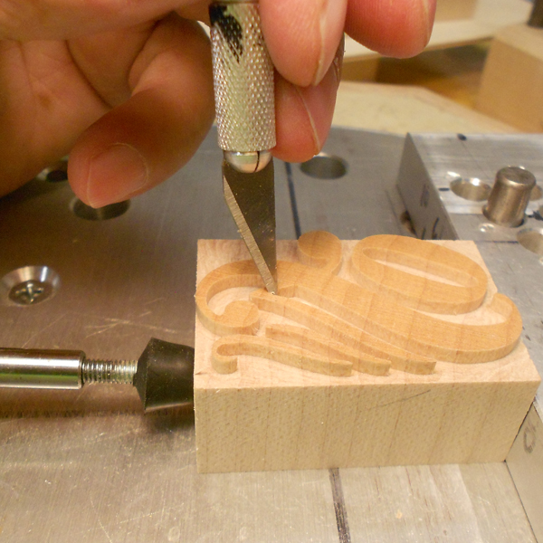
scott7Stencils are created for the pantograph, which traces these while the connecting arm carves the actual wood type block.

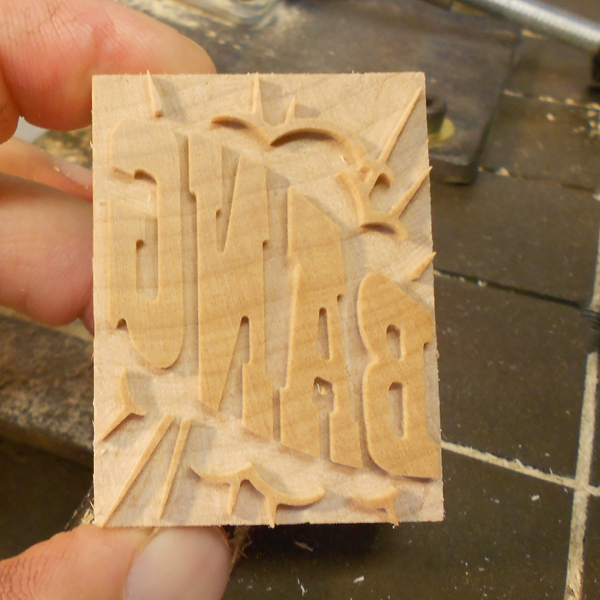
scott4Here's a great shot of the original stencil alongside the finished piece of type.

scott3The smallest areas and details are trimmed by hand. Love the laboriousness of this process!

scott6

scott2

scott1The poster I printed was the combination of a laser cut Lost Type logo, the pantograph cut catchphrases and magnesium plates of the names of the designers underneath.

Tlosttype5I printed the posters at Jim Pollock's studio, as he owns a Vandercook 320G press, which is substantially larger than our Vandercook SP-15, and capable of printing 18x24" posters.

Tlosttype2I particularly enjoy this ampersand.

Tlosttype4

losttype4

Tlosttype3See that little POOP in there? That one was designed by new friend Frances MacLeod, which I didn't realize until well after this printing!

Plosttype5

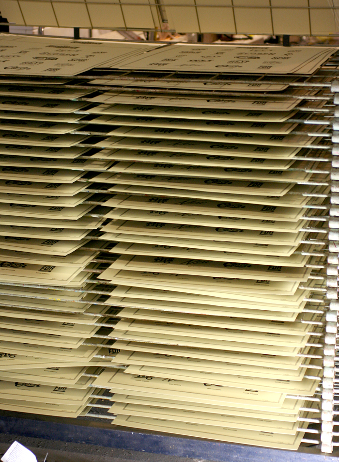
Plosttype6The posters had their own dedicated drying rack after printing, which was handy given that there were about 300.

Plosttype2

Plosttype3The digital catchphrases are now available, so grab 'em and update your look. You can contact Lost Type about acquiring a poster, and Scott Moore about the possibility of getting the real deal in wood.


Words + Music

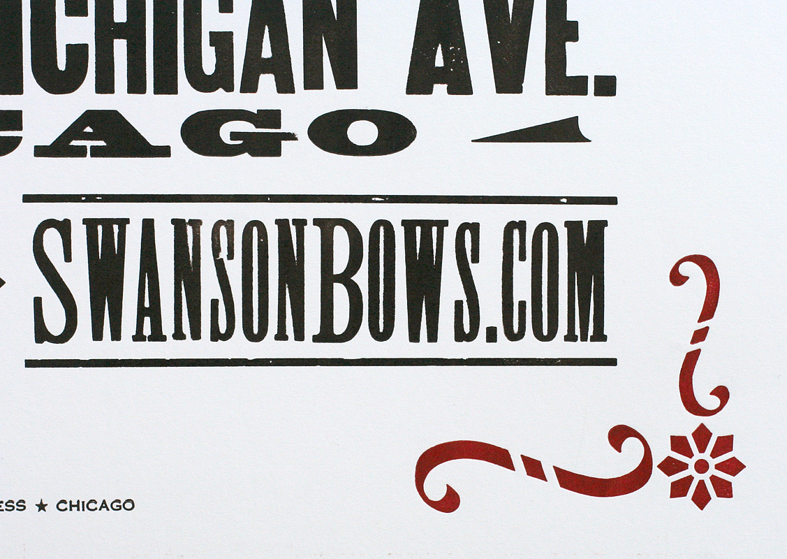
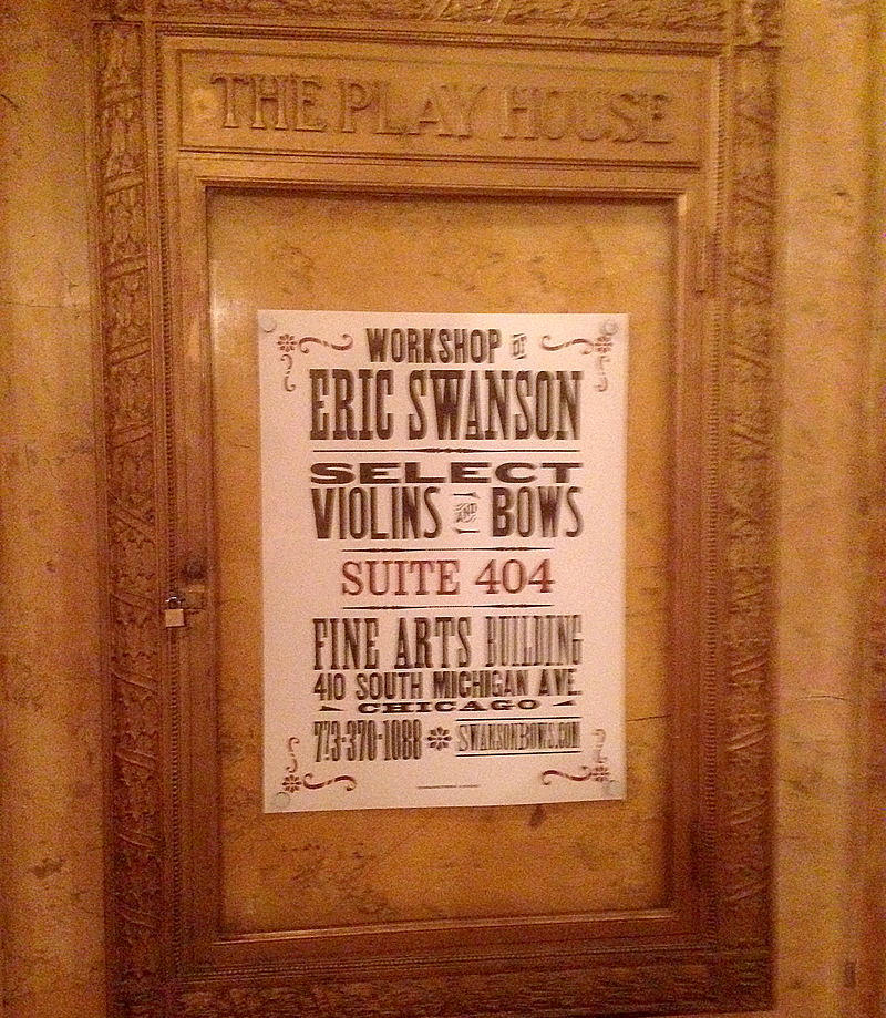
Two inspiring music projects involving violins came our way this Spring. The first was a poster for Eric Swanson's workshop in the Fine Arts Building, downtown Chicago. The historic building has beautiful brass display frames for just the sort of poster as this: ericswanson1The poster measures 18x24", which is substantially larger than what our press can handle, which meant spending a little time with our building mate, Jim Pollock. His Vandercook 320G is the perfect size for large prints of this nature. As you can see, even the form was impressive in size.

Tericswanson1

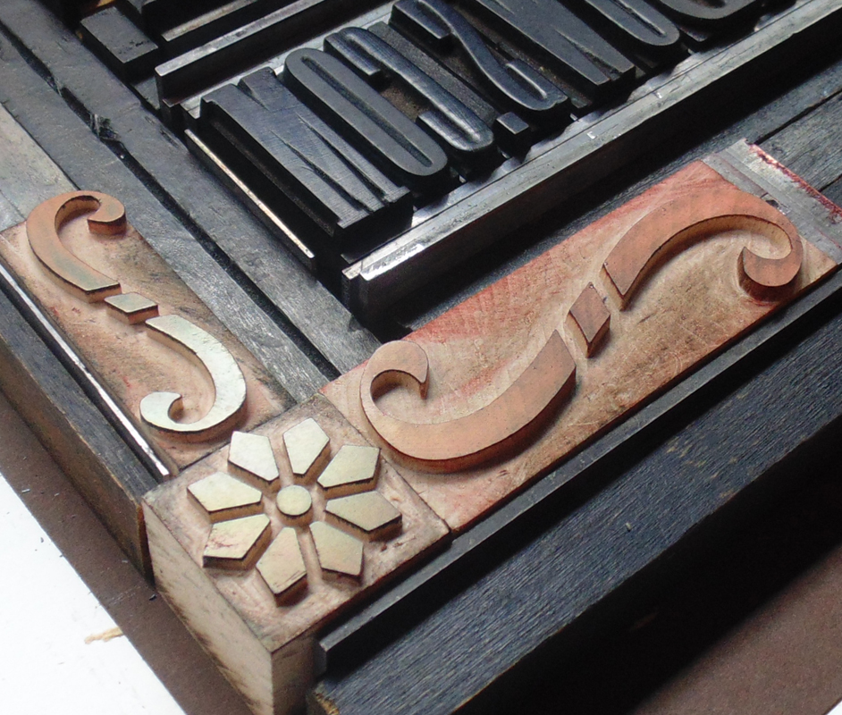
Tericswanson2Eric wanted a large print with a vintage feel, including blocky gothic type. We've got that! The corner brackets were created with three ornaments pieced together. All were produced by Moore Wood Type. Mixing old and new elements gives work produced in the studio a fresher, cleaner feel than similar projects produced 100 years ago.
ericswanson2

Tericswanson3Not a fabulous shot, but this is the poster in its proper place:

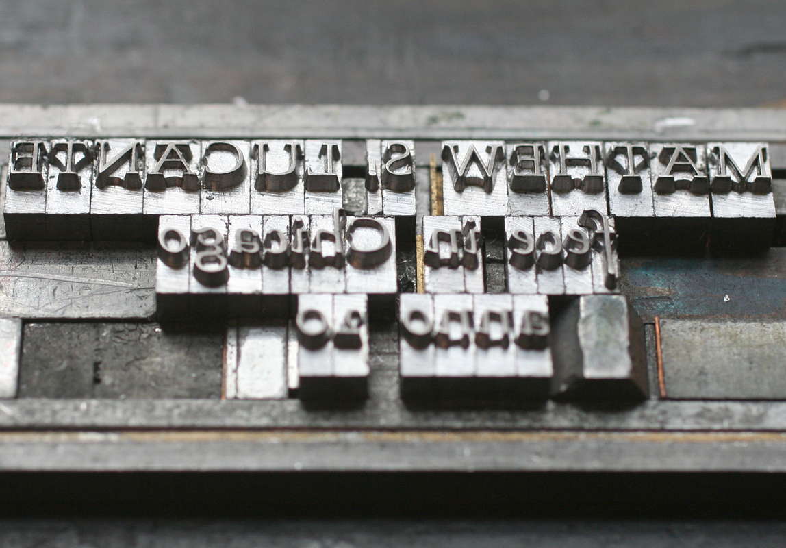
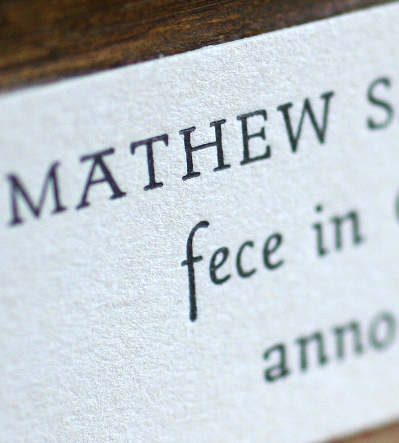
ericswansonfinalMoving from one of our largest pieces to our smallest, we were asked to create tiny labels (about 2.5x1") to go inside hand built violins. What a treat! They are printed on Stonehenge cotton paper (a very soft khaki), using a unique typeface called Stern. It was the first typeface to be simultaneously released in both digital and metal form. Right up my alley! Obviously Mathew adds the full year to each label before pasting it inside his creations.

mathew1

Tmathew2

mathew2I love the juxtaposition of these two projects destined to be seen by the same style of musicians. Creating such disparate projects is what makes work at the studio so interesting!