CPG is A-OK

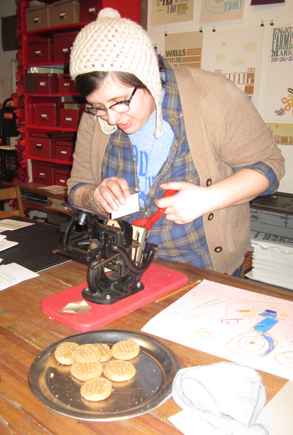
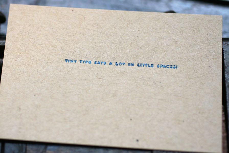
About four years ago, our fellow printmaking friend, Nadine (now of Sonnenzimmer fame) suggested that Chicago area printmakers pull together and create an organization that would help to define, promote, support and educate the printmaking community of the city we all call home. This turned into the Chicago Printers Guild and has been gaining momentum ever since, through monthly meetings, field trips, outreach and print shows. Each month a different studio in the city hosts a meeting, where as many printers as possible gather together to discuss issues that surround the field and then enjoy a demo from the hosting studio. Beer and cookies abound. In February, Starshaped was up! Because the group is largely made up of screenprinters creating large works of art, I decided to set up our tiniest Press Bike press with the tiniest type in the studio, which happens to be 4-point type on a 6-point body. Here's the little Sigwalt in action. And yes, that had been a plate of peanut butter cookies.

cpg2

This is Rebecca from Rar Rar Press, one of the few studios (alongside us, of course), that prints entirely with antique type. So this is a lady who knows what's she's doing here.

cpg10

The little Sigwalt isn't the finest press we've got, so there's something left to be desired in the print quality. But you get the point.

tinytype1

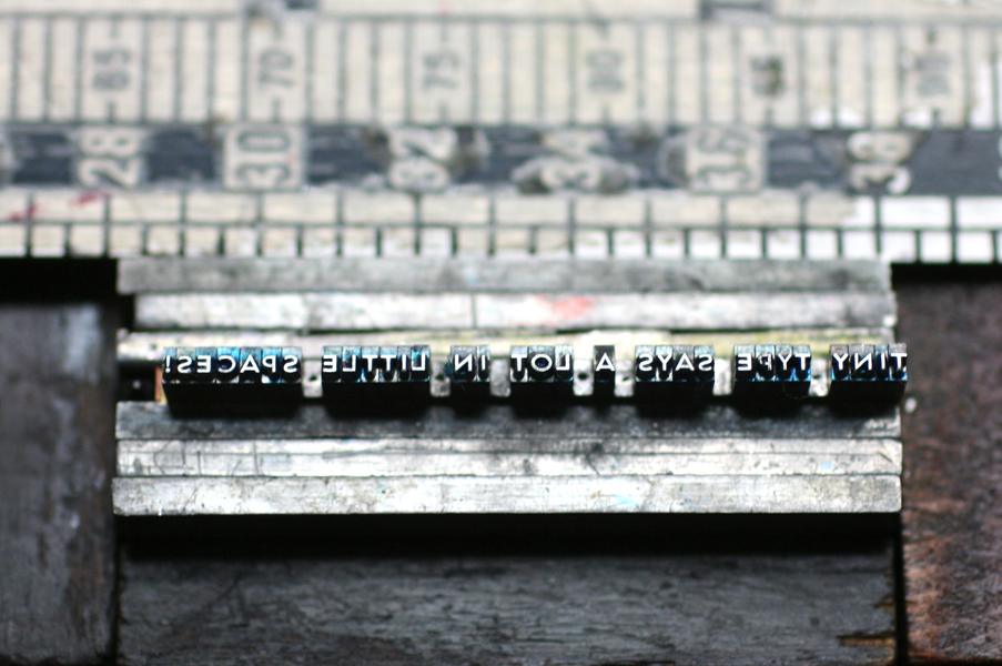
Here's the form for the tiny print alongside a pica ruler. This is approximately 1.5" in length.

tinytype2

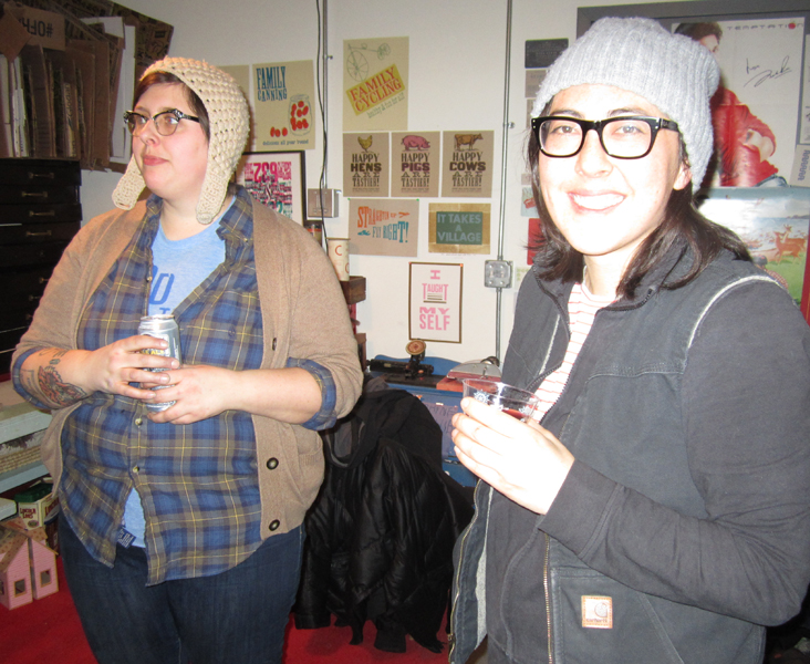
And here are a few of the stars of the printmaking galaxy, including the 'dorky hat club' members Andy Schwegler from Letterform, Dan Grzeca from Ground Up, and Nick Butcher from Sonnenzimmer.

cpg9

cpg4

More fabulousness in the form of Megan Sterling, a former Starshaped alum, alongside Julie Morelli of Letterform and Nourishing Notes (seriously multitasking lady). Following is ass-kickin' Sonnenzimmer Nadine Nakanishi.

cpg11

cpg8

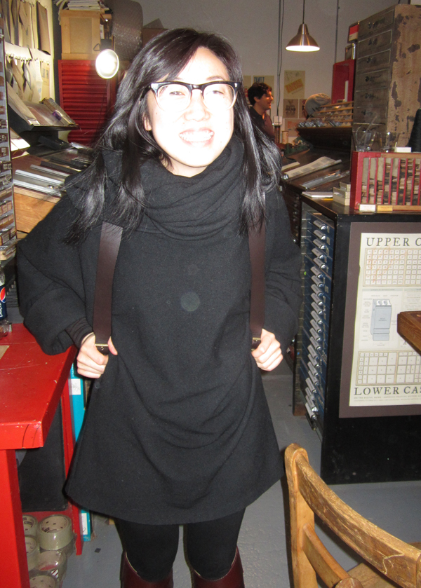
Here's our own lovely Janice!

cpg3

Tiny future printmaker and CPG member. Already churning out some great ideas.

cpg7

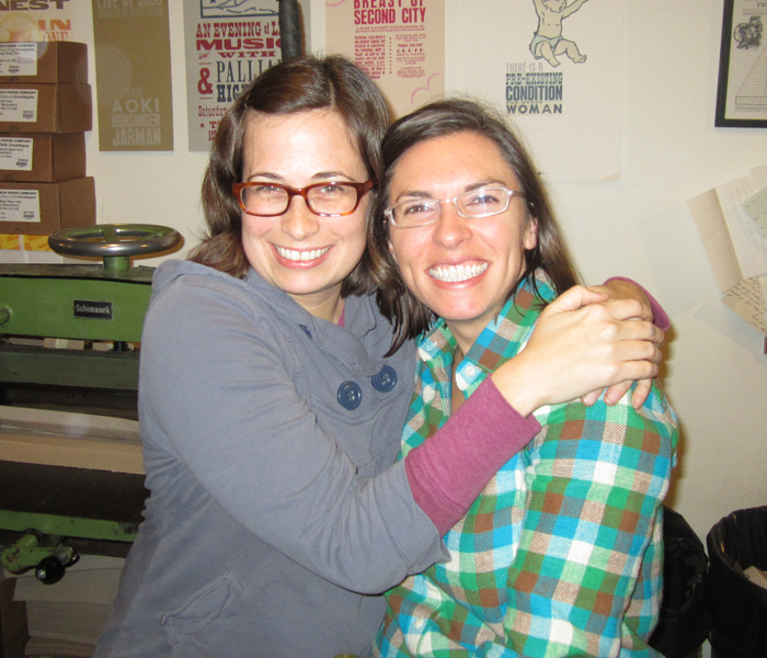
And here's me and Julie again! A while back we were thrilled to have Julie print with us at Starshaped, until she acquired her own press.

cpg5

If you're curious about printmaking in Chicago, please check out the CPG! New members are always welcome and we've got some great projects up all of our inky sleeves...

City in a Garden... and in How Magazine

I'm pleased to share that our poster, Urbs in Horto, was just selected as one of the Outstanding winners in How's International Design Awards issue, which is out now. howcover

howpage

Last February, I built the form for this poster and printed it over the course of 4 days, to be included in the city's show, The Flag and Seal Revisited, which featured different takes on Chicago's flag and seal by local artists and printmakers.

When starting the print, I wasn't sure if it would be successful or not, as I explored the idea of building a city of ornaments (which we do a lot in the studio) in multiple colors and in a circular shape. The type was set solid, meaning there was very little spacing in it, making it that much harder to take out the individual colors while maintaining the overall integrity of the print. Here's the initial shot of pulling ornaments and designing it before moving to press; I can't help but liken it to building the Death Star:

initial

Here are a few other close ups of some of the colors once I moved the form to press:

Tfull3

Tclose5

Tclose2

And here is the final print. I wanted it to have a specimen-like feel, and labeled the bottom accordingly with mini pins.

FARRELLurbsinhorto1

Ttitle

urbstitle

The print plays off of the idea of City in a Garden, the Latin motto of the city. There are flower and plant ornaments cropping up between all of the buildings represented, as well as little 'trees' that follow the line of the water meant to represent Lake Michigan. Many popular features of the city are included, like the Sears Tower, Buckingham Fountain and Harold Washington Library.

urbs7

The other side of the print ends in the more stereotypical bungalows that make up many of the city's neighborhoods. And would it have been complete without a cow?

urbs4

The 'kissing kids' in the lake is a small cut originally produced by Chicago's own Barnhart Bros. & Spindler type foundry.

urbs6

The print (which sold out quickly) was a crowning achievement in my typesetting career, and I'm glad it turned out to be successful on many levels. We'll be celebrating at the lovely Atwood Cafe in the historic Reliance Building downtown.

And as if the recognition of this piece wasn't enough, How also selected one of our invitations to be included in the Merit category:

howpage2

Also a city, but this time San Francisco. Apart from the difficulty of setting the Golden Gate Bridge with curved rules, the other fantastic and challenging aspect of this project was setting it in both english and french, which required the use of accents and a little 'type surgery'. Here are a few close ups:

*marieeve1

*marieeve2

Notice here the addition of accents, and the trimmed Copperplate E's (to make room for the accents).

Tmarieeve2

goldengate1

Why does it look like this picture was taken late at night? Because it was... it took about 4 hours just to get it to stay together and straight given the bent rule, let alone getting it on press. Is it worth it to spend this amount of time typesetting? Yes, given that the mission of Starshaped is to preserve the typesetting techniques of the past and make them relevant to commercial work today.
Anatomy of a Move

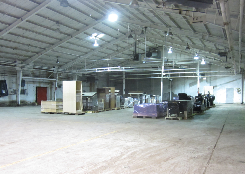
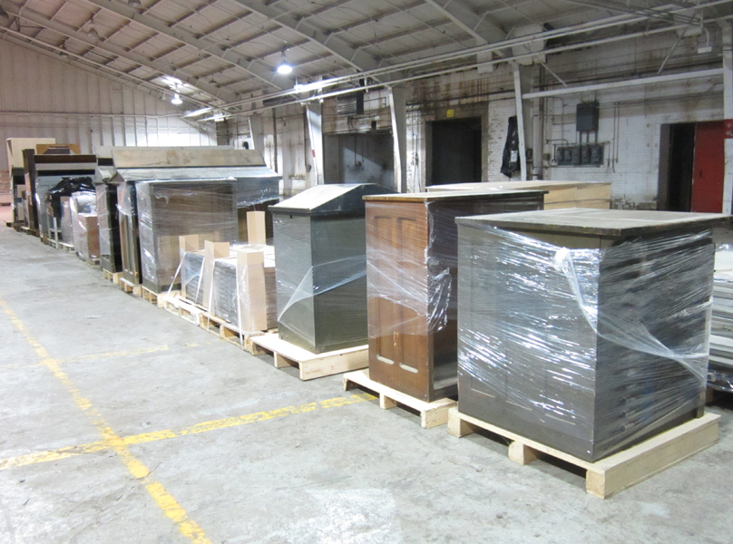
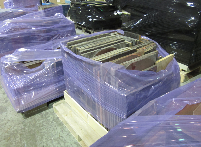
This past weekend I traveled up to the Hamilton Wood Type and Printing Museum (again) to help with one of their volunteer move events. As you may know, they need to move from their current location (the original home of Hamilton) to a new space in Two Rivers by April first. If you've ever moved any printing equipment and/or type, then you know what a monumental task this is on a small scale let alone 30,000 square feet of printing history. Jim and Stephanie, the museum directors, have put a great and organized system together for labeling each piece for the move, and an impressive amount of packing has already taken place. I got a chance to walk around and get a few great shots of the current state of progress. If you've been to the public area of the museum, this will look familiar. The system for packing involves shrink wrapping pallets in colors coordinating with where the pieces are at the current location. Many of the displays have been removed and are awaiting pallets.

pack8

pack7

pack6

Not only do you get to see the organization of these final staging areas (this is just one), but the sheer scale of the building itself.

build6

build5

build4

Some very large wood type ready to go.

build3

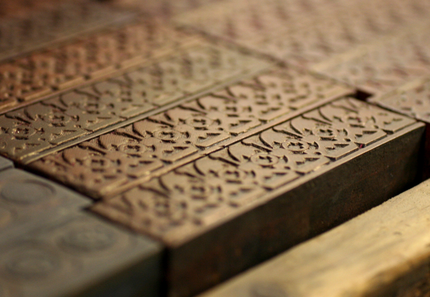
Pallets full of half rounds that could be (and hopefully will?) be used to create new wood type.

build7

build6

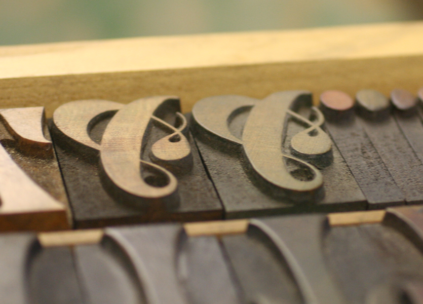
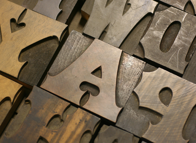
My job involved packing up the bits and pieces for printing (leads, reglets, furniture, etc.), as well as organizing the type cases in preparation for packing on the second floor of the building. This was a delightful job as I got to use years of experience with moving type as well as peek at many fabulous (and fabulously dirty) wood typefaces, some of which are here:

type1

type3

type2

type5

type6

type4

Found this type set in its case like this. And yes, I was.

type7

This ampersand is approx. 5" tall.

type8

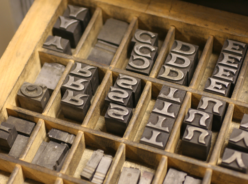
There is also a fair bit of metal type at the museum, and this was a treat to find. It's 48 pt. Spread, a typeface we have at Starshaped in a tiny 8 pt version. Just lovely.

type11

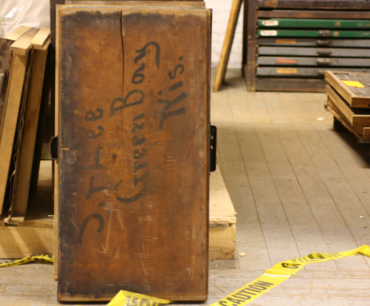
The back of one empty type case. We have some similar styles of written labels in the studio, though ours are from Chicago.

type10

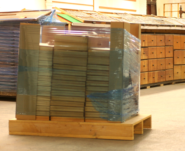
Our first load of wood type on a pallet, ready for labeling, shrink wrapping and banding. There is a sheet of bubble wrap and cardboard in between each case for extra protection.

typepallet1

We may not be up again until after the move and hope that all continues to go well. Money still needs to be raised and you can still help. And the always lovely Mari will gladly ship orders of some of the awesome prints and souvenirs you can find in their shop. Let's hope our next post about Hamilton involves a happy new homecoming and opening celebration!

The ongoing task of Type Proofing

The Baffler once said, Interns Built The Pyramids. This couldn't be more true at Starshaped, where interns keep tabs on the type collection every week, with the menial tasks of sorting, setting and proofing in order to keep everything in top shape and ready to use. Every few months we take a moment to catalog new metal type in the form of a small type specimen book. This isn't exactly formal or complete, but it lets us know what we have in the collection, lest we forget (which can happen when you have 600+ fonts). Our metal type book has been growing from day one, and is updated as more type makes its way into the studio. We also take the opportunity to print full proofs of any unusual or 19th century faces that come our way and for which we have no digital versions. typebook1

typebook2

metaltypecards

Last year we started proofing the wood type collection in the same fashion, only on larger 12x18" sheets, and combining the typefaces with wood ornaments, rules and borders. Not only will this give us a better working knowledge of the type in the studio, but it also puts it in an easy-to-scan format to aid in making quick digital mockups of jobs. The wood type is a much more time consuming project, mostly because of the setup process. We've been trying to do all of the faces we have in a given size at a time, as this keeps the basic framework similar from one to the next. As of now, we have about 1/3 or so completed, or around 35 complete fonts proofed. This project, like with the metal type proofing, needs to happen when the presses aren't running actual jobs, so it is often put on hold for downtime, which can be hard to come by. Once we have them completed (a task that's never really finished, given that we're acquiring type all of the time), we can put together one nice set for the archive and reference another for instruction or daily use. Occasionally, other printers have asked to reference type we have in the studio for research purposes and this will come in handy for that.

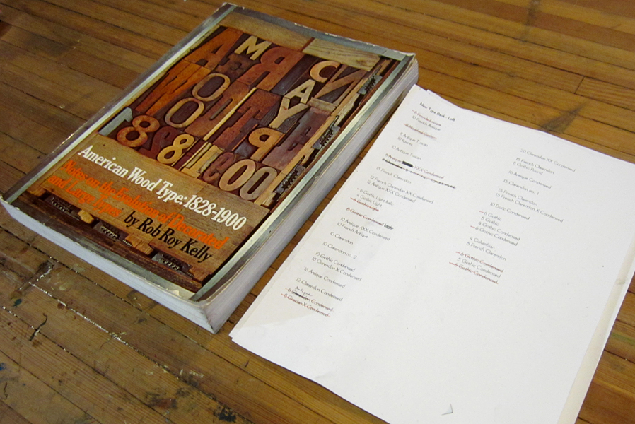
Our lists of wood type, along with the best reference book:

rrkbookandsheet

One of the 8-line forms on press:

Tproof

Just a few recent sheets:

fullsheet1

fullsheet2

The other great thing about this project is that it's a down and dirty lesson in every step of the printing process for the interns. The overall design and format of the pages have to match from one to another, the type needs to be set correctly, justified and line spaced accordingly, and then there's makeready on the press from the ground up. Oh, and did I mention printing? That's actually the easiest part.

Dennis and Marie at home

Back in November of 2012, I had the pleasure of meeting Dennis Gilliam at the Hamilton Wood Type Wayzgoose. As someone with a past in typographic arts, we had a lot in common when it came to our passion for antique type and typesetting. Apparently, I 'won him over' with Starshaped's commitment to only producing work with metal and wood type, and after traveling home to Portland after the 'Goose, he contacted me about creating calling cards for both himself and his wife. For his own card, he pulled heavily from the silent film/ragtime-inspired print in our self promotional packet and pieced together what he thought would look great on the card. Here's a shot of the form. It has a combination of mortised multi-line rules around the name, and a tricky set of rules to create a box around the main text.

Tdennis1
Tdennis1
Tdennis2
Tdennis2

And here's the final card:

dennis1
dennis1
dennis2
dennis2

And since we were already working on one card, Dennis also ordered cards for his wife, an avid bonsai tree admirer. They provided this image, which I cleaned up to make into a magnesium plate and then combined with type. These are printed on 100% recycled stock.

Tmarie1
Tmarie1
marie1
marie1

One of great perks of collaborating with Dennis? He's currently working with the fabulous Bob's Red Mill and sent coupons for their fabulous products! Granola? Flour for cookies or cakes? Any which way, the studio will be stacked with delicious treats.