Printing with a special collection of metal and wood type has always been at the heart of what I do at Starshaped. Sharing this collection with clients and collaborators means we’re preserving the materials through production. Here are a few prints and projects that affected the direction of the studio and cemented my ideas about the kinds of pieces that should be produced.
Starshaped began not long after Fireproof Press closed, forcing me to go it alone. I took on a bunch of work that would have been printed at Fireproof, and started picking up work on my own, like these Shellac tickets made for Stormy Records. The idea of Starshaped felt like a viable pursuit when I did an interview for Punk Planet magazine. I’m still immensely proud of this experience as it aligned then and now with my approach to the craft of printing and where it fits in the larger culture.
I’ve been able to collaborate on projects with people I deeply respect and admire. One of these great clients is the band Ida, a staple of my developing years. We created a few different posters and music packages over the years. I’ve had the pleasure to work with other favorites, such as Naomi of Damon & Naomi/Galaxie 500 and Kristen Thompson of Tsunami on personal projects.
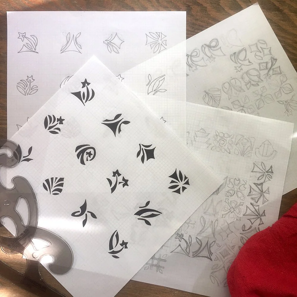
I’ve had multiple opportunities to design ornaments as well, for both wood and metal type. I’ve worked with Moore Wood Type to laser cut pieces for the Print Club as well as Bowerbox Press on catchwords. In 2016, I collaborated with Three Ton Bridge at the Bixler Letterfoundry to produce two collections of Chicago-inspired architectural ornaments. Read about these here.
Passionate clients have contributed so much to the success of Starshaped. Many come back, time and again, for new projects and I’m always grateful. Often, their projects are too personal to share on the site, but Nora and Brian are happy to share; in this example, a print made their first year of marriage and their tenth. It’s an honor to be part of so many moments for so many folks.
The first time I built a skyline of ornaments was for Reetu and William’s wedding invitations. This sparked further explorations of the concept on many, many forthcoming invitations, for cities far and wide. The City of Big Ornaments collection can be seen here.
Another ongoing partnership is with Christy Bennett, a musician and teacher in the neighborhood. Her projects are always interesting and intricate, involving research about songs, styles and women’s roles in songwriting. On the most recent CD collaboration, I also worked with Judith Mayer, who created the fantastic illustration of Irene Higginbotham.
Over the years, I’ve developed a handful of self-promotional pieces for the shop, some of them award-winning. Often these were designed and built to showcase collections of typefaces and styles and to celebrate the versatility of type. The 2020 promotional mailer was made in lieu of being able to have any in-person celebrations and was mailed to the usual cast of characters that came out for open houses. It looked like the building Starshaped inhabits and included a playlist, a bottle opener and tiny notebook.
Occasionally, interesting and historic printing plates find their way to the studio, often from other printers. When possible and appropriate, I’ve printed them and rounded out their designs with additional colors. They’re important artifacts in the history of printing but also create work to sell, thereby supporting the studio.
In 2020, I was one of a collection of nationwide letterpress printers creating cover designs for Field Notes. This project took over the shop for weeks that summer, and even Bean, a new puppy at the time, got in on the action. Check out all of the covers and more about the series.
Around 2015, I started considering projects that would fall under the Book Arts genre. With the success of early books, I explore portfolios of prints and unique structures. I was immensely proud of my first catalog of work and the sales that came in after shopping it around to libraries and collectors. It’s the most exciting area of work for me as it’s the most challenging and thoughtful.
CHIRP, or the Chicago Independent Radio Project, is an absolute gift of music and culture. A completely independent radio station, both over the air and streaming, its people are huge proponents of indie music and the local scene. We’ve worked together on a number of projects over the years and here are just a few.
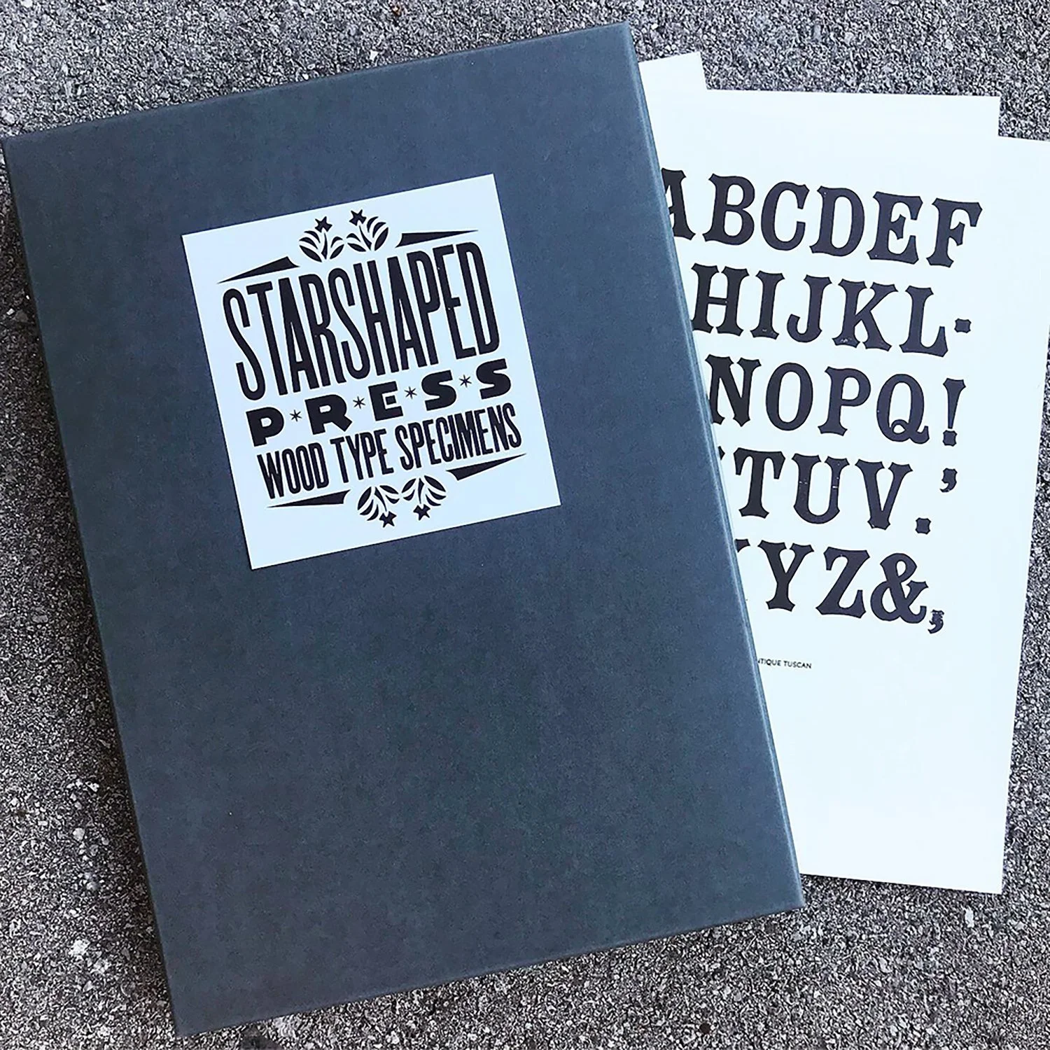
Whenever new type comes into the studio, I do my best to get it proofed. These proofs aren’t fancy; they’re just black and white and easy to scan. When there are 3 or more typefaces in the same family, they get their own proof card. Almost all of the ornaments are proofed as well. This has been a great project for past interns as they need to learn all of the steps to print, from typesetting to makeready on a press. Many hands have made this essential studio tool a reality!
Thanks for reading along and for 25 years of support!


