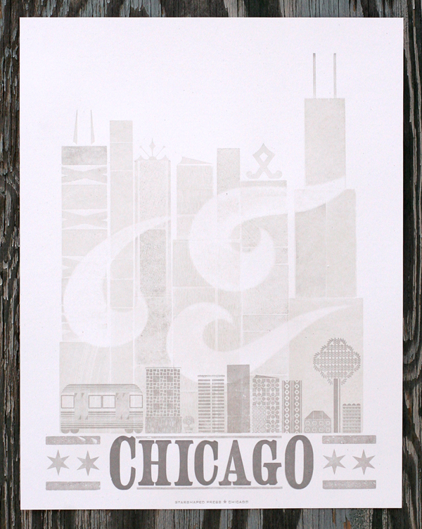
If you want to get an idea of what's going on in gig posters, urban prints and street art, head straight to Logan Square and Galerie F. I was pleased to be invited to contribute to their collection of exclusive prints, and the poster is now available on their site. Here it is:

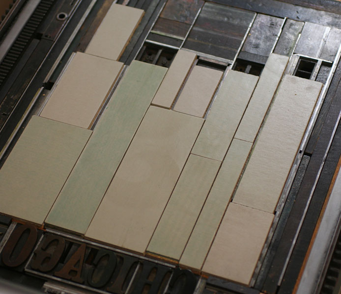
Chicago is always a popular theme and one I love. For this one, I wanted to create a large cityscape to represent downtown, but also something that was indicative of the smaller skylines of the neighborhoods. The first two layers were printed with wood type (and the back side of wood type), and linoleum blocks in very pale dirty gray to give depth and texture to the image. The wind image is a pressure print, which is created by adding a shape or cutout to the makeready of the press which affects how evenly the paper will roll over type.
Here's a shot of the wood type as well as the linoleum blocks.
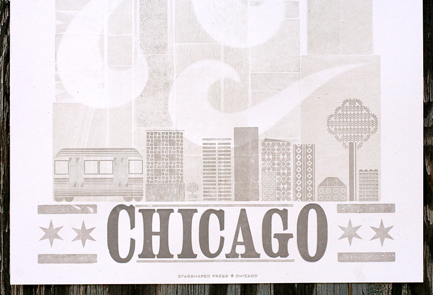
You can see the texture created by multiple layers, as well as the hints that came through the pressure print to keep the wind shapes subtle and soft.
After those two runs, it was time for the type and the small cityscape. To create the type with a larger first and last letter, you actually have to have two separate fonts of the same thing. This also features the Chicago wood stars we commissioned from Moore Wood Type. There's a small representation of a CTA train car, as well as an ash tree, in defiance of the emerald ash borers that are destroying the ash trees of the city.
You can get a copy of the print directly from Galerie F for the next month, as well as a number of our other prints if you pop by the gallery. It's definitely worth a stop if you're in the neighborhood... so much great stuff to look at and take home with you!


