Dann and I have been friends for... two decades? So long I can't fully recall how we met. What I do remember are all of the shows we've been to over the years, the scheming about building prints shops, bands, record labels, you name it. The hours at Dons in Rogers Park and Trevi in Lincoln Park. And the thread that's pulled us through all of these years is a simple one: Sweet. Pop. Music. So when Dann came to me in December with the direction to 'make some cool posters', I gave it a shot. Hosting a residency at the Hideout, a veritable Chicago institution, meant a whole lot of type to go with a whole lot of music. The Cooper Black was calling out for a little action, so I set the themes for each night to proof and play with digitally.
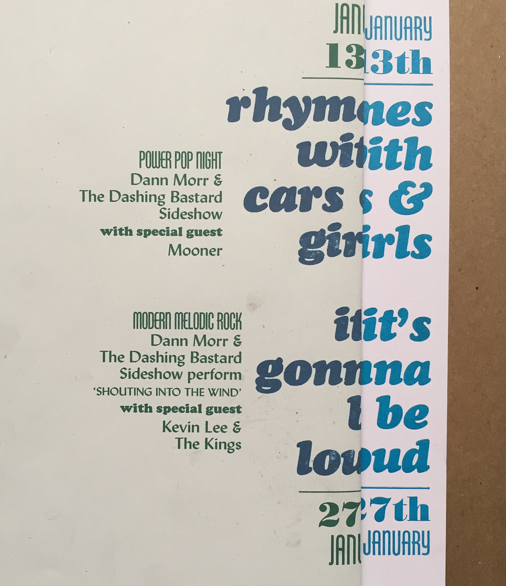
 After scanning them into a 'fake out' file, I could then figure out how all of the rest of the type would fall into place for the design I had in mind. This is the computer print next to the first printed proof; I can line up both together to check for spacing and alignment.
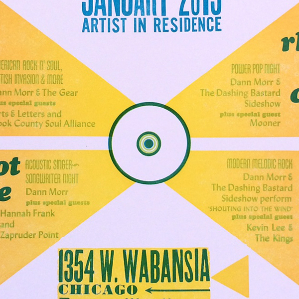
 I wanted to create the effect of an old 45 label with shapes reverberating out of the center. I drew what these would look like on a transparency then used it to confirm the text would fall within the proper areas.
 I set all of the type at once to make sure the placement was correct and then labeled what blocks would be what color (green and blue).
 A brass circle for the center, coupled with a wood circle ornament from Moore Wood Type.
 This is the full form, inked for the proof. It's a sexy amount of type!
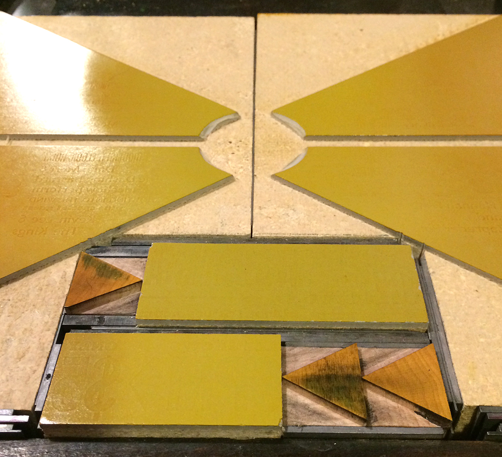
 I cut linoleum for the shapes and printed them last given the highly transparent ink. It's a very subtle split fountain that is yellow in the center and orange on the outsides.
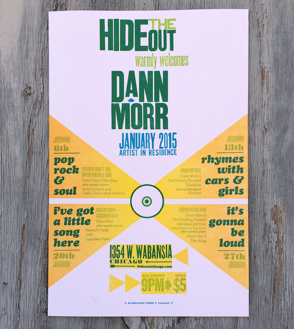
 Here's the final poster. The shows were intimate, entertaining and stacked with some of the best talents in Chicago. No doubt you'll witness another collaboration before long. Check Dann out here, or scroll down here to listen to his interview on WBEZ. Or damnit, just go see him play... you won't be disappointed.


