WNYBAC Book Fest

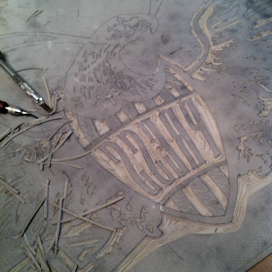
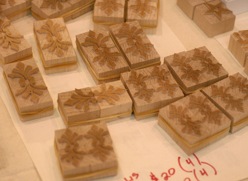
As you may recall, I've got a weak spot for the Western New York Book Arts Center since Rich and Carima of P22 fame got it going years back, and I've had the pleasure to print there in the past. This summer I was asked to contribute a linoleum cut for steamroller printing at their annual Book Fest. bookfestposterThe cut would have to be a large one, and mine is 4x2', officially the largest linoleum cut done at Starshaped. While thinking about what the image would be and what it would say, I wondered if I could potentially use my grandfather's recently inherited wood carving tools. My grandfather was an avid woodworker, churning out all manner of projects that would commonly be referred to as folk art. He loved Americana and patriotic imagery, and of these, his favorite was eagles. They were everywhere I looked when growing up, and to this day one watches over my grandmother's home. Finding and carving the appropriate eagle with grandpa's set of tools would be a tangible homage to the love of craft that he instilled in me.
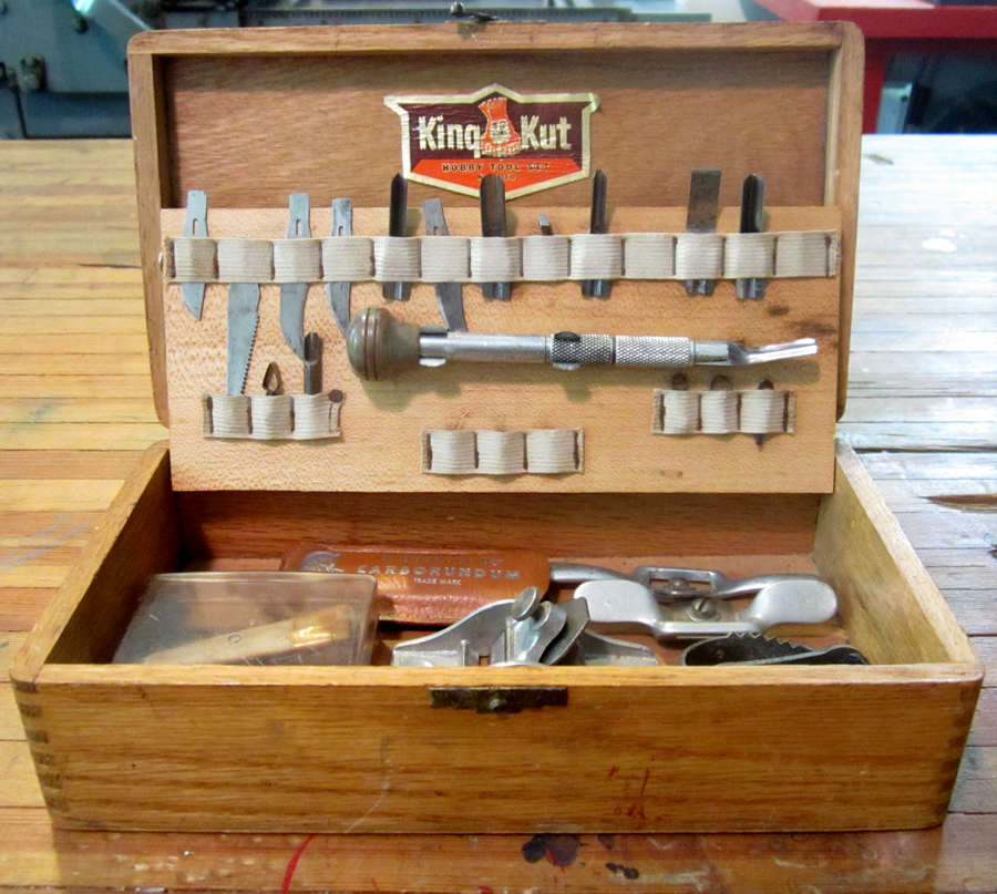
woodcuttools2

woodcuttoolsI looked at vintage eagle cuts and started to find a form that would work best in the size of linoleum I had. This is the first clean sketch.

eaglesketchThough I do love stars, there were too many here, and I felt it would be awesome to pull in imagery pertinent to what I do. This led to altering what the eagle carried to a composing stick for setting type and rolls of paper.

eaglesketch2

After this, I scanned it to piece it together and add the text. Then it could be printed out in tiles to its accurate size and traced onto the actual linoleum.
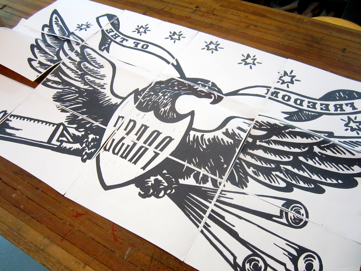
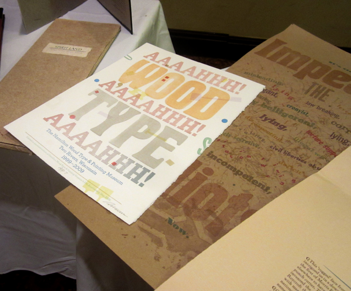
eagletransferThe type used was HWT's American Chromatic and Antique Tuscan no. 9, which seemed fitting and appropriate, not only stylistically, but because they were digitized by Rich Kegler, WNYBAC founder, for The Hamilton Wood Type Museum. That's how we tie it all together, folks!

The cut took many nights.

roughcut

roughcut2

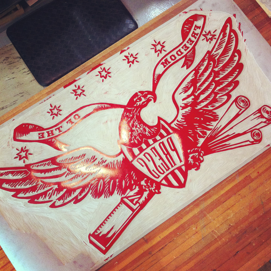
When it was largely finished, I roughly inked it in to see if any glaring problems popped up, and if anything else needed trimming. This was my first 'it's glorious...grandpa would be proud!' moment. And right after that, it was rolled and sent off to Buffalo.

eagle

wnybacfront

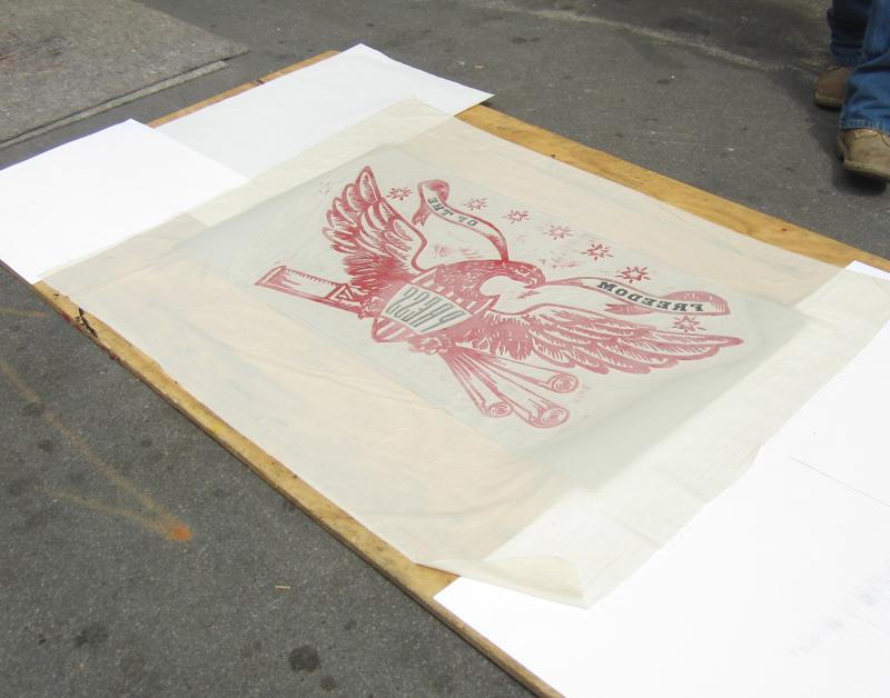
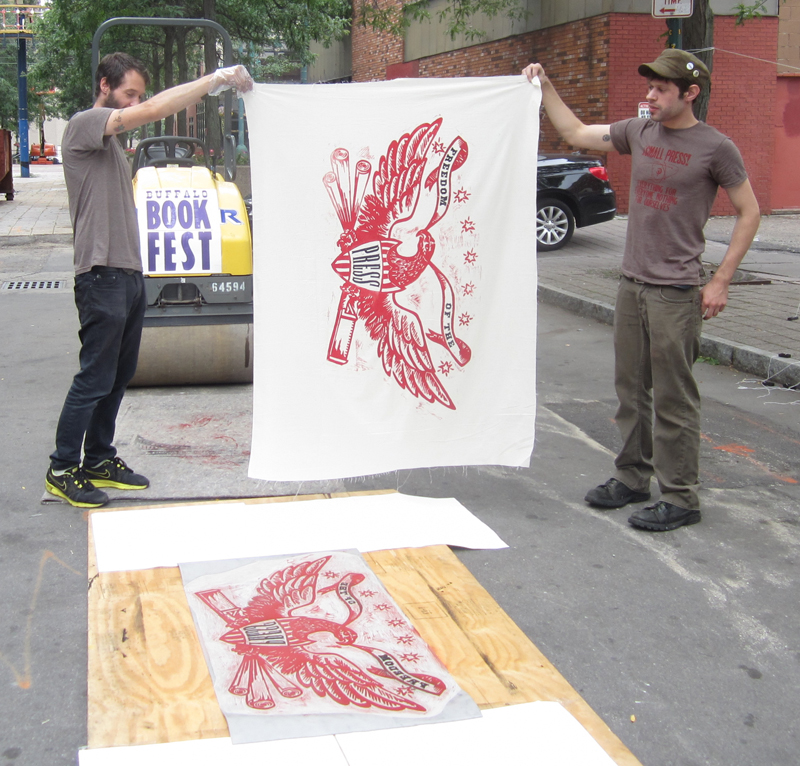
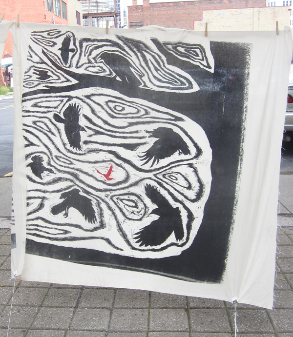
Printing via steamroller was not only more successful than I imagined, it was a lot of fun as well. Here's a little of the action, thanks to many great volunteers and a donated steamroller (at bottom). Prints were all done on dampened muslin:

eagleprint9

eagleprint6

eagleprint4

eagleprint1

eagleprint8

Here's a little video of the whole thing:

[wpvideo amJwpn1I]

Major success! There were 3 other talented printmakers represented under the steamroller that day, including Keegan Onefoot-Wenkman, Tom Rooney and Jodi Hamman & Christine Gallisdorfer:

keegan5

tomrooney

christine1

And looks who's parked behind our prints blowing in the breeze...
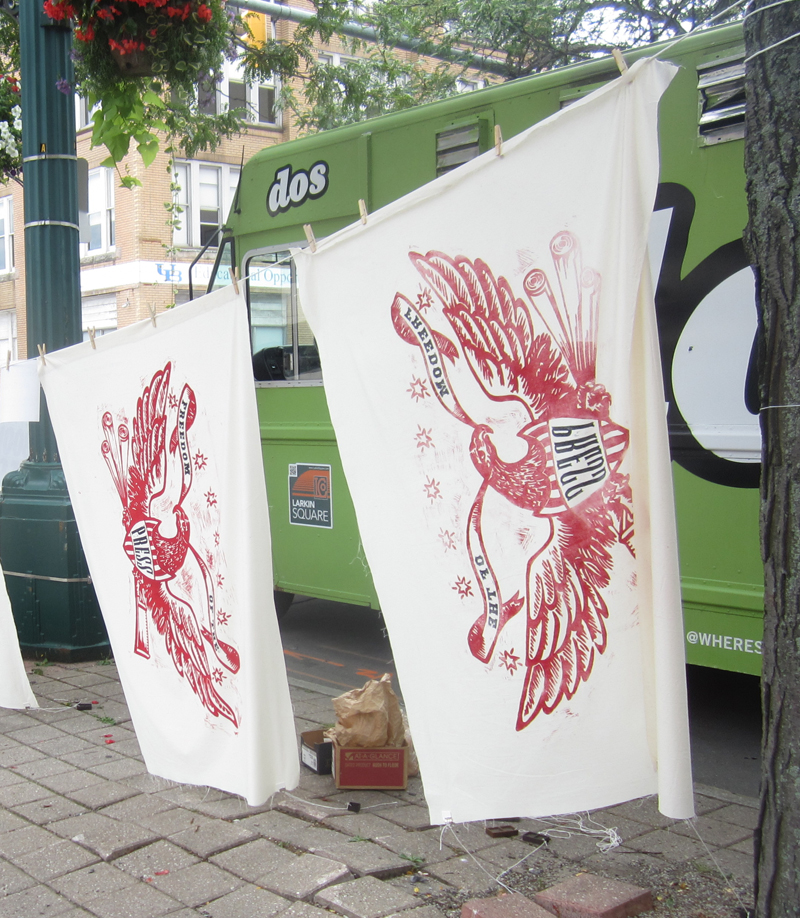
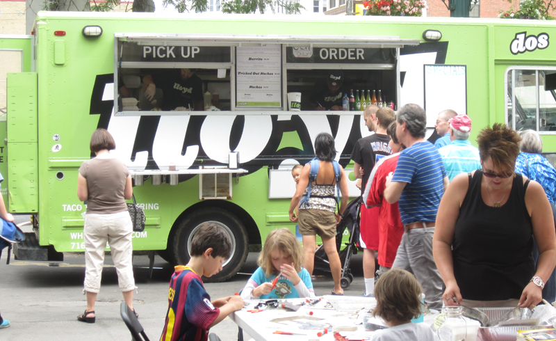
eagleprint10A little skeptical of the food truck phenomenon, I gave Lloyd's Tacos a spin, and they were hands down amazing.
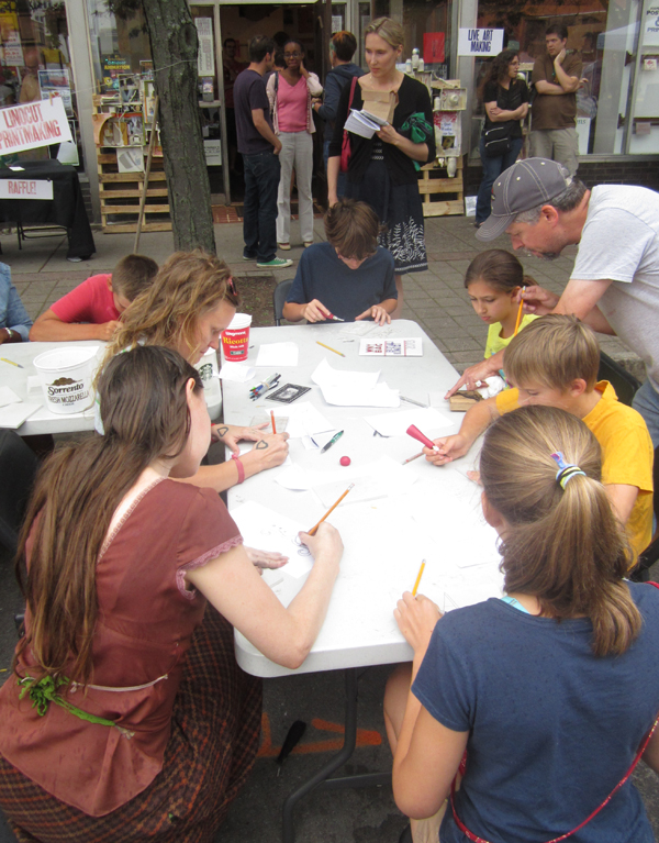
lloydMeanwhile, there was also an artisan market, paper making and many other demos going on throughout the day including linoleum cutting.
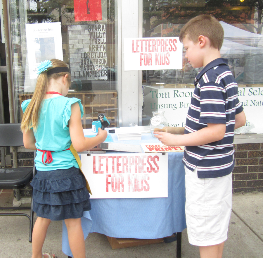
linocutting2And Jo had her own Letterpress For Kids demo; more about that here.
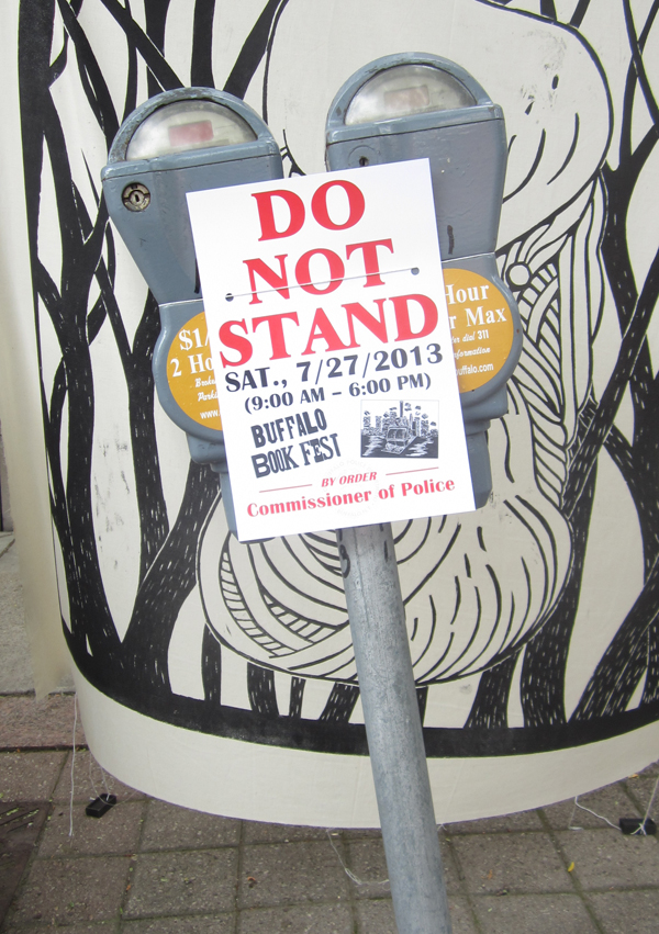
joadampressAnd while the city of Buffalo hasn't always been amenable to local upstarts and the arts, they did fork over for some No Parking signs so that WNYBAC didn't have to print their own as they surely could have (another story):
noparkingAll in all, a fantastic day of printing and making new friends. WNYBAC is a beautiful facility that's still very much on a path toward finding itself and working at its full potential. You can help keep them vibrant by visiting their Indiegogo campaign.

Open House!

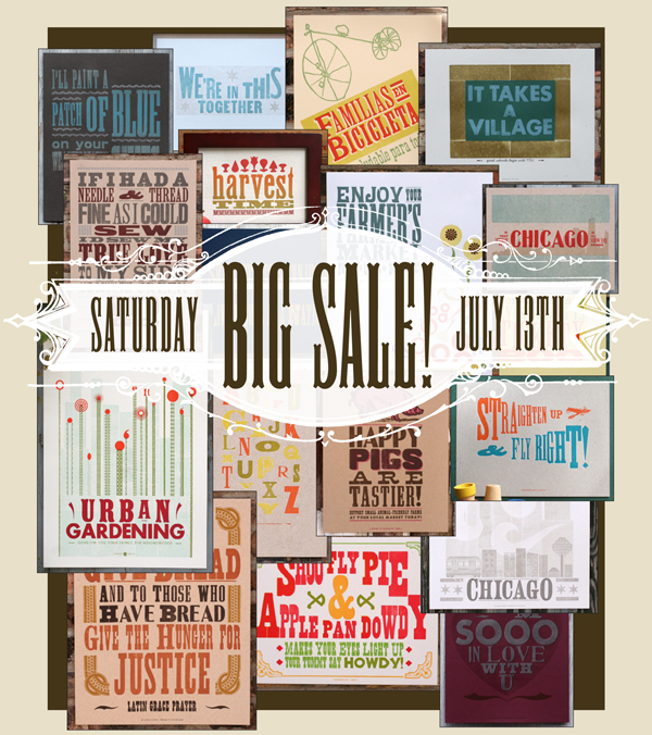
julysaleimage2013Ten years ago this week, Starshaped Press moved into our current location in the charming Bulldog Lock Co. Building in Chicago's Ravenswood neighborhood. Since then we've had the privilege to work with many great folks both in the city and around the world. It's time for a little change, and Starshaped is getting a studio makeover! This Saturday we'll be having an Open House and Sale to clear out the old and make room for the new. All of our prints and cards will be out for sale, and most will be heavily discounted; many are set to retire so now is your chance to grab them at crazy low prices. We also have lots of old typecases for sale and blank paper that's free to a good home.

Come and Visit!
Saturday, July 13th, 2013
10am - 2pm
4636 N. Ravenswood #103
Chicago, Illinois
773-728-6359

Amazing, Beautiful and Adventurous

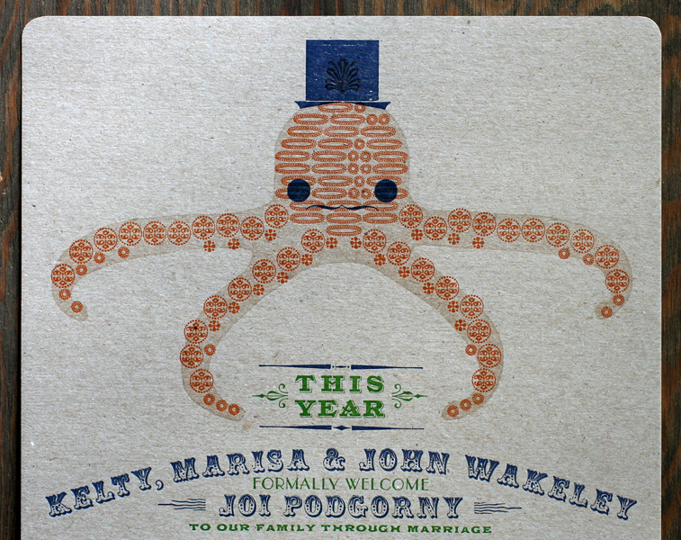
When a client comes to you and says they want an invitation with an ornamental octopus and a frog with a waistcoat, you don't turn them down! Such was the case this Spring when we were approached to do an invitation celebrating a woman never interested in marriage and a stand up guy with two kids. Have fun with it, they said, as the wedding would be a celebration on many fronts. So we did: joikelty1The octopus definitely gave us a run for it, as it stylistically couldn't be too far off from the frog image and the delicate typefaces. So instead of using larger wood type elements that seemed out of place, the whole thing was created using 3 different border ornaments.

Tjoikelty5Before printing the ornaments, I carved a simple linocut of the octopus shape and laid that down first in transparent ink for guidelines.

joikelty6The invitation was printed in four colors, one at a time. After the transparent ink (this is usually used to create lighter tints of saturated inks) was done, the green came next, followed by the orange. Both are set up at the same time for the initial proof to make sure the leading and spacing would all be correct. Then the orange is taken out so the green can be printed. When the green is done, the orange is put back into the form and the green is taken out.

joikelty5

Here you can see all but the blue set up and ready to proof.

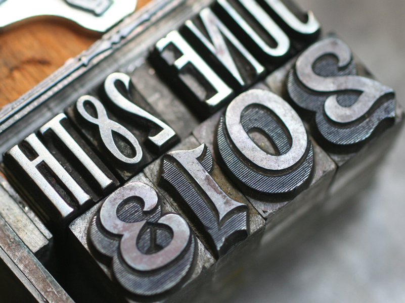
Tjoikelty1Blue was the final color. There were a number of elements to get right here, from the top hat and face of the octopus to the curved type and plate of the frog. It was a joy to use some really beautiful type on this one, including the 2013. The studio only has this in figures, so it was a treat to finally have a good use for them. The June 28th is set in Headletter, a Chicago-designed typeface from Barnhart Bros. & Spindler.joikelty2

Tjoikelty7

Tjoikelty2And here's the full octopus in all of its glory.

joikelty3The invite was printed on gray chipboard and scored so that it would fold into a 6x9" envelope, which was navy blue to match the ink. This was such a treat to design and print; we love a unique challenge! And all the best to the happy family.

Phoenix Welcomes the Goose

The Amalgamated Printers Association (APA) is one of the great organizations that I've been a part of for the last ten years. It's a group of 150 printers that range from hobby to professional, and issues a monthly 'bundle' of print samples from members in the group. Every year they host a Wayzgoose (a traditional printers gathering) in a different location around the country. This year the Goose was held in Phoenix and I was one of the members asked to speak. The weekend features hands on demos and workshops along with lectures and hospitality (great chance to share printing tips!), as well as a great swap meet, auction and banquet. When there's time, it's possible to visit the shops and studios of members in the group that live in the vicinity. This year's Goose was packed with great events! Clearly, though, the hotel didn't ask any members to contribute signage: privatesignOn Friday, there were a number of great presentations at Letterpress Central, the home of Cindy and Gary Iverson, who kindly opened up their impressive paper and print studio to all APA'ers. One of my favorite lectures was by Kseniya Thomas, the co-founder of Ladies of Letterpress and the owner of Thomas Printers which were the topics of her presentation.
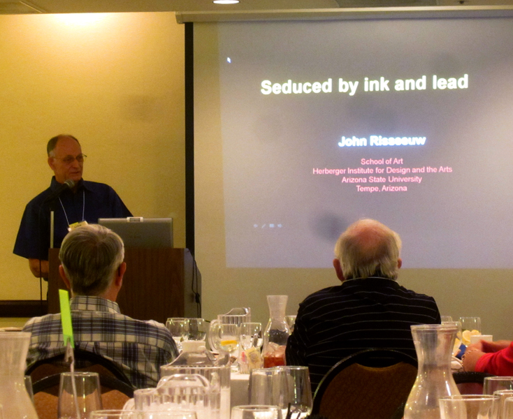
kseniyaSaturday morning is always a highlight because it starts with a big swap meet. This year was fabulous... so much type to choose from, both old and new. Below is a shot of the Letterpress Things table, and some of the type I couldn't get enough of. There's also newly cut wood type from Stan Harris and the beautiful ornaments of Moore Wood Type.

swapmeet2

swapmeet3

swapmeet1Here are some of the treats I added to the Starshaped collection:

ribbon

marbleheart

agencygothicAfter the swap meet there's an auction of even more goodies. Had to get a rough shot of Dave Peat at his finest here!

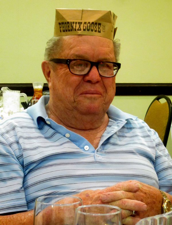
davepeatauctionSaturday evening there was a banquet for all of the members and guests and we were treated to BBQ this year. Here's a shot of our fine organizers wearing the printers caps they made for everyone. From left to right is Jeryl Jones, Mike O'Connor, Cindy and Gary Iverson.

organizersHere are the Bauders, local to Arizona. They ran a print shop together for 33 years and just celebrated their 60th anniversary. Chatting with them was a highlight of the trip.

baudersThis is the venerable Don Black of Don Black Linecasting fame in Toronto. He knows a whole lot about printing equipment, and even more about the Canadiens.

donblackOur guest speaker for the evening was a real treat. John Risseeuw outlined his fine career in printmaking and teaching and brought along a lot of stunning examples of his work and the work of his students.

johnriseeuwThese are a few of the pieces from a series on landmines and their effects on the people who live in their path. Absolutely incredible technique, layering and use of materials, not to mention the social impact of the printed word. Read more about it here.

riseeuw2

riseeuwAfter dinner there was more time for socializing in the hotel and more chatting about printing and presses.

hospitality2Here's a motley crew representing many lifetimes of printing and type knowledge!

hospitality4

stickitOne of the lucky things that came together for the weekend was that former Starshaped intern, Claire, who left Chicago for LA, was able to meet up and join in on the fun. Here she is enjoying an animated conversation with Don. You can find her work at Small Press LA and VIA.

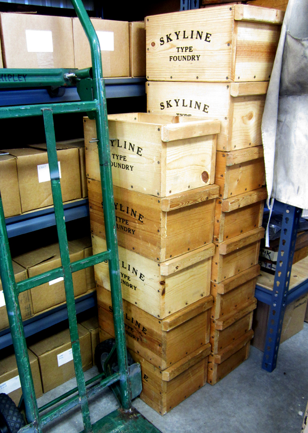
clairedonOn Sunday we headed up to Skyline Type Foundry. If you've seen any work that's come out of Starshaped, then you've seen the results of Sky's typecasting adventures. His shop and foundry are the gold standards for organization, layout and quality in production.

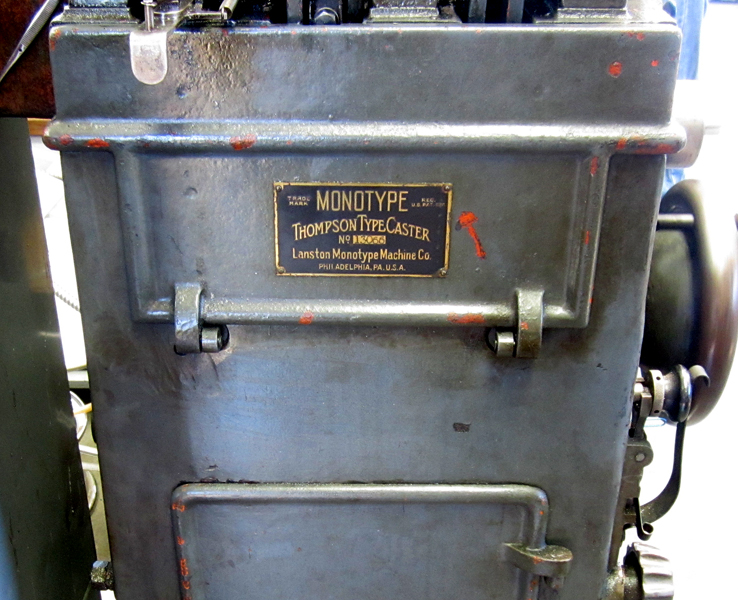
skyline1Sky, along with Dave Macmillan, had two casters up and running to show everyone the process of casting metal type. The equipment is meticulously maintained and in great shape, so it goes without saying that the results are stunning. Good hard type in hard to find faces!

skyline4

skyline9

skyline10

skyline11

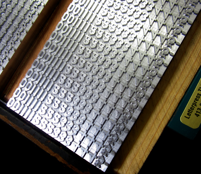
skyline2Sky preps the type on galleys by sort so that it can easily be fonted up into classy little boxes and sold.

skyline7

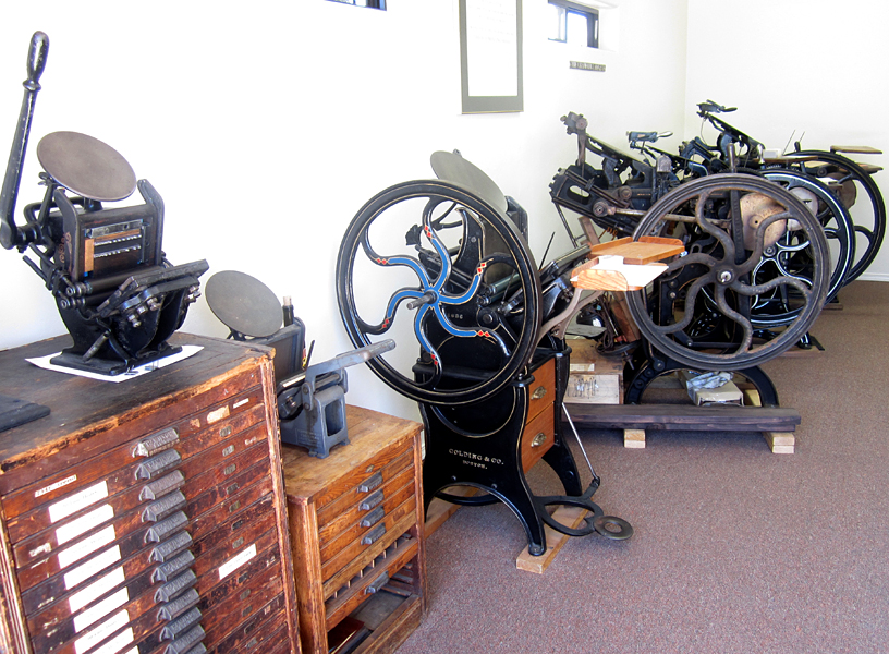
skyline6There is also a space for the press and type collection.

skyline12Shopping! All of the type options for sale were out for all to see. It was like being a kid in a candy store. So many choices!

skyline20

skyline19

There are also lots of fun bits and pieces of type history floating around the shop.

skyline21

skyline14

skyline17One of the highlights of the visit for me was picking up a complete set of Sky's newest casting, Arboret in 12 and 24 point along with a set of ornamental pieces to accompany the typeface. This is an incredible face with many options for constructing literal arbors or anything you can imagine. Below is the print Sky created to showcase the type along with the form for printing.

skyline16

skyline15

This is one of my favorite shots; two Starshaped Rock Stars in one place! Sky of Skyline Type Foundry and Scott from Moore Wood Type. The enthusiasm of these two along with that of the rest of the crew in Phoenix was really inspiring and breathed new life into forthcoming Starshaped projects. Looking forward to next year's Goose!

skyscott

Skirting the Issues

The League of Women Designers is a group I'm proud to be a part of in Chicago. Made up of product, furniture and home goods designers, the group meets regularly to discuss issues related to the field of design, and to help each other out in the interest of forwarding the prosperity of all members. The first LWD show is opening this weekend at Manifold, the beautiful studio and gallery of member Elizabeth Fiersten: skertThe theme, skirt, was meant to be taken in any definition of the word:

skirt (verb) 1: to form or run along the border or edge of : border 2: to furnish a border or shield for 3: to go around or keep away from in order to avoid danger or discovery 4: to avoid especially because of difficulty or fear of controversy

skirt (noun) 1: a separate free-hanging outer garment or undergarment usually worn by women and girls covering some or all of the body from the waist down 2: the rim, periphery, or environs of an area 3: slang: a girl or woman

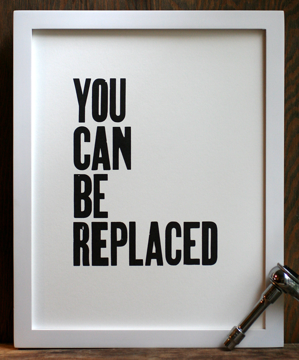
I went with definition 4 of the verb form of the word for a series of simple prints. Inspirational artwork for home decor (such as the Keep Calm and Carry On variety of posters) are incredibly popular, especially those that are hand printed and simple in structure. However, many of the themes of these prints represent more of an idea of ourselves than the reality of everyday life. With that in mind, I put together a series of simple black and white prints that express the true fears we face as opposed to the image we project to the public.

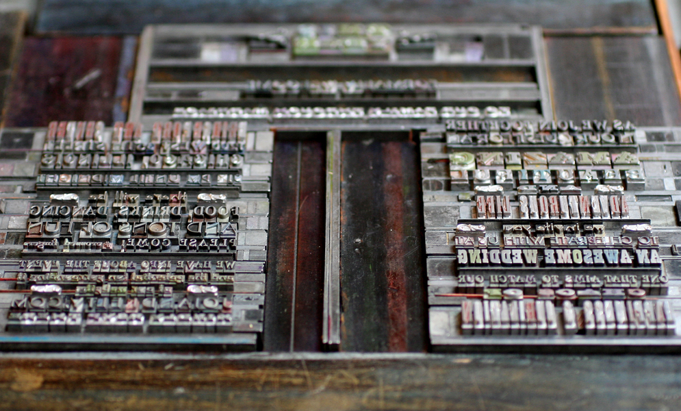
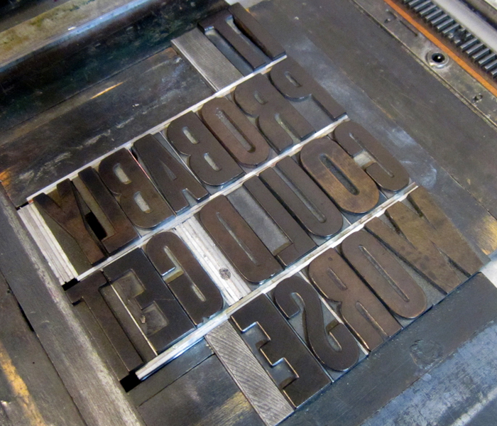
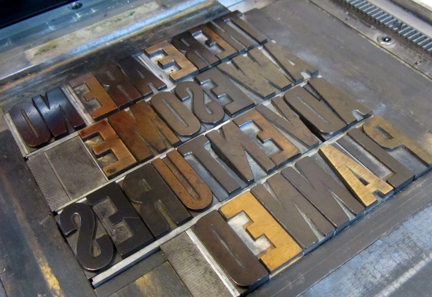
Here are the three prints done so far, along with the type forms for each.

LOyoucanbereplacedframed

replaced2

LOcouldgetworseframed

getworse1

LOawesomeadvframed

adventure3

We've done our fair share of inspirational prints at Starshaped, and they continue to be good sellers. That said, it was great fun to take a break from the sincerity of that style of print to poke fun at the genre. The framed prints will be available at the opening on Saturday, June 15th, and a limited edition of unframed prints will be sold on our etsy site.