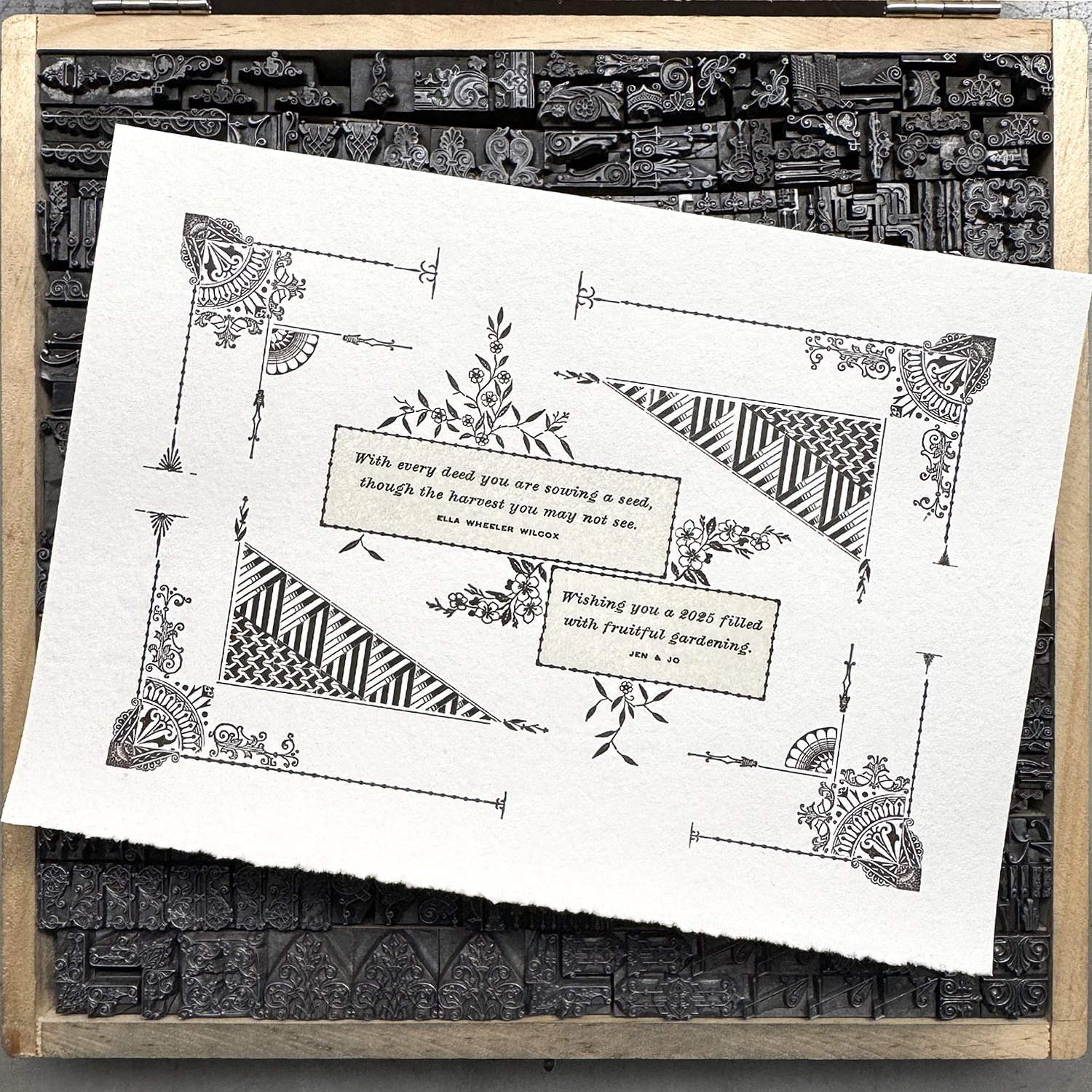
At the end of every year, I like to send out a New Year card to family, friends and Starshaped supporters. This time around, I wanted to dig into my collection of nineteenth-century type to see what I could create.
Nineteenth-century type presents a number of challenges when setting it as much of it was created prior to the development of the point system for measuring type in 1887 (shout out, Chicago!) This means working with a variety of sizes not necessarily designed to play well together as different foundries had different ideas of sizing. Imagine Tetris with individual, uniquely-sized blocks vs. uniform ones that still have to work together to advance the game.
As you can see from the form image below, the spacing (darker) material is hodgepodge all over the place to fill the gaps around odd-sized ornaments. This was as tidy as I could get it; as a rule, the less spacing you need to absolutely hold together a form correctly, the easier your lockup will be when getting ready to print.
Much of the ornament for this card was produced at Mackellar, Smiths & Jordan in Philadelphia, though some is marked ‘Johnson’, a precursor foundry affiliated with MSJ.
These specimen books are incredibly helpful for identifying small, seemingly random bits of ornament as part of systems. It’s also informative to know how they were designed to go together to create larger imagery. Most of the collections show the initial set of individual pieces in the middle with surrounding ideas of how to work with them.
My card uses a set of angled-looking ornaments that are on rectangular bases but in sections so that they can be built to whatever configuration of space needs to be filled.
The scan below is from the MSJ book, but I’ve erased the pieces I don’t have so that I can focus on digitally building forms with what’s available. I often start with rough sketches, digital mockups and then fight with the actual type to get it to work the way I want.
Combination ornaments make an appearance on the card. They’re a bit worn from use so it’s nice to see them in their original, delicate state. Wear and tear on type is common, even with newly cast type. The makeup of the metal used for casting can vary widely between foundries and some is harder than others. I find that, in general, the older the type is in the studio, the more durable it is. That said, there’s a balance between what is worn in a good, printable way and that which is beyond use. I shoot for the best print possible but allow the flaws; if a perfect print is desired, use a computer. The scars are a testament to the life of these objects.
A few corner ornaments come from this set that I acquired a few years ago (yes, even the dogs! Notice one is on his side!) Thanks to Laura at Pinwheel Press for finding this reference image. Chicago Type Foundry is otherwise known at Marder & Luse, a foundry that (just barely) survived the Great Chicago Fire in 1871, then went on to standardize the point system.
If you don’t have the access to or money to own original specimen books, I highly recommend The Handy Book of Artistic Printing for incredible samples of what letterpress printers did with metal type and ornament to compete with commercial lithography in the late 1800s. I often reference it for ideas and color combos, as well as to revel in the talents of my predecessors. Find it at your favorite indie bookshop!
The final New Year cards are 7x5” and printed on my last bit of Zerkall paper (this German papermaker ceased operation in the past few years following centuries of production). I sweated over, but was successful, at locking up the complex form to print on the 1923 Chandler & Price press in the shop.
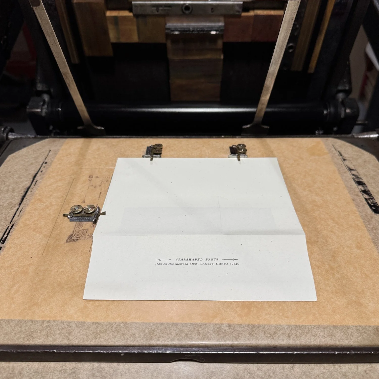
I added a homemade chipboard extension to a gripper to help hold the paper down as it went in, given it’s a lightweight stock that wants to fly away. There are all kinds of ways to do this but my configuration was the quickest given the lockup I put together.
Here’s a bit more detail on the corners, along with the type form.
I also printed envelopes as some inevitably make their way back to the shop and it’s handy to know who didn’t receive one.
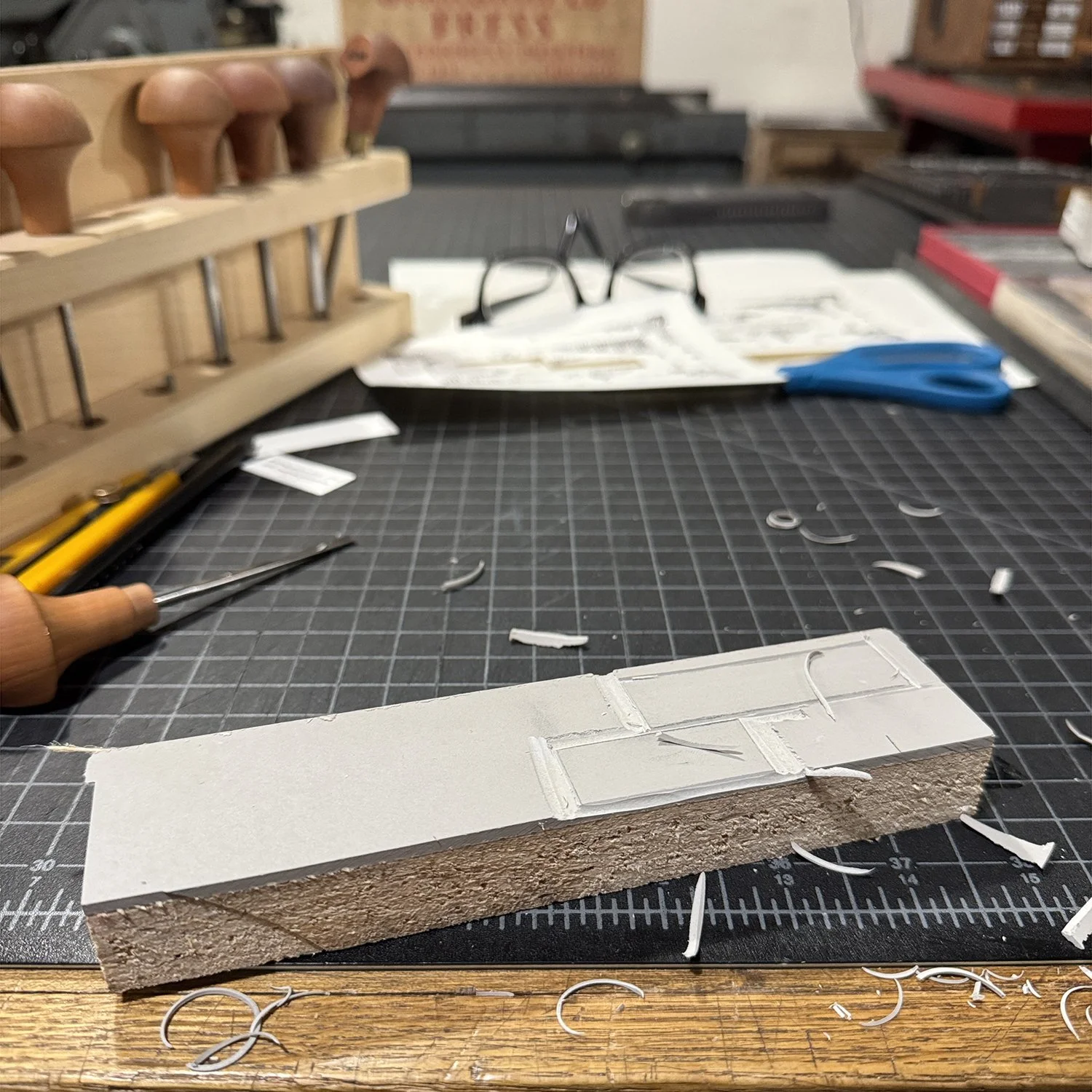
Wanting to pop the text blocks a bit, I carved a simple linoleum cut and inked it with a very pale moss green, that was, in fact, mostly transparent ink. Linoleum blocks are the easiest way to add a block of color to prints.
As the current caretaker of these materials, it’s important to me that they don’t just sit in boxes like a prize; while they have value, to me, this is represented in their staying power and ability to hold up over more than a century. Some find their way onto custom client projects and some on former Print Club pieces. At any rate, my job is to care for them, document the collections and be ready to pass them on when I’m no longer able to print. How many other printers have done just that.
I may have extra cards… if so and you’d like one, please reach out.


