You Are Beautiful

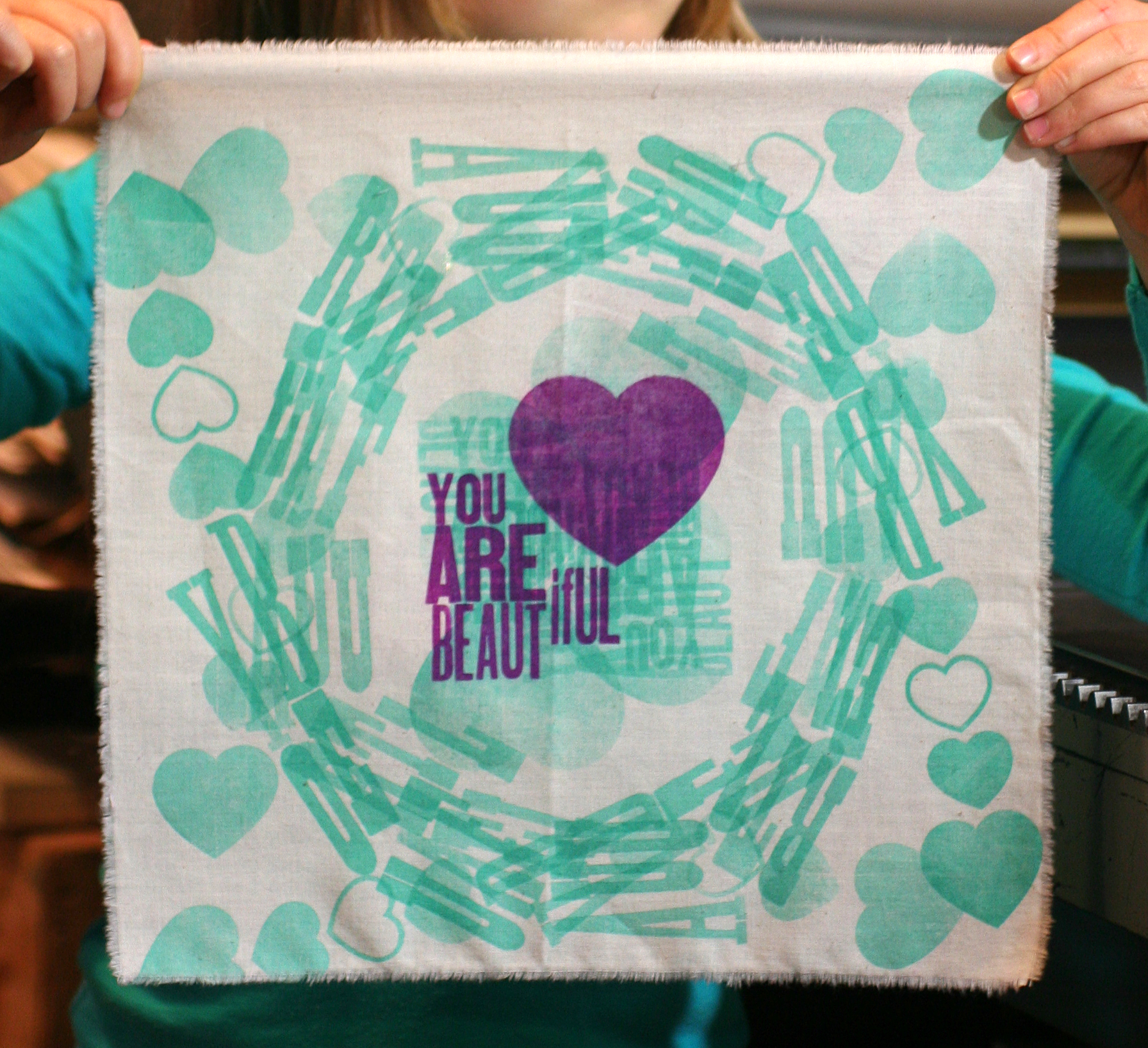
Having a child and a business are two great things that don't always go great together. When my daughter was born almost seven years ago, the best laid plans to preserve the studio fell into shambles and there were rocky periods of wondering if I could pull off printing and mothering on a daily basis. Fast forward to now and I'm beginning to see the ways that the two disparate identities can come together as one. Jo has been experimenting with printmaking at the studio, where she can often be found after school and on Saturdays. I'm not always convinced that she takes delight in the process as her attitude can be quite cool, case in point our latest collaboration. We were asked to contribute a piece to the You Are Beautiful exhibition at Galerie F here in Chicago. You are probably familiar with these little stickers, and this show is a celebration of the success of the campaign. All pieces submitted are 12x12" square and represent various media.

I thought this would be a great collaborative project, and an opportunity to explore printing on fabric, something we've been experimenting with this year. I wanted the opportunity to work together on a project that promoted a very basic concept of accepting oneself and recognizing beauty where it exists. Having a daughter is a constant reminder that societal pressures on women and girls to conform to ideals of beauty and behavior has not lessened, and that it begins at a very young age. I constantly strive to expose Jo to women who do marvelous things, from writing books and making art to seeking advanced degrees in science to better the lives of others.

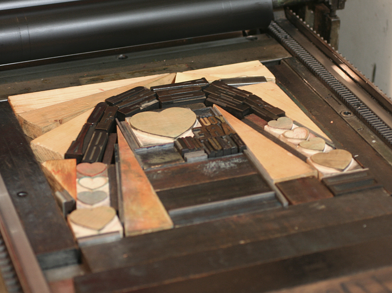
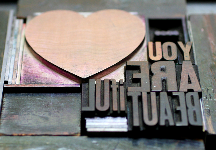
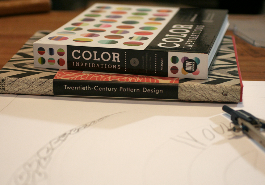
But of course my effort to read into the project didn't make for a smooth start. The night we had to get moving on this project, Jo was completely uninspired and had no interest in working with me. I resigned myself to creating a print on my own and pulled out books and sketch paper to get going. Not surprisingly, seeing my thumbnail sketch efforts and fumbling with a compass was just enough to pique the eye of a curious six year old, and Jo quickly started to put together her own ideas. Her sketches involved lots of hearts and circles, which doesn't make for the easiest type form on press:

sketch2

sketchI pulled the smaller type and let her find some that would still spell You Are Beautiful even when twisted into other shapes. We could almost create a circle and with the help of a cache of triangular furniture, we got it together.
typeform1

typeform3We realized that running the fabric through the press 4 times (one in each direction) achieved a true circular shape and produced very interesting effects in the overlapping.

jopress2

jopress6All of the green runs went first, followed by the main purple color.

jopress8

See our printer's devil in action... just tall enough to run the Vandercook.

[wpvideo ipQpfFBQ]

We printed the muslin at a larger size then tore it down and heat set the print afterwards so that it would be 12" square. Here's the final! We'll be heading to the opening of the show to check out all of the other great pieces that make up the exhibition and to share in the positive message.

finalprint2

Wood, Metal, Type, Irony

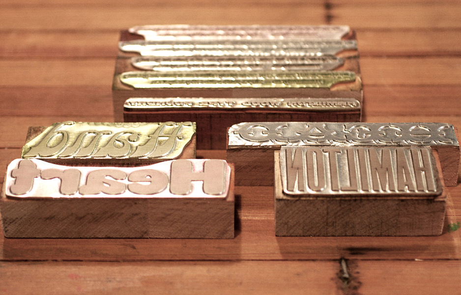
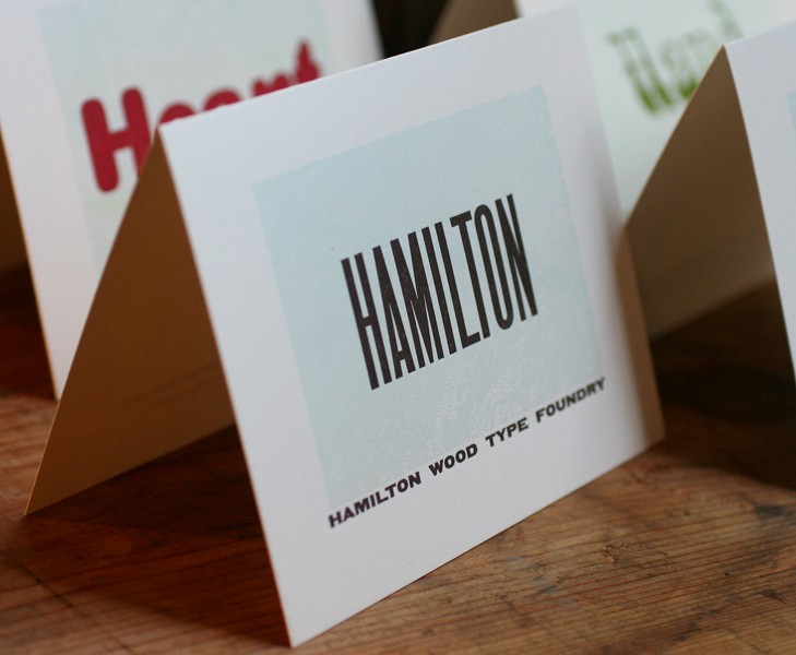
Starshaped rarely prints work that is not designed in the studio, given our mission of printing only with the metal and wood type we have. But every once in a while, a project comes along that offers a chance to combine our materials and knowledge with the talents of others in a collaborative way. You may be familiar with the Hamilton Wood Type Foundry's new initiative to digitize some of the gems of the Hamilton Wood Type Museum (we've played around with these before). The effort is spearheaded by P22, a type foundry I have long admired, so when they asked about printing some note cards that feature the new digital versions of some of the upcoming releases, saying Yes was the obvious answer. Four cards were planned to coincide with the theme of the AIGA National Conference in Minneapolis October 10th-12th, and would be given away at the Adobe booth, as three of the fonts featured are volunteer efforts by Adobe designers. The first, Gothic Round, will be in circulation before the conference begins, and the others have release dates over the next few months.

I love a little irony in our printing and this project is a great example. We were to print magnesium plates made from digital typefaces designed from the original wood type.

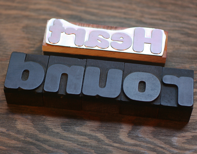
Thwtf3Just for fun, I pulled out some of our 8 line Gothic Round type to shoot with the plate for the first card:

Thwtf4Each card would also feature a subtle background texture printed from the wood type in our collection. Here's the lucky piece, which has a lovely grain:

ThwtfLong ago I discovered through trial and fail that it's better to print transparent-base inks over the darker, more prominent ink color. So for each of the four cards, the main color was printed first and the lighter background wood texture printed afterwards. This keeps the darker color from pooling on top of the lighter pass, and anything with a mostly transparent base will never compete with a dark, saturated ink. In order to make sure everything would line up, I created a template on a transparency that I could place over top of the first color:

transparencyThe color palette was solid, and each card coordinated with rich envelopes from French Paper. Here's the cheat sheet for matching inks.

inkswatchesThese are the final cards together, along with a close up of the pale wood type texture.

hwtf1

hwtf3

hwtf4The sets are to be given away at the AIGA conference, and I'm told Hamilton will also have some. These faces were exceptionally designed the first time around for their wood type form, and I can attest to the quality of the new digital versions. If you can't work with the real thing, grab yourself these digital versions and support Hamilton. We've got some big doings up there in another month... more on that later.

hwtf2

Skirting the Issues

The League of Women Designers is a group I'm proud to be a part of in Chicago. Made up of product, furniture and home goods designers, the group meets regularly to discuss issues related to the field of design, and to help each other out in the interest of forwarding the prosperity of all members. The first LWD show is opening this weekend at Manifold, the beautiful studio and gallery of member Elizabeth Fiersten: skertThe theme, skirt, was meant to be taken in any definition of the word:

skirt (verb) 1: to form or run along the border or edge of : border 2: to furnish a border or shield for 3: to go around or keep away from in order to avoid danger or discovery 4: to avoid especially because of difficulty or fear of controversy

skirt (noun) 1: a separate free-hanging outer garment or undergarment usually worn by women and girls covering some or all of the body from the waist down 2: the rim, periphery, or environs of an area 3: slang: a girl or woman

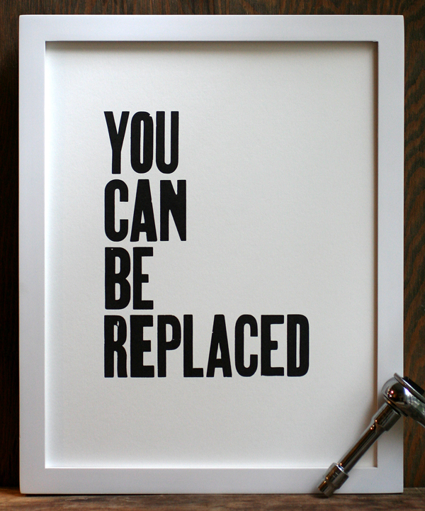
I went with definition 4 of the verb form of the word for a series of simple prints. Inspirational artwork for home decor (such as the Keep Calm and Carry On variety of posters) are incredibly popular, especially those that are hand printed and simple in structure. However, many of the themes of these prints represent more of an idea of ourselves than the reality of everyday life. With that in mind, I put together a series of simple black and white prints that express the true fears we face as opposed to the image we project to the public.

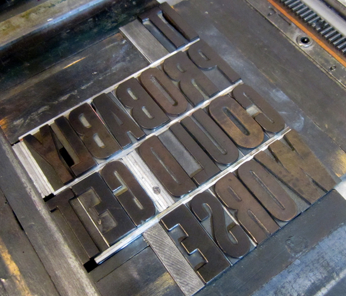
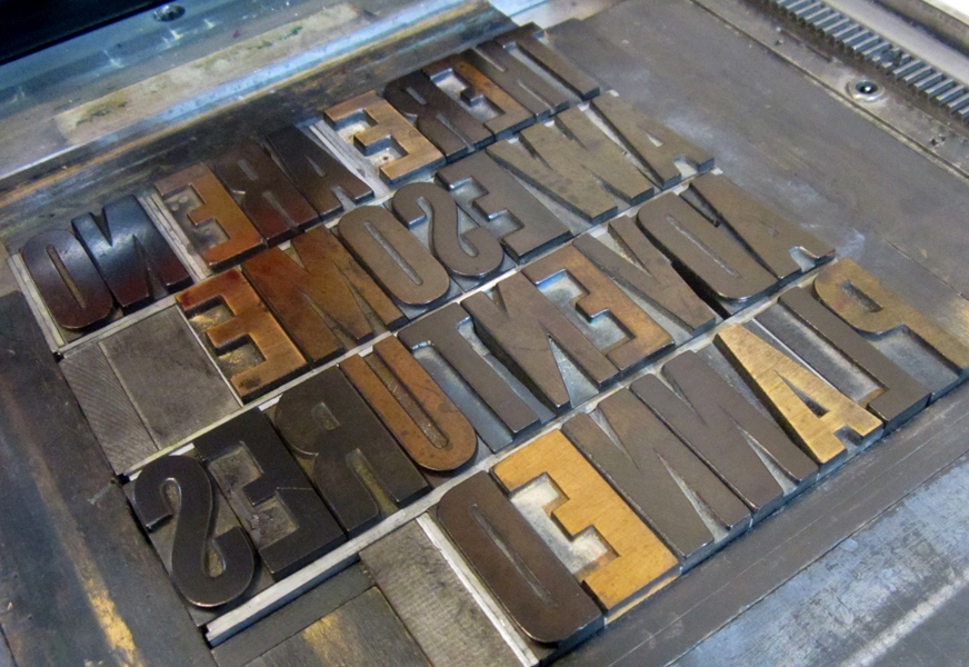
Here are the three prints done so far, along with the type forms for each.

LOyoucanbereplacedframed

replaced2

LOcouldgetworseframed

getworse1

LOawesomeadvframed

adventure3

We've done our fair share of inspirational prints at Starshaped, and they continue to be good sellers. That said, it was great fun to take a break from the sincerity of that style of print to poke fun at the genre. The framed prints will be available at the opening on Saturday, June 15th, and a limited edition of unframed prints will be sold on our etsy site.

City of Wind

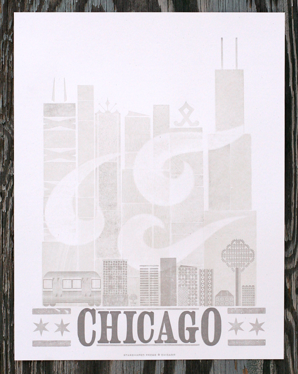
If you want to get an idea of what's going on in gig posters, urban prints and street art, head straight to Logan Square and Galerie F. I was pleased to be invited to contribute to their collection of exclusive prints, and the poster is now available on their site. Here it is: chicago1

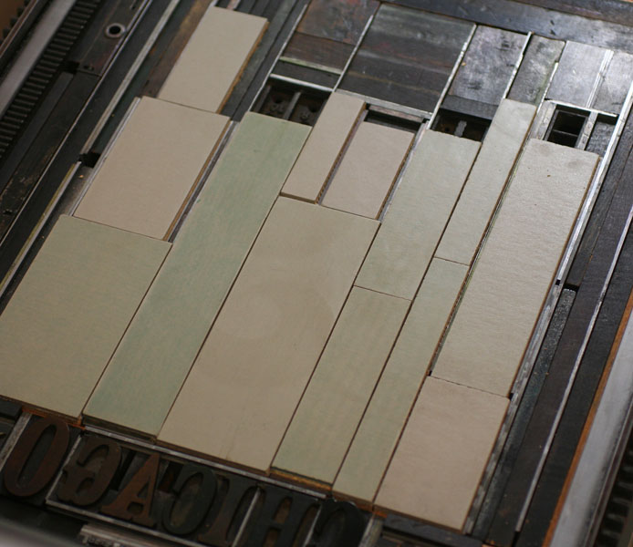
Chicago is always a popular theme and one I love. For this one, I wanted to create a large cityscape to represent downtown, but also something that was indicative of the smaller skylines of the neighborhoods. The first two layers were printed with wood type (and the back side of wood type), and linoleum blocks in very pale dirty gray to give depth and texture to the image. The wind image is a pressure print, which is created by adding a shape or cutout to the makeready of the press which affects how evenly the paper will roll over type.

Here's a shot of the wood type as well as the linoleum blocks.

Tchicago1

Tchicago2

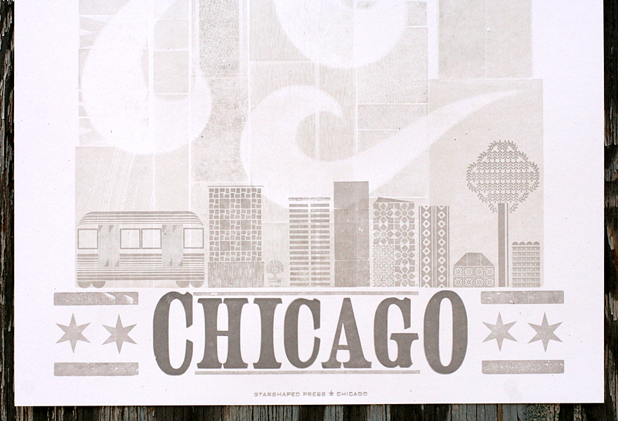
You can see the texture created by multiple layers, as well as the hints that came through the pressure print to keep the wind shapes subtle and soft.

chicago4

After those two runs, it was time for the type and the small cityscape. To create the type with a larger first and last letter, you actually have to have two separate fonts of the same thing. This also features the Chicago wood stars we commissioned from Moore Wood Type. There's a small representation of a CTA train car, as well as an ash tree, in defiance of the emerald ash borers that are destroying the ash trees of the city.

Tchicago5

chicago2

You can get a copy of the print directly from Galerie F for the next month, as well as a number of our other prints if you pop by the gallery. It's definitely worth a stop if you're in the neighborhood... so much great stuff to look at and take home with you!

If Rosie Can Do It

I am often asked how we maintain our presses in the studio and folks always find it surprising when I answer that we do it ourselves. The truth is, armed with a manual or two and a few connections with experienced printers, keeping our presses in working order is pretty simple. They need oil, and plenty of it, along with a little cleaning and visually checking that screws and bolts aren't working themselves loose. Both of our platen presses are motorized, with the motors running directly off the flywheel. I'm not a big fan of belts (even after successfully replacing a disintegrating one on our Vandercook press), so this setup is ideal. Both of our motors are made-in-Chicago Kimball motors that are period to the presses, and have had a pretty good run of 10+ years in our shop with little complaint. That changed this past Fall when the 10x15 C+P press motor decided to act up. After a little cleaning and investigating, it was apparent that a few parts were worn to what is probably a not fixable degree. Because this press is our workhorse, we took the motor from the 8x12 C+P and put it on the 10x15 for a temporary fix while searching out a replacement. In the meantime, I purchased a treadle for this press as it seemed like a good idea to have a manual backup. Think vintage, foot-powered sewing machine.

Well, I suppose the treadle came in perfect time, as the 'new' motor on the 10x15 died last Saturday. This was most likely due to old wiring with poor connections. This was the throw-the-hands-up-in-the-air moment of realizing both motors are long overdue for an overhaul. I ripped the treadle out of its crate and got it on the press. First, the unused motor mount had to come off because it's attached to the same hinge that is needed for the treadle mount:

motormount

Here's the front of the treadle that sees all the action.

treadle

Bad!

badmotor

I lowered the pulley away from the flywheel so it doesn't needlessly drag on the flywheel now that it's operated by foot:

disconnectedmotor

And here's the happy setup. I printed over 2400 calendar pages by foot (more on those later), which was not unlike spending about 4 hours on an elliptical, only with one foot at a time. This was followed by 200o 4-run gift certificates. Happily, next week is a Vandercook week so I've got a little break coming up. The interns will be getting the workout!

presswithtreadle

The beauty of working in Chicago, the city that works, is that there are motor shops in nearly every neighborhood. We'll be taking both of the motors in to see if they can get us up and running again at full speed soon.