Printing in the D

Right before the Letterpress Trail took over life, I spent two days at Signal Return, located in Detroit's Eastern Market, hanging out, printing and enjoying the company in their incredible space. When you see a giant manicule, you know you're in the right place. And when you understand their mission to create a vibrant printmaking studio that seeks to 'Teach, Connect, Serve, and Produce', then that's even more rewarding. sr19

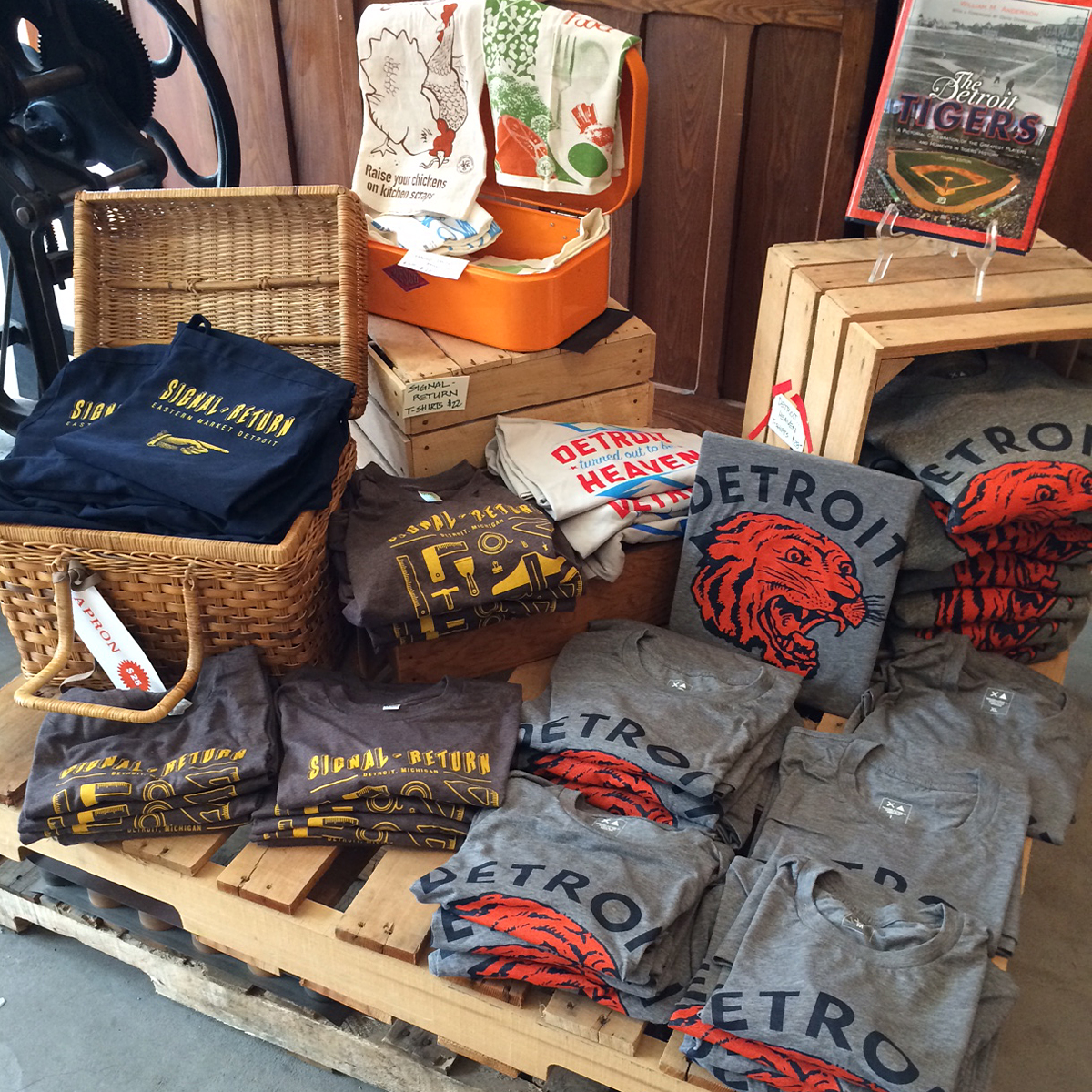
sr2Their open and airy retail space literally invites people to come in and browse. So many beautiful prints and cards from all over, as well as pretty sweet aprons and shirts. I'm happy to say that Starshaped's cards and prints are in good company here. Need an awesome gift for someone? This is the place to go, Detroit! Stop on over after you hit the markets on Saturday morning.
sr8

sr9

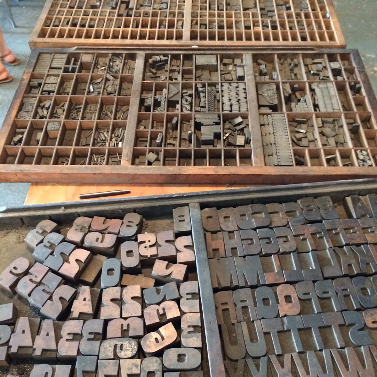
sr3They had recently acquired a few new banks of incredible wood and metal type. Here you can see Meg going through it to gauge what was lurking in these cases. I can tell you, there were some real treats there, buried under decades of dirt and dust. And mouse poop. Because all old type comes with complimentary mouse poop.
sr13

sr21Here's Bryan Baker, SR's printer-in-residence, going through some of his own new type.

sr14And Bryan's dog Isabelle! I point her out here because she's an absolute doppelganger of my own dog.

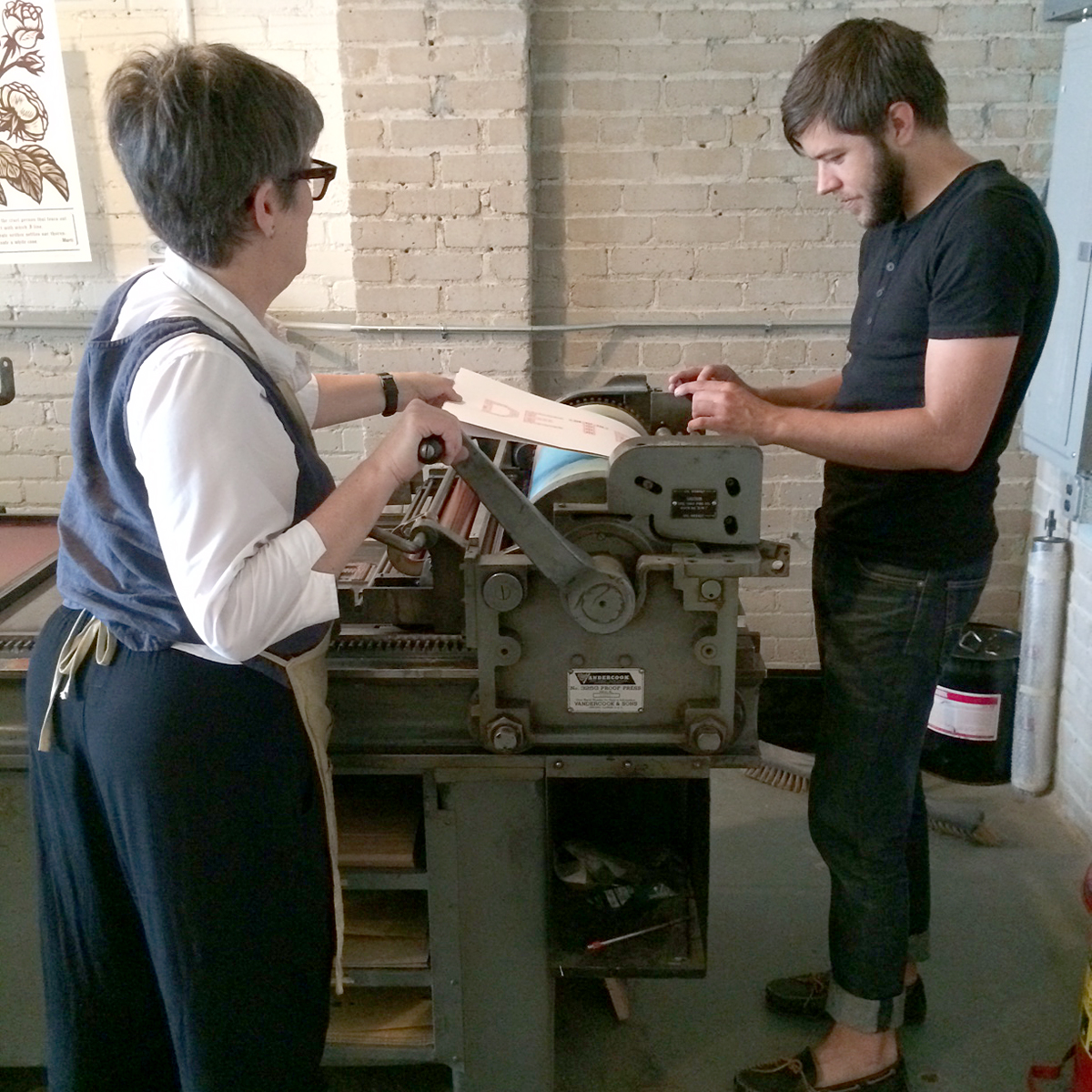
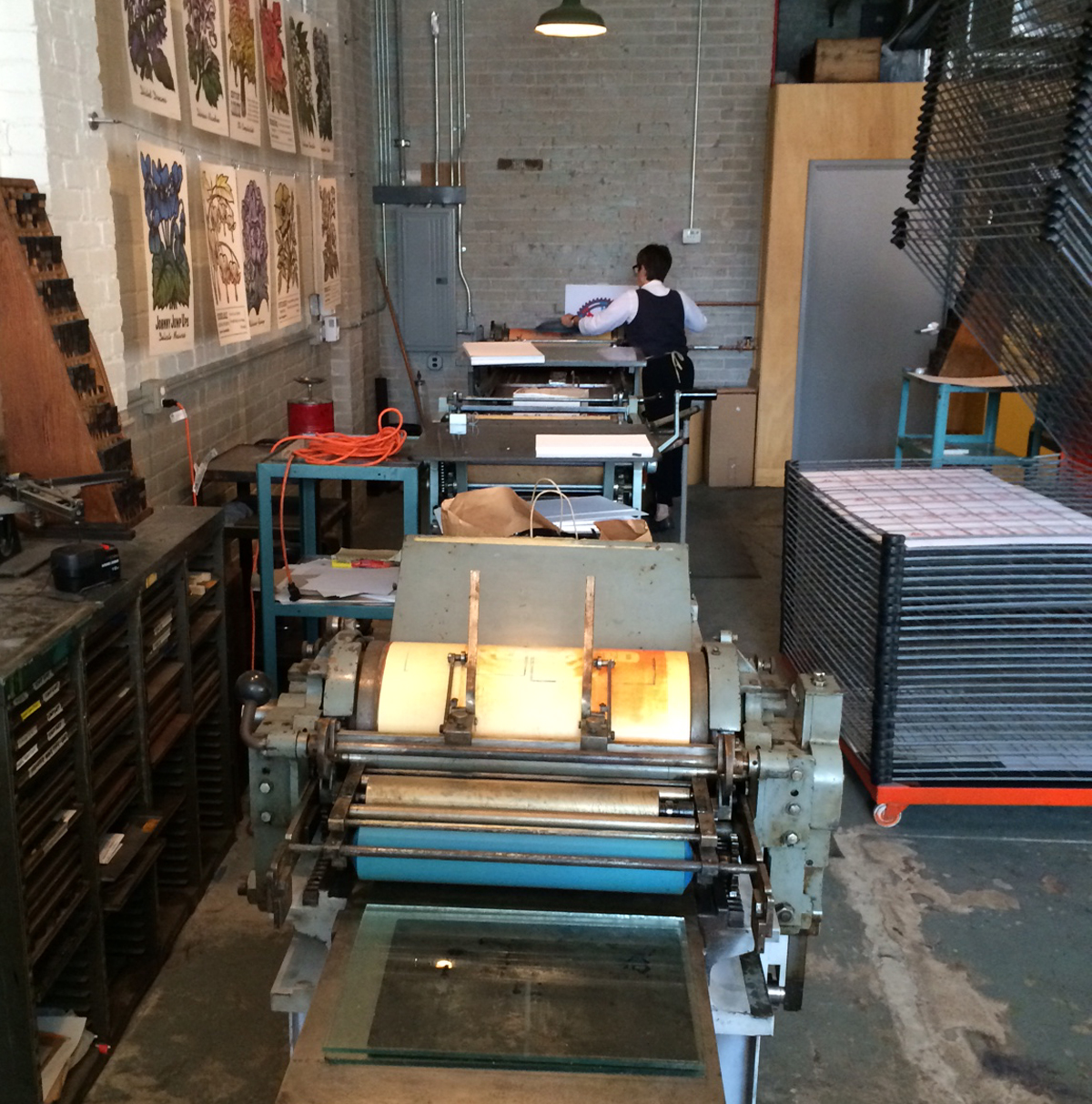
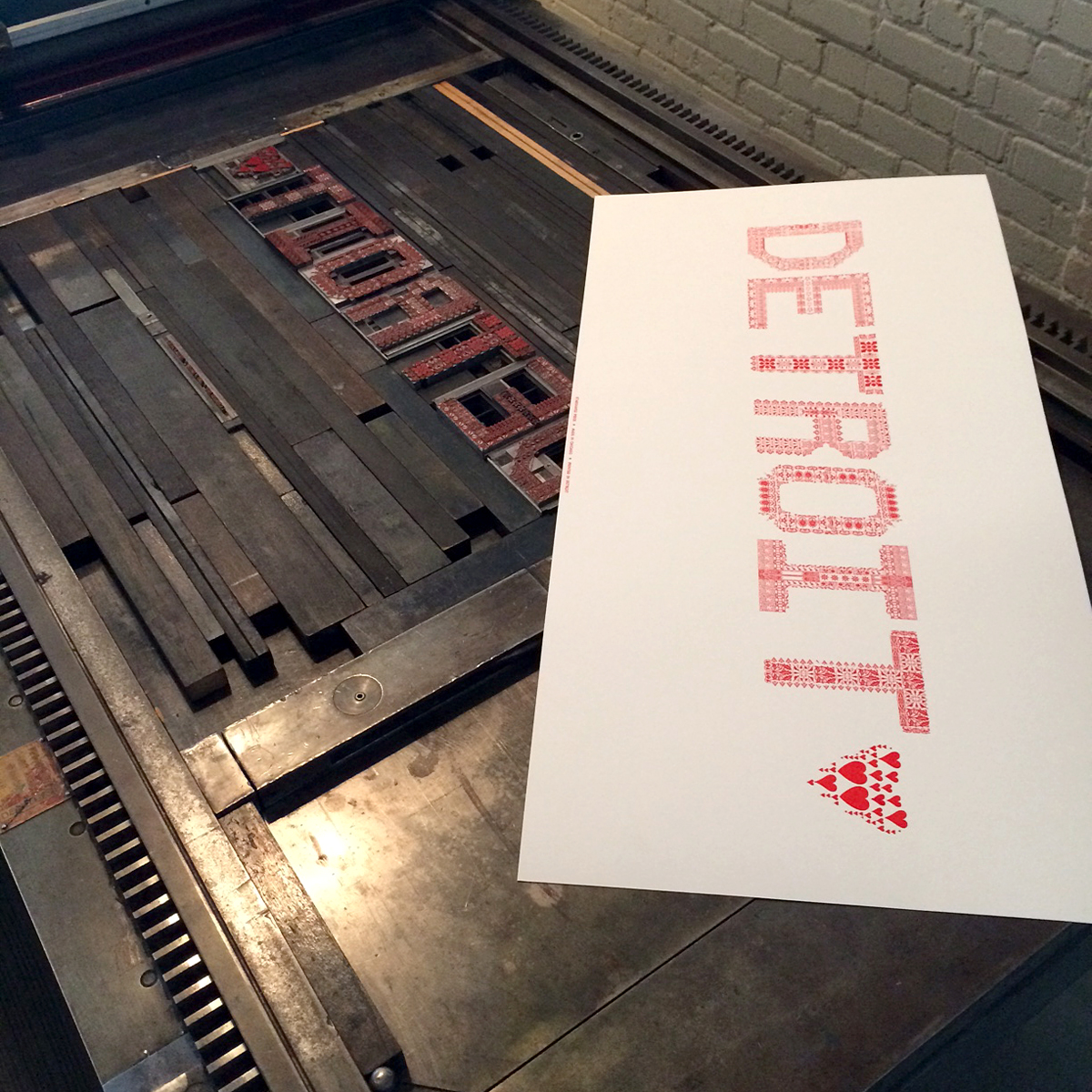
isabelThis is 'proof press row', with 3 presses lined up and ready to print. Lynn Avadenka, the artistic director, is at the end, pulling prints of the Detroit type I brought with me.
sr15Joel is moving in for a close up shot!

sr5The beauty of this Vandercook is that it was actually large enough to set all of our ornamental letters in a straight line. So we took advantage of that and printed quite a few new Detroit prints. These are for sale at Signal Return and all of the cash goes directly to them to support their workshops, outreach and all around awesomeness. If you're in Detroit Friday, September 19th, you can attend their fundraiser, Type-Oh!-Rama, which looks to be a pretty fantastic evening of letterpress activities.
detroittype2

sr20After printing, eating and fraternizing on Friday we went to Shinola for an Art Crank poster show. What an incredibly beautiful place this was. Here's just a tiny shot of the bike I coveted all night. If anyone wants to donate this to Starshaped, it would see a lot of use.

shinola2Their storefront is virtually a museum, and you can see the posters in the background here. Many of the prints were sold as a benefit for Back Alley Bikes, a cause we can really get behind. The community support and brisk sales of prints was heartening, not to mention the overall enthusiasm for the print community in Detroit.

shinola3After my time at Signal Return on Saturday, I headed over to Kennedy Prints to hang with Amos and see how Detroit was treating him. He has a lot of space for his vast collection of prints, type and presses. Not fully unpacked since moving from Alabama, he's got plans for a grand and glorious new space.
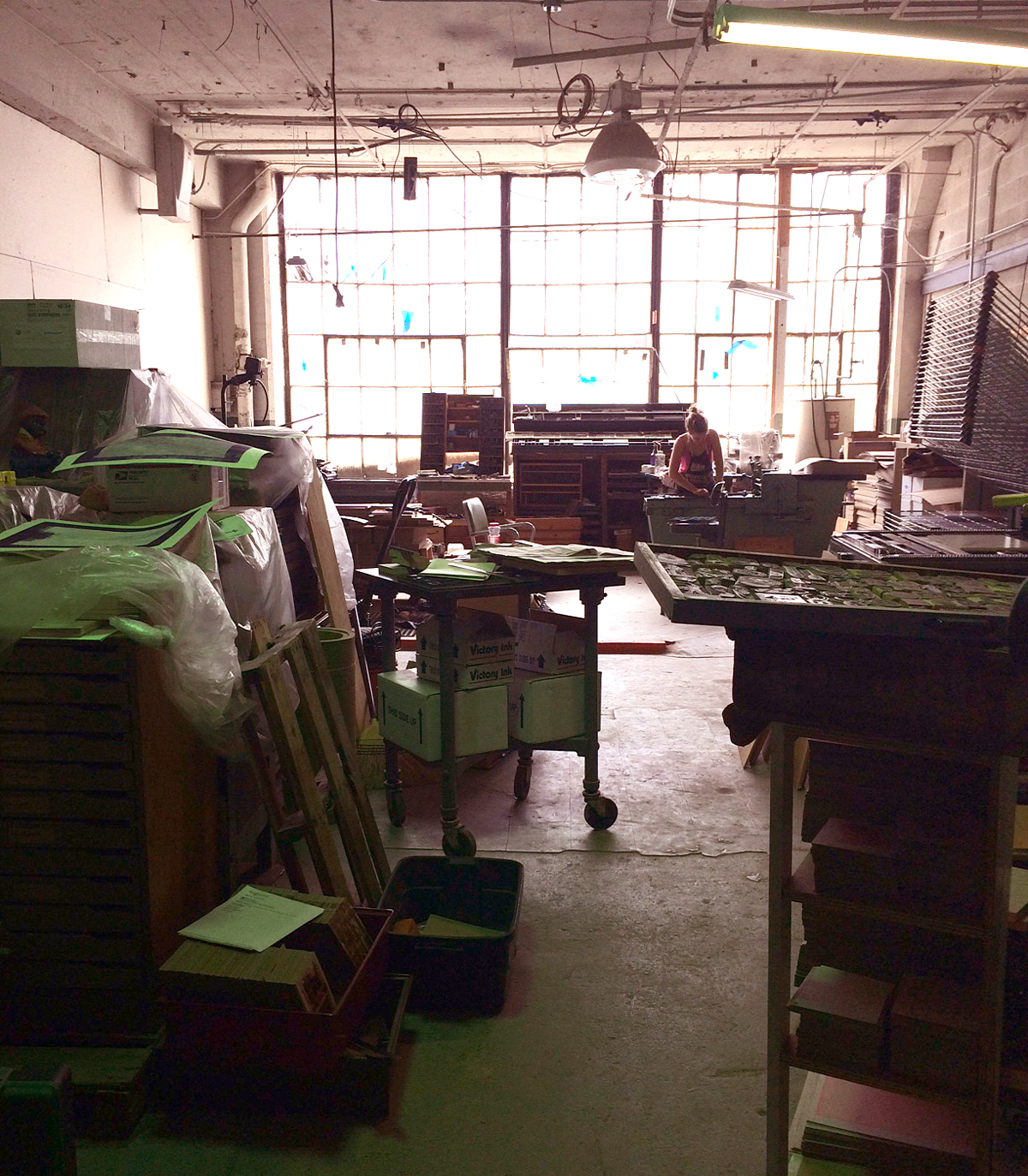
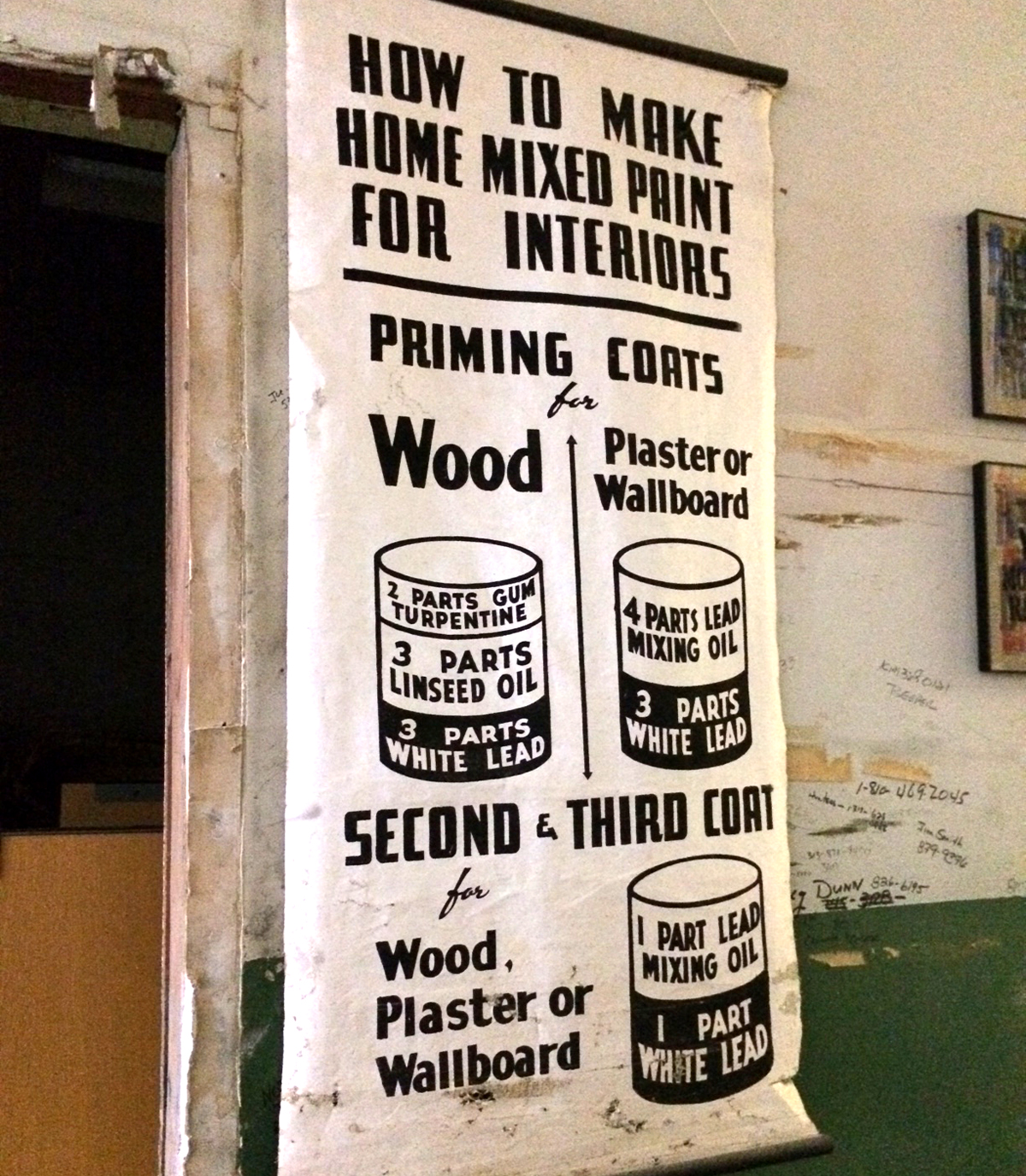
amos3This is a hand lettered print Amos picked up from a school while in Alabama. Gotta love lead paint!
amos2And a classy ampersand discovered in his wood type collection.

amos7Amos also picked up a few cases of beautifully detailed, hand carved wood cuts with African and African American themes. These came from Italy. What a journey.
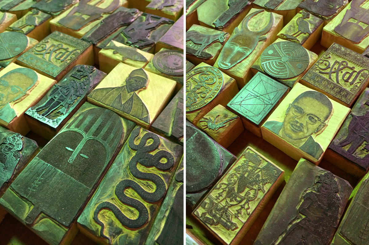
amos5And here are a few of the prints Amos sent me home with. He's doing a lot of fantastic work for the city, as you can see.

amos4Of course I had to go here. It felt like a pilgrimage, and it's hard to believe I felt my heart flutter when driving by. So modest. And so earth moving at the same time.
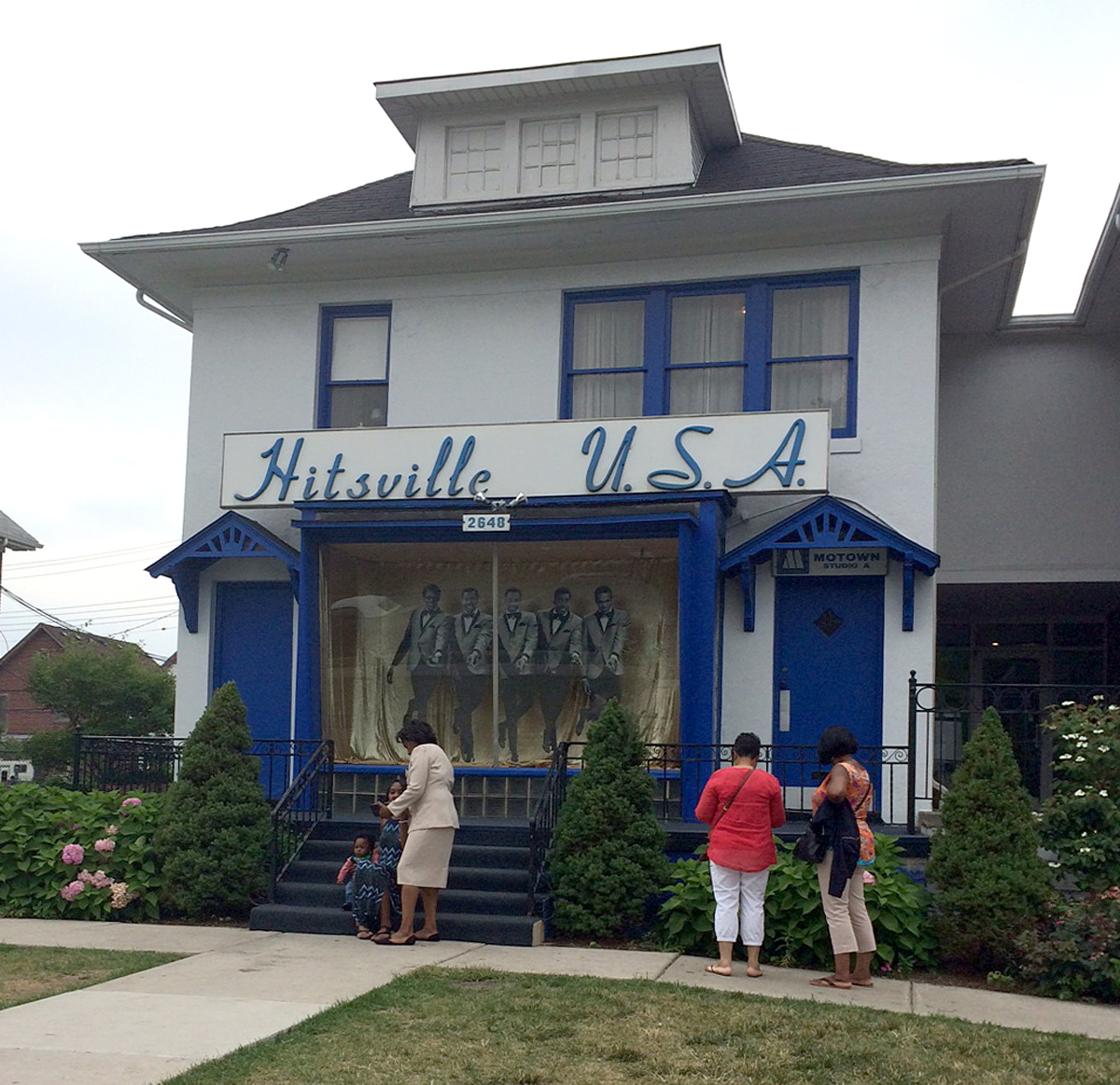
hitsvilleIt was such an inspiring 36 hours in the D. Everyone I had the opportunity to work and chat with was filled with the midwestern gumption that makes me proud and assured of the fact that they will succeed with whatever ventures they choose to take on. Go Detroit!

SRswag

Reverie

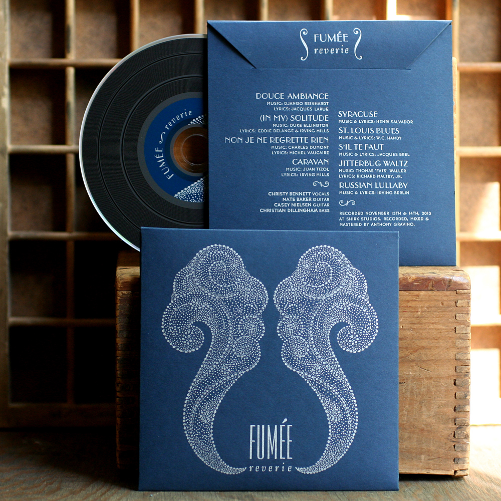
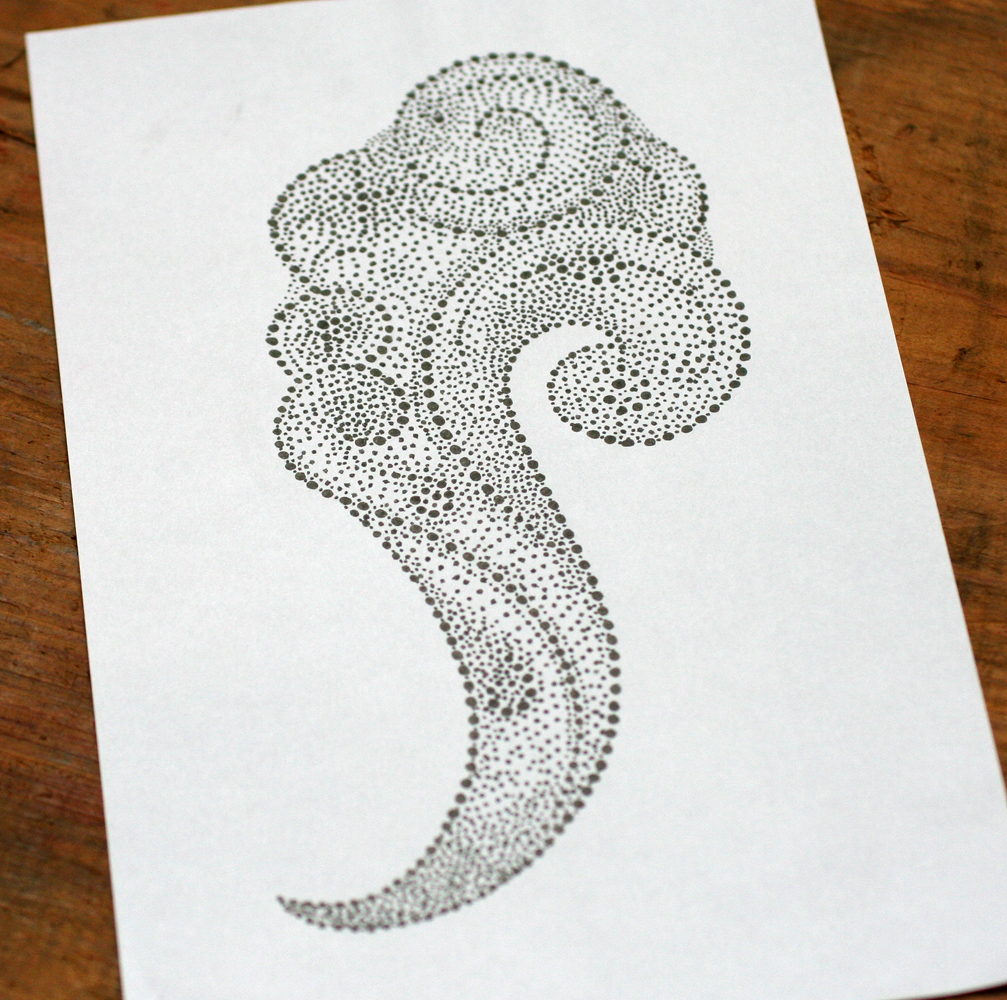
Before hitting the road on our Letterpress Trail this summer, we designed and printed a charming little cd sleeve for the local gypsy jazz (is there any other kind?!) band, Fumée. fumee1Obviously they hoped to create something that was indicative of the style of music and built an inspiration board that included references to Erté artwork. I riffed on that and drew this smoke-like image:

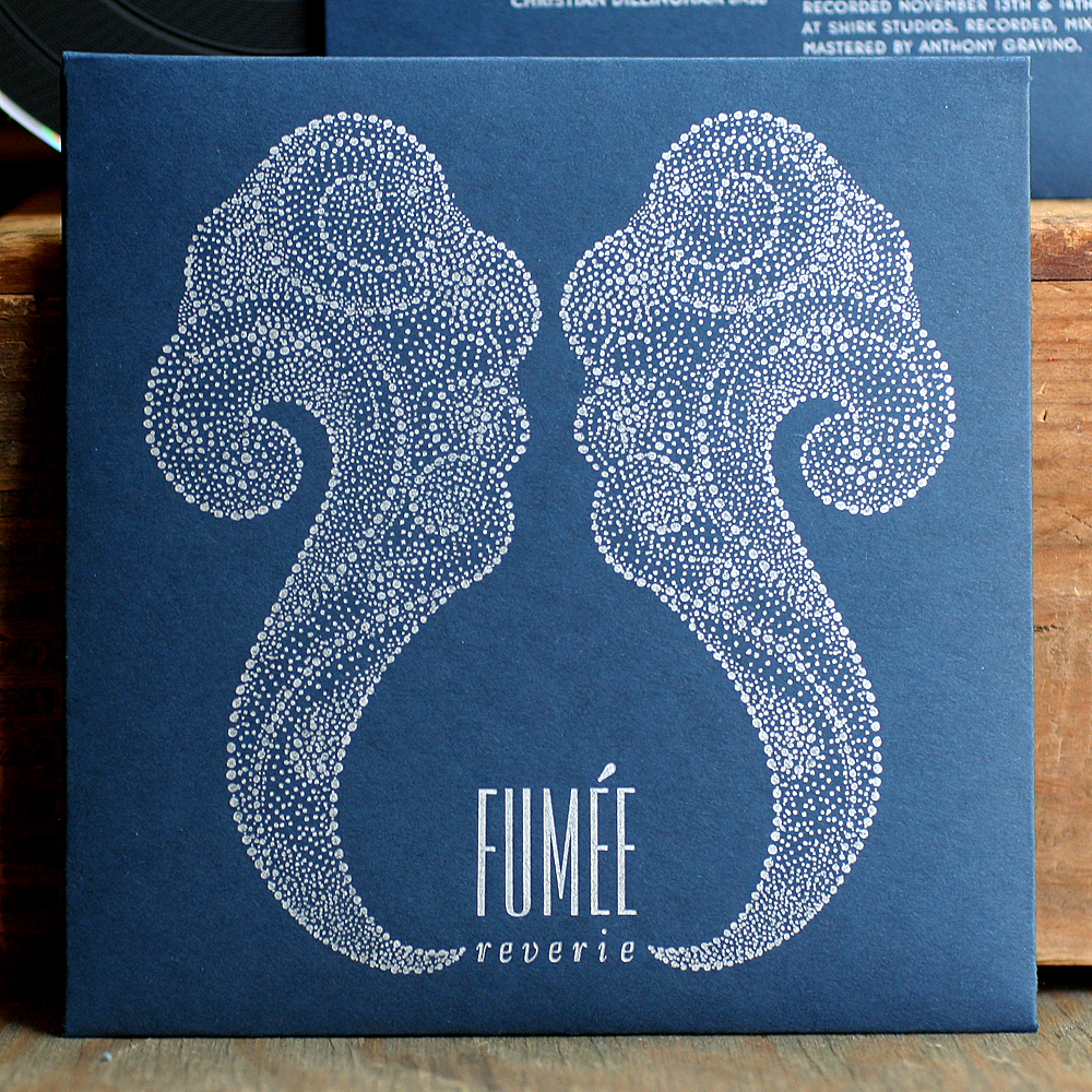
Tfumee5Double it up and there you go:

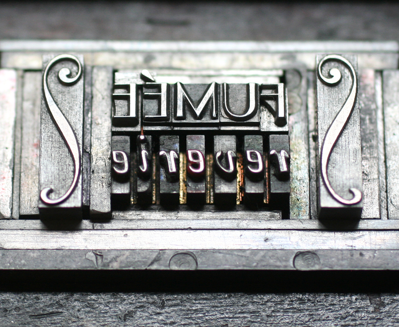
fumee2Conveniently, I had just acquired a set of accent characters so we could actually set the name correctly. Since a plate was required for the artwork, I cut into it to insert the hand set text.

tfumee1

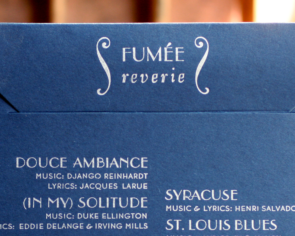
fumee5The back side of the sleeve has a smaller version of the main text, so I used a tinier accent here. These curly ornaments from Skyline Type also came close to matching the art of the front.

tfumee4

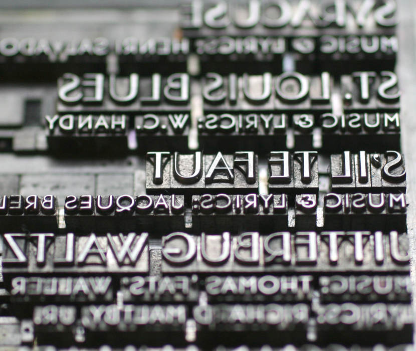
fumee4Beautiful Parisian and Bernhard Gothic, two of the studio's workhorse typefaces.

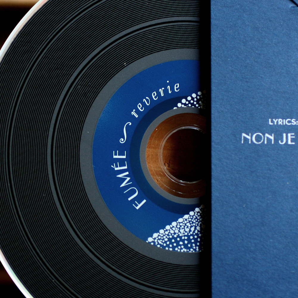
tfumee3The band found a cd duplicator that offered vinyl-looking disks, which was a perfect fit for this project. If you want to check them out, you can find more info here, or head over to Rogers Park Social every Monday night for the real deal!

fumee3

The 2014 Letterpress Trail finale!

Well, we've come to the end of the road on the Letterpress Trail for this summer, and it ends in Rochester, New York. Hold on to your hats because there's so much type in this post that it's a little mind blowing. While Jo was distracted with family, slip n' slides and ice cream, I headed over to Rochester to visit Amelia at the Cary Graphic Arts Collection, part of the library at RIT. Feeling a little homesick for the City That Works, Amelia kindly pulled type specimen books from my fair city, largely from Barnhart Bros. and Spindler. bbscoversTheir first building was a block from where Mr. Starshaped's theater (the Shubert) is today.

bbsbuildings4What a treat. What follows are some poor photos (in the interest of preserving bindings) of some of the type I found that I both already have and that which I might die for. We'll start with what I already have in the studio and was happy to confirm as Chicago-born:

have3

have4

have6I'm missing the bug from this set of ornaments, which is a shame because he's an attractive little fellow.

have8

have7While I don't have Lightface Era per se, this was a precursor to Pastel, a typeface that I do have in the studio, and one that was popular for silent film intertitles. Here's a sample of what we've done with it.have5

have9We've recently proofed up a bunch of catchphrases in our collection, including many that are here.

have2What follows here is a wish list of things I'd love to have for the studio.

want5

want1Beautiful forms!

want2Pretty sure we could recreate this one with little ornaments.

want3And this is the cream of the crop. Totally speechless over this modular alphabet.

want4What strikes me most about the BB&S specimen books is the writing. Here's a little sample from various books:

bbstext1

bbstext2

bbstext3Each book has wonderful samples of exactly what you can do with their type. Here are a few inspirational pieces:

inspiration1

inspiration3

inspiration4

inspiration5And here's one that features a cyma, or tilda-like squiggle that fills the space next to a capital L (thanks, Nick). You can often find these in hand painted signs and occasionally in the stone signage of apartment buildings around Chicago.

inspiration2I also found a great ad for the rule bender we currently have on loan from the Platen Press Museum. This handy tool will bend rules to create curved lines in print. For $20...what a steal!

rulebenderAs if that wasn't enough type to delve into, Amelia then pulled out just a tiny bit of their collection of Albert Schiller's work. His ornamental print work makes me want to pack it in. So clever and beautifully printed.

schiller3

schiller2

schiller7The magical ampersand machine...

schiller5This is THE press, which is currently being restored.

kelmscott

After an overwhelming visit to RIT, I made my way to Virgin Wood Type, the second of two wood type makers on our Trail. It was great to see Geri and Matt again; here's their humble pantograph in the middle of cutting a new font.

virgin4Boxes and boxes of patterns!

virgin5Matt's Ludlow box.

virgin6So many beautiful ornaments... how do I narrow down choices?

virgin1This is what I left with. These will be in print soon.

virgin3Then Geri and Matt took me over to Rochester's Book Arts Center in the Genesee Center for the Arts. What a great facility!


roch6

roch5

roch1

roch7If you're going to explore a wood type collection, is there anyone better to do it with besides Geri? Here are some of her favorites.

roch2

roch3

roch4Thanks to Virgin for letting me crash yet again and geek out on wood type for an afternoon.

Our last stop on the trip is a sentimental one. Ten years ago Mr. Starshaped and I were married at the Genesee Country Village, a complete historic village that includes a print shop. I try to get Jo there every summer to explore.

gcv1Their quirky prints are everywhere around the village and are a delight to see. They are also available for purchase and if you're lucky, someone is around the day you visit to show you how the hand press works.

gcv4Maybe Jo wasn't keen on staying behind to help like I told her she would as their new apprentice. But at least she knows her way around a shop!

gcv5That's it for our 2014 Letterpress Trail, though it's certainly not an end to visiting more shops as the year progresses. We've got some plans for 2015 already. In the meantime, it's back to the shop with a ton of new treasures to get on press.

finishedmap

Maria, Dan, Butterflies

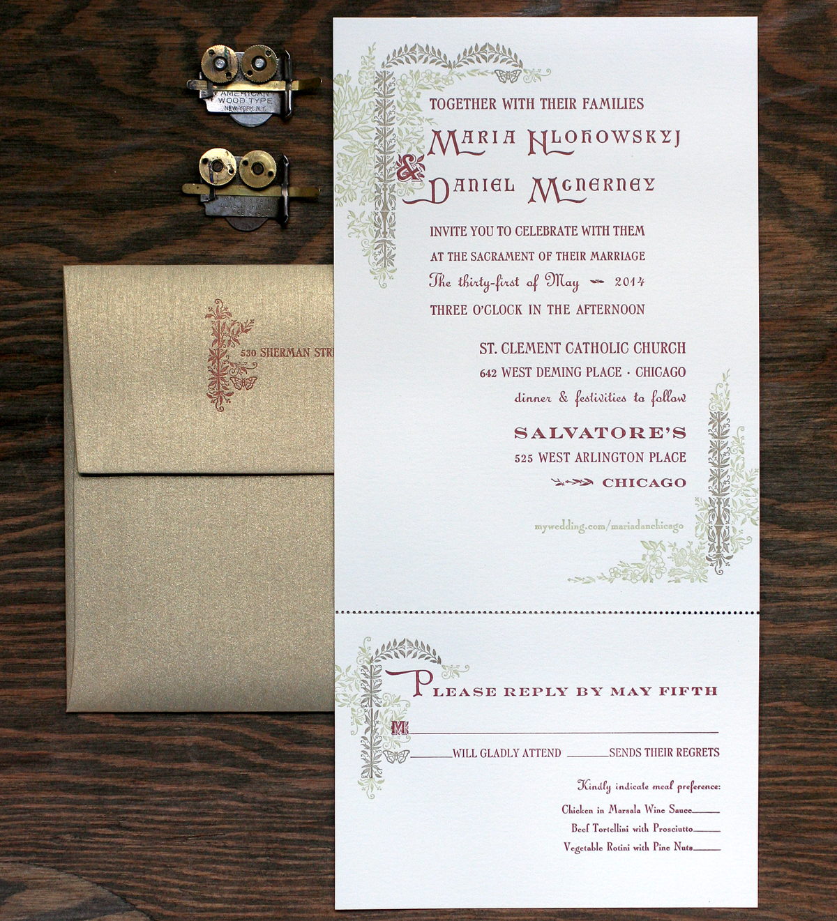
We're pretty lucky to have had some great clients looking for wedding invitations. This Spring I met Maria and Dan, fellow Ravenswood dwellers and fans of working with local sources for their wedding planning. Maria definitely wanted to include floral images and liked our 19th century inspired collection. Here's the final invitation: mariadan4This was the perfect project to work in a new cast of Arboret, courtesy of Skyline Type Foundry. This lovely set includes both 12 and 24 pt of floral type as well as ornaments that can be set in endless configurations to make the type look like it is part of an arbor. And while I didn't use any of the type (apart from two characters, including the ampersand), the ornaments created plenty of ways to add floral elements to the invitations.

arboretornamentsHere is the lockup for the green and gold at the top of the invite. Both are set together to make sure they will line up appropriately, and then each color is swapped out for spacing when the other color is ready to print. Worked into the Arboret ornamentation are a few actual 19th century pieces from our collection (the flowers and right side stems).

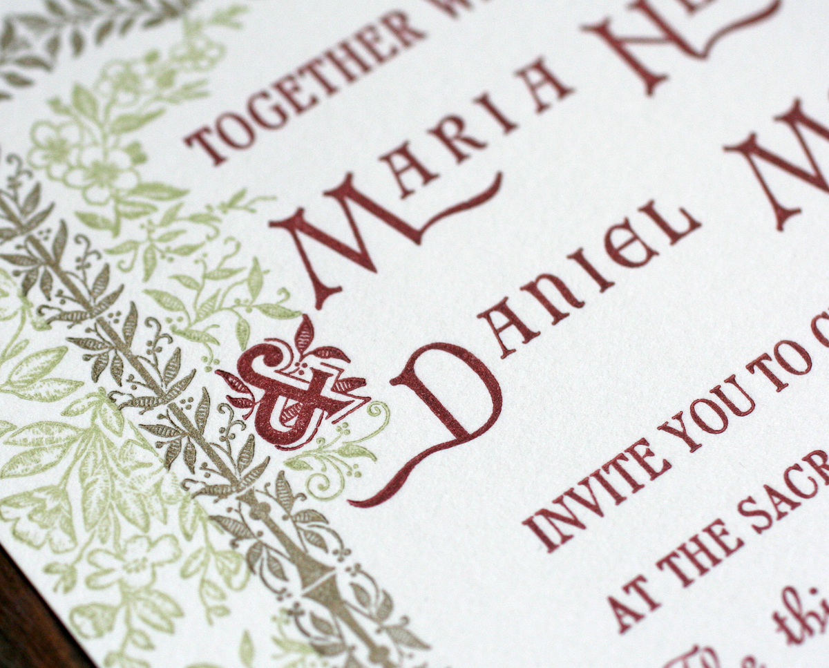
Tmariadan1Here is the Arboret ampersand, printed with the rest of the main text. Maria and Dan's names included 100 year old initial caps, mortised to include a 20th century typeface.

mariadan8Here are a few more of the ornaments at the bottom of the invitation. Their website was printed in green so as to be a little less prominent than the important text.

Tmariadan2This is the second character worked into the reply card text. A great shot of all of the elements coming together.

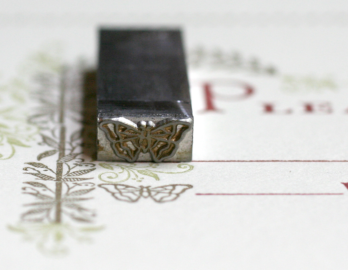
mariadan6Maria's family does a lot of work for butterfly conservation, and she was hoping to work this into the invitation. No problem, thanks to Skyline and a recent cast of this little guy:

mariadan7He also makes an appearance on the envelopes, which were a shimmery gold to tie into the gold ornaments on the invitation. It's remarkable that such detail holds up with metal type, much more so than digital type converted to plates for printing. And we're lucky to have an opportunity to work these historic typefaces into our everyday projects.

mariadan9


Small but Mighty

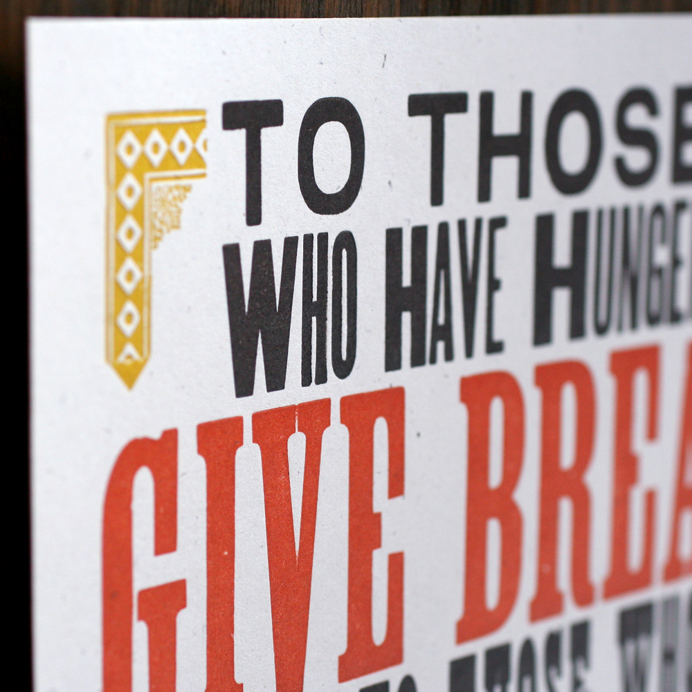
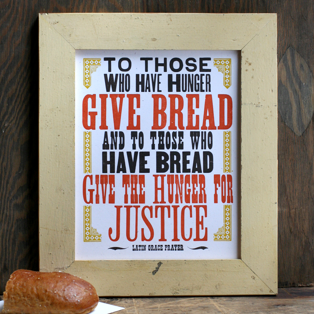
There are many great experiences that come hand in hand with participating in an awesome craft show like Show of Hands or the Renegade Craft Fair. One of my favorites is the opportunity to talk directly with shoppers and get instant feedback on the work created in the studio. One of the most common requests we get is for smaller sizes of our most popular large posters (and occasionally large versions of our small prints). This is for myriad reasons that include limited wall space and a cheaper price point. There were a few prints that I wanted to shrink, while focusing on our more socially relevant pieces, starting with the popular Give Bread print. The original is 14x18", and the new one is 8x10" and easy to frame. This series is printed on a 100% recycled white card stock for consistency between the prints.

Tgivebread2

givebreadsmall3

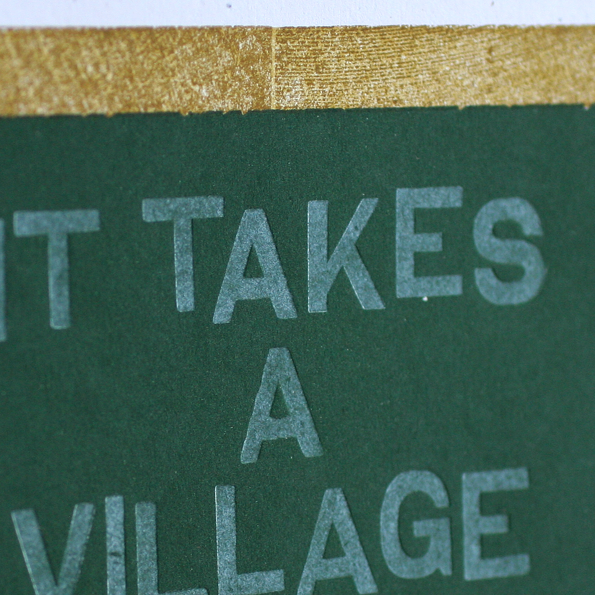
givebreadsmall1The second print is a tinier take on our It Takes A Village print. You can read about the original one here. I've discovered that this is a very popular print for teacher gifts, but we are always asked for a smaller, more convenient size.

TittakessmallI love the various techniques in this print. It's set up to look like a chalkboard, with wood type and linoleum blocks to create the frame. The green is a linoleum block that's very heavily printed so that the opaque white type shows up similarly to chalk on top of it.

takesavillage3

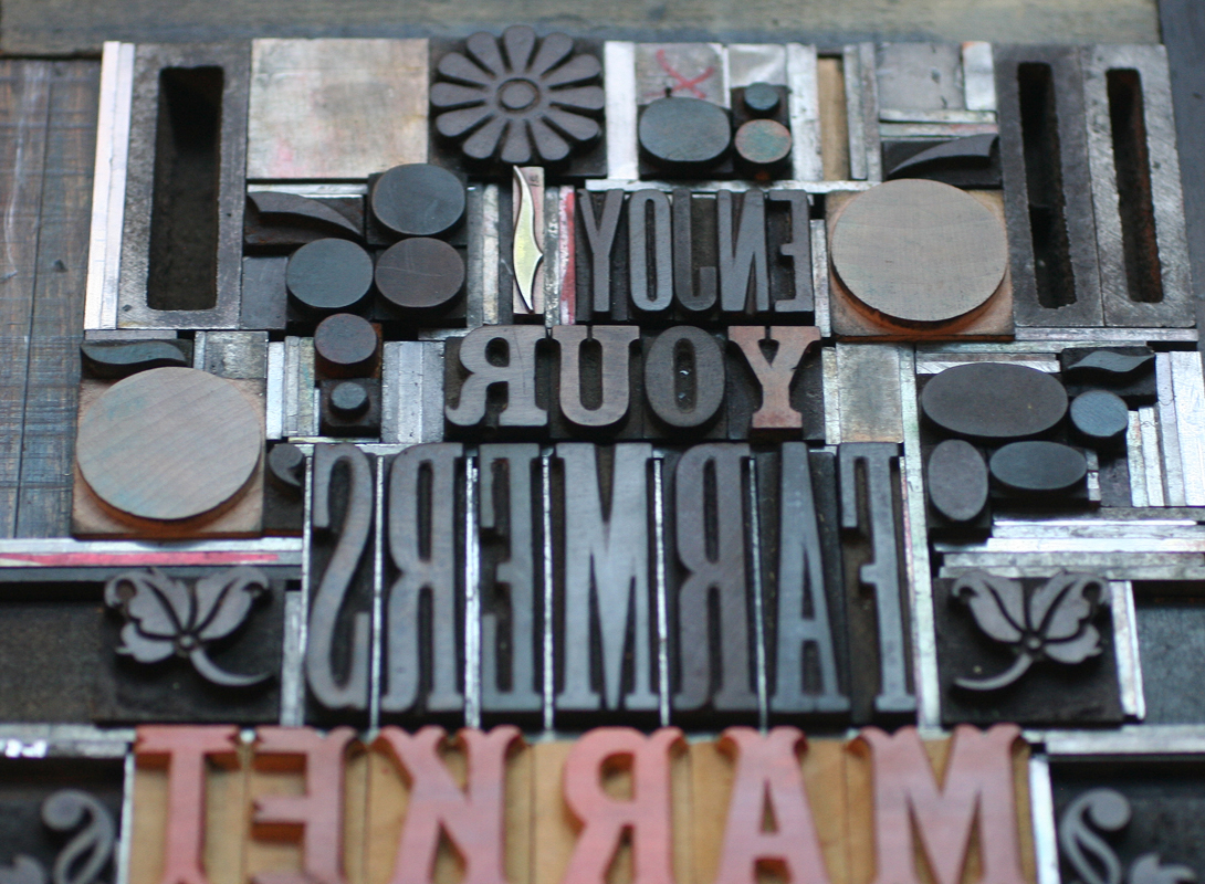
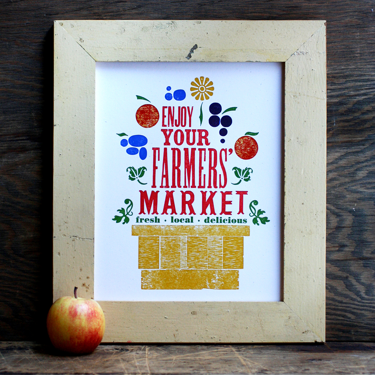
takesavillage1The trickiest of the three prints is a recreation of Enjoy Your Farmers Market, which was originally printed in 7 colors and is sold out (another reason to tackle this one!). This time, it's reduced to 4 colors and an abridged collection of typographic 'fruits'.

Tfarmersmarketsmall2After pulling out the type that seemed appropriate, I did a quick carbon proof on press to see how all of the pieces would work together, and to figure out which type would be which color. Not pretty, but enough to go on!

carbonproofThis is how it broke down to mustard, red, blue and green. There's a bit of overprinting as well to create new colors.

farmersmarket3

farmersmarket5

And while we're on the subject of reducing prints, last year I created both mini prints and cards of our best selling posters. I didn't want to print them with another means such as digital, offset or screenprinting, so that they'd be exact replicas of their larger siblings. Instead, I sought the challenge of building them entirely with our tiniest type and ornaments. The first set of prints and cards measure 3.5x5".

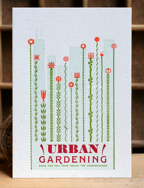
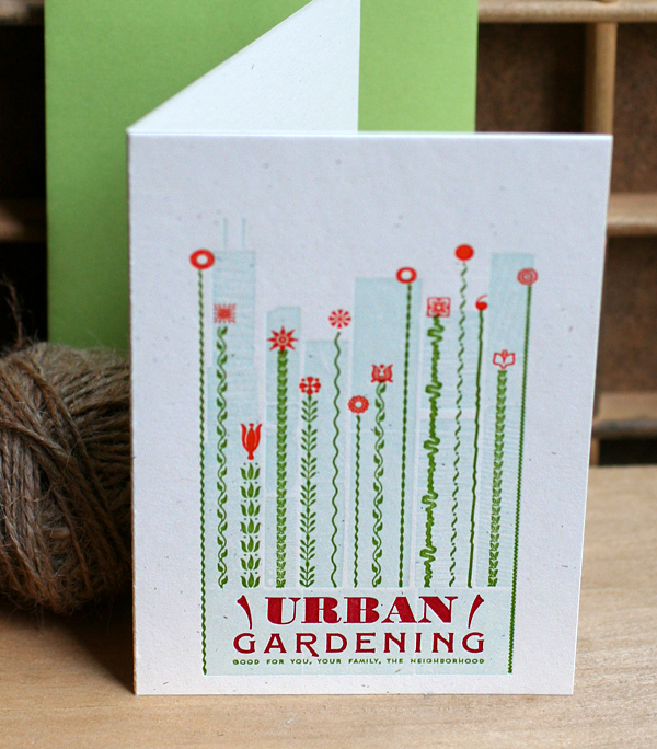
Our Urban Gardening poster has been one of the biggest sellers for the studio for years, and was first choice to be shrunk down to this (note that tiny 4 point type at the bottom!):

murbangardening1Skylines are a familiar subject matter in the studio and this one is no exception. It is created from the back sides of wood type and two little 'l's.

Turbangardening5 copy

urbangardening2

The greenery is mostly created with lino slugs, or ornamental rules cast on a linotype. The little orange 'flowers' need to be spaced accordingly to line up with the green print.

murbangardening3

Turbangardening4 copy

Turbangardening1 copy

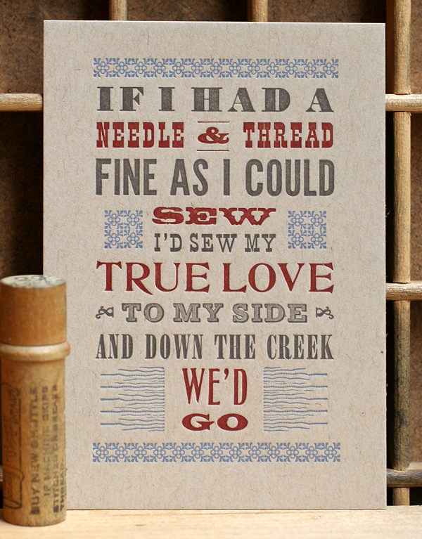
Another popular print in the studio is Jubilee, which pulls song lyrics from the charming old timey song. This mini print presented a lot of challenges in maintaining the same typographic feel as the poster, given that wood and metal type styles have historically been a bit far apart. But I found a few in our collection that fit the bill!

Tjubilee1 copy

mjubilee1

jubilee2

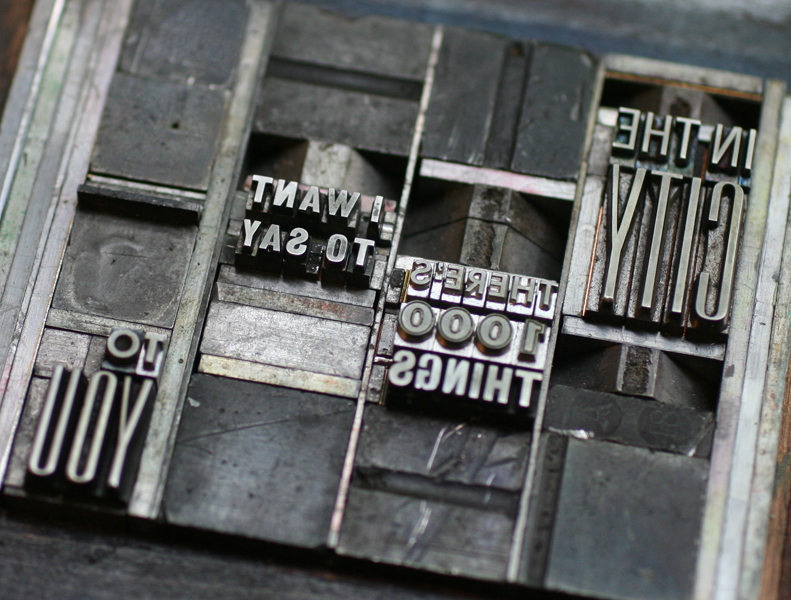
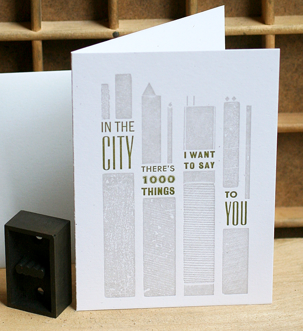
We scored a hit with In The City, pulled from the song by The Jam. For this one I had to find some tiny triangles and little lines.

minthecity1

Tinthecity1 copy

Tinthecity2 copy

inthecity2

I'm thrilled with how all of these prints turned out! Nothing beats a good challenge, and taking an existing design and manipulating it into a different format while working within the parameters of metal and wood type (and occasional linoleum blocks) is just that. All of these prints are available in our etsy shop.