The Annual Platen Press Museum Type Sale

If you have any interest in the history of printing, the Platen Press Museum is a must see place in Zion, Illinois (about an hour north of Chicago). It's run by Paul Aken, who is very much a mentor and booster of all things Starshaped. My relationship with Paul goes back many years to when I routinely went to the museum to help identify type and learn as much as possible about printing. Every Spring Paul hosts a type sale at the museum to clean out many of the duplicate typefaces, as well as other bits and pieces necessary to the craft. For the last two years, the sale has also include complete tabletop and sign presses, all set up and ready to print. If you're just getting started, or looking for a few missing things that would make your print practice that much better, this is a not-to-be-missed event. Today I went up to Zion to help identify, label and price some of the type that will be available. I'm thrilled to say there are some real gems set to go for the sale!

Here are the details:

Saturday, May 4th, 2013  ·  9:00 a.m. to 2:00 p.m.

Cases, Type, Tools, Supplies, Toy Presses, Books, Bits and Bobs

Table Top Presses (Pilots, Sigwalts, Kelseys) with new rollers and a starter kit

3051 Sheridan Rd.  ·   Zion, IL 60099

847-746-8170  *  847-731-1945  *  platenpress@sbcglobal.net

One Day Sale   -   No Shipping

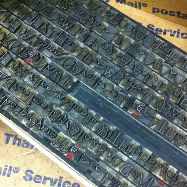
Here's a tease of just a few of the typefaces that are fonted up for sale. Type is also sold by the pound in cases, and there are blank cases as well. You really can't beat the prices (type ranges from $10-$100), not to mention the company of fellow printers that will be shopping. Hope to see you there!

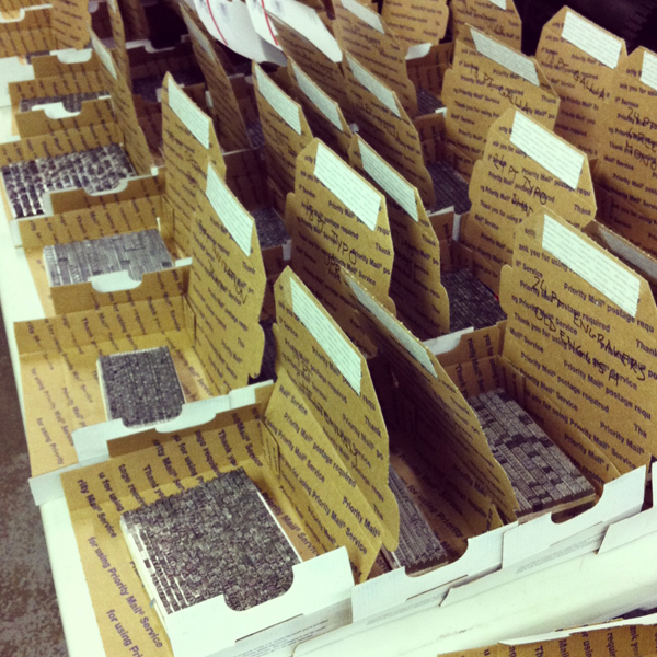
photo4

photo3

photo2

photo1

I Wood Die 4 U

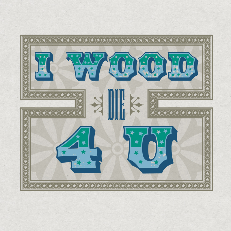
If you know anything about wood type, then you're familiar with the important role the Hamilton Wood Type & Printing Museum plays in the history of its creation, production and usage. In the last year, the heavy hitting digital type foundry, P22, teamed up with Hamilton to release new digital versions of many of their classic wood typefaces under the name Hamilton Wood Type Foundry. Rich Kegler, the talent behind the project, approached me about working with a few of the new faces, especially their star border, to see what I could come up with. And while pushing actual wood type around on press is more my speed, it was sure fun to come up with something that had no size restrictions or limitations based on what was in the typecase. From the comfort of my home and with Prince on the brain, here's what I did:

hwt1

hwt2

hwt3

hwt4

The Star Ornaments border is all sorts of awesome. It comes in various configurations that you can easily combine to create elaborate frames or maze-like images. And there are tons of stars to choose from, even more than what we have in the studio. Also shown here are: American Chromatic (too amazing for words, really), Antique Tuscan no. 9 and Republic Gothic.

Why wouldn't you want to get your hands on these gems? Follow along with the Foundry's adventures, and check out their site for ordering info. And no, this isn't a paid endorsement (just a plain ol' enthusiastic one), though if I'm lucky there might be some Buffalo wings in my future.

Celebrating our Neighbors

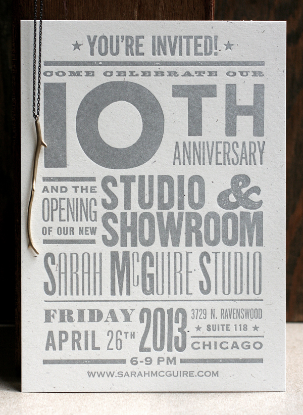
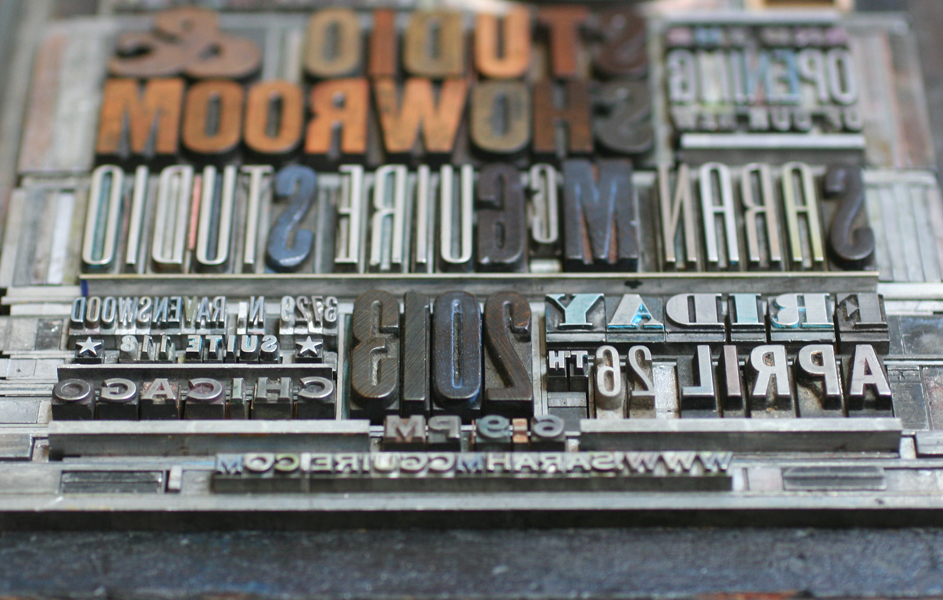
Every once in a while, the stars align and we can sneak jobs on press during our busiest times. I was recently contacted by Sarah McGuire, a local jewelry artist, about her upcoming 10th anniversary open house, with the hope that we could come up with a great invitation in a short period of time. Yes! Here's what we did, photographed with one of Sarah's lovely necklaces. sarahmcquire1

Sarah wanted a broadside-styled card with blocky, simple typefaces in various sizes, and definitely printed in silver.

sarahmcquire2

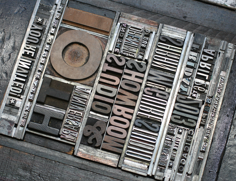
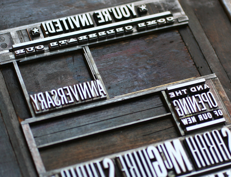
This is the form, showing the combination of metal type, wood type and rules (used for printing lines).

Tsarahmcquire

Tsarahmcquire3

Here's the form in the press, inked and ready to go.

sarahmcquirelockup

After the basic setup, I've found that large wood type often doesn't print as well combined with small type on a platen press. I took out the larger wood elements and filled them with spacing (called furniture) in order to run the small type first. After that, I put the wood back in and replaced the metal type with furniture. Two runs for one color seems like a pain, but the result is that much better and two runs on the platen are still faster than one on the Vandercook, where everything could be printed at the same time.

Tsarahmcquire5

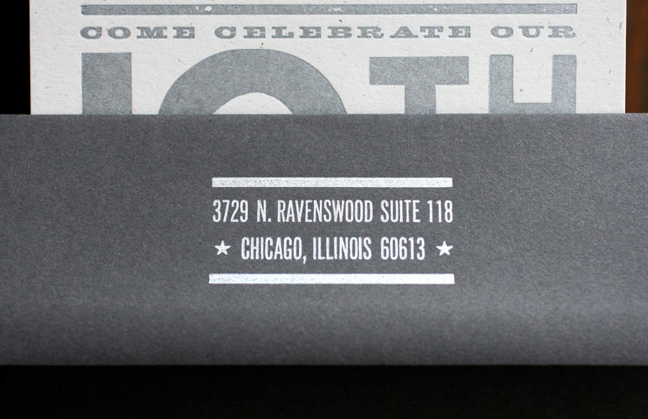
Here's the studio address, in our own lovely Ravenswood neighborhood! We will be celebrating with Sarah in her lovely new space on April 26th, and hope to see you there, too.

sarahmcquire5

If Rosie Can Do It

I am often asked how we maintain our presses in the studio and folks always find it surprising when I answer that we do it ourselves. The truth is, armed with a manual or two and a few connections with experienced printers, keeping our presses in working order is pretty simple. They need oil, and plenty of it, along with a little cleaning and visually checking that screws and bolts aren't working themselves loose. Both of our platen presses are motorized, with the motors running directly off the flywheel. I'm not a big fan of belts (even after successfully replacing a disintegrating one on our Vandercook press), so this setup is ideal. Both of our motors are made-in-Chicago Kimball motors that are period to the presses, and have had a pretty good run of 10+ years in our shop with little complaint. That changed this past Fall when the 10x15 C+P press motor decided to act up. After a little cleaning and investigating, it was apparent that a few parts were worn to what is probably a not fixable degree. Because this press is our workhorse, we took the motor from the 8x12 C+P and put it on the 10x15 for a temporary fix while searching out a replacement. In the meantime, I purchased a treadle for this press as it seemed like a good idea to have a manual backup. Think vintage, foot-powered sewing machine.

Well, I suppose the treadle came in perfect time, as the 'new' motor on the 10x15 died last Saturday. This was most likely due to old wiring with poor connections. This was the throw-the-hands-up-in-the-air moment of realizing both motors are long overdue for an overhaul. I ripped the treadle out of its crate and got it on the press. First, the unused motor mount had to come off because it's attached to the same hinge that is needed for the treadle mount:

motormount

Here's the front of the treadle that sees all the action.

treadle

Bad!

badmotor

I lowered the pulley away from the flywheel so it doesn't needlessly drag on the flywheel now that it's operated by foot:

disconnectedmotor

And here's the happy setup. I printed over 2400 calendar pages by foot (more on those later), which was not unlike spending about 4 hours on an elliptical, only with one foot at a time. This was followed by 200o 4-run gift certificates. Happily, next week is a Vandercook week so I've got a little break coming up. The interns will be getting the workout!

presswithtreadle

The beauty of working in Chicago, the city that works, is that there are motor shops in nearly every neighborhood. We'll be taking both of the motors in to see if they can get us up and running again at full speed soon.

Metal Typography in Context

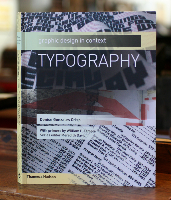
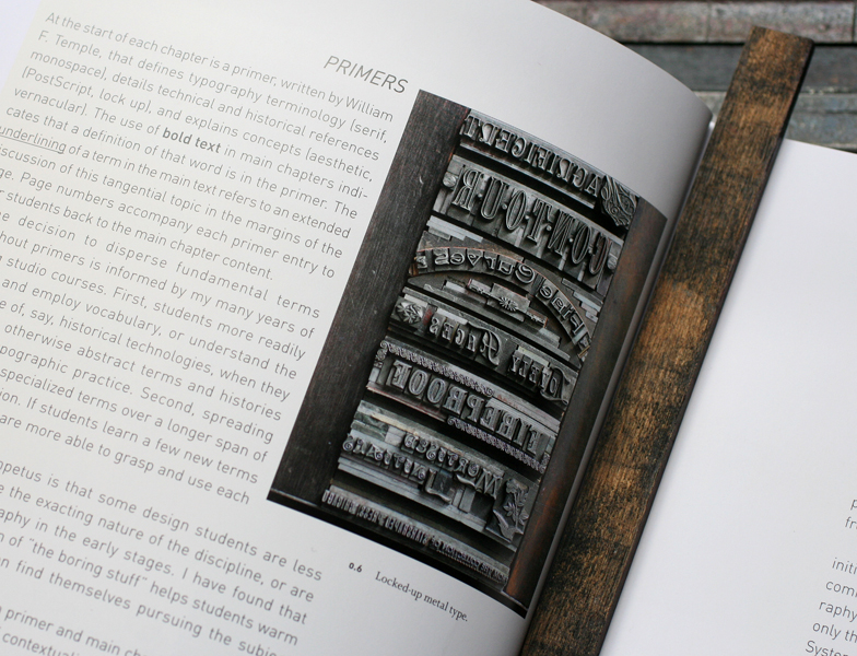
I recently acquired a copy of the new textbook, Graphic Design in Context: Typography, as a photo of one of our type forms appears in the book. typographybookfront

page

This was a piece I put together 2 years ago to showcase many of the victorian typefaces in the studio for the purpose of photographing them. Forms are so lovely and architectural, and we've endeavored to include process shots on our site, the flickr letterpress forme group as well as this blog to share. Here's the full photo:

loresFULL2

And after taking the care to build this, I decided to print a number of copies of it so the actual type could be seen as it was originally intended. It's available on our etsy site.

specimen1

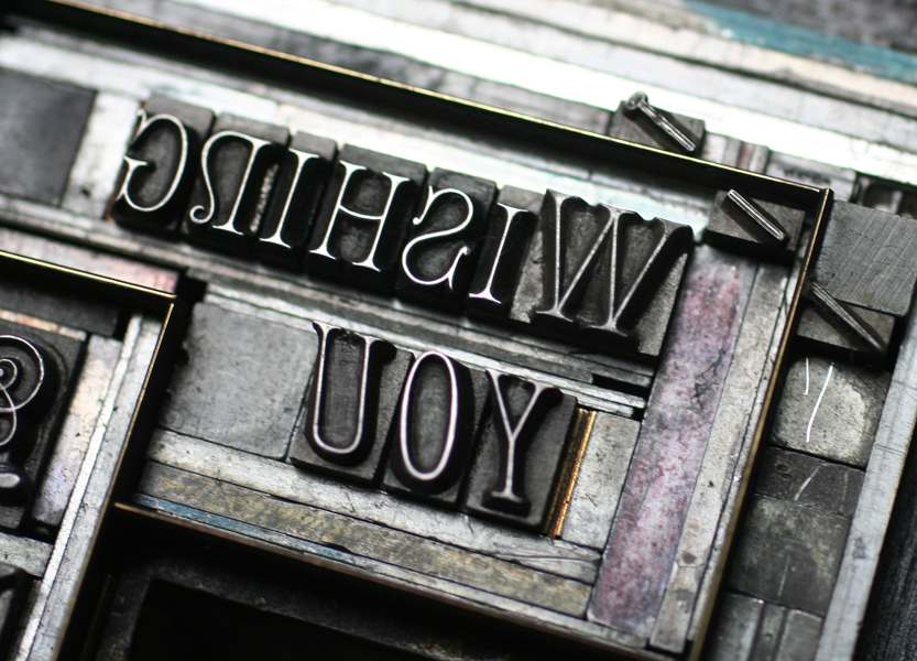
Just this week I assembled a similarly complex form with more of our 19th century type for a birthday card, which you can see here. The best bit is the little pin set in the corner that requires careful setting in order to line it up correctly.

wishbirth1

wishbirth2

There'll be more on this card coming soon... In the meantime, if you have any interest in the study of type, check out Typography. It's thoughtfully laid out, very concise and offers a unique perspective on how type functions in the real world. I can't put it down.