V-Day in... September

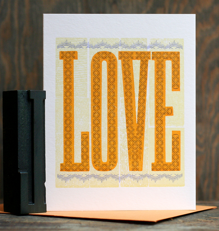
One of the wacky things about printing for the wholesale market is the scheduling. While it's just September, our Valentine's Day cards are finished and ready to go! There are three new ones to add to the catalog this year and all three are unique in their inspiration. The first one was built around this simple, skinny wood type, with the idea that we could add ornamentation for a folk art sampler feel.
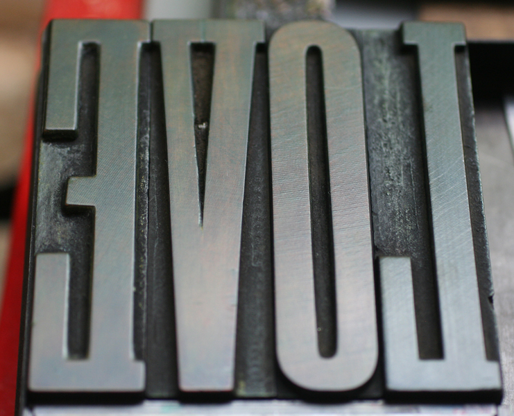
Tlove2That was the easy part! Next came the ornaments, forced into typographic lettering.
Tlove1Here's the final card, printed in orange, lavender and pale yellow. The close up shows how the background was printed with the textured back side of wood type.
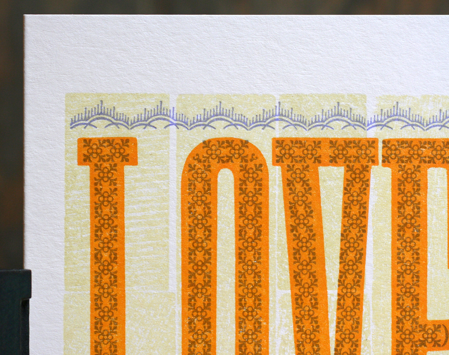
love1

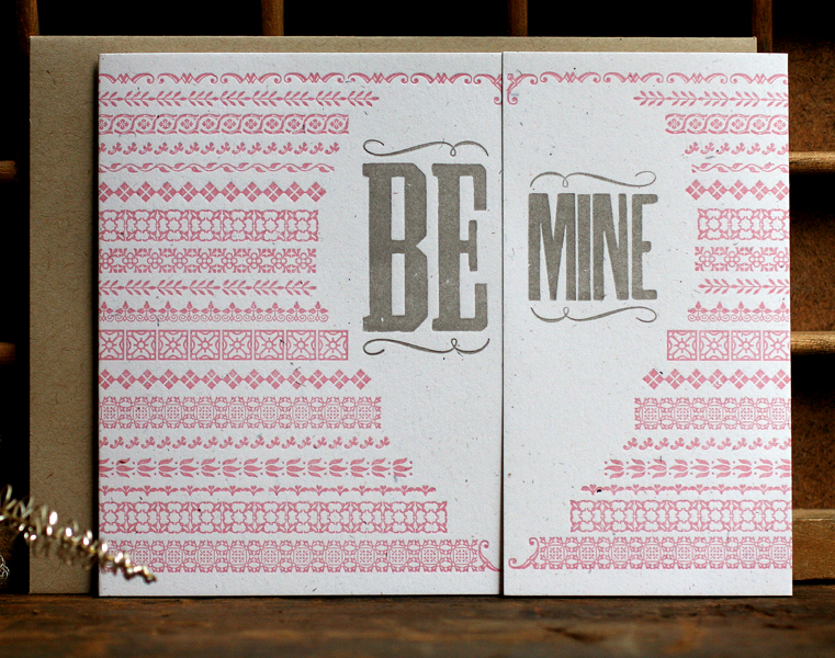
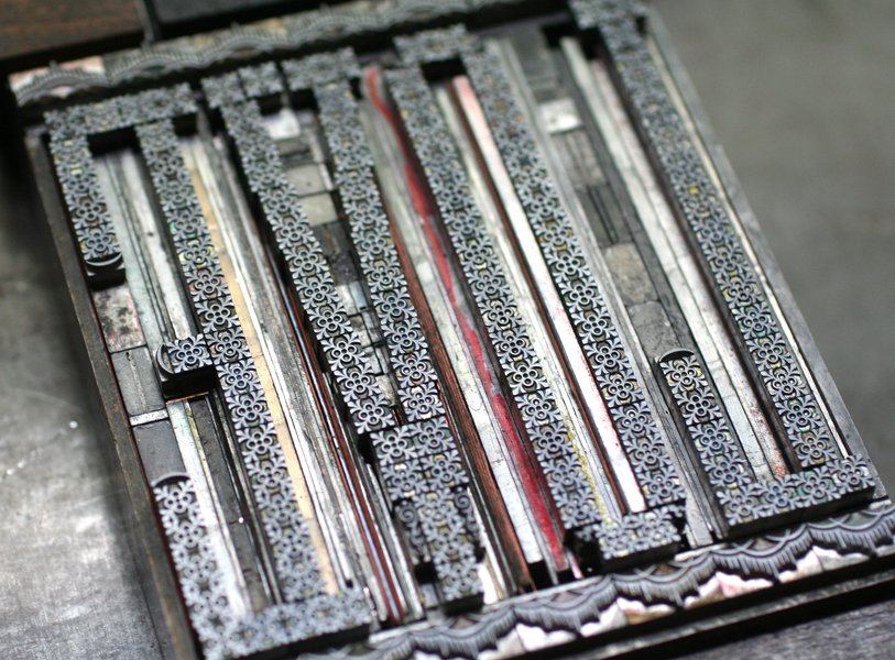
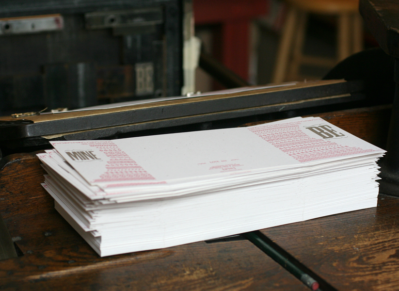
love3For the next card, I wanted to see if we could create a heart shape out of ornaments, but in a less obvious way. Thus I designed a gatefold style card so that the two sides would come together much the way a paper cutout heart does. Here is how it looked printed flat:
vdaysetup

vdaysetup2Printing gatefold cards requires a little thought and precision in the layout so that the two sides come together correctly when folded. This makes for interesting forms. As seen below, the words 'Be Mine' were on opposite sides of the chase.
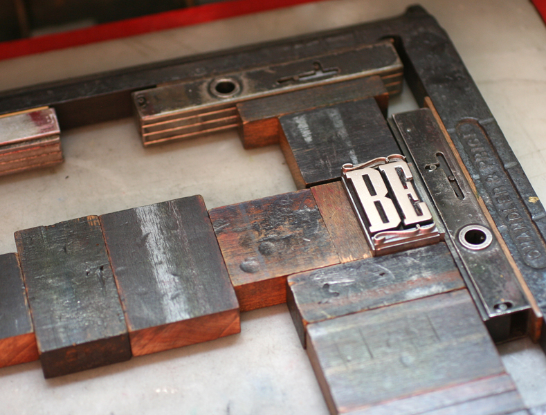
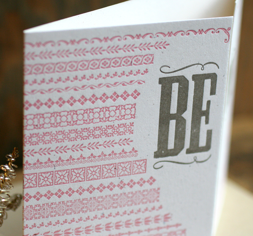
vdaysetup5Here's the final! bemine4Hundreds of little ornaments make up the textured, afghan-like pattern.

bemine2

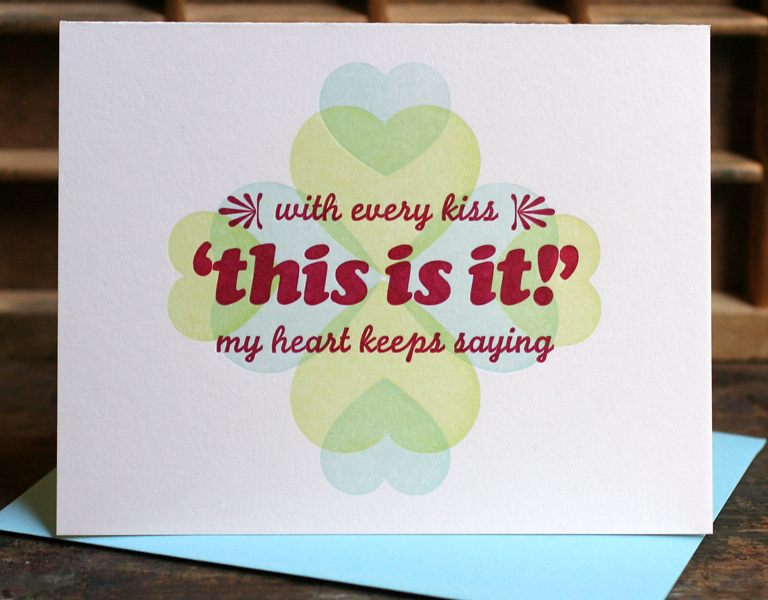
TbemineThe final card was a bit of a fluke, and came from listening to a lot of The Crystals in the studio, specifically 'Today I Met The Boy I'm Gonna Marry'. I pulled out our Moore Wood Type hearts to see if this card could come together organically.

vdaysetup4It's not every day we get to use our Cooper typefaces, which is a shame. This seemed like a golden opportunity to pull the Black Italic together with our cursive-styled Monoline Script.
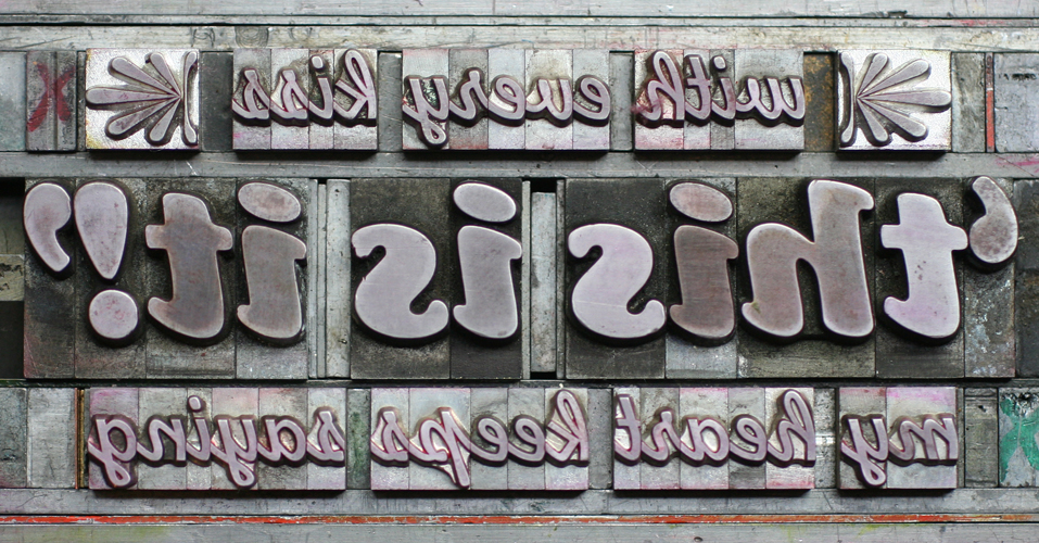
Tthisisit1And there you have it! thisisit1I printed the stars first in one direction then the other so that the subtle, largely transparent colors would overlap and create other colors. Then the burgundy text was printed on top.

thisisit4Three great cards, in my humble opinion, that were very fun to design and print. And when all was said and done, the forms fit comfortably on one galley, ready to be distributed back into the collection. All three are now available in our etsy shop.

vdaysetup3

We're Number One

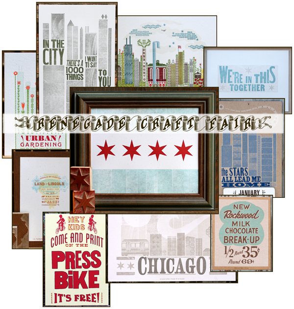
It's time for the Renegade Craft Fair right here in our hometown of Chicago. This is a great event, chock full of folks we both love and work with throughout the year, and it's one of our favorites. We hope you'll come out to see our new booth (Booth Number One right at Division and Damen) and check out the crazy amount of printing we've been doing this summer. Lots of new work, as well as our Chicago-themed staples. Come on out, say hi and chat! Bring us hot dogs. Meet Lindsay, intern extraordinaire. Not to be missed. renegade2013white Okay, so you have to miss it because you're not lucky enough to live in Chicago. Then use the code RENEGADE13 in our etsy shop for free domestic shipping on everything through September 13th.

An Artistic Approach

One of the best collections in the studio is the 19th century typefaces I've been acquiring over the last 15 years. Most of them are pre-1900, and some were created before the standardized point system (it can be pretty annoying to space 13 point type when the spacing doesn't exist!). Luckily, Skyline Type Foundry is creating new casts of some of these typefaces, using the original matrices but with new metal. The beauty of these is that we have access to antique typefaces but in the form of new type.

I wanted to spend some time with these typefaces and ornaments to create new pieces that mimic 'artistic printing' of the 1890s and challenge my typesetting abilities. I immediately sketched out a bunch of ideas for text and layouts based on actual print samples from the time (for inspiration, check out the incomparable Stephen Saxe's photo feed).

The series is open ended; the first three are completed, and two more are just about set and ready to go. Then there are other ideas still on paper, waiting for the chance to pull out more of this gorgeous type and get it on press.

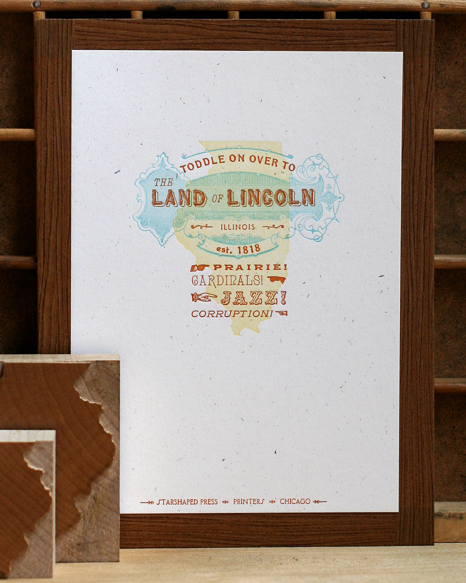
The first print celebrates our home state of Illinois. The inspiration actually came from receiving a new wood block of Illinois from Moore Wood Type. This is combined with an antique copper cut (love the line detail in this), a mash up of typefaces and two simple curves. In this image you can also see the Illinois woodblocks.

illinois1

And here's a close up of the detail in the copper cut and type. Rustic, the type for Land and Lincoln, is so kitschy and great.

illinois3

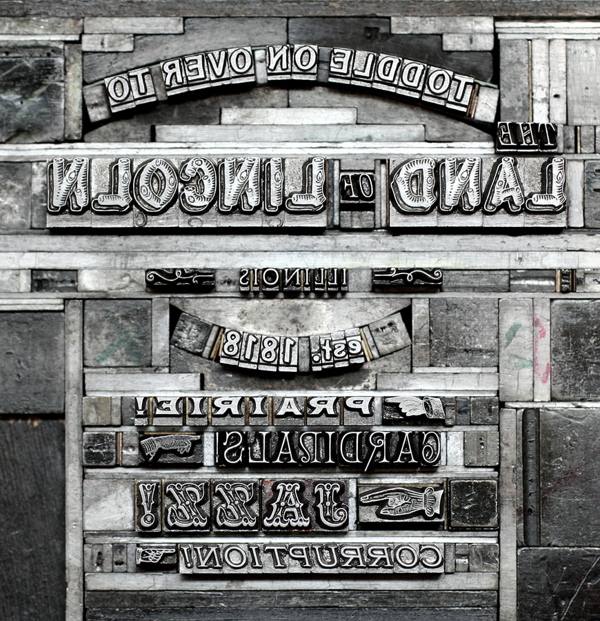
Each print for sale also includes an ink jet print of the form, or type set up, so that the viewer can appreciate just how the print was put together, and understand that it wasn't done digitally. Here's the form for the Illinois print:

Tillinois

The second print in the series is pulled from the song 'Deed I Do, a big favorite. This one works in a brand new cast of Arboret, a lovely and complex typeface (in 12 and 24 point), along with a set of ornaments to mix and match. So beautiful.

deedido1

My favorite thing about this print is the little line of ribbon type. This was a real find back at the Wayzgoose in Phoenix, as it is not only awesome, it includes a second set of solid background sorts so that you can print it in two colors. The pale purple ornaments are wood, and the yellow is a linoleum cut.

deedido2

Here you can see the various elements of Arboret to create all the floral ornaments.

Tdeedido

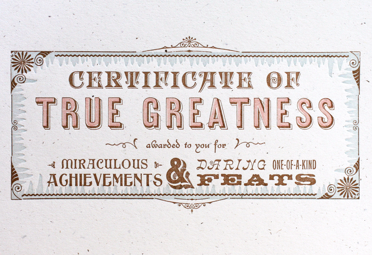
The third print is really fun and is perfect as a gift for someone that just accomplished something great.

truegreatness

The border is made up of detailed ornaments and decorative rules (lines), set in a rectangular shape. There's a funky blue background around the edge made up of what we like to call 'icicle border'. This is also one of the best ampersands in the studio. The second light color for 'true greatness' is a linoleum cut; it's not perfect, but then again, very few artistic prints are.

truegreatness2

Ttruegreatness

All of the prints are available for sale in our etsy shop. Over the next few weeks (years?) we'll be adding more prints as great ideas strike and more type makes its way into the studio. I make an effort to curate what typefaces find a home at Starshaped so that we can be sure that they are getting used and pulling their weight, so to speak. There are still many that haven't gotten their chance to shine, so they will be getting a stage soon.
American Made... of course

badge We're pleased to announce that Starshaped Press is in the running for the Martha Stewart American Made awards! Between now and September 13th you can vote multiple times each day for us, or for one of the artisans in any category. We'd sure appreciate your support of old fashioned, real letterpress, and our passion for keeping the original methods alive.

And in true Chicago form, we're offering bribes! Anyone voting can email their address to us and we'll be sending out little print treats in the mail each week until the end of the voting. Vote on!


The Society of Typographic Arts

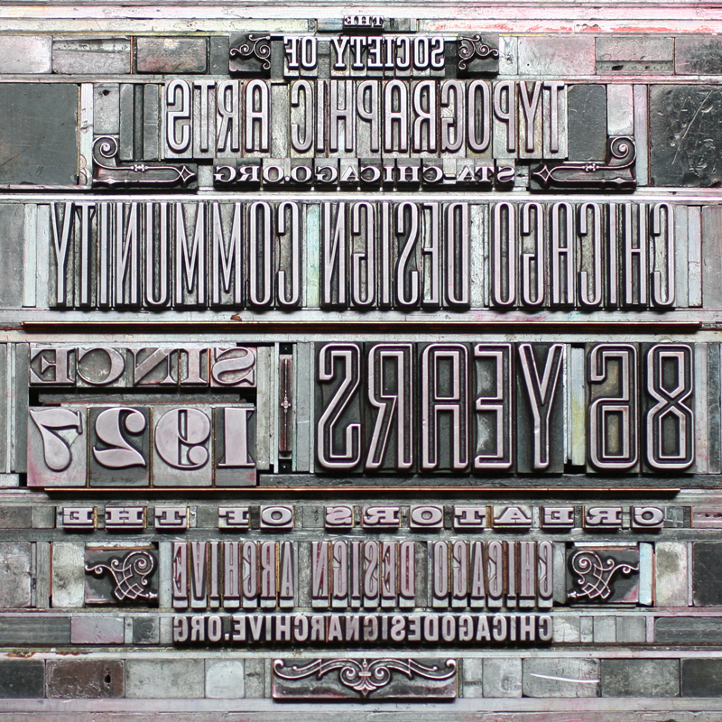
We recently finished a broadside project for the Society of Typographic Arts, located right here in Chicago. Obviously, typographic was the way to go! The broadside is intended as a welcome gift to new members and for promotional purposes, so it's scaled to 8x10" to fit in a mailer. It's printed simply in just one color on each side. sta1

I created a circular shape without actually putting any of the type on a curve. There are about 9 different typefaces of historical importance, combined with 19th century ornaments forced into a more modern configuration. Here's a little close up:

sta2

The backside of the print has a small and subtle colophon that's directly behind where the front circle of type is.

sta4

For this piece, the form images are just as beautiful as the actual print:

Tsta2LO

Tsta1

It's always great to work with folks that love type as much as we do!