Of all the wonderful things that Fall brings, one of the most endearing is the annual gathering of printers and type enthusiasts that flock to the Hamilton Wood Type and Printing Museum in Two Rivers, Wisconsin. I've written about the museum here many times, and it was a treat to attend our second Wayzgoose there. The museum has had one hell of year, having to move from their location in the original Hamilton building to a new spot overlooking Lake Michigan. And they've done it up in style, with this classy sign painted with the humbling talent of John Downer.
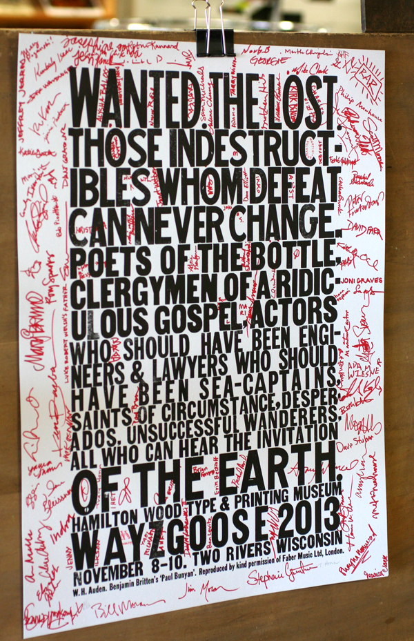
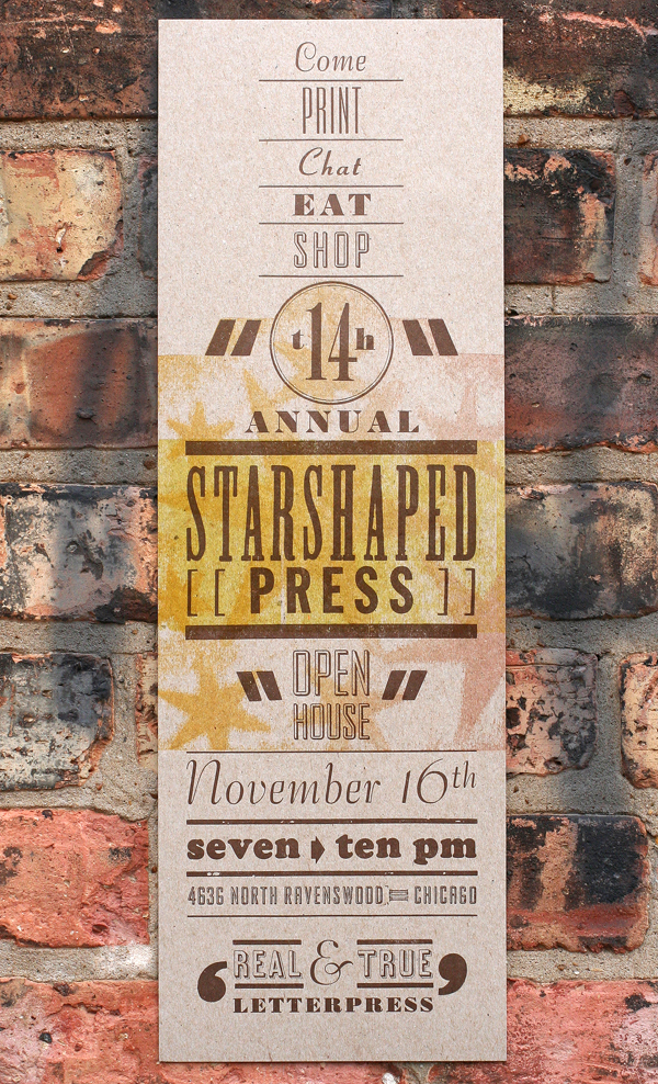
 Let's face it. The best thing about getting to Hamilton is the folks we meet. This is the only time during the year that I get to see some of the printers and type enthusiasts I admire from around the world, as well as meet new, up-and-coming craftspeople. One of those I greatly admire is Tracy Honn, from Silver Buckle Press in Madison, who provided this year's incredible poster:
 More on that later. After first arriving at Hamilton, we had a lovely dinner with old and new friends. One of the old friends was Scott Moore of Moore Wood Type, along with new friend Phil Moorhouse, all the way from Australia. Here they are enjoying dessert and sketching details of wood type production.
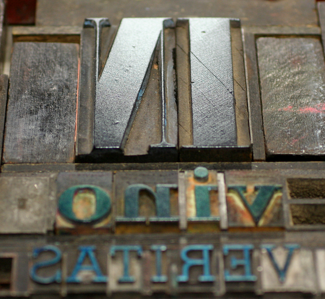
 Friday was workshop day, and I taught Mastering Metal and Wood Type Composition, hoping to help the attendees improve their game with typesetting, really look at spacing issues and work with various typefaces in one piece. The museum's new space is incredible, and a better fit for the direction in which they want to go. There are distinct areas set up as 'classrooms', and this was our area, outfitted with a number of sign presses and a substantial run of wood and metal type:

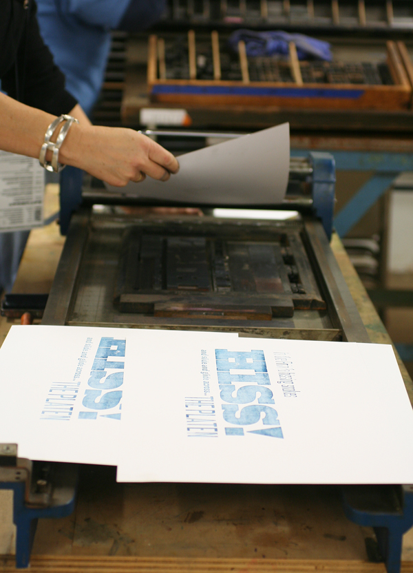
 Here are a few of the happy printers and prints from the day. The first print immortalizes one of the statements I made while introducing the concepts we'd be covering in the workshop.


 Talented and all around great guy, Brad Vetter, helped out in the morning. Here he is assisting with hand burnishing some of the peskier type from Arlene's form.
 Clint and Tahlia made the trek all the way from Australia so they could use this giant quoin key.
 Amy took on a simple form in the afternoon and it was very successful. She nitpicked the justification for some time and the result really paid off.

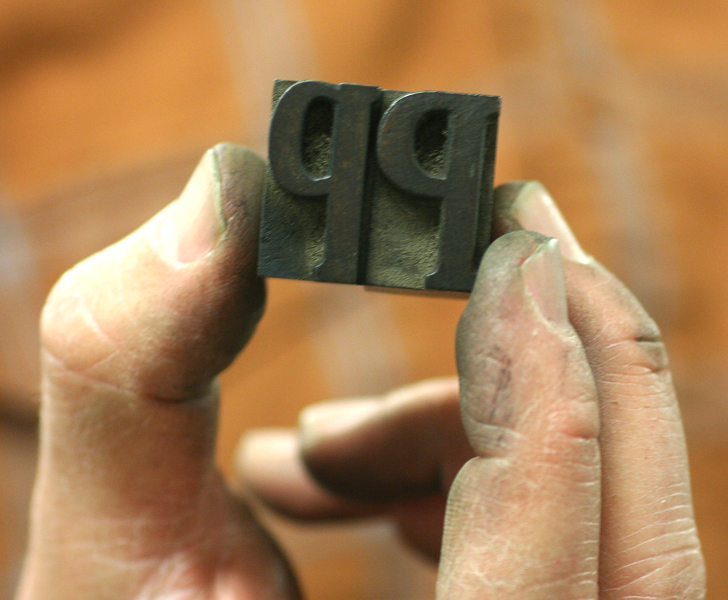
 Which one is a 'P' and which is a 'd'? We printed a handful before catching it!
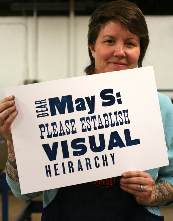
 A print that takes my 'establish a visual hierarchy' rule to heart:

Saturday was lecture day! This time around, I was speaking about Documenting Type Forms in the studio. Here's one of the three enthusiastic groups that sat in on the discussion. Notice anyone intimidating in this crowd? Yep, I was sweating.
 Three of those intimidating people are right here. David Shields from Virginia Commonwealth, Paul Brown from Indiana University and Erin Beckloff from Miami University. Too much typographic knowledge for one photo. I'm surprised the camera didn't pop a spring.
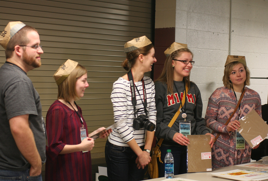
 Erin also brought this energetic crew of Miami students with her, in all their matching t-shirt glory.
 While I was talking and answering questions, Jo was busy in the back printing up a storm! We packed her little homemade press and she created a number of pieces (hand illuminated, of course) for the Sunday print swap.

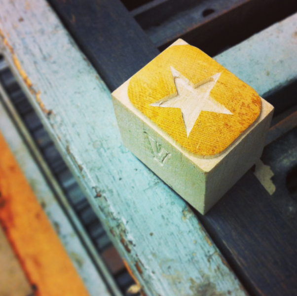
 I had the pleasure of meeting Geri from Virgin Wood Type... finally. You know you're in the right place when a little gem like this ends up in your apron pocket.
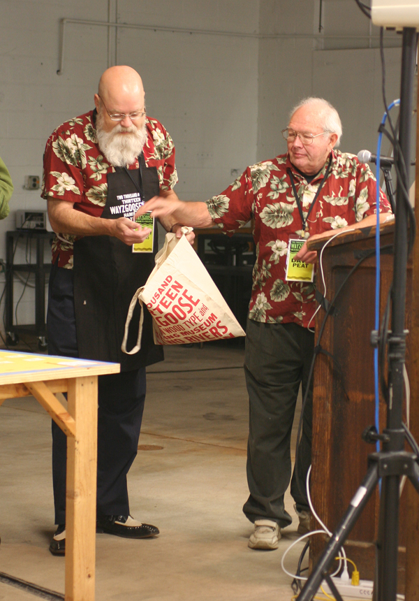
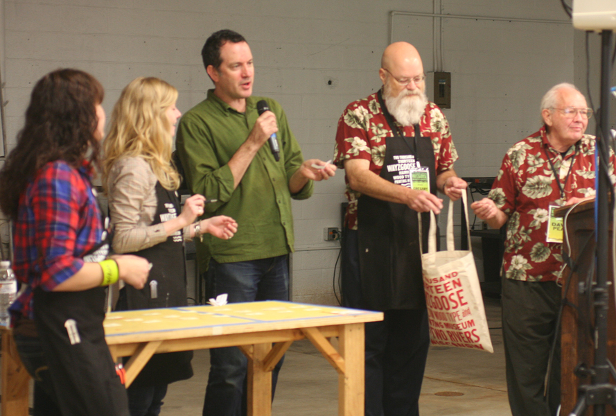
 Sunday morning presented one of the more thrilling moments of the weekend. The incomparable Dave Peat brought a large number of items to be given away as door prizes. You can see the crowd here, anticipating his talk about how different type forms can be created and the following giveaway.
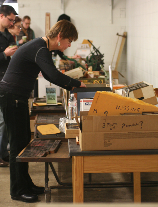
 This entire table was set up with prize items. Books, presses, type, mystery boxes and candy... If these items were 'throwaway' to Dave Peat, imagine what his personal collection looks like.

 Greg Walters, another fine APA member, was on hand, along with Bill Moran and Stephanie Carpenter, to call names for the prizes. It was agreed that this was the best form of The Price Is Right. Come On Down without having to guess at pricing!

 Our new friend Tammy of Red Door Press from Iowa scored some large wood type.
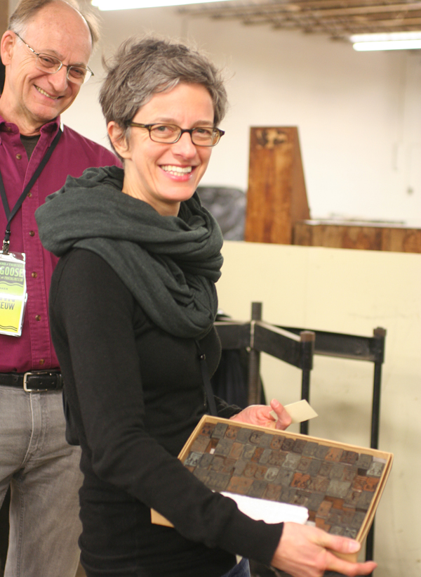
 Judith Poirier also scored some lovely type. And looks who's looking on... it's John Risseeuw, an incredible papermaker and printer. I was delighted to meet him back in June at the Phoenix Wayzgoose.
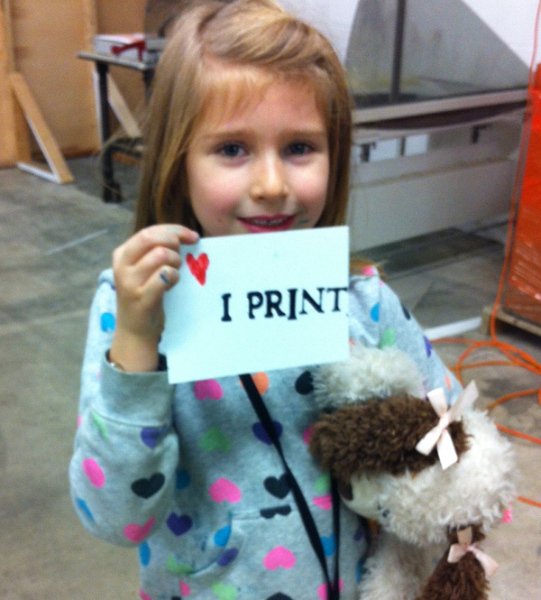
 Look who else scored something great! Jo picked out a small card press and couldn't have been happier. The dolphin was also a 'prize', so it was a good morning to be six years old.
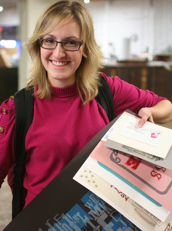
 Following Dave Peat (though it's hard to do so), was the annual print swap. All participants grabbed a table on which to spread their wares and got an opportunity to talk about print projects, techniques and interesting tidbits related to the craft. Here's our friend Lorraine with a growing bundle of awesome samples.
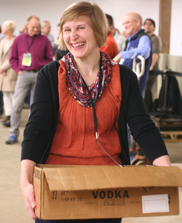
 The Miami students had a number of fun things to share, besides just smiles.
 And here's Andy, the other half of Red Door Press, with some awesome prints and bookmarks to coordinate with his dapper printer's cap.
 Jo always has a keen eye for art that's worth investing in, and she didn't disappoint this time around. Here she is with her first Dafi Kuhne print. And of course, Dafi himself, who led experimental chipboard type workshops on Friday.
 A gratuitous shot for me, it's Matthew Carter holding one of our type specimen prints. Fuzzy photo? Sure. But you'd shake, too, if a MacArthur Genius was holding something you made.
 Two of my favorite ladies in print, Martha Chiplis (who co-authored this informative book), and Jessica Spring of Springtide Press. Personal heroines.
 Loved these little punch out kits for building letterforms!
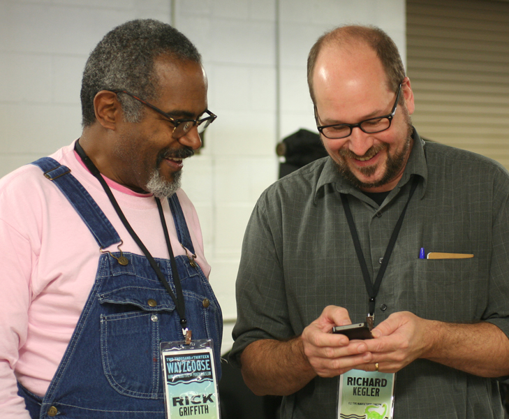
 Amos Kennedy Jr. (don't let the tag fool you) and Rich Kegler take a print break to visit that new-fangled technology.
 More APA members! Bob Piontkowski and Rick Von Holdt dressed for success on Sunday.
 It's always hard to say goodbye and head home. Jo had a great time hanging out with my two helpers for the weekend, Brad Vetter and Dan Elliot. And yes, Richard Zeid photobombed the second image. But we're sure glad he did.

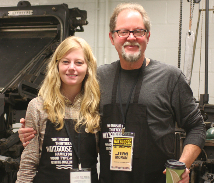
 And of course, the brains and heart behind the entire operation, Stephanie and Jim. The pure love for what they do coupled with a breakneck schedule for opening the museum cements the fact that this place is around to stay.
 By the end of the weekend, this was the Wayzgoose poster.
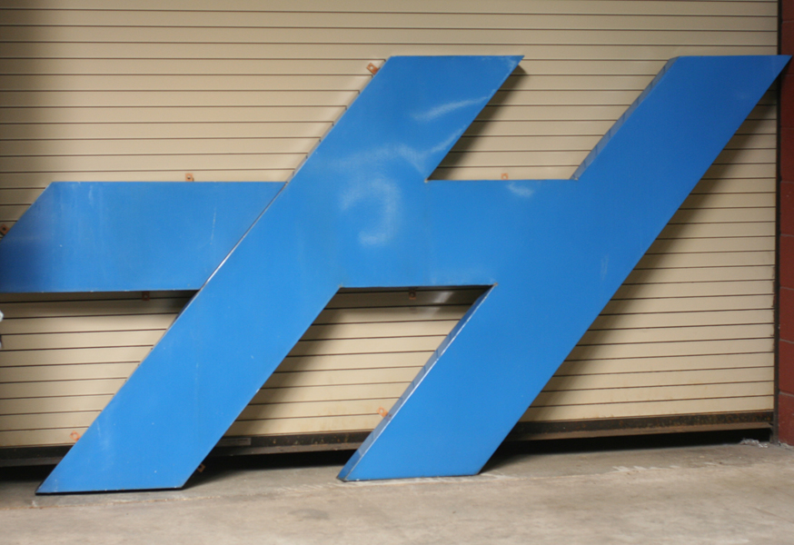
 H. A little remnant of the old building, now living in the new. Yet another reminder that the building may change, but the spirit of preservation and good old-fashioned midwestern gumption will guarantee the success of a project, no matter how far fetched it might seem. While I like to think that we'll be at the museum again before the next Wayzgoose, that may not be the case. But the wait is made easier by the now constant connection to the friends we made while there, and that shared aspiration to become better printers, designers, typographers and teachers will sustain us all. Until next November.

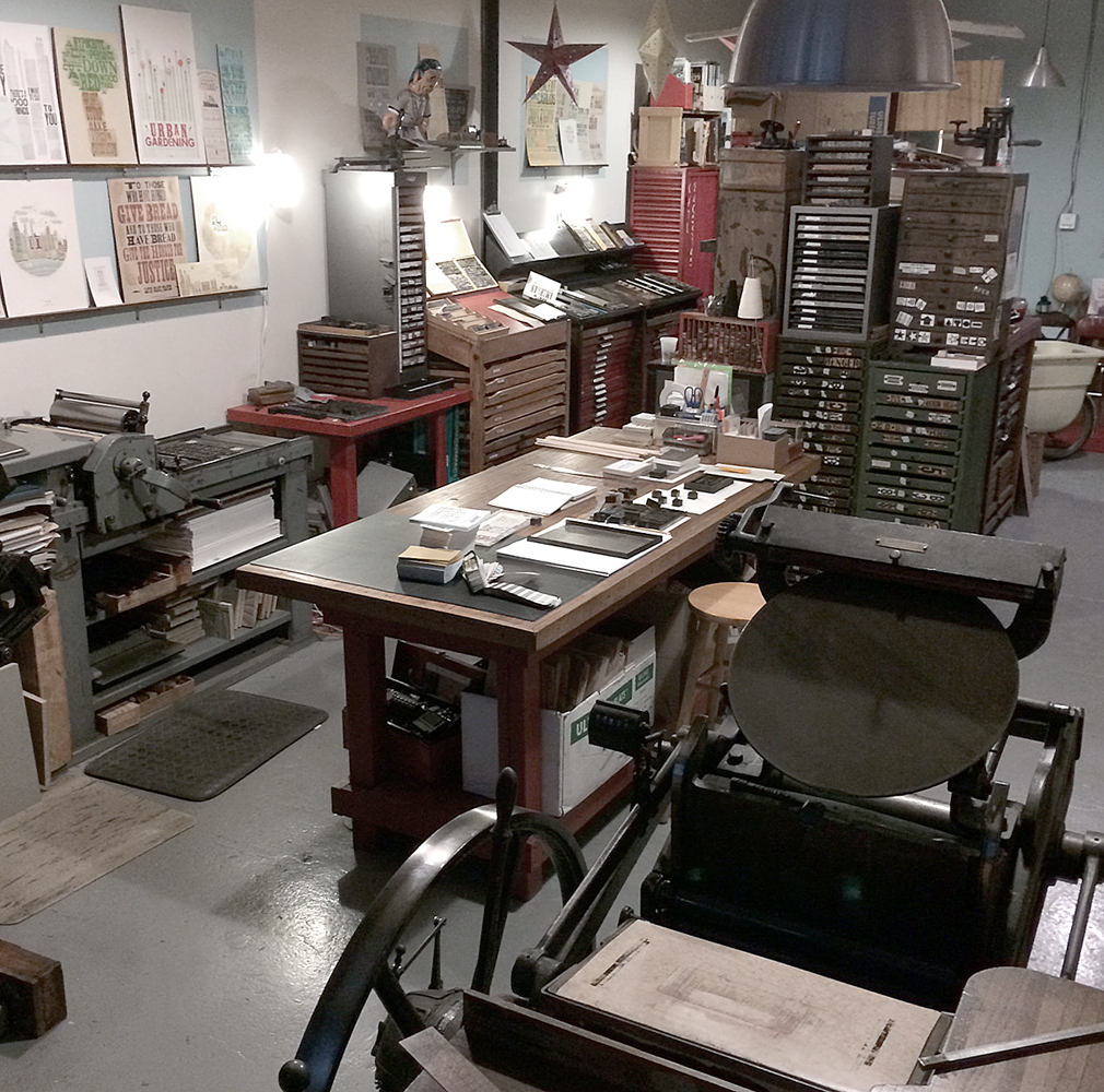 To celebrate the 15th year of the studio, I've planned a series of prints to showcase some of the fine type in the studio as well as the ideals that have guided the work of Starshaped over the last 15 years. The first print pulls a quote from the Barnhart Brothers & Spindler type specimen book of 1923 and is printed in three colors.
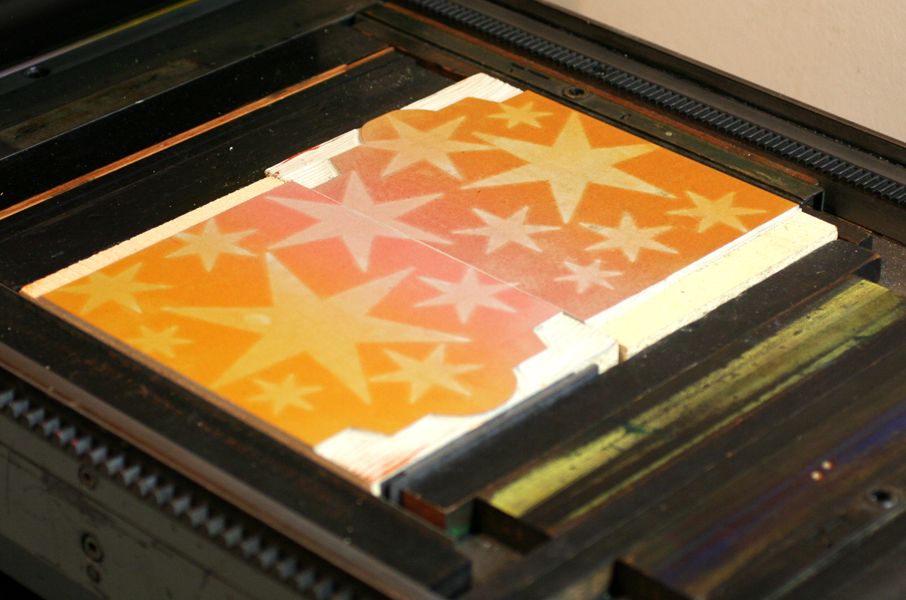
 The first layer is printed using the back sides of wood type, allowing the texture of the wood to come through.
 The border elements are composed of ornaments from different collections, mostly cast at Skyline Type Foundry.
 'Tradition' and 'Progress' were printed with wood type that's in pretty rough shape. But I wanted to contrast the rustic aspect of this 100-year-old type with some of the newest metal type; 'typographic art' is set in Runic, a brand new cast and not used before this project.
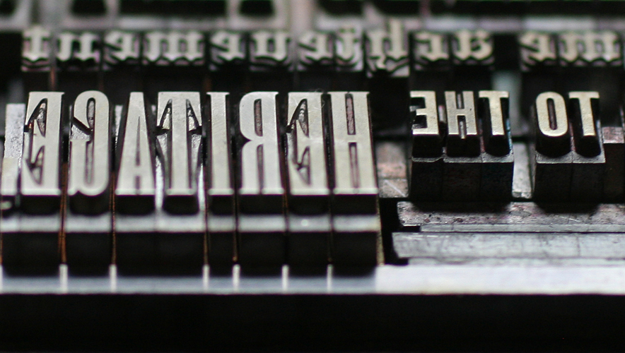 Where did the time go? These four typefaces (Railroad Gothic, Onyx, Engravers Old English and Stymie Bold) have all come to the studio collection from different sources over the years.
 Here is a full shot of the final print. I wanted to deconstruct the traditional text-heavy broadside of the late 1800s while maintaining the 'more is more' approach to typesetting of that time. I felt this quote was particularly forward thinking, especially given that it appeared in print in 1923.


