Seeing Stars and Moons

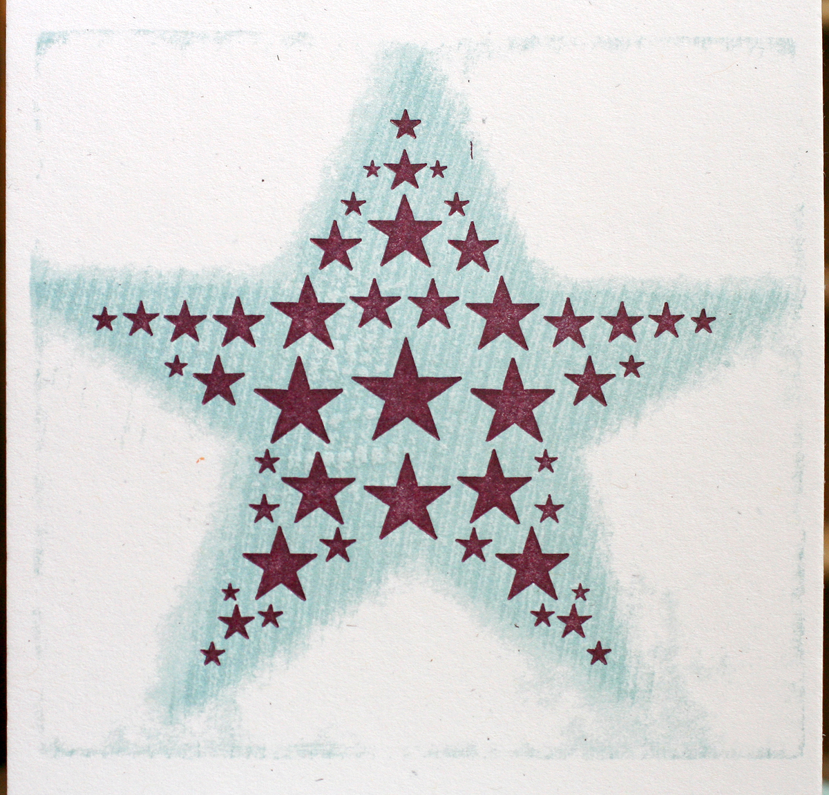
Occasionally there's a collection of ornaments sitting in the studio just begging to be put to use. This is the case with our hundreds of stars and little moons faces. So it was time they saw more action in the form of new cards. compile1Starting with stars (for obvious reasons), I built this form, hoping that it would be relatively, ahem, starshaped. After a bit of tweaking with different sized stars, it came together:
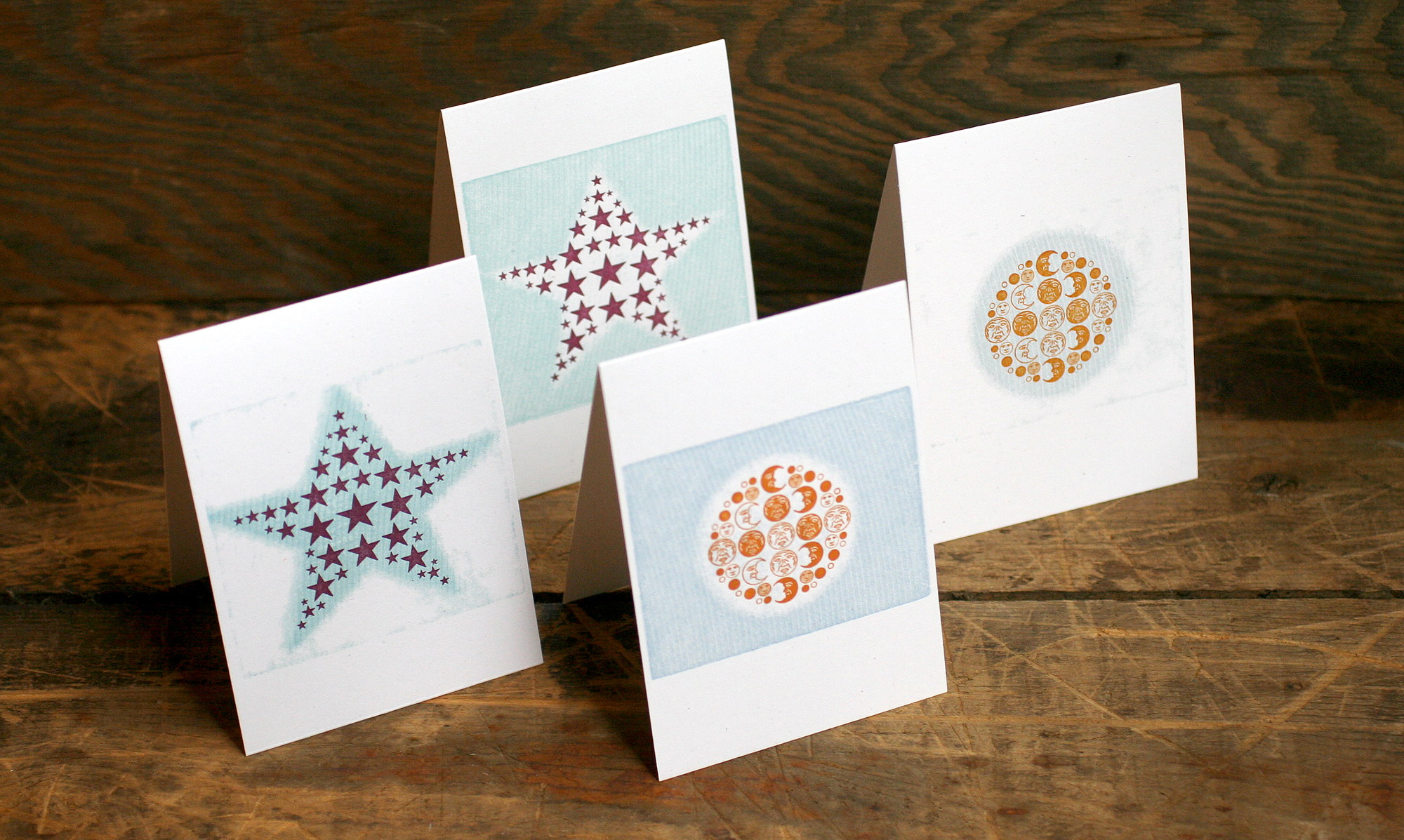
TstarI wanted to explore pressure printing as a way to round out the card and add another color. So I cut out the star (and ultimately the moon) from a piece of chipboard that was taped to the initial carbon proof of the form. The solid background could then be placed in the makeready on press to alter how both a piece of linoleum and wood would print on top of it.

pressureprintsThe background was printed first with the linoleum block, and then with a same-sized piece of wood type (the back side of the type). These were both done in the same color, so as to add texture without overwhelming the design. They printed more heavily where there was extra cardboard, leaving a ghosted star image inside. Then the burgundy stars were printed.

2star3

2star4

2star2After all that, the thought of a reversal of the pressure print came to mind. So instead of printing the solid background, I put the chipboard star down in its place so that only the star printed with a bit of 'noise' around the edges. I did this after printing the stars, so it made the burgundy a little darker.

star3

star4Now that you've enjoyed these stars, go watch this.

Time for moons! These guys got the same treatment as the stars, but in a round moon shape. Love the lined details on the tiny ones.
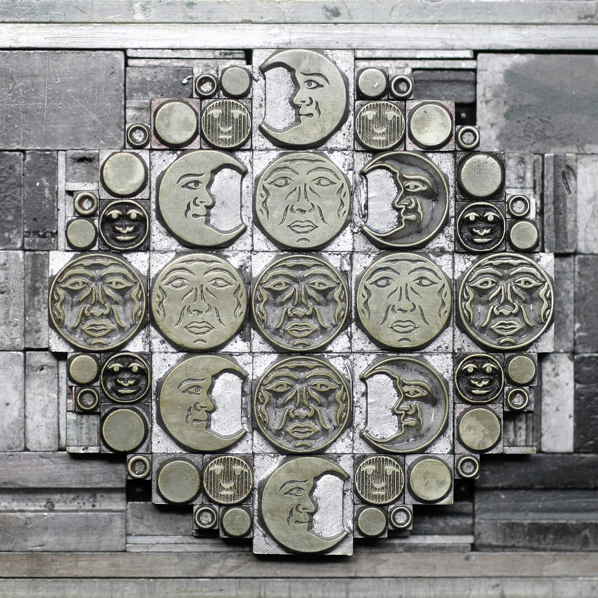
TmoonsThe background is printed in a slightly different blue, but with the same linoleum-then-wood process.

2moon3

2moon2

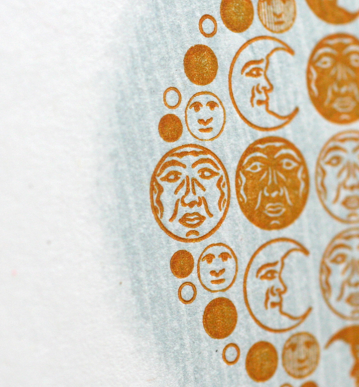
2moon4Then I did the reverse as well which gives the moon a different look with fuzziness around the edges.

moon2You can see a process shot here with the 2-hit version at the bottom and the linoleum-only shot at the top. Everyone loves wood grain, right?
comparison

moon3Both the moon and star cards are available individually and in sets on our etsy site right now. The perfect little blank greeting for everyday correspondence.

Maria, Dan, Butterflies

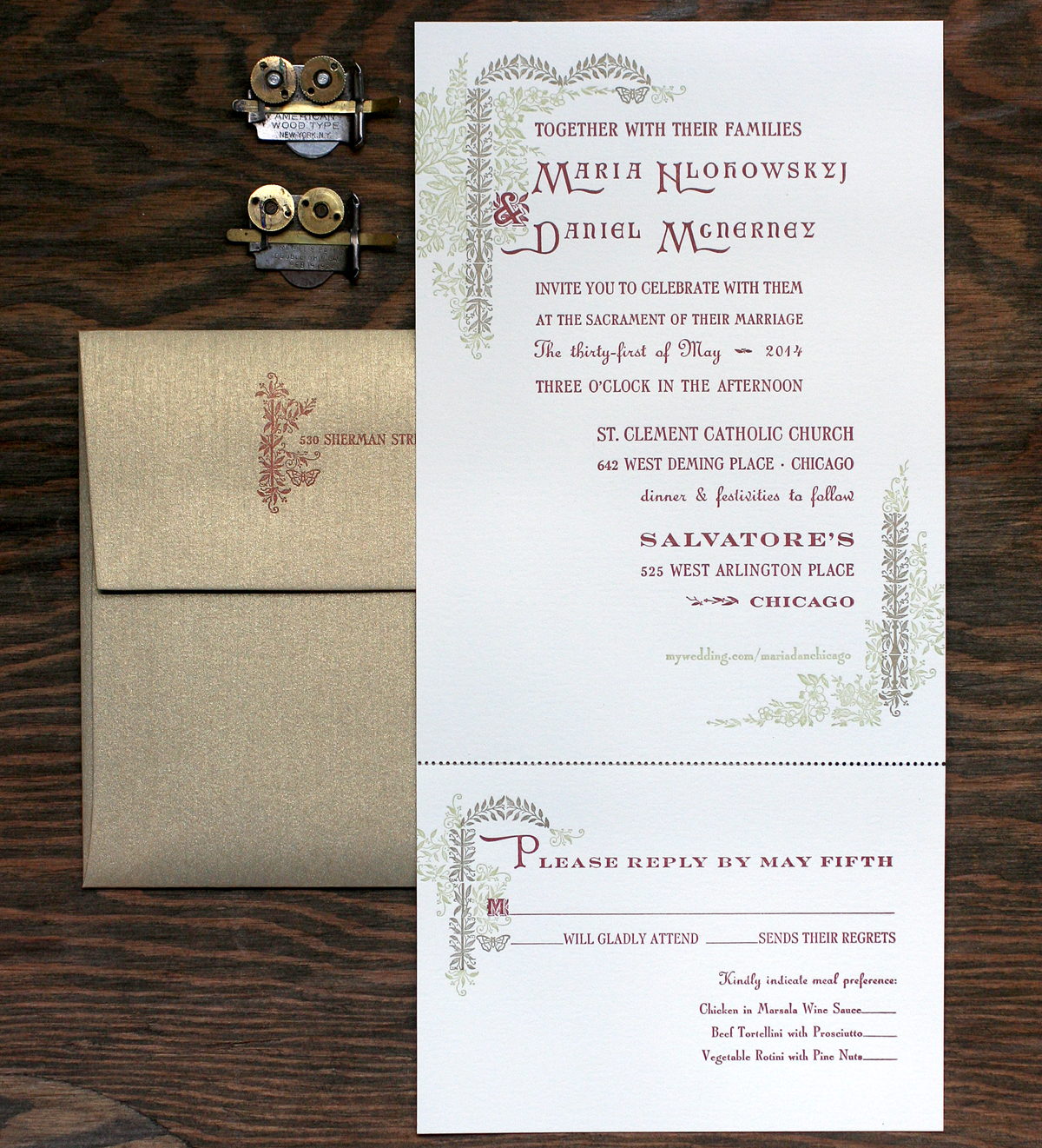
We're pretty lucky to have had some great clients looking for wedding invitations. This Spring I met Maria and Dan, fellow Ravenswood dwellers and fans of working with local sources for their wedding planning. Maria definitely wanted to include floral images and liked our 19th century inspired collection. Here's the final invitation: mariadan4This was the perfect project to work in a new cast of Arboret, courtesy of Skyline Type Foundry. This lovely set includes both 12 and 24 pt of floral type as well as ornaments that can be set in endless configurations to make the type look like it is part of an arbor. And while I didn't use any of the type (apart from two characters, including the ampersand), the ornaments created plenty of ways to add floral elements to the invitations.

arboretornamentsHere is the lockup for the green and gold at the top of the invite. Both are set together to make sure they will line up appropriately, and then each color is swapped out for spacing when the other color is ready to print. Worked into the Arboret ornamentation are a few actual 19th century pieces from our collection (the flowers and right side stems).

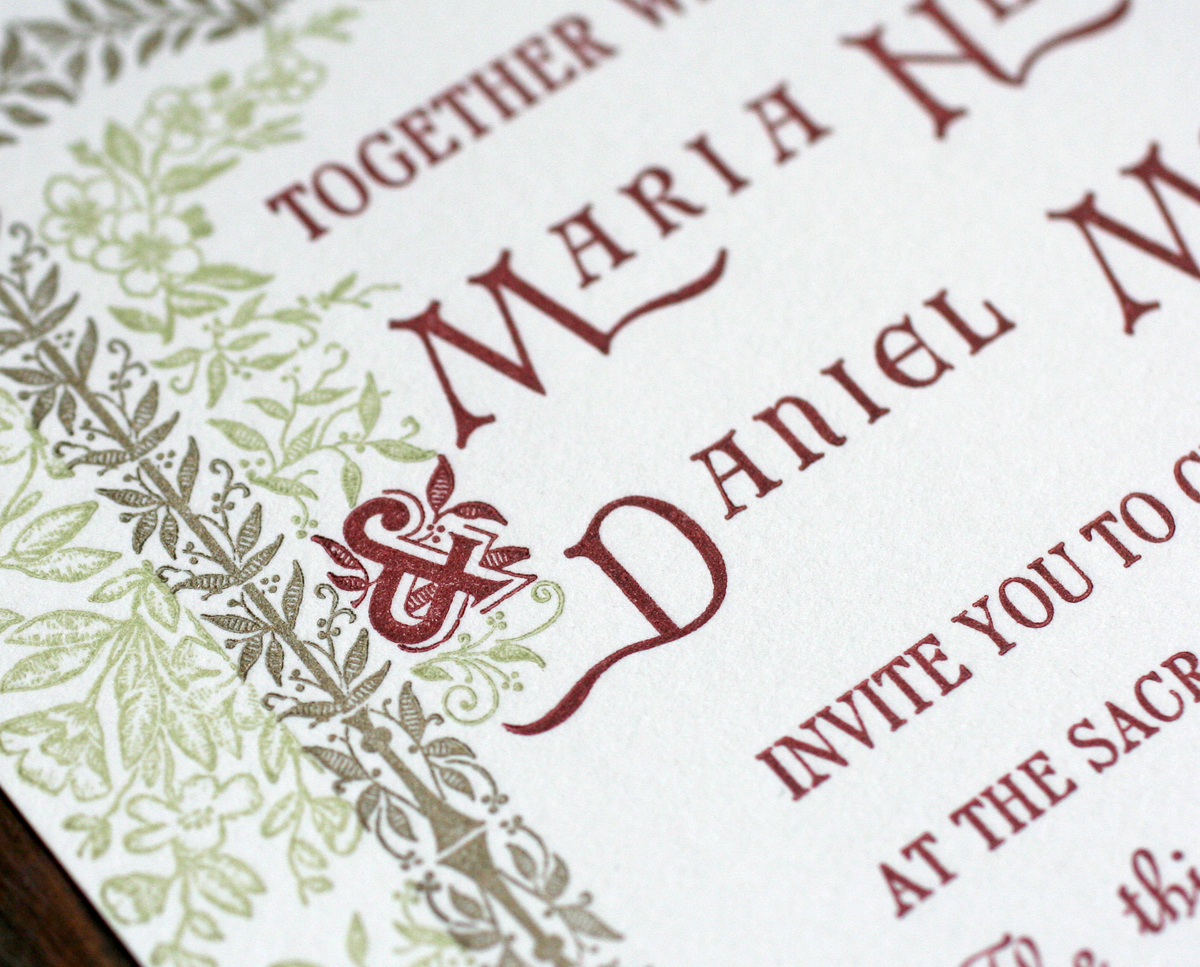
Tmariadan1Here is the Arboret ampersand, printed with the rest of the main text. Maria and Dan's names included 100 year old initial caps, mortised to include a 20th century typeface.
mariadan8Here are a few more of the ornaments at the bottom of the invitation. Their website was printed in green so as to be a little less prominent than the important text.

Tmariadan2This is the second character worked into the reply card text. A great shot of all of the elements coming together.

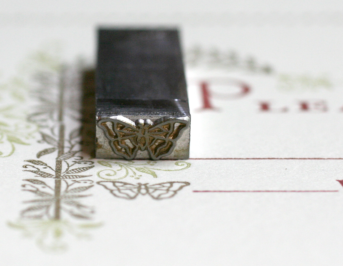
mariadan6Maria's family does a lot of work for butterfly conservation, and she was hoping to work this into the invitation. No problem, thanks to Skyline and a recent cast of this little guy:

mariadan7He also makes an appearance on the envelopes, which were a shimmery gold to tie into the gold ornaments on the invitation. It's remarkable that such detail holds up with metal type, much more so than digital type converted to plates for printing. And we're lucky to have an opportunity to work these historic typefaces into our everyday projects.

mariadan9


The APA Goose 2014

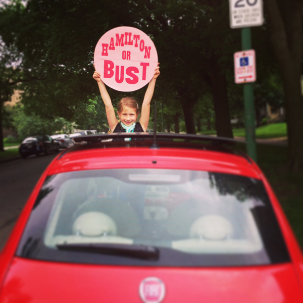
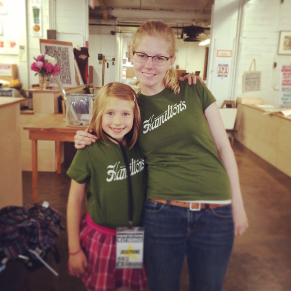
It's always a treat to drive up to Hamilton for a visit, especially when it involves seeing our print and type friends from the Amalgamated Printers Association, a group I've been a part of for 10+ years. After cutting school early, Jo and I hit the road. If this shot doesn't ring a bell, maybe this image from a favorite album will hint at our inspiration. Our little fiat is well traveled. hamiltonorbustAfter checking in (and yes, Jo gets a pretty special badge), we found our friend Scott from Moore Wood Type already at it, cutting type and doing demos for onlookers. He also brought a lot of his patterns for people to see so they could learn about the process of pantograph cut wood type.

badges

scott

patterns2Love these star patterns. You can see the 6 pointed Chicago style star (which Scott named 'Jo's star') down in the corner.

patterns3We found our friend Jason of Genghis Kern trying his hand at the pantograph.

jasonpantographAnother workshop about wood engraving was also going on, and everyone there carved into blocks that were ultimately cut as letters for Wayzgoose 2014.

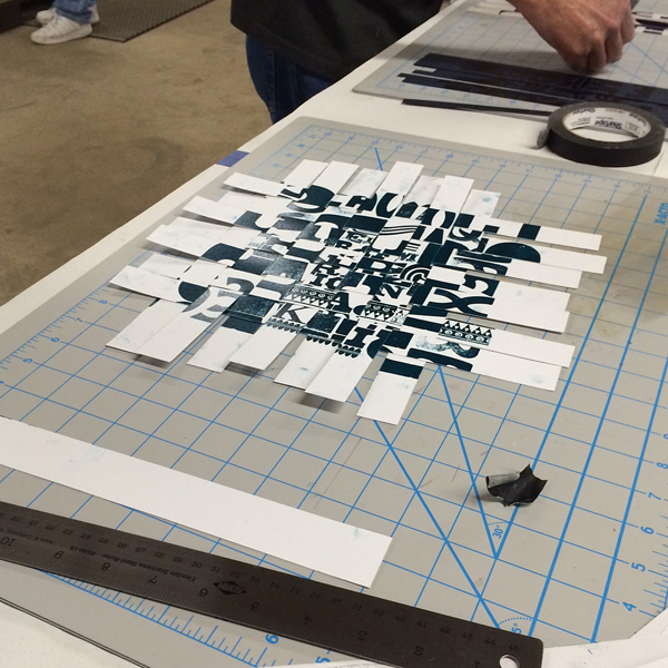
woodengravingFriday I finally got the opportunity to teach a workshop with a longtime friend and talented printer, Jessica Spring of Springtide Press. We worked with our class on two projects: the first was to contribute a page to a meander book and the second was to print type as pattern to then cut and weave. Jessica led the way on the book, setting up the form on press and then demonstrating how to cut and fold the single sheet into a book.

ws4

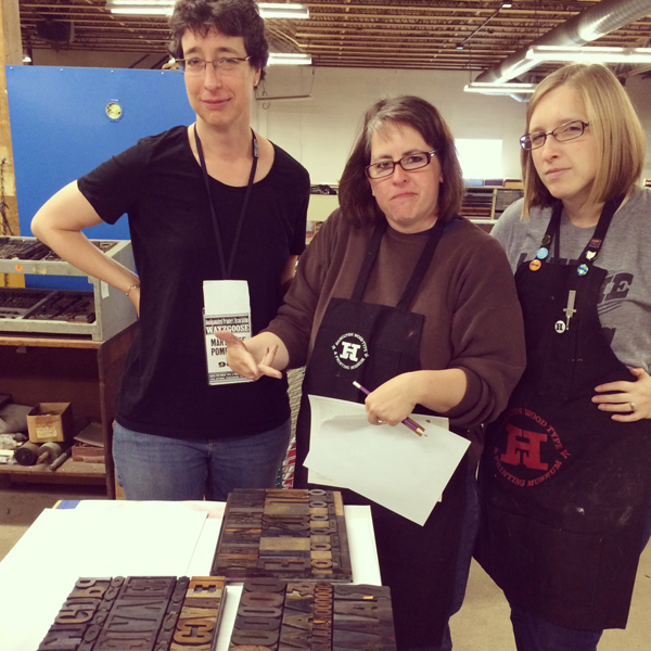
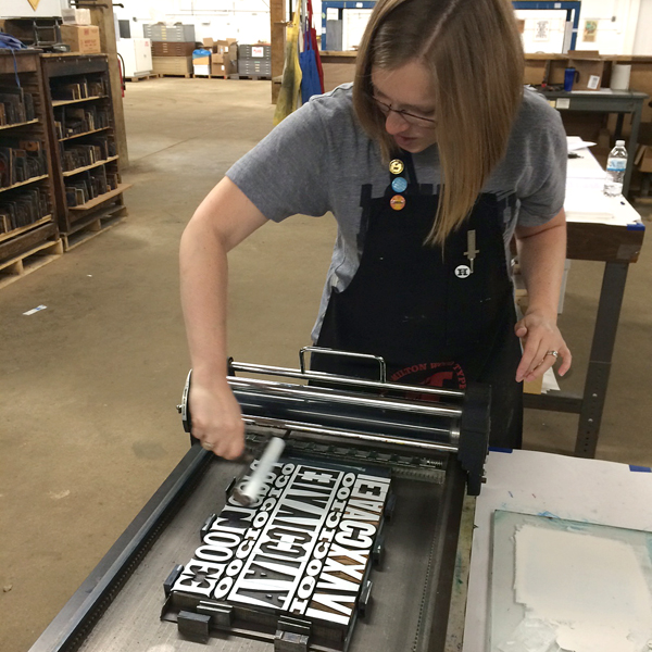
ws2Here are a few of the serious ladies pulling type for the print and paper weaving.

ws7Here's our good friend Erin of Inky Winke trying her hand at a little opaque white ink.

ws5Our prints were a bit wet, but we were able to trim them down to start weaving together. This creates an entirely new kind of print that can be trimmed to a smaller, square size, functioning as a piece of art in its own right.

ws1Mary Alice used a few different sheets of paper for her prints (and some attendees swapped with each other), and ended up with a very patriotic weave.

ws6Rich from P22 (and also responsible for spearheading the digitization of Hamilton's type for the HWTF) was there, showcasing his latest project. Borrowing the Cloister Initial matrices from RIT's Cary Collection, he worked with Greg Walters in Ohio to cast whopping 120 point versions of the beautiful initials. Bringing a set to Hamilton to share, he also printed a broadside with all of them; you can see a snippet of it below with the S and P we came home with.

rich

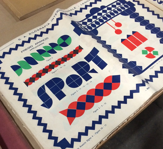
cloisterFriday night, Greg Walters (who cast the above initials) gave a talk about foreign type specimen books and brought a large selection from his personal collection. Below are just a few shots of the pages I found incredibly inspiring, including these magnificent brass rules printed in multiple colors.

spec1Greg mentioned many trends, including the predominance of art nouveau faces, which all but escaped American type founders. There were also many thick and heavy, multi-color patterns and borders.

spec2

spec4

spec5After the conference, I realized I didn't get any full shots of the group. Luckily, an APA group photo is always taken, and hopefully we'll see that soon. There's been a sea change in the APA. Can you guess what it is?

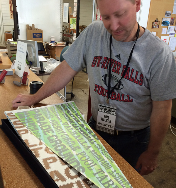
husbandcalledBefore checking out for the weekend, we got a little sneak peek at Tom Walker's incredible series of baseball-inspired pennant prints. Incredible and detailed work, with a hand built box to boot.

tomwalkerAs always, we had a great weekend in Two Rivers, and look forward to November when we're back again. And next year the APA Goose will be in Chicago, and it'll be incredible so mark your calendars.

Matching type nerds!

jostephtwins

Sky's the Limit

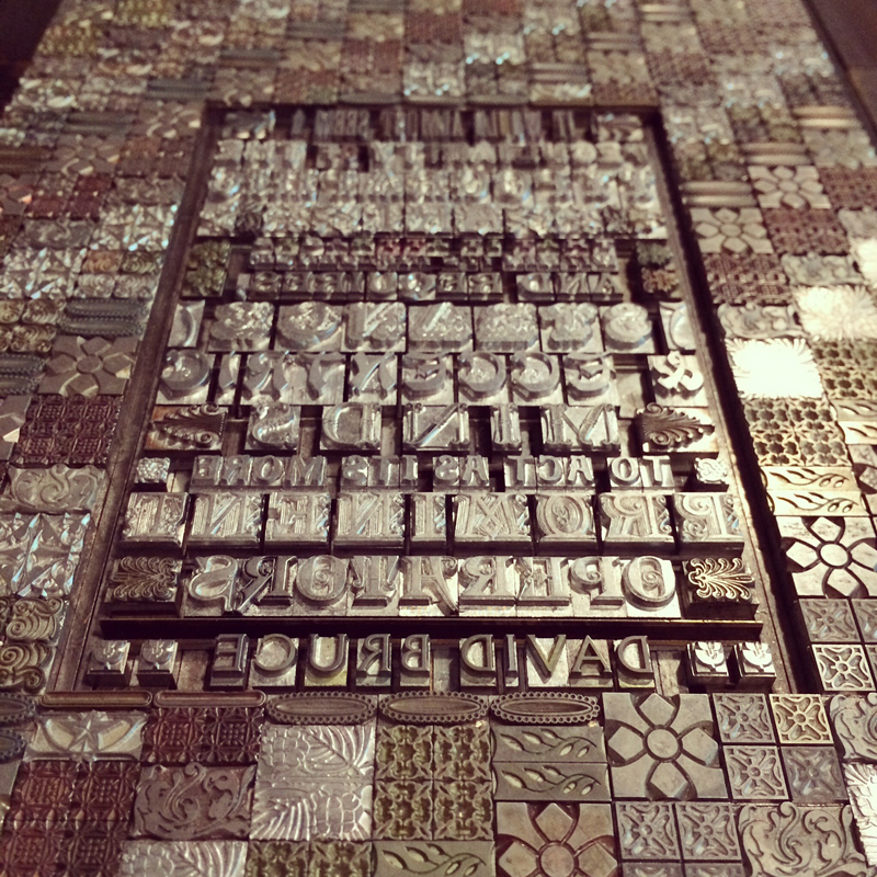
How great is it that metal and wood type are still manufactured today, albeit by a small group, and that we call these makers our friends? For years Starshaped has enjoyed a strong relationship with Skyline Type Foundry, run by Sky Shipley. Formerly in southern Illinois and now in Arizona, Sky has consistently cast quality type on his Thompson casters, and I've been buying it up almost as fast as he can create it. The time had come for a collaboration and here it is! Working exclusively with Skyline type, I built this behemoth form of ornaments and type. The quote is one provided by Sky, and one of his favorites (and did I mention appropriate?). TskylineinstaThe idea for the print was to form an actual piece of type, or sort, out of hundreds of smaller pieces of actual type, and then to print it to look like a shiny piece of type. I decided to create an angle in the design and then print in three shades of silver to give it a textured and luminous feel. After an initial proof all in one color, I subdivided it into the three color sections. Pictured here is the last and lightest silver run.

skyline5My first thought was to create the text block in a circular form to mimic a pin mark, but Sky doesn't cast his type with pin marks, so I left it rectangular and set (nearly) solid and force justified to fill the space inside the piece of type. This was also a great place to put the non-border ornaments that Skyline offers.

Tskyline4Sky has used many great slogans over the last ten years, including 'Set Your Byline in Skyline' and 'Real Printers Don't Use Plastic', but was always a fan of one of our favorites, 'All Metal, All the Time'. So it seemed like a no-brainer to include that one, given the nature of the project. Below are a few of the gorgeous 19th century faces cast in recent years.

Tskyline5

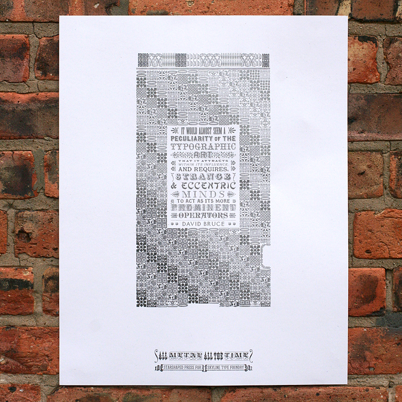
skyline2Here's the final print. Sky has often said that he loves to see what his 'kids' are doing at 'Camp Starshaped'. Well, this summer, camp was particularly awesome. The poster is available for purchase here, though the edition is very small and won't last. Get one today!

skyline1

skyline3

Congrats on 10 years in the business, Sky! We're all anxiously waiting to see what comes out of your casters next. Below is a wonderful group photo of my favorite makers taken at the APA Wayzgoose in June 2014, starting with Matt, Geri and Derek of Virgin Wood Type, Sky in the middle, Scott Moore of Moore Wood Type and Rich Kegler of P22 Type Foundry. Long live the type founders!

typemakers