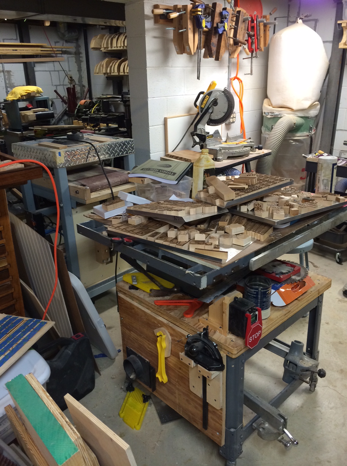
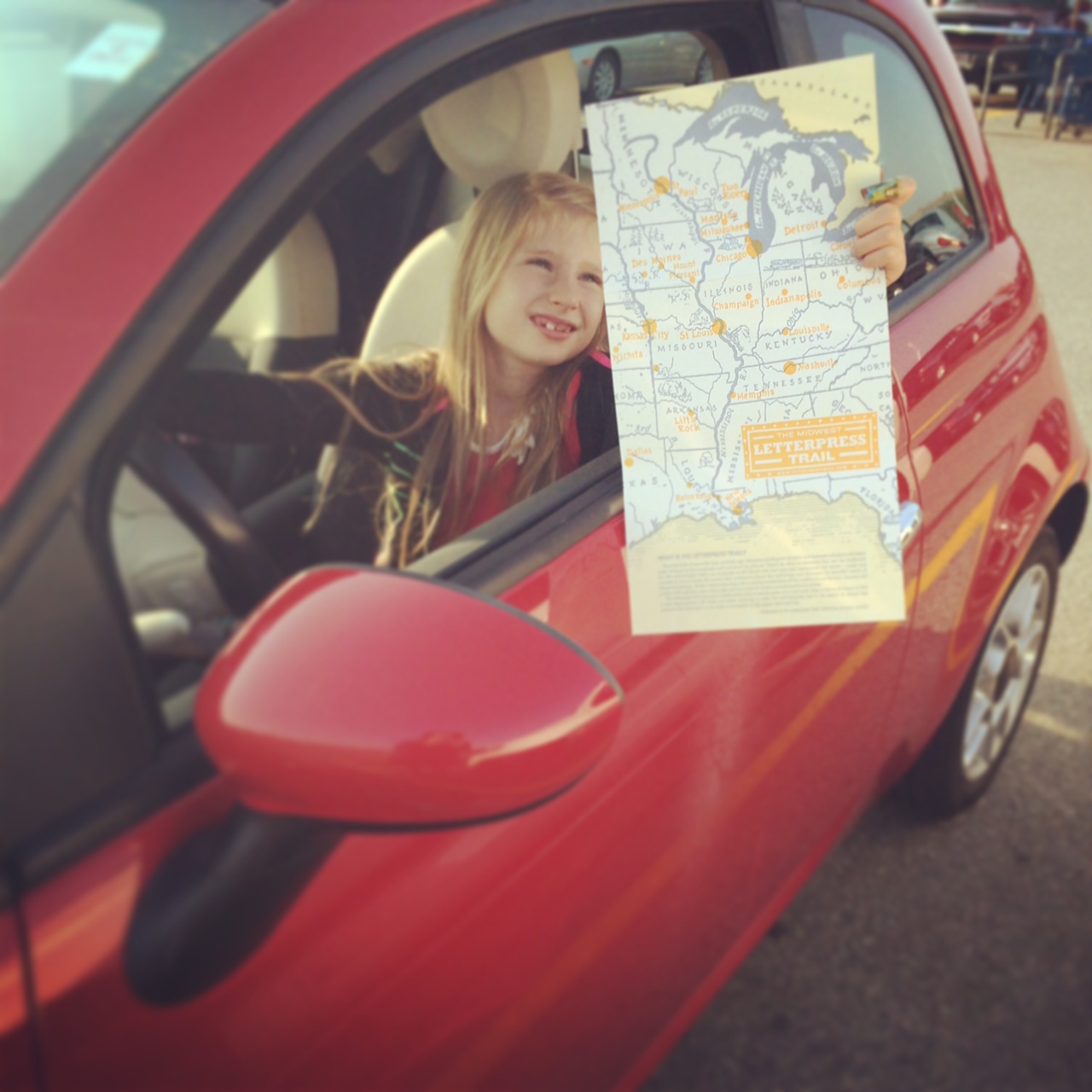
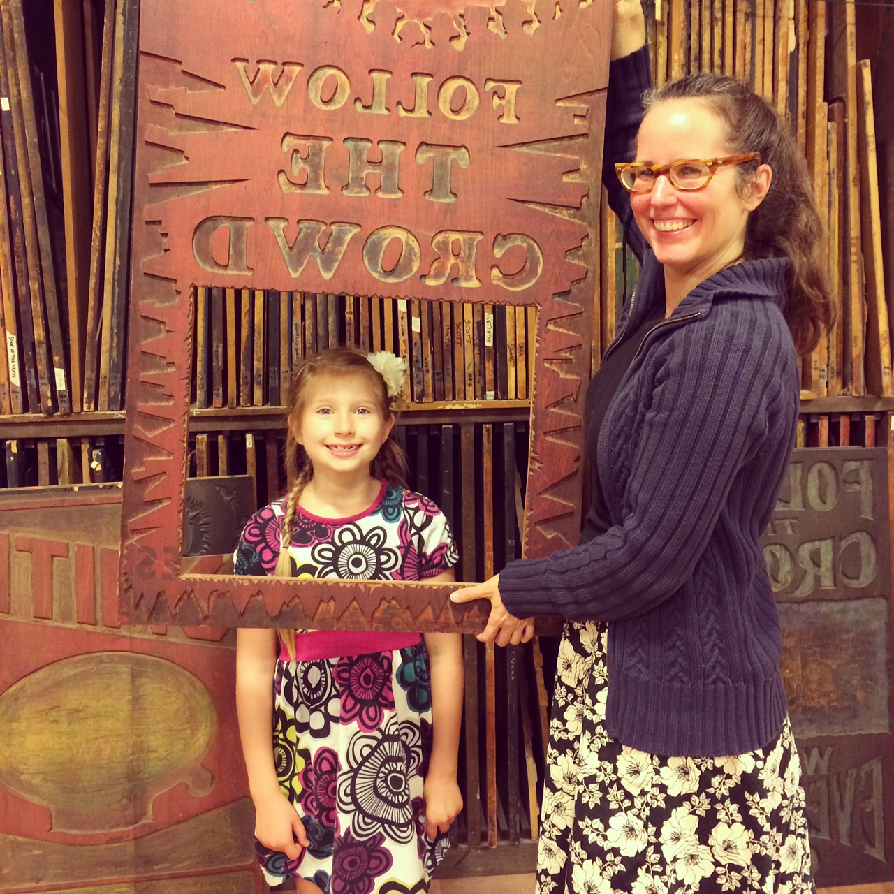
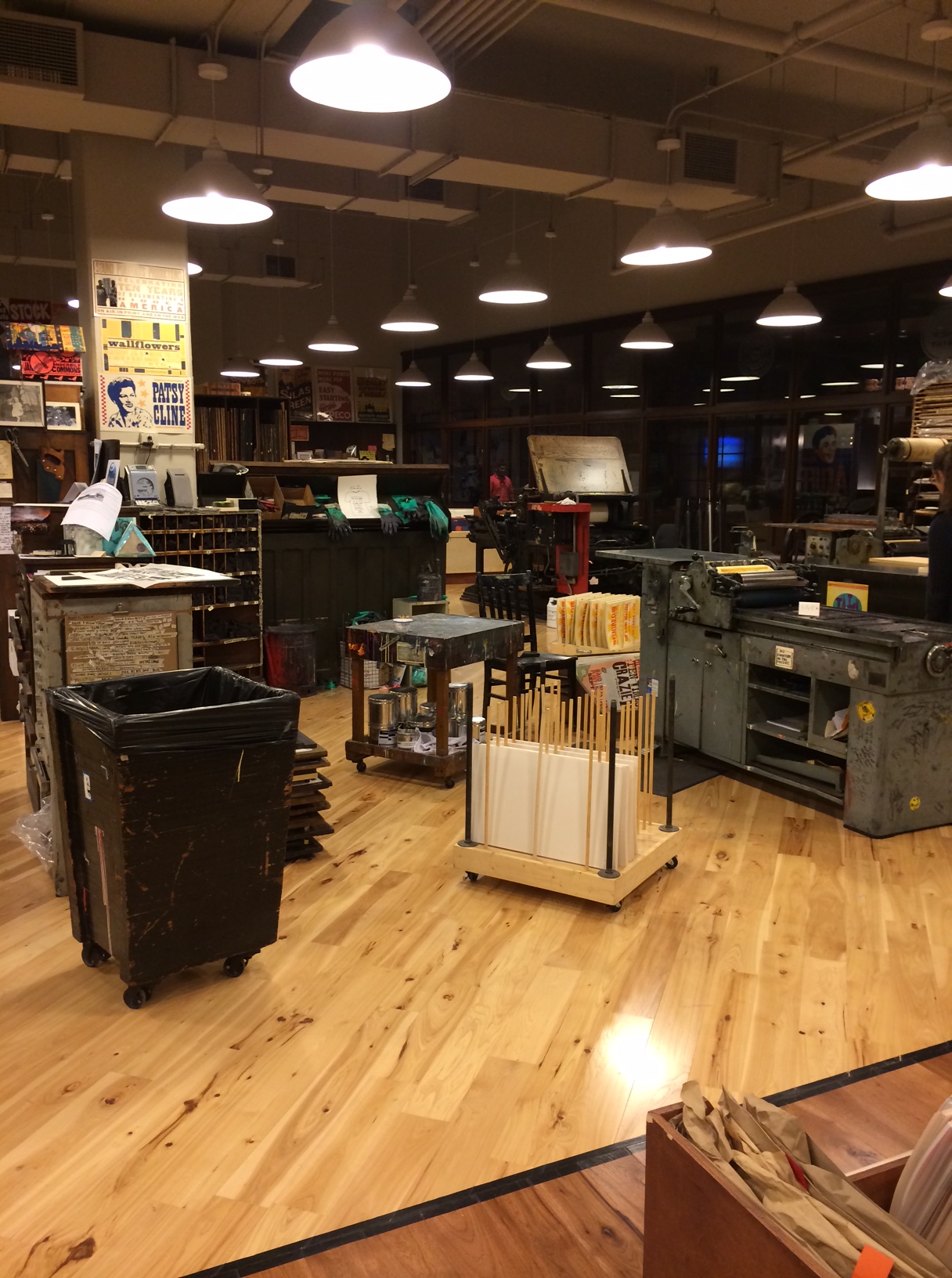
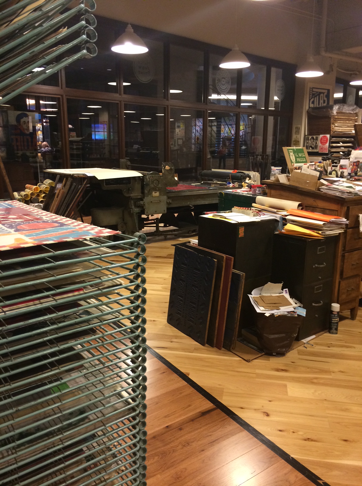
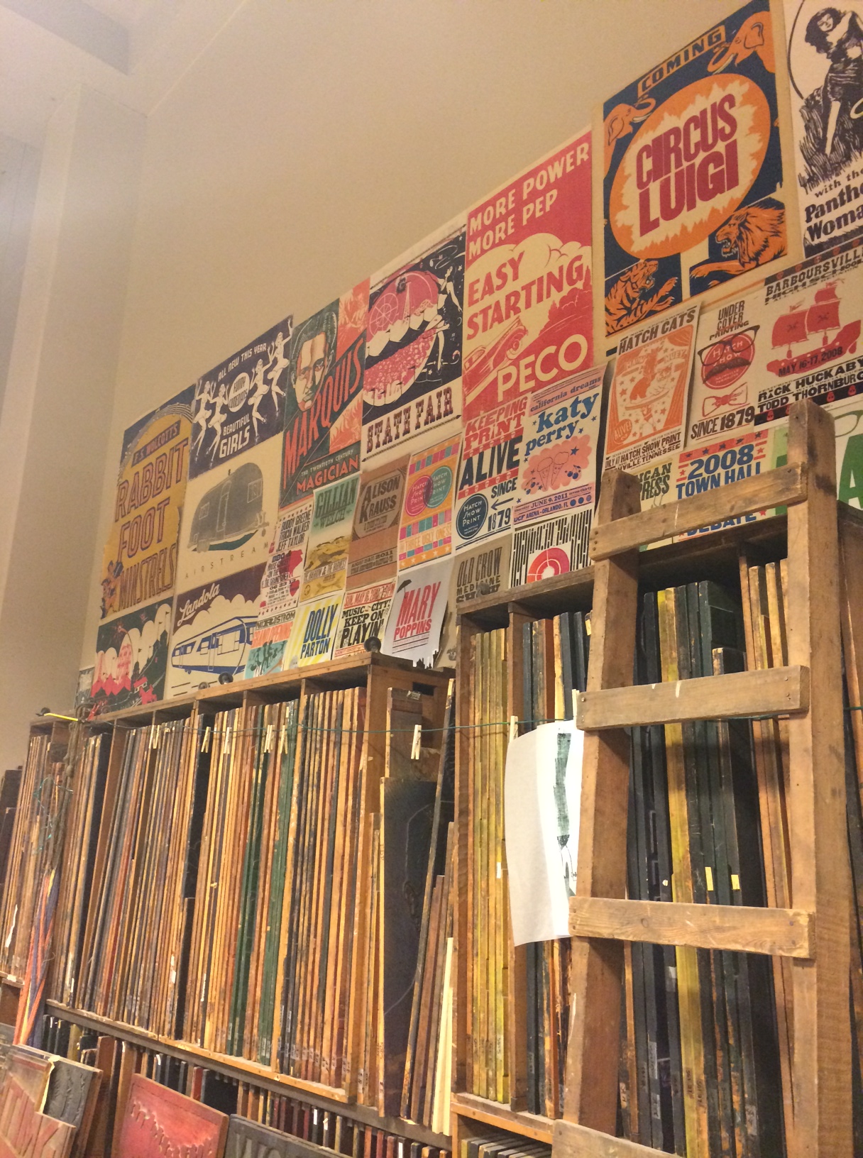
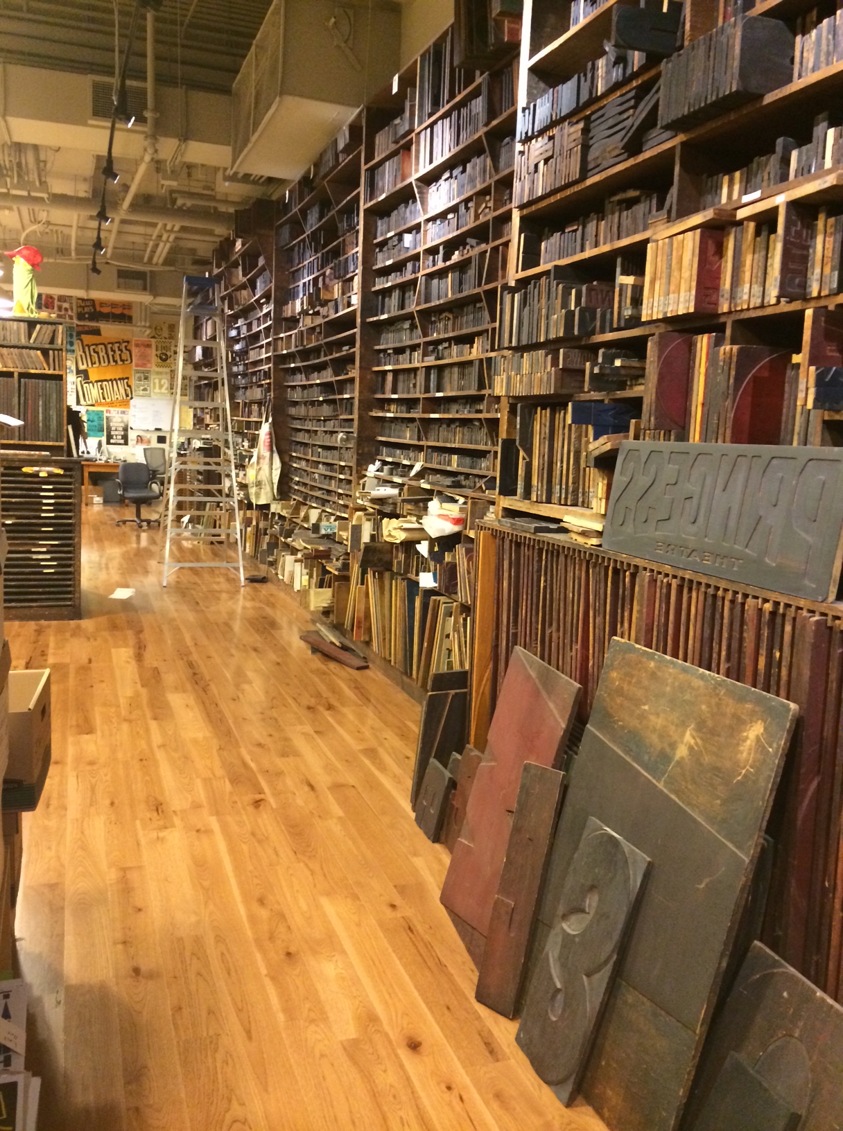
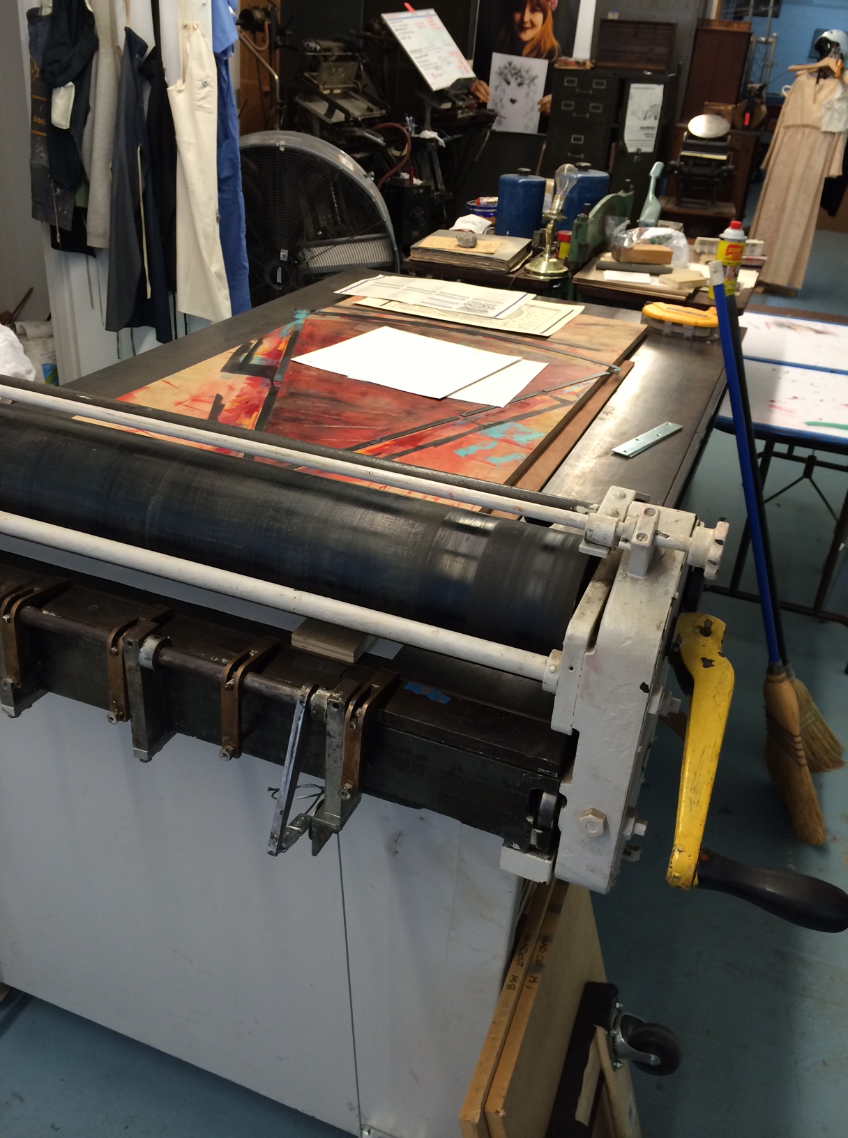
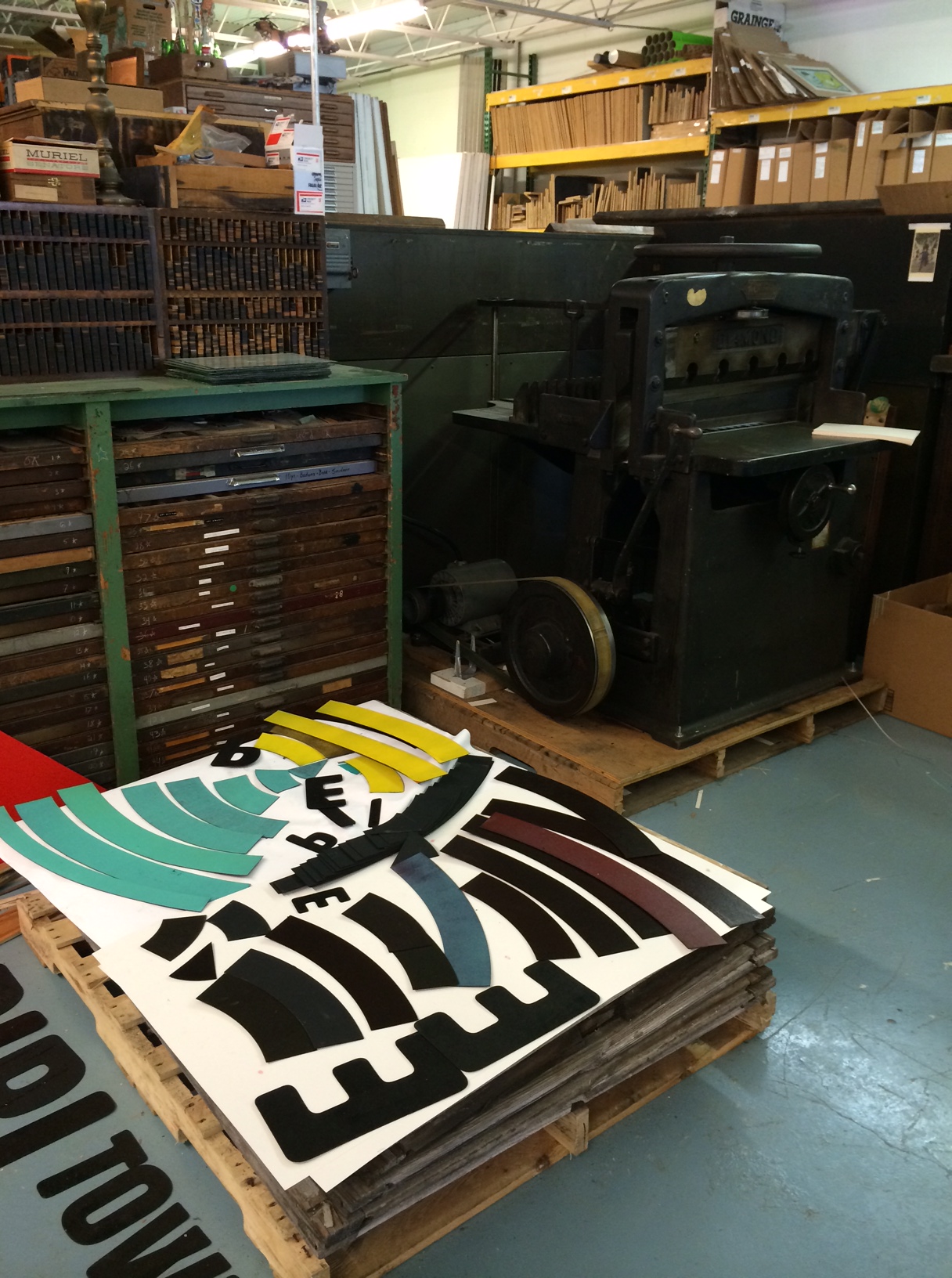
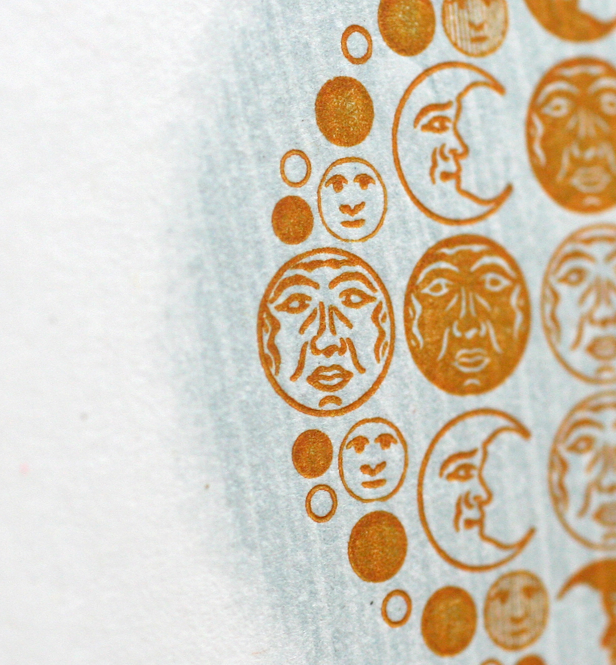
The next stop on our Letterpress Trail following Cincinnati was Columbus, home of Moore Wood Type, one of two wood type makers in the US and a great friend to Starshaped. Scott's humble workshop is mostly in his basement, where he has just the right set up of equipment, tools (some handmade!) and wood for production.
 A table full of recently cut type. And a sneak peek of half rounds in the background!
 This is Scott's pantograph, next to a trim saw. You can see a pattern set up here.
 A box of patterns for catchphrases.
 Scott has also been laser cutting wood type, and here is an experiment with creating a border. After cutting a full sheet of finished, type high maple, he can then trim out the individual borders and ornaments. Working with the laser allows for greater flexibility of sizing, not to mention detail in the smaller sizes. And speed!
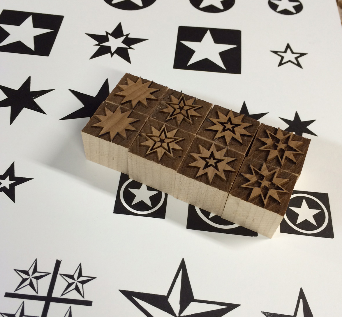
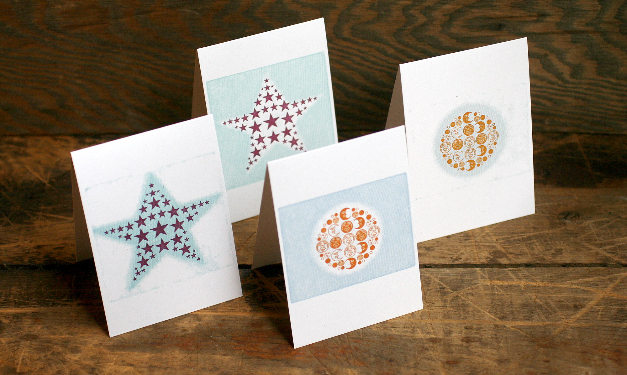
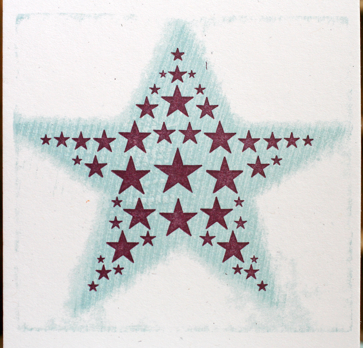
 These are a few new stars sitting on top of the proof sheets of our Moore collection at Starshaped. I brought them to double check our own stock against the new Moore offerings.
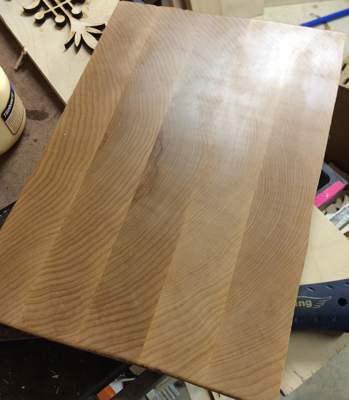
 Check out this beautiful block ready to be trimmed and carved. You can see the lovely wood grain, and well as a bit of the sheen from the smoothness of the surface.
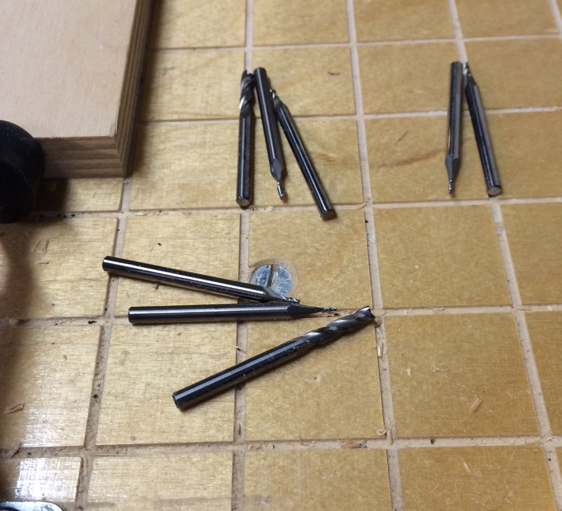
 These are the cutters for carving the final pieces. You can see the range of sizes to accommodate a variety of type forms and counter spaces.
 Happily, I got to cut my first wood type! Scott let me choose what I wanted to do, so I picked this ornamental rule that he hadn't done yet. I even got to pick the length; the final piece can be cut to any size, which is the beauty of working with a pantograph. Scott has a notebook of configurations for each of his patterns, and also makes notes directly on them so as to remember how to set the pantograph measurements to cut accurate sizes.
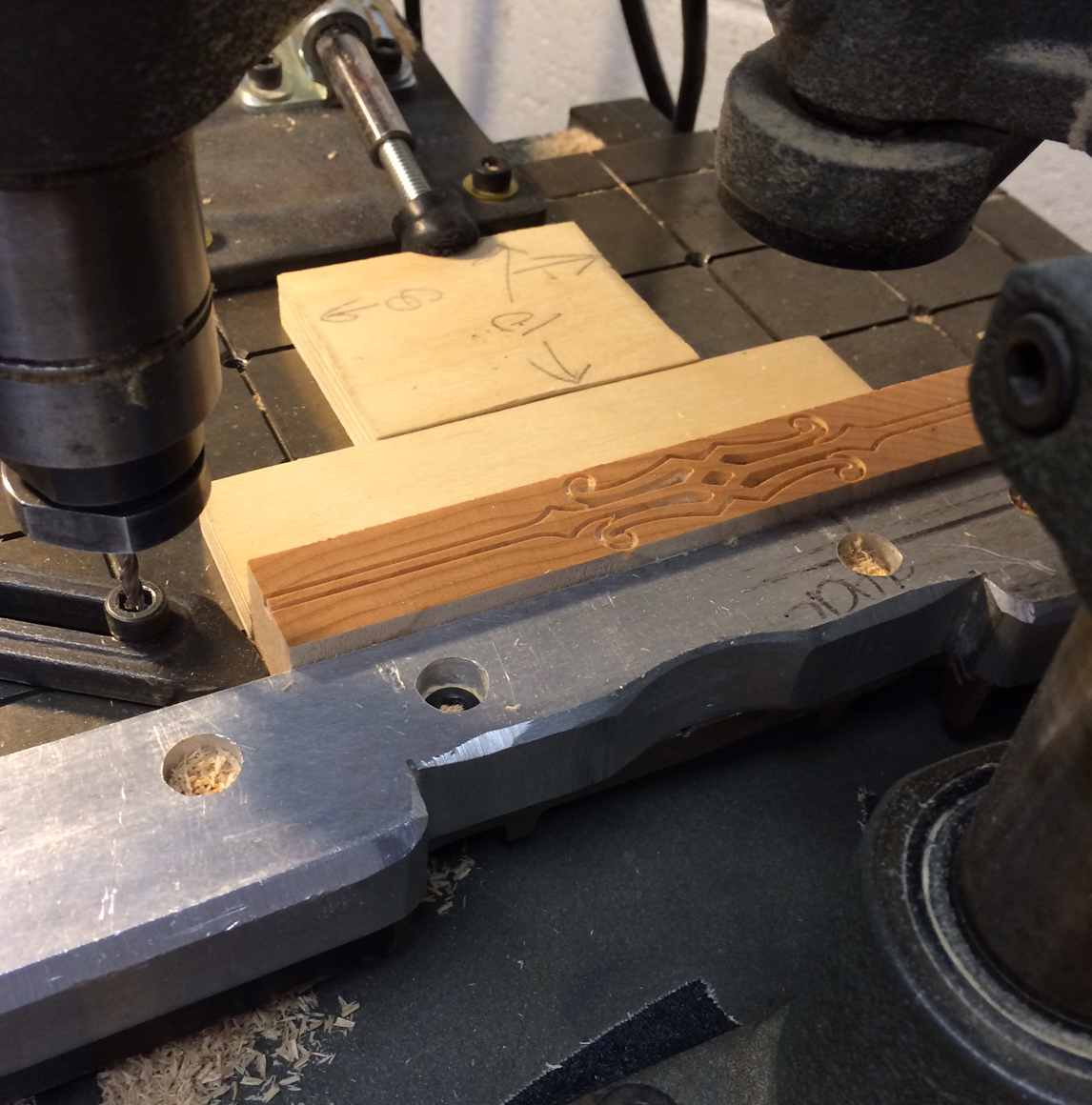
 The first cut is the more detailed one, and you can see how the outline of the rule is taking place. After this, the cutter is swapped for a larger one to clear the solid areas that are not part of the design.
 Look at me go! I'm using the tracing side of the pantograph to outline the pattern.
 Here are the final pieces.
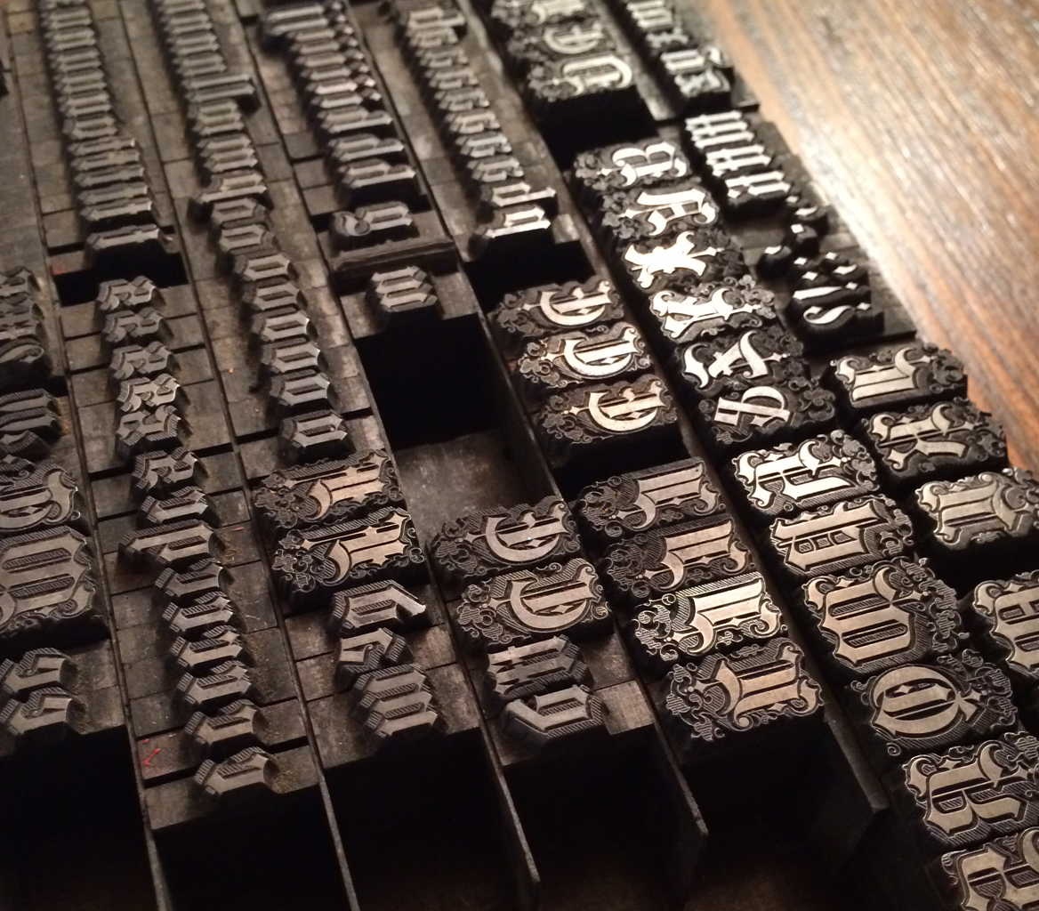
 Scott made patterns for an Antique Tuscan, a typeface that's near to my heart and one we've had the longest in the studio. Because I'm missing a few letters, we thought it would be fun to make replacement characters. Here's a box of the patterns ready to be mounted, traced and cut as new wood type.

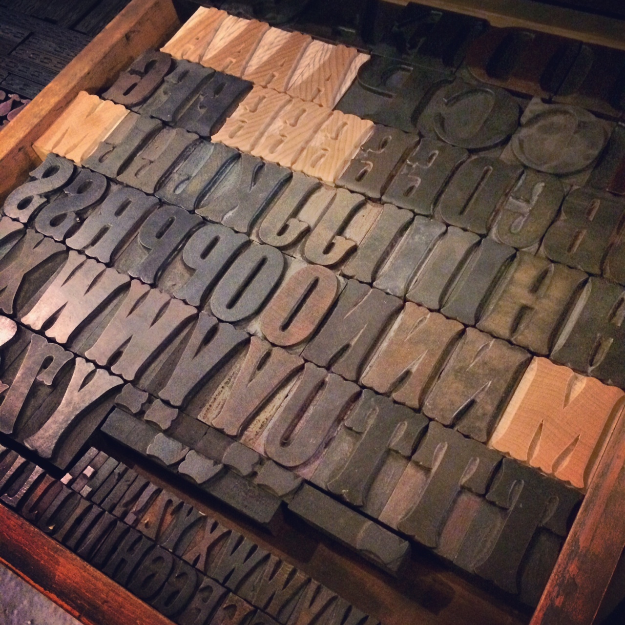
 After much configuration, we were successful and I was able to make a handful of the missing letters needed to complete my set of 12-line type. It is now at home with its 100 year old siblings.
What a delight it was to visit with the Moores for two days, sharing stories, cutting type and playing with the dogs. Can't wait to see them again!

 After Scott checked the fluids in the Fiat, we hit the road to Pittsburgh to visit Matt Braun of the Outdated Press. He's got a cozy shop that's enviable for its tidiness. It's the perfect collection of unique metal type and impeccably restored Pearl presses (and he's got one for sale, folks!).


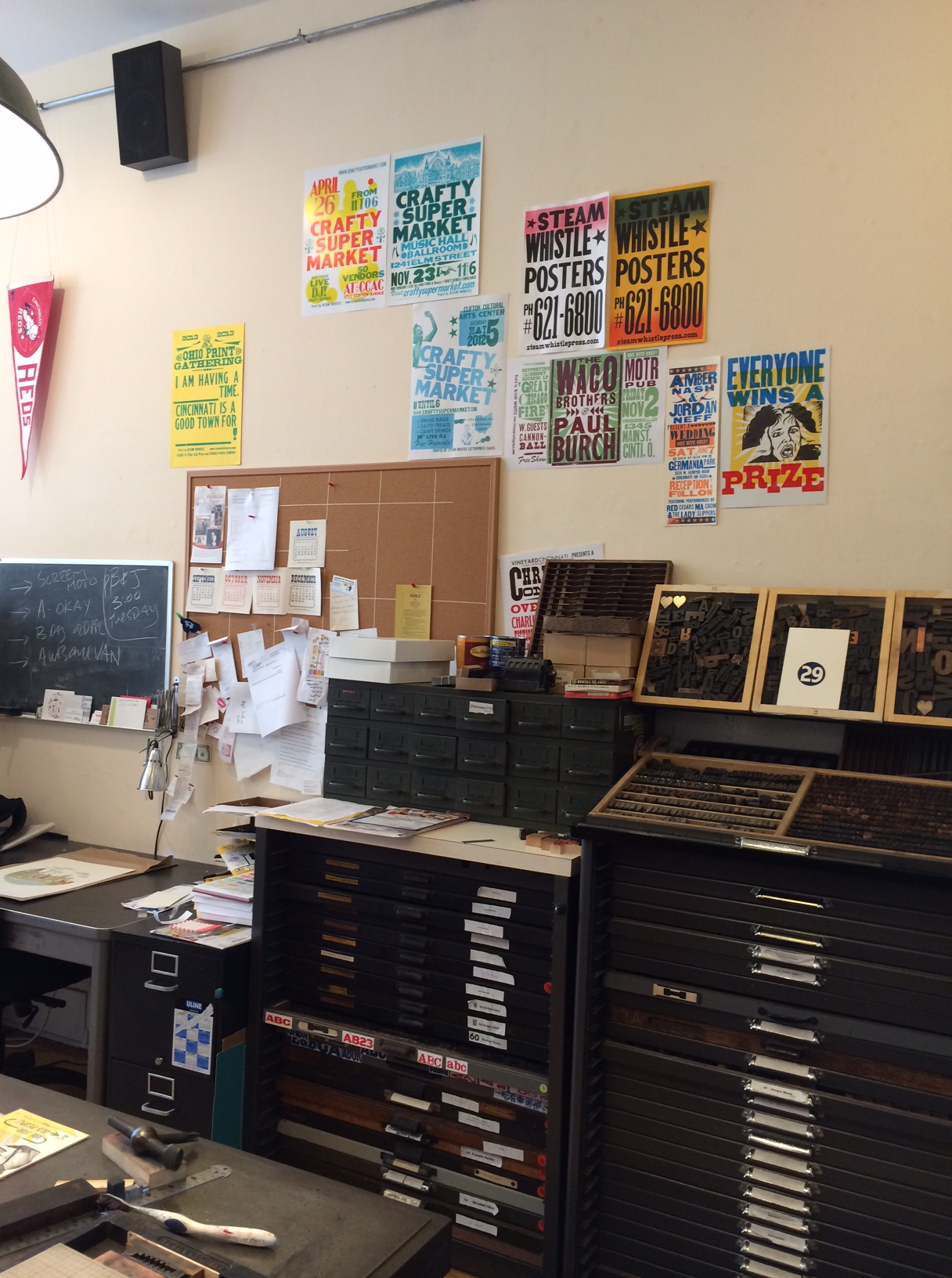
 Here are a few of Matt's beautiful typefaces.

 This is the next restoration project!
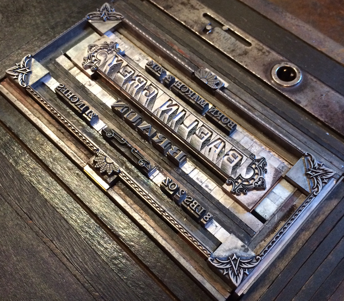
 Here's a fine example of Matt's talent with complex forms. Also a project near to his heart; his own newborn's birth announcement! And what a cutie he is.
 Matt took us downtown to the office of Bearded, his day job. They have a fine way of mixing old and new, as web designers with a stellar letterpress studio all in the same place.
 These are just a few shots of their incredible wood type collection. And you're in luck, because many of these have been digitized and are available as part of Wood Type Revival.


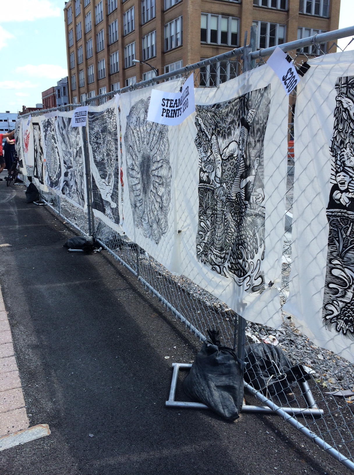
 Four hours after leaving Pittsburgh, we made it to Buffalo to catch a few hours of sleep before participating in the Western New York Book Arts Center's annual Book Fest (read about last year's event here). I was happy to contribute another large linoleum cut for their steamroller printing, which is really a sight to see.
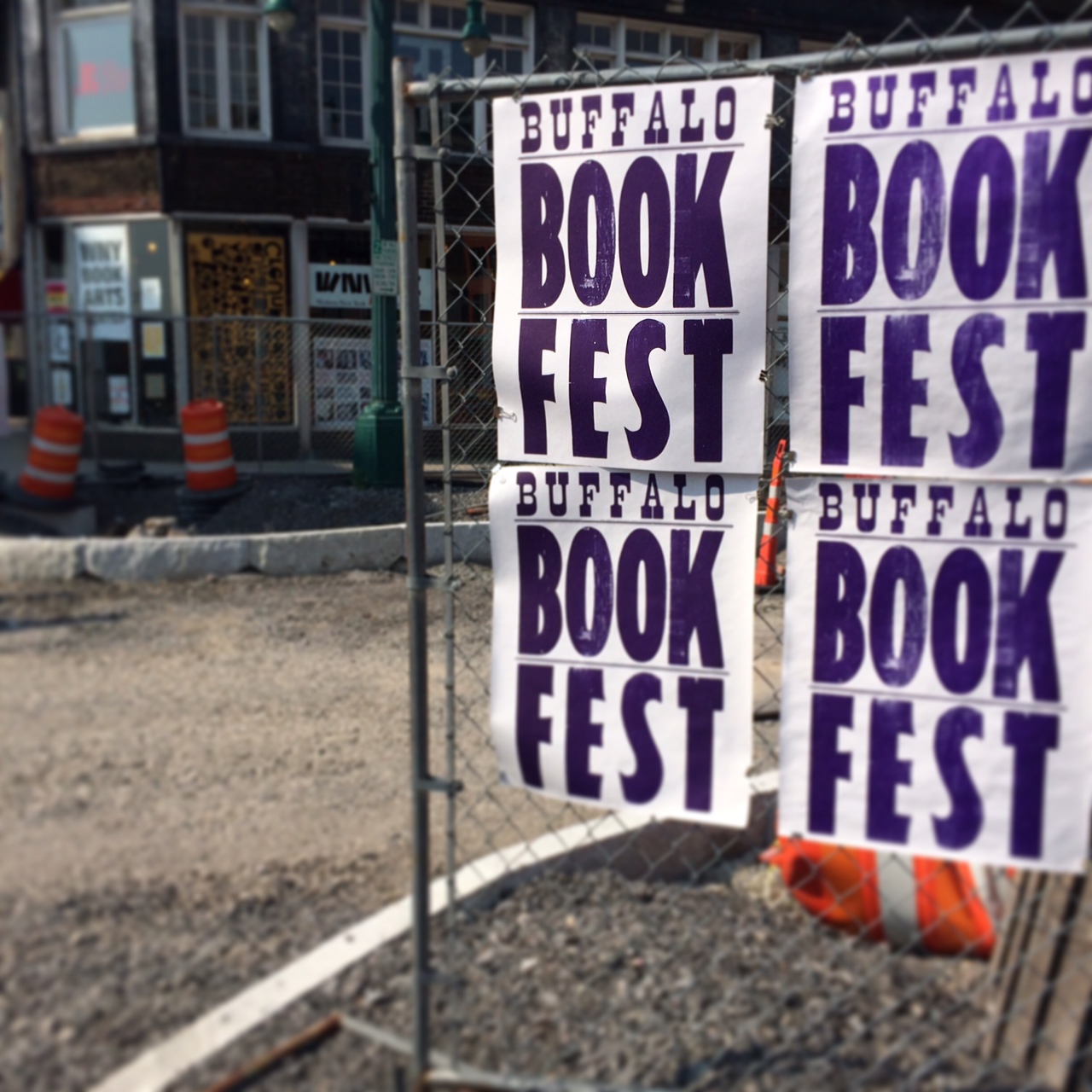
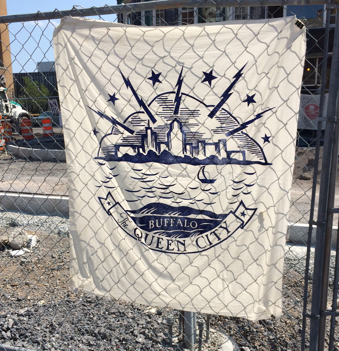
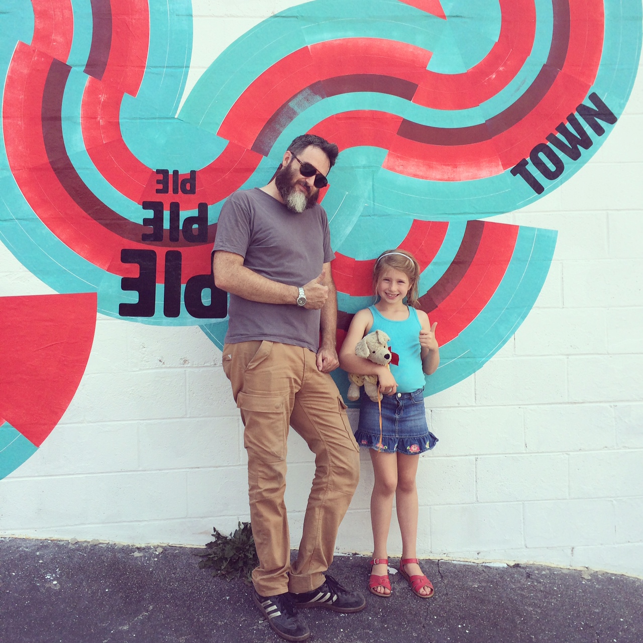
 Despite the construction, many folks came out to the parking lot to see the steamroller in action. And thanks to the construction, we had a lot of chain link 'walls' to fill with beautiful prints on muslin. You can see my ode to The Queen City 3x3' linoleum cut here.

 Everyone got into the action and it was great to engage the younger members of the audience in inking up the cuts.
 Yep, watching a steamroller print is indeed camera-worthy!
 Check it out for yourself:
[wpvideo 6e8WUFEr]
And here's the final result! All of the prints pulled are for sale at WNYBAC, and the proceeds all benefit the Center.  Sunburned and exhausted, I took a day off before finishing up our Letterpress Trail in Rochester. Given the amount of type seen that day, I'll be saving those images for their own post! Check back soon.
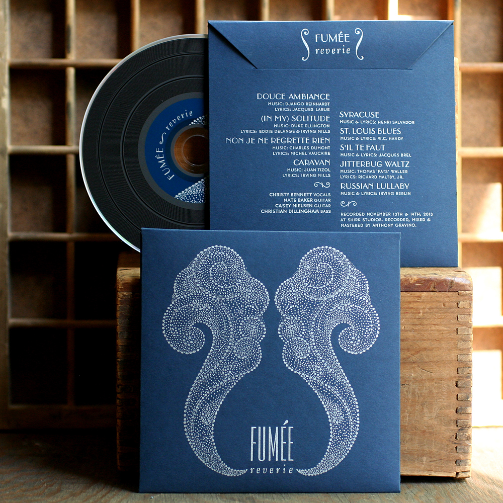 Obviously they hoped to create something that was indicative of the style of music and built an inspiration board that included references to Erté artwork. I riffed on that and drew this smoke-like image:
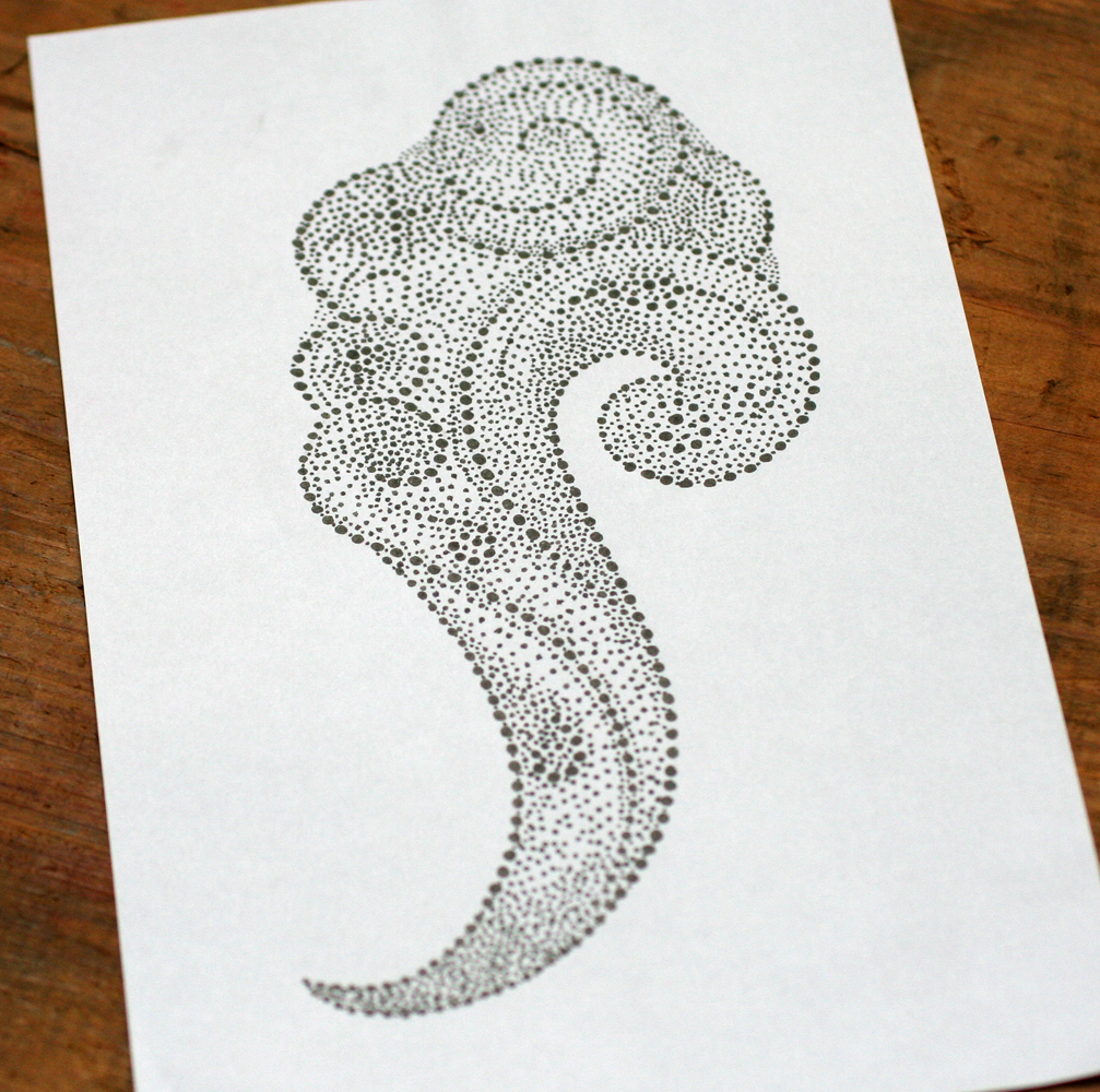 Double it up and there you go:
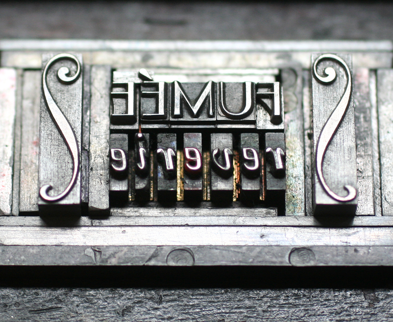
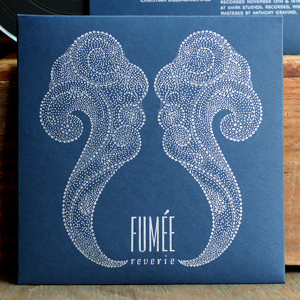 Conveniently, I had just acquired a set of accent characters so we could actually set the name correctly. Since a plate was required for the artwork, I cut into it to insert the hand set text.
 The back side of the sleeve has a smaller version of the main text, so I used a tinier accent here. These curly ornaments from Skyline Type also came close to matching the art of the front.
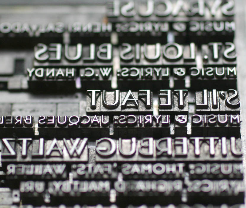
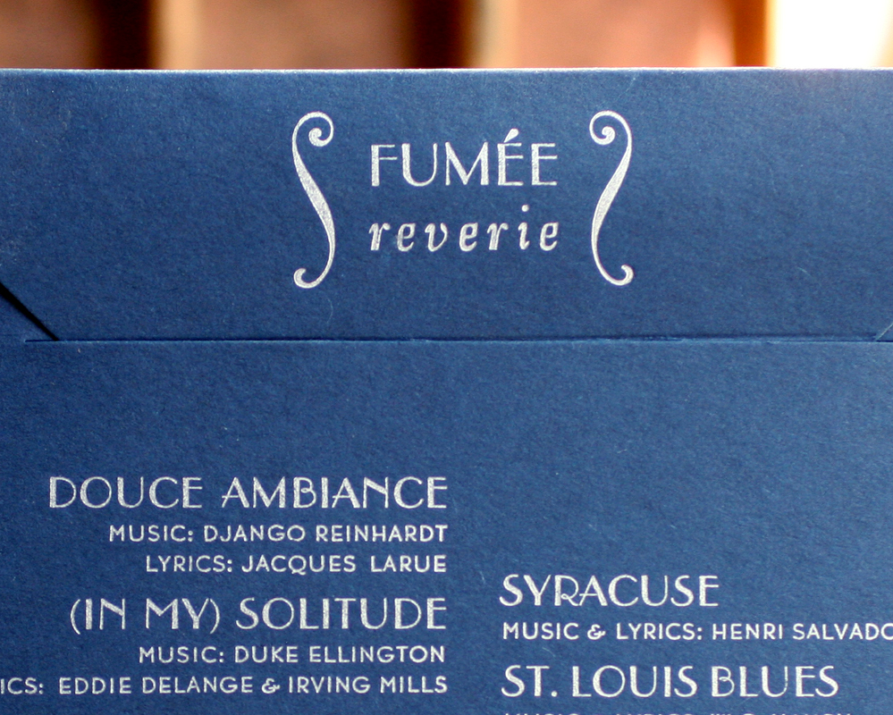 Beautiful Parisian and Bernhard Gothic, two of the studio's workhorse typefaces.
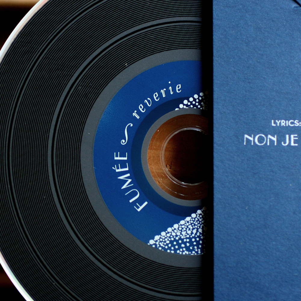
 The band found a cd duplicator that offered vinyl-looking disks, which was a perfect fit for this project. If you want to check them out, you can find more info here, or head over to Rogers Park Social every Monday night for the real deal!

