Gig Posters for All!

There's no doubt Chicago has a thriving and close knit screen printing community that is centered around gig posters. I have shared spaces with these printers and displayed work in countless print shows side by side. And while we're all friendly, I have always been dismayed to be one of the few, if not only, letterpress printers represented. And let's face it, compared to large, multi-colored illustrated posters, letterpress work can look, well, rather drab, with it's subtle color palettes, detailed typography and smaller size given the limitations of the presses. This has often left me feeling diminished on this particular stage.
About a year ago I had this thought: Okay, screen printers, you might be able to do giant, colorful gig posters but I can do really tiny ones because letterpress can do small better than screen printing. But who wants really tiny posters? With that the idea for Dollhouse Gig Posters emerged.

But how on earth could I sell little tiny posters and make it even moderately worthwhile given the amount of time that goes into each minuscule print? I couldn't. The idea was temporarily shelved.
I cautiously shared the concept with a few trusted collaborators as I wasn't convinced it was viable or that anyone would get the joke and enjoy it as I did. During one of our early meetings about the format of Alphabet of Sorts, Rich Kegler (RK) would repeatedly break and say 'let's talk about the tiny gig posters again' which made me think that it just might have legs.
What if the posters were distributed the way record clubs used to work? What if people bought subscriptions and got a new poster in the mail every month? Just crazy enough to fly?

Having spent most of my college years either working in or frequenting record stores, I knew that the best albums came with the goods. 7" singles had an extra photo of the band. 12" albums came with stickers and zines. And box sets, well, box sets held all manner of fun surprises; I am still looking for the missing records to complete my Working Holiday set. So if all of my mini gig posters fit into a classy reel box there should most definitely be additional treats.
I brainstormed my ideal list of contributors, all of whom answered with a resounding YES. Maybe I was on to something after all.


I've known Dan Grzeca since... I don't know when? He is one of the many incredible talents in the screen printing community and we've always run in the same circles. Our friendship was solidified, however, not through print but by our children, who have become fast friends at the school they attend. Dan's style is decidedly old school as he works with scratch boards to create dynamic, original illustrations. His art prints are among my favorites and I love seeing him not only stretch his style past gig posters, but relish the ridiculous in his work and elevate it to fine art. We've shared many drinks (me: cappuccino, Dan: orange blossom tea) at Spoken, our favorite cafe, and his clan have helped the Starshaped family through dark times this Fall. I was pleased when he said 'Hell Yeah' to my inquiries about contributing art for a temporary tattoo to accompany the March poster.

Coasters Dan designed and I printed, along with his label for Apocalypse Cow.

Coasters Dan designed and I printed, along with his label for Apocalypse Cow.


As I started to think of how this project not only pulled together all of my interests but also gave me the opportunity to revisit the people and ideas that brought Starshaped to its current state, it felt natural to have RK on board. I have always been the biggest fangirl of P22 Type Foundry. In P22 I found inspiration, research, thoughtful digital type, oddball projects, music and a spirit that felt like home through my college years and beyond. Now that we have collaborated on a number of projects, a fact that still surprises me, I am pleased that RK, in a new incarnation as P22 Analog, was on board to contribute whatever I wanted. And what I wanted was an incredible letterpress print that fit the themes of the project. He has delivered on this, I can promise, but you need to wait until the August mailing to receive it!
 

P22 2015 Club Cards printed at Starshaped, one of many print collaborations.

P22 2015 Club Cards printed at Starshaped, one of many print collaborations.


I often recall the days of working at Fireproof Press with a nostalgia that doesn't involve the mundanity of running a business, the days when I could show up at a print shop and set type without a care for how the lights were staying on. But the best part was just being around John Upchurch, owner of the whole operation. I learned all of the things from John that you're supposed to learn at a good job, as well as the things that find no place on a resume. And while it's been more than 15 years since Fireproof existed, the Upchurch family still feel like my adopted tribe. I run to John for perspective on life, love and friendships, knowing it will be tempered with humor and pragmatic, personal anecdotes. He is a true friend.
John was also a member of The Coctails, a band that cemented their place in the history of Chicago music just as I was calling it my home. By the time I was old enough to get into a club to see them play they had already called it quits. Thankfully they performed twice more and I was present for both shows. It was through John that I met Mark Greenberg, another member of the band, who has appeared as a supporting musician on stage at many shows I have seen since the Coctails days. Mark is kind and funny and connects people throughout the music and art community. I was pleased to present him and his work to Erin Beckloff, the masterful mind behind Pressing On, for which he is now creating the music. This collaboration makes me clap my hands with glee.

The Dollhouse Gig Posters box needed to have some actual music to go with it. I stewed on who could help with this and what the format would be, when I both stumbled on affordable flexi disks and remembered John & Mark still write music together and just might be on board. When I asked them about the prospect of writing a new song to fit the series I got a resounding We're In!

A few relics from my Fireproof Press days.

A few relics from my Fireproof Press days.


With this incredible team in place the project moved from a silly idea to seriously great fun. The posters don't advertise specific bands or events, but different genres of music through the stereotypical styles of each. It involves the most enjoyable research; I listen to music indicative of the prints while pouring over books and records so I can compile all of the best and appropriate features.
January's mailing includes the reel box that houses all of the posters, which are mounted on 7" cards. They are wrapped in a band that's fresh off the press:

Fiat, compliments of John, full o' paper for the tiny gig posters.

Fiat, compliments of John, full o' paper for the tiny gig posters.

The back side of the wrapper borrows a locking tab die from old metal type packages.

The back side of the wrapper borrows a locking tab die from old metal type packages.

Little details on the sides of the wrapper.

Little details on the sides of the wrapper.

The back side of the chipboard cards the posters are mounted to are printed with a checkerboard-style collection of vintage mid-century cuts on loan from P22 Analog. These were odd-sized remnants of advertising plates that I trimmed to be uniform. It's just a little extra detail to enhance the overall look of the project.

The first poster is on deck to print this week and ship, along with the reel boxes, as soon as it's finished. Can you guess which musical genre is first? Subscriptions are still available if this is exactly the little bit of joy your mailbox would love to see every month this year.

Put It In A Letter

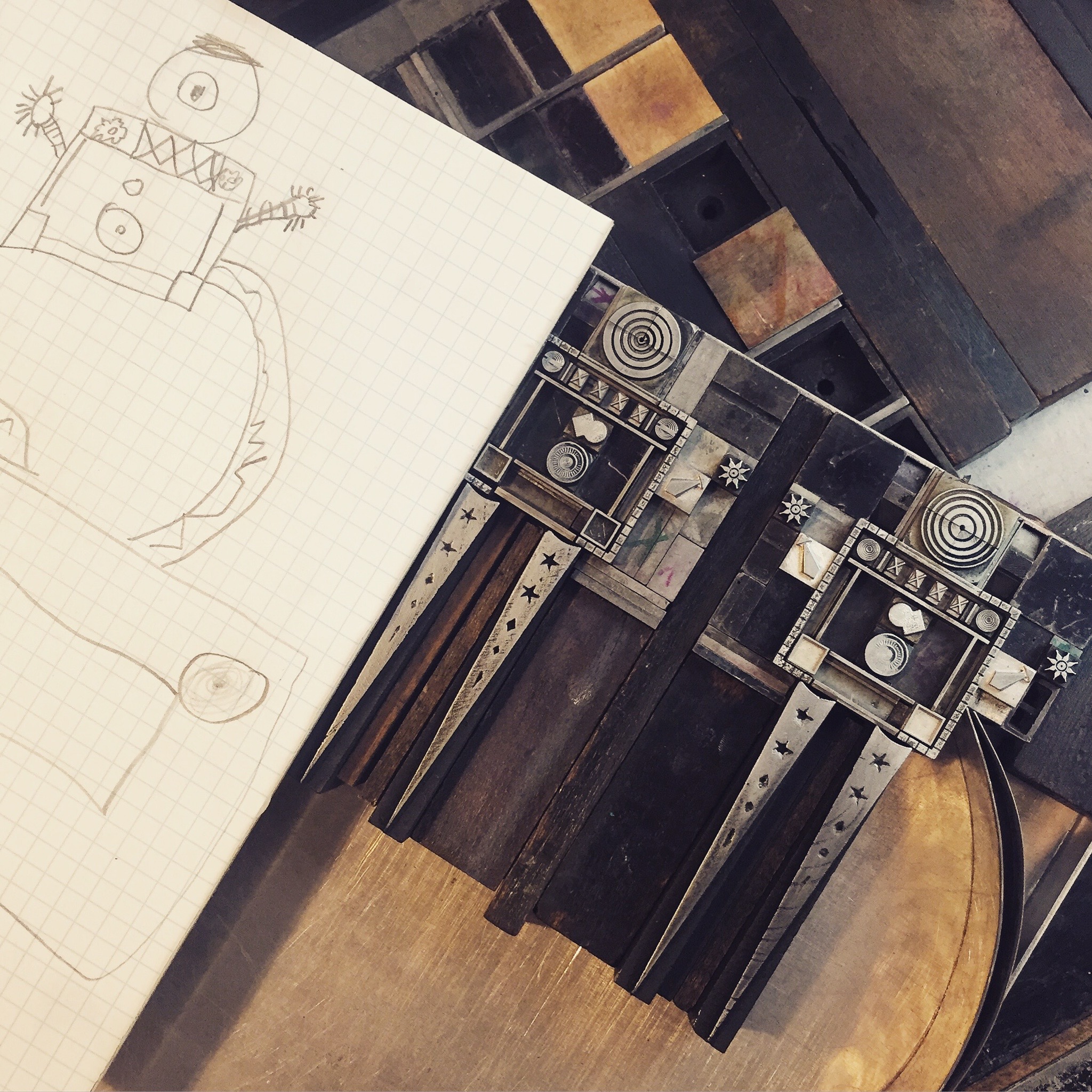
On September 25th, 2015, Mr. Starshaped and I celebrated our 11th anniversary at Northwestern Memorial Hospital, downtown Chicago, awaiting a surgery that was to remove a mass in his chest. The operation was described to us as 'kind of laparoscopic, but with chopsticks that have robots at the end.' To make light of the situation, printer's devil Jo and I collaborated on this print:

First sketches

First sketches

Operation: Robot Chopsticks

Operation: Robot Chopsticks

Within a few hours we learned the mass could not be removed; not only had it grown substantially from the previous scan, it was very definitely cancer. While Mr. S slept that night, I went to Starshaped and built this tiny form, determined to salvage something of our anniversary:

truelove.jpg

We waited two excruciating weeks to receive devastating biopsy results. The tumor was indeed a rare and aggressive sarcoma, and it had already spread to his lower spine and hip.
To distract during this time I threw myself into The Well-Traveled Ampersand, spending many late nights taking out frustration and fear on these elaborate projects. But then little forms appeared in my head in time to the music that was pulling me through a dark time. I saw them so clearly that I set them quickly, pulling other people's words that filled the spaces where I could produce none.

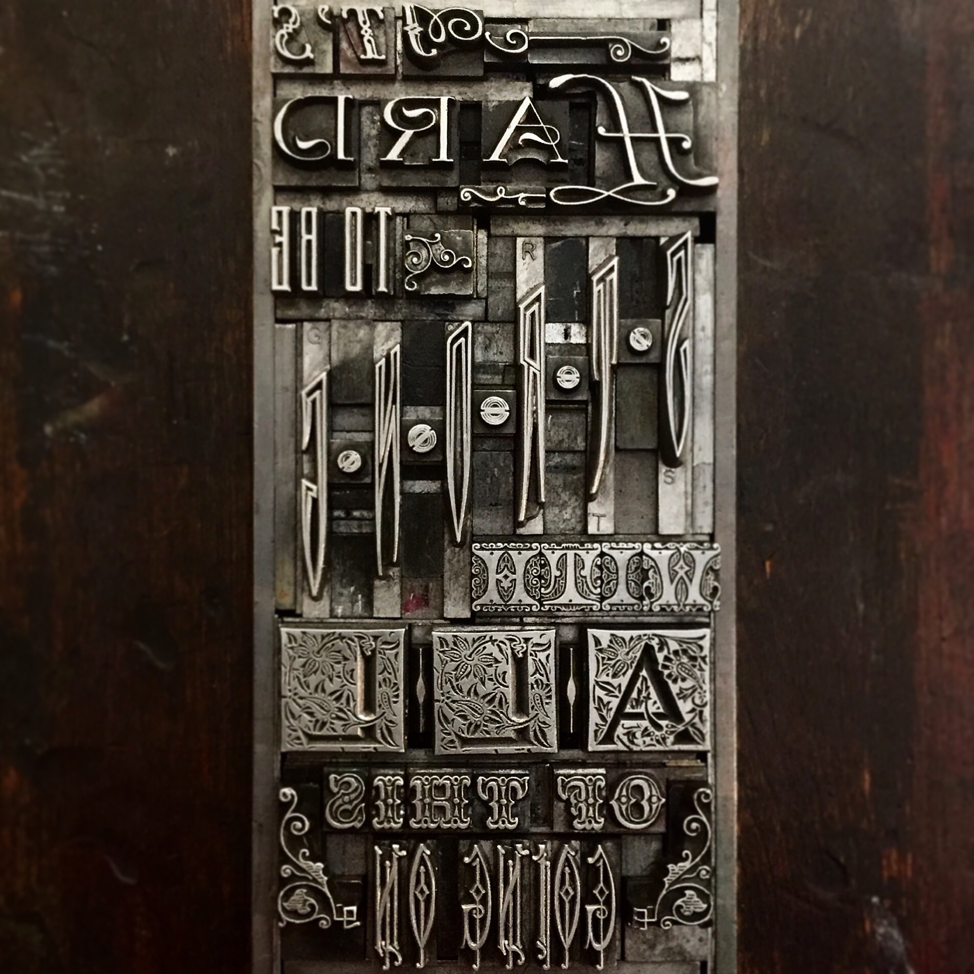
'You Can Have It All' · Yo La Tengo

'You Can Have It All' · Yo La Tengo

'This Water' · Ida

'This Water' · Ida

'Heaven' · The Walkmen

'Heaven' · The Walkmen

A testament to my love for Mr. S started the flow, followed by the Ida song that has pulled me through every journey made over the course of our relationship; every theater he worked in another state, every flight to New York to learn new theatrical technology and now this unknown path that felt like he was heading into an unpredictable and unforgiving sea. The Walkmen gave us a rally song.
I had no plan for these type forms. Much like the run to the restroom when you know you're going to vomit, I raced to the studio at night after every More Bad News appointment to let another form escape. They spilled out, in 30-60 minute spurts, not unlike therapy sessions (though these didn't involve set times and insurance companies.)
While waiting on conclusive scans in October, I learned of the death of Carey Lander from the Scottish band Camera Obscura, struck down by the same crappy sarcoma that we were now facing. The sheer ruthlessness of this cancer and its penchant for attacking young people was a crushing blow.

'Cri du Coeur' · Camera Obscura

'Cri du Coeur' · Camera Obscura

Their words appeared again, inspired by the incessant and absolutely necessary text messages I received throughout a Saturday from Matt Rieck, my 'other work husband' as Mr. S warmly refers to him. A day filled with beautiful and distracting images of monograms from the Genesee Center for the Arts pushed this out of me:

'Away With Murder' · Camera Obscura

'Away With Murder' · Camera Obscura

More on Matt later. He's important.
I also learned, through mutual friends, that Sue Miller, the wife of Jeff Tweedy from Wilco, but more importantly to me one half of Lounge Ax, the seminal club I spent many, many nights at before it shuttered in 2000, also suffered through a near identical cancer to Mr. S and came away from it battered but intact. Wilco songs percolated in moments of hope.

'A Shot In The Arm' · Wilco

'A Shot In The Arm' · Wilco

'Sunken Treasure' · Wilco

'Sunken Treasure' · Wilco

On the day of the failed surgery in September I escaped the stale waiting room to buy records. I picked up the solo album by Mac McCaughan of the band Superchunk, potentially my favorite of 2015. Two songs immediately went on constant repeat in my brain.

'Only Do' · Mac McCaughan

'Only Do' · Mac McCaughan

'Lost Again' · Mac McCaughan

'Lost Again' · Mac McCaughan

At the end of October we were introduced to the world of chemotherapy. I'm thankful for Mr. S's brother who came to help the first day, as well as the best friend that flew in for the weekend to see it through. This gave Jo and me a chance to escape for a long weekend, because we learned that no matter how committed we are to going through this together, we still need to have time independent of each other and can take advantage of the large support network that was gathering around us.
Chemo is terrible. I have watched it take my husband's hair, his muscle tone, his energy, his appetite, his ability to find fulfillment at work and occasionally his dignity. If you have spent time in hospitals, you'll recognize the agonizing details in every line of this Sleater Kinney song:

'The Size of Our Love' · Sleater Kinney

'The Size of Our Love' · Sleater Kinney


Shortly after the first round and a few days into thinking he could still work, I dragged Mr. S and Jo to the Hamilton Wood Type Museum annual Wayzgoose. This was a very low point. It was clear immediately that Mr. S just needed to sleep (and so did I, not having done so that entire week), and that the personal superseded the professional and I couldn't escape into print and design conversations like every other year. This was also exacerbated by the fact that I was a volunteer and worked the event as opposed to wandering about at large. Why didn't I skip this year? Mostly I tell myself I wanted Mr. S to see my important place in the community and that his support of me over the years was not in vain. This task wasn't successful, but it ultimately didn't need to be. I also sought a sense of normalcy with my work that was not to be achieved in one weekend away.
I woke up early each day and paced the lakefront, sobbing and losing myself in the angst of Frightened Rabbit to exorcise the exhaustion and icky feeling. And I counted the hours until I could get him home safely again. It was clear that travel wasn't going to work.

'I Feel Better' · Frightened Rabbit

'I Feel Better' · Frightened Rabbit

'My Backwards Walk' · Frightened Rabbit

'My Backwards Walk' · Frightened Rabbit


We live by a bridge that crosses the Chicago River. When I traverse it in the morning I know the day has started. When I trudge over it at night I'm ten minutes from home. Pausing at the top, and depending on the time of day, we see rowers, nature walkers, ducks, a sneaky heron. It's the body of water that has grounded us since purchasing our little home in 2009.

'Levitation' · Beach House

'Levitation' · Beach House

As a private person, the outpouring of support has been hard to swallow and not because I eschew the attention for Mr. S. For weeks, friends and family would show up at the studio, food was coming in droves, money appeared in the mail and I suddenly had what I now refer to as 'my part-time cancer job' of maintaining and art directing our new, very public, life. Every bit was appreciated but being so new to this, I had to develop strategies for maintaining our home, our child, my full-time job and my ailing husband. The studio languished; then overqualified printers from around the world started showing up and somehow, miraculously, work was accomplished.

The Starshaped interns that come in to help from time to time (and the current roster isn't doing it for school credit or money; they just keep showing up) have been patient and kind and funny. They take me out of myself and make me laugh. On one particularly productive day, I vented about trying and failing to manage all of the assistance we were now receiving and Isabella said this, pulled from a legal case she had just read about:

lostinafog.jpg

Not a song, but absolutely perfect.
Sometimes the forms feature funny or uncomplicated lyrics that tie into our history:

'I Love You, You Big Dummy' · Magazine

'I Love You, You Big Dummy' · Magazine

'#1 Hit Song' · The Minutemen

'#1 Hit Song' · The Minutemen

'New Morning' · Bob Dylan

'New Morning' · Bob Dylan

Mr. S affectionately calls me 'Dummy,' and The Minutemen are one of his favorite bands. We had the Dylan song 'New Morning' sung at our wedding, in a moment marked by the standing of my brother-in-law in a show of affection, a brother currently fighting his own war with cancer and chemo. The one benefit of Mr. S being home so much now is that we have time to talk, and we do go on about many anecdotes of our last 15 years together. And we hold onto these things.

Subconsciously I knew the chemo wasn't working. But we didn't know until December 8th that it was not just failing, but the cancer had spread significantly in multiple places as well as having caused a fracture in his spine. A new course was needed asap. I left Mr. S with his visiting sister that night and raced for the studio as another form was bubbling, painfully. This type will surely rust from tears. No matter that it's 4 point type (on a 6 point body); I couldn't see it anyway.

'Tomorrow' · Daughter

'Tomorrow' · Daughter


As we move forward, there's a new path in many ways. I learned to direct all of our support. I know I need to reduce my workload at the studio and that this will affect what jobs I take and when. I know Mr. S needs what he needs to get through one hour at a time.
But these forms kept coming and with so many piling up, something needed to happen. 'Print them for me' he said, and so I have.

I cut scrap paper from The Well-Traveled Ampersand to 4.75" squares, planning to print 30-40 of half of the forms and 200 of the rest so that I'd have extra pieces to submit for my APA membership requirements in 2016. I built 25 forms, significant for the date of our anniversary and life-altering news in September. 'True Love' was additional in case I needed it for any reason.

Each form is set to print as one color, but I wanted the final collection for Mr. S to be special. The studio's Christmas gift was a set of 120 beautiful German colored pencils so that I could test my latent drawing ability. Coloring brought in a whole new aspect to the therapeutic nature of this project and the results were cathartic.

There was no rhyme or reason to the order of coloring; if I was inspired with an idea for one then that was the one on deck. Here are snippets of the final pieces.

Going into this part of the project, a way to house the prints was needed. It wasn't appropriate to frame them as they feel more personal than that, like they should be kept on a bedside table and not explained to house guests. I asked Matt if he could make a simple wooden box to hold them. He created something so truly beautiful it made me gasp. Matt is the person who checks in every day ('what are you printing today?' 'what's going on Farrell?') and talks to me like life is completely normal right now. He sends pictures of fantastic type, especially ampersands, shares anecdotes about making type as well as family stories and makes me laugh. He is, as Jessica Spring says, the guyfecta: smart, thoughtful, funny.

'What Can We Do' · Superchunk + Matt's beautiful box

'What Can We Do' · Superchunk + Matt's beautiful box

The final print is from what I've often considered a theme song for me and Mr. S. Every lyric could be represented but I opted for this one as the memories of shoveling out our little Chicago bungalow during the last blizzard are actually warm ones, shared with our neighbors.

Now the project is nearly complete, with just the song credits to print on the back of each piece. I am grateful to the musicians who could say what I was unable to squeak out. I gave this to Mr. S as a Christmas gift, which felt more like handing over my heart in a box. It's our project, not just mine. But the tiny forms have run their course and no more are presenting themselves in my head. This is the physical manifestation of the tough turn our lives took this Fall and has given me the tools necessary to approach future projects.
There will be fewer Starshaped jobs for the foreseeable future while I focus on finishing current commitments and overhauling a few of the things we've always done. It is absolutely crucial that the work coming from the studio be the best, most enlightened and forward-thinking work I have ever done. Mr. S has long considered Starshaped the Family Business, even though it has never been the most lucrative option, and the confidence and joy that inspiring work gives me is ultimately the most soothing medication for my other half.


If you're interested, the Spotify playlist of all the above songs is available here.


Hundreds (literally) of family members, friends, printers and stagehands have taken the helm of our lives for us and guided us through the rough seas. We are currently printing special projects to thank them all and these will get their own blog post in the near future.

Maybe You're Right But This Is My Song

"No, no, no, no. If the book is made up of ornamental patterns then no pattern paper made by someone else will fit."
"Well what do you suggest then? Printing your own end papers?"
"I guess so. Yes."

This snippet of conversation between Richard Kegler (RK) and myself during the early development of An Alphabet of Sorts is representative of many of our collaborations; a lack of satisfying answers until one that involves a lot more work presents itself. And that 'lot more work' is what pushes our projects to be stronger than we ever thought they might be. This post, told through a few recent projects, is the anatomy of an ongoing professional partnership that has always been greater than the sum of its parts.

VERSE

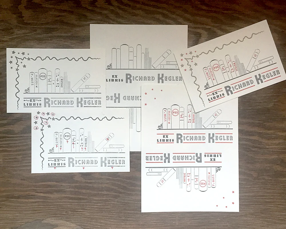
During my residency at Wells Book Arts Center in March, I stewed on an appropriate gift for RK to thank him for securing the position as well as suggesting the creation of An Alphabet of Sorts. When he showed me his library at the Center and mentioned needing a way to differentiate his books from those of Wells I knew immediately that bookplates were in order.

The bookplates I designed were a stew of all the things that came to my mind when thinking about him and what he was passionate about and involved in at various points in life. I created an image of books on a shelf, alongside records in the middle (including the lone 10" that got away, RK). The type is German and includes initials in Alpha-Blox. Rather prophetic.

The form for these was particularly pleasing, with so many tiny pieces all coming together. I pulled a carbon paper proof to check the result and was relieved that they looked like books, especially the angled one. It was time to separate the different colors and mark them in a way to keep every piece of spacing in place.

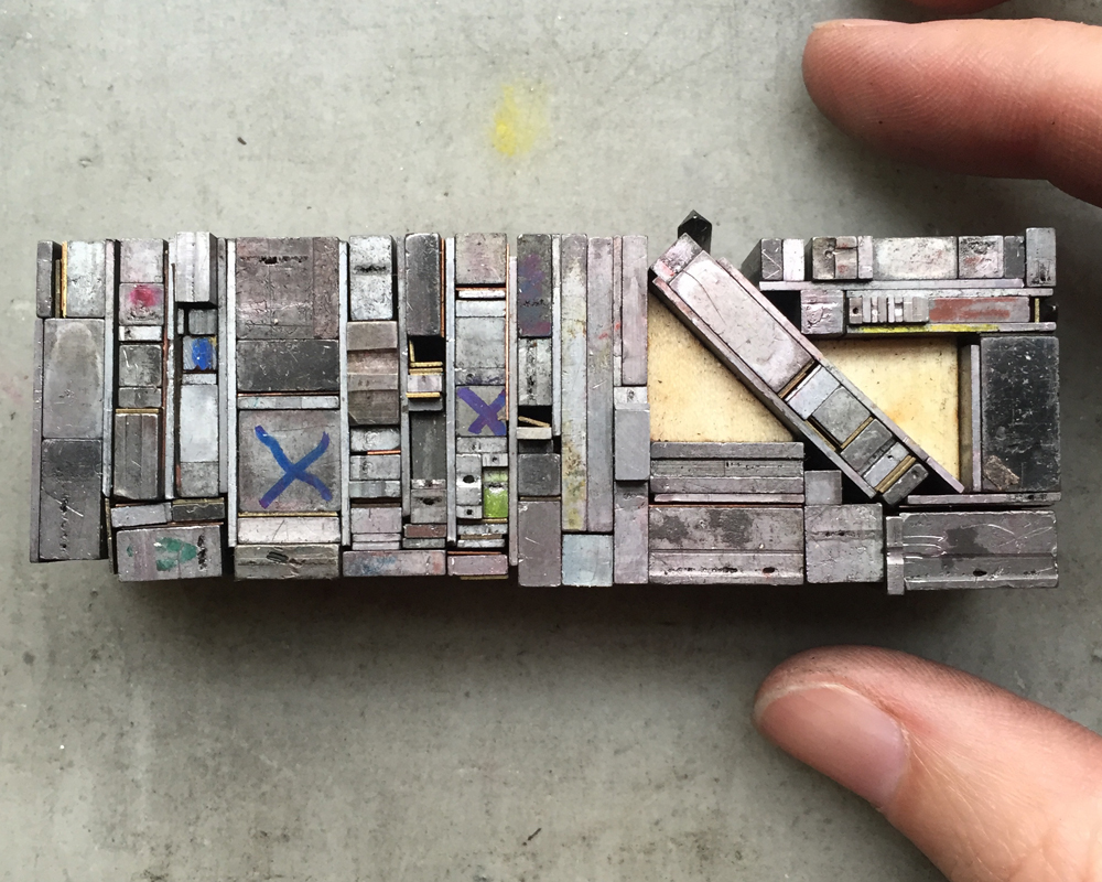
I started with gray because it was the key color. You can see where marker delineates which spaces are placeholders for the other colors.
It was right about here when RK started texting me how badly he needed bookplates. Unbelievable. I bit my lip and kept printing, all the while being bombarded with images of "stuff I really like... y'know, for inspiration."
I replied, "You're breaking my heart. Can you wait on this until Friday, please?" thinking that would give him a hint. It didn't. He sent more.

Gold followed the red. The tiny star in the middle represents the gold star on the spine of An Alphabet of Sorts. I wasn't about to leave that volume off the shelf.

I loved the little detritus left behind when I started to put it all away because it's a fine example of how not to set something unless you're doing exactly what I did; moving minuscule sorts for multiple colors.

This is a rough shot of all stages of the printing, from the first single-color proof to the end result.

I was quite taken with these until I remembered I was no Rogers or Dwiggins or Preissig, or ANY of the imagery RK had sent during the process. But I mailed them anyway.
I have been asked to occasionally run something through what I've coined 'the RK translator,' meaning his expressions can be difficult to read, especially from a distance. I have discovered that 'nice' means 'that's really f-ing amazing and I'm jealous' and that '!!!!' is the highest praise one can receive.
So when I got this anomaly a few days later, I kept it:

Sorry, RK, but there are actual, complete sentences here and it needed to be documented. I nailed it; a challenging project we were both happy with.

CHORUS

There's no doubt, no doubt, that RK and I butt heads on many things. Anyone privy to our phone conversations will likely overhear one of the following statements:

"You never listen. You're a horrible communicator."
"Don't be so taunting."
"Get off the spectrum and put yourself in my shoes!"
"You're really reading too much into this."

Tension, anyone? But the arguing brings breakthroughs that are the seed of the Next Big Thing. I may be angry, but it channels into pushing my design work beyond myself, all while knowing, feeling I have the full confidence of someone whose respect for me means something.

One thing we almost always see eye to eye on is music. With our record store pedigrees and heavily used Spotify accounts, countless playlists have furiously flown between us as our tastes mirror each others. Kiwi bands: Go! Top Ten Wedding Present songs: Go! Cover songs: Go! I made the 4AD list, he followed with Factory Records. We tackled Creation together, all the while avoiding Oasis. It is truly a level of geekiness of which I have no shame.
There are no ground rules but we each have our limits. My 'No No' list: Pink Floyd, Johnny Cash, Nick Cave. His: Morrissey, Death Cab for Cutie, Sleater Kinney. Fair enough.
My favorite playlists are coined One Degree. With these, one person adds one song to the list and the other follows it with something that is one degree of separation away by song title, band name, band members, record label, country of origin, producer, etc. Most of these run about 3 hours long.
One evening Mr. Starshaped came into the office and saw me belaboring a song choice. When asked, I explained how the One Degree lists worked.
"Well, he started it with The English Beat so I followed with Beat Happening. Luna did a cover of 'Indian Summer' so he added 'Ride Into the Sun' which Luna also covered. So I followed with an actual Luna song which he then chased with Wire's 'Outdoor Miner', another song Luna covered. So I followed with a Felt song because, duh, Felt and Wire!..."
And this is when Mr. Starshaped exited stage right, trailing, 'I'm glad you have a work husband to share this with...' and hence that terminology was born.
Side note: I have a second 'work husband' but he surely deserves his own post someday, no?

Sometimes records arrive in the mail at the perfect moments. After lamenting that a beloved De La Soul CD didn't make it out of our old car when trading it in, it showed up just in time to print the aforementioned end papers for the book.

The Bill Drummond record was sent to remind me of the time I couldn't quite place it when he played 'you have 20 guesses to figure this one out.' The Bedhead when I was having a particularly bad day, depressed and struggling with the Magic Hour print. I texted:
"Bedhead live in Chicago record store day only release. Lame. Can you find me one?"
"Of course."

Three days later it showed up with the silly secret admirer note.
And the most recent addition, my holy grail, Velocity Girl's cover of Seven Seas. Note packaging that arrived to Jennifer Gedge, a nod to my crush on David Gedge of The Wedding Present. Aren't you funny, RK.
Lest it seem one sided, I have been hunting for two LPs I want to send and can't find them. I prefer perusing stores to ebay so it's going to take a while. But I have been known to put a little heart into custom notes for special occasions, like his solo show at WNYBAC.

Music softens the proverbial blows we repeatedly throw at each other and I am grateful for it.

VERSE

"How many bookplates did you send, out of curiosity?"
"I don't know... about 400?"
"Do you know how many books I have?"

Do you see what he did there? I certainly did.

Sigh. "What do you want this time?"
"I need really tiny ones for my small artist books."
"Okay. What should these ones look like?"
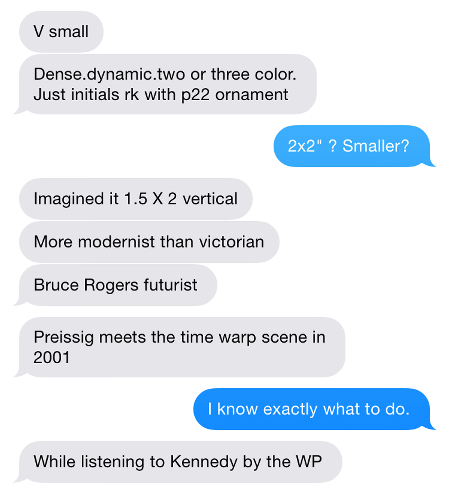
Enter the best art direction I have EVER received:
 

And I did know exactly what to do, right after I joked about the book I was writing, with Replacements reference, 'Unsatisfied: 25 years of bookplates for Kegler.'
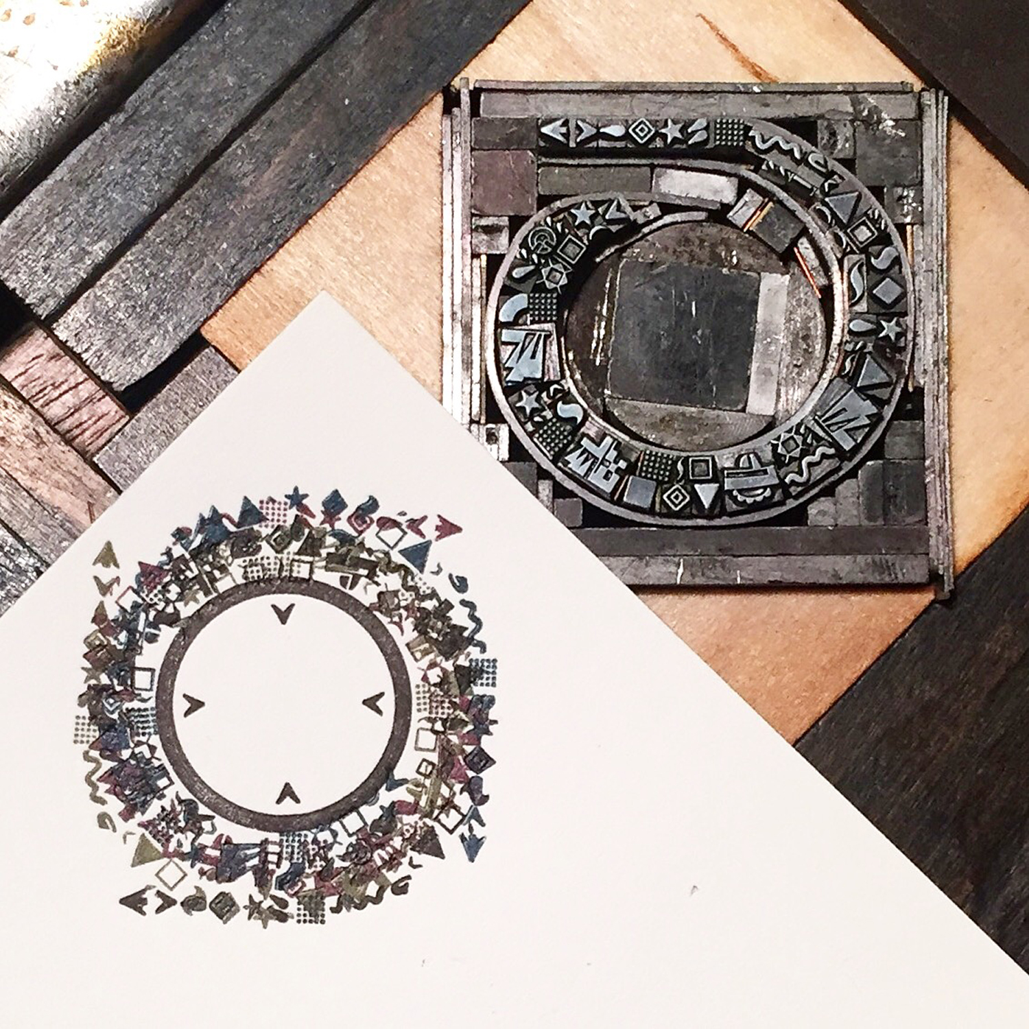
First, a Wedding Present nod as mentioned. This is one of our favorite bands, hands down, and the 'Too Much Apple Pie' line comes from the song Kennedy. I wanted to add it in a way that would be obscured but there. The inner circle would print to help ground what I planned next, but the outer would not. The type is 6 pt. Remember his size requirements? I used an etching needle to shove those tiny brasses in place.

I set and proofed the three main elements so that I could scan and digitally manipulate them to find the best angles. I also gave him options on the tiny inner ornaments.

'Dense' and 'dynamic' weren't going to happen in 2-3 color. To create a time warp it needed to be layered and a little nuts. This coil was printed in four different directions, with each ink being slightly tinted with CMYK, as per RK's request.

Here are the 6 (yes, 6) color separations.

While finishing up, the deluxe 10" set of The Wedding Present's Bizarro album showed up in the mail. Perfect.

BRIDGE

While teaching again at Wells this summer, RK showed me his plans to create an Alpha-Blox style modular type system and I said "I want in. What can I do?" without having any idea of where I'd fit beyond getting to play with the end result. Two months later, a $20k+ kickstarter and plastic injection molds being made as I type, I'm in deep.

I am crazy proud of my work on P22 Blox. With shockingly few moments of wanting to poke out my eyes (or his), I have never been involved in such a successful and equal collaboration. RK had the pieces modeled and drafted and found the injection mold company. I brought in an engineer for second opinions and drawings. He quoted and budgeted the pieces while I quoted and budgeted the prints, packaging and shipping. He threw up all of his thoughts and research into the kickstarter site and I cleaned it up and rounded out the story. He made a clever video while I printed cards and built P22 Analog. He oversaw the start of production while I designed the key chart for the digital release of the typeface.
Our enthusiasm is matched by that of the print community and the support we've received is borderline overwhelming. I like to think my ability to edit and focus and appeal to the right crowd was the perfect complement to the respect RK receives for being a hard worker who delivers (with charm!) on promises of typographic greatness.

CODA

The lack of tension directly related to Blox almost makes me worry something isn't quite right, but we've managed to annoy each other in different ways throughout, so I think it's on the level. It's very possible our friendship will come to blows and explode in our faces (you heard it here first, folks!), in which case I hope we have enough of an understanding of what was to send it off with a proper requiem drink and of course, a playlist centered around the theme of Death.
But we must be gluttons as the next project has already happened! Here's a peek:

I've roped in RK for my Next Big Thing that will be announced in November; I'm excited about this one and wouldn't have had the presence of mind to present it to the public without his guidance and enthusiasm, which I am reluctant to admit but it's the truth.

This in a recent email: "Collaborating has been good for us. Better things yet to come."
If this is true, and collaboration continues, then my best work hasn't even been imagined yet. And that's the challenge that gets me into the studio everyday, as well as the prospect of seeing '!!!!' when I shoot off an idea.
Thanks for keeping the faith, RK.


Disclaimer: If your fact checkers confirm with RK that all of the above is a fabrication, please refer to title of post, courtesy of Lush.

The Well-Traveled Ampersand

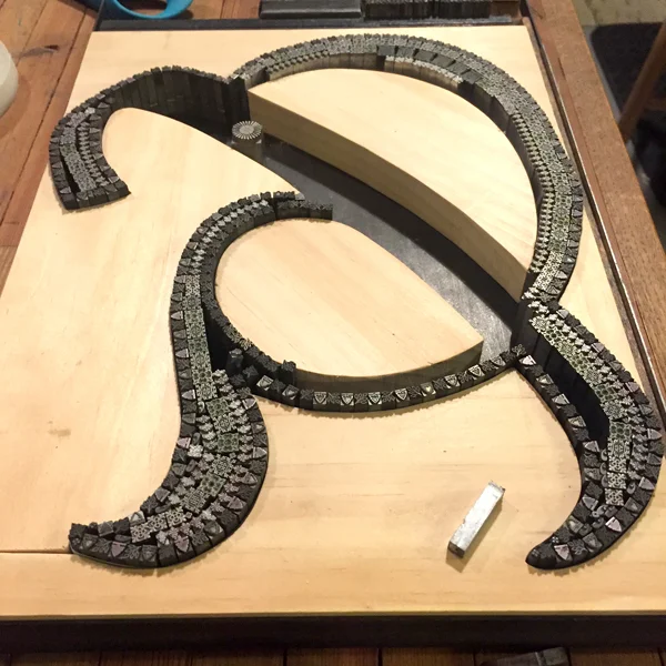
Who doesn't love a great ampersand, that 27th letter of the alphabet, in all of its varied and interesting forms? The Starshaped collection of metal and wood type includes hundreds of examples of how fantastic this form can be in print. Ampersand imagery is one of the biggest sellers in the studio and I wanted to go big to create larger versions from the metal ornament collection. Instead of being locked into the rigidity of a standard letterpress form, I could create wood furniture (the pieces used to hold a form together) that was based on existing ampersands. This would allow me to be true to a pre-existing design.

And because that one concept wasn't enough, I started thinking about how the ampersands could tie into a geographical region or city and somehow represent that location. And thus, this was born:

Before solidifying my idea for The Well-Traveled Ampersand, I built the structure for the first in the series, Frederic Goudy's Californian, a typeface he designed for the University at Berkeley. I timed this to coordinate with our trip to the Renegade Craft Fair in San Francisco so I could gauge the response.

Filling in a frame isn't as challenging as some of the other work in the studio. However, building in a mini set of row houses and hill-climbing trolley was a lesson in holding things in place while squeezing in spacing. This ampersand was ideally suited for the hills of San Francisco for this reason and the result was very pleasing.

The second ampersand was done while teaching at the Wells Book Arts Center in July. It features Victor Hammer's American Uncial, designed while at Wells College. I love how different this form is from Californian.

Wells College is nestled next to Cayuga Lake, one of the beautiful Finger Lakes of Central New York. While not saturated with people and structures, it does have a fantastic sunset over the lake which informed the imagery in this print.

The third print is near to my heart. Before even casually mentioning what typeface would be used to represent Chicago, folks said 'it has to be Cooper, right?' Indeed. Cooper Black is the only typeface meaty enough to carry a substantial skyline of the city I love.

I had an epiphany the night I embarked on this one, realizing that there has to be a way to represent wind for The Windy City. This involved a lot of lead curving and some tricky setting to retain the shape but hint at the sky. It's almost ridiculous how much is going on in this design.

The fourth ampersand representing the London Underground is fresh off the press!

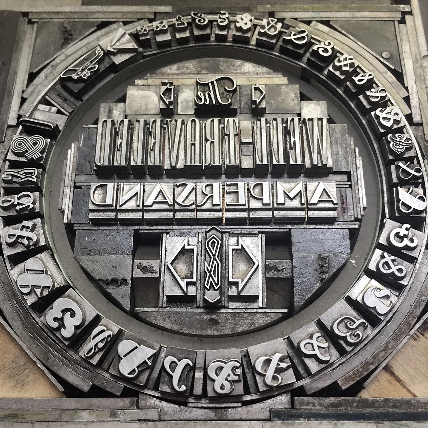
This form for printing the prospectus will also appear on the final sleeve that houses all of the prints. I arranged the ampersands in order of size to make it look like the tiny airplane was pulling them in banner form.

Here are the details! While each print will be available individually, 50 sets will be packaged in an LP-style sleeve and include a digitally printed colophon showing photos of all of the type forms used to create the ampersands.

The series is available for sale here and individual prints will be listed on our etsy site as they come off the press.