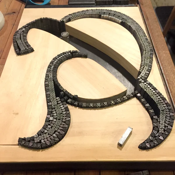
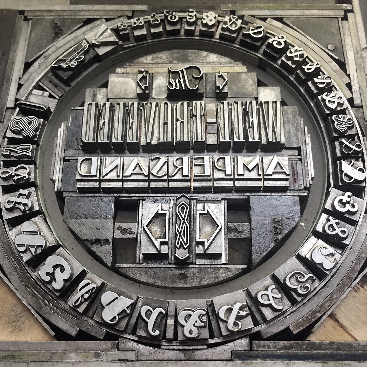
Who doesn't love a great ampersand, that 27th letter of the alphabet, in all of its varied and interesting forms? The Starshaped collection of metal and wood type includes hundreds of examples of how fantastic this form can be in print. Ampersand imagery is one of the biggest sellers in the studio and I wanted to go big to create larger versions from the metal ornament collection. Instead of being locked into the rigidity of a standard letterpress form, I could create wood furniture (the pieces used to hold a form together) that was based on existing ampersands. This would allow me to be true to a pre-existing design.
And because that one concept wasn't enough, I started thinking about how the ampersands could tie into a geographical region or city and somehow represent that location. And thus, this was born:
Before solidifying my idea for The Well-Traveled Ampersand, I built the structure for the first in the series, Frederic Goudy's Californian, a typeface he designed for the University at Berkeley. I timed this to coordinate with our trip to the Renegade Craft Fair in San Francisco so I could gauge the response.
Filling in a frame isn't as challenging as some of the other work in the studio. However, building in a mini set of row houses and hill-climbing trolley was a lesson in holding things in place while squeezing in spacing. This ampersand was ideally suited for the hills of San Francisco for this reason and the result was very pleasing.
The second ampersand was done while teaching at the Wells Book Arts Center in July. It features Victor Hammer's American Uncial, designed while at Wells College. I love how different this form is from Californian.
Wells College is nestled next to Cayuga Lake, one of the beautiful Finger Lakes of Central New York. While not saturated with people and structures, it does have a fantastic sunset over the lake which informed the imagery in this print.
The third print is near to my heart. Before even casually mentioning what typeface would be used to represent Chicago, folks said 'it has to be Cooper, right?' Indeed. Cooper Black is the only typeface meaty enough to carry a substantial skyline of the city I love.
I had an epiphany the night I embarked on this one, realizing that there has to be a way to represent wind for The Windy City. This involved a lot of lead curving and some tricky setting to retain the shape but hint at the sky. It's almost ridiculous how much is going on in this design.
The fourth ampersand representing the London Underground is fresh off the press!
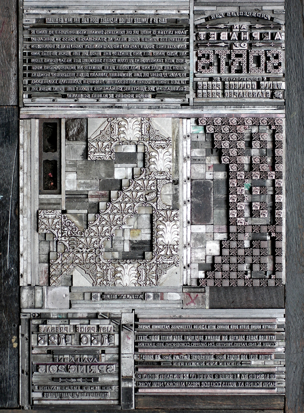
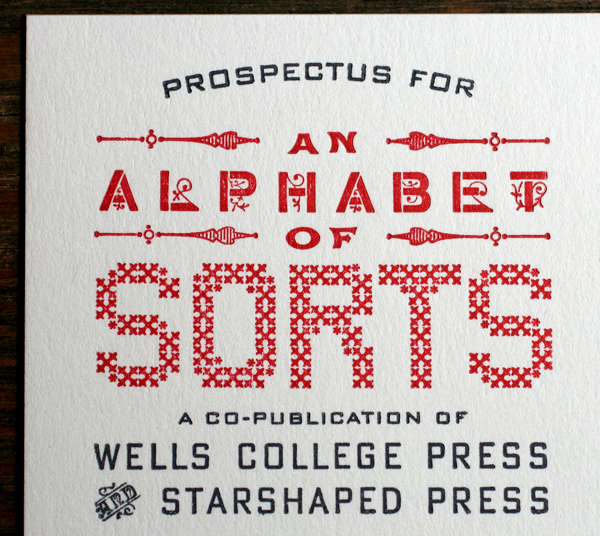
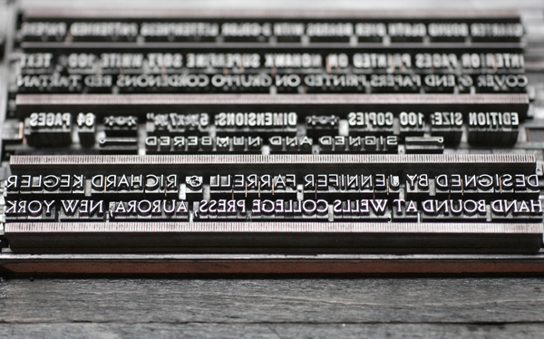
This form for printing the prospectus will also appear on the final sleeve that houses all of the prints. I arranged the ampersands in order of size to make it look like the tiny airplane was pulling them in banner form.
Here are the details! While each print will be available individually, 50 sets will be packaged in an LP-style sleeve and include a digitally printed colophon showing photos of all of the type forms used to create the ampersands.


