Book of Rules

On June 30th, 2016, I lost Mr. Starshaped following a nine month battle with cancer that I attempted to process through print here and here. As we pick up the pieces and wade into our next chapter, we're grateful for the unwavering support shown us by so many.
Over the winter, unbeknownst to me, Mr. S and his psychologist, Stacy Sanford, at Northwestern Memorial Hospital, documented a series of thoughts that he wanted to leave with Jo before the inevitable separated them. I discovered this when Stacy reached out at one of his appointments and gave me a copy. I was blown away; this short list included things he repeatedly expressed to Jo but couldn't write down. I knew immediately it needed a better format than a sad Word print out.

Kooks, by David Bowie, was the first song Mr. S taught to Jo and she could sing it at the age of 2. It's been a touchstone for the two of them over the years and given the weird things her parents do for a living, Jo has always loved it. Bowie mentions giving his child a 'Book of Rules... what to say to people when they pick on you.' This seemed a perfect description for Mr. S's list.
I created a simple structure that would serve as a sort of chapbook for Jo to keep close. I looked at the delightful work of W.A. Dwiggins for ornamental inspiration that would appeal to a nine year old so she could interpret the images as she liked. Everything about the simple design kept this audience of one in mind.

Printed in an edition of 75, many have been gifted to family but a number remain and are available here. There are 12 rules, with a brief intro and colophon on the inside covers.
At the risk of adding too much of my own verbiage, I'll let Mr. S's words take it from here.

Images from July 2015 and June 2016. The appearances of my two loves may have changed but the intangible between them never did.

Sweet Home, Ornamental Chicago

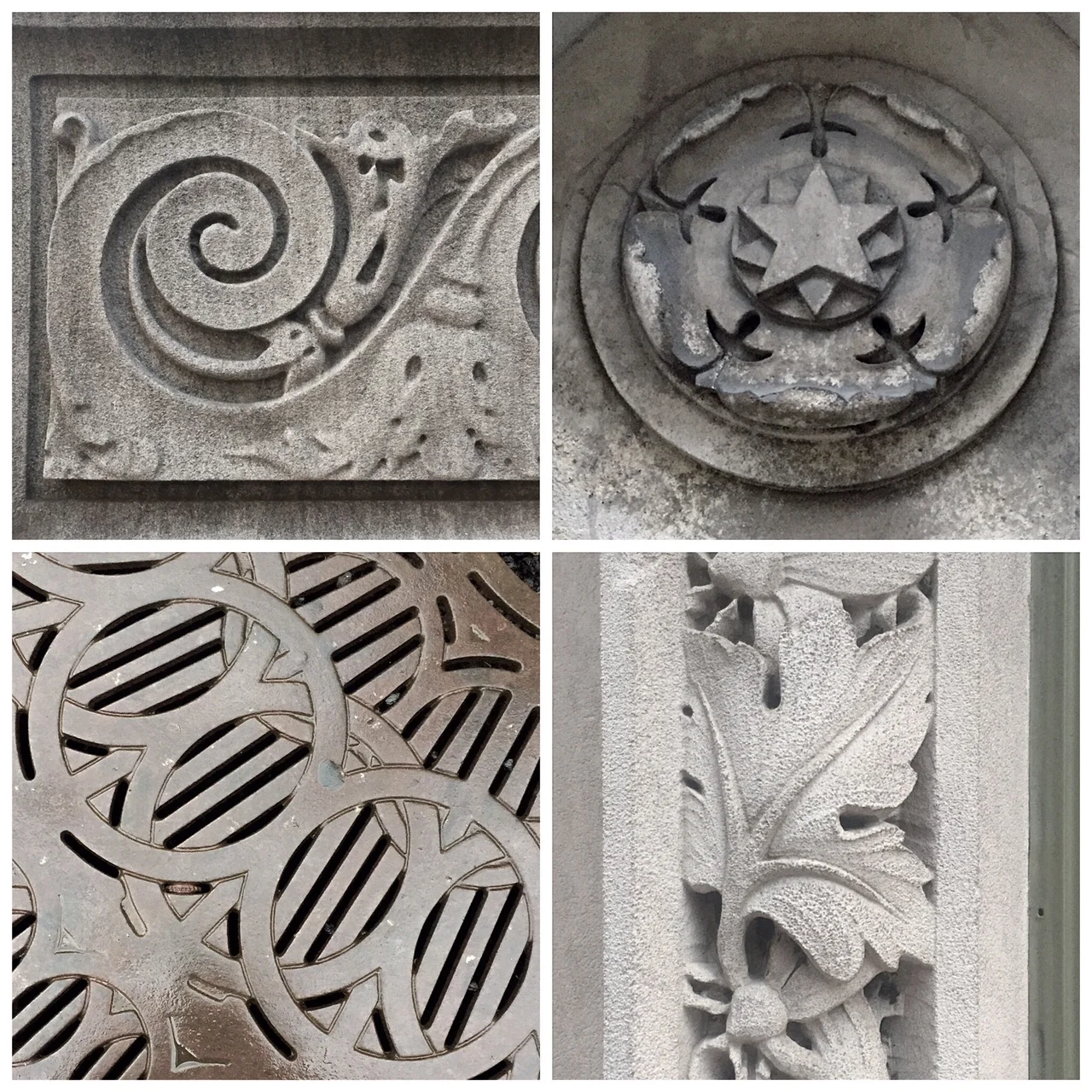
Since moving to Chicago in 1994, I've been captivated by both the ornate and the everyday architectural ornament of the city and how both are at home together, as if they recognize their disparate elements and accept that it takes all types to build a city.
I've used all types of metal ornament to create structures that represent various aspects of Chicago, the city I love, warts and all. 'Mom, why are you taking pictures of that again?!' has given way to 'Mom did you get a picture of this ornament here?'

A few images captured around the Mag Mile

A few images captured around the Mag Mile

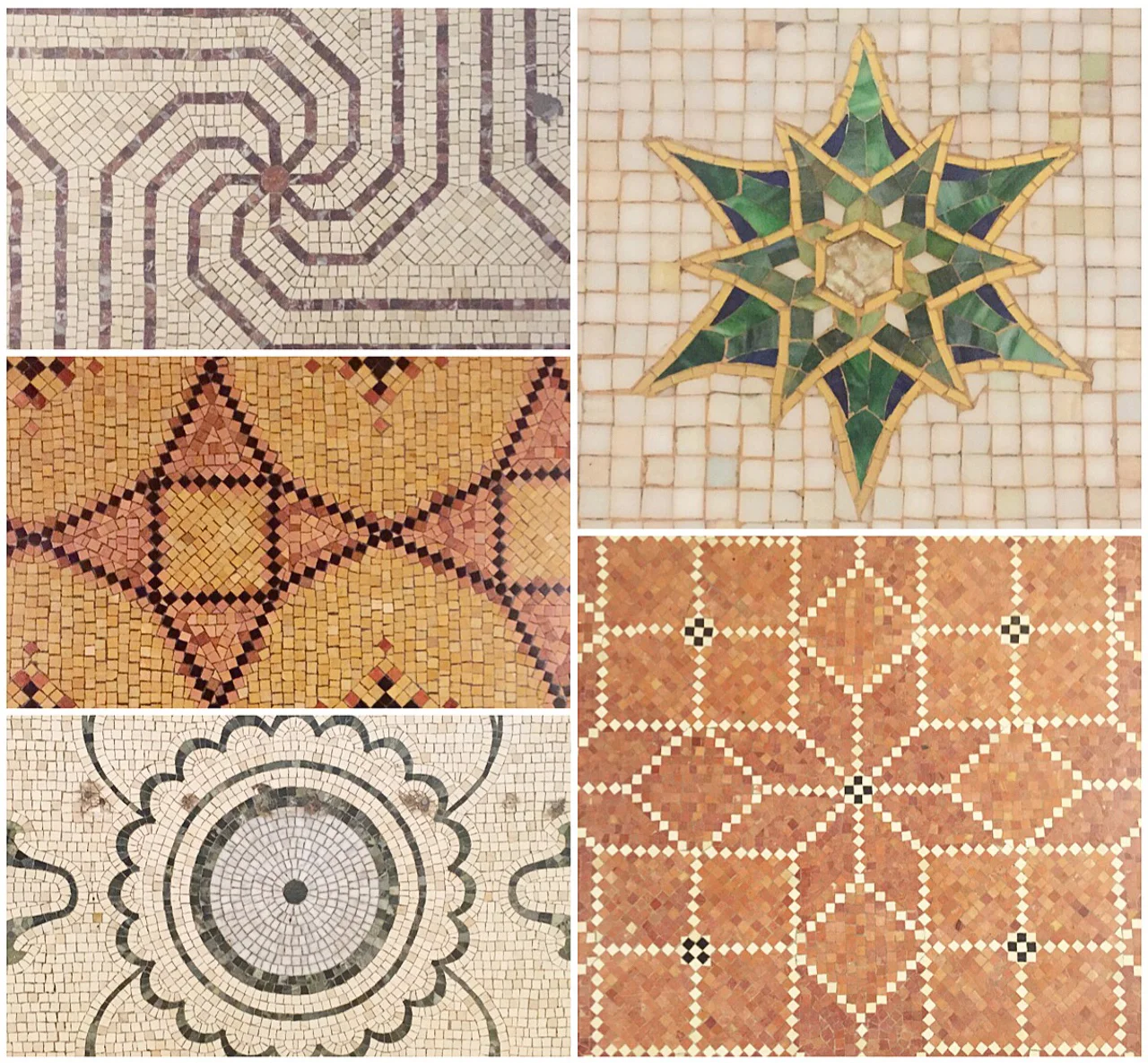
A tiny sampling of the beautiful Cultural Center

A tiny sampling of the beautiful Cultural Center

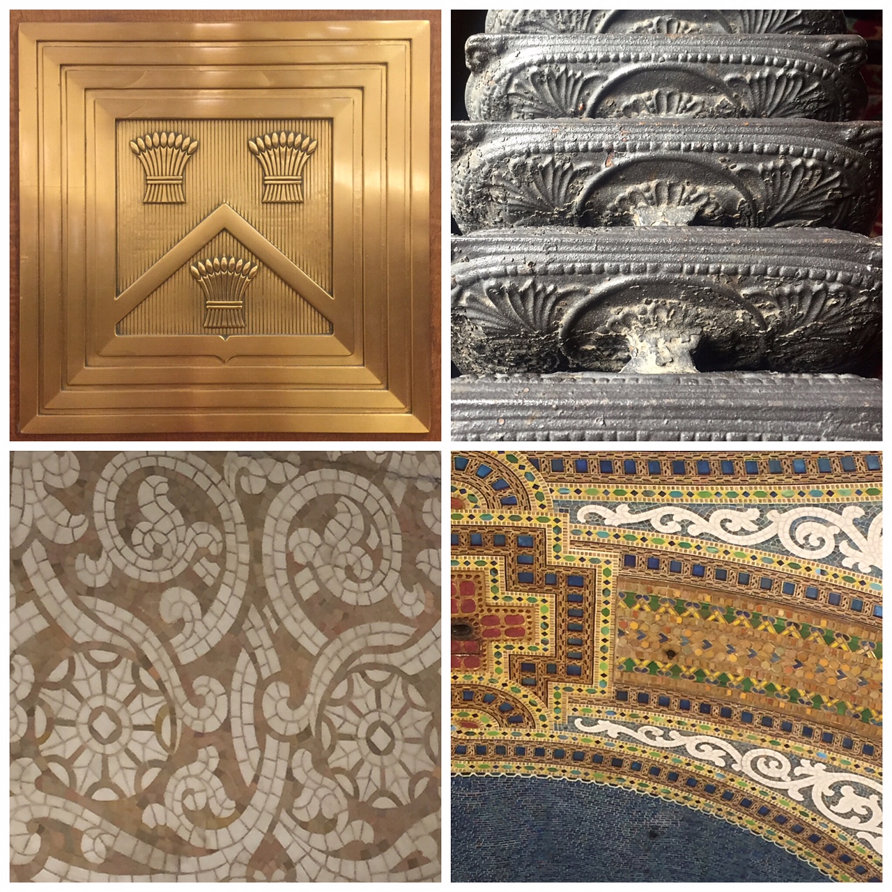
Macy's on State Street, neé Marshall Fields

Macy's on State Street, neé Marshall Fields

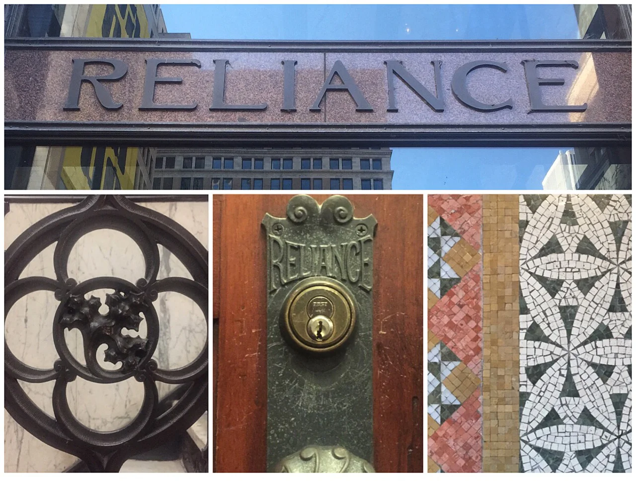
The Burnham Hotel in the former Reliance Building never disappoints

The Burnham Hotel in the former Reliance Building never disappoints

Not exactly at a loss for metal type to create buildings in the studio, I still itched to try my hand at designing ornaments entirely specific to Chicago and based on my photos. Thankfully the technology to create the matrices needed and the craft of casting are accessible today.

Jessie Reich, First Lady Typecaster in Space

I met Jessie in the Fall of 2014 and ever since then we've attempted to find the perfect collaborative project. At last, it's here! Jessie is full of firsts, from being the first graduate of the Book Arts Concentration at Wells College to being the first woman to attend and graduate from Skyline Type Foundry's Thompson Tech. She Really. Likes. Typecasting. In her words:

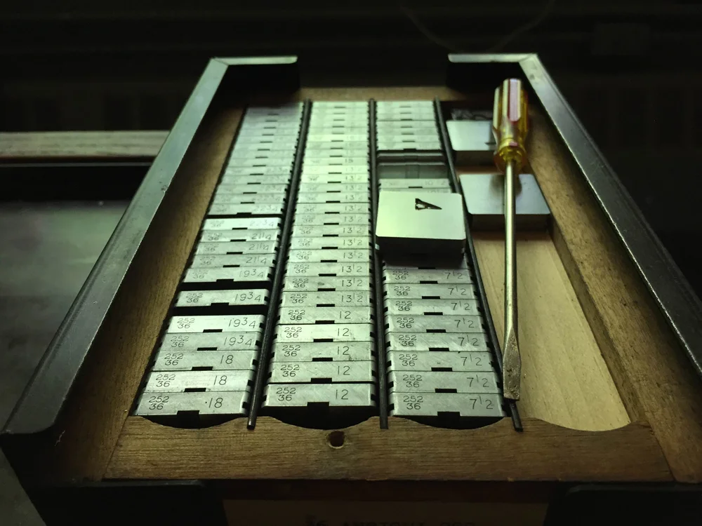
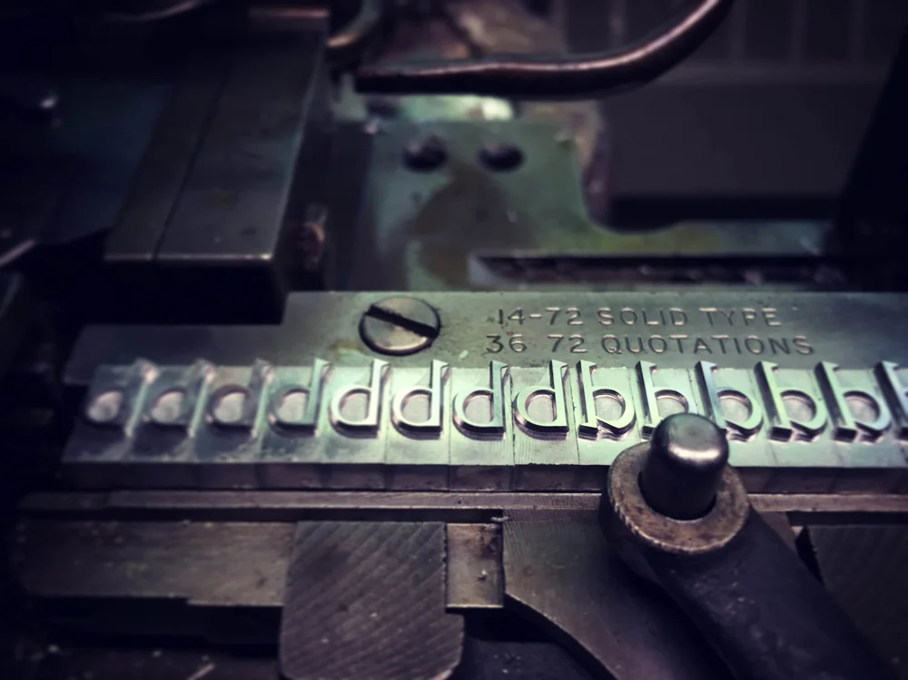
I love the grittiness and the glitz; amidst the grease and kerosene and smoke, from the freshly cast type to the mats to the machines, there is endless beauty within a working type foundry. It’s a great feeling to begin a day with an empty galley, a box of mats, a pair of tweezers, and a trusty casting machine, and end it with a sense of accomplishment supported by the production of beautiful new type, soon to be shipped off to continue the life and legacy of letterpress printing. It’s both highly satisfying and empowering work.

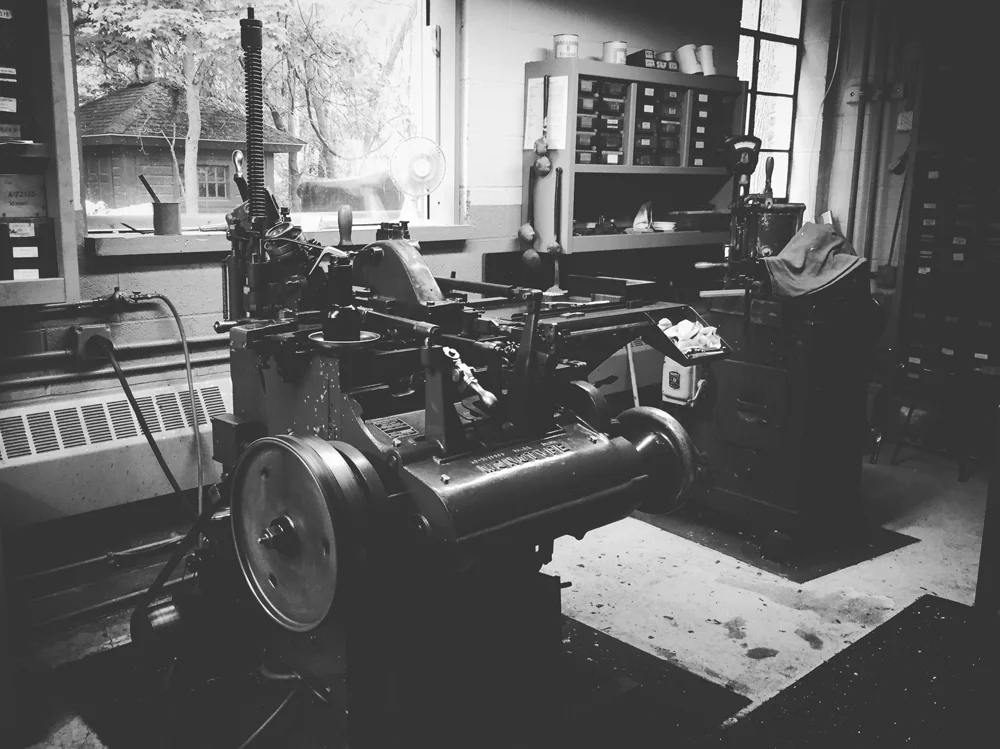
Whenever she has a free moment, you can find Jessie at the Bixler Letterfoundry in Skaneateles, New York. These are a few of her gorgeous photos that show exactly what she mentions above.

bixler2.jpg

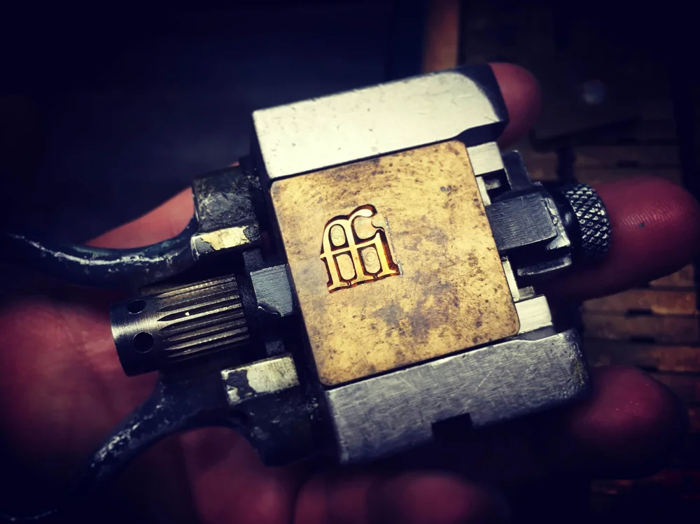
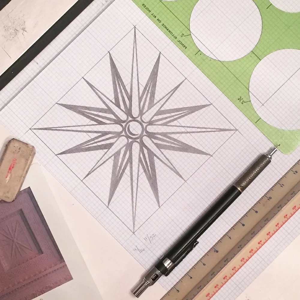
Luck brought us Ed Rayher at Swamp Press to create the precious matrices. Working to develop exactly what will provide the best result is currently where we're at with the production. Learning the nuances of a new-to-me material is a challenge I love; after sketching and re-sketching a few dozen ornaments, we've whittled it down to the top contenders.
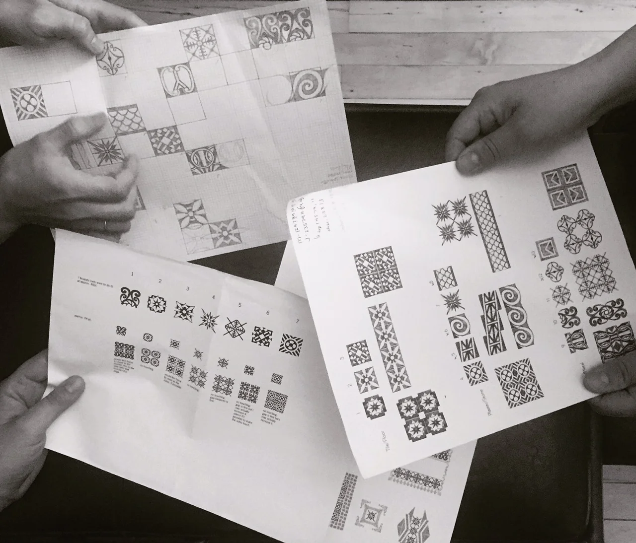
Quickly drafting these in Illustrator lost something in translation, so I've been revisiting the designs to add warmth and imperfections, the characteristics that brought me to this project in the first place. And so I am redrawing the best of the bunch to see which feel right and represent what I find to be missing from my own collection and often those of shops I've visited across the country.

Looking over various incarnations with talented design ladies

Looking over various incarnations with talented design ladies

When the correct number of ornaments is established (between 4-6), then we will work with Ed on the specifics of creating the 24-point mats for Jessie to cast. We have already begun to develop our packaging ideas and usage information, as well as deadline schedules, and will announce pre-orders on sets as soon as we are confident that all systems are go. Stay tuned.

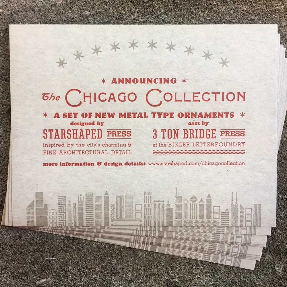
In the meantime, you can grab one of these sweet postcards from Jessie at the American Typecasting Fellowship conference this coming weekend (August 11-14th) or request one from Starshaped.

I agree with Jessie when she states 'anyone involved in contemporary letterpress printing can see that its Renaissance is in full swing; with new wood and metal type still being made, new typefaces and ornaments being designed, artists making ground-breaking work that is completely innovative yet pays homage to the tradition, and an entire community built on the grounds of a like passion and the drive to move it forward.' It's a thrill to work with another lady as enthusiastic as myself about ornament and pushing the craft of letterpress. Even if the process is centuries old, adding our stamp on it and challenging other printers to create exciting work is a worthwhile endeavor.

On My Tour of the World

San Francisco, Chicago, Vancouver, Siena, London, Two Rivers, Aurora, Prague, Vienna... The Well-Traveled Ampersand series has made one loop around the globe and is about to embark on a second. I'm using this layover to show a little more behind-the-scenes as to how each ampersand is created. While the process for building each is similar, the drastic differences in form means tweaking how the structural elements are cut and stabilized.

The first step is choosing what ampersand to tackle and why. Does it tie in well with a region or city? Was it designed by someone I admire? Will it challenge me to set type in a new way? Is the form ridiculously incredible, and will that give me the fuel to work day and night to elevate it through the use of metal ornaments?

Russell Maret cleaning up his Cancellaresca Milanese before the pattern was made.

Russell Maret cleaning up his Cancellaresca Milanese before the pattern was made.

About half of the ampersands were chosen before beginning the series. I left the remaining open so that there would be flexibility in case something surprising presented itself, and if I found contemporary collaborators to contribute. The caliber of folks jumping in to provide a character is overwhelming and inspiring.

The pattern for Wien, by Frances MacLeod.

The pattern for Wien, by Frances MacLeod.

After the pattern is sketched out, I trace it onto wood and trim it in sections with a bandsaw to fill the galley. Some of this custom made furniture, the non-printing wood supports, is sanded and refined, then double stick taped onto the galley. If needed, I run a paper strip around all seams to smooth the joins.

Cooper Black, awaiting its destiny with metal ornaments.

Cooper Black, awaiting its destiny with metal ornaments.

Then I'm off and running! I pull together research for each ampersand, examining how to represent its region or city. Are there specific structures that are recognizable? Is there an overarching ideology that encompasses the area? Does the city offer something specific that no other city has? What ornaments in the Starshaped collection will best represent this?
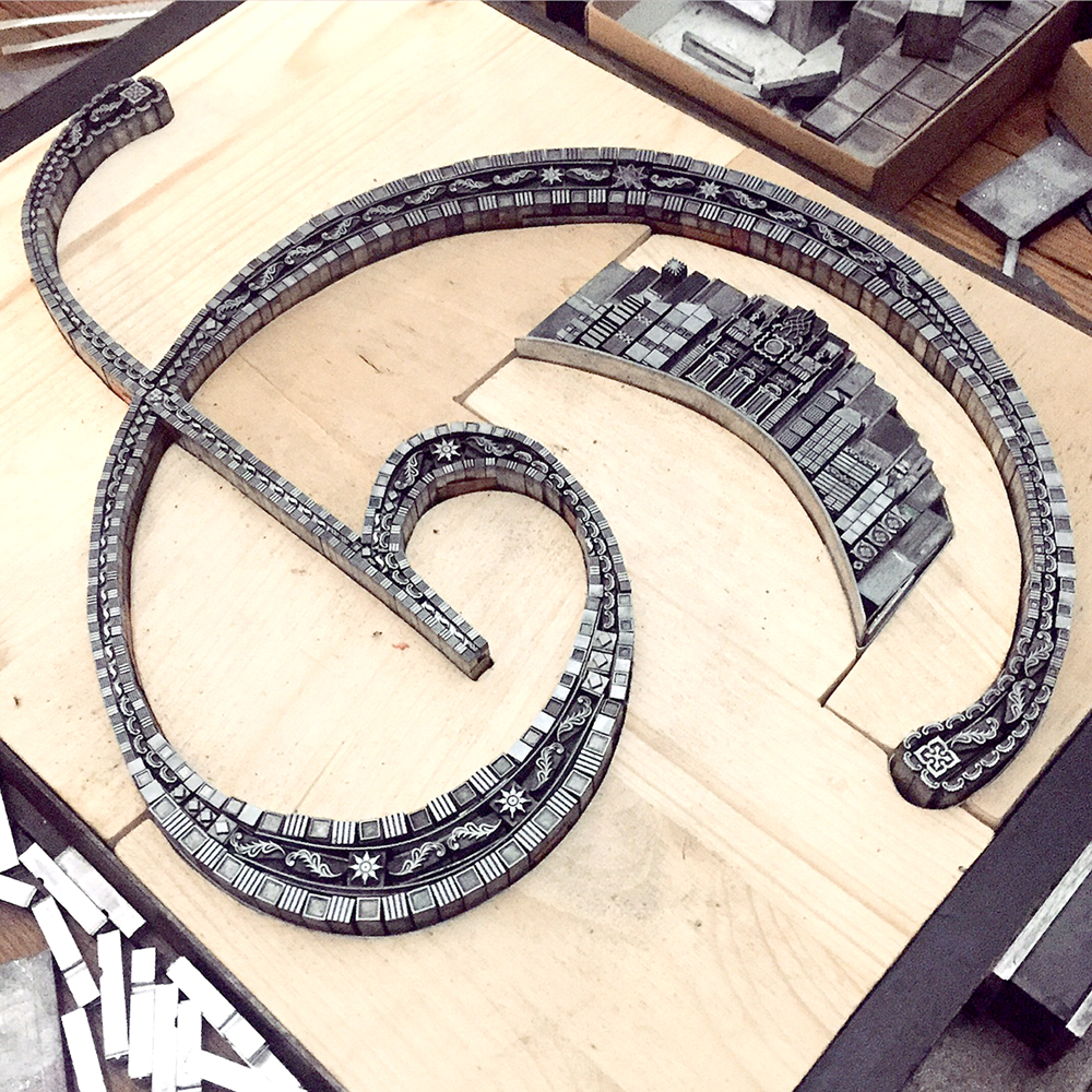
Building out the structure is a bit like Tetris-meets-Operation. Like all letterpress work, the type and ornaments must be held in place firmly to print successfully. But unlike normal typesetting, the elements of each ampersand must work around curves instead of straight lines. So while I attempt to set them solidly in place, they occasionally fall over and out come the tweezers.

Filling in Californian.

Filling in Californian.

The hardest two ampersands thus far, for entirely different reasons, have been Preissig (Prague) and Cancellaresca Milanese (Siena).
For Preissig I wanted to create a little snapshot of Prague, keeping the vantage point straight while building on an extremely angled ampersand. It took days to get it right and many, many proofs of the sky area to develop the 'magical winter night' feel I wanted.

Preissig detail with tweezers, extra sorts and an etching needle for pushing down errant spaces.

Preissig detail with tweezers, extra sorts and an etching needle for pushing down errant spaces.

Late night workspace.

Late night workspace.

Every ampersand has an entirely different form; this is probably why it is such an attractive character to both type junkies and those who couldn't tell you what 'stem' and 'counter' mean. I fell hard for Russell Maret's Cancellaresca Milanese, with it's sleek and sweeping curves. Having had the fortune to discuss it together in the studio, we considered how some aspect of Siena could be included that was outside of the form itself, given it's narrow curves.

Detail of Cancellaresca Milanese.

Detail of Cancellaresca Milanese.

The final form, with many thin copper and brass spaces along the edges to help keep the curve true.

The final form, with many thin copper and brass spaces along the edges to help keep the curve true.

Since writing this post about the first four ampersands there have been these additions to the series:

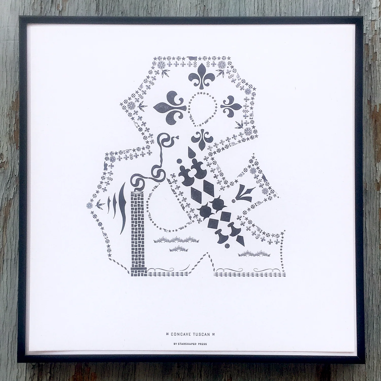
Concave Tuscan

Concave Tuscan

Concave Tuscan is a chunky nod to a well-known wood typeface and represents Two Rivers, Wisconsin, home to the Hamilton Wood Type & Printing Museum. I chose ornamentation that is popular in both wood and metal form and used wood type from Hamilton as well as Virgin Wood Type and Moore Wood Type to recognize today's practitioners of the craft.

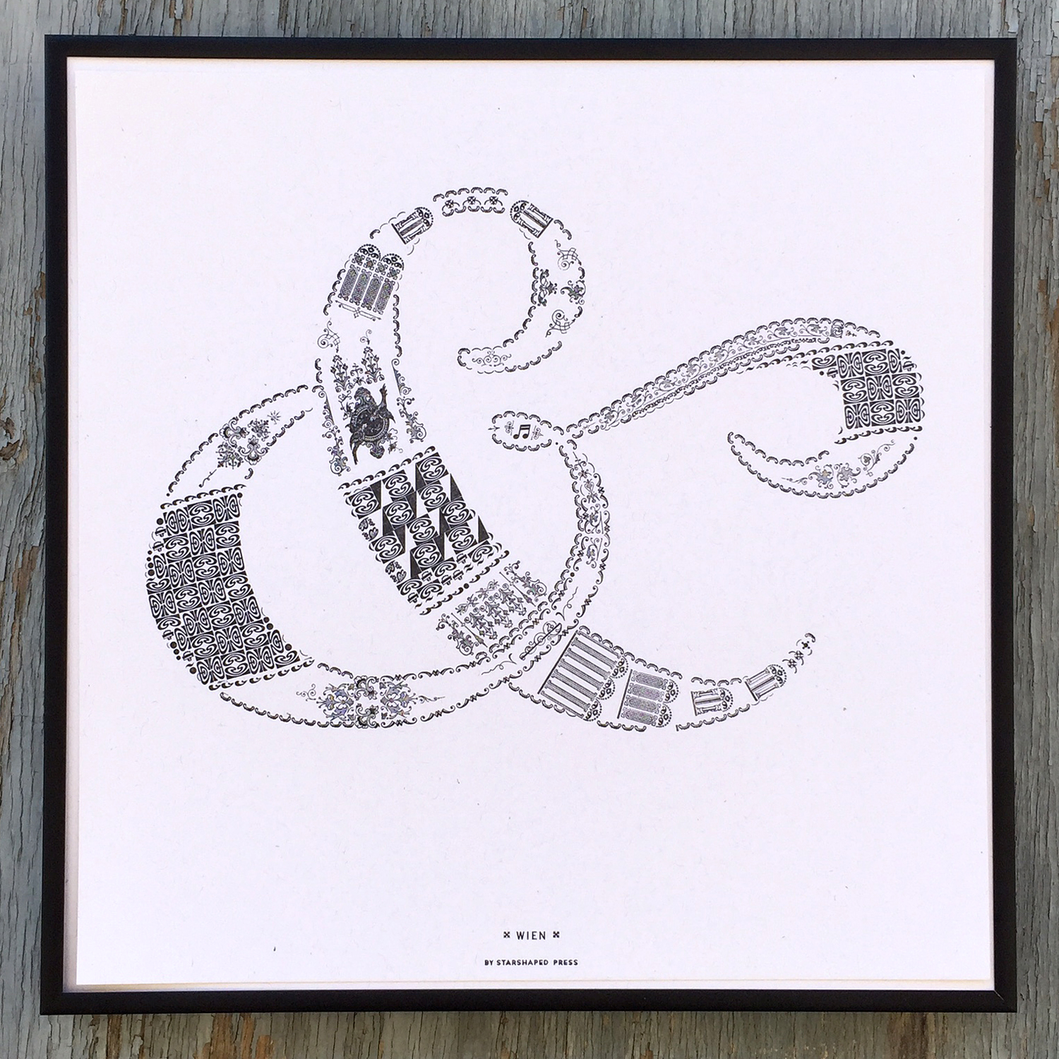
Wien, by Frances MacLeod, pulls in architectural styles for which Vienna is known, including Romanesque, Baroque and Workstatte.

Wien

Wien

The most recent ampersand is Totemic by Jim Rimmer. It features bold, graphic elements indicative of the totem poles of Vancouver and was downright fun to piece together.

Totemic

Totemic

I've selected some glorious additions to the series to be printed over the coming months. While some are historical by designers no longer with us (Adrian Frutiger and Dard Hunter are on deck), a few are brand new, never-before-seen characters by women I am so pleased to have on board. Jenna Blazevich will be creating an ampersand based on her upcoming design intensive in Rome while Nadine Nakanishi, one half of Sonnenzimmer, those international design world game changers, will no doubt be drawing something unlike all ampersands ever known.

Limited sets of the entire portfolio are available at the presale price through the end of June. Individual prints are also for sale as the ampersands are created. The portfolio includes a digitally printed 12" colophon with photos of all of the type forms. All are housed in a printed sleeve.
Show a little love for the 27th letter, like my Spanish sister-in-type Eva of Familia Plomez, who came to visit this Fall.

For Those in Peril

As the salt water gushes into our ship’s holes,
Don’t you dare jump without me
I’m no good on my own.

'The Wreck' · Frightened Rabbit

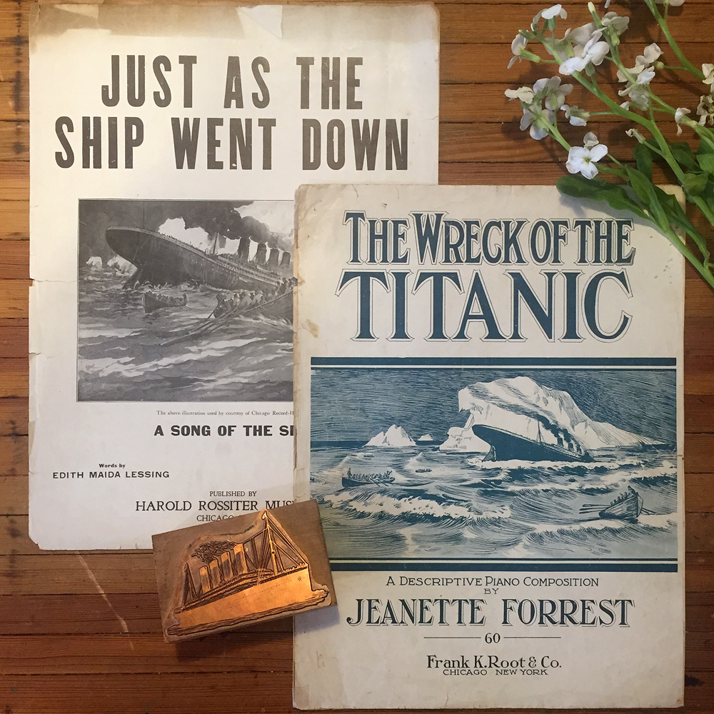
On this night in 1912, Mother Nature took the life of the Titanic in a death scene that lasted less than three hours. Like so many, this story captivates me and is subject to prints like this:

What hold does this have on my psyche? Two reasons come to mind. The first is my fear of water and the claustrophobic feeling I encounter when up to my neck in it. This mistrust led to successfully enjoying the last 20 years sans bathing suit, a record broken at the insistence of my 9-year-old mermaid.
The second is the loss of this floating monument to Craft that took countless skilled hands three years to build. I wonder if the plasterers, the carpenters, the riveters, the woodworkers mourned not only the loss of life that day but the loss of what may have been the finest work of their hands. It reminds me that all craft is ephemeral and part of a bigger story, not the story. I create and let the creations go, to soar or fall flat, and I am grown up enough accept both scenarios.

by Arsenal Handicraft... a favorite print, acquired at a very low point in 2015.

by Arsenal Handicraft... a favorite print, acquired at a very low point in 2015.

On the other hand, a friend moving to Nashville lamented the loss of feeling grounded, of not having a large body of water nearby. Water reminds us exactly how small and inconsequential we probably are. We celebrate this humble moment the last day before school starts in September every year, heading to Lake Michigan at sunrise with friends to give our city kids their last taste of the beach.

Everything I love is on the table.
Everything I love is out to sea.

'Don't Swallow the Cap' · The National

These days our house is swimming in a rainbow of drugs as Mr. Starshaped navigates cancerous waters. Got nausea? There's a drug for that! Got anxiety? There's a drug for that! Got pain? Lots of drugs for that! Got a rare fibroblastic reticulum cell sarcoma the docs only see every 4-5 years? Sorry. You're F'd.
My cheap and easy drug of choice is music that enhances the therapeutic studio hours. And I am apparently not the only one to use it as such:

In the studio I find every drug I need. Focus issues? Debussy's Preludes. Exorcise demons? Daughter. Unrequited passion for Mr. Starshaped? Puccini (mostly the 3rd act of Tosca). Every other emotion? Ida.

Oh, this water is making my death
Every season stealing my man from my bed
And if this winter should carry him through to the next
All I can offer is yours to take

'This Water' · Ida

As a stagehand his entire adult life, Mr. S's craft is quite literally an entertaining one. I have watched him explain to Jo the principles of automation, hydraulics, rigging and conductor cameras. But she sees father-as-magician: 'Daddy made it snow!' 'Daddy made the stairs appear in the wall!' 'Daddy made the furniture move with no one touching it!'
On Christmas Eve, 2015, we watched Gotta Dance from the front of house, the only seat available to Mr. S this time around, due to the deleterious effects of cancer on his ability to work. Rounding out Jerry Mitchell's trifecta of populist musicals, (Mr. S worked the first two), we laughed through it until Mae, an elderly woman losing her husband to Alzheimer's, sings The Waters Rise. It was then I realized the fear of losing my husband was the same as my fear of drowning. Was Jo oblivious, parked in between us? No. The second time she and I saw the show she anticipated the song, looked to me and reached for my hand. At that moment she understood metaphor while I understood we'd keep each other afloat.

Let the water rise,
Let the ground crack.
Come out, come out, to the sea my love...
and just... drown with me...

'Shallow' · Daughter
'A song about the Last Day' explained Elena at the February 2016 Chicago show

This is the wave of grief that came after learning our experiments with chemo had come to an end. It resolutely failed in every way. The daily dichotomy of vibrantly pushing past memories to the forefront while not knowing what's actually on the road ahead, especially given the lack of signage, is a dance we perform.
Seeing Mr. S in pain and helpless to do anything about it? Another all-consuming wave.

The musical b-roll in my brain put this on constant replay:

When I hear you saying
That we stood no chance
I'll dive for your memory
We stood that chance

'Dive for your Memory' · The Go-Betweens

I can't think of anything worse than actually, not metaphorically, diving into something over my head. But if there was a cure for Mr. S on the other end of that dive, like when those kids on The Twilight Zone dive into the pool through a metaphysical hole that leads them to a happy place without horrid, bickering parents, then I'd do it.
But there isn't, so I bend my metal rules to do what they don't want to do, because it's the only thing I can control.

All together, the forms became this.

We sought another expert opinion this week but the second verse was the same as the first. I carved, carved away at this linoleum, wishing I could cut out the malignancies creeping through Mr. S's chest. My hands guide me through uncharted waters, laying down new, coping graphs, and when they are distracted this way, my eyes forget to cry for a while.

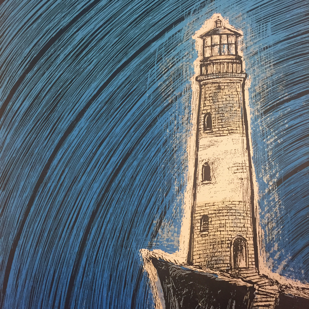
Together these elements formed a print in serious blues on muted gray cotton paper that absorbs the waves. It reminds me to practice diving, to make sure I return to the surface with poignant, silly or sublime memories and the best day's work, the common ground the three of us share.

I thank The Go-Betweens for their words that gave this print legs and the ornaments that played along. When I sit in my 'crying spot' on the studio floor, the vantage point is of the vast ornament collection, and I yield to their siren call. Tears released and then shut off, I reach my hands up and outward and towards their little metal bodies and the typesetting therapy session begins.
Can I make peace with water? With the metaphor? Yes, because of my village of friends that give me a sense of place:

Close up of 'This Must Be The Place' by Dan Grzeca

Close up of 'This Must Be The Place' by Dan Grzeca

I will continue to make things, then sell the things, and if no one wants the things and they all end up at the bottom of Lake Michigan, I am fine with that. I inherently understand the ephemeral, our place in the world and that we've already built everything we truly need.

Oh, hear us when we cry to Thee,
For those in peril on the sea!

'Eternal Father, Strong to Save'

'Dive for your Memory' was printed in an edition of 75, which is available here. And thanks for thinking it doesn't belong at the bottom of the lake.


Of course there's a playlist to accompany this post. It's available here. Note choice of Irish Guards cover of 'Eternal Father' as a nod to the Irish hands that built the Titanic. Bonus point for anyone guessing my superimposed, though historic, link between 'California' and the ship.