Every year we look forward to the annual Hamilton Wood Type & Printing Museum Wayzgoose, which attracts type nerds (i.e., all of our best friends) from around the world. And while the 'Goose usually only lasts about 3 days, this year, for us, it stretched to a week and spanned the distance between Two Rivers, Wisconsin and Chicago, Illinois.
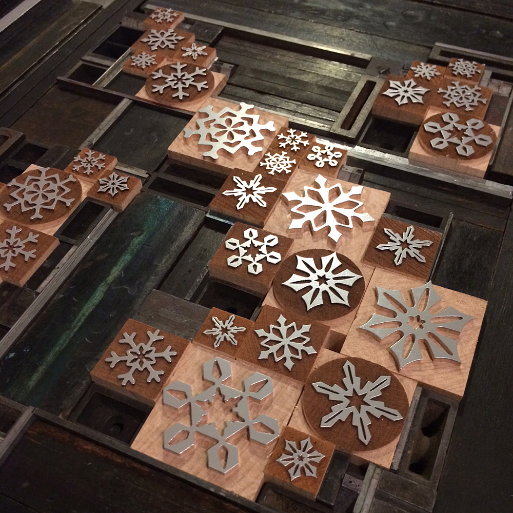
A few days prior to heading north, Jo and I set up and printed our pieces for the print swap (more on that later). I was thrilled to work with Moore Wood Type to design a series of snowflakes to be both laser and pantograph cut. Having just received my batch to print with, and knowing that Scott planned to take them to Hamilton to share, I put together this poster to showcase how fantastically well they look and print together. They'll be available for sale soon.

 While I played around with snowflakes, Jo went straight for the stars and put together this great little number:
[wpvideo oytXOAai]
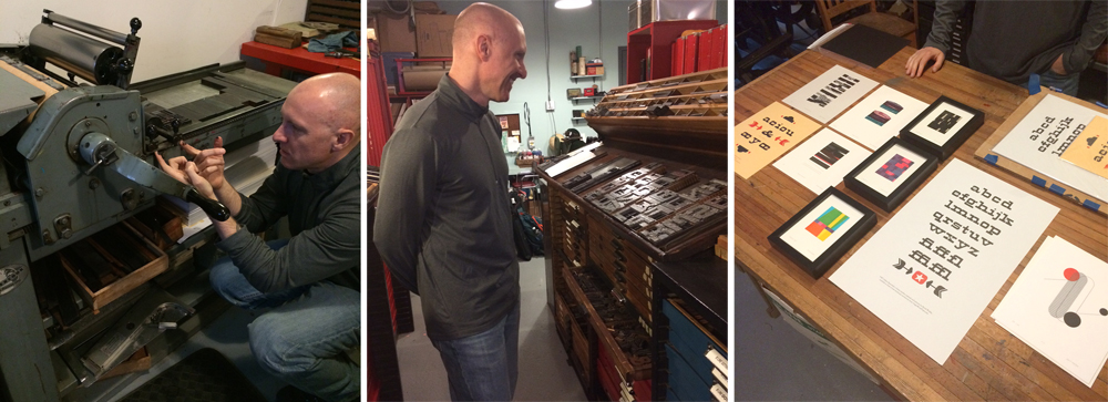
It was such a treat to have longtime friend and printer David Wolske swing by on Wednesday. I put him to work, we shared some laughs and I got a sneak peek of what he'd be presenting at Hamilton. His work is stunning in its thoughtfulness, exploration and expert technique.
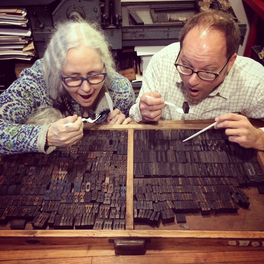
 Thursday we welcomed Geri and Matt of Virgin Wood Type. Obviously, we had some fun. These folks eat wood type for lunch, so I took them out for pizza before it got ugly. Matt wrote a great post about the 'Goose that you can read here.
 Friday we hit the airport to pick up this guy and head up to Trivers.

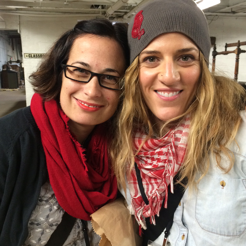
Once we made it to Hamilton, Jo immediately sought out her besties, Chelsea and Laura, who made her a very special badge this year, the only one with fancy hand lettering.

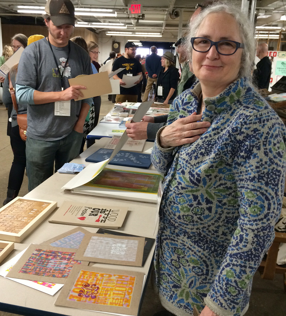
New this year is a wall featuring a mashup of Hamilton-related prints from just about everyone. Jo even found her Turtles print from the June 2014 APA Wayzgoose.


To keep a 7-year-old going all weekend I gave Jo my digital camera and unleashed her on the museum. She had a blast documenting everything and took dozens of charmingly blurry photos.


Also new this year is the substantial type wall which proved to be extremely photogenic (it's like they planned it).

I joined Erin Beckloff, mover and shaker extraordinaire as well as daughter to Scott Moore, in taking some great shots of David Shields and Rich. Wonder what their photos look like.

Later in the evening we heard from the chiefs: Stephanie, Jim and Bill. These three, along with a slew of eager volunteers really knocked it out of the park this year. Screens! Lighting! Backdrops! Sound! All pro.

Their intro was followed by Charles S. Anderson. If you've ever ordered paper from French Paper or pretty much just lived in the world, you're familiar with the work of CSA, so there's not much I can add!
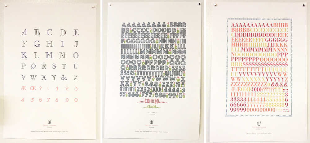
After the image overload, I got a moment with Nick Sherman to check out the new book published by Tipoteca Italiana about their incredible collection of wood type. Needless to say, one of these came home with me.
 Saturday's schedule was too packed to see and experience everything. I sat in on David's formal presentation to get a chance to see his lovely work again.

Following that was a rousing discussion by Clint Harvey of Design College Australia and The Bacon Factory in Brisbane, Australia. They're doing amazing work to collect and preserve letterpress equipment Down Under, as well as present it to the next generation of designers.

Clint brought a number of sample prints featuring Australian slang. Then he challenged everyone to decipher them and write their ideas directly on the prints. Did anyone get them right, CH?

Meanwhile, Jo stationed herself with our Isle of Printing buddies from Pie Town (some people call it Nashville) and their Our Town portrait project. Throughout the weekend folks could sit down at a mirror and use clever stamps to create their own likeness which is then documented.

Jo's Cindy Sherman-esque self portrait.

After an evening banquet of chicken and milk (if you were there, you know), we headed back to the museum for a presentation from Tipoteca about the creation of their museum and the collection it houses. Let's just say we were all convinced to spend some time on the prosecco farm that serves as guest quarters for visitors to the museum. More of their incredible type porn below.
The last event of the evening (given that this is the censored version of the weekend's activities), is the annual type quiz hosted by Nick and David. This year, with the addition of the Hamilton Smokestack costume, a volunteer was needed. Guess who jumped in? Jo stood on a chair for an hour and pointed out those that raised their hands to answer the somewhat dubious questions in order to win typographic prizes.
 Sunday morning brought an impressive display and discussion of artistic watermarks from Greg Walters (is there anything he doesn't collect!?), as well as the entertaining giveaway of door prizes by Dave Peat. But by far, the most popular event is the print swap. So much good work to share with everyone.
 Here's Geri of Virgin Wood Type with her beautiful layered wood type prints, as well as the newest typeface set out to tease. Thanks to Virgin, wood type can be everyone's passion. Looking on is Jason, otherwise known as Genghis Kern, or #thebeerisforscale in social media circles.
 Jo signed just a few of her prints and took them around to share.
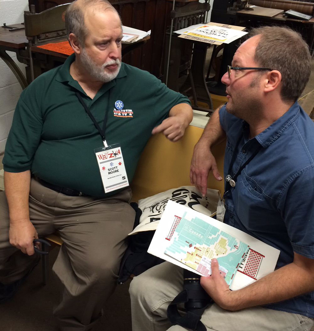
 Meeting of the wood type minds! Scott and Matt, all business. What secret wood type schemes are they hatching?
 Erin's print this year was so lovely. Look what you can do with her dad's beautiful type! And she made me promise to show this photo and not the one of her getting into the whiskey. Like I mentioned, this is a G-rated blog.
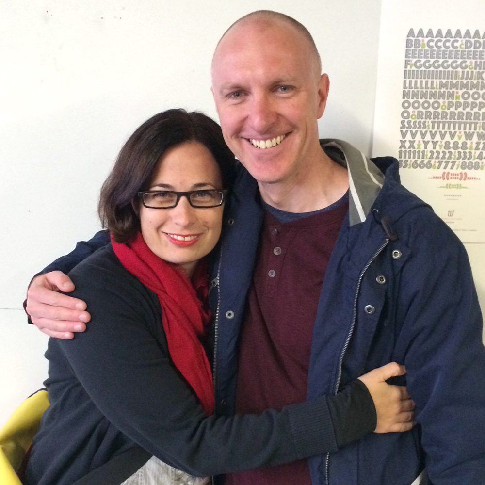
 I took the opportunity to grab a few shots with others wandering around. Selfie with the Morans!
 With David. So love this guy.
 And this lady! Mary is the killingest lady printer I know. New York attitude with a midwestern accent.
 Jessica Spring... not content to push the boundaries of daredevil printing, she's now offering Daredevil Furniture for letterpress printers, meaning we can all create fantastically nutty lockups. A lady after my own heart, and the only one to make Hobo look brilliant.
 Jo got a lesson in sign painting from the incomparable John Downer, who is responsible for the sign on the front of the building. What a treat for mom and daughter, as well as everyone that looked on.
[wpvideo E5TX3MNg]
 As promised, here's Silvio from Tipoteca signing my new book. Many of their stunning prints were on display. Are you ready for the type porn?


 It's always sad to leave on Sunday, knowing that it might be another year before we see a lot of the people that make this trip so special.

Before checking out we got a stamp on our Letterpress Trail map.

But this year was different! Because of Chicago's central location, a number of printers were still around to explore the city or have a little downtime before jetting off home. So Monday welcomed the Aussies, Clint and Tahlia, into the studio. Here's CH groveling at my feet! 
Along with Clint and Tahlia, Michael from Clawhammer Press also came for a visit, securing his status as Friend by bringing really nice coffee. We talked letterpress for quite a while before I caught them escaping with type!

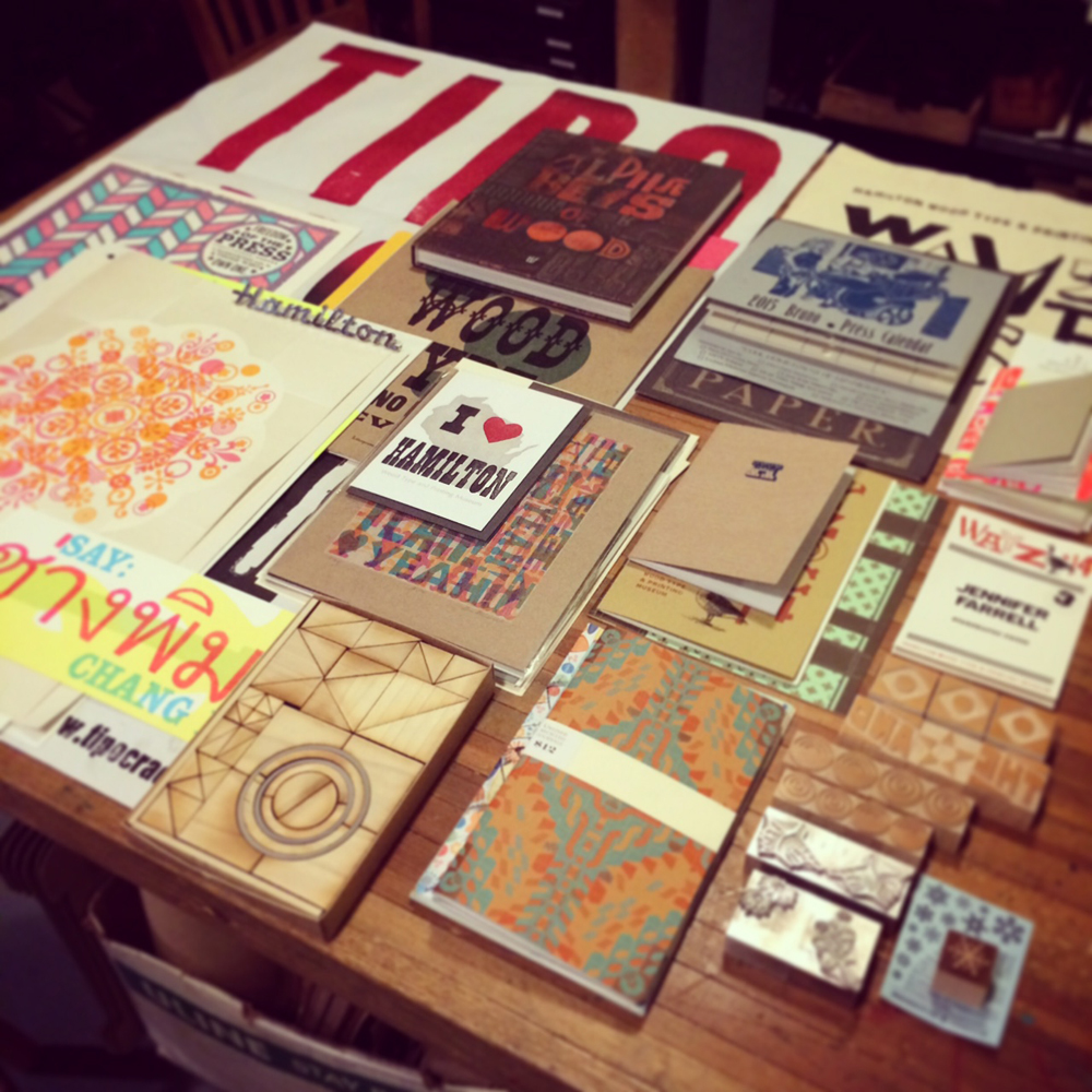
 Later that evening I was able to organize the swag from Hamilton that Jo and I collected. Talented folks.
 Tuesday night, Rebecca of Rar Rar Press hosted a printer dinner and made stew for everyone. What an incredible group, and no one had to feel bad about talking type and presses all night. It's the one kind of party where print-themed alcohol shares a place on the table with actual type. And Rebecca's apartment is a veritable museum of letterpress awesomeness.
 Unbelievably, I convinced new friend Jessie Reich of Punky Press to stay all day Wednesday and work in the studio. Huzzah! She set one of our cityscapes for a series of cards and learned how the platen presses function. We swapped stories, metal & wood type and fist bumps. Here's to all of our new and old friends that made the 'Goose (as well as the before and after gatherings) so memorable this year. See ya in 2015. Hopefully before.


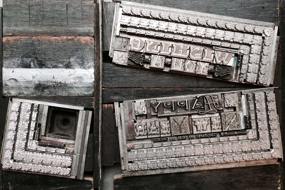
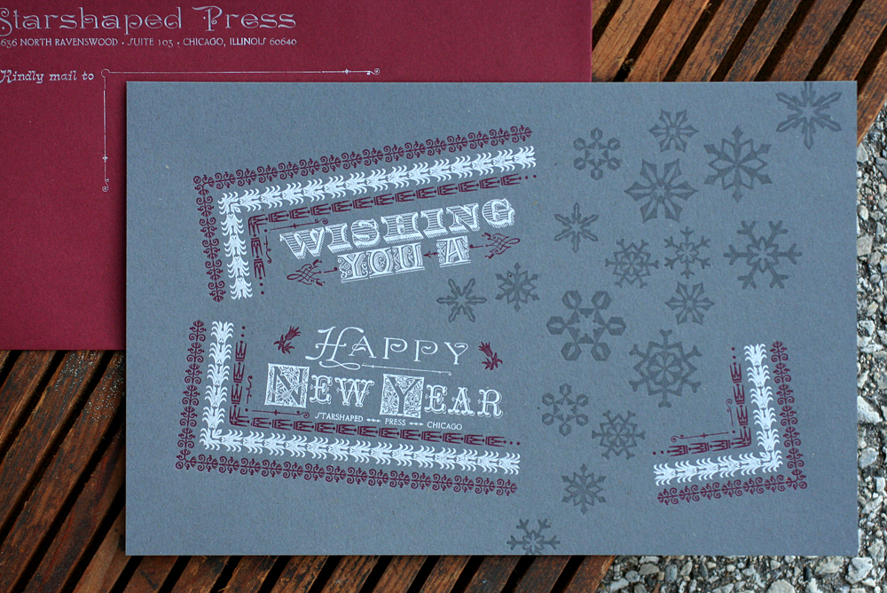 The idea was to take a standard rectangular form and make it appear as if the snowflakes were swooping in to break it apart. Below is a reversed image (so it's easy to read) of the main sections of the type form before separating them.
 How about a typographic rundown? 'Wishing' is a new cast of Ray Shade by Hill & Dale Type Foundry in West Virginia. 'You A' and 'ew ear' are Latin Ornate and Tuscan Graille, both from Skyline Type Foundry. 'Starshaped Press Chicago' is 6pt Camelot and the N and Y initial caps have yet to be identified. 'Happy' is a mortised initial cap with Dakota. The three main borders are from Bixler Letterfoundry, courtesy of Punky Press, coupled with tiny bits and pieces from our collection.
 Here you can see the angled furniture that holds the sections in place and keeps them flush with the rest of the form.
 I first pulled a few proofs on the actual paper with the entire form to set up placement and look for any wacky spacing issues. After that was established, I took out all of the second color, leaving just the sections to be printed in burgundy. I marked the spacing with a sharpie so I would remember what I added in place of the type that was there.
 The burgundy read well on Wrought Iron, dark gray stock from Neenah's Environment line. It matched the Paver Red envelopes from French Paper. Printing dark inks on dark papers can always be a bit of a crap shoot but this worked well. Silver is a no-brainer. The registration is pretty tight, and given the angles in play here, that's impressive.
 Next up were the snowflakes. I trimmed most of mine to be as close to the edge of the design as possible so that they could almost sit on top of each other.
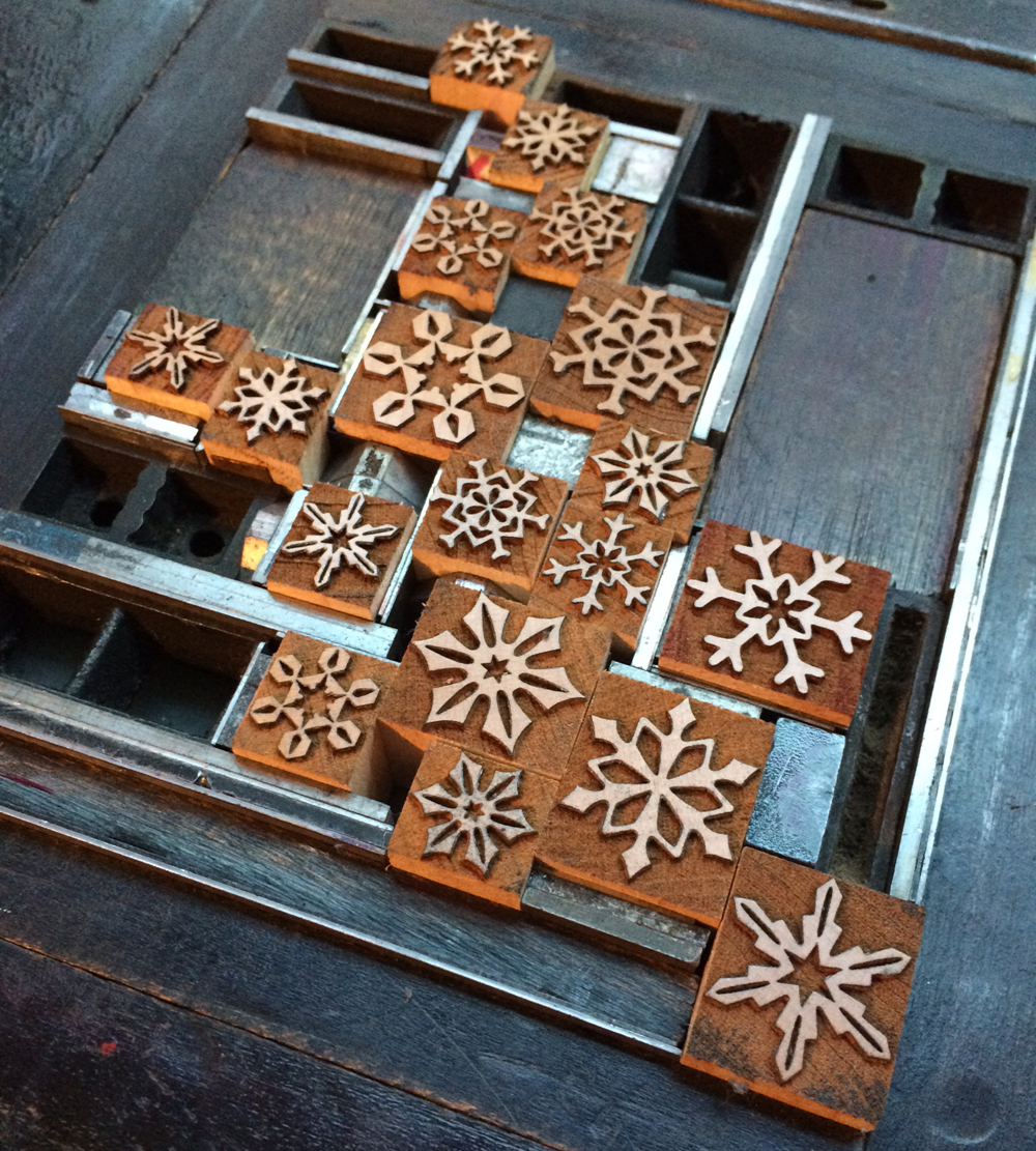 Figuring out what ink they'd be printed in was more challenging. My first thought was opaque white so I could test how this would perform on the gray paper. But the white competed with the silver and the type receded, which was definitely not desirable. So I tried transparent white as well as variations on this with differing degrees of silver and black mixed in. The final was a combination of all of these.
 While the snowflakes were set up on press, I used them to print the front of the envelopes as well, where they appear a little darker on burgundy stock. The silver on these is particularly striking. More great initial caps.
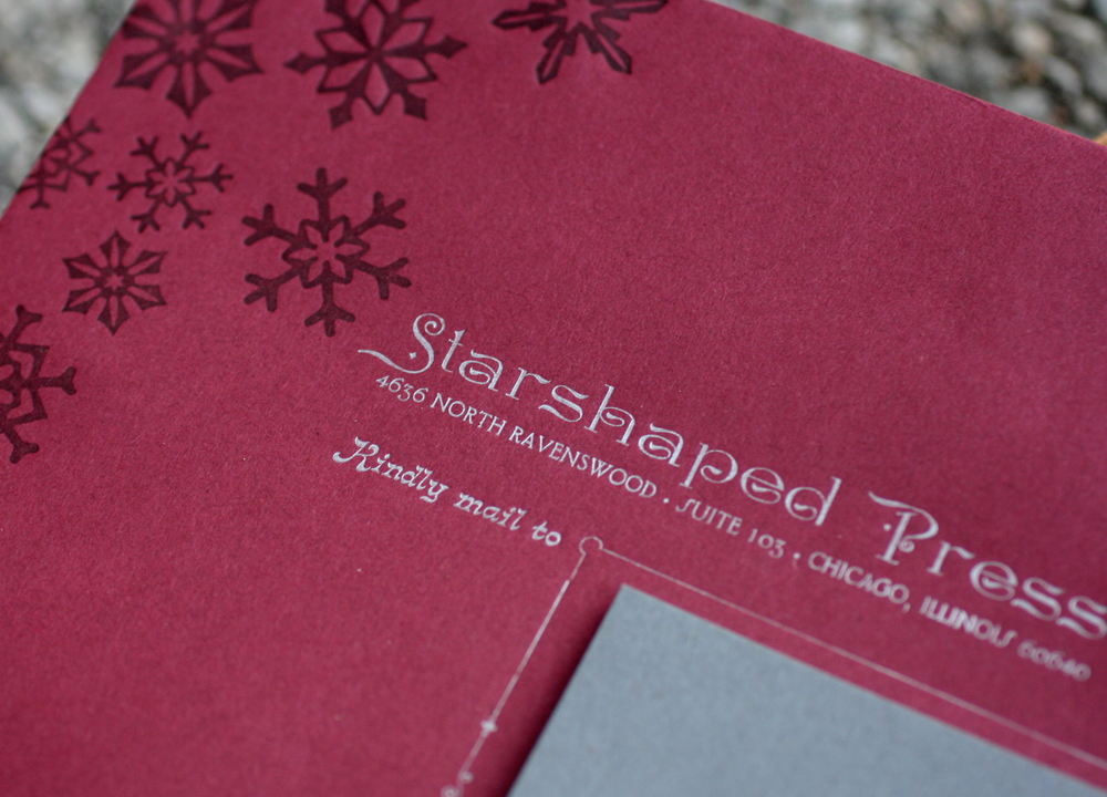 I was very pleased with how the cards turned out, as they hit all of my bases for typography as well as great paper and ink combinations. The challenges of setting this form were also very pleasing and it's great to see both old and new type functioning on a heightened level. One of the plans for the studio this year is to really highlight some of the gems of the Starshaped collection and use them in similar ways to how they would have been used 100 years ago, but with (hopefully) a modern breath of fresh air.
