Small but Mighty

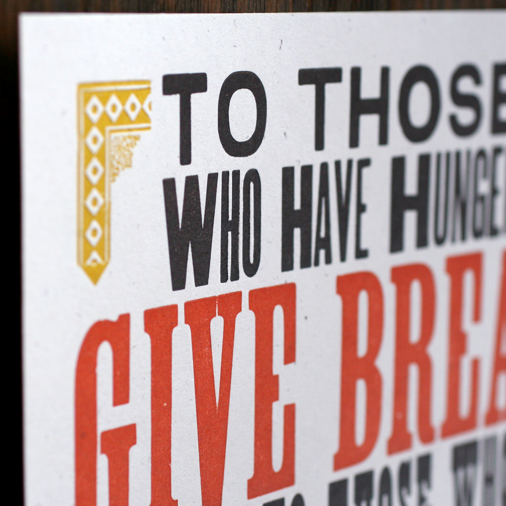
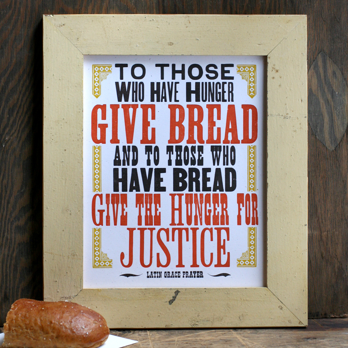
There are many great experiences that come hand in hand with participating in an awesome craft show like Show of Hands or the Renegade Craft Fair. One of my favorites is the opportunity to talk directly with shoppers and get instant feedback on the work created in the studio. One of the most common requests we get is for smaller sizes of our most popular large posters (and occasionally large versions of our small prints). This is for myriad reasons that include limited wall space and a cheaper price point. There were a few prints that I wanted to shrink, while focusing on our more socially relevant pieces, starting with the popular Give Bread print. The original is 14x18", and the new one is 8x10" and easy to frame. This series is printed on a 100% recycled white card stock for consistency between the prints.
Tgivebread2

givebreadsmall3

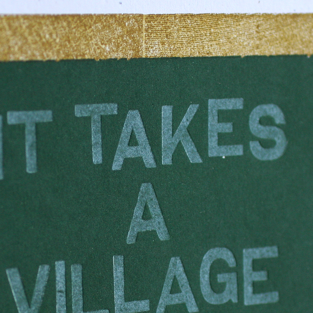
givebreadsmall1The second print is a tinier take on our It Takes A Village print. You can read about the original one here. I've discovered that this is a very popular print for teacher gifts, but we are always asked for a smaller, more convenient size.

TittakessmallI love the various techniques in this print. It's set up to look like a chalkboard, with wood type and linoleum blocks to create the frame. The green is a linoleum block that's very heavily printed so that the opaque white type shows up similarly to chalk on top of it.

takesavillage3

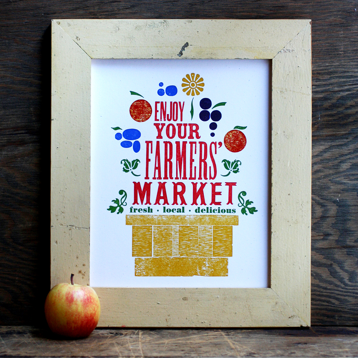
takesavillage1The trickiest of the three prints is a recreation of Enjoy Your Farmers Market, which was originally printed in 7 colors and is sold out (another reason to tackle this one!). This time, it's reduced to 4 colors and an abridged collection of typographic 'fruits'.
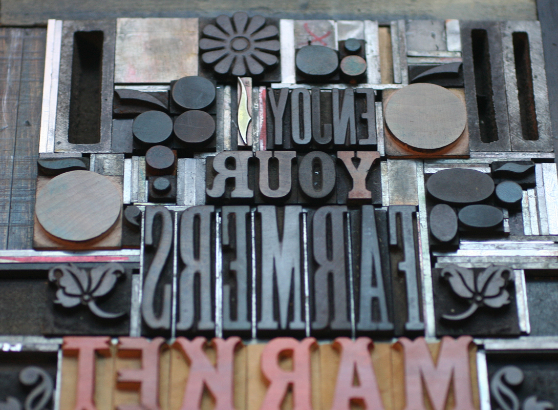
Tfarmersmarketsmall2After pulling out the type that seemed appropriate, I did a quick carbon proof on press to see how all of the pieces would work together, and to figure out which type would be which color. Not pretty, but enough to go on!

carbonproofThis is how it broke down to mustard, red, blue and green. There's a bit of overprinting as well to create new colors.

farmersmarket3

farmersmarket5

And while we're on the subject of reducing prints, last year I created both mini prints and cards of our best selling posters. I didn't want to print them with another means such as digital, offset or screenprinting, so that they'd be exact replicas of their larger siblings. Instead, I sought the challenge of building them entirely with our tiniest type and ornaments. The first set of prints and cards measure 3.5x5".

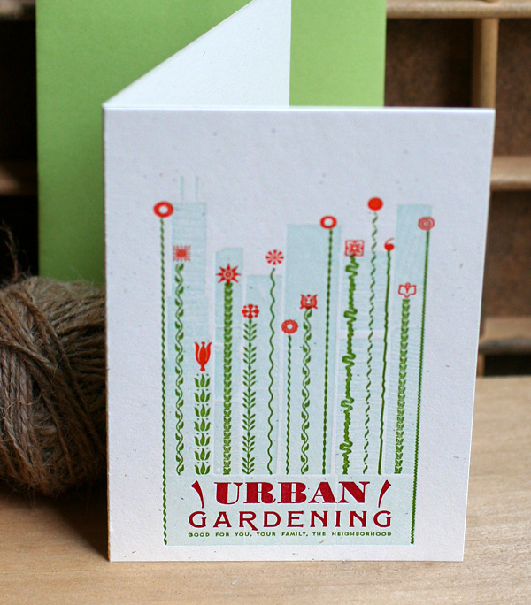
Our Urban Gardening poster has been one of the biggest sellers for the studio for years, and was first choice to be shrunk down to this (note that tiny 4 point type at the bottom!):
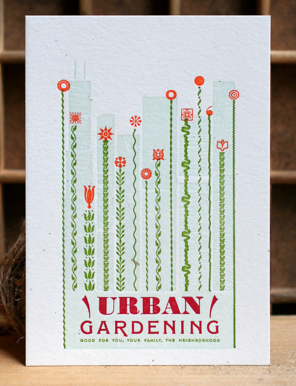
murbangardening1Skylines are a familiar subject matter in the studio and this one is no exception. It is created from the back sides of wood type and two little 'l's.

Turbangardening5 copy

urbangardening2

The greenery is mostly created with lino slugs, or ornamental rules cast on a linotype. The little orange 'flowers' need to be spaced accordingly to line up with the green print.

murbangardening3

Turbangardening4 copy

Turbangardening1 copy

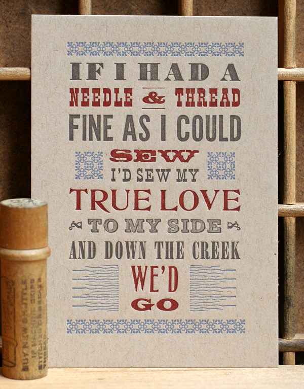
Another popular print in the studio is Jubilee, which pulls song lyrics from the charming old timey song. This mini print presented a lot of challenges in maintaining the same typographic feel as the poster, given that wood and metal type styles have historically been a bit far apart. But I found a few in our collection that fit the bill!

Tjubilee1 copy

mjubilee1

jubilee2

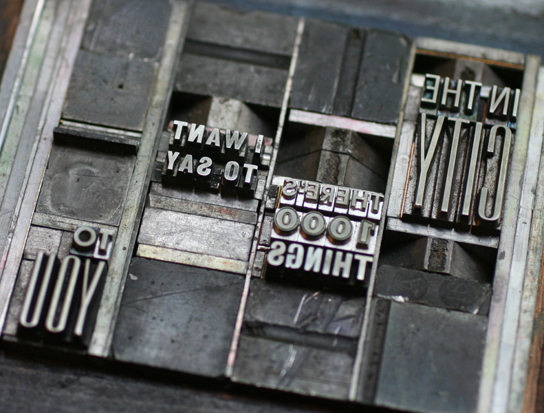
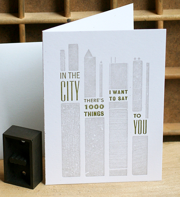
We scored a hit with In The City, pulled from the song by The Jam. For this one I had to find some tiny triangles and little lines.

minthecity1

Tinthecity1 copy

Tinthecity2 copy

inthecity2

I'm thrilled with how all of these prints turned out! Nothing beats a good challenge, and taking an existing design and manipulating it into a different format while working within the parameters of metal and wood type (and occasional linoleum blocks) is just that. All of these prints are available in our etsy shop.

Tradition and Progress

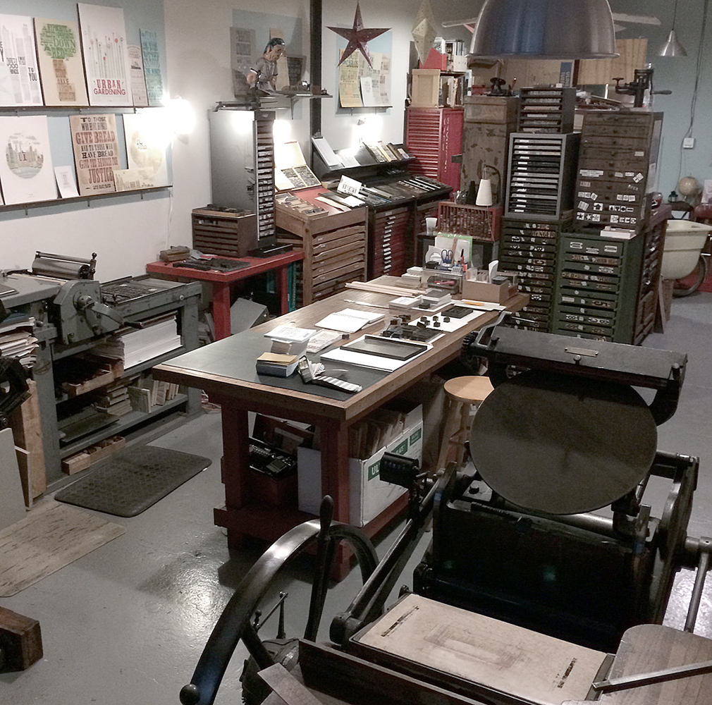
Way back in 1996, I started working at Fireproof Press, run by John Upchurch and Matt McClintock, known for producing music packaging, posters, business cards and other oddball print pieces, mostly for Chicago-based artists. The third floor workspace, shared with Screwball Press, was hot in the summer, cold in the winter, scattered with press bits and flying sheets of paper. I loved every minute of my time there (almost). Everything was made better with root beer. John closed Fireproof in the winter of '98, and I like to think that had he not done so, I'd still be there today. Forced out into the world, I got one press, and then another, and in the summer of '99, Starshaped Press was born, at least in name. I took over a number of jobs that had been intended for Fireproof, and then began a two-year stint at Columbia College, alongside John in his new position. During that time I grew the business and set up our first studio, about 385 sq ft in the lovely Ravenswood area, where I worked exclusively for two years after leaving Columbia. In the summer of 2003, the studio moved to a bigger, brighter space also in Ravenswood, where the work continues today. Here's what an average day look like:

studio114To celebrate the 15th year of the studio, I've planned a series of prints to showcase some of the fine type in the studio as well as the ideals that have guided the work of Starshaped over the last 15 years. The first print pulls a quote from the Barnhart Brothers & Spindler type specimen book of  1923 and is printed in three colors.

bbspromo4The first layer is printed using the back sides of wood type, allowing the texture of the wood to come through.

Tbbspromo6

bbspromo3The border elements are composed of ornaments from different collections, mostly cast at Skyline Type Foundry.

Tbbspromo9'Tradition' and 'Progress' were printed with wood type that's in pretty rough shape. But I wanted to contrast the rustic aspect of this 100-year-old type with some of the newest metal type; 'typographic art' is set in Runic, a brand new cast and not used before this project.

bbspromo2

Tbbspromo2

Tbbspromo3Where did the time go? These four typefaces (Railroad Gothic, Onyx, Engravers Old English and Stymie Bold) have all come to the studio collection from different sources over the years.

bbspromo5

Tbbspromo4Here is a full shot of the final print. I wanted to deconstruct the traditional text-heavy broadside of the late 1800s while maintaining the 'more is more' approach to typesetting of that time. I felt this quote was particularly forward thinking, especially given that it appeared in print in 1923.

I am sending the print (along with ones to come this year) to the printers and designers that I admire, and that have championed Starshaped over the last 15 years, as well as folks that have a passing interest in letterpress and typography. There are still many copies left in the studio and I'm happy to send one to anyone that would like to have it! Just email with your info. And thanks for the support. 2014 is going to be a great year in the studio.

bbspromo1

It's beginning to look a lot like...

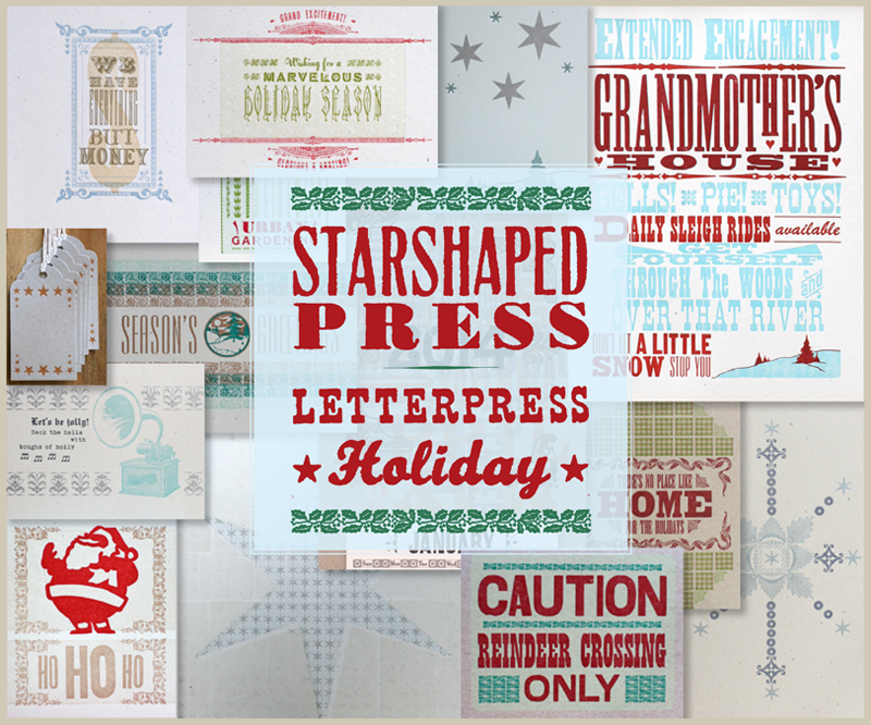
holiday2013email...the best printing time of the year! I like to think that this year we've really put together a wide variety of cards, prints and posters that highlight myriad letterpress techniques available with a great type collection. From new Artistic Prints to patterned cards to kitschy wood type prints, there's a little something for everyone. One of my new favorites is this print that we threw together for the open house and then liked so well it got an upgrade to two colors that's ready to frame:

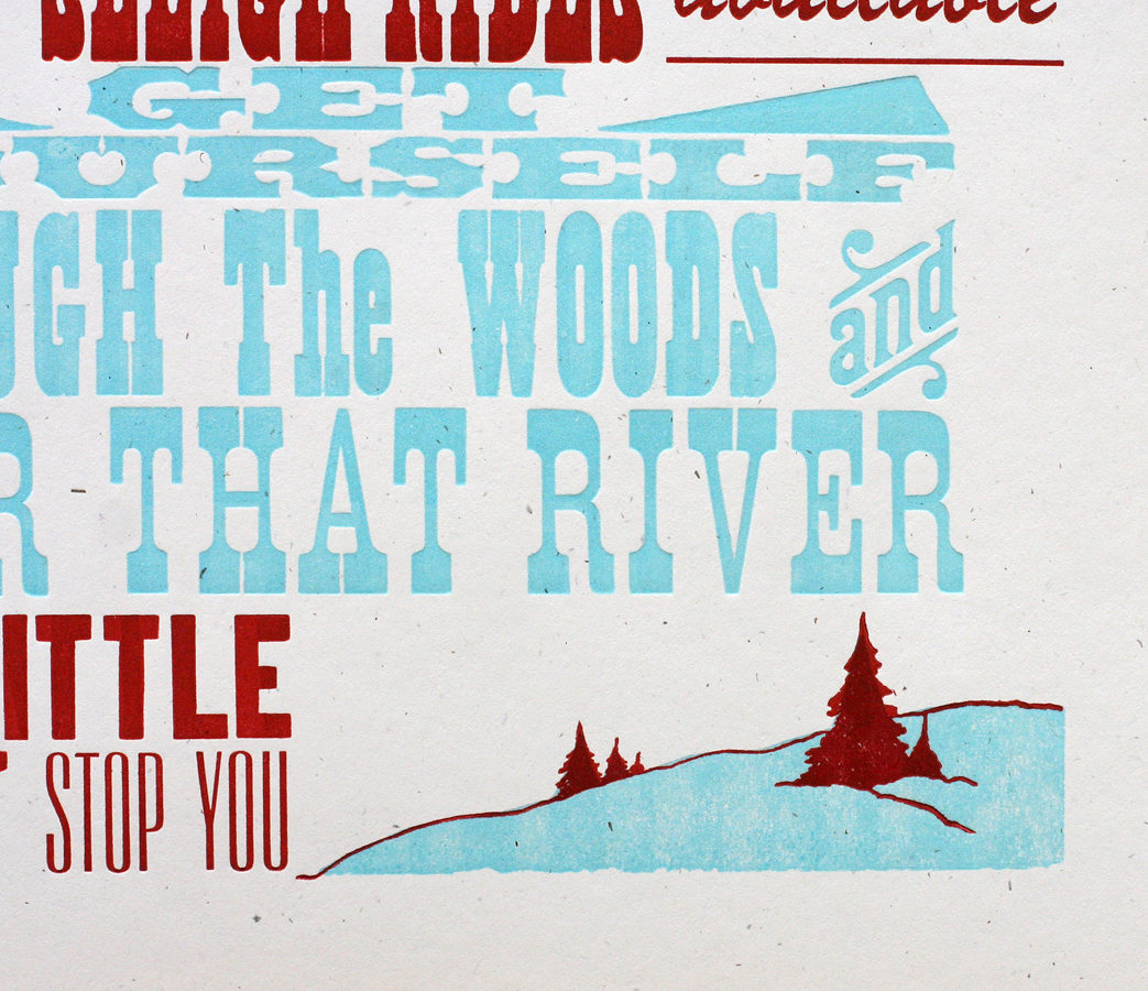
grandmother3Consider it a gig poster for Grandmother's House, and a quirky take on the classic holiday song. There are a lot of fun details, including my first use of these great Moore Wood Type ornamental rules and some endearing hearts.

grandmother7The image at the bottom is an old cut that's been floating around the studio for years. This time around, I made it two colors by adding the light blue linoleum cut. Grandmas everywhere will approve!

grandmother8I love the sweet simplicity of the form:

TgrandmotherAnother print for the holidays is the next in our series of 'Artistic Prints', which glorify the techniques and typefaces of the 19th century.

holiday1There are some lovely details in this one, from the type on curves to the details hidden in the 'marvelous' typeface. The background is a border that's stacked to create a texture with a very subtle pattern.

holiday2

holiday4Another lovely form! 'Holiday Season' is set with initial caps, hence the bouncing baselines.

TholidayIf you've got your gifts and you're ready to wrap, our classic wood type wrapping paper is available, as are these new tags hot of the press. There are cityscape tags, as well as manicules (printer's fists) and stars, all printed in bright colors on diecut kraft card stock. They're strung up with butcher string, and ready to go.

city4

stars3

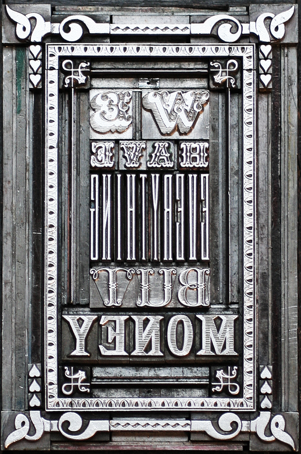
manicule2And though it's not specifically for the holidays, I also finished another Artistic Print recently that's near to my heart. Inspired by the comment of an elderly individual that lived through the Great Depression:

money1And it's so true. I wanted the ornate type and ornamentation to resemble that found on paper money. The 'everything' type is actually designed to function as monogram type, but was just the tall and skinny thing needed here.

money2Love the shadow on that scroll type, as well as the slight bit of wood texture in the dollar sign. It's a perfect gift for your sweetie.

money4And like all of our Artistic Prints, there's an image of the type form included with every one.

TeverythingGift wrapping can be one of the most fun parts of gift giving, unless it isn't. If that's how you feel, we can gladly wrap our prints, posters, cards, etc. for you and ship them direct to the receiver, along with a little tag and note. Just let us know when you purchase something from the shop and we'll handle the rest.

As always, thanks for supporting letterpress at its finest! We source all of our paper in the midwest and continue to use type that has existed for decades, if not centuries, making us one of the most eco-friendly American printers around. And if buying local is your thing and you live in Chicago, be sure to stop by and see us at the Renegade Holiday Craft Fair, December 7th and 8th. The selection of beautifully handmade goods at the Fair will surely mean that you can finish your holiday shopping in one weekend.

redgoldwrap3

You Are Beautiful

Having a child and a business are two great things that don't always go great together. When my daughter was born almost seven years ago, the best laid plans to preserve the studio fell into shambles and there were rocky periods of wondering if I could pull off printing and mothering on a daily basis. Fast forward to now and I'm beginning to see the ways that the two disparate identities can come together as one. Jo has been experimenting with printmaking at the studio, where she can often be found after school and on Saturdays. I'm not always convinced that she takes delight in the process as her attitude can be quite cool, case in point our latest collaboration. We were asked to contribute a piece to the You Are Beautiful exhibition at Galerie F here in Chicago. You are probably familiar with these little stickers, and this show is a celebration of the success of the campaign. All pieces submitted are 12x12" square and represent various media.

I thought this would be a great collaborative project, and an opportunity to explore printing on fabric, something we've been experimenting with this year. I wanted the opportunity to work together on a project that promoted a very basic concept of accepting oneself and recognizing beauty where it exists. Having a daughter is a constant reminder that societal pressures on women and girls to conform to ideals of beauty and behavior has not lessened, and that it begins at a very young age. I constantly strive to expose Jo to women who do marvelous things, from writing books and making art to seeking advanced degrees in science to better the lives of others.

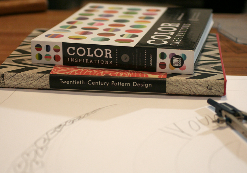
But of course my effort to read into the project didn't make for a smooth start. The night we had to get moving on this project, Jo was completely uninspired and had no interest in working with me. I resigned myself to creating a print on my own and pulled out books and sketch paper to get going. Not surprisingly, seeing my thumbnail sketch efforts and fumbling with a compass was just enough to pique the eye of a curious six year old, and Jo quickly started to put together her own ideas. Her sketches involved lots of hearts and circles, which doesn't make for the easiest type form on press:

sketch2

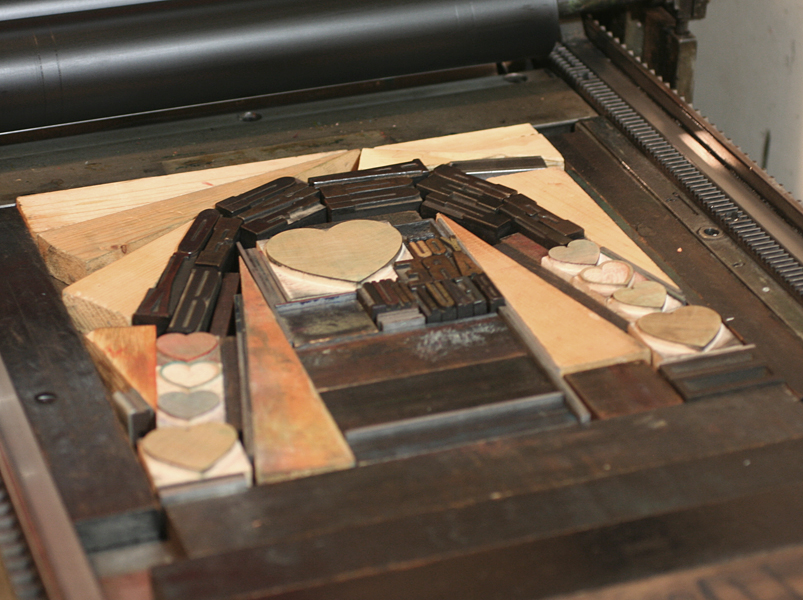
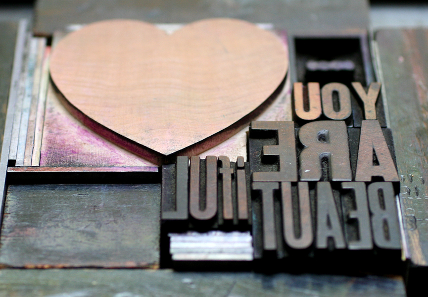
sketchI pulled the smaller type and let her find some that would still spell You Are Beautiful even when twisted into other shapes. We could almost create a circle and with the help of a cache of triangular furniture, we got it together.

typeform1

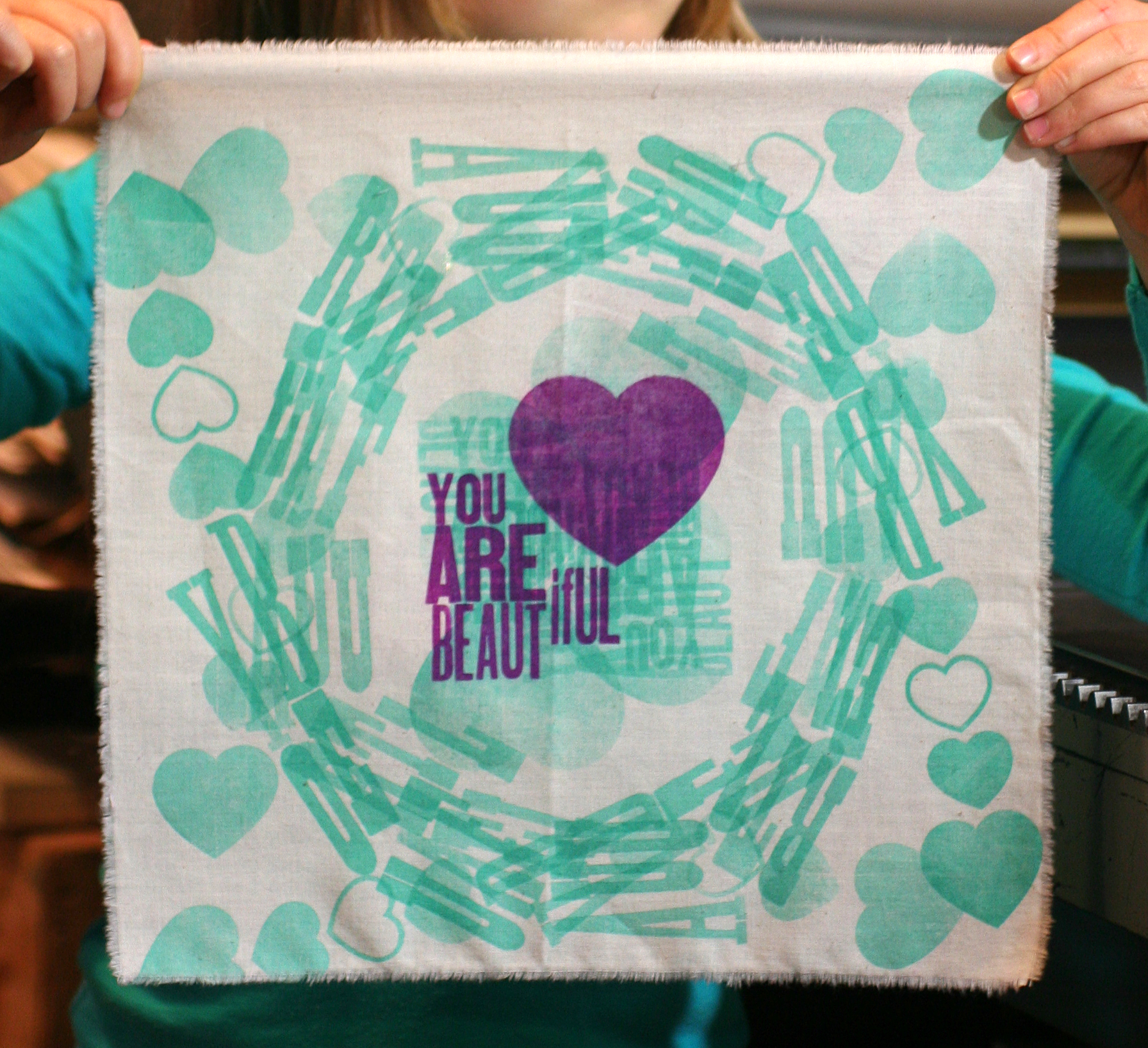
typeform3We realized that running the fabric through the press 4 times (one in each direction) achieved a true circular shape and produced very interesting effects in the overlapping.

jopress2

jopress6All of the green runs went first, followed by the main purple color.

jopress8

See our printer's devil in action... just tall enough to run the Vandercook.

[wpvideo ipQpfFBQ]

We printed the muslin at a larger size then tore it down and heat set the print afterwards so that it would be 12" square. Here's the final! We'll be heading to the opening of the show to check out all of the other great pieces that make up the exhibition and to share in the positive message.

finalprint2

Printing in Biblical times...1823

Love for the world of theater and spectacle runs deep in me and as luck would have it, I am married to a stagehand here in our windy city. Brad, otherwise known as Mr. Starshaped, is not only the muscle behind Starshaped but is a member of the Stagehands Local 2 union, which means he is usually found in one of the larger theaters downtown. For the last year he has worked on The Book of Mormon which needs no introduction. What might be less commonly known is that at the end of a long and successful theatrical run, the cast, crew and production staff will often share gifts given in a 'we did this together' spirit of solidarity. This is why our home is overrun with esoteric t-shirts from Kinky Boots, a transistor radio from Jersey Boys and other odds, ends and personal notes from the various productions that have toured Chicago.

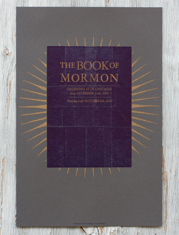
Having printed a fantastically fun and vintage-inspired poster for Jersey Boys, we decided there was too much great material in Book of Mormon to let the opportunity pass. After exploring a number of ideas that were riffs off of the current print materials, I thought perhaps we could move in a different direction and mimic the actual book of Mormon. This decision was also fueled by the fact that the studio has some beat up old sign type that closely resembled that of the book.

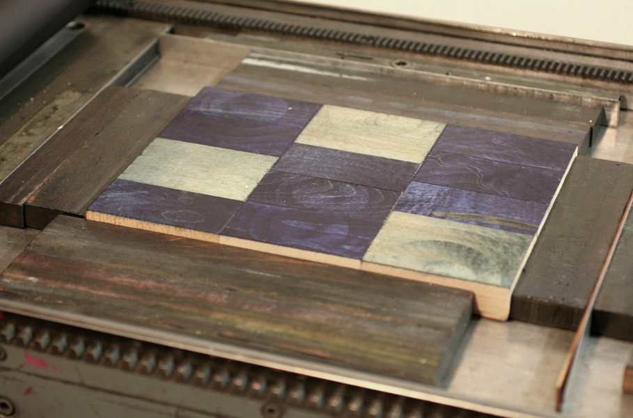
Tbom3Instead of printing a solid background or otherwise literal image of a book, I created a more textured rectangle out of two layers of wood type, which gave the area a somewhat rustic (and a little pleather-y?) look. This is easily achieved by printing the back side of large wood type, and I used both 30-line and 20-line sorts. You can see how the individual letters are flipped:

Tbom4

Tbom1

This is the final print. I used a dark gray paper, and brought in the gold starburst from materials used to advertise the show. If you're familiar with the songs of the production, then you will get the references to 'crushing it' and 'turning it off'; don't want to explain that and ruin it if you haven't seen it! The dates refer to when the show began and ended. After distributing these to everyone at the theater, the cast and crew passed them around to collect signatures, yearbook-style.

bom1

bom3

Research led me to an extraordinary article about the original printing of the book of Mormon (letterpress printed, of course), and the potential for it having been a miracle given the short amount of time in which it was produced. Getting these posters done quickly was also something of a miracle, as they were hot off the press a few days before the end. And we don't have any angels sneaking in at night to sort our type!

It is always inspiring to see a show come together in a theatrical space, with so many disparate elements needing to work together. From the teamsters and stagehands that move and setup equipment and sets in a raw space to the crew that runs the same thing over and over for a year or more to the cast that has to bring it for every performance, it's a truly working class form of art. I couldn't be prouder of Mr. Starshaped and his continued passion for the work.