Love for the world of theater and spectacle runs deep in me and as luck would have it, I am married to a stagehand here in our windy city. Brad, otherwise known as Mr. Starshaped, is not only the muscle behind Starshaped but is a member of the Stagehands Local 2 union, which means he is usually found in one of the larger theaters downtown. For the last year he has worked on The Book of Mormon which needs no introduction. What might be less commonly known is that at the end of a long and successful theatrical run, the cast, crew and production staff will often share gifts given in a 'we did this together' spirit of solidarity. This is why our home is overrun with esoteric t-shirts from Kinky Boots, a transistor radio from Jersey Boys and other odds, ends and personal notes from the various productions that have toured Chicago.
Having printed a fantastically fun and vintage-inspired poster for Jersey Boys, we decided there was too much great material in Book of Mormon to let the opportunity pass. After exploring a number of ideas that were riffs off of the current print materials, I thought perhaps we could move in a different direction and mimic the actual book of Mormon. This decision was also fueled by the fact that the studio has some beat up old sign type that closely resembled that of the book.
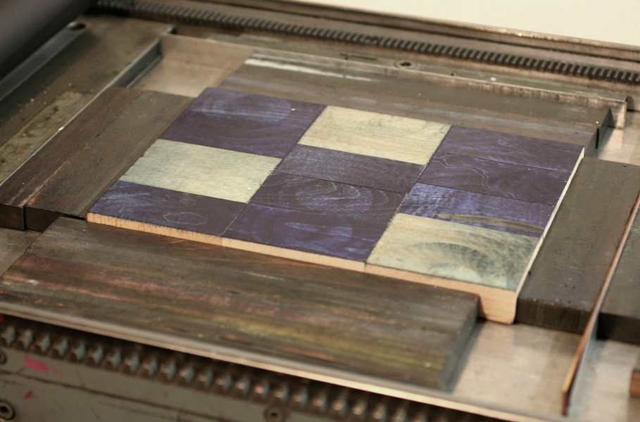
 Instead of printing a solid background or otherwise literal image of a book, I created a more textured rectangle out of two layers of wood type, which gave the area a somewhat rustic (and a little pleather-y?) look. This is easily achieved by printing the back side of large wood type, and I used both 30-line and 20-line sorts. You can see how the individual letters are flipped:
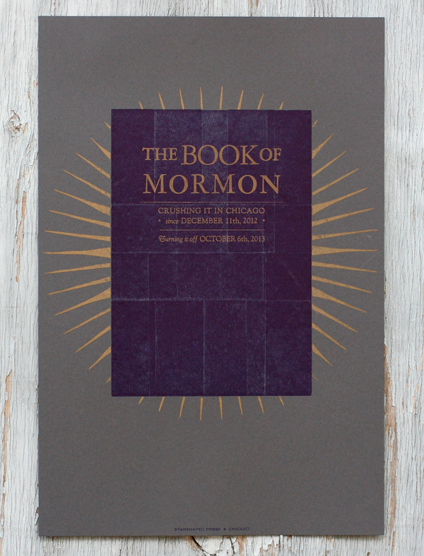
This is the final print. I used a dark gray paper, and brought in the gold starburst from materials used to advertise the show. If you're familiar with the songs of the production, then you will get the references to 'crushing it' and 'turning it off'; don't want to explain that and ruin it if you haven't seen it! The dates refer to when the show began and ended. After distributing these to everyone at the theater, the cast and crew passed them around to collect signatures, yearbook-style.
Research led me to an extraordinary article about the original printing of the book of Mormon (letterpress printed, of course), and the potential for it having been a miracle given the short amount of time in which it was produced. Getting these posters done quickly was also something of a miracle, as they were hot off the press a few days before the end. And we don't have any angels sneaking in at night to sort our type!
It is always inspiring to see a show come together in a theatrical space, with so many disparate elements needing to work together. From the teamsters and stagehands that move and setup equipment and sets in a raw space to the crew that runs the same thing over and over for a year or more to the cast that has to bring it for every performance, it's a truly working class form of art. I couldn't be prouder of Mr. Starshaped and his continued passion for the work.


