Printing at WNYBAC

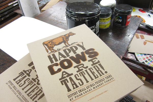
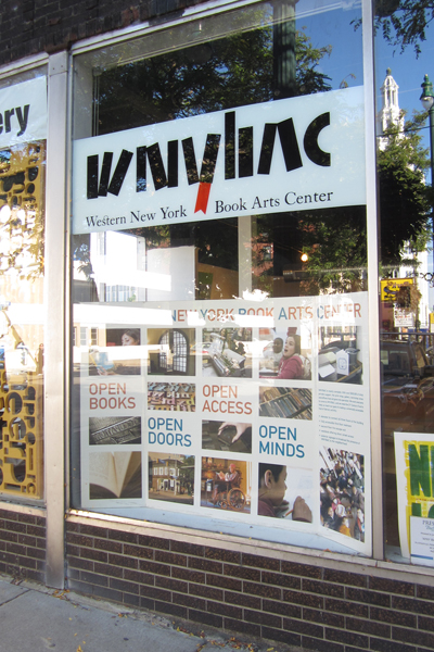
Visiting New York State is not only a great chance to relax with family, but a good time to catch up on printing for the Renegade Craft Fair, thanks to the lovely Western New York Book Arts Center. I packed up the formes for our popular 'Happy Pigs are Tastier' print (as well as a few new versions...), along with some ink and paper, and headed to downtown Buffalo for an afternoon of printing.

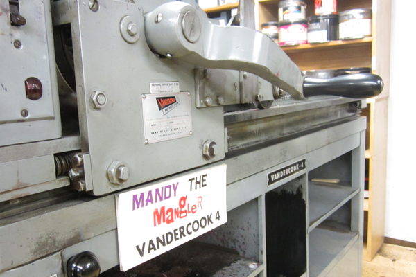
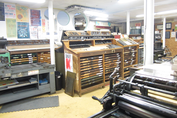
The Center has really turned into a fantastic work space, as well as gallery and shop, and offers many opportunities to get your hands dirty with letterpress, screenprinting and bookbinding. There's also a retail space to pick up prints, cards, books and supplies. I spent a little time with Mandy the Mangler:

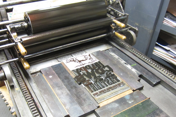
Happy Cows and Happy Hens will be added to the Happy Pigs series of prints, and it was fun to see our type (and linoleum cuts) on a different press:

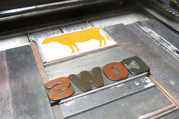
And here's a sneak peak of the almost-finished Happy Cows print. We'll be finishing them up next week to have ready at Renegade. Thanks to the entire staff of WNYBAC for so graciously allowing me use of the press and space! It's always an inspiring learning experience to print in other shops, especially ones as well organized as this!

At Last!

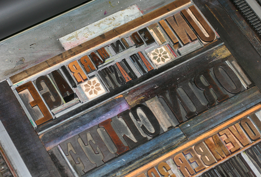
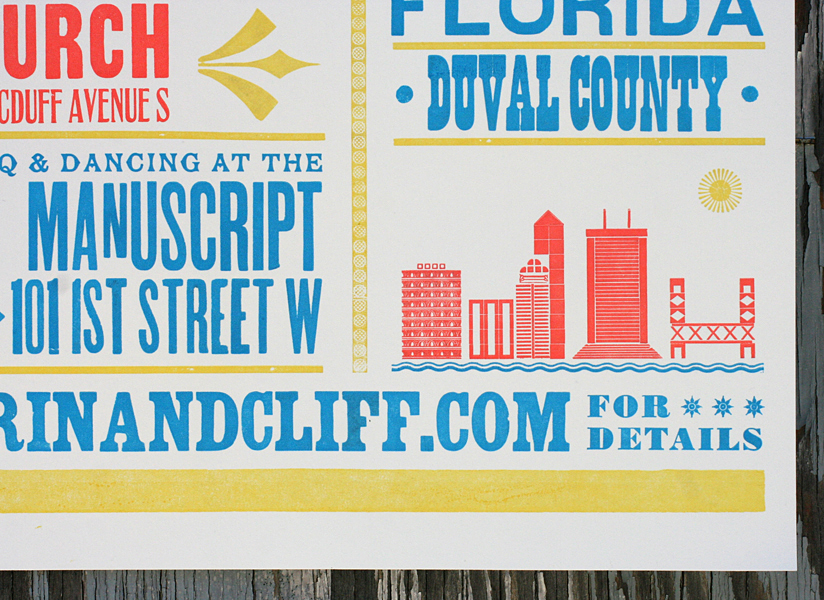
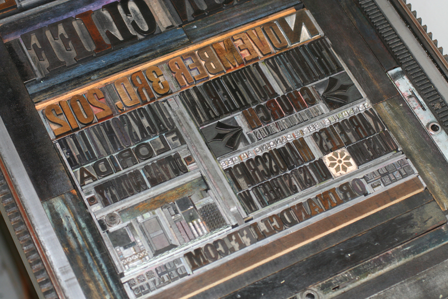
We've been printing a number of posters and large prints lately, many celebrating weddings and anniversaries in a novel way. This poster invitation for Orin and Cliff is no exception. They were looking for a colorful poster to share with their friends and family announcing their upcoming wedding. This one features a few sweet elements to give it a breezy, vintage Florida feel. The little 8 pointed stars are actually new wood ornaments from Moore Wood Type, and it's such a delight to get brand new wood type! The large yellow block around their names is a linoleum cut, purposefully offset a bit to make the names pop. The ampersand is printed in the blue color, but is transparent enough to look green and create other shapes and colors via overprinting.

Orin and Cliff also liked many of the cityscapes we create, so the poster features a little section of Jacksonville, complete with a water line and sun-like ornament. And surely the wedding will be just as bright and sunny!

It Takes a Village

There's a fantastic organization known as Ladies of Letterpress, and they host an annual conference in August. This year, I was asked to contribute to a portfolio project that will be shared with a group of other printers at the conference in a few weeks. The theme was Expanding Communities, to be taken as each printer saw fit, with the only limitation being the 9x12" size. I'd been wanting to explore the idea of greater community involvement in education, and this was a great opportunity. After thinking through a few ideas about typographically creating a school building, I narrowed the concept to the easily recognizable image of a chalkboard, which could be achieved by layering both wood type and linoleum cuts.

Here are a few sorts of our 30-line (5") wood type. This is actually the back side of both number 1's and punctuation. These would serve to give texture to the frame.

I was able to print two-up on each sheet of paper, which was kindly donated by Mohawk. In this image, the first frame shows just the print of the wood type, while the one on the right shows the frame with a transparent overlay created by linoleum blocks cut to size. This gave the frame a richer and more solid feel while maintaining the wood grain.

I chose gothic wood type that was reminiscent of the basic style of lettering that our little printer's devil is learning in school. Each letter is slightly offset to avoid looking too 'perfect' when printed.

For the bottom text, the type is set in Monoline Script and Futura, also mimicking the cursive and lettering styles popular in school (note: there is currently a debate on the loss of teaching cursive in grade school. We fully support keeping it in the curriculum. Great handwriting is always classy!).

And this is the final print. The green is printed with a linoleum block trimmed to size, while the text is printed in opaque white on top of it. Opaque white isn't quite that, fortunately, so it resembles the look of chalk on a chalkboard.

The required 9x12" size felt a bit cramped as I like to have a little more breathing room for the art on my prints. So I added a short run of copies for sale on a muted, speckled stock at 11x14".

You can see the texture of the back of the wood type here, as well as the mottled texture of the linoleum blocks and white type.

Hopefully it will serve to remind everyone that great schools do indeed begin with EVERYONE. Looking forward to seeing what the other talented printers come up with!
Stephanie + Keith

Stephanie and I met at IndieWed back in January, and she was instantly smitten with our Wanted! Wedding Collection. She loved the idea of the 3-panel, accordion fold style, so that their names could be large and the details could be on the second panel. We looked at a number of color options, but greens seemed to stick, so we went with a dark chartreuse and warm gray on textured off white card stock. Gotta love the 'messiness' in this wood type!

These little fan-like ornaments used throughout are new to the studio. They were a recent purchase from Skyline Type Foundry and have already put in appearances on a number of projects.

More little ornaments from the same Skyline collection. The more type the merrier... and check out the shading on 'DINNER'. Can't get that detail in magnesium or polymer plates.

And it's finished out with a mad libs-style perforated reply postcard.

While working on the invites, we also put together some fun flat cards to be used as thank you notes and anything else the couple might need them for. And because Keith goes by both Conley and, ahem, Keith, we put their first and middle names on the cards. These use some of our tiniest wood type, which is just shy of an inch.

We had such a good time with the invites and note cards, Keith wanted to do a run of rehearsal dinner invitations as well. These could be more playful and definitely push the Wild West theme (unfortunately we didn't have any small gun ornaments as requested, but did have some pretty awesome manicules, or little hands).

There's a lot of heavy forced justification in this layout, which is a great way to tie together disparate typefaces. And the diamond shaped linotype slugs were found at the always great Platen Press Museum type sale back in May. The pointers next to 'given by' are over 100 years old, and were made right here in Chicago.

To stand out from the invite, we printed on kraft stock and worked in brick colored envelopes. What's really WANTED! in this picture? The chance to work with Stephanie & Keith again!

Tonight... and every night after

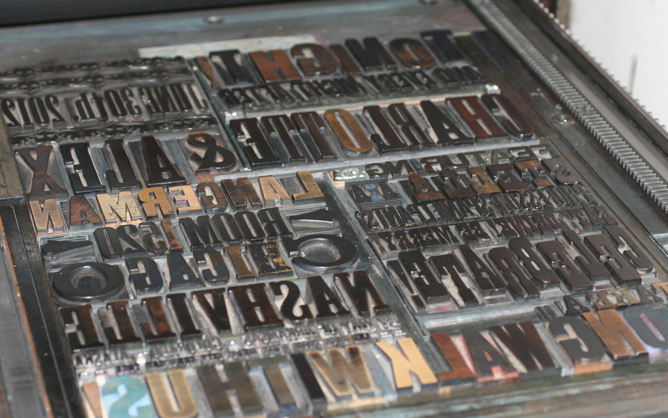
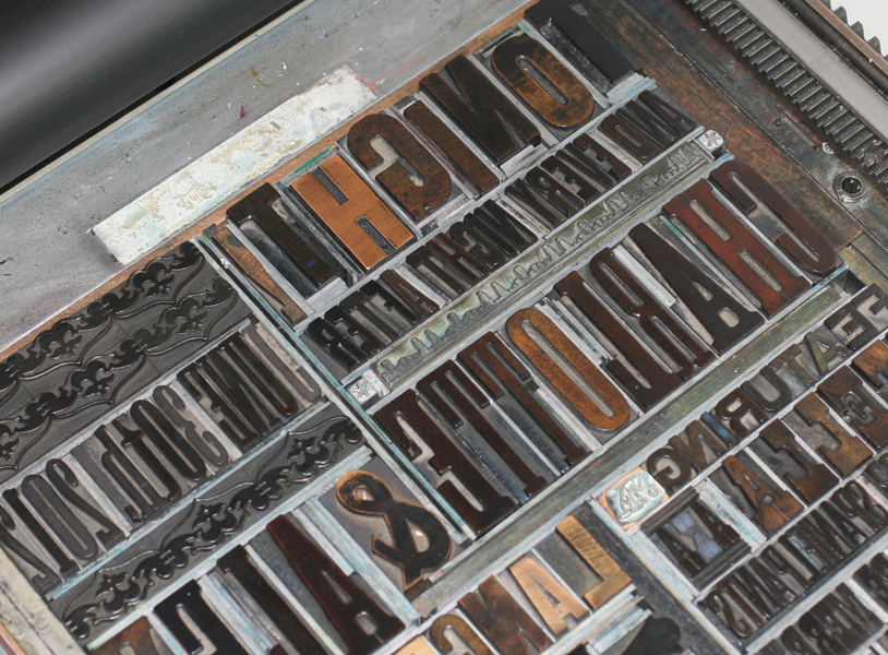
Charlotte came to me with a request for a customized poster that she wanted to give to her fiance on their wedding day. Her ideas were all fabulous, and text rich, which makes for challenging experiments with type. Having lived in Nashville and being huge live music fans (Alex proposed while attending a show), she wanted something reminiscent of Hatch Show Print, but with a more urban, Chicago-y feel, given that this is now their home. We decided to go large with a poster that would be 14x18", with bright colors that would match their home. Here are a few shots of the form I put together. With a few tweaks, it was ready to print!

And here's the final print, done in three colors. The teal and bright red overlap on their names to make them pop. Little Stella is their sidekick dog.

Conveniently, this little Chicago cityscape existed in the studio collection, along with the Chicago stars and music notes.

Charlotte and Alex have lived in numerous places, many of which are listed in the style of concert tour locations. They enjoyed a lovely trip to Europe, which shows up here as a 'multi-city European tour'.

Congrats to both! If the marriage is half as fun and entertaining as this poster was to print, it's made to last.