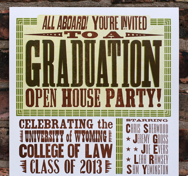
This past winter, I had the pleasure of printing graduation announcements/party invitations for the University of Wyoming College of Law graduates. They celebrated in style at the charming Laramie Depot Museum, a must see for vintage train enthusiasts. The location drove the direction of the design, right down to the muted color palette, as you can see here:

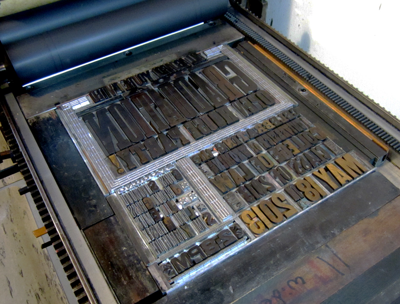
This poster was a long one, at 12x22", a bit long for our press to print comfortably, and so it was done in separate passes for the top and bottom. The top went first as you can see here, followed by the bottom section for each color (three altogether).
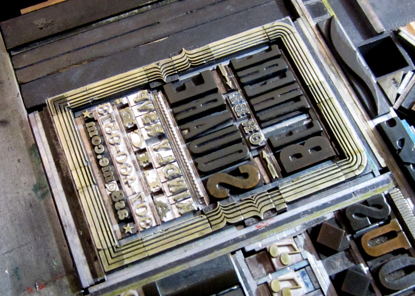
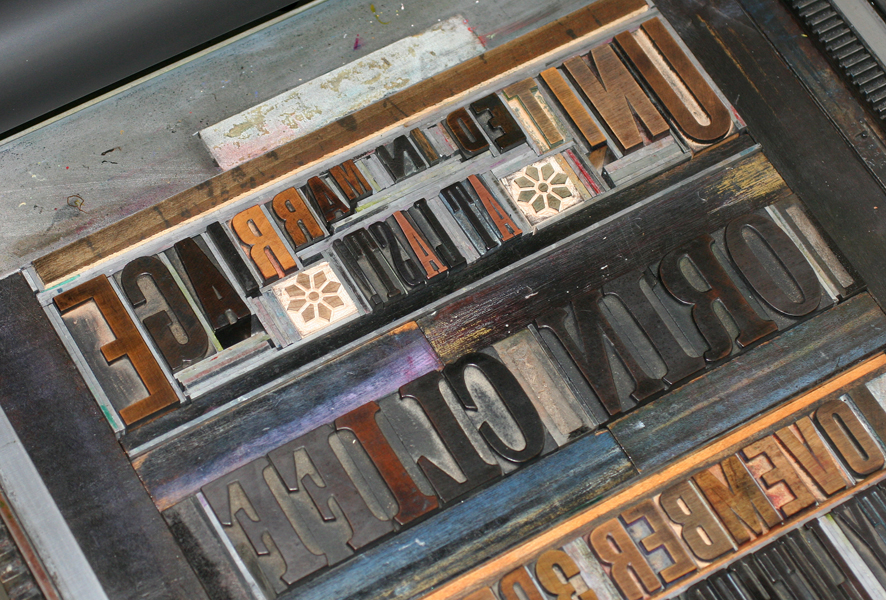
I thought it would be fun to throw a curve into the layout to break it up a bit and mimic some of the vintage train posters in the Starshaped collection. This involved a little creativity in the form, as you can see from the diagonal leads and furniture. The small train is a copper cut I found years ago.
One of my favorite bits is the Ombree border around the reply and contact info. It requires a bit of tricky manipulation but with a little effort you can come up with all sorts of combinations to create square and curved corners as well as 'dips' in the middle of any line. Sadly, my collection of Ombree has seen a lot of love in its lifetime and has many damaged spots. However, I recently tracked down a brand new set (well, not new, but never used), so it'll be making many more appearances in the near future.
Here you can see both the curved type and the beaten up Ombree border:
I also found a new cast of this track-like border that seemed perfect for the occasion. Graduation is printed in both the brown and green to give it a little more emphasis. The All Aboard type is actually cut on a diagonal and has it's own spacing to make it gel with everything else. There's always a lot of improvising going into posters; there is no N to fit with Invited, so I had to find a smaller one that would work. These are the joys of working with hand set type as opposed to digital; problems you never imagined pop up and need to be solved, which keeps the process from getting stale and takes the design in a direction that you may not have anticipated in the thumbnail sketching phase.
Congrats to the Class of 2013! Hope the party was as swingin' as the poster.

