I Have This Thing About Ships

I have this thing about ships. Often the ones that met untimely ends at the bottom of an ocean or through fire. My home library includes accounts of the Andrea Doria, the Lusitania, Walter Lord’s thorough accounts of the Titanic and lists of Great Lakes shipping disasters. Maybe there’s metaphor in it, considering I’ve likened navigating loss, single parenting, health insurance and a small business to steering a ship through icebergs. Maybe it’s my passion for the work of skilled craftspersons who labor for years to create something that carries people from shore to shore, and is then lost in moments. Maybe it’s the beautiful architecture and technology of these vessels that inspires me to be a more thoughtful designer.

One ship I adore that escaped the fate of those in my library is the SS United States, which made its record-breaking maiden voyage across the Atlantic on July 3rd, 1952. It is a stunning piece of American innovation and her architect, William Gibbs, famously touted her as unsinkable, inflammable and unmatched in speed. By design or circumstance, he was correct.
On May 31st, 1954, my grandmother set sail on the United States, destined for a few weeks with my grandfather, then stationed overseas in the Air Force. Here she is on the stern, in personal photos shared with me.

gundy1.jpg
gundy2.jpg

I’m certain my grandfather’s penchant for ephemera was the impetus for saving the souvenir program and menu from this trip and I couldn’t be happier about it. The incomparable Lester Beall designed these pieces, making them important artifacts for both ship and mid-century design lovers.

programfront.jpg

One of my own exciting finds is this postcard featuring a beautiful illustration of the ship just prior to her launch. And even better, the card was sent by a representative of Mergenthaler Linotype, whose machine was present to cast lines of type used for shipboard printing. Two of ‘my things’ on one little card!

postcard1.jpg
postcard2.jpg

Below is my grandmother’s menu from her first night on the ship as a Cabin Class passenger. This is the kind of thing that would be cast on the Linotype (similar to the slug I am holding at the bottom) and then printed for that day’s meals.

menu.jpg

In June I had the honor of being invited to spend a week at John Horn’s Shooting Star Press in Little Rock, Arkansas, alongside other printers I greatly admire. If this is hell, I’d like to spend eternity there.

printingdoor.jpg

This sounds snobby, but I’ve spent 20 years building a collection of metal type and ornament and it is extensive and designed for the kind of work I do. It’s rare for me to be in the presence of another collection that inspires me to the level of, or in this case, well beyond, that which I’ve lovingly built. John’s print shop is so well-appointed, well-organized and well-loved that I nearly fell to my knees to praise the printing gods.

type.jpg

These boxes store diverse typefaces that span decades, styles and sizes and I opened every one. John has multiple systems to find, identify and label his collection, making it easy to waltz in with a plan and out with a print.

typeinboxes.jpg
typecases.jpg

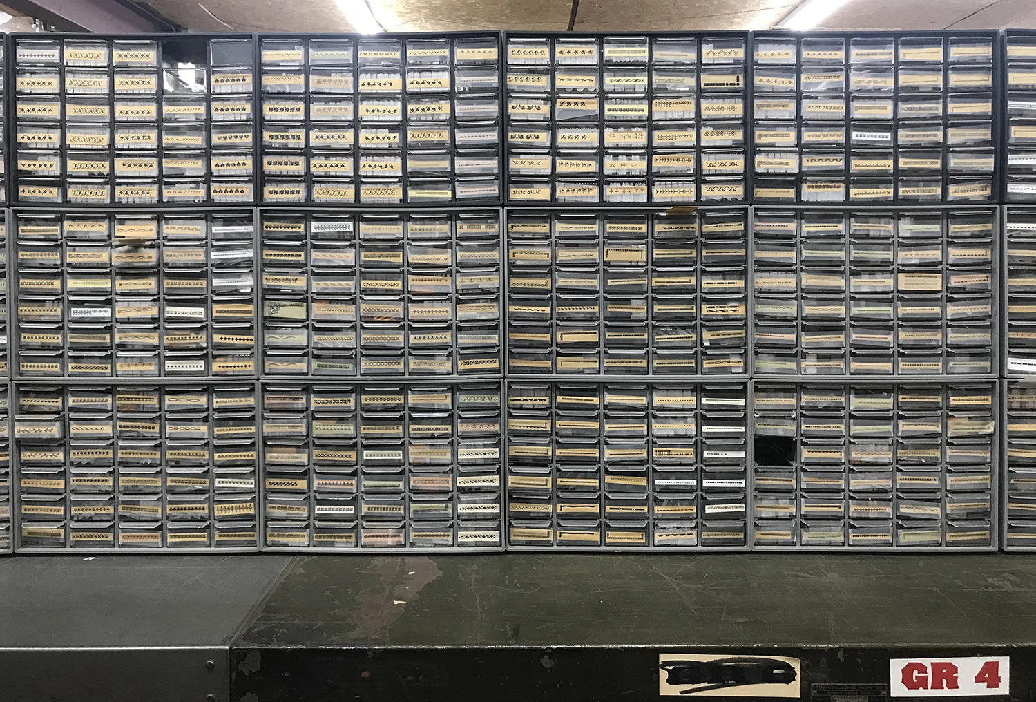
One section of the shop is purely ornament, with little treasures painstakingly labeled and organized, sometimes even by size and style. These photos represent only a small portion of what is there.

ornament2.jpg
ornament.jpg

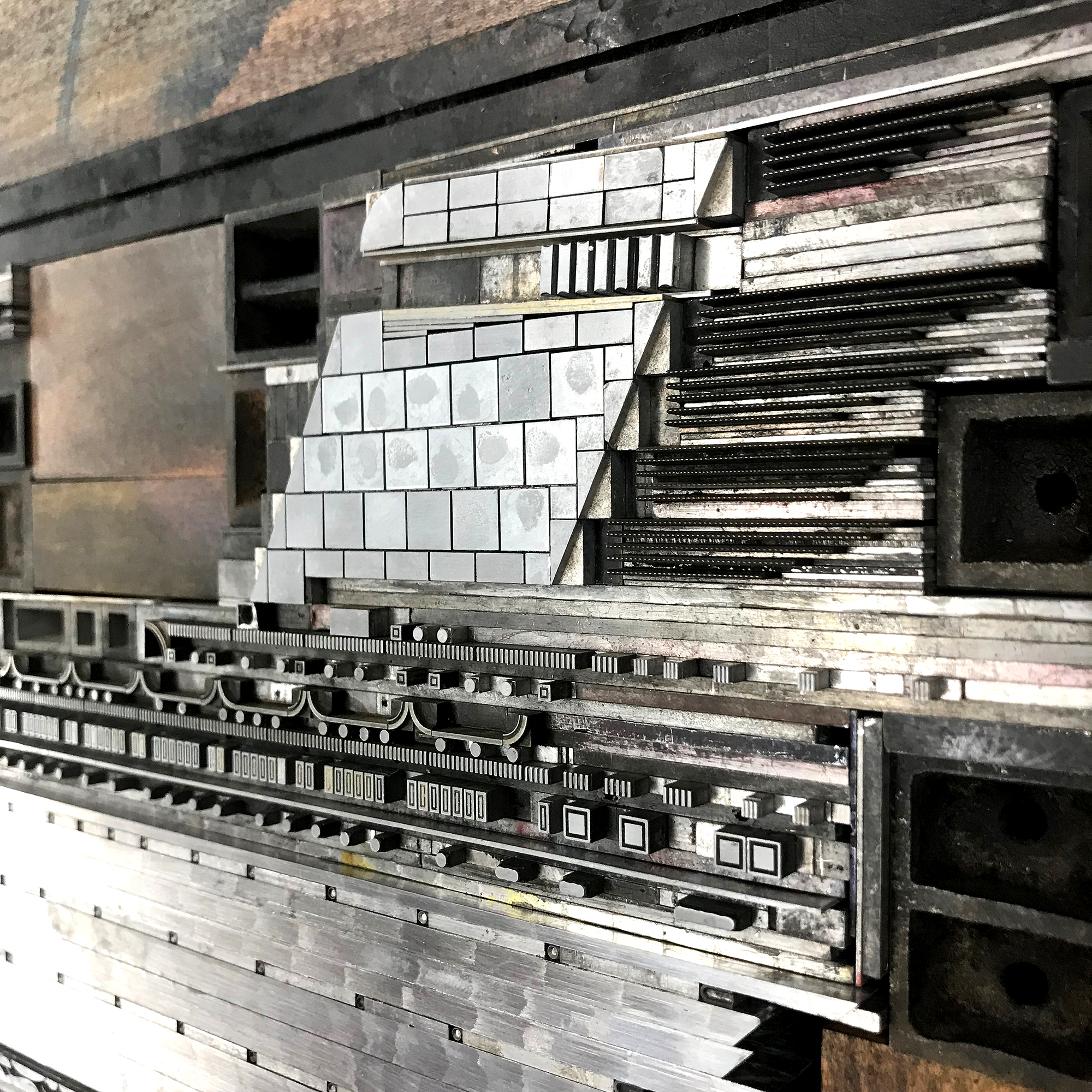
I had it in my head that it might be possible to create a print that would pay homage to the SS United States, in all its streamlined and luxurious glory. And printing at John’s place gave me access to a massive collection of ornaments I don’t have as well as a press that would allow me to print a sheet that’s 25” long. I started sketching potential solutions for the design on my pica paper so that I could easily find ornaments and rule that work with this typographic grid. It didn’t take long to realize the image would be more successful if I didn’t include the entire length of the ship, and instead focused on detail in a loose, illustrative style. The ship is still the fastest cruise ship ever built, so I considered ways to represent her speed.

ssussketches.jpg

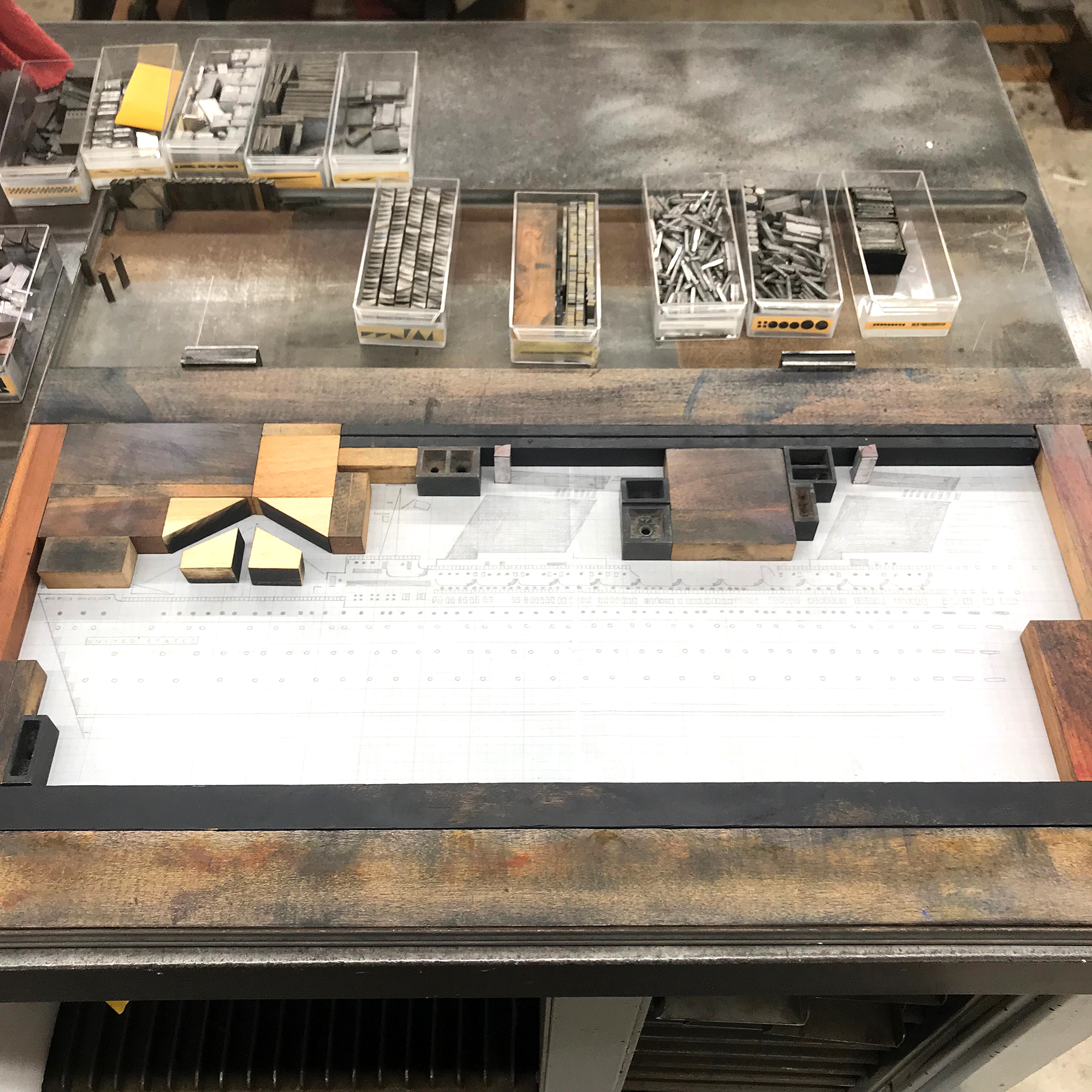
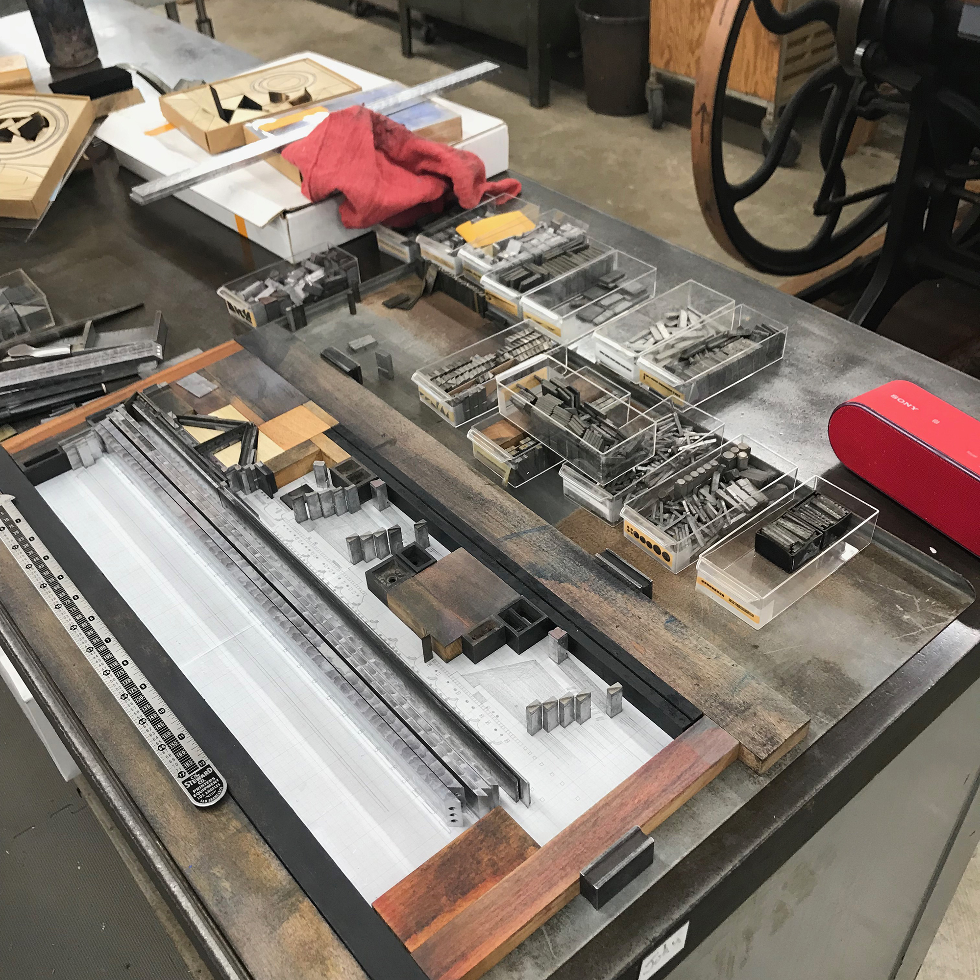
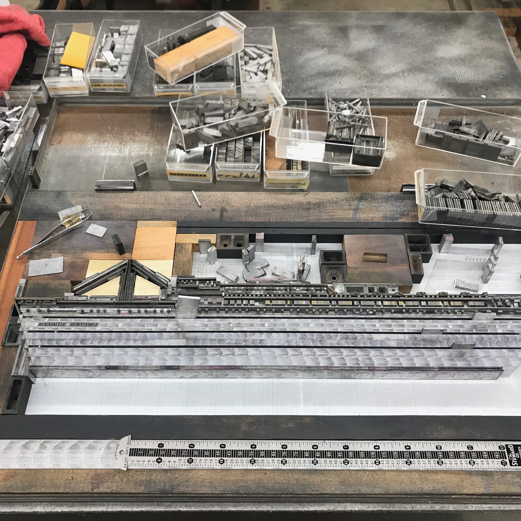
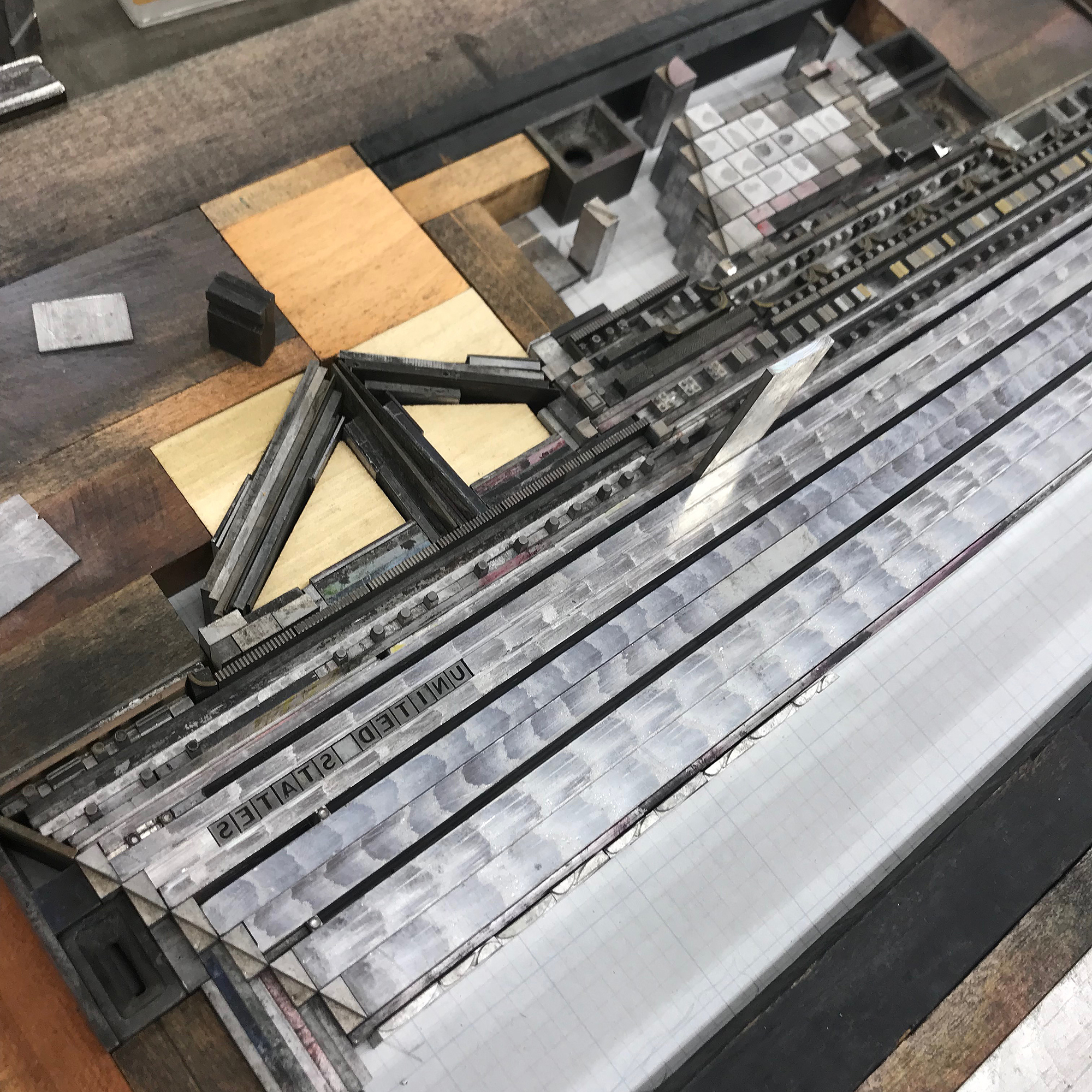
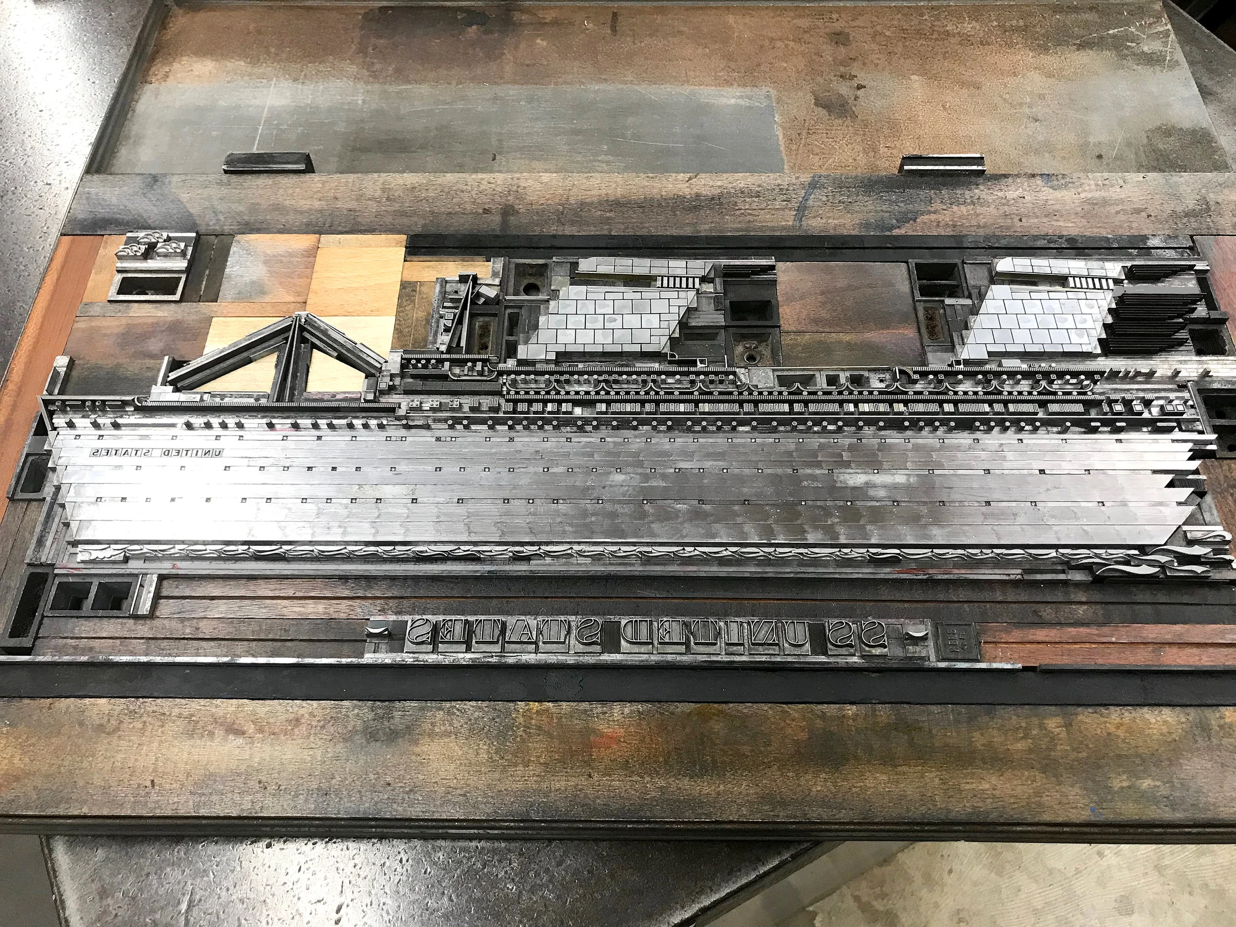
These images show the slow progression over two days of starting with a letterpress ‘dry dock’ in which I could piece together elements to form the ship.

The distinctive funnels have dotted brass rule trailing behind for ‘speed lines’ and I mitered the ship’s body, made from thick metal rule, and included wave-length ornaments to hint at how it cut through the ocean. While fast, it wasn’t quite fast enough to relieve my poor grandmother from 5 days of seasickness.

ssusfullform.jpg

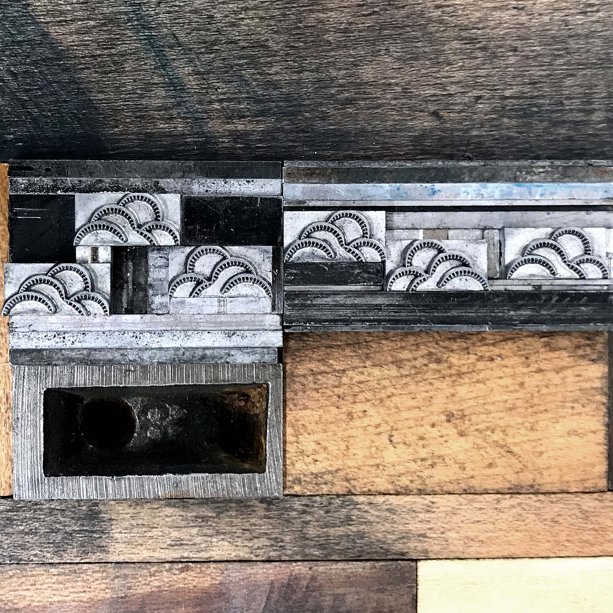
My original form included small, 6 point open circles as portholes in what would be the black sides of the ship. These were nearly impossible to print correctly once on press and I scrapped the idea given the limited time I had to work with. I also added more of the wonderful clouds and changed the ornaments framing the name at the bottom to be more in keeping with its style. Major thanks to Jessica Spring for the suggestions on both of these.

Together John and I carried the giant form to the Vandercook Universal III, and here it sits, awaiting its proper lock down for ‘sea trials.’

formonpress.jpg

Usually with multicolored projects, I first pull a proof of the entire form, then mark which colors must be removed to print the first color, then replaced, with the finished color then coming out (repeat for each color.) It’s complicated. But printing this one was not unlike a reduction linoleum cut in that it would be extremely difficult, or impossible, to replace elements once they’d been removed. So I tackled the gray first, as this was the most detailed. Below is how it looked with the red, blue and black removed.

gray.jpg

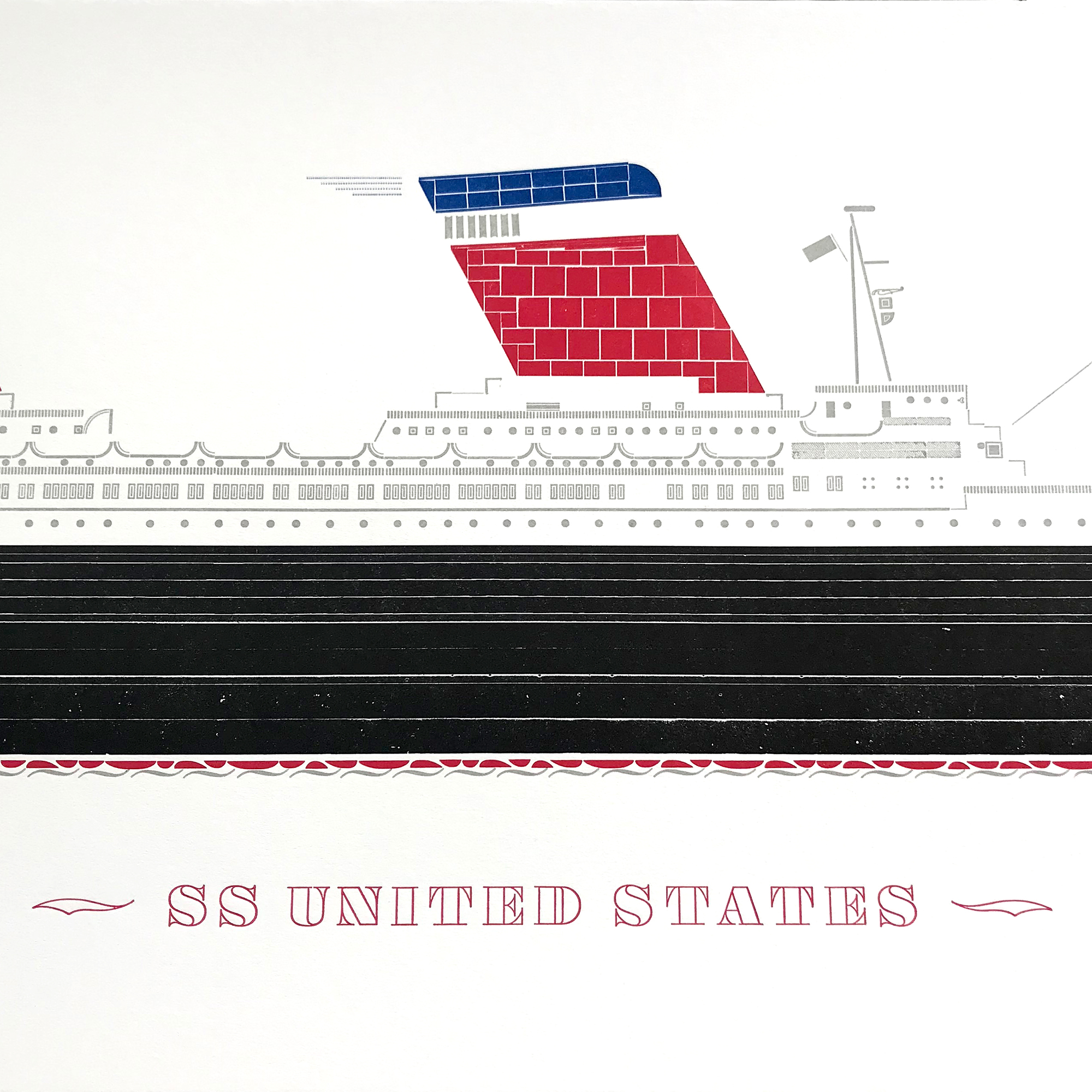
And this is the final print, on Stonehenge white and soft white cotton paper, measuring 25x11”.

ssus1b.jpg

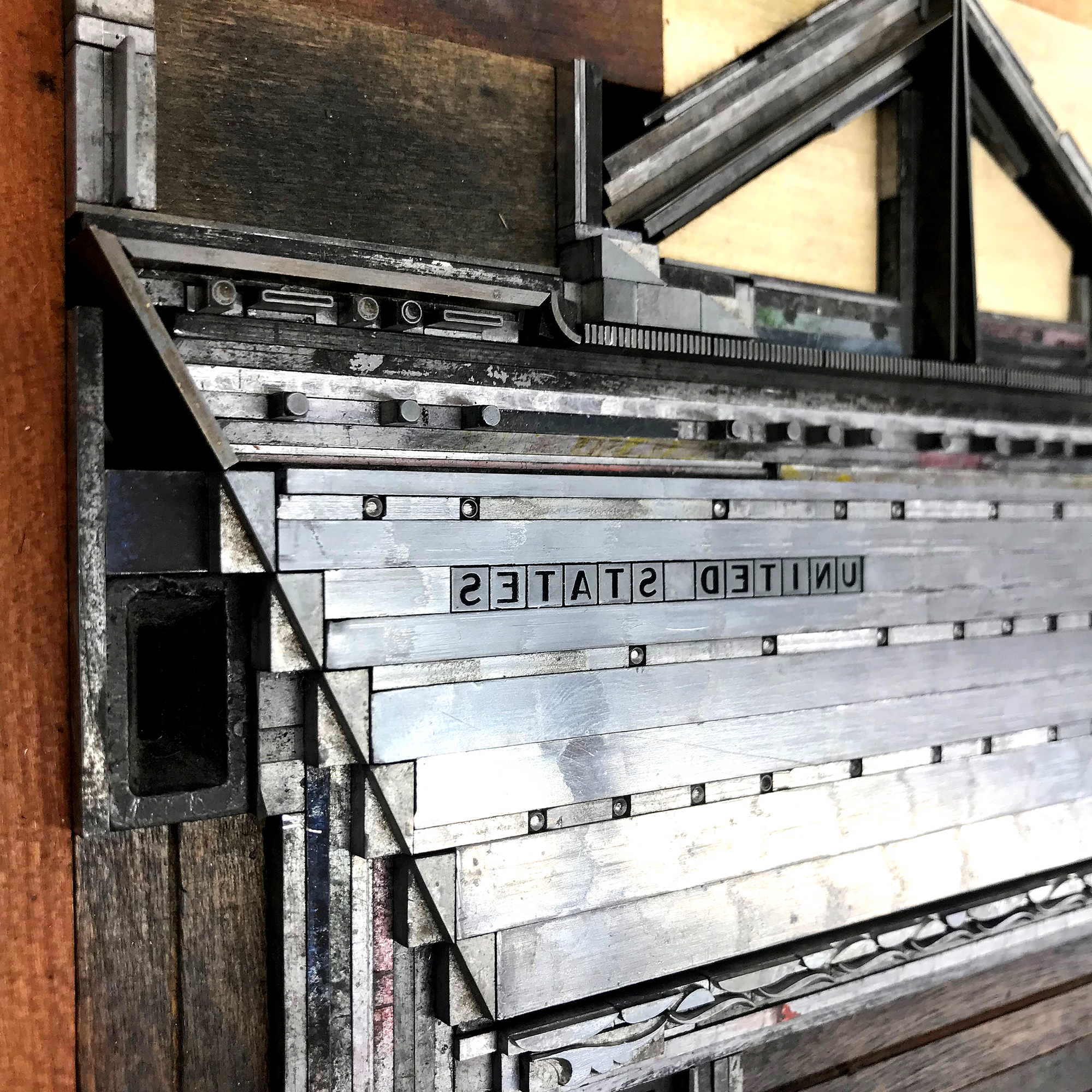
The details… I wanted the idea of the ship versus an exact replica and this approach to working with metal type is always the most successful. If I wanted absolute realism, I’d get out the colored pencils instead. So the lifeboats are 1/4 circles in two different weights with a little rule between them. And the funnels are squares, rectangles and rules to fill the solid color area.

ssus3.jpg

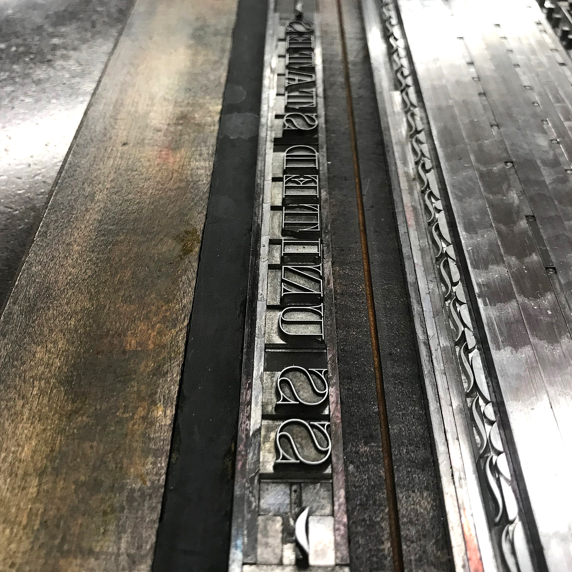
Luckily John had the perfect reverse gothic type for the name.

ssus4.jpg
ssus5.jpg
ssusangled.jpg
ssuscolors.jpg

The limited set of prints are now available here. I’m so pleased with the turnout, especially given the time I had. If there was a Blue Riband for typesetting, I would have run away with it.

I’m so grateful for the opportunity to work at Shooting Star Press and it would take another lifetime to fully take advantage of what exists there. John’s unwavering support of my work over the years gave me the confidence to build the ship of my dreams when I wasn’t sure it was a good or even possible idea. It challenged me to look at ornaments in a new way and gave me the scary ‘this could certainly fail BIG’ feeling that pushes me forward.
The SS United States still exists and currently resides in Philadelphia, though the burgeoning airline industry killed her career in the 60s. I can’t bear to post any images of the state she is currently in and her future is not secure. If my print becomes merely a memorial and the familial ephemera just memories, I’ll take that.

programinsert3.jpg

The Almighty Starshaped

I heard a guy on the radio extolling the virtues of his small town, with its community and people-run businesses. It was nothing like the city, he said, which is cold and run by giant corporations. With much resistance, I did not throw the radio out my window and instead made a mental list of all the ways this guy got it wrong.
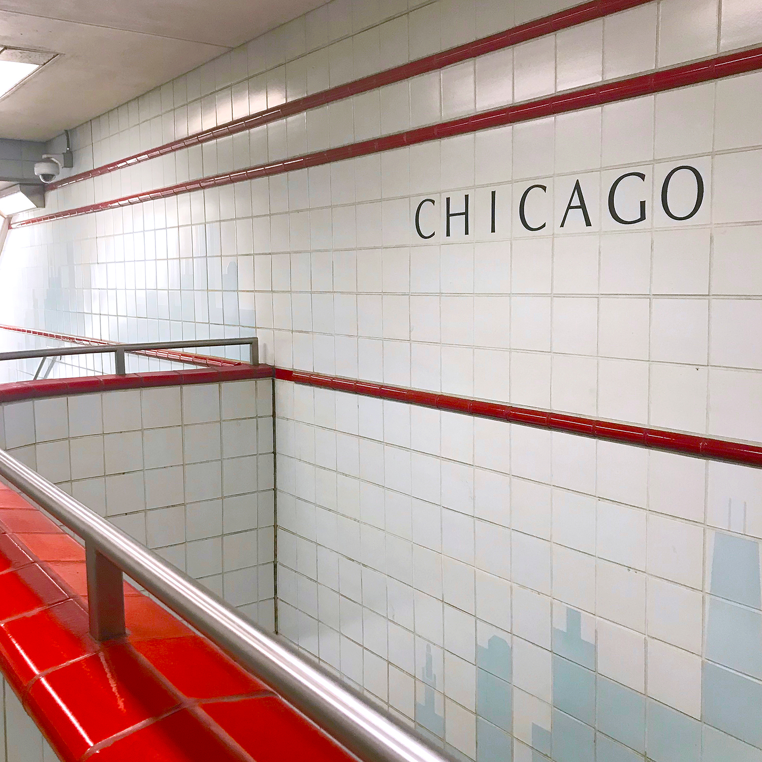
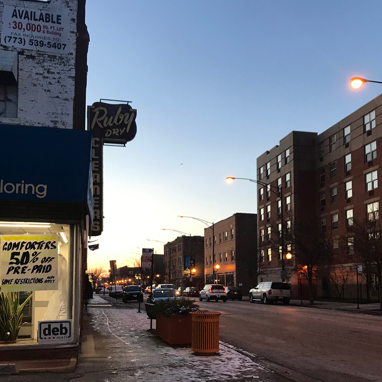
On the mile walk from home to studio, I pass elementary schools, bakeries, coffee shops & restaurants, boutiques & book stores, post offices. Buildings are being built, new sidewalks laid, people opening shops, garbage collected, children ushered across streets. I wave to friends and neighbors.

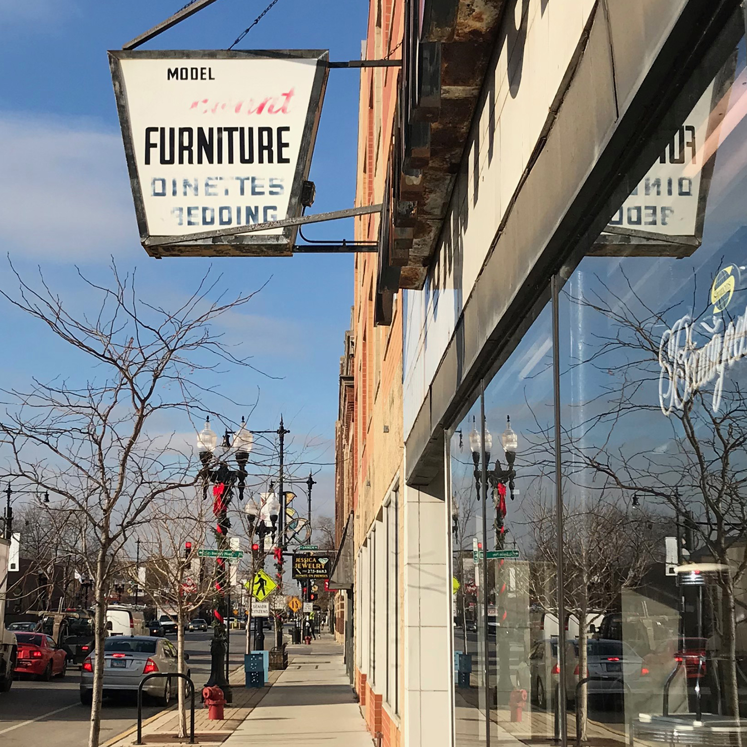
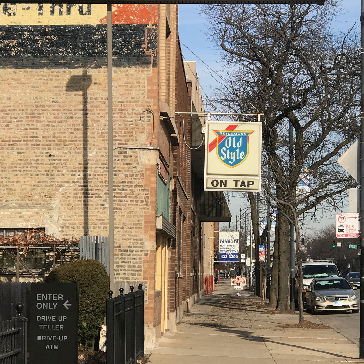
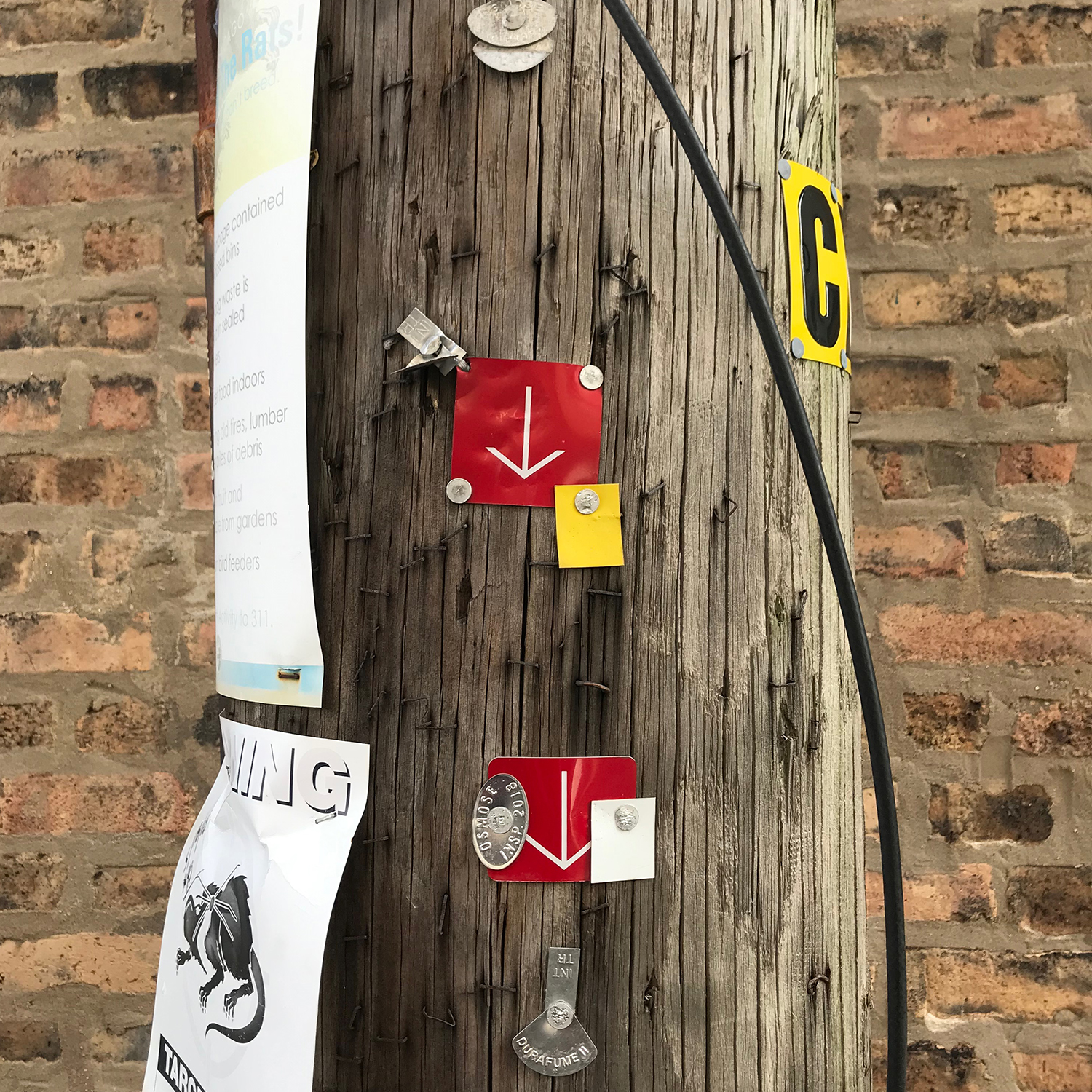
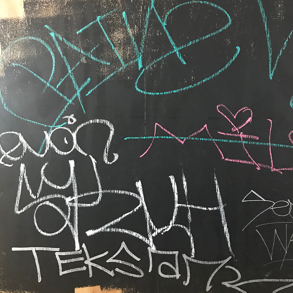
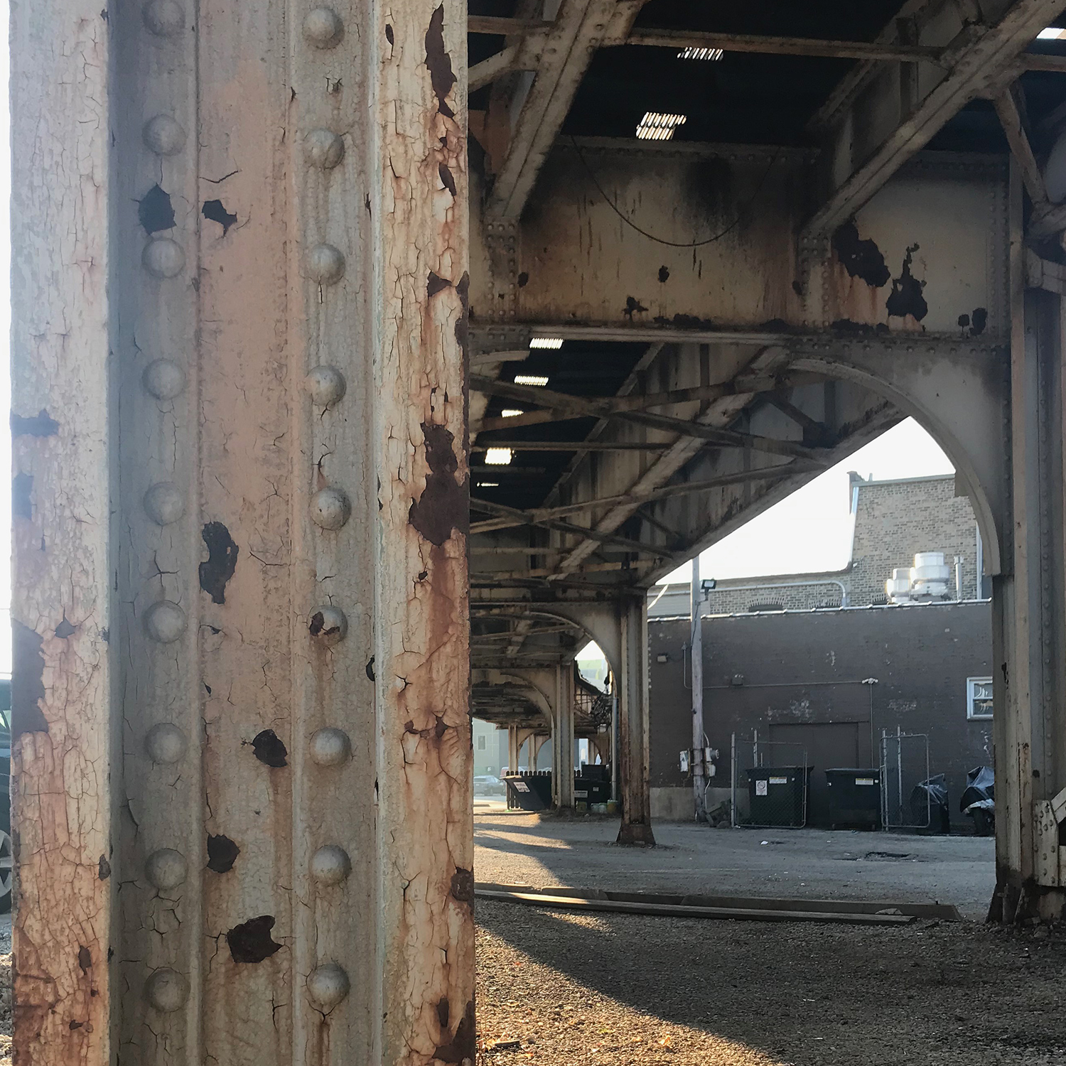
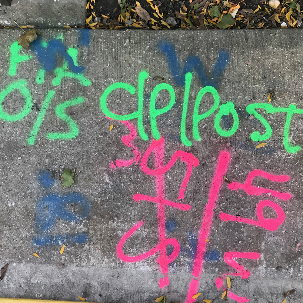
Everywhere I look I see the work of so many hands. Bricks laid both 10 and 100 years ago. Dated stamps in cement that say ‘I’m proud of this work.’ Tags on poles and tagging in the alleys. I think ‘Who did this? What is/was their situation? Did a life of dedicated craftsmanship create this or a moment stolen to record I WAS HERE'? It fascinates me in the same way the hand paintings in Argentinian caves speak to me, but in an even more immediate sense.

The streets, parks, buildings and alleys all tell different stories but are connected in one way: the people who use them every day.
I love people. Watching and listening and learning from them. I love to see how they interact with the city, from handmade signage to tagging to how they move through it, especially if that movement is facilitated by walking, biking or riding trains.

In considering the work of all these varied hands, I consider the work of my own. How do I interact with the city? How do I represent it? Does my work communicate the vibrancy and interconnected nature of those who share the streets, parks, alleys and buildings? Can I build a sketchbook that encompasses an everyday snapshot of the few miles I cover daily, with their textures and colors and eccentricities?
And that’s when the idea of The Almighty Starshaped was born.

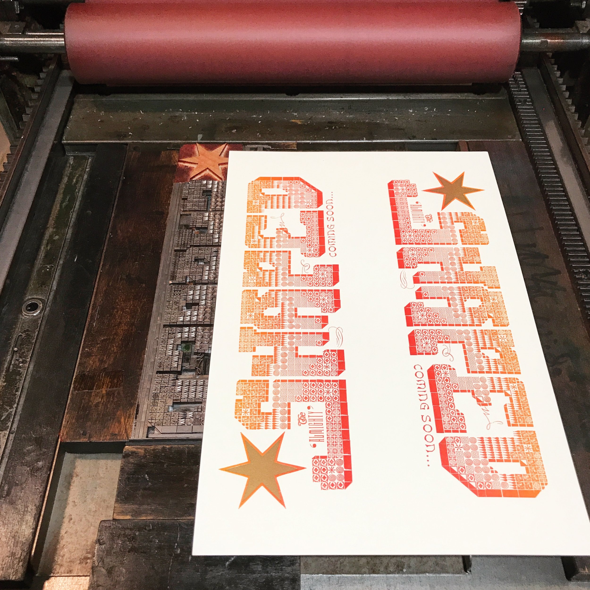
prospectus1.jpg

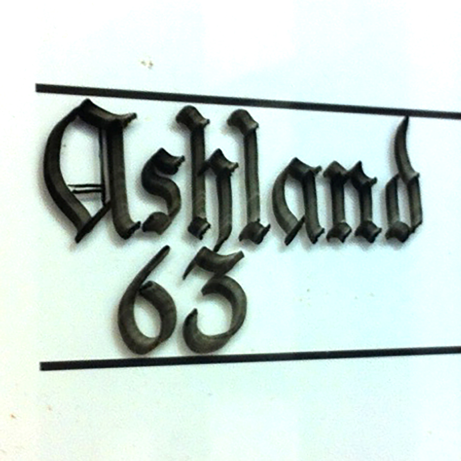
In the 70’s and 80’s, it was common for Chicago gangs to print their own compliment cards (have some fun with this in your head for a second) which you can enjoy in the book, The Almighty & Insane. I fell hard for these for two reasons. First, gangs printed their own cards as a way to say ‘this little piece of the city is ours and this is who WE are,’ and second, a majority of these cards feature blackletter typefaces paired with an unflinching braggadocio.
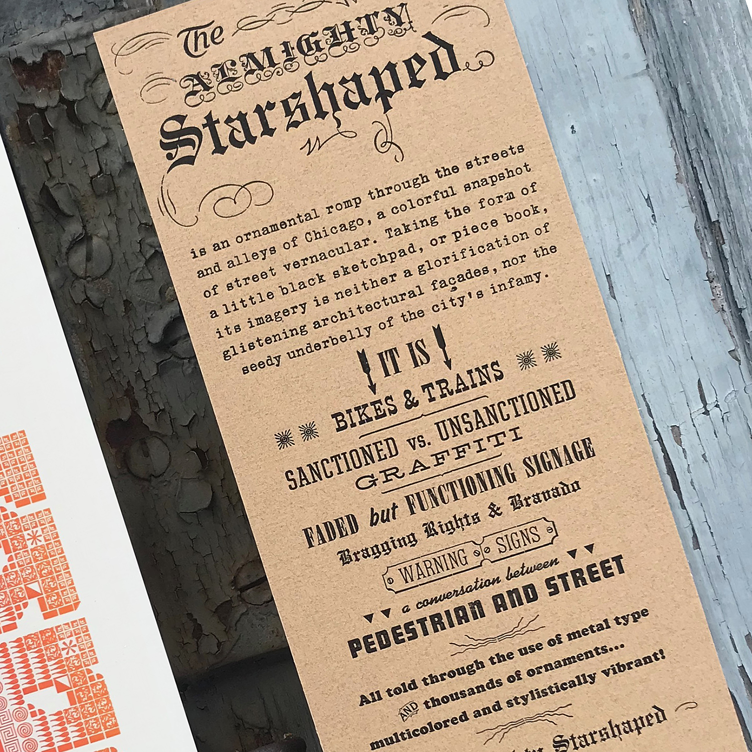
I set out to create my own almighty piece book styled after those of graffiti writers. It is a collection of vignettes inspired by my foot/bike/train travels around Chicago, a record of the sights that often go unnoticed and ignored but build the character of the city.

My goal for the book is to create an entertaining sketchbook with images built entirely from metal type and ornament. The irony and challenge is that in order to create imagery that appears to be sketched and recorded quickly, I must do some of the most complicated typesetting I’ve ever taken on.
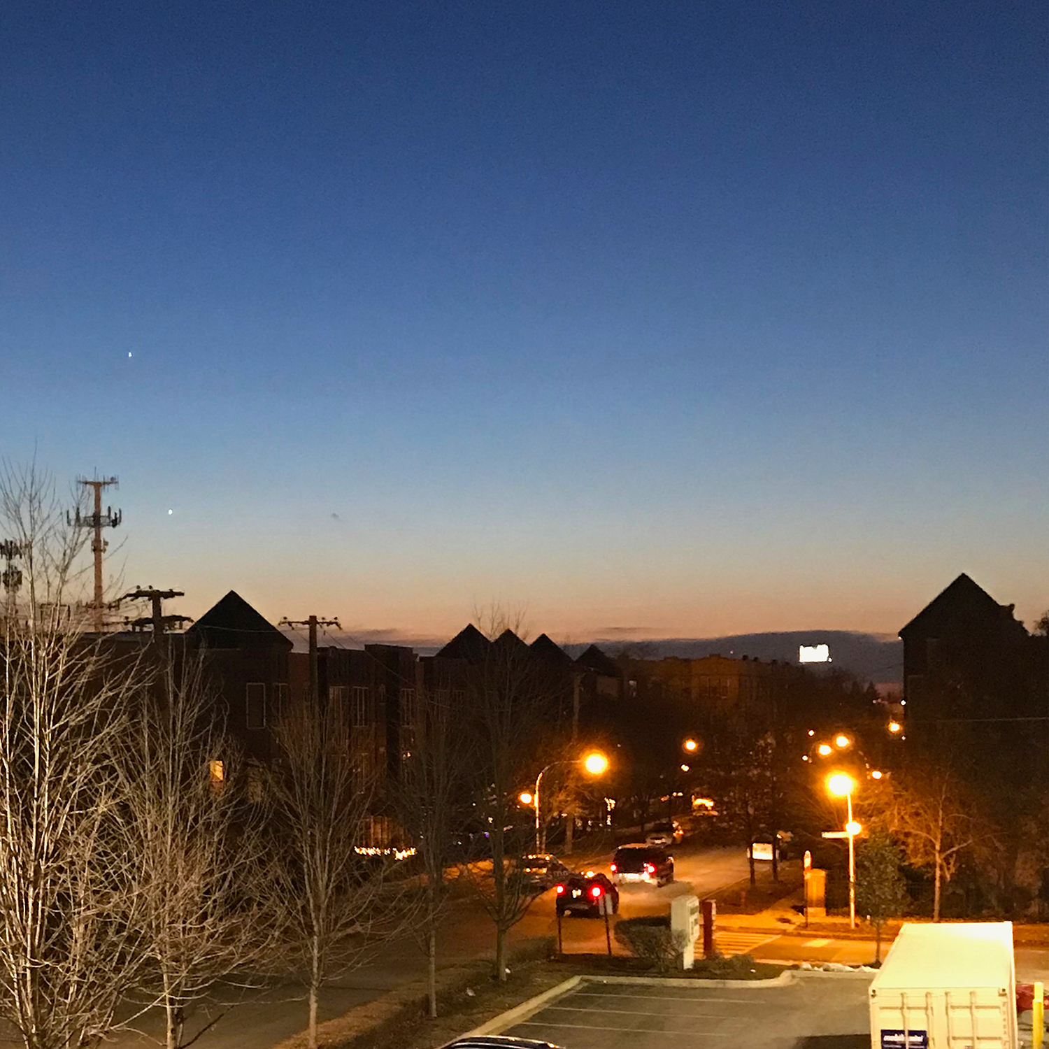
There are 48 pages and the center section of each signature folds out to show larger images that include the title image (metal type takes on spray paint!), an homage to the train-riding experience, bike haters (sneak peek above) and the city at magic hour, looking west.

The book, entirely covered in black book cloth, will have one ‘sticker’ on the front, meant to resemble those that taggers are so fond of. I am, indeed, claiming this book.

hellomynameis.jpg

Here’s a look at a few of the other forms on deck to be printed. The final pages will be full of color.

I often hear the rhythm of Carl Sandburg’s Chicago in my head as I wander the city streets… Shoveling, Wrecking, Planning, Building, Breaking, Rebuilding… and think no one has ever gotten it as right as that. I want to add to this visual with Thinking, Designing, Addressing, Including and of course, Printing. Where would Chicago be without that?

Go here to order the book. I owe high fives to Craig Jobson of Lark Sparrow Press, one of the finest teachers I’ve ever had. He encouraged everyone to always look around and be a part of the community, because design inspiration is everywhere.

Party with the Girls of Starshaped

Many lunch dates with a particularly good friend end with 'book store?' and we wander over to Ravenswood Used Books to see what awaits us. One fruitful trip resulted in many books, one of which covered German graphics and included this image:

Progressive German Graphics 1900-1937, Leslie Cabarga

Progressive German Graphics 1900-1937, Leslie Cabarga

Immediately drawn to these as having been created with metal type and rule, I thought, I could do this... but can I make them... cool? Relevant? Reflective of my experiences as a woman vs. an idealized image created by men? Can I do it with just the modular type in the studio to keep the strong contrast and bold imagery? Does everyone ask themselves a million questions before starting a project?

When I moved to Chicago, the city felt like both a warm hug and a kick in the skirt, declaring, 'what are YOU bringing that will make me even more interesting, more diverse in expression and thought and experience?' I was quickly enamored of a number of subcultures in which girls drafted their own personas based on a shared passion for style, fashion, music and writing. They were built on the past while adding something new... a tweak on the clothing, bands diverging from the originals, working in the vernacular of the street. I adored the attitude of the rude girls, mod girls, b-girls and straight-edge girls that didn't necessarily fall in line with the punk crowd. This was the perfect line up of girls to create that directly reflected my experiences, and so the research began.
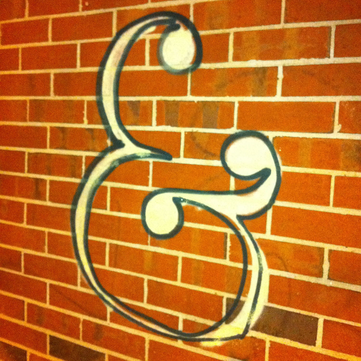
inspiration1.jpg

Creating angles seems like an easy enough task with metal type but not if they veer from 45º or if each image contains more than one set of angles. I attempted basic starter sketches of each girl on grid paper to look for common angles and to begin seeing how the simplest metal sorts could fill the space. I had to be mindful of what areas would be 'black' and what would be 'white,' leaving this a little up in the air as I had a sense these ladies needed to be printed on black paper.

inspiration2.jpg

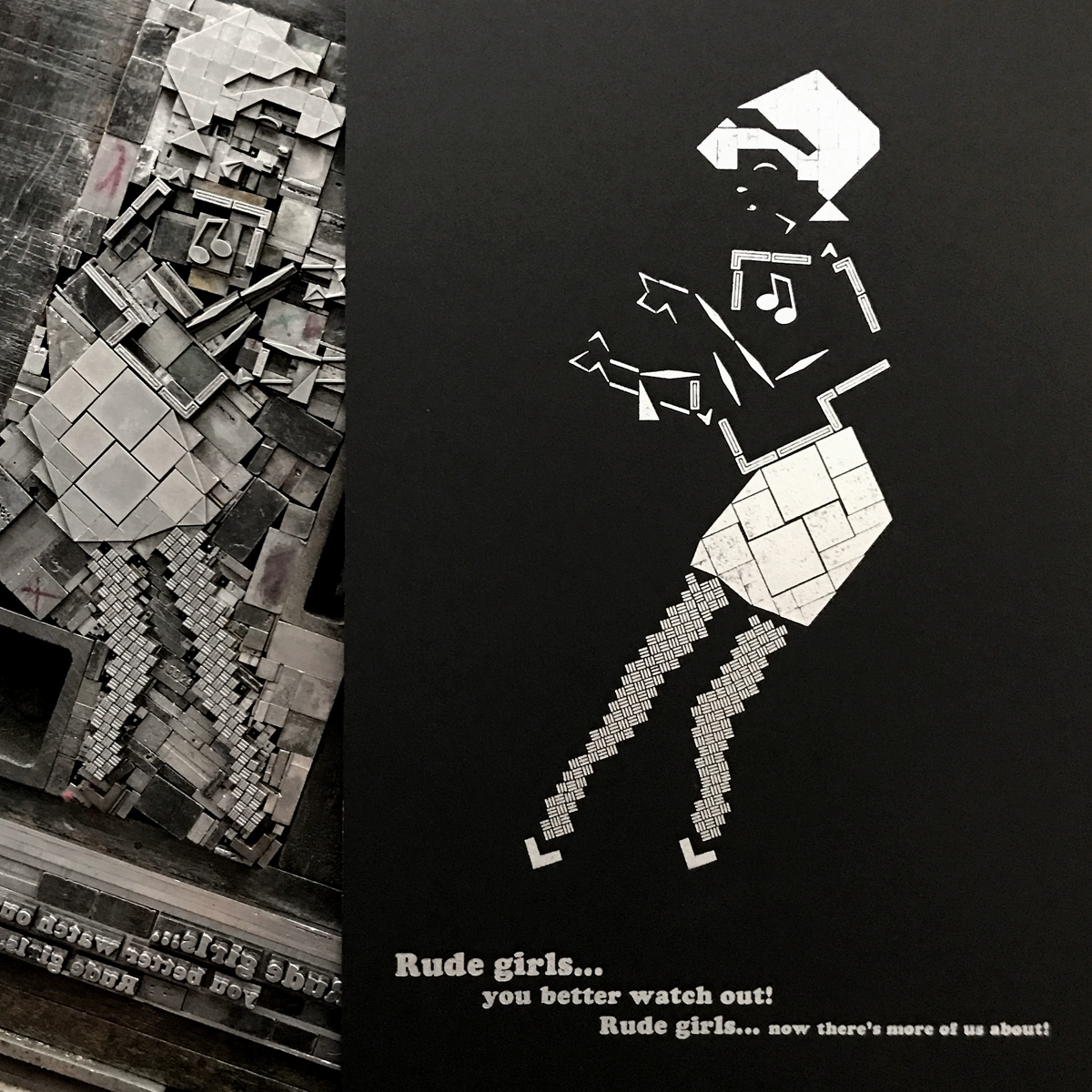
Rude Girl, with her clean, black & white sweater paired with pencil skirt, grooving to ska and rocksteady, came first. This classic image is already so graphic it felt like an easy place to start; it helped establish the use of white/negative space as part of the design itself.
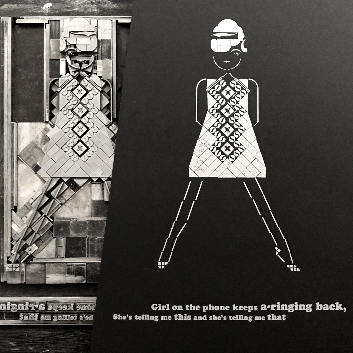
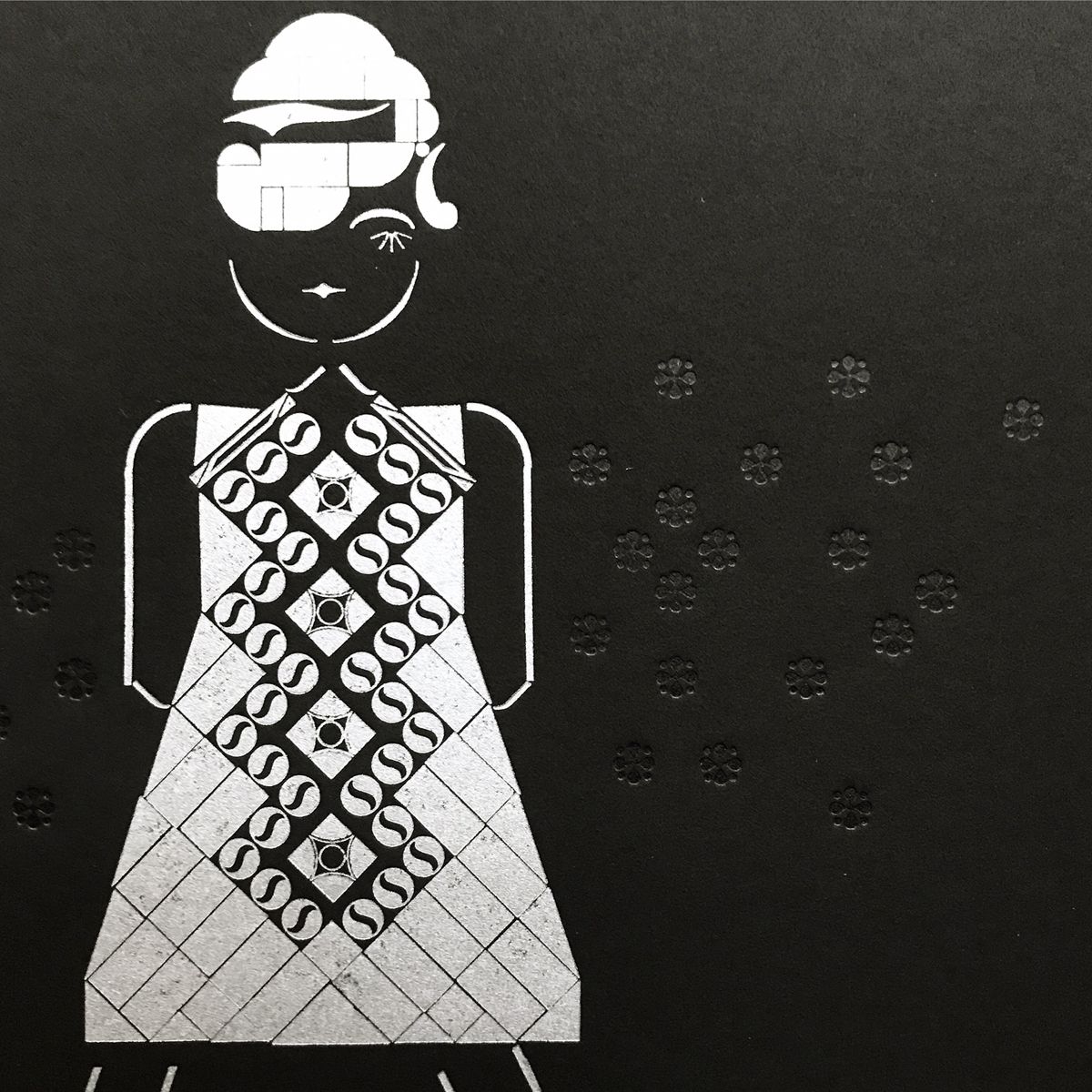
Mod Girl, that icon of 60's style so classic it persists today, was a natural follow up to Rude Girl. Her mascara and pop art dress were built to a steady soundtrack of Northern Soul and English Mods.

formmodgirl.jpg

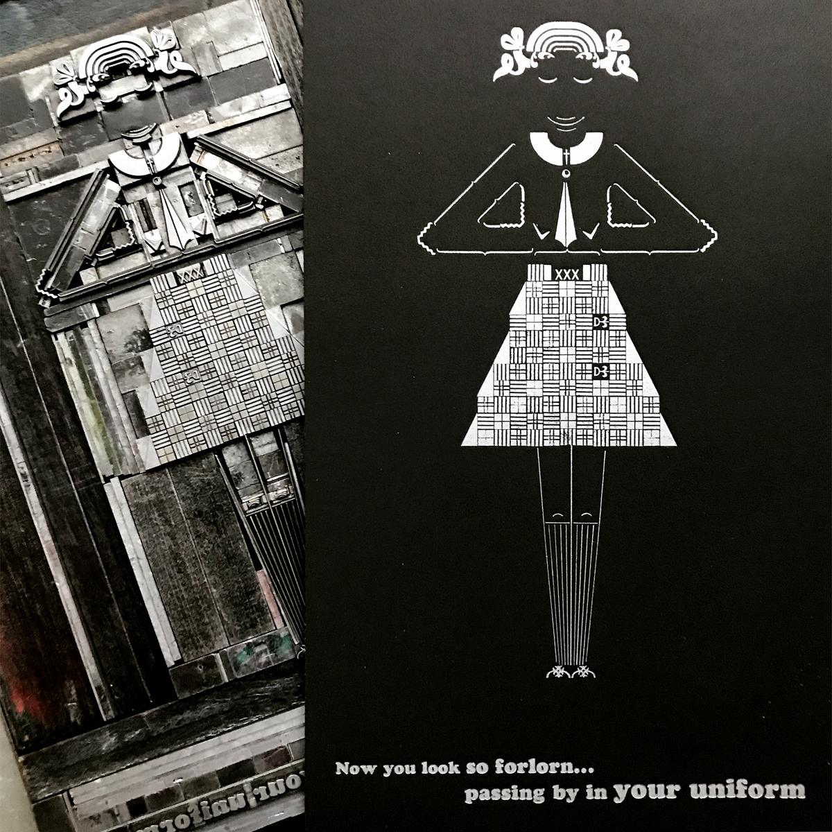
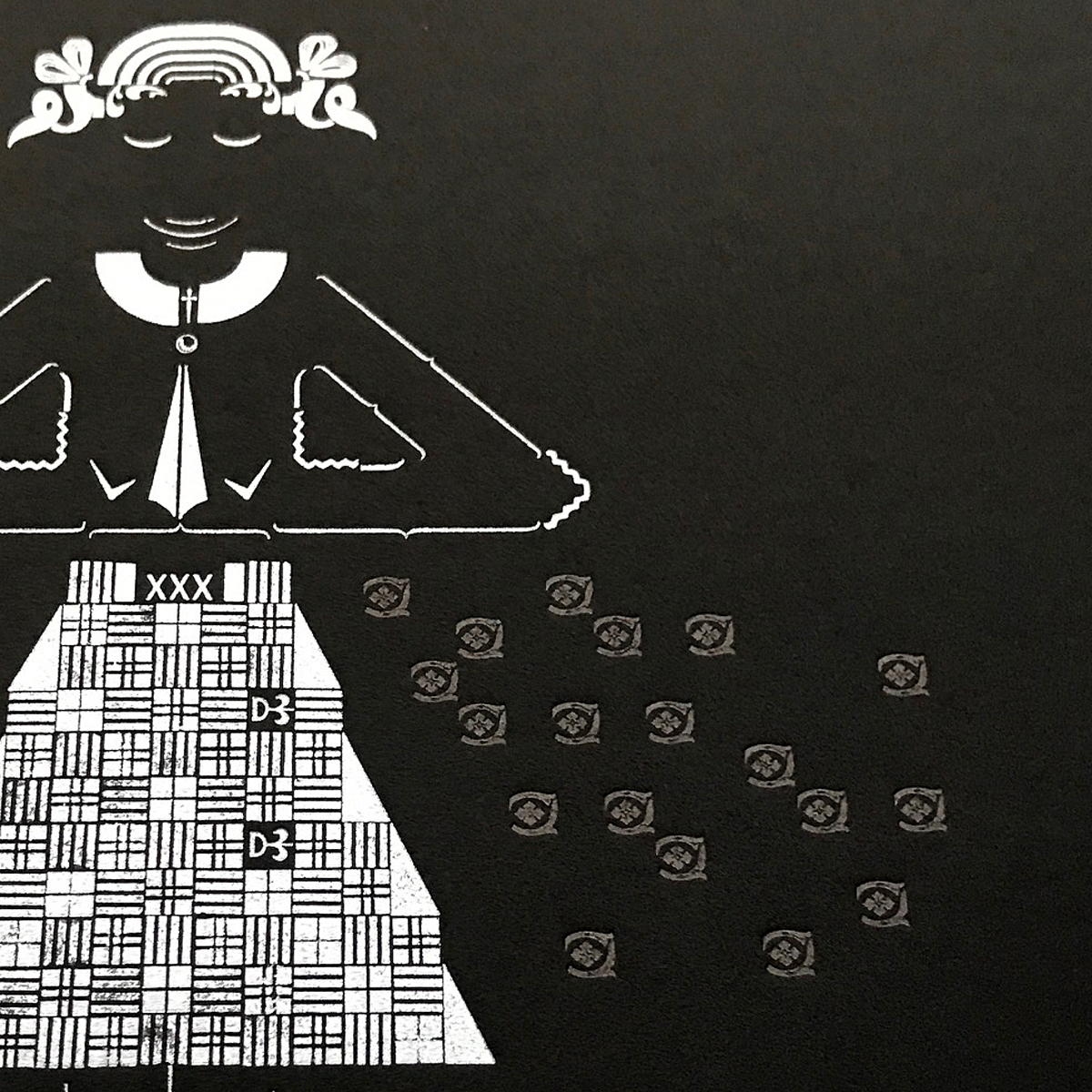
Good Girl, a variation on Straightedge Girls, preferred the scrappy sounds of garage bands and gospel soul to punk rock. She offered more opportunities to rock a uniform while staying true to her ideology. Also, it was really fun to build that skirt.

formgoodgirl.jpg

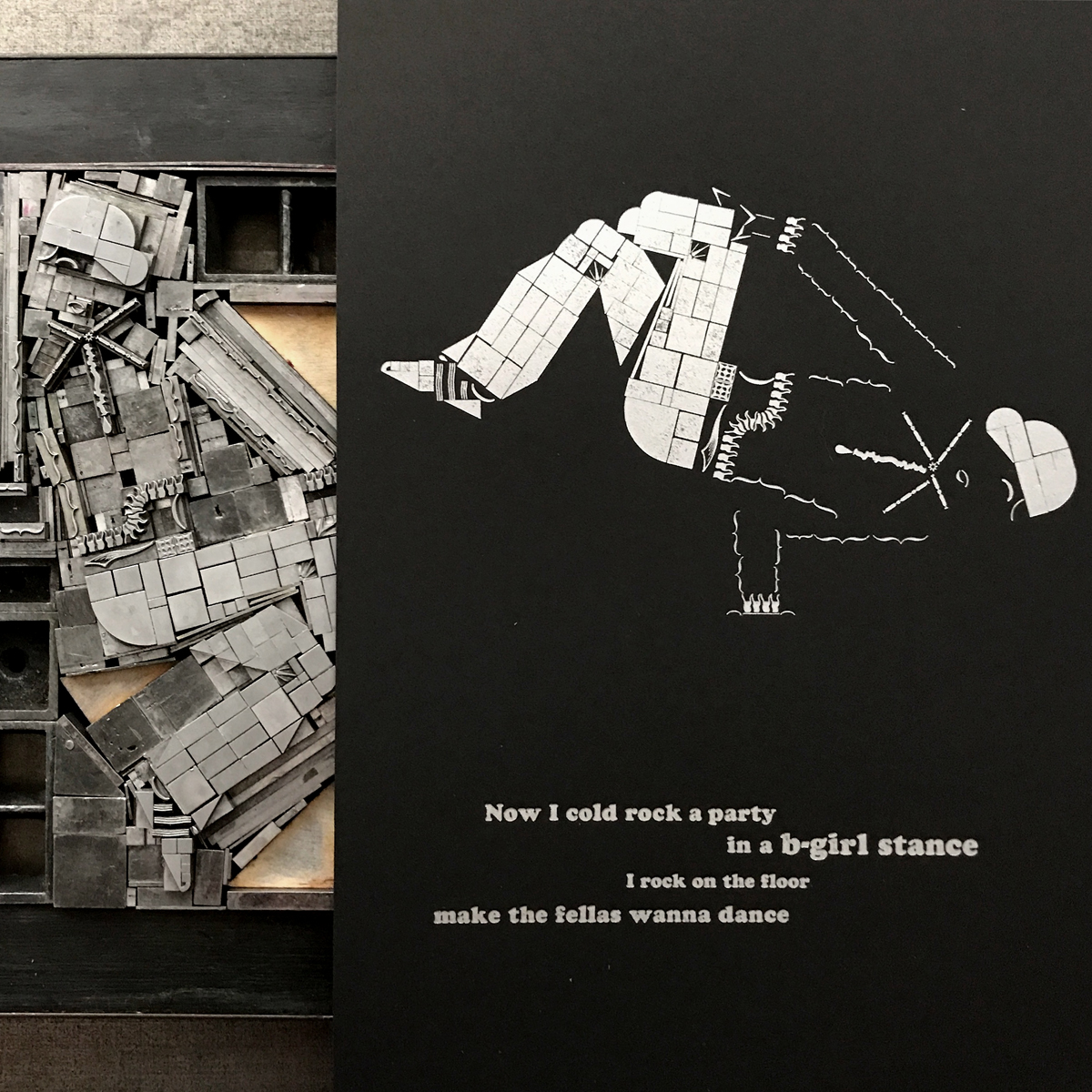
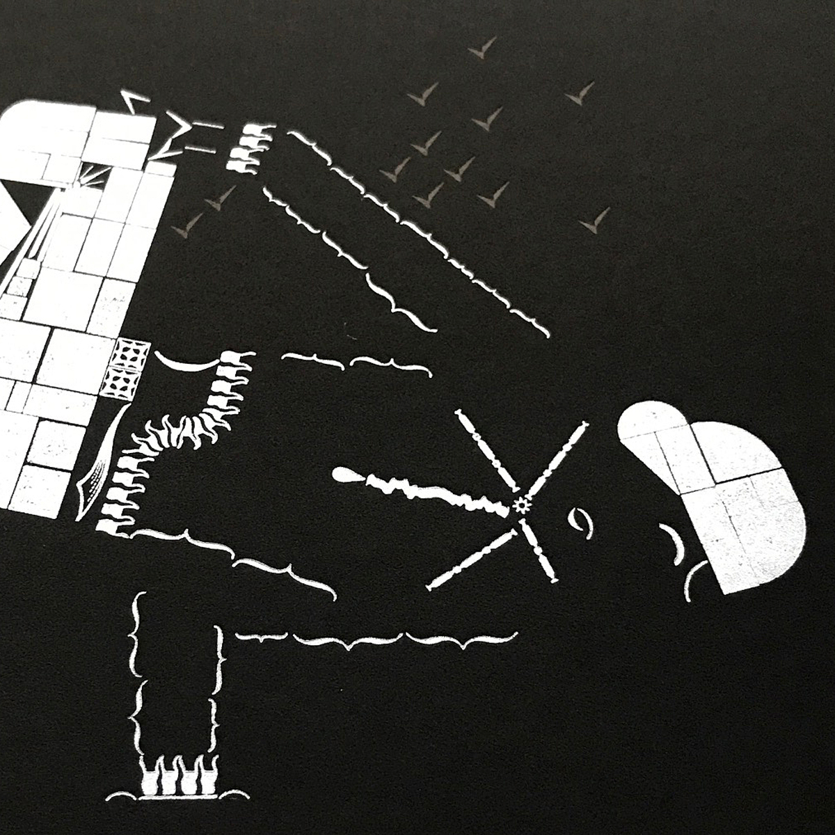
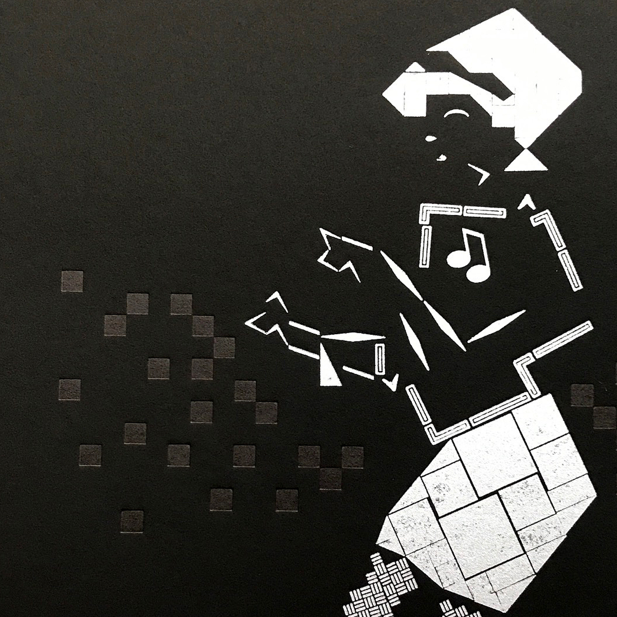
B-Girl brought it home with the most challenging form. How do you capture such incredible movement in one print? What iconic pose gives you the attitude of these breakdancing ladies without killing the energy? I went with this one to show the strength, all while rockin' the cap and Adidas.

formbgirl.jpg

Printer's Devil Jo and I often have what we call Dance Parties in the studio, where we turn up the tunes and let it all out. This is a good exercise after school that loosens us up to get through a few more hours at the studio. So it seemed natural to brand a series based on girls and music as such.

danceparty.jpg

It also felt important to include song lyrics with the prints to ground them on their respective dance floors. Our pals at Jump Up Records suggested the Bodysnatchers for our Rude Girl and no one is ruder than these ladies. Mod Girl got a little Paul Weller because she's a girl that can scare Paul Weller. Good Girl pulled out her Alex Chilton/Big Star albums, knowing he can write about uniforms with reverence and not creepiness. MC Lyte lays it down on the cardboard harder than anyone else could for our B-Girl.

Rounding out the images, I added some subtle black-on-black ornaments for each girl for that little somethin' somethin'.

dots.jpg

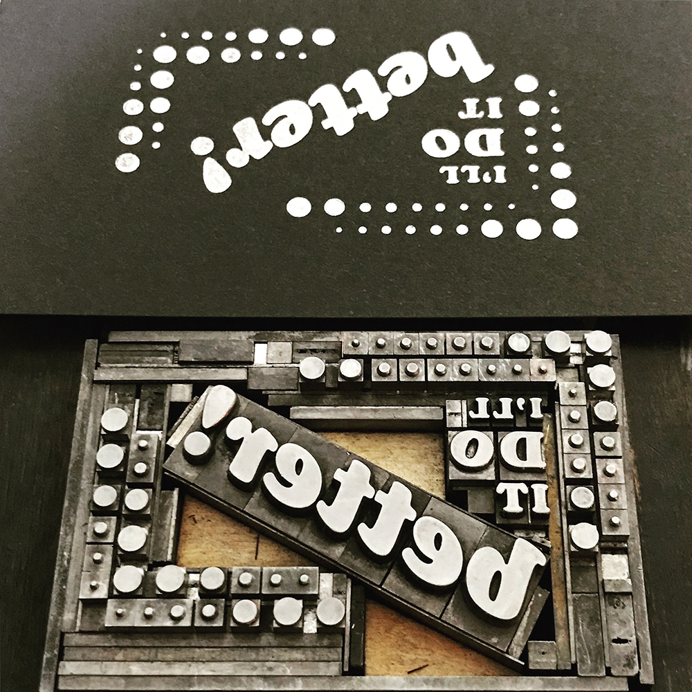
The paper, Curious Matter, is made from potato starch and has a very tactile, space age feel to it. The silver ink pops and the black is so subtle it's difficult to photograph.

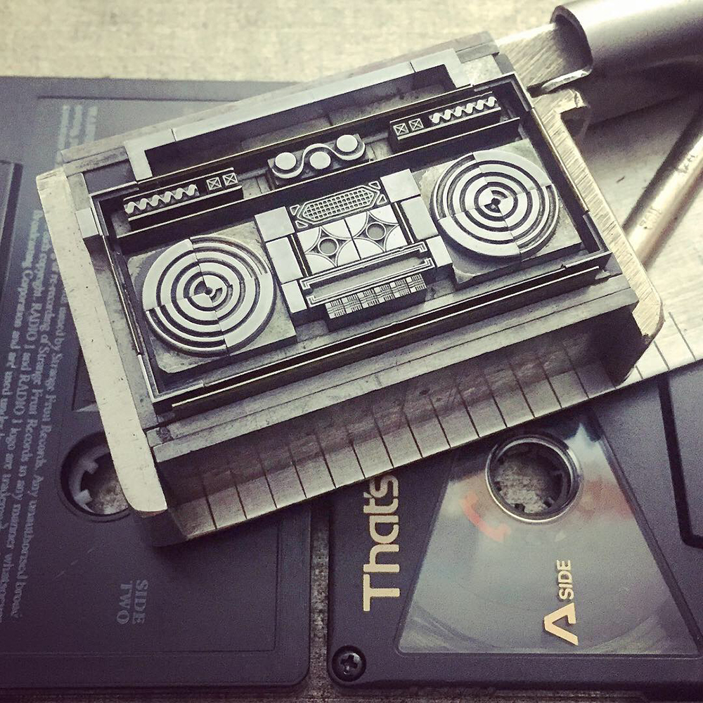
These ladies definitely presented as a series and I planned to bind them as such, in a sleeve resembling that of an LP. The first page functions as colophon/liner notes. It's printed on shimmering, silver paper in all Cooper Black because nothing says Dance Party like Cooper Black.

insert3.jpg
insert1.jpg

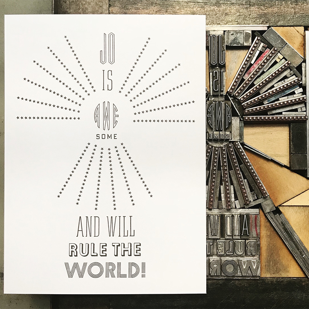
Jo graciously brought the attitude to photograph the final product.

jocover.jpg
jomod.jpg

Half of the edition of 50 was bound and finished at Penland School of Crafts in my downtime from teaching there this Fall. When in Rome, bind like real bookbinders do.

spines.jpg

I might not be able to get coffee and pie at Don's in Rogers Park with the mod/ska kids anymore, and I might not get to as many clubs for music as I did 20 years ago, but I'm surrounded by girls in the city who are taking the term 'girl' and owning it, removing the negative connotations that come from downplaying their cultural role and denying them status as full-fledged women. I see styles evolving from the above to give new meaning to navigating fashion, music and attitude, building confidence along the way.
To support the next generation of ass-kicking girls, 20% of the sales of Dance Party is going direct to She Crew, an organization that Jo and I can't love enough. The innovative and tireless youth of Chicago show us all that our future is savvy, smart and stylish.

Residing in the Ornament

In September 2016, I had the pleasure of listening to Lin-Manuel Miranda in conversation with Chicago theater critic, Chris Jones. While discussing his collaborators, he emphatically stated, 'Find the people who can make your work better.' The comment struck me as it gets to the heart of collaboration; your own work is validated and strengthened by honoring the work of your collaborators.

I've been fortunate to call Geri at Virgin Wood Type a friend for some time. While the craft of making wood type in the 21st century is not one pursued by many, there is little doubt in my mind that Geri's acute attention to the details of the process and commitment to creating the finest quality wood type is unmatched. The unfortunate fact that our personal lives share many sad roadblocks has brought us even closer and the friendship only wanted a project to highlight our creative strengths.

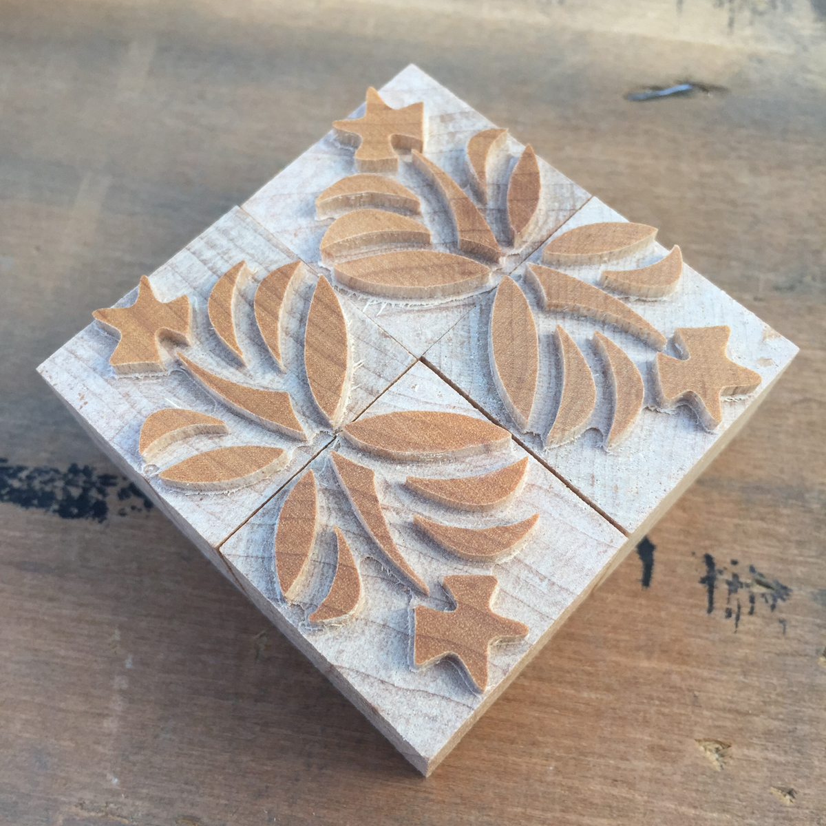
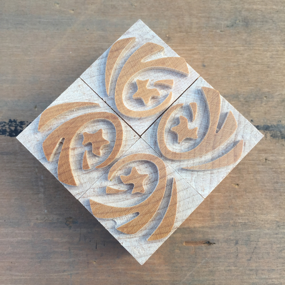
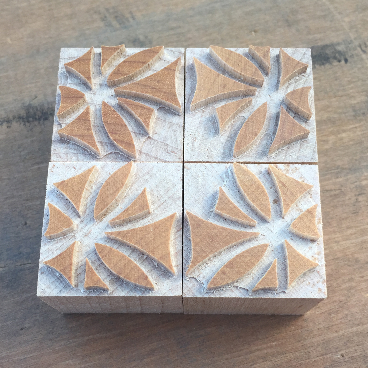
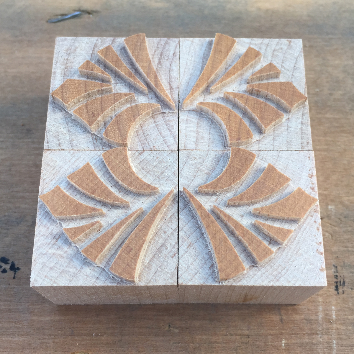
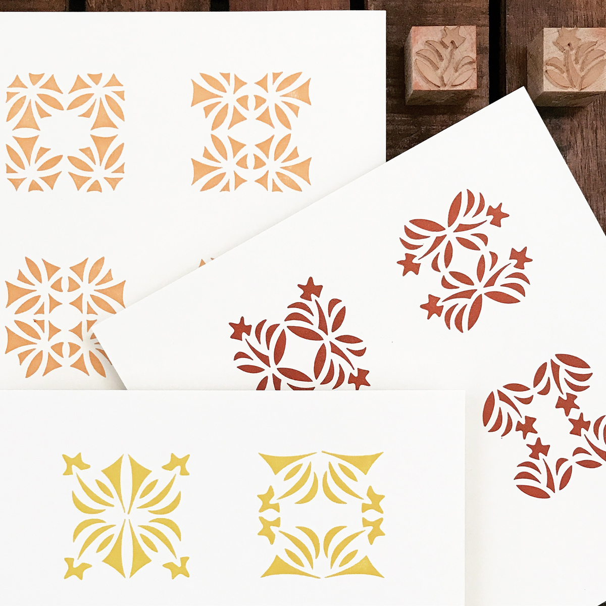
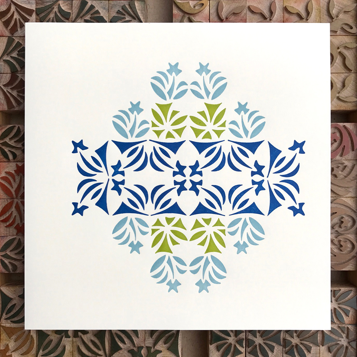
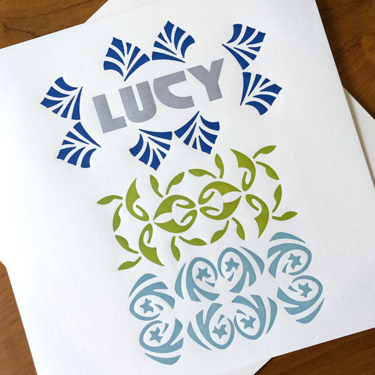
I started drawing ornaments that would stray from The Chicago Collection in all its rigid architectural influence but retain the subconscious effects of prairie-style design on my work. These ornaments would be organic in form but cut to mirror each other, giving the user the opportunity to create symmetry, if desired.

The semi-final round of choices

The semi-final round of choices

From here I chose six designs that would be cut as reflecting pairs. Then Geri and I decided to create two collections that would contain four sets each of three designs, meaning printers could get one or both sets to mix and match. Here are the final patterns, notes for cutting and a sneak peek of the pantograph cutting, courtesy of Matt Rieck:

patterns.jpg
cuttinginfo.jpg
cutting.jpg

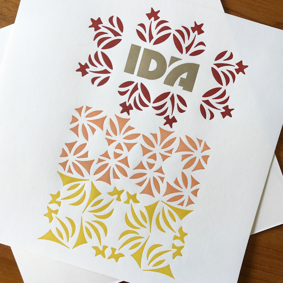
They are so beautifully made that it was only right they be named for two very different Chicagoans I admire: Ida Terkel and Lucy Parsons.

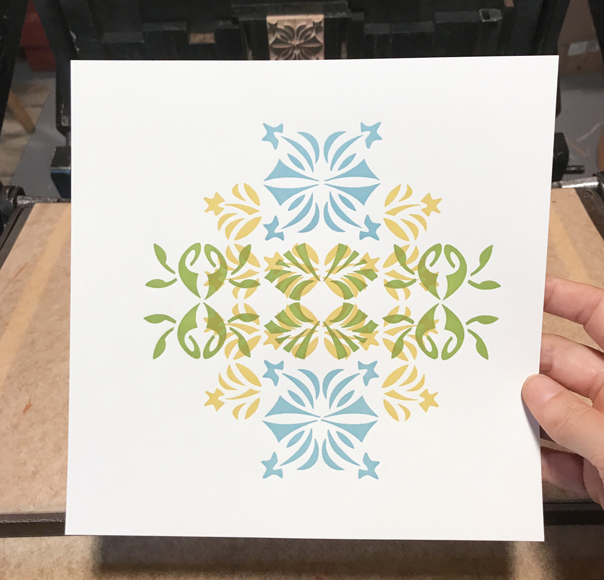
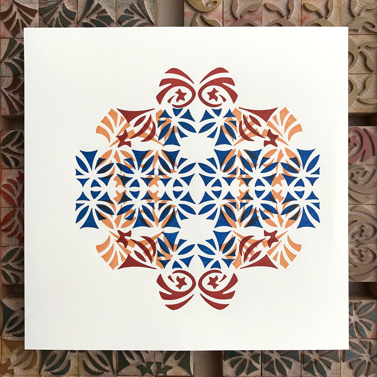
Another goal of the project was to create something outside of the traditional vernacular of wood type ornament. Sure, we all love the stars, rules, pointers and manicules, but what if wood type ornaments could reflect the aesthetics of a time period in which its production was declining? What if these ornaments could help printers push their design work in new directions and interpret existing type collections in different ways? I was certainly anxious to try, and so began a specimen book to put them through the ringer. It started with simply combining four of the same ornament together to create larger designs and progressed to multi-color, overlapping pages.

I felt color would best serve these ornaments and went for it with a full-on rainbow, albeit it one woven through an Arts & Crafts sensibility.

All of the designs held a certain charm for me, but it wasn't until printing that I fell head over heels. The final version of these ornaments added two somewhat unexpected layers: the living nature of the wood itself and the skilled hands that cut and trimmed each one. Some may consider this a residual loss through production; I will fiercely defend this as a rooting the designs required in order to thrive on the page.

The final books are bound and available here in a limited edition of 65. The ornaments themselves are made to order via Virgin Wood Type, alongside a stunning roster of beautiful wood type faces that pair perfectly with them (Craftsman Gothic, Preissig and Rugged.) I cannot wait to see how they are interpreted by other designers and grow beyond the initial sketches. Louis Sullivan said 'the building's identity resided in the ornament.' At face value, this is a guiding principle of my most self-fulfilling work. As metaphor, the buildings I raise are given their true identity when layered with the kind of collaborators who make my work better.

The Well-Traveled Metaphor

I've never been out of the country (you don't count, Canada, to a New York gal coming of age in the 90's.) When asked about this 'choice' I am forced to both consider and share that it was anything but. The lack of travel tied into paying for my education, starting a business and ultimately owning the 1920 poky-walled bungalow of my dreams, all of these things held together with spackle, paint and sheer gumption. But with the exception of the til-death-do-us-part mortgage, life is debt-free and Starshaped boasts one of the finest metal type collections in the Midwest. My true choices were good ones.

Eponymous Dard Hunter ampersand, representing East Aurora, New York

Eponymous Dard Hunter ampersand, representing East Aurora, New York

American Uncial, by Victor Hammer, printed at the Wells Book Arts Center in Aurora, New York

American Uncial, by Victor Hammer, printed at the Wells Book Arts Center in Aurora, New York

Totemic, by Jim Rimmer, representing Vancouver

Totemic, by Jim Rimmer, representing Vancouver

Given my foreign travel virginity, the irony of The Well-Traveled Ampersand series is not lost on me. My anxiety with this shortcoming often leads to insecurity and not feeling qualified to engage in conversation with exceptionally well-traveled individuals in printing circles. I am thankful for two situations that help alleviate what is likely a self-imposed stress. The first is that we live in an extremely diverse and multicultural city. The street by our home is host to many Latin and South American parades in the summer, prompting a 2-year-old Jo in 2009 to ask 'can we go to the parade this weekend?' assuming there was one every Saturday at noon. There almost always is.
The other benefit to living is Chicago is our position as travel hub for those on their way to the annual Hamilton Wood Type & Printing Museum Wayzgoose or Newberry Library. This brings a stream of travelers through the studio and exposes both of us to cultural differences and funny slang; Jo learned this year that 'trump' in England is code for 'fart.' This was a gift to a 10-year-old if ever there was one.

Concave Tuscan, a popular style for wood type, much of which was produced at Hamilton

Concave Tuscan, a popular style for wood type, much of which was produced at Hamilton

Prior to hitching his wagon to mine, Mr. Starshaped was indeed well-traveled and spent a year living in London. I regret we were never able to travel together and it pains me to remember his first sentence after learning he had cancer: 'You need to get a passport.' I built ampersands during his illness that prompted discussions of his time and experiences abroad as well as reconnecting with the people there he loved.

London Underground, by Edward Johnston

London Underground, by Edward Johnston

Ampersand by Vojtech Preissig, representing Prague

Ampersand by Vojtech Preissig, representing Prague

Adrian Frutiger's ampersand for the Paris airport

Adrian Frutiger's ampersand for the Paris airport

Jo and I get a lot of mileage out of our fair city. We've spent hours in front of the Chagall windows at the Art Institute, a favorite of hers as she likes us to make up stories about the imagery. And we study the Tribune Tower which boasts stone and brick from famous structures all over the world, including the pyramids; this gives new meaning to the Magnificent Mile.
In the summer of 2015 she and I traveled by car to California and then east to New York, a trip that was physically and emotionally challenging for me (more here) but presented Jo with her first opportunity to see the ocean. She fixated on this as a personal manifest destiny-style mantra and her 8-year-old exuberance was a welcome respite.

Californian, by Fred Goudy

Californian, by Fred Goudy

Over the 18 months of developing this project, I reached out to a few contemporaries, crossing my fingers they'd contribute an ampersand based on their varied travels and experiences in the world and so I could live vicariously through them. One of these was Russell Maret, who shared his Cancellaresca Milanese, the one image that breaks out of the form itself to add structures of Siena. I can't pretend to understand most of the work Russell does; what I do know is that it's visually striking and beautifully printed, and I can stare at it for hours and hours as I attempt to pick apart the brain that made it possible.

Cancellaresca Milanese by Russell Maret, to represent Siena, Italy

Cancellaresca Milanese by Russell Maret, to represent Siena, Italy

Another lucky shot was getting Mark Van Wageningen of Novo Typo on board to contribute. I've been watching his work with chromatic type, both digitally and in metal, for some time and fell in love with how well this form fit the cityscapes of Amsterdam.

Bixa Stencil by Mark Van Wageningen, to represent Amsterdam

Bixa Stencil by Mark Van Wageningen, to represent Amsterdam

Joseph Churchward's Maori was supposed to be the final ampersand as it would provide the biggest challenge to my bandsaw skills. But my quest for contributors had to be put on hold while caring for Mr. S in his final months so I jumped it ahead. It's a truly impressive ampersand, and I nailed it.

Churchward Maori, by Joseph Churchward, in homage to the Maori of New Zealand

Churchward Maori, by Joseph Churchward, in homage to the Maori of New Zealand

There was a shocking lack of women designers when I first developed a list of potential ampersands. Not acceptable. It was suggested I check 'my own backyard' for talent and there's no doubt I am surrounded by it.
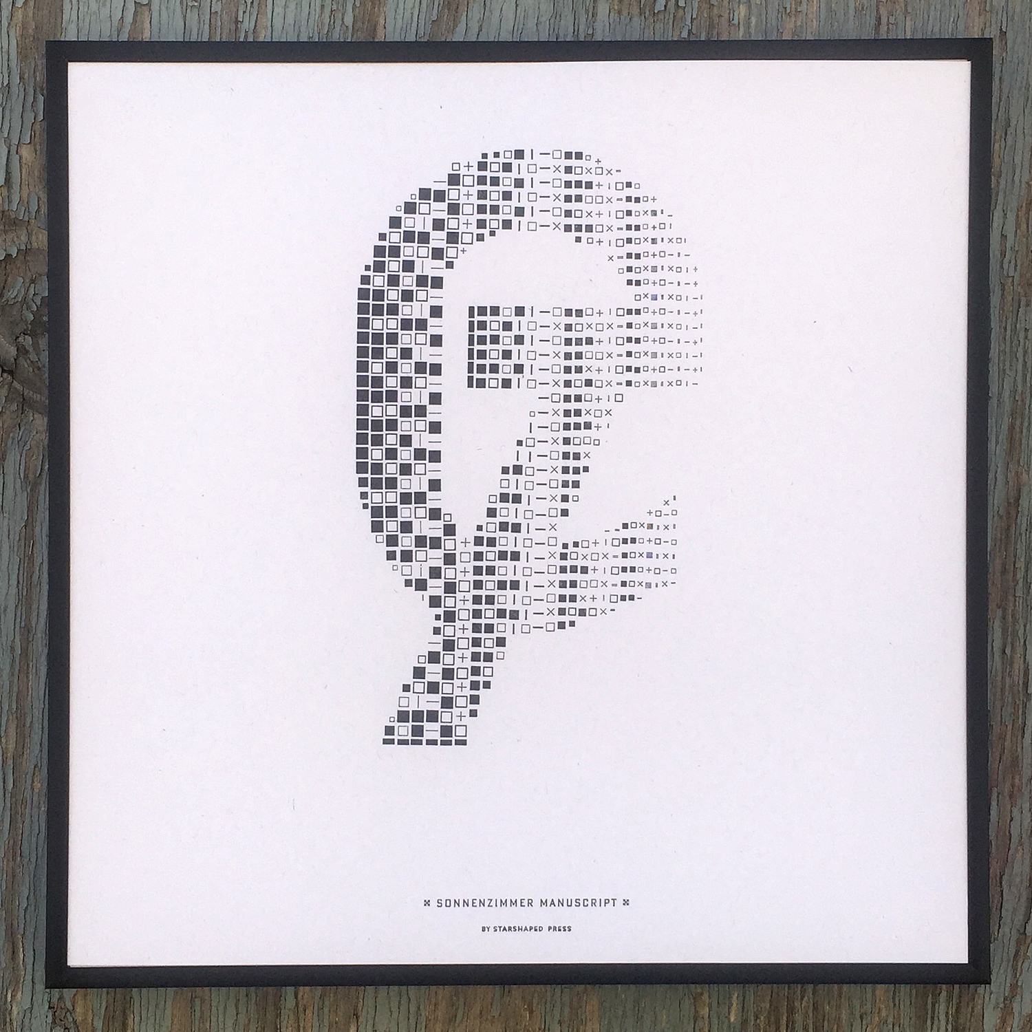
Nadine of Sonnenzimmer is a solid friend and comrade-in-arms in Chicago's design scene. She's always been there for me with no nonsense insight into work and a kick in the ass when it's needed. She has held me accountable to my own work and if I ever phoned it in she'd be there to let me know. As a native of Switzerland, it's impressive how quickly she developed her no-BS Chicago attitude and I love her for it. Her typographic work is anything but stale and this ampersand was the biggest challenge of the entire project.

Sonnenzimmer Manuscript by Nadine Nakanishi, representing Switzerland in grid form

Sonnenzimmer Manuscript by Nadine Nakanishi, representing Switzerland in grid form

Frances, my Frances, the cleverest turn-of-phrase woman I know, who seamlessly maneuvers between pattern and type, provided a sprawling ampersand based on her time in Vienna. How badly did we want to call it Wiener Chic? We giggled and silenced our 10-year-old selves.

Wien, by Frances MacLeod, representing Vienna

Wien, by Frances MacLeod, representing Vienna

Jenna Blazevich of Vichcraft is a beacon for feminism and owning the issues that surround empowering women and running a business. Her time studying letterforms in Rome led to Sea Change Script, and the change we hoped would come in November 2016.

Sea Change Script by Jenna Blazevich, representing Rome

Sea Change Script by Jenna Blazevich, representing Rome

I found Pooja Saxena through Alphabettes and admired her writing and type work. There is no ampersand in Devanagari script so she created a reverse stroke form that hints at the style. I found new ornaments cast at Skyline Type Foundry from Indian matrices. Tiny pigeons and kites dot the Delhi sky. This is a place to which I have longed to go for many years.

Viparit, by Pooja Saxena, representing Delhi

Viparit, by Pooja Saxena, representing Delhi

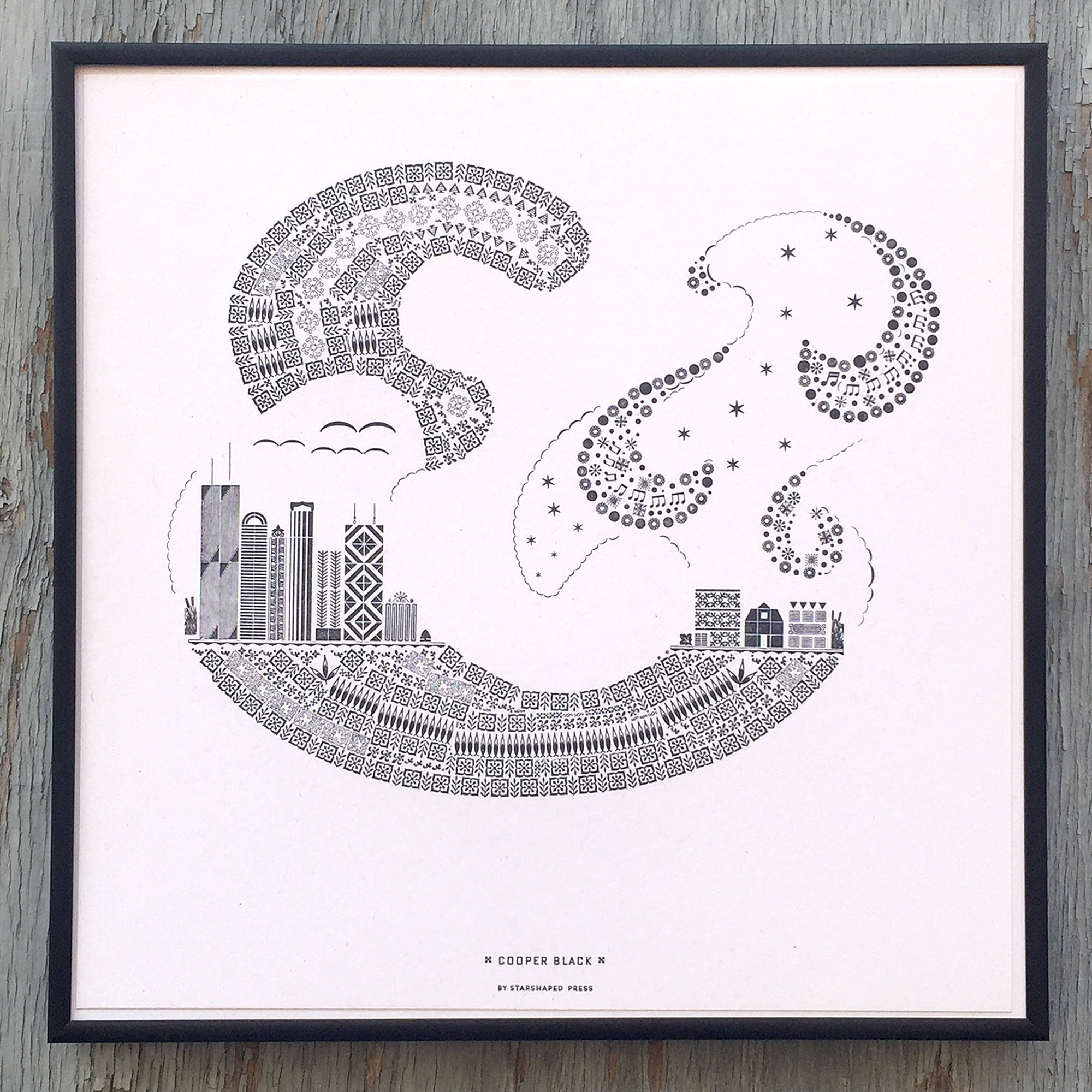
Chicago, my Chicago. The city is the constant in my life and grounds both Jo and me. Its streets and structures remain throughout all trials and the people, our village, are everywhere I turn.

Cooper Black, by Oswald Cooper, representing Chicago

Cooper Black, by Oswald Cooper, representing Chicago

I'm ever mindful that the triple crown of parenthood, homeowner and entrepreneur is an exhausting mantle to bear and we are very slowly settling into what I call our New World Order. I am hopeful that opportunities to travel and see the world will present themselves for myself and Jo. In the meantime, the passport that I rushed for a failed attempt to leave town last summer will sit at the back of the desk drawer, patiently awaiting its first stamp.
That said, there's a substantial, challenging and exhilarating project on the horizon for Starshaped that will define the studio's place, as well as my own, within the context of Chicago's past, present and future. I am looking forward to revealing more of this as 2017, already off to a jump start, progresses.

For more detailed process info on the series, please read this post. And this.
Full portfolios as well as individual prints can be purchased here.