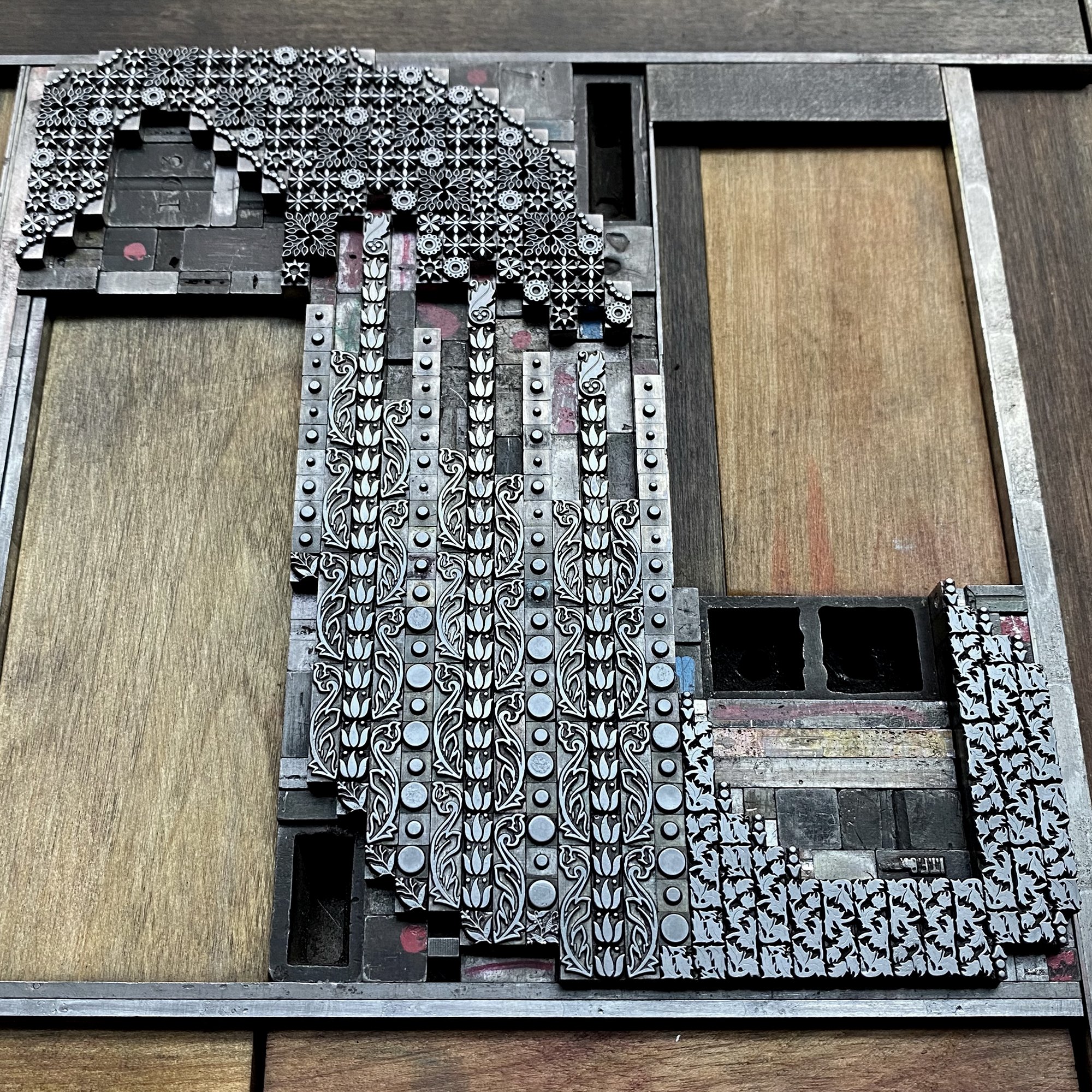
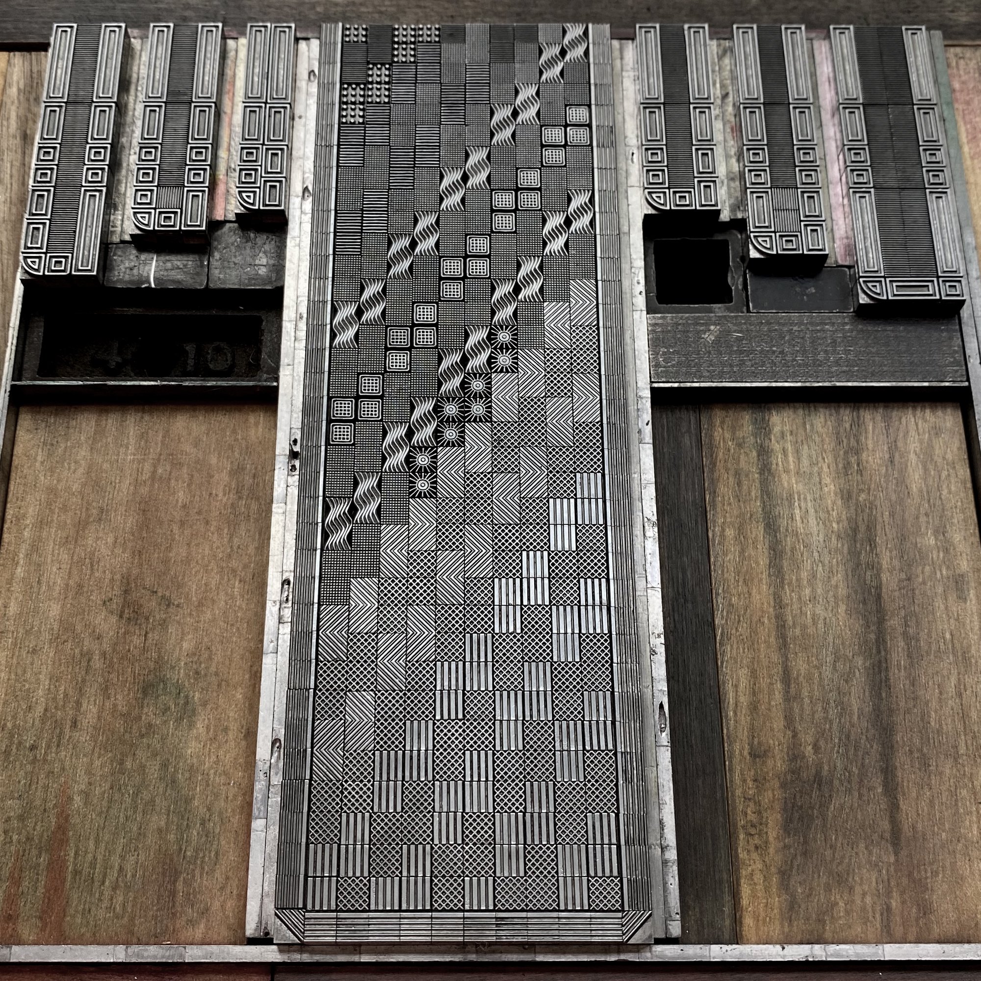
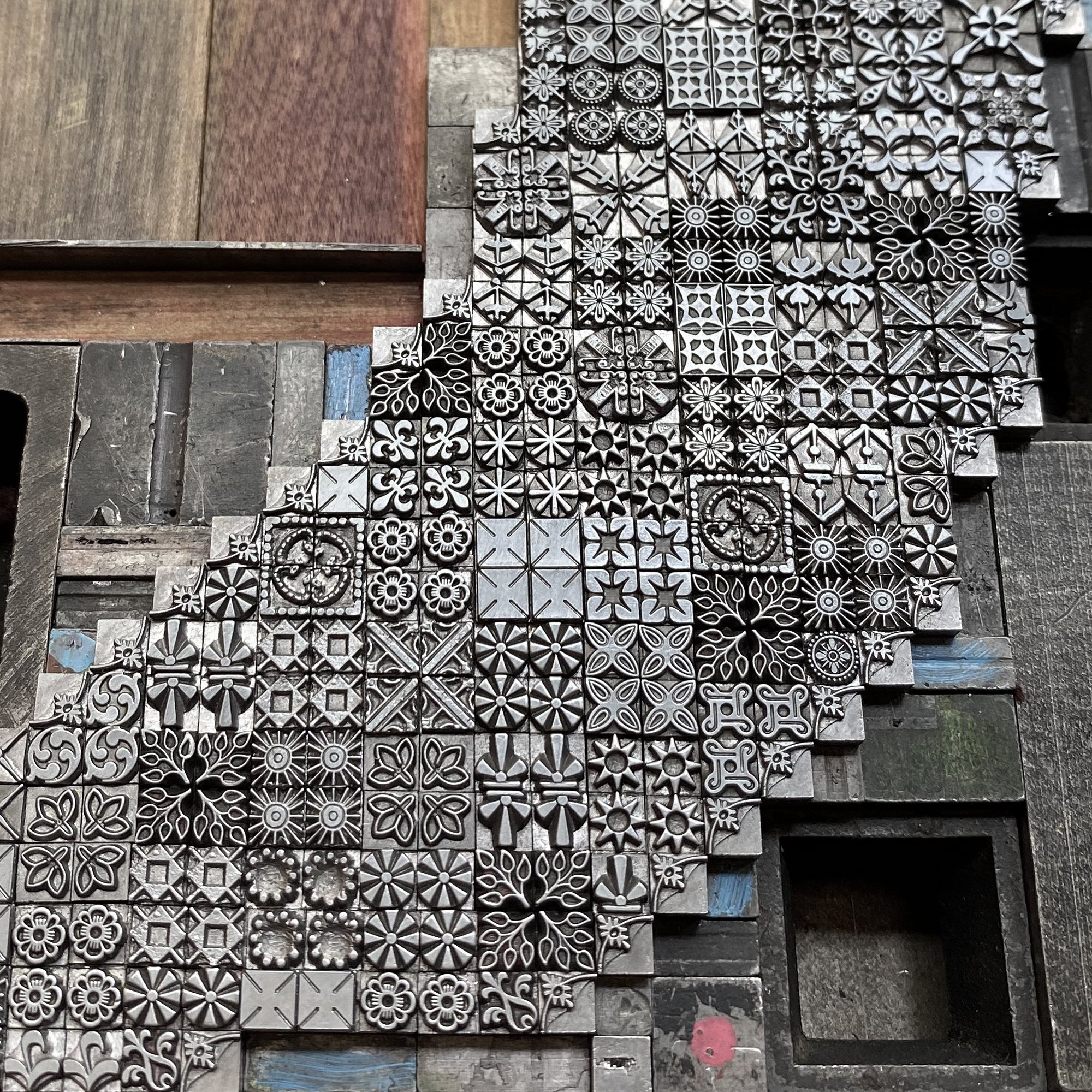
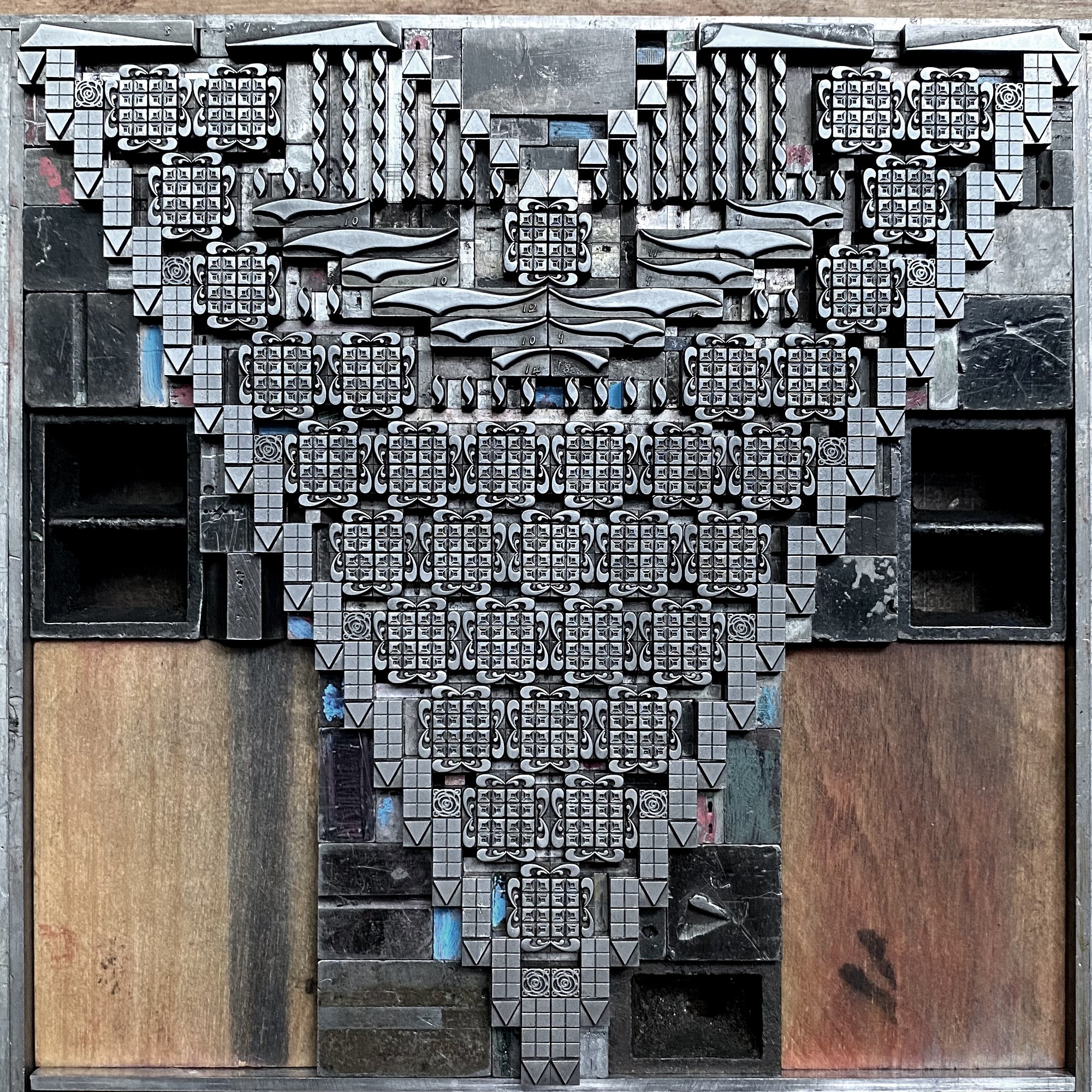
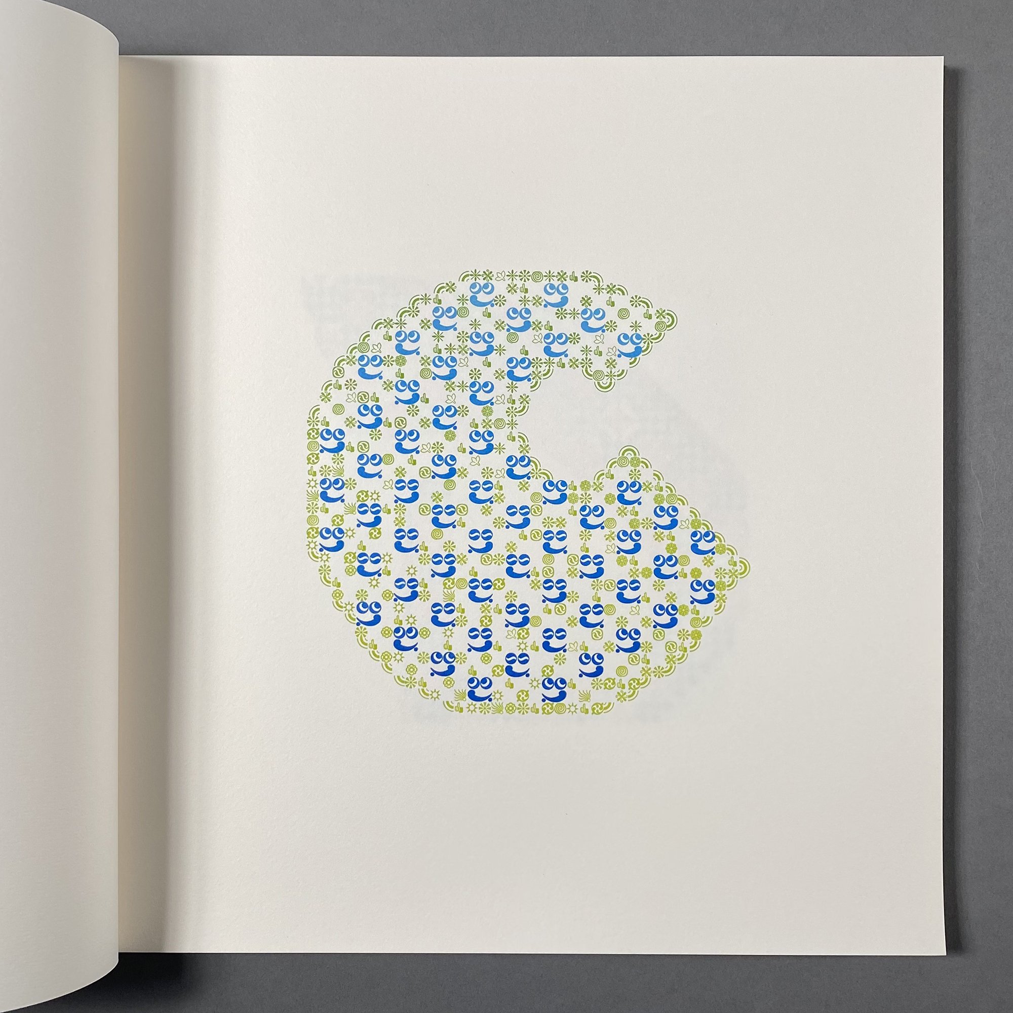
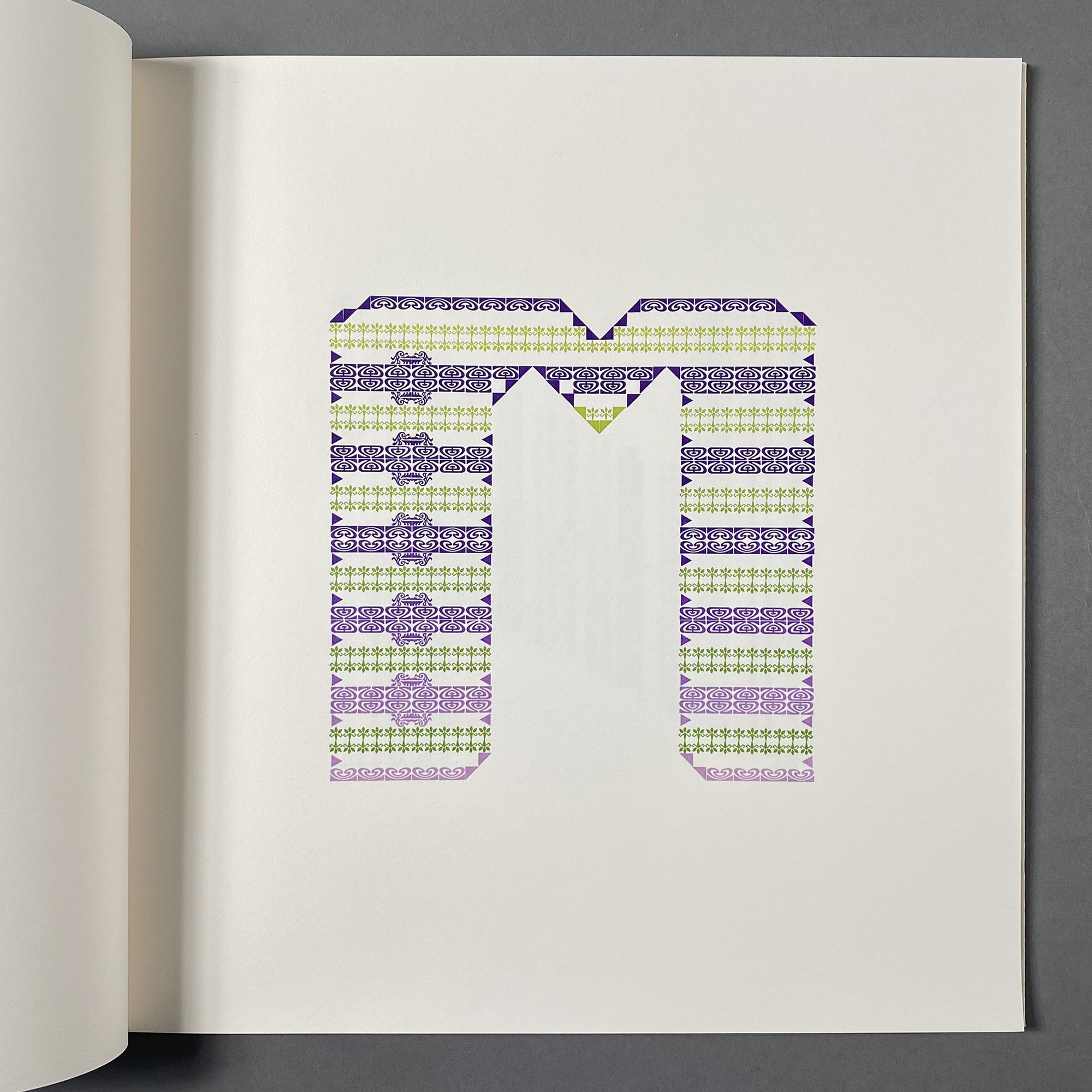
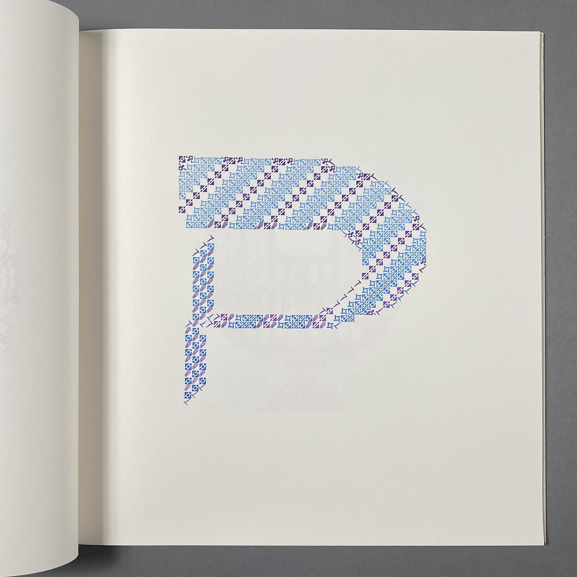
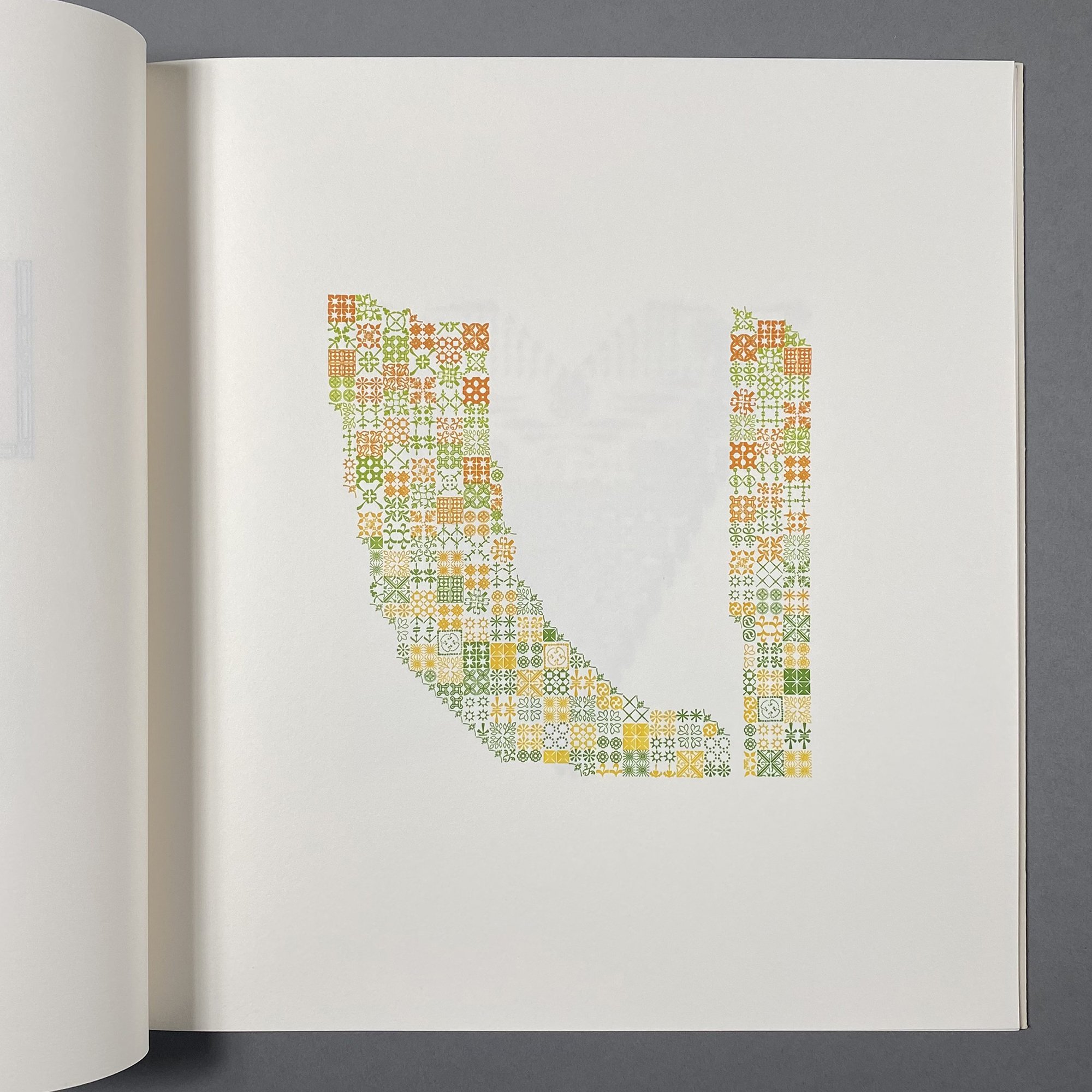
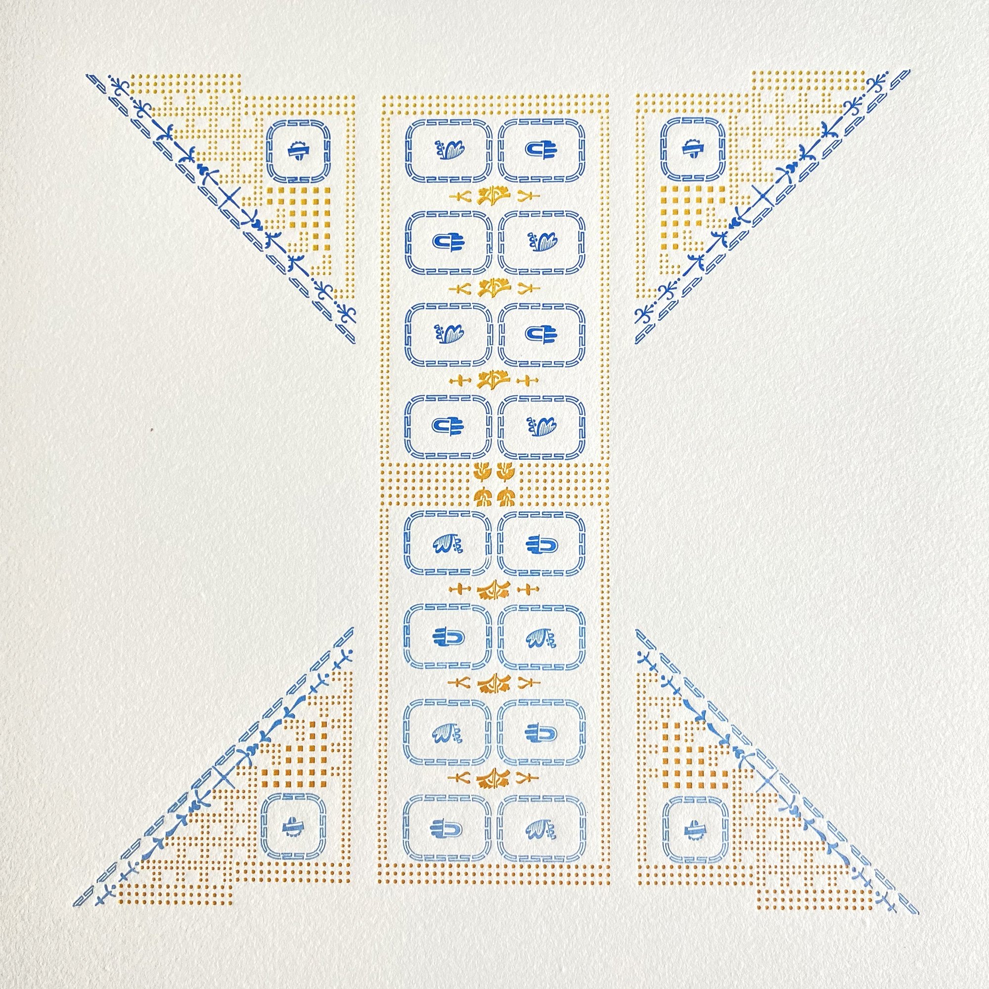
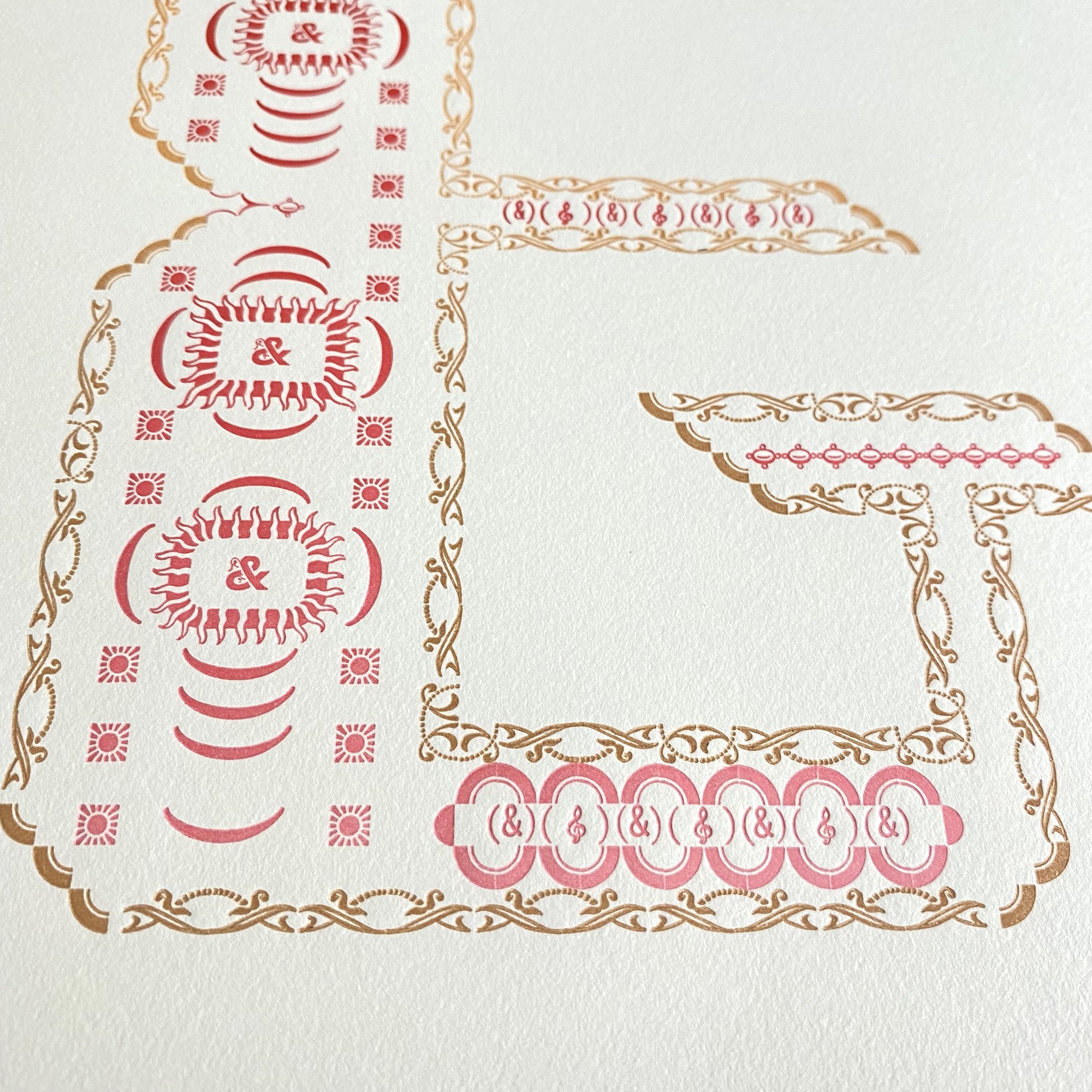
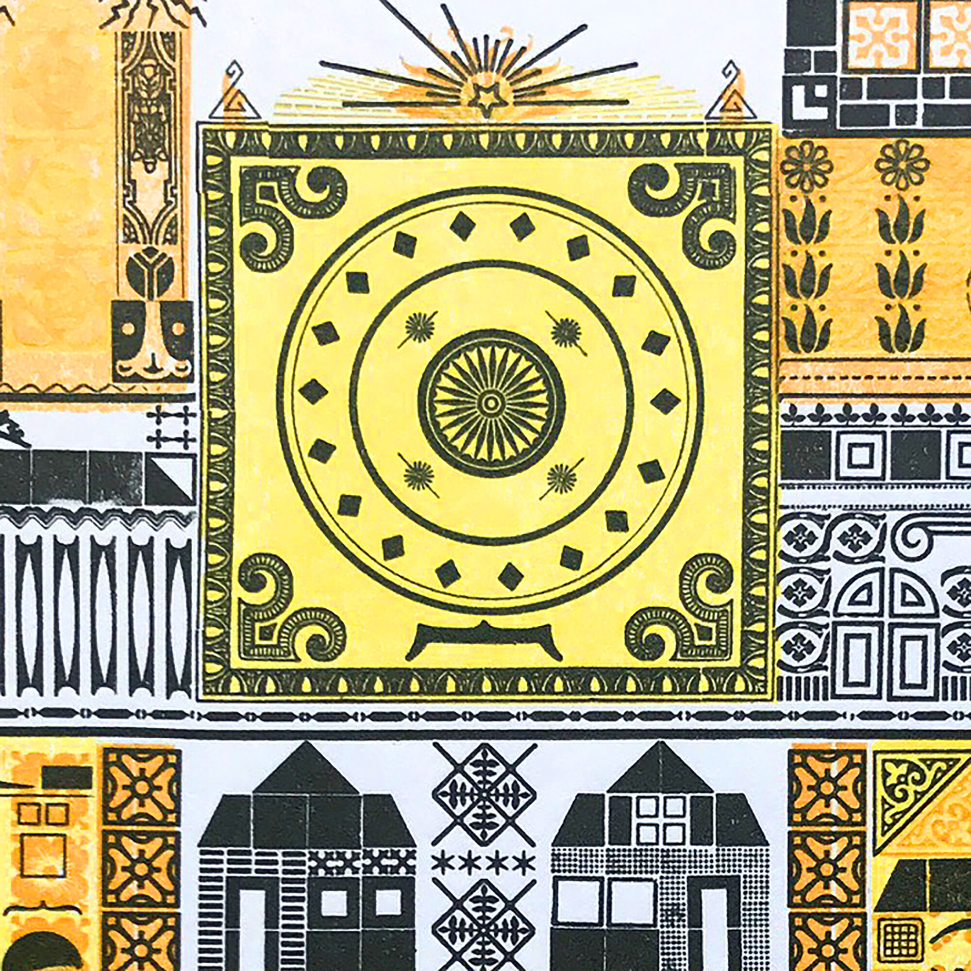
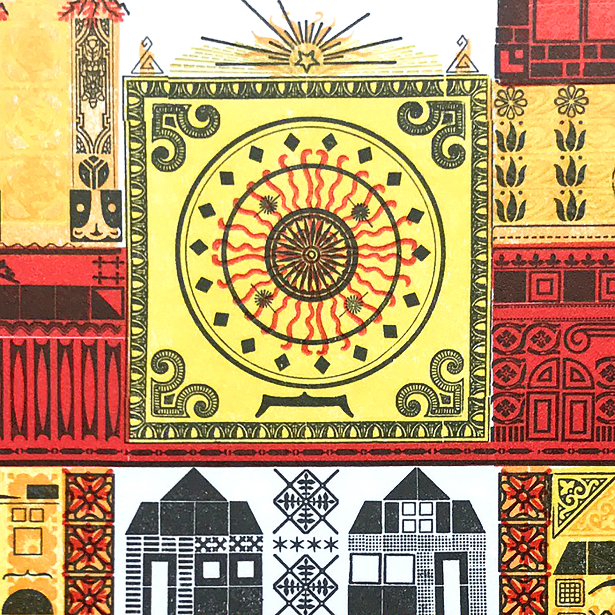
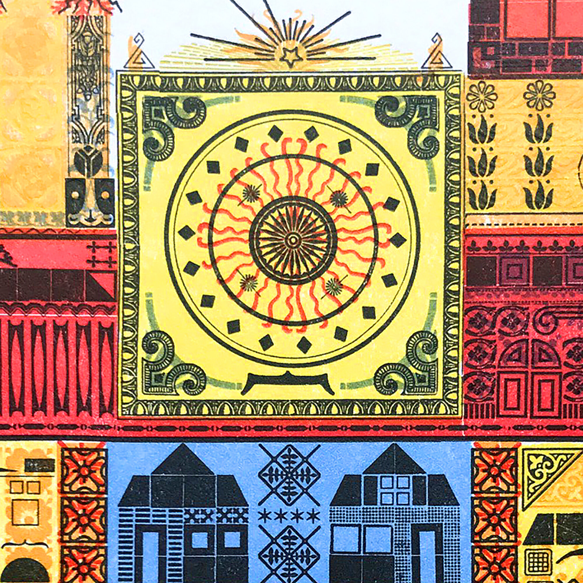
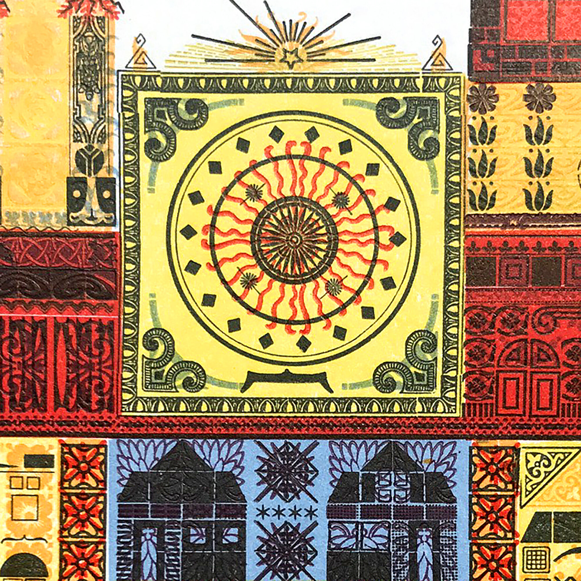
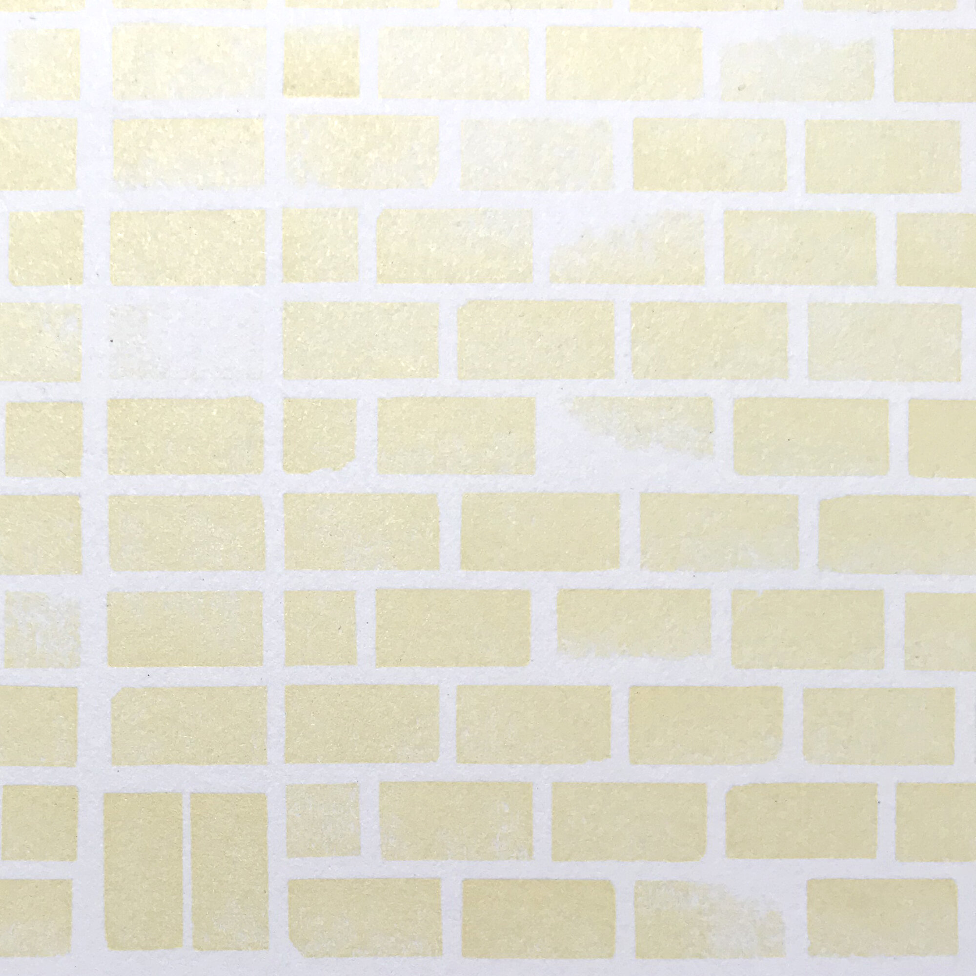
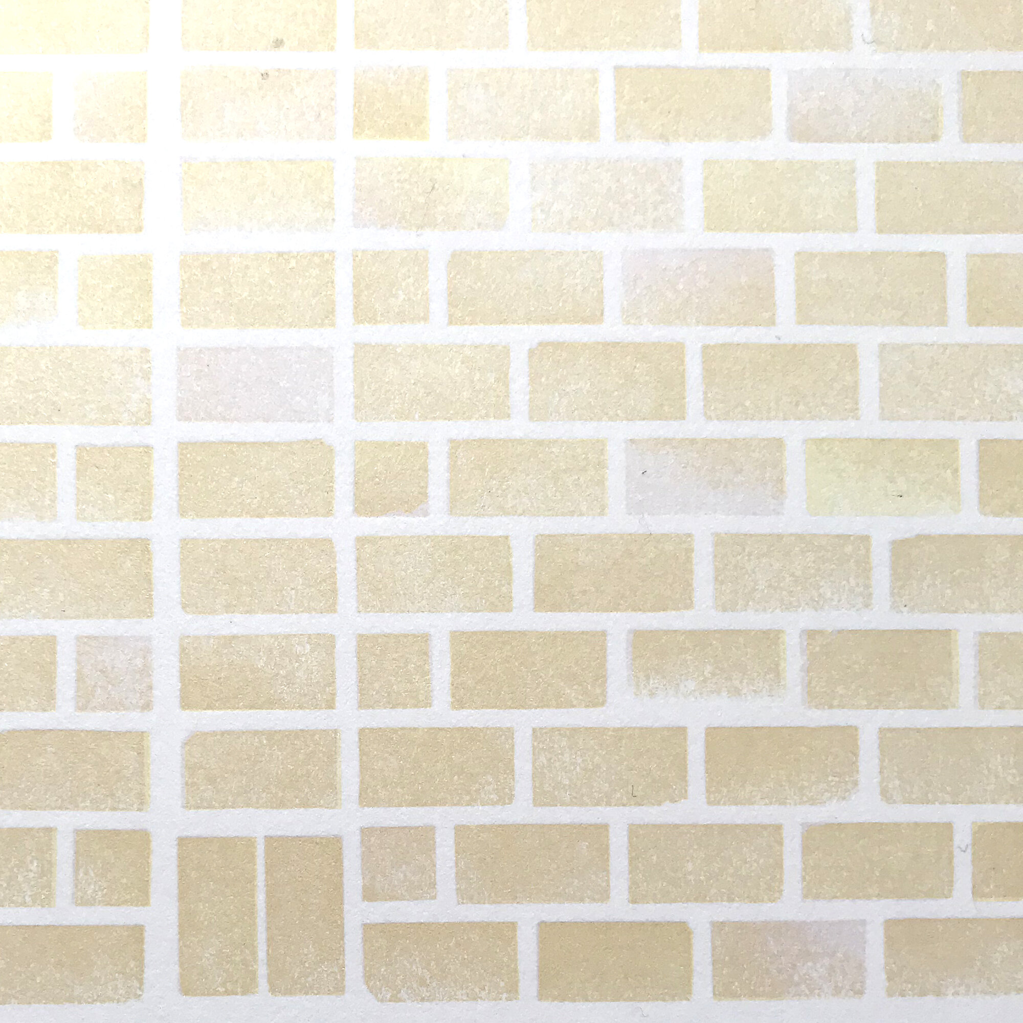
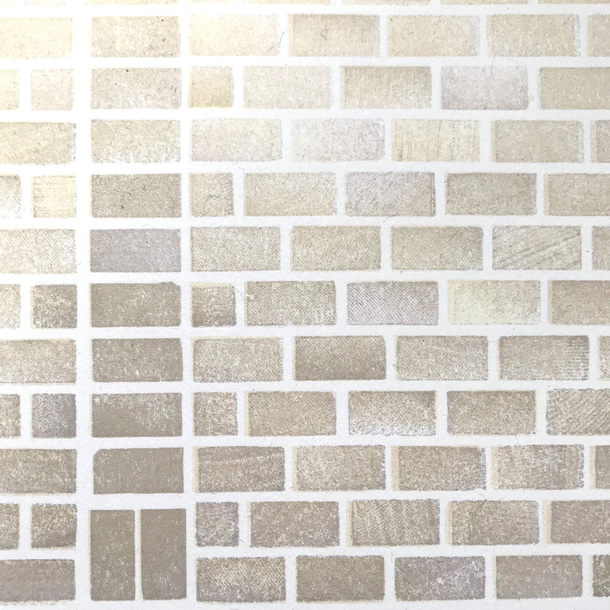
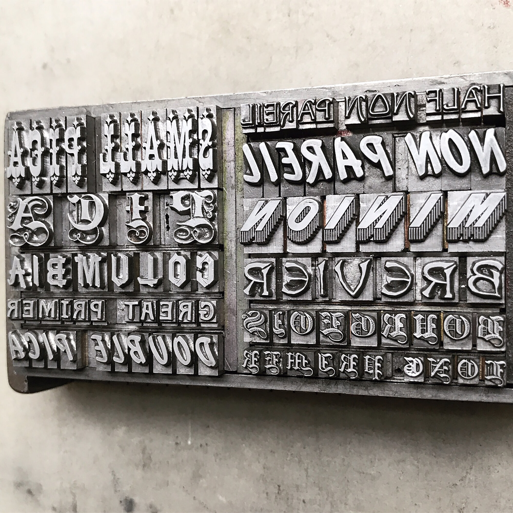
The Twelve Alphabet

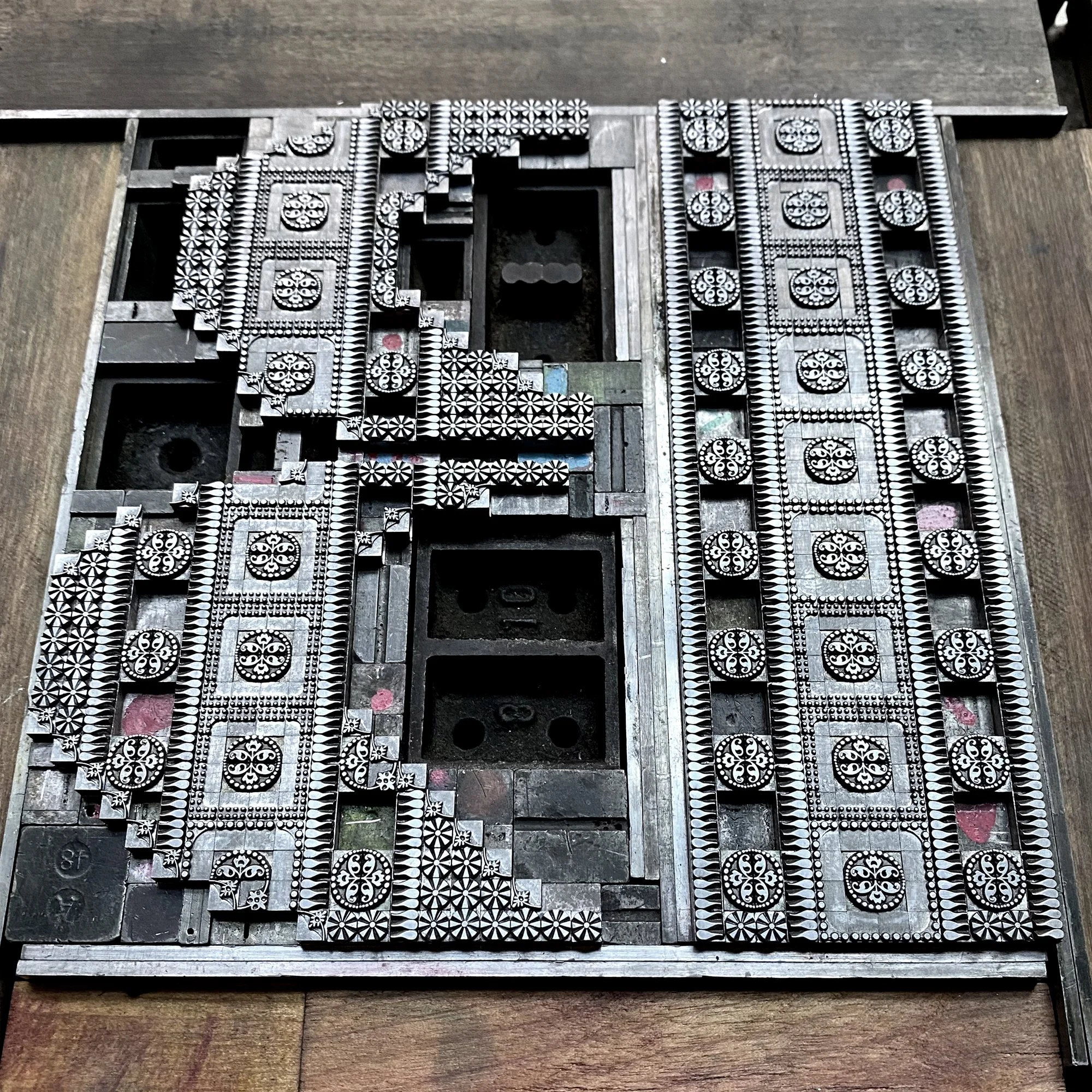
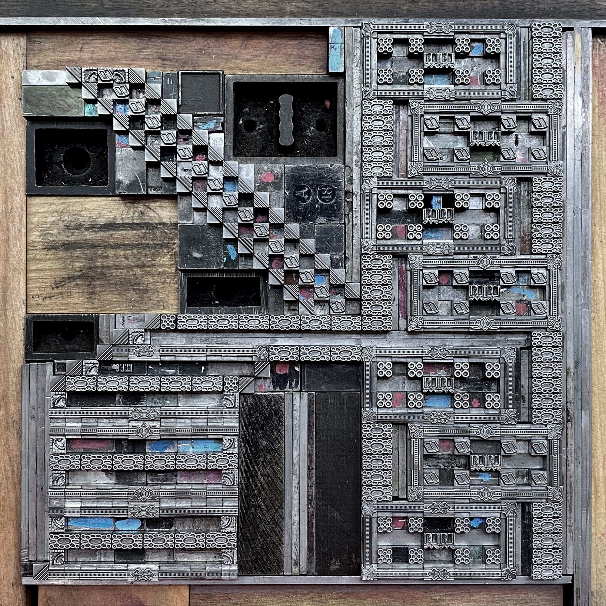
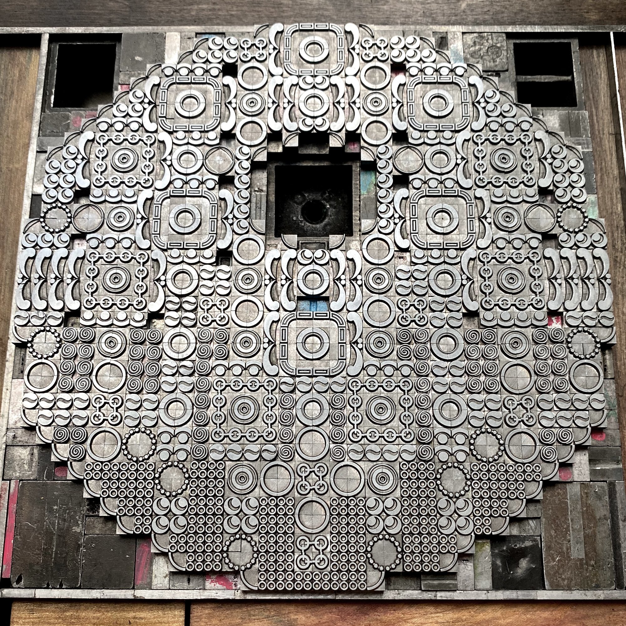
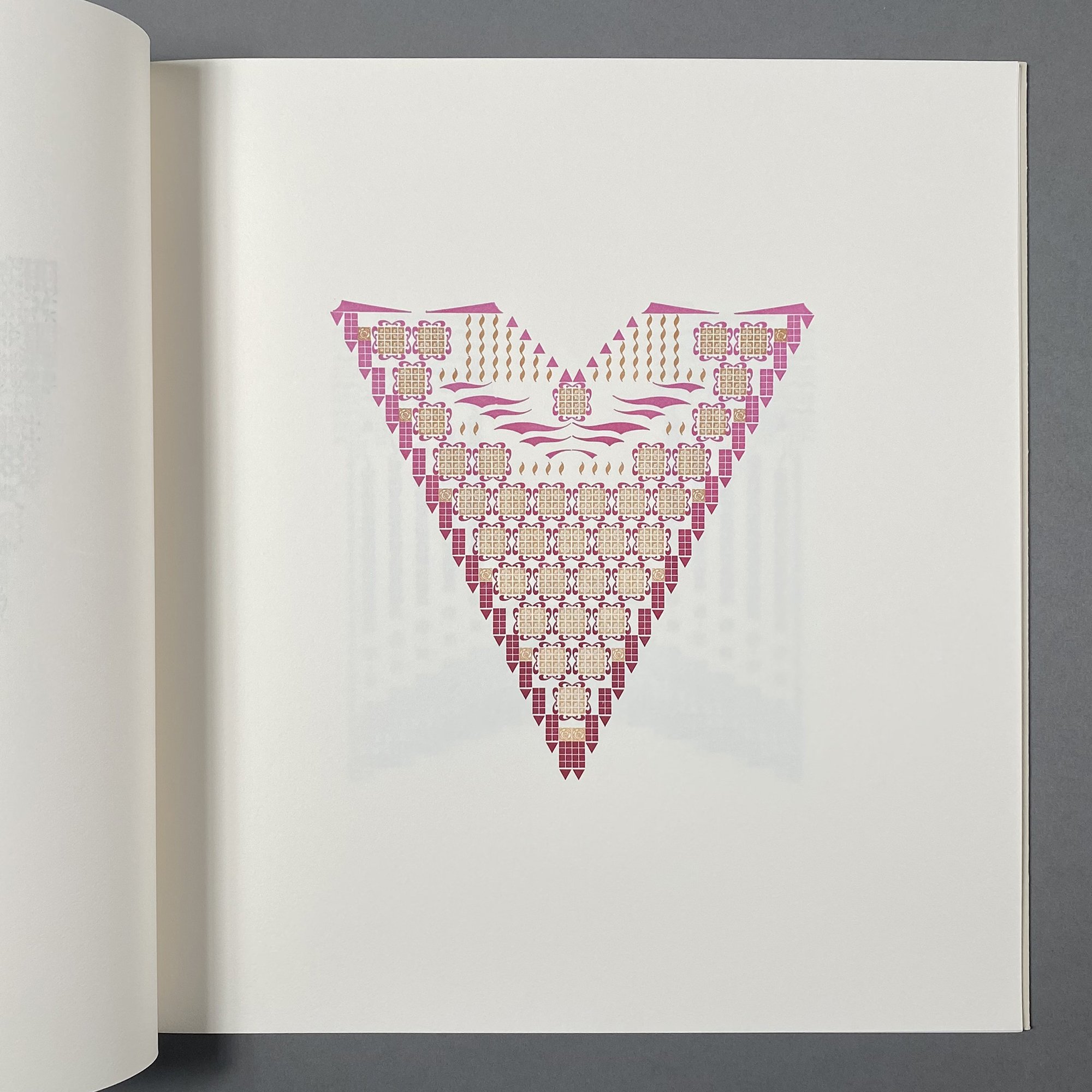
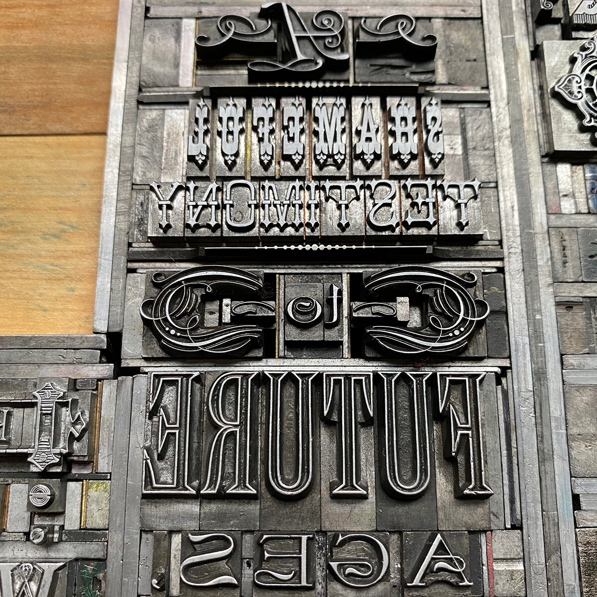
In early 2021, I had the idea for a book of letterforms built entirely from 12 point metal type ornaments. This arose following a year of non-stop hustle to keep the studio afloat and the desire to do something that was a creative challenge of my own making. A mental cleanse. A brain break.
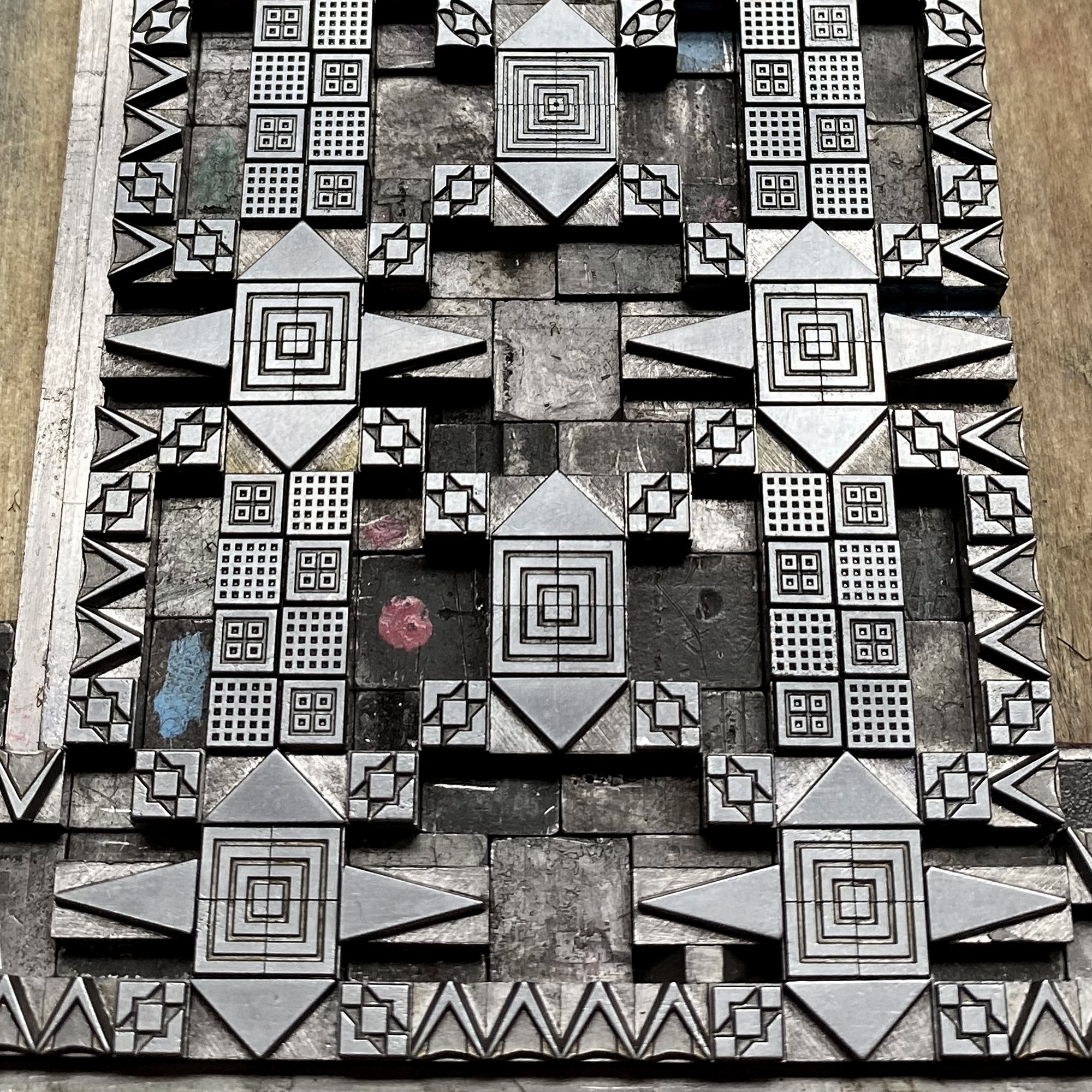
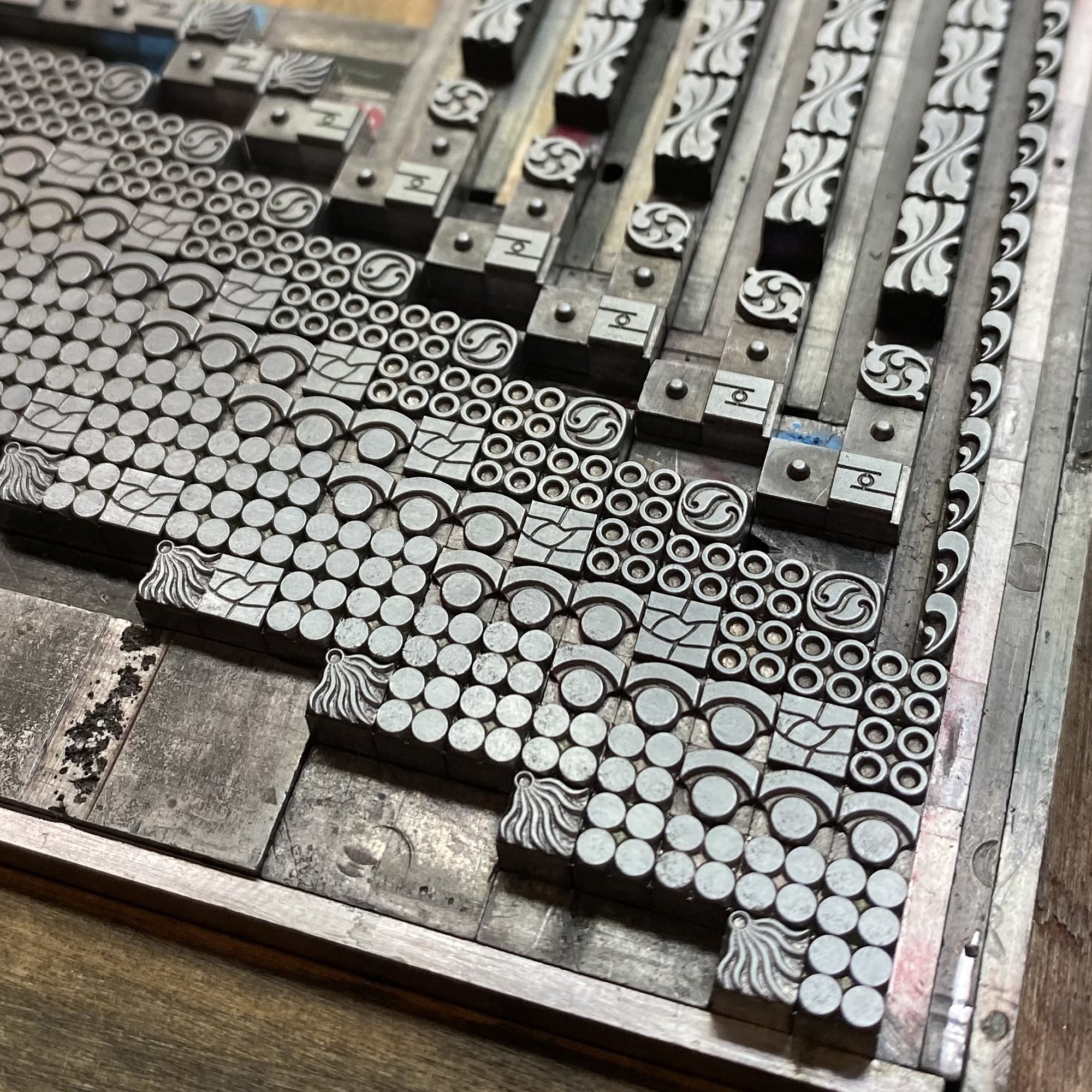
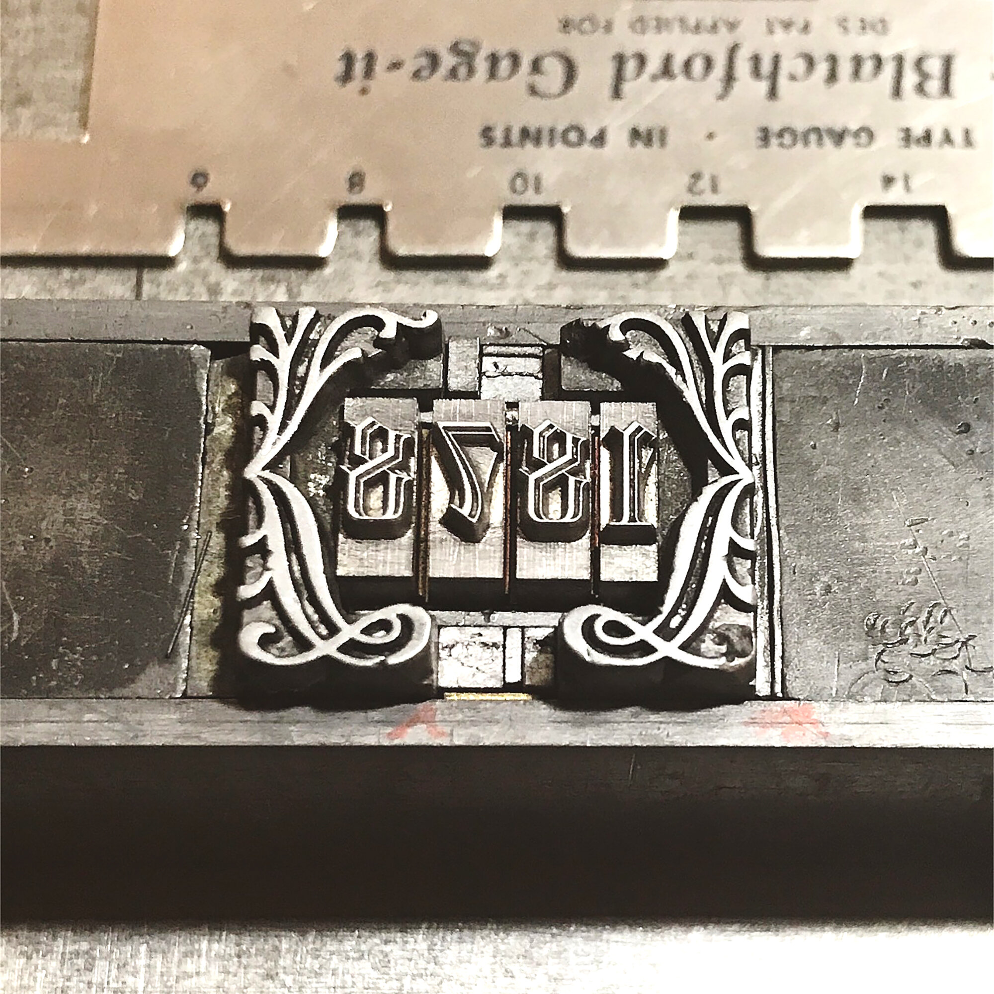
Metal type and ornament is measured in points, with 12 points making up a pica and 6 picas forming an inch. I love collecting ornaments that work on a typographic base 12 system of measurement because they play well together: 6, 12, 18, 24 and 36 point ornaments are the most plentiful at Starshaped.
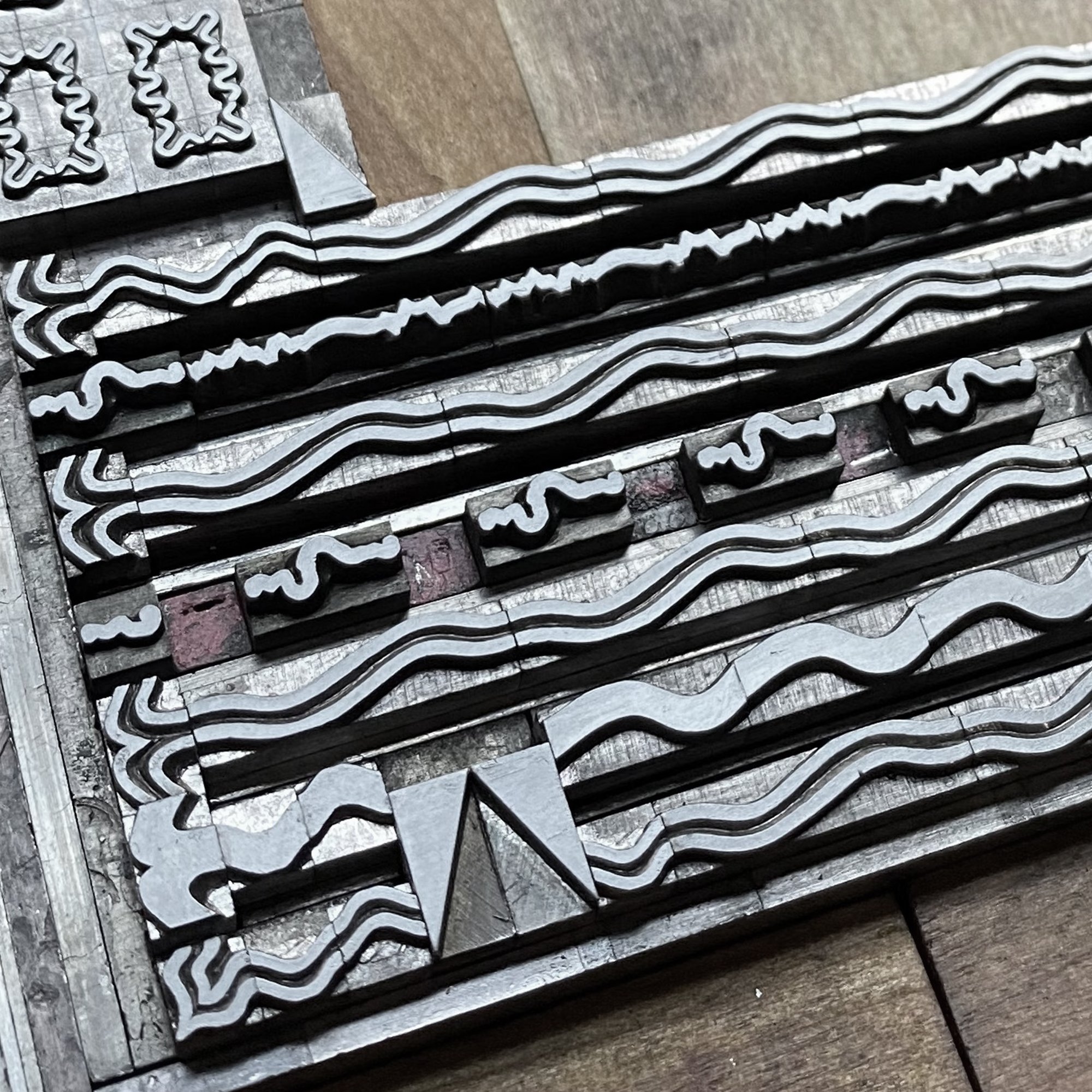
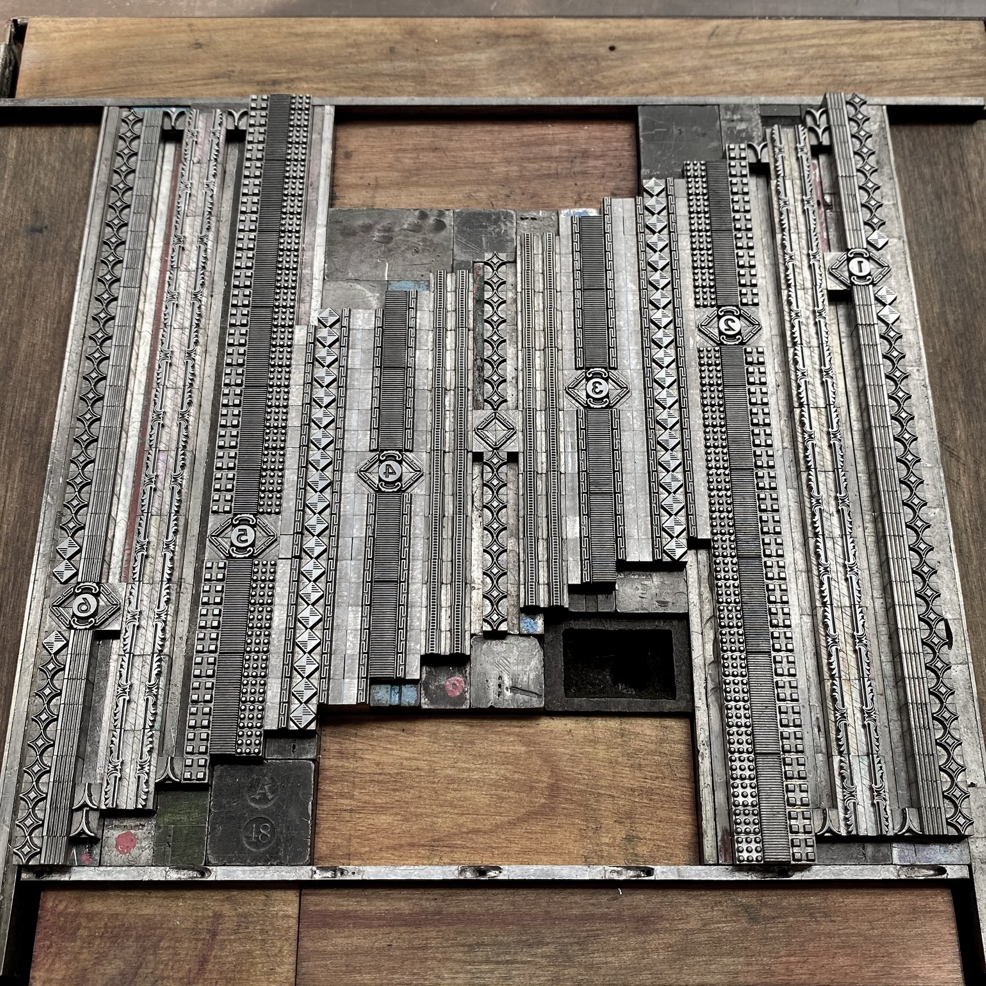
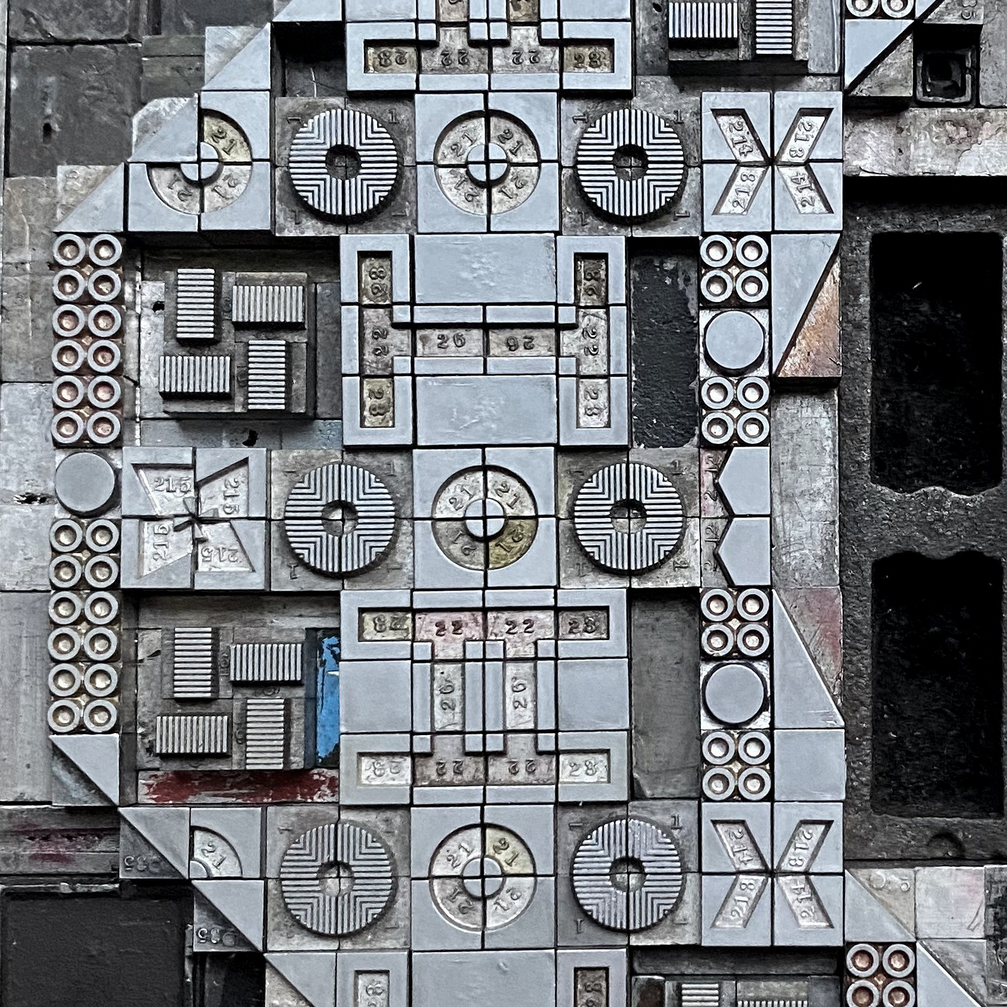
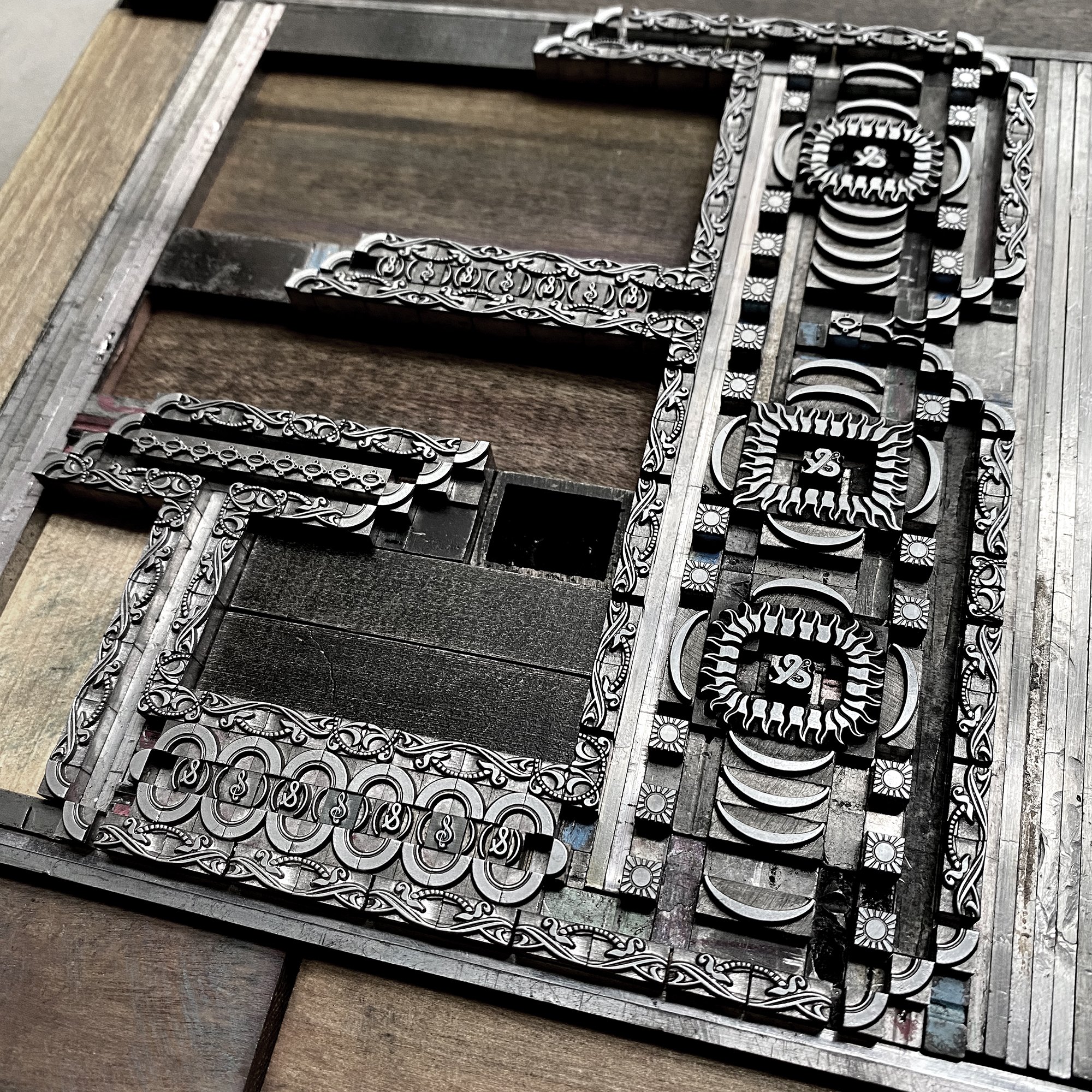
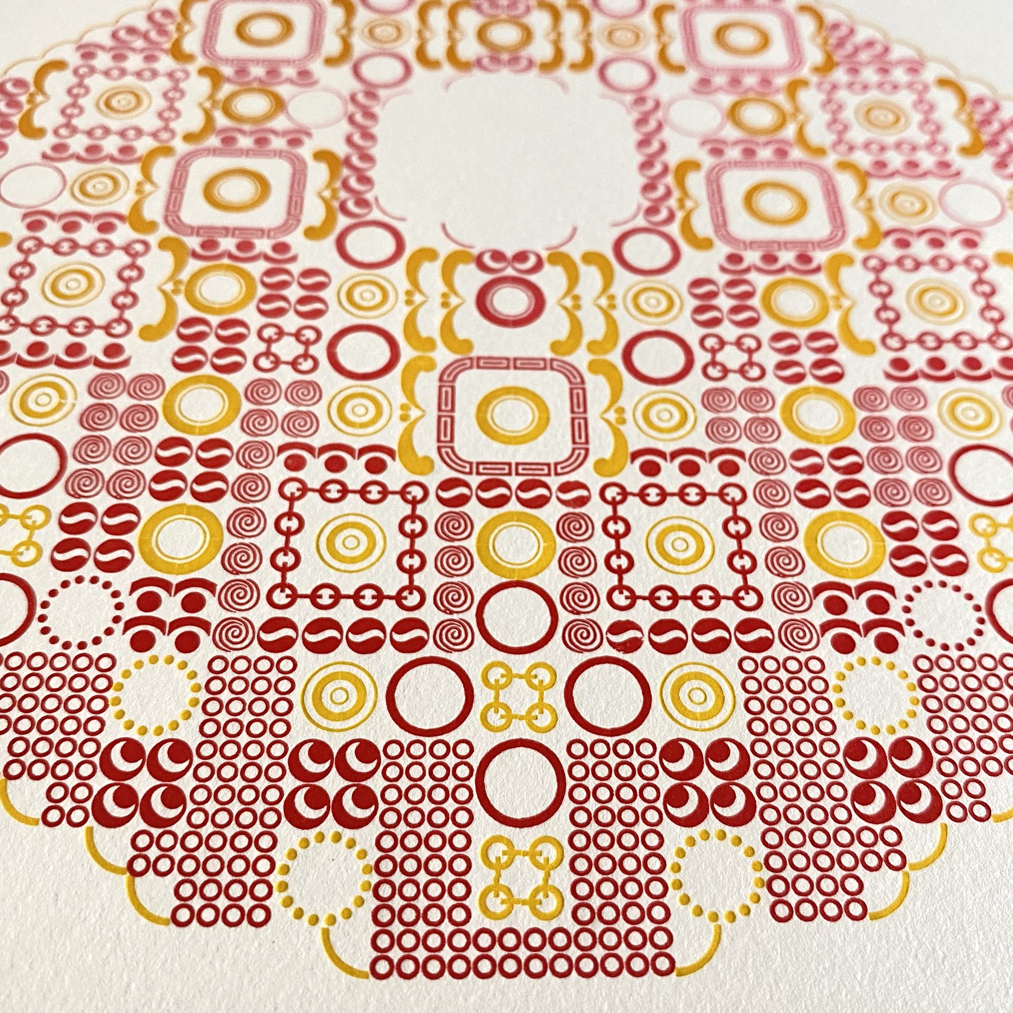
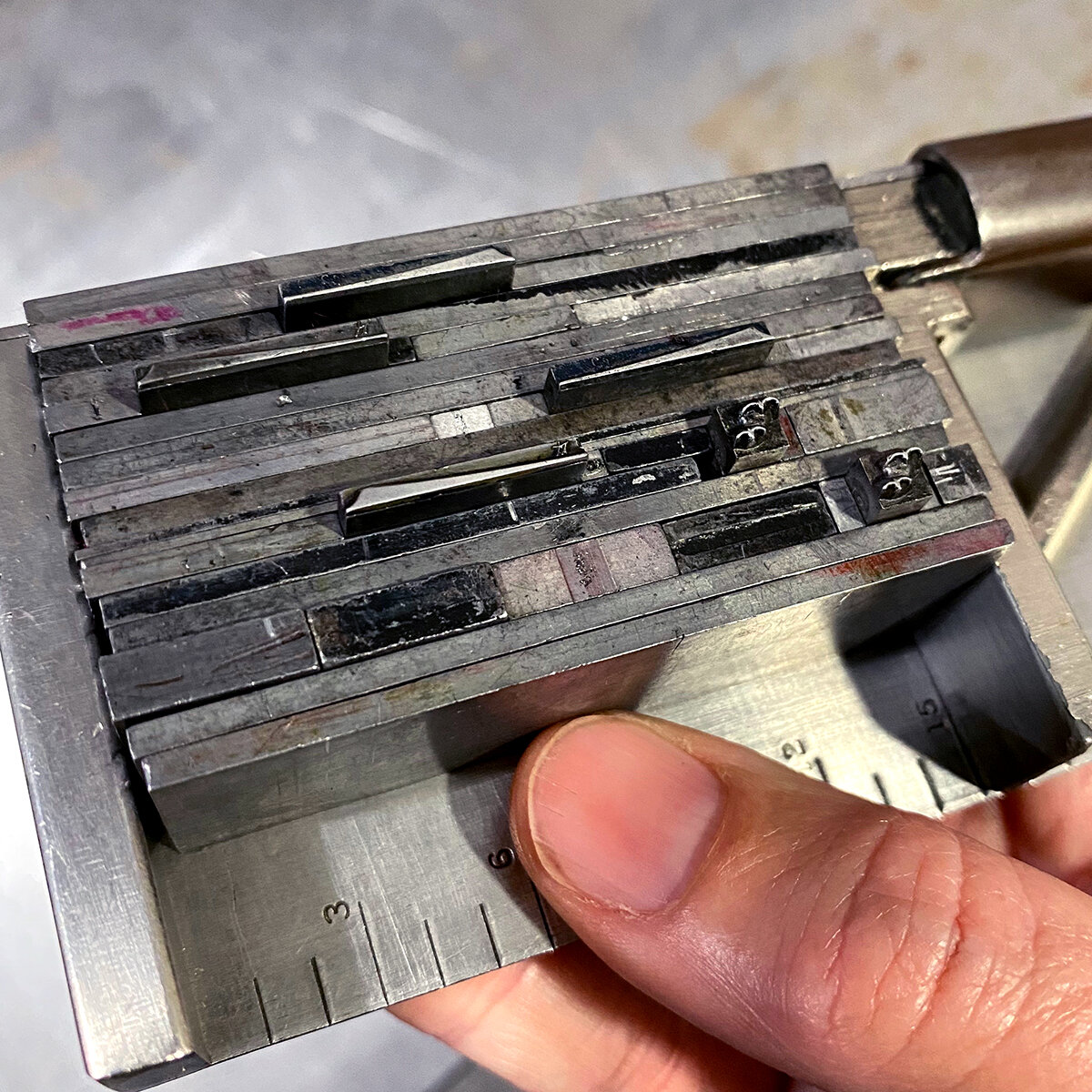
For this project, I decided any ornament in the collection that had 12 points on at least one side would qualify. In the image below, you can see that some ornaments measure 12x(insert length), can be corners for 12 point borders and are therefore L-shaped, or are 6 point ornaments that are double length. This made for endless possibilities.

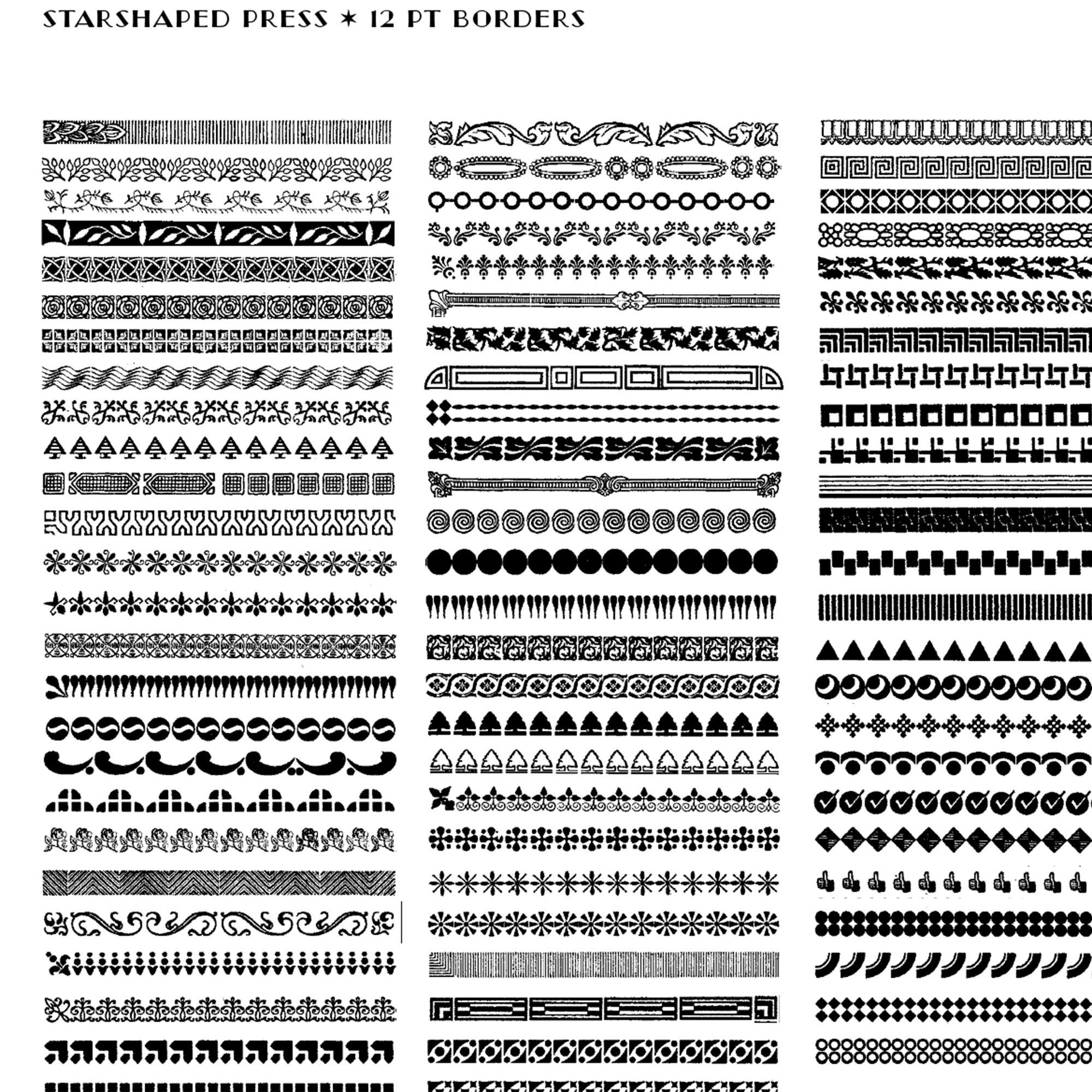
Almost as soon as new-to-me type enters the studio, I print black and white proofs of it to have a visual representation of the collection. I also scan these and create digital cheat sheets to pull from when building digital mockups for projects and client work.
Thanks to the wonderful casting talents of Pat Reagh, my 12 point ornament collection increased significantly around the time of developing this project. Below is a screen shot of one section of the digital repository of my collection. I find this visual reference tool incredibly helpful when designing.

I began by looking at all types of letterforms and deciding there would not be a cohesive alphabet but instead a variety that could show off different ornamental styles. Then I sketched myriad options before slowly starting to refine the final layouts. Many have curves and there’s a limit to how to create these shapes with rectilinear metal type. I had to keep in mind its capabilities and referred to the above cheat sheets often, looking for non-solid, or non-square shapes within the very solid metal body of the physical piece of type. I often point out seeing positive vs. negative space to folks working with ornaments when building shapes, like in this Weekend Printer post.

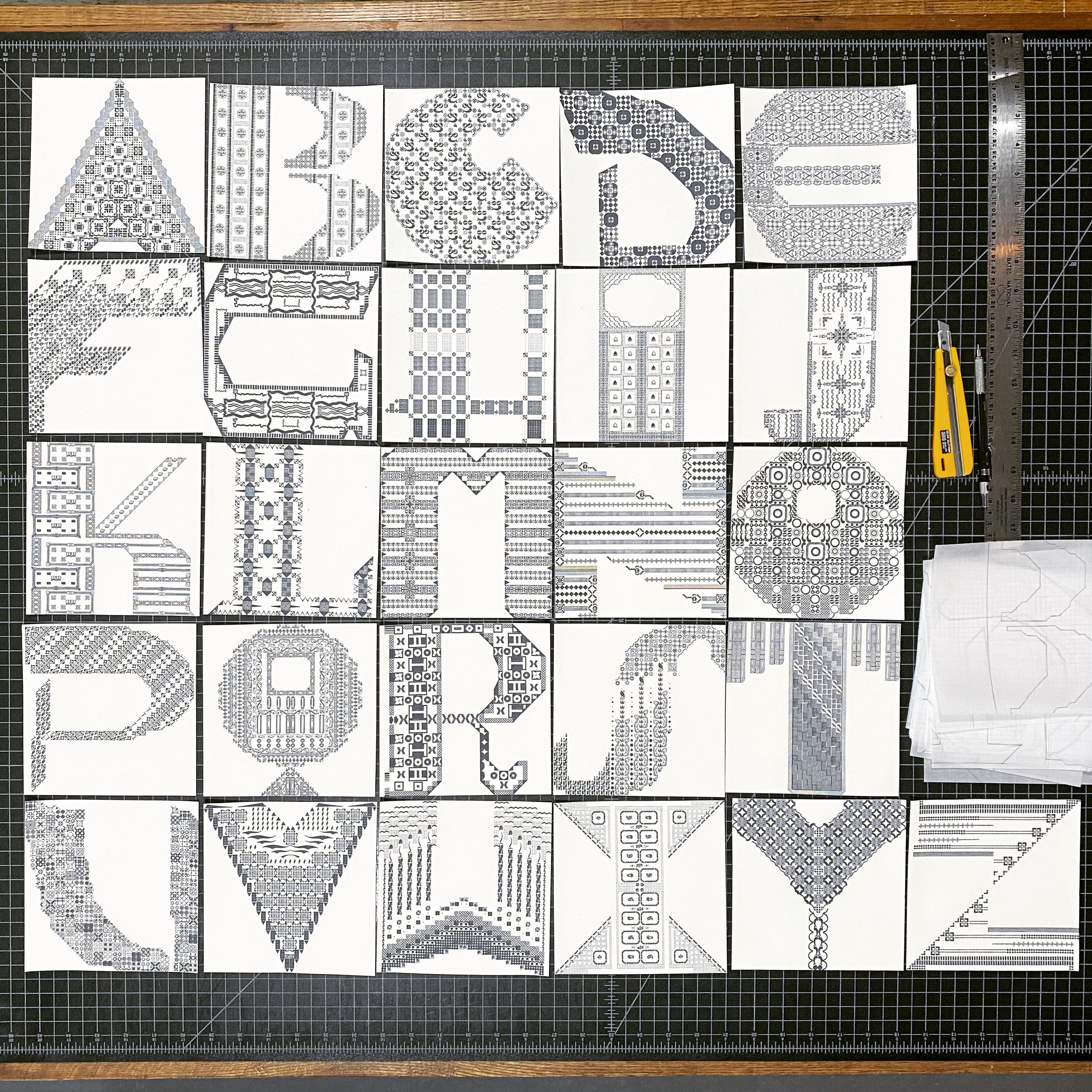
I laid out all of the designs in a 6” square assuming a 12” page size (for obvious reasons) on the computer. Below is the first iteration of the whole alphabet. Many of these would change as I started the typesetting as there would be shortages of some of the ornaments or the occasional ‘that just isn’t right’ moments. These digital guides are just that— guides for getting the setting off the ground so there are fewer problems to solve, not an elimination of all problem solving.

The other nice thing about having digital proofs is playing around with the color to make sure it was to my liking. More on that later.
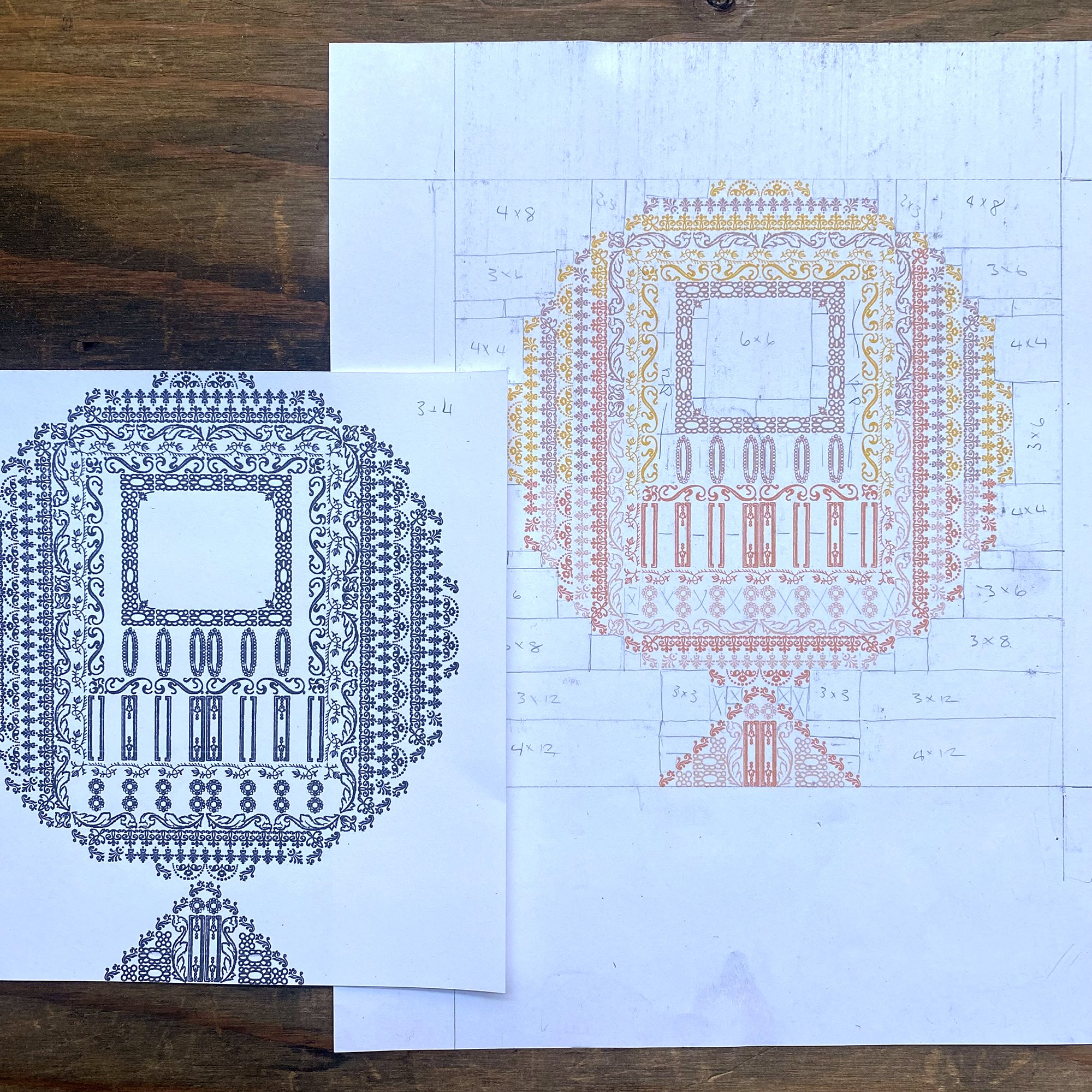
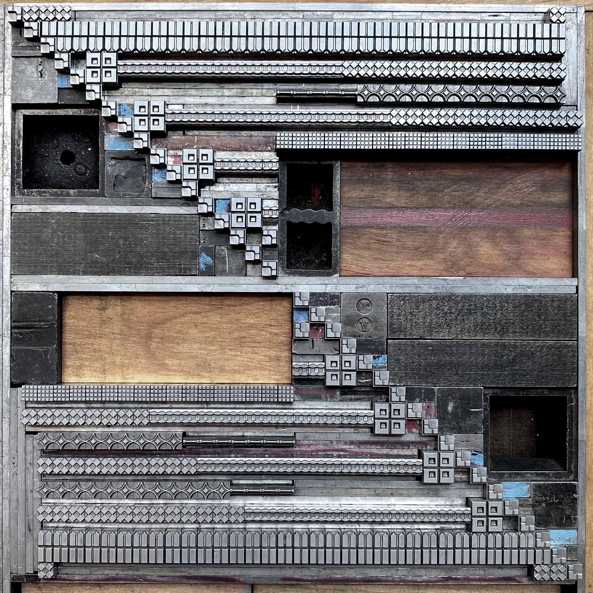
The files are also built on a grid, meaning I could block out the spacing material which is equally important, especially given that these would be printed in two passes with extremely tight registration. This sheet shows marking up what small furniture and spacing was needed to fill in around the ornaments.

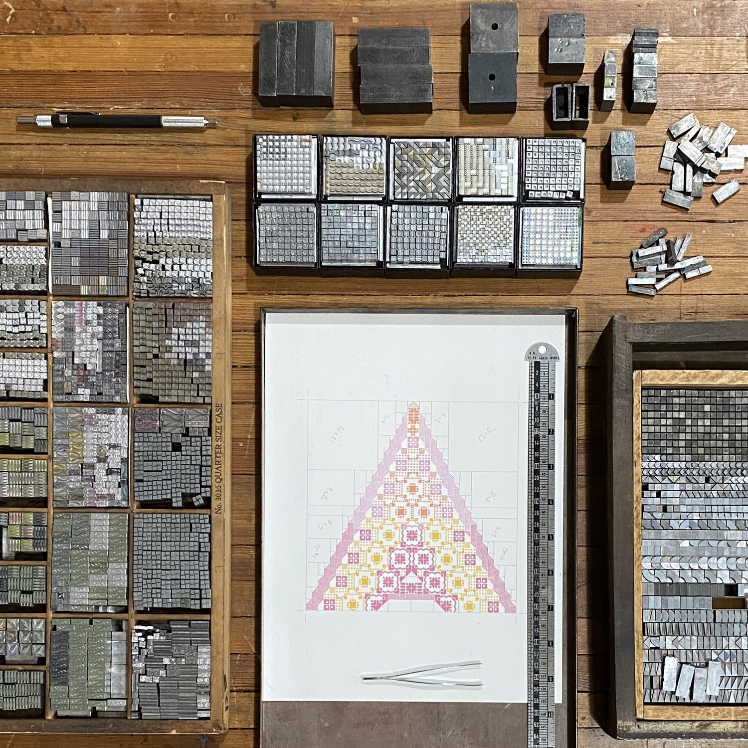
I set up time lapse videos for setting all of the letterforms, one of which is here. Planning ahead with all of the ornaments and spacing pulled meant actual setting time was about an hour. I built the form on top of the computer print out of the letterform, which is often how I discovered a shortage of ornaments or a problem with the setting that needed correcting. After it was completed, I slid the paper out.
As an aside, I’ve had ridiculous comments lobbed at me by certain people in the letterpress community for using the computer for laying out projects, as if it’s not a ‘pure’ enough tool for composition. I’ve spent the last 20+ years collecting, cataloging, cleaning, meticulously identifying, proofing and USING the type and ornament that comes into the studio. I use it for every project produced at Starshaped, which is my full time job. I do this because I don’t want to use polymer (plastic!) plates and want to carry on the life of what I think is a beautiful typographic art form that people can have access to if I show them what it can do. I show them by having the means to quickly mock up their projects; I could do all of this work by hand at twice the time, which cuts into my bottom line. The computer is a tool, just like all of the other tools in the shop. Get thee off thy high horses, gentlemen.

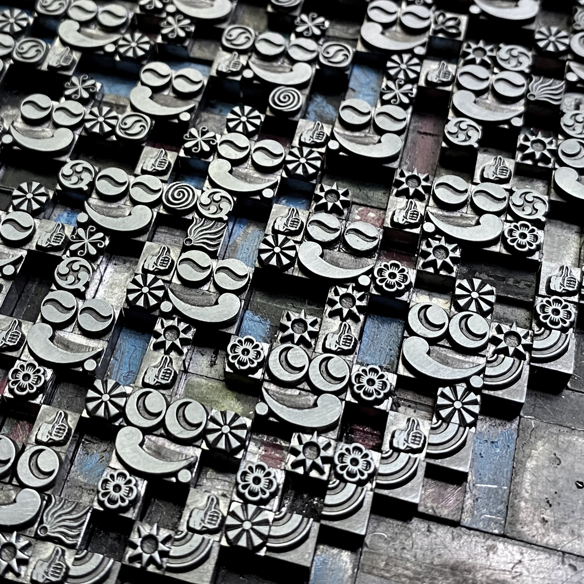
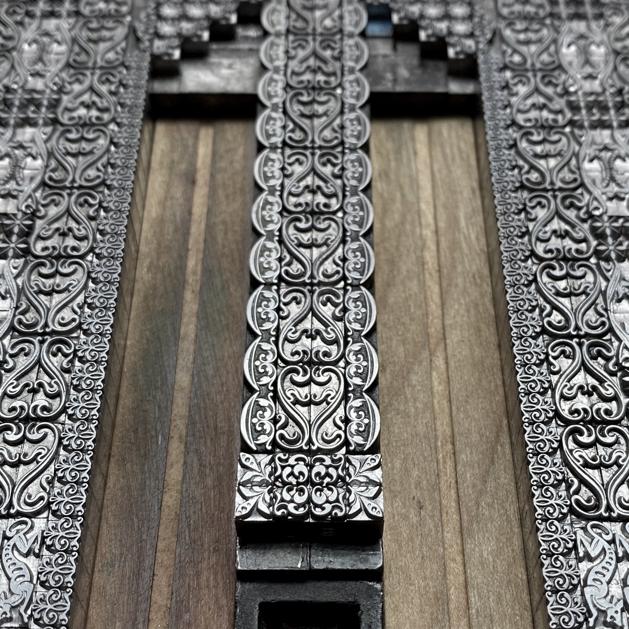
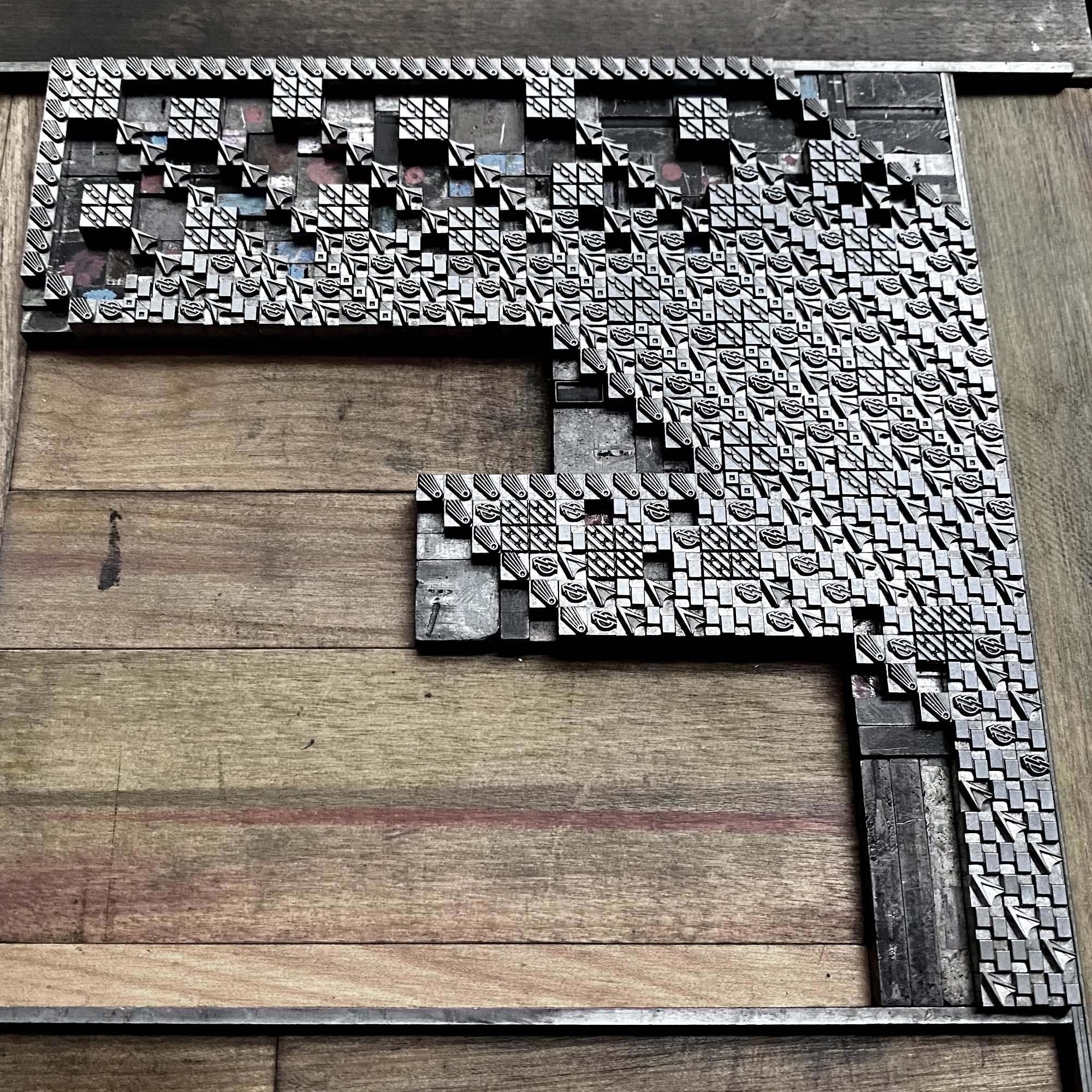
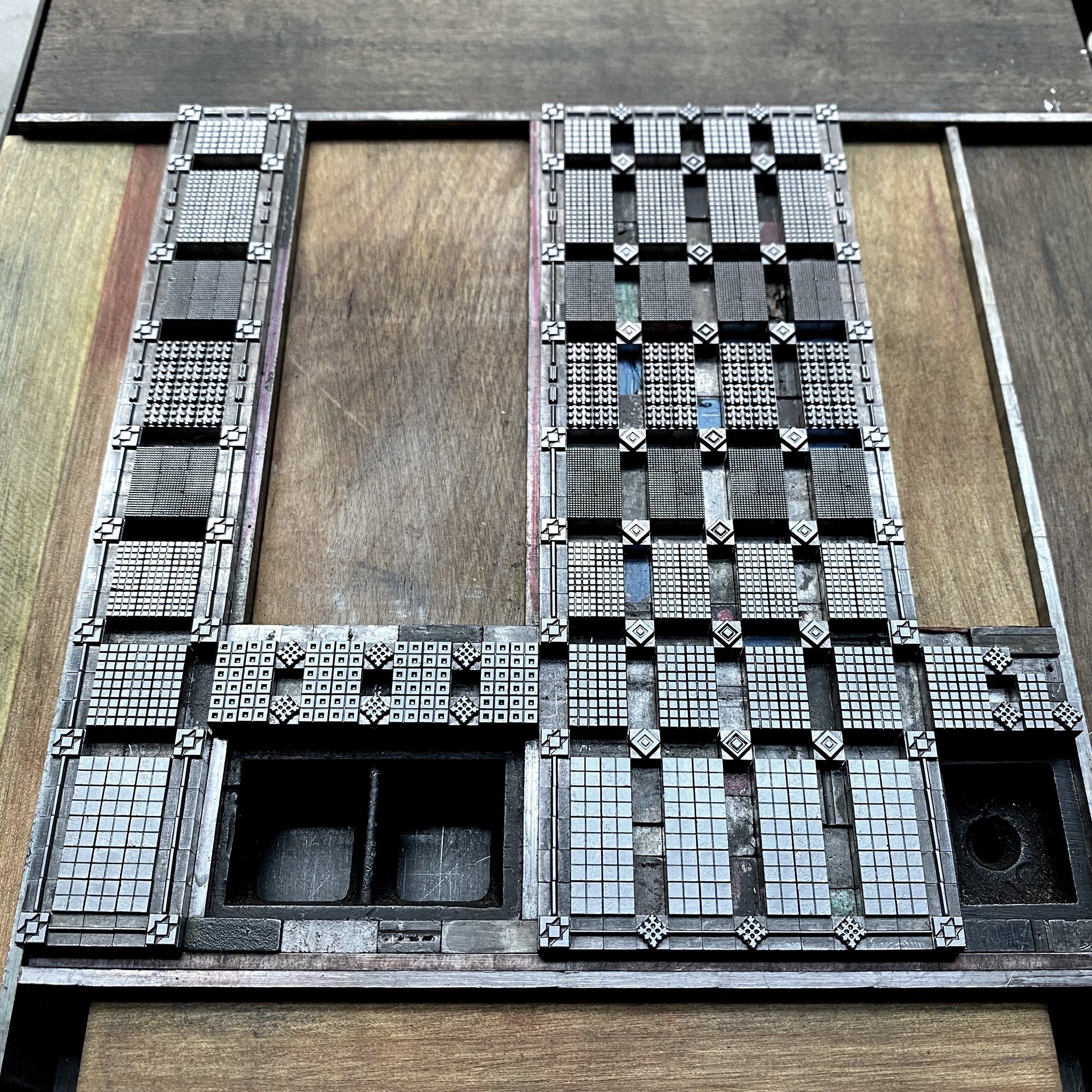
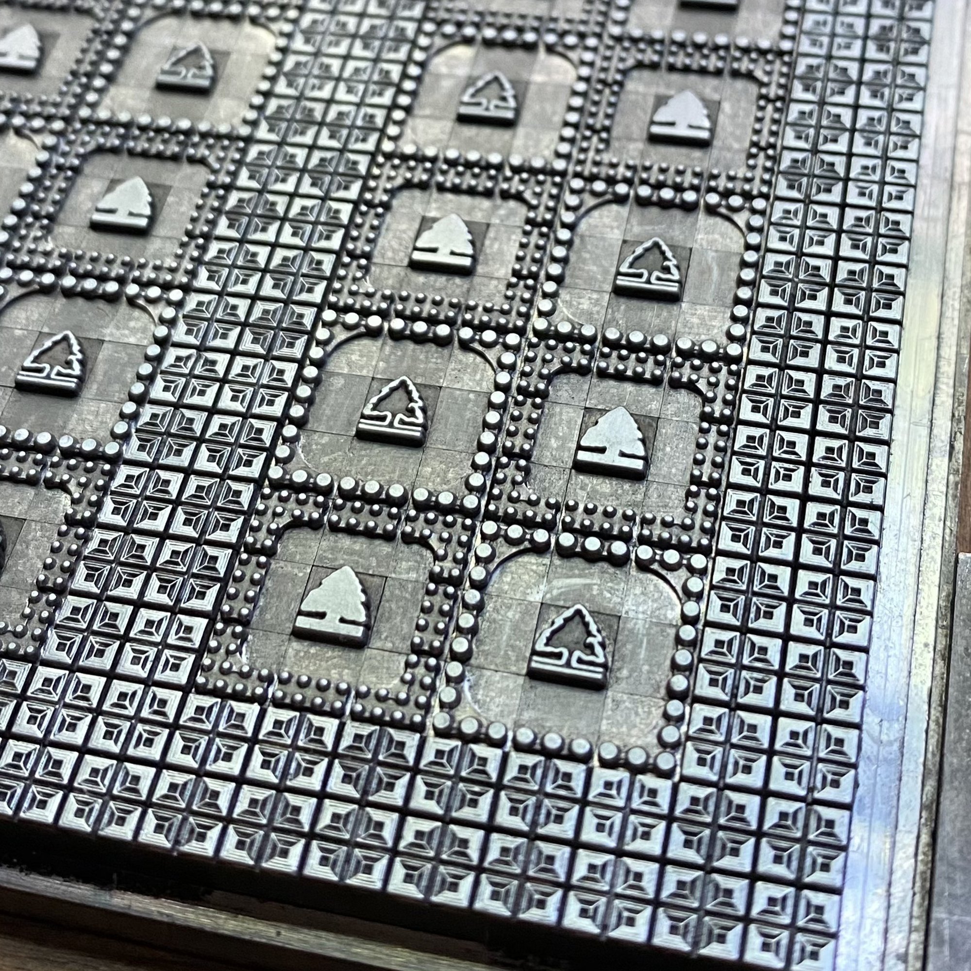
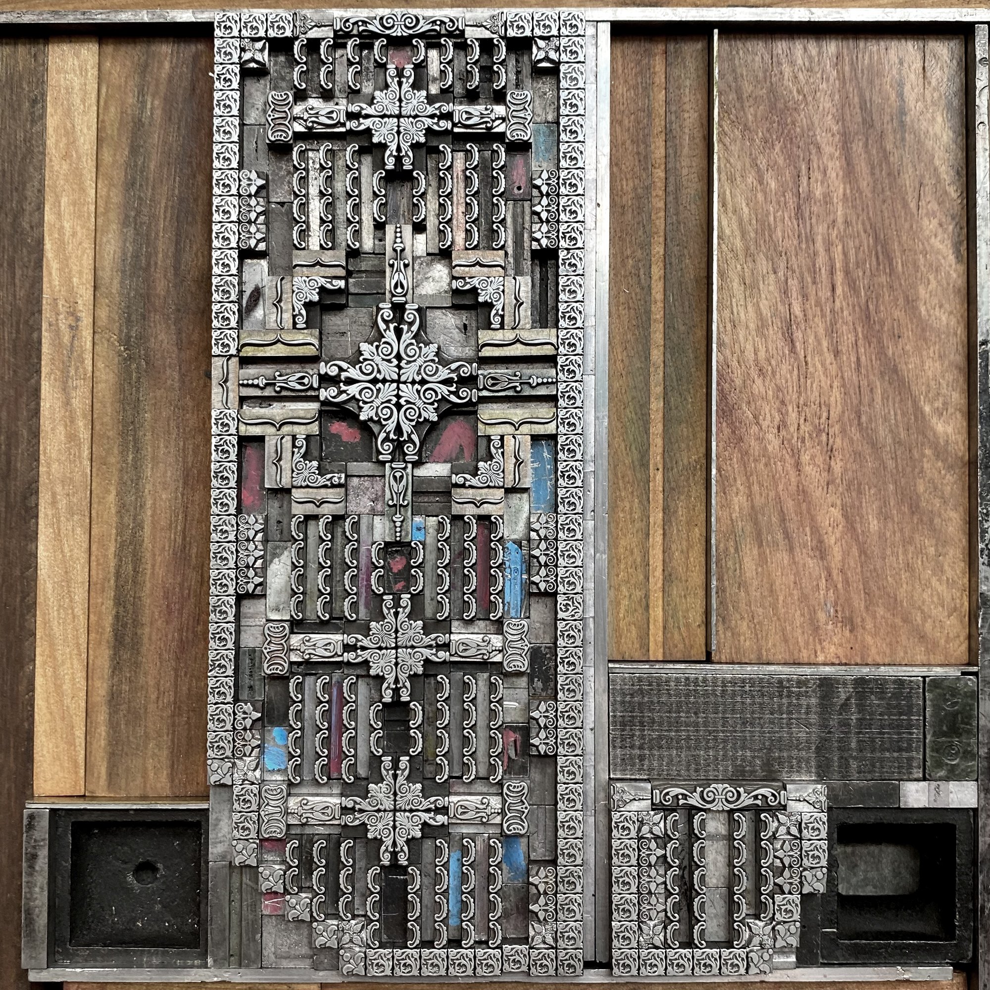
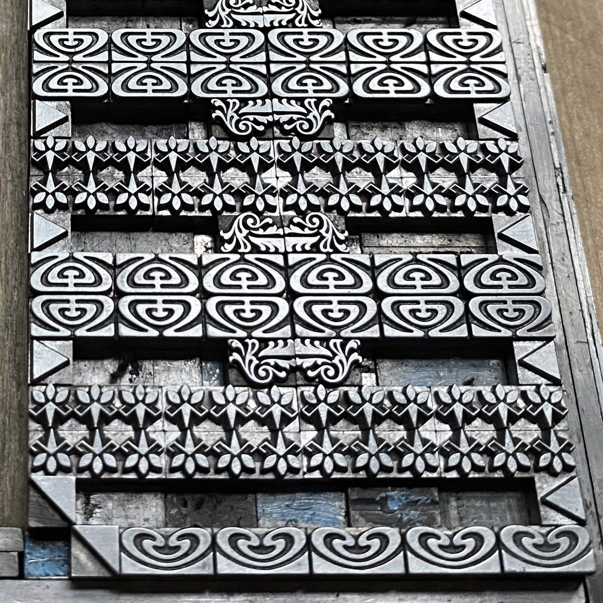
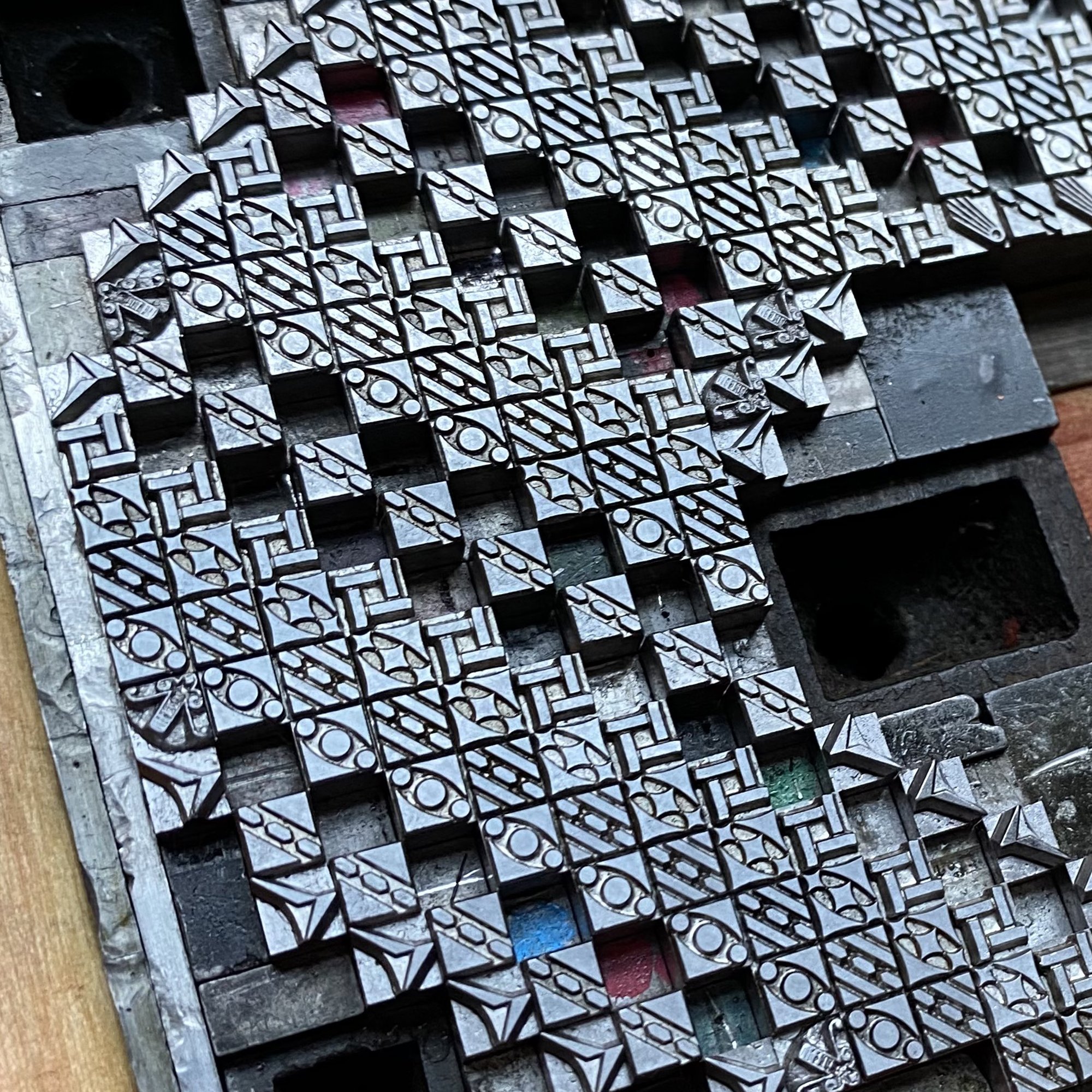
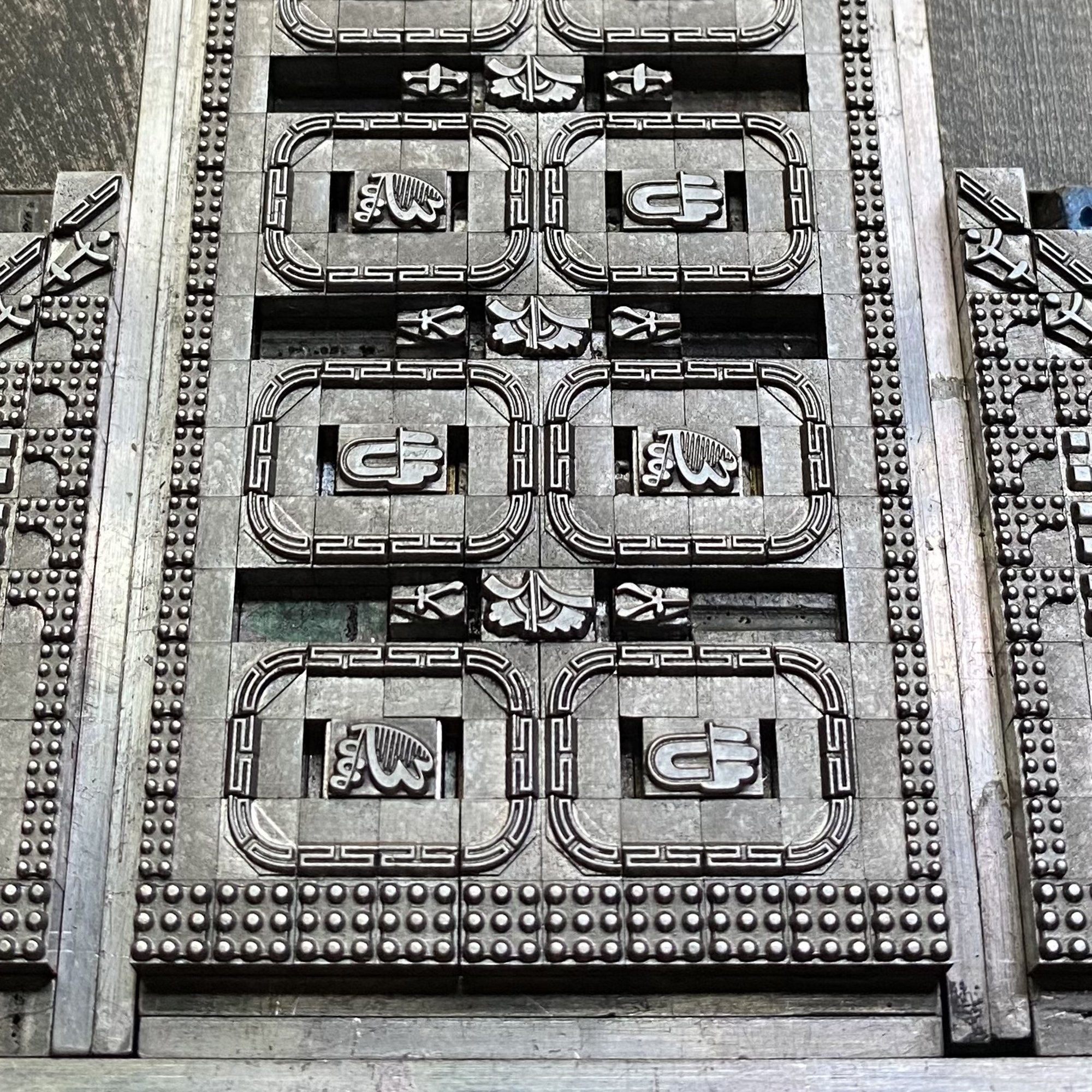
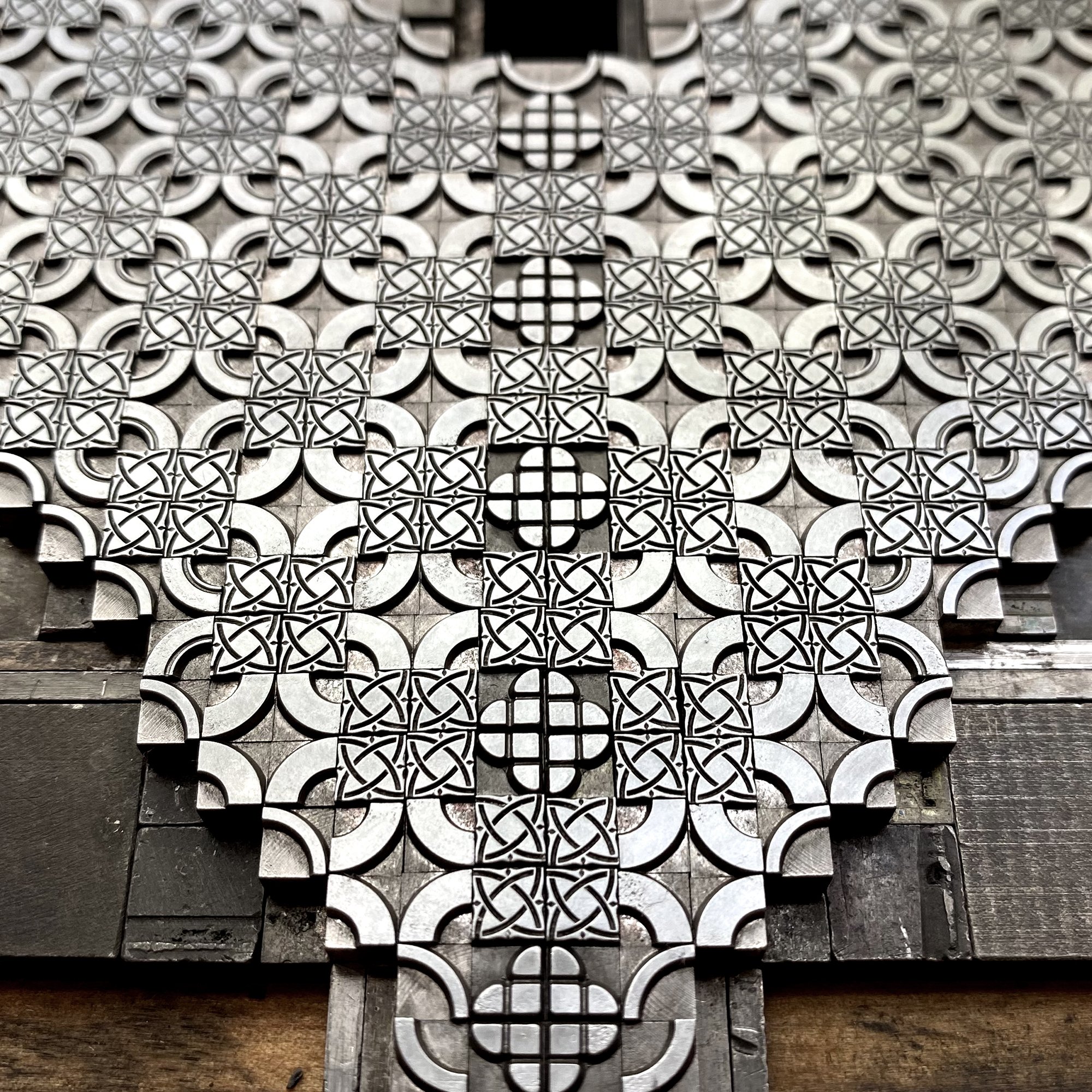
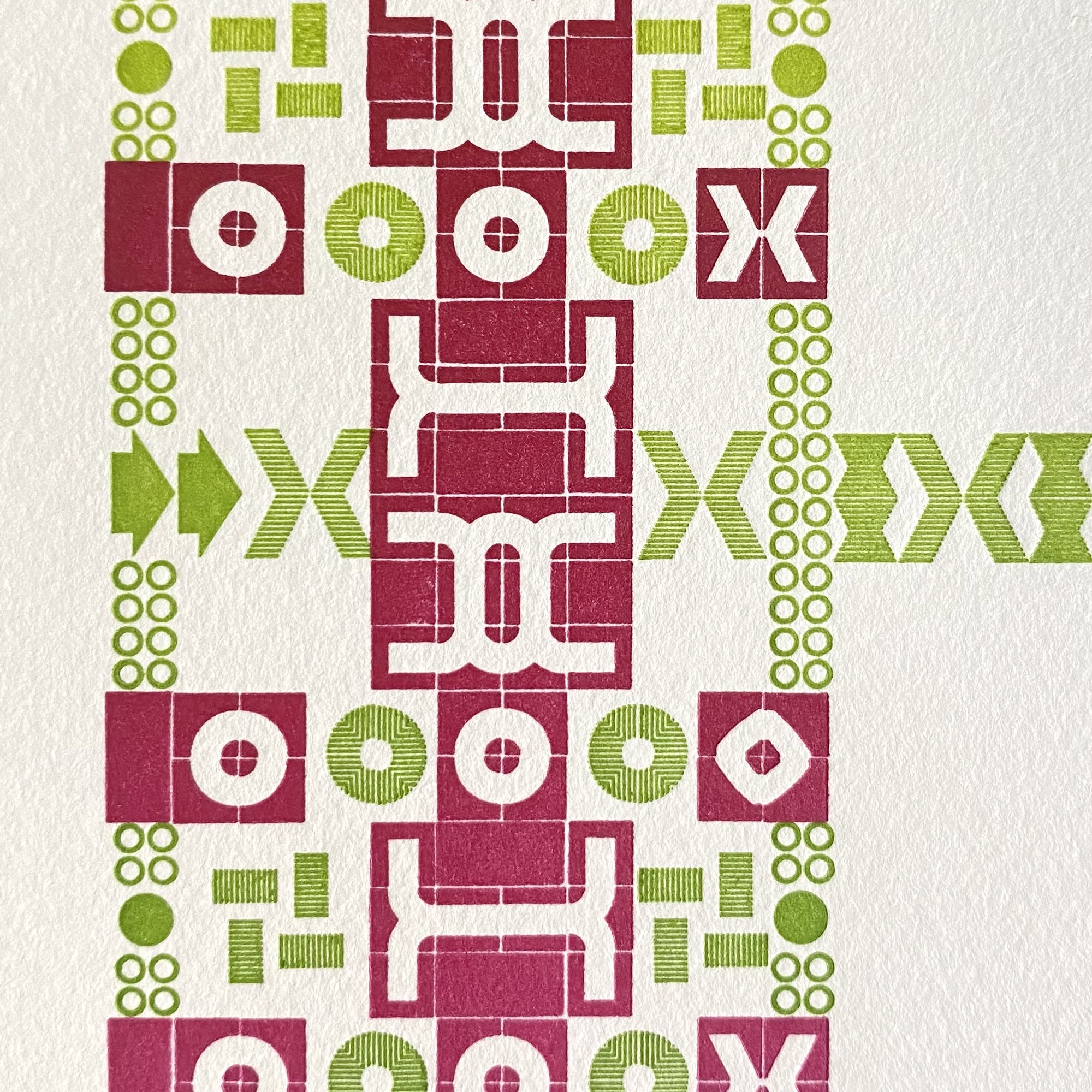
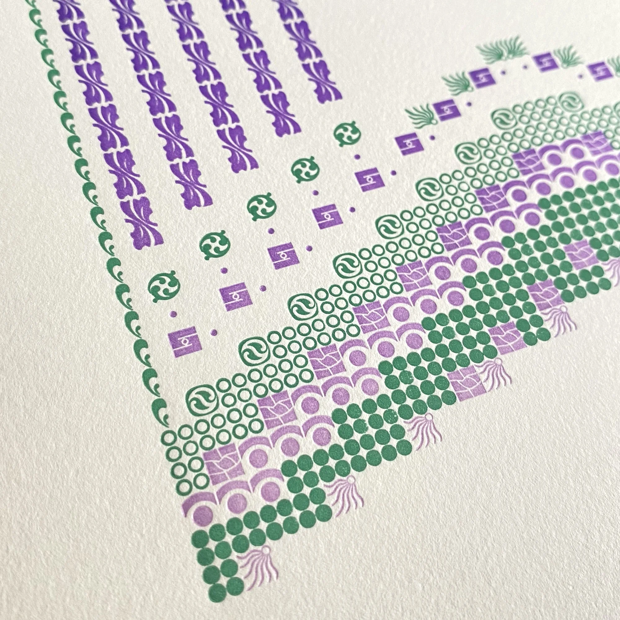
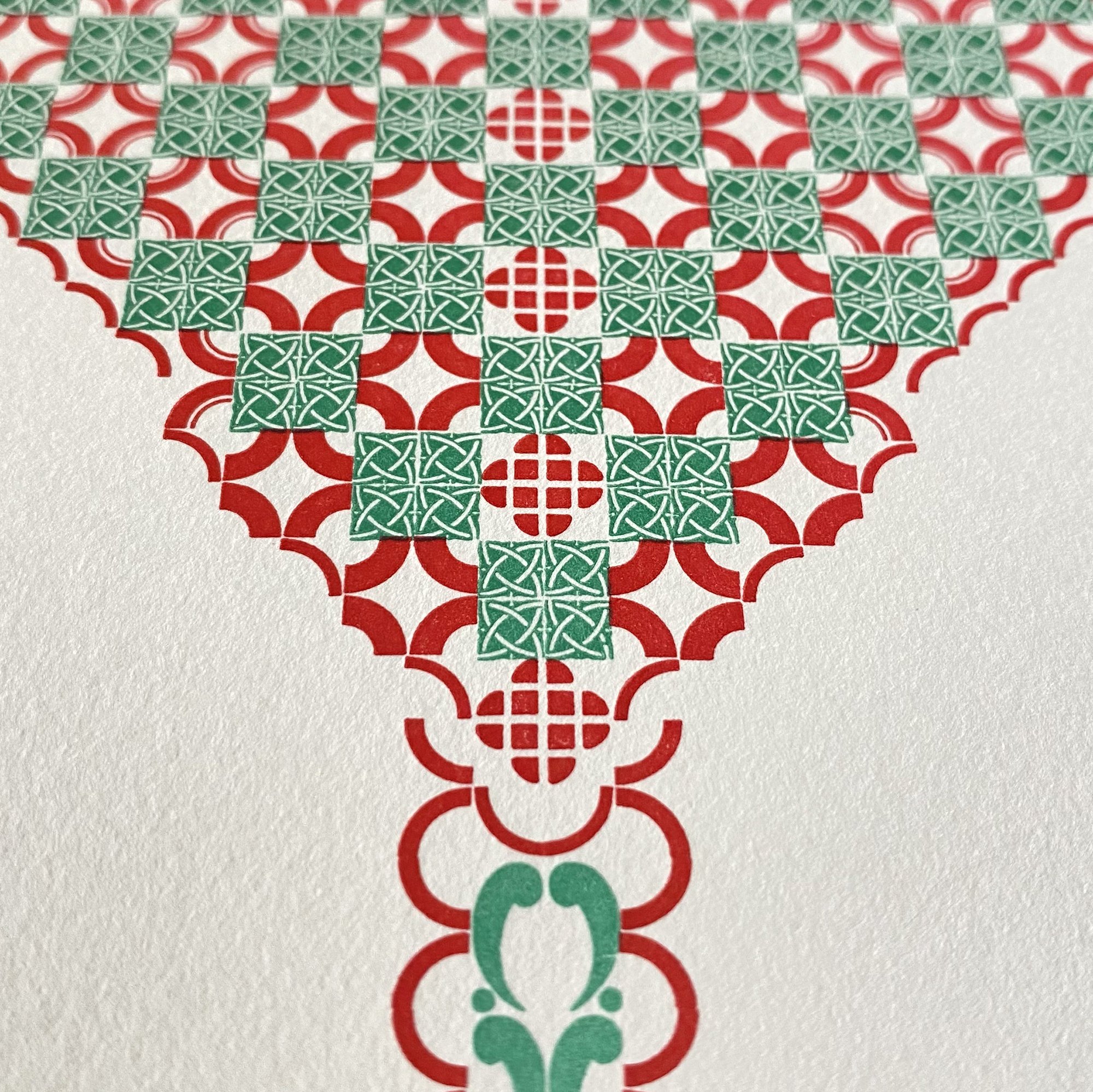
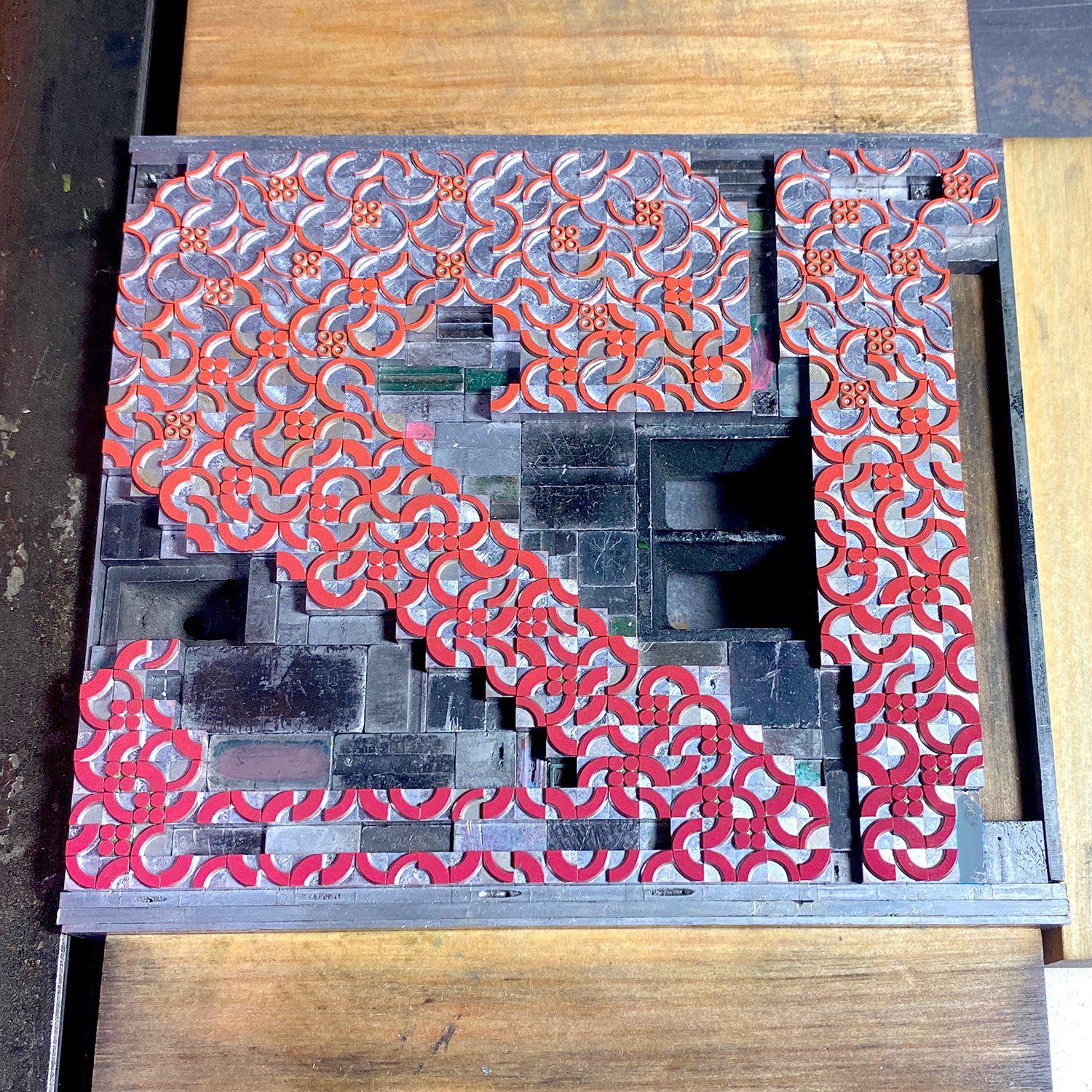
Here are some of the images taken while setting the individual letterforms, which were done one at a time and produced, as time allowed, over a few months. There are so many things I love about metal ornaments, but for this project in particular, I loved creating larger elements from many smaller pieces, or what felt like long running lines from disjointed ornaments. It’s so beautifully adaptable and credit goes to so many designers, many of whom we will never know much about.

After setting each letter, I pulled a carbon paper proof, using good ol’ carbon paper instead of inking it, for a quick idea of what it would look like.

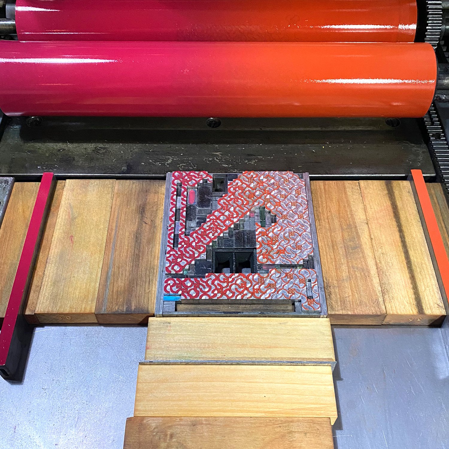
While I love the challenges of creating with metal type, proper inking makes me sweat a lot more. Each letter would be printed in two color passes, but each one would involve a split ink fountain, meaning there were two colors on the press at the same time that gently meld together in the middle (Tribune Showprint are masters of the rainbow split fountain). I established a color palette of what those splits would be and the number of combinations that could exist so that only two letterforms had the same. I mixed all of the inks ahead of time so they’d be consistent across all of the printing. They conveniently fit in the Farmer’s Fridge containers we saved from pandemic orders and hospital visits.

I proofed an entire letter with the first split color to make sure all alignment and set up was correct before pulling out the ornaments that would be used for the second color pass. You can see there’s a very gentle color shift from top to bottom.

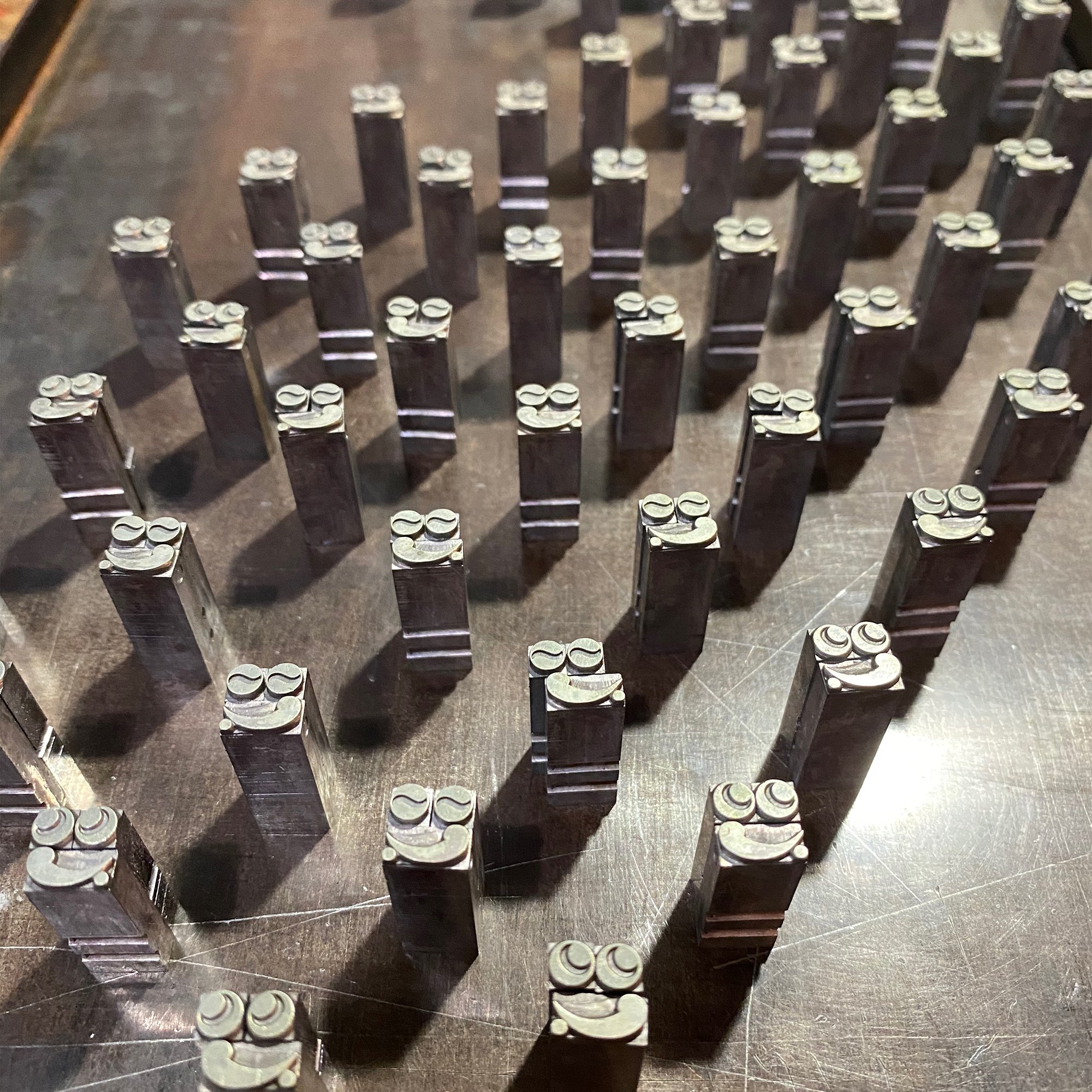
Color separations are always a tricky thing (I’ve also written more extensively about color seps on The Weekend Printer). Once I’ve got the placement established, I pull out all of the color that’s not being printed and try to mark its location by tagging the spacing used to replace it with paint marker. Then, when the first color is finished, I put the next color back in and take out all of the ornaments that were just printed. I try to keep the ‘on deck’ ornaments roughly in location on a galley; I love the look of these little faces lined up and ready to go.

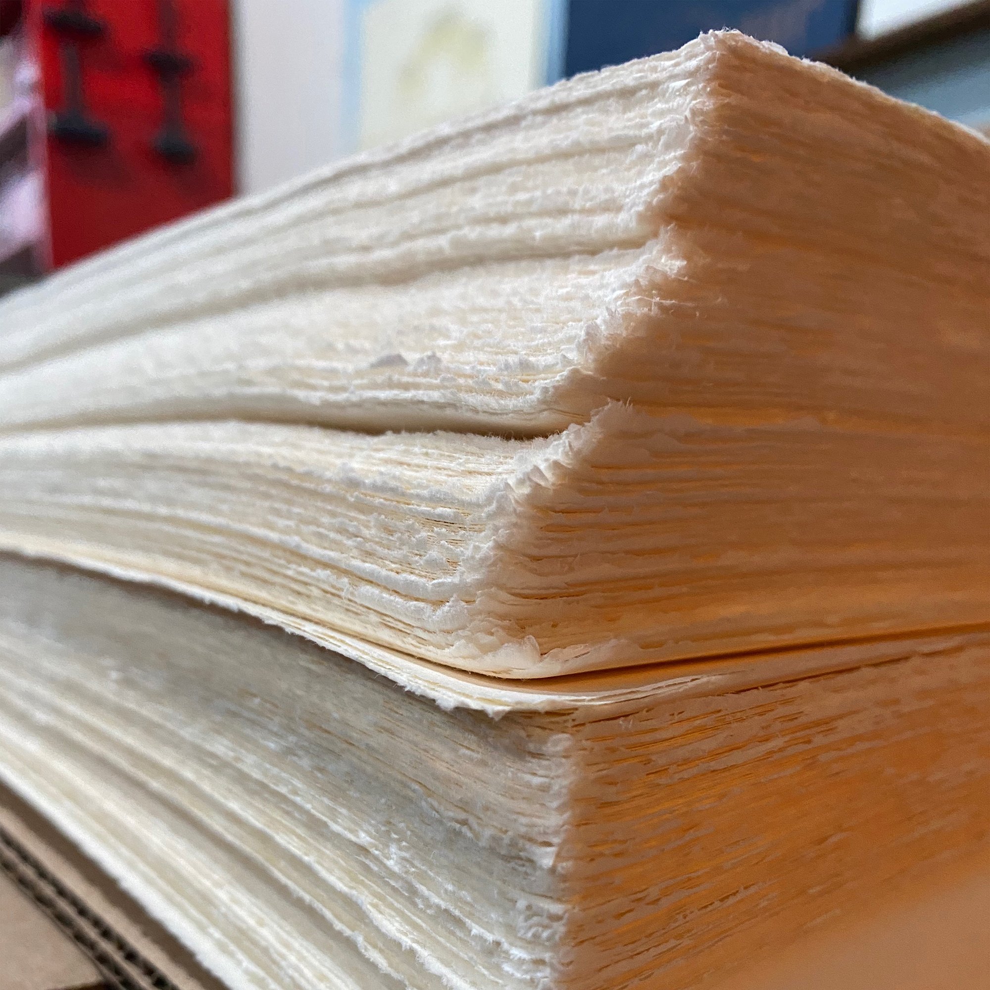
The paper is Zerkall, one of my favorites that is sadly no longer available. It comes in large sheets with fluffy edges and needs trimming to size. I cut the sheets larger than needed so all of the pages can be collated and trimmed together at the end.

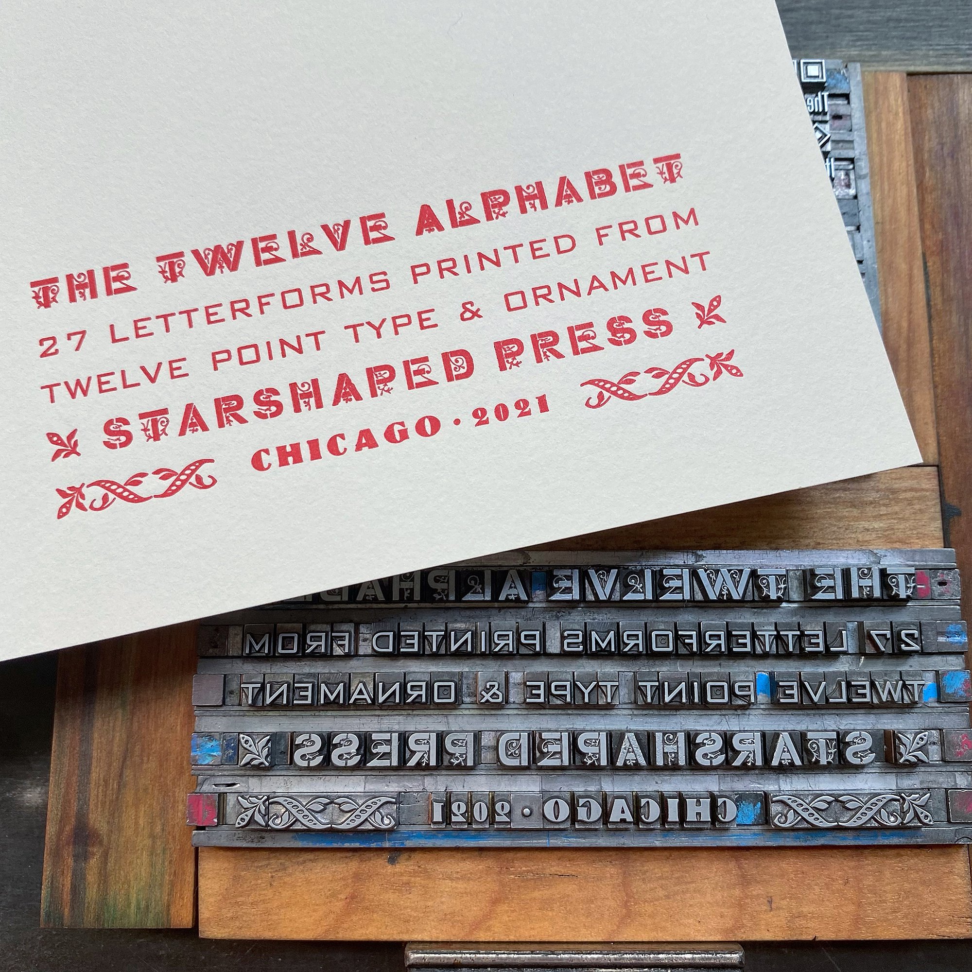
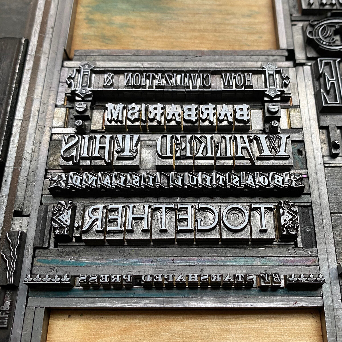
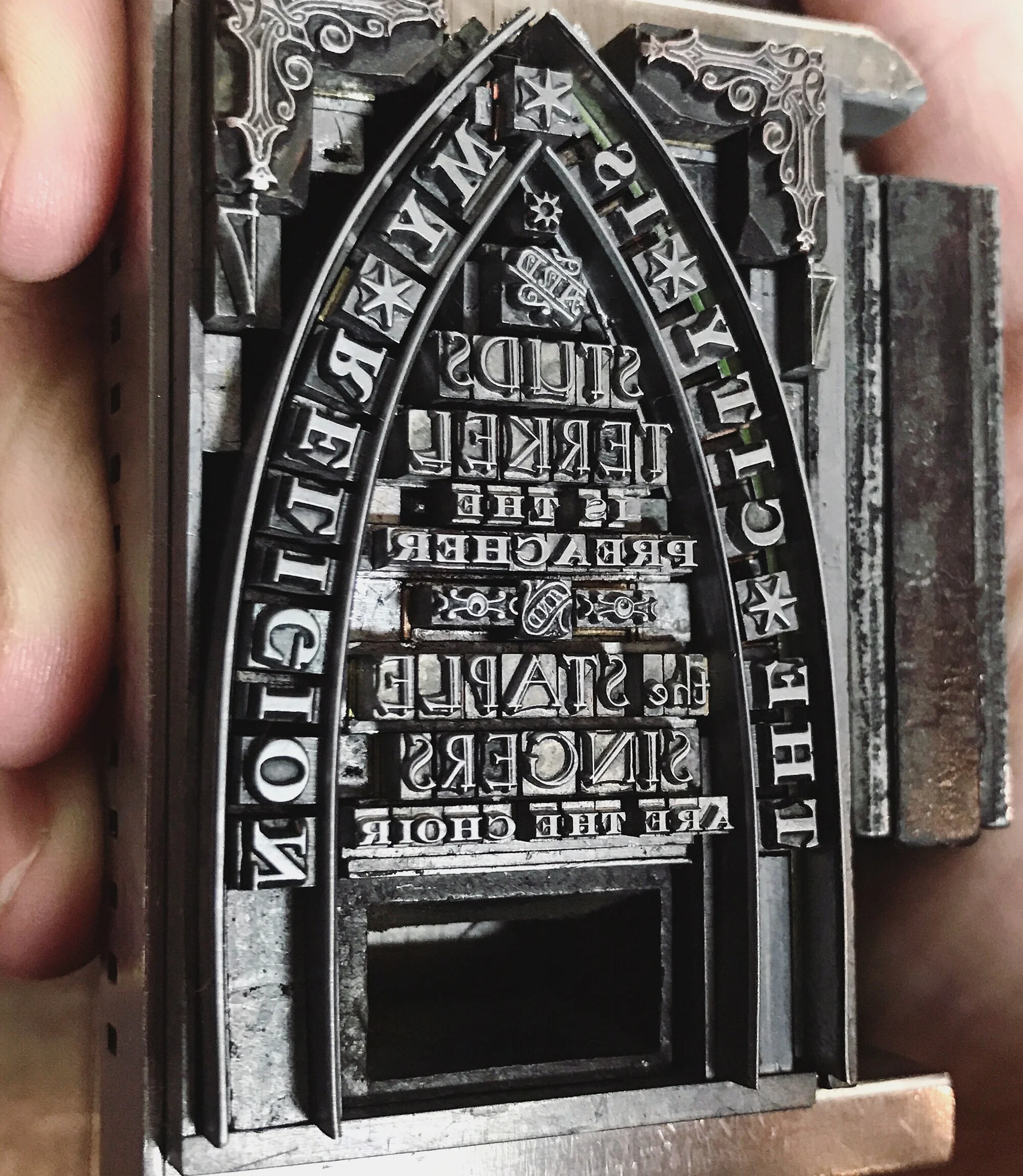
The title page and colophon were also printed in various 12 point types. I love this main typeface, Cleft Gothic, as it’s a basic gothic with a little surprise in it, which seemed appropriate for the project. It was a surprise when I got it as well, hiding amongst another gothic in a job case that went unnoticed until I started to clean it and saw pretty quickly that there were two faces on the caps side of the case.

Here are the pages laid out for collation, after going through them to pull out any less-than prints.

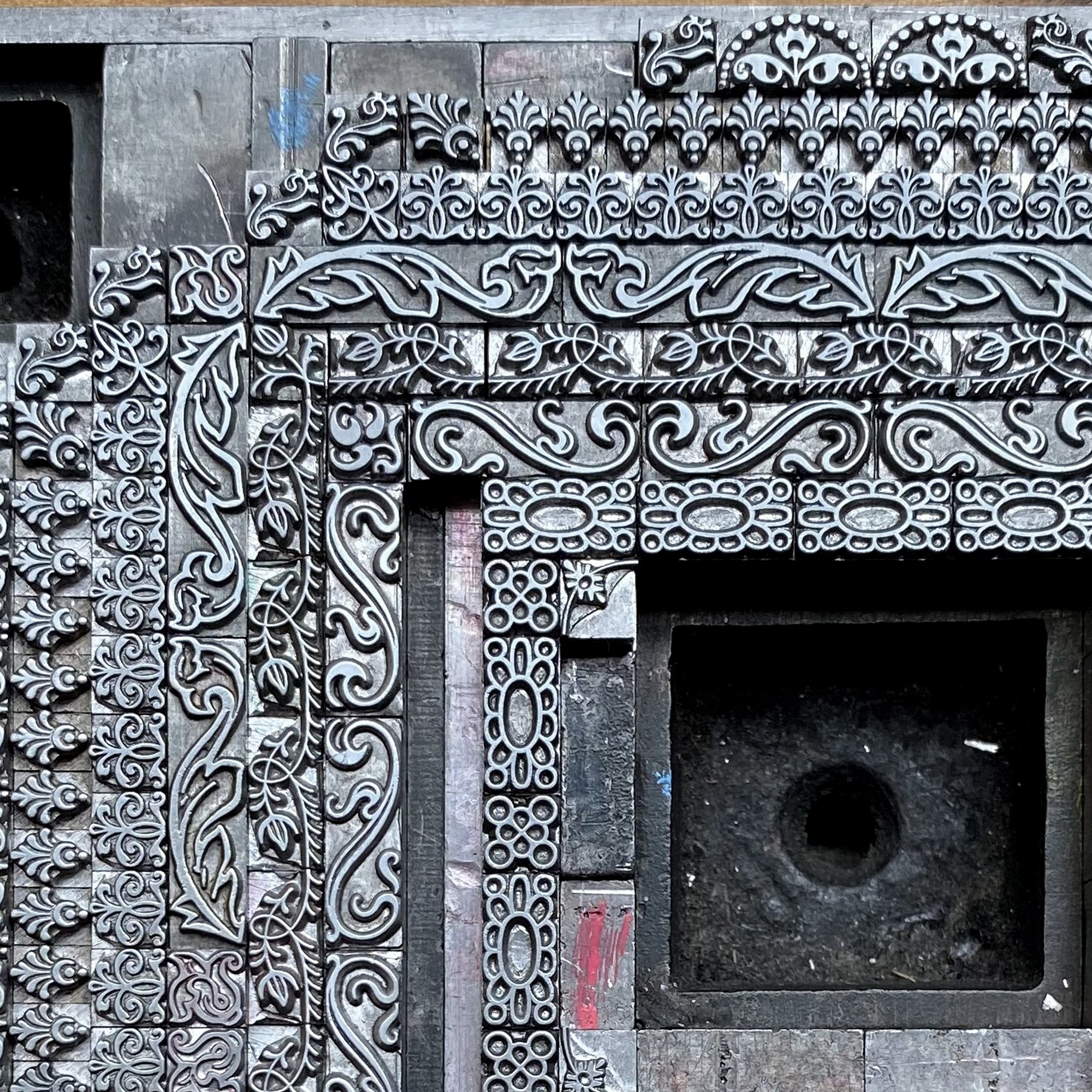
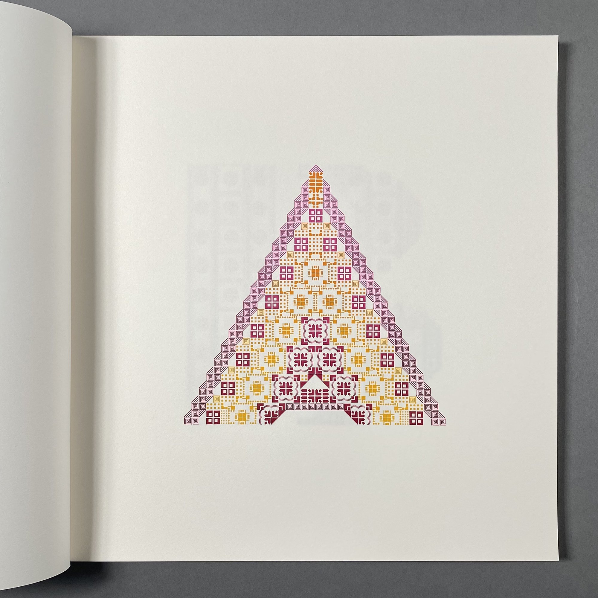
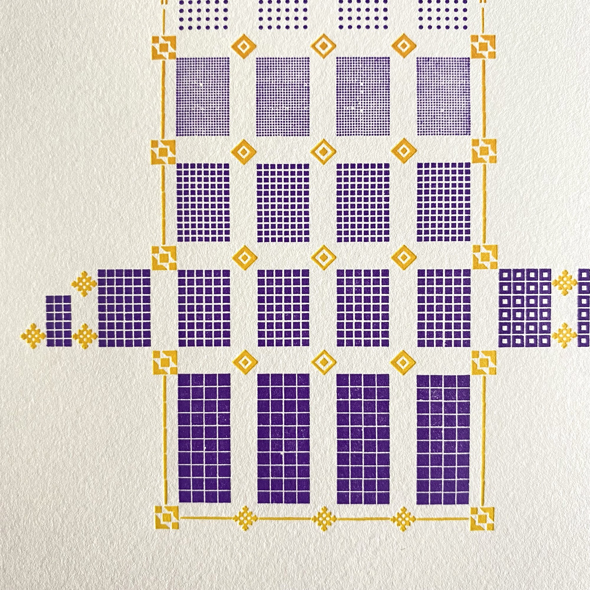
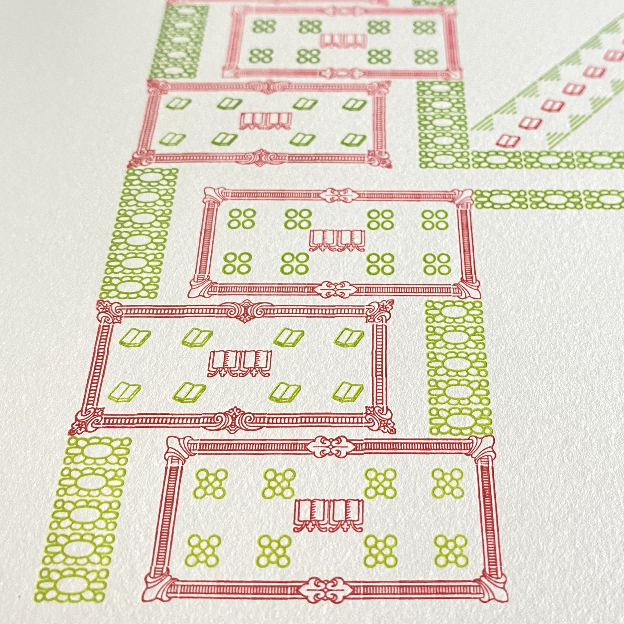
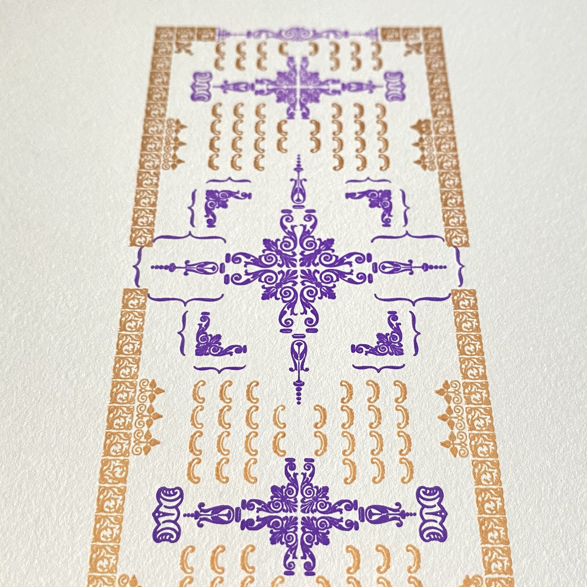
A smattering of pages and close ups! I think it’s fair to say you wouldn’t know all of the ornaments used have 12 points along one side if I didn’t tell you. The depth and variety of designs of the ornaments and how they are placed on the body is so different that the possibilities are endless. This is why I love metal type and never feel that it’s too limiting.


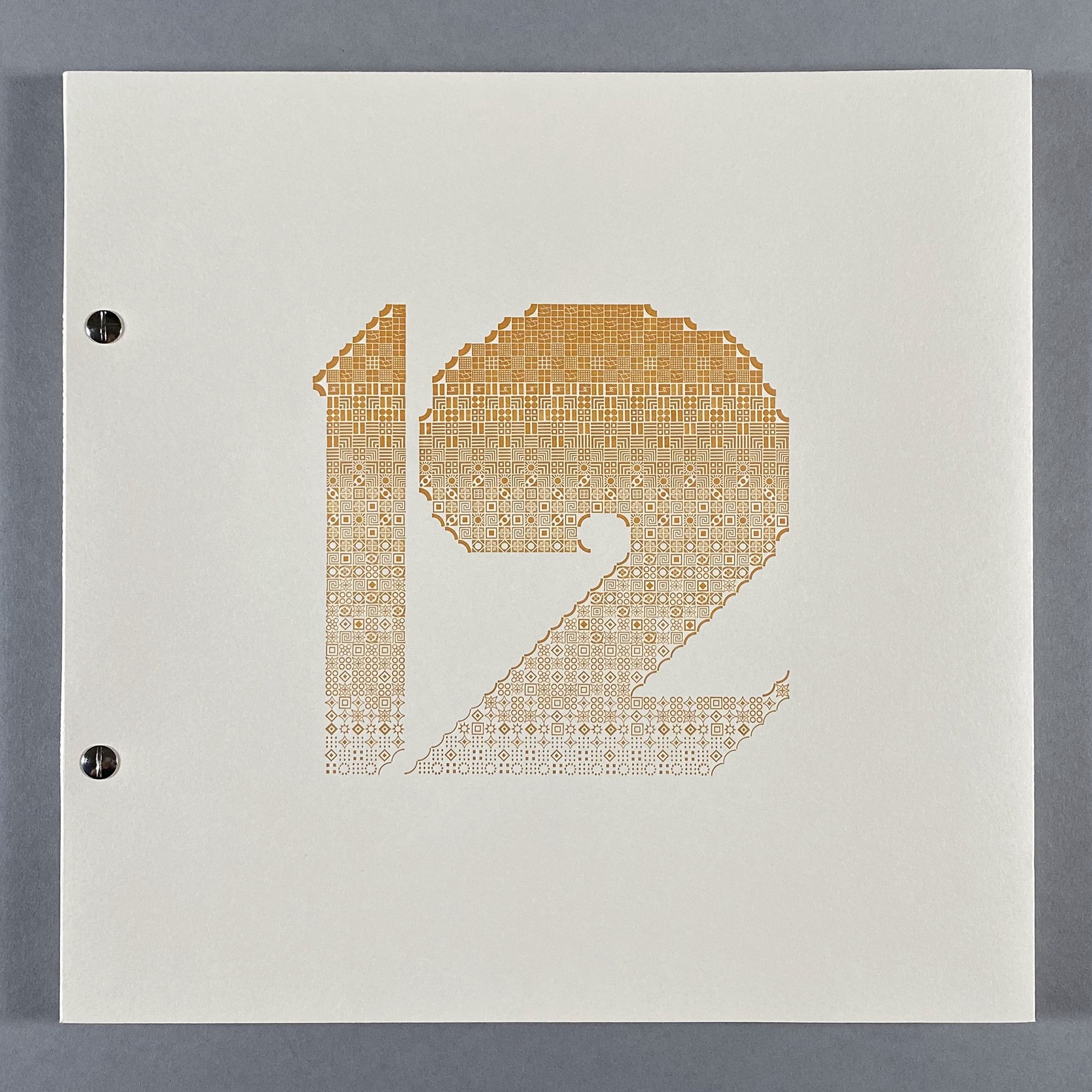
Just prior to digging into the book, I printed a prospectus in order to explore the idea of creating letterforms in this method. The number ‘12’ was printed with a subtle split fountain but with a reduced set of ornaments along a theme that went from thin curves to fat ones to create another gradation.

I liked that idea so I carried it through for the cover of the book, too. It would just be one color, with the weight of the ‘12’ changing from heavy to light because of the surface value of the ornaments themselves. I followed the same process of sketching out ideas for the shape and then playing around with what ornaments would achieve this goal.

Initially I thought the binding would be more involved and sewn. I tried a number of versions of this and was deeply unhappy with every one of them, as the sewing looked too soft and sloppy next to the bold, graphic ‘12’. Then I tried screw posts and immediately felt a connection with their subtle, industrial feel. It matched the overall tone without detracting from it. I’m so pleased with this collection of letterforms, with how they came together and what they say about my collection of type and its endless possibilities.

While most of the edition of 40 now resides in libraries and private collections, the remaining copies are available here. There were also a handful of individual prints of each letter outside of the edition that are now available to purchase here.

Field Notes

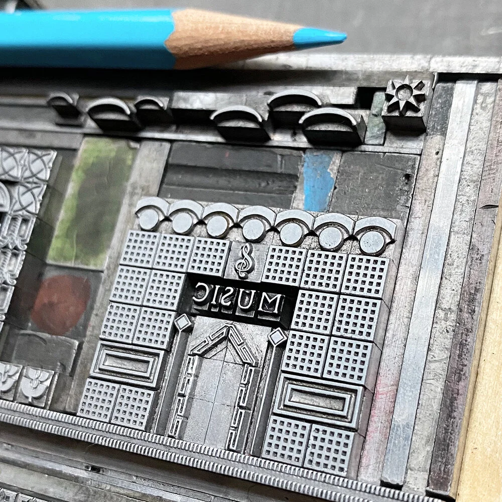
Over the summer of 2020, I, along with 9 other printer/designers, created a limited edition Field Notes notebook. In the midst of a global pandemic and viscerally witnessing and feeling the loss around me, in life and life’s work, I wanted my design to be a tiny nod to the spaces that make a community home. A safe community. A connected community.
These are some candid shots of the building and printing process. See the wonderful short doc Field Notes did on the entire series. Some notebooks are available for purchase in the shop. Please continue to support these independent makers and all of the ones in your community.

processbluesetup.jpg
processbluesetup2.jpg
rubinesetup.jpg
boxes.jpg
onpress.jpg
stacks.jpg
cornerstore.jpg
cafe.jpg
bikes.jpg
library.jpg
icecream.jpg
music.jpg
school.jpg
counter.jpg
fieldnotesfinal.jpg

The City Is My Religion — Requiem

I wrote a requiem when I turned 40. It was for a part of myself that bore a nagging, persistent allowance of words that diminished me and the work of my hands, words that always came from men. I could wax on about why they did this but tomes have been written on the subject already; I could address why I tolerated it but this is also well-covered ground.
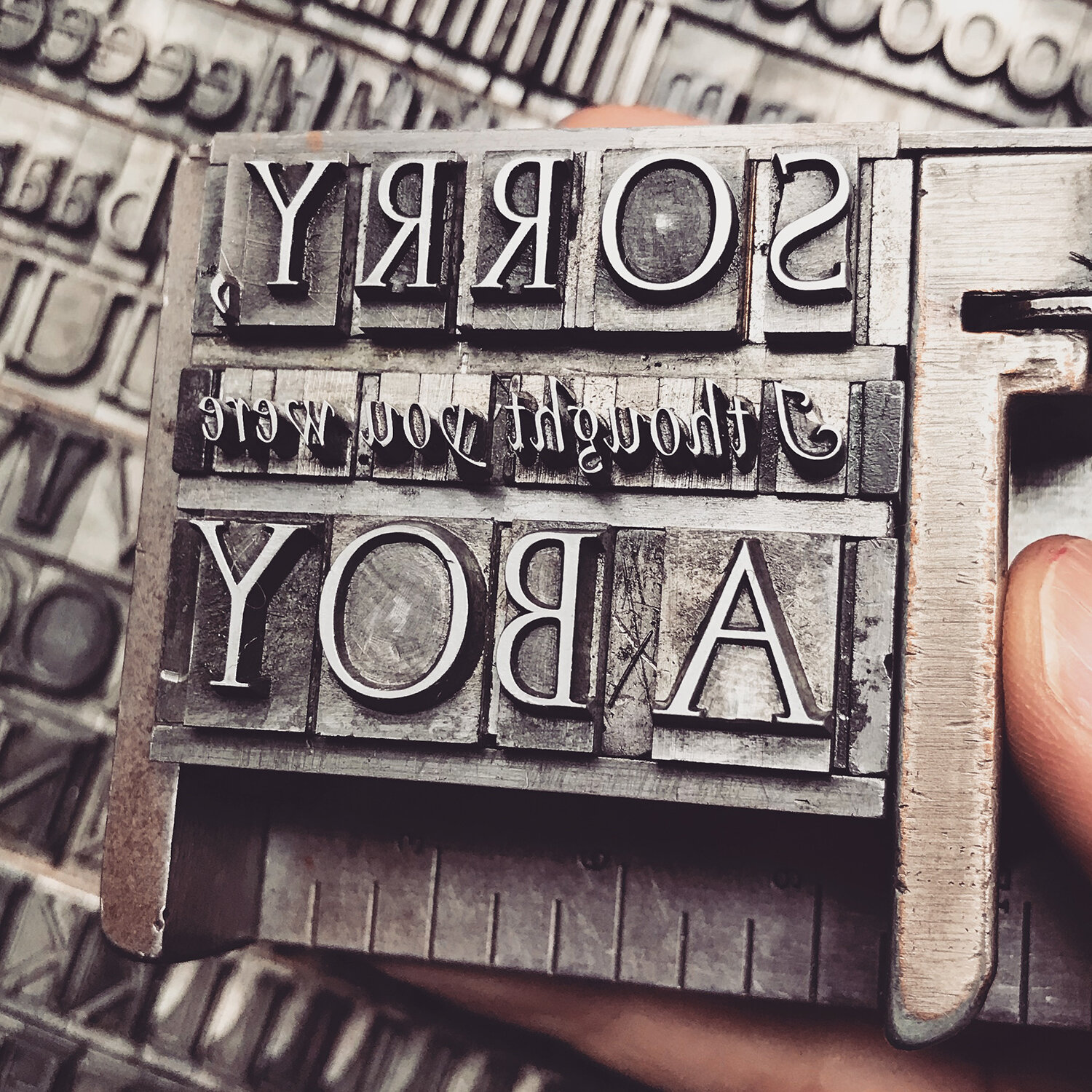
The only pseudo-apology I’ve received from a man was ‘sorry, I thought you were a boy.’ I think of this whenever I’m put in a position with a man who wants me to demur to his authority or knowledge so that I’m forced to pause before the words ‘sorry’ or ‘apologize’ escape from me. Because more often than not, it’s a power play and my knowledge is just as powerful.
I constantly correct my child on apologizing: If I say ‘do your laundry’ then do your laundry; it doesn’t require an apology for not having done it. It requires saying ‘okay’ and doing it. No offense has been committed. I’m not sending a child into the world apologizing for their very existence.
I see criticisms of women’s work on social media and the woman posting is quick to apologize for whatever the commenter deemed insufficient. I message her to say ‘Don’t apologize for the work you put in the world!’ More often than not, the troll has nothing in their own feed to indicate they have any advanced knowledge of the subject and if they were truly invested in helping, they’d do it directly and privately and not in a humiliating fashion. It’s a power play.

FarrellWomanInPrint1.jpg

I’ve tried, whenever possible, to collaborate with other women in my field and have had deeply satisfying results on personal and professional levels. Sometimes a friendship goes years in search of a project and other times I cold call a woman I admire to see if there’s a collaboration waiting to happen.
In 2016, I worked with Jessie Reich of Three Ton Bridge Type Foundry, operating out of the Bixler Letterfoundry in Upstate NY, to create two Chicago Collections of metal ornaments based on architectural elements in the city. You can read more about this project here.
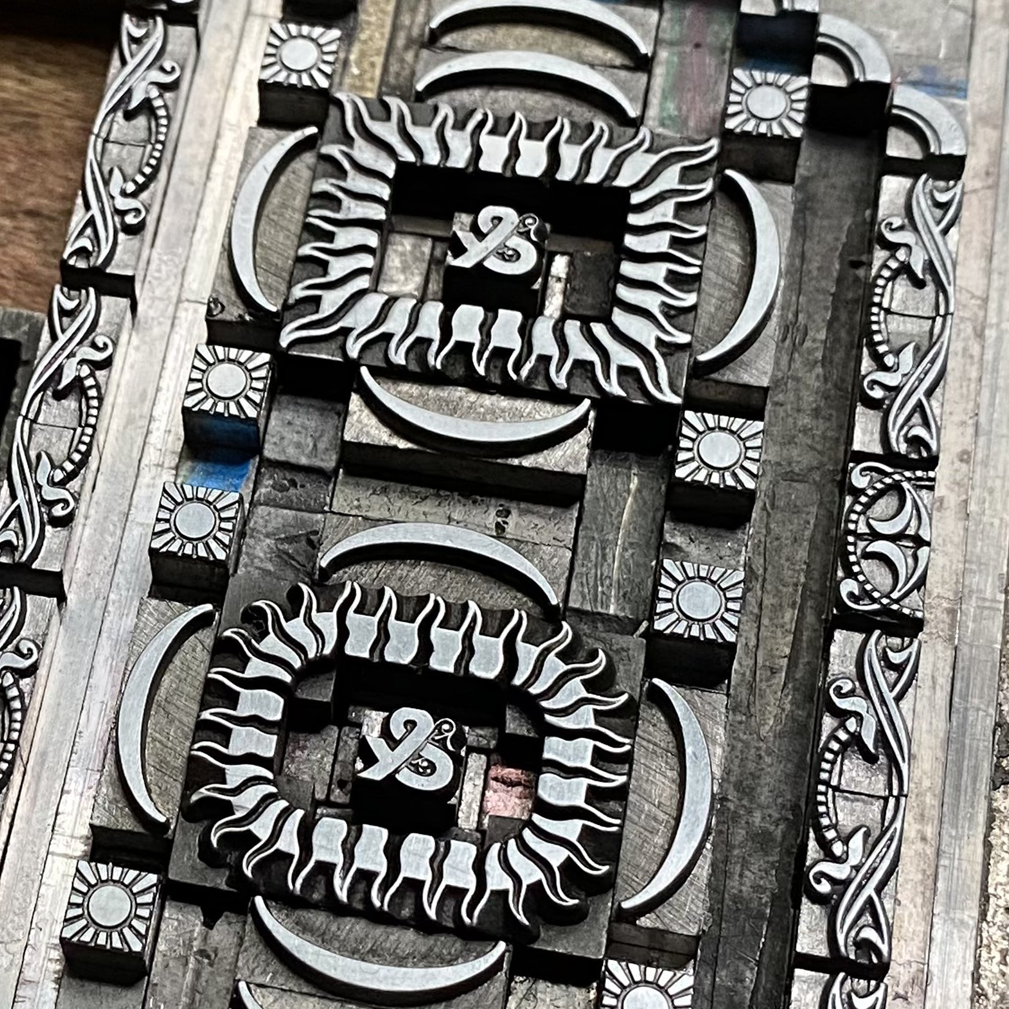
StarshapedPress3.jpg

And in 2017 I had the pleasure of collaborating with Geri McCormick of Virgin Wood Type, also in NY, to create two sets of wood type ornaments drawn from looser, prairie-style ornament. Read about developing Ida and Lucy here.

idalucyonpress.jpg

Clearly a print in my typographic memoir needed to cover the fact that I was a woman in print, that I worked in letterpress at a time when it was gaining greatly in popularity and transitioning from a male dominated field to a female one. So I collected many of the things men said to me over the years and wrote them down. Some were actually sent in letters and postcards and I kept them but don’t want to give the senders any more space here than they deserve.
It felt important to use all type designed by women for this print. But therein lies the conundrum– there isn’t much, or at least it isn’t specifically documented and credited to women. So I started with my own ornaments mentioned above, arranged in quilt-like patterns as a nod to a traditionally female craft.

FarrellWomanInPrint2.jpg

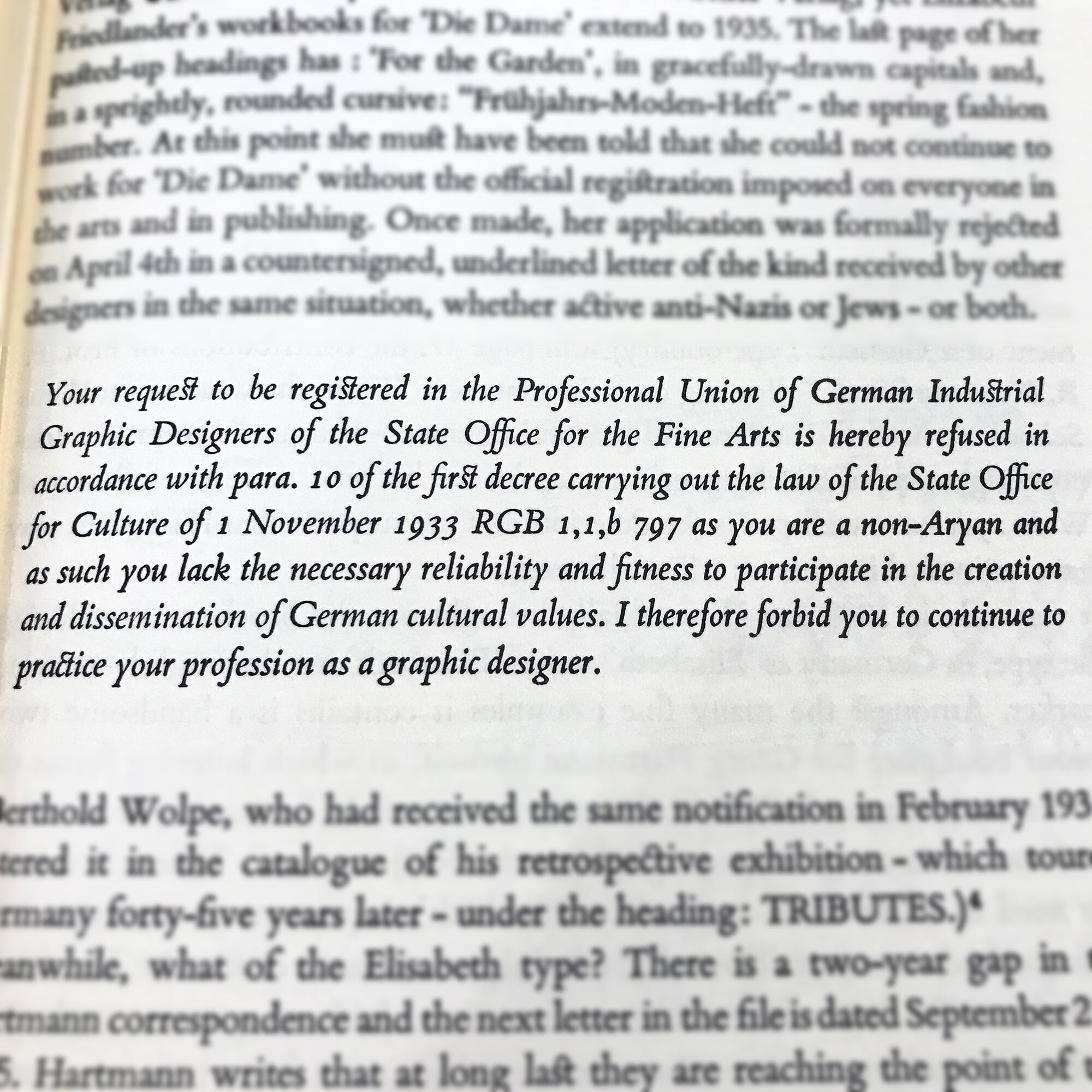
In the winter of 2017 I had the wonderful opportunity to meet Caryl Seidenberg in her home north of Chicago. Moving away from making books, she was selling most of her collection, including a nearly complete run of the typeface Elizabeth, designed by Elizabeth Friedlander. After a delightful morning of looking at her past projects and gleaning what I could from someone who also balanced work and motherhood, I left with all of the Elizabeth type. The Newberry Library has a small archive of materials about Friedlander, including Pauline Paucher’s wonderful book about her life and work. A Jew working in Germany in the late 30s, she was forced to flee to Italy and then England, where she continued to live and work following the war. It’s a story worth reading if you can, even if it requires digging and visiting your special collections library.

eliz1.jpg

I think of the phrase ‘I forbid you to continue to practice your profession’ whenever I’m confronted with sexism because any ‘ism’ is based on the supposition that a perceived flaw prevents one from effectively producing or being something, that your ‘otherness’ is a disability. And after I think about it for a minute, I figure out how to do whatever it was I was told I couldn’t do in a more thoughtful and engaging way to show that I could do it. And this is why anyone marked out as ‘other’ from the ‘norm’ should be listened to; this extra hurdle is where the very seed of innovation is planted.

FarrellWomanInPrint3.jpg
womaninprint2.jpg
womaninprinttrimmed.jpg

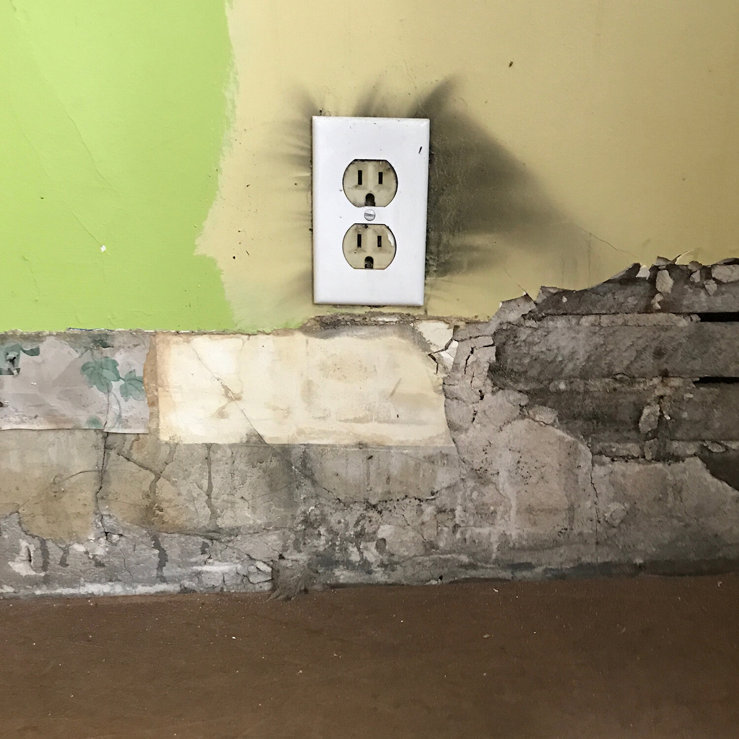
On May 7th, 2017, my neighbor called me to come home immediately as my house was on fire. By the time I arrived, there were firefighters on the roof, punching holes in it to allow for the release of smoke as the fire itself was out. The rest of the evening was a blur of insurance calls, board ups, neighbors checking in, consoling my child (the electrical fire started in their room and it was a near total loss) and coping with the shock. This image encapsulates so much of that; it shows the layers of my 100 year old home exposed in a near instant.

house3.jpg

My little house is a huge source of pride for me. We purchased it in a perfect storm of dumb luck that I never thought would happen: the height of the recession with drastically falling home prices, my husband had steady and rising income from working one job as opposed to several (rare for a stagehand) and Obama’s $8000 tax credit for first-time homebuyers. I had my heart set on one of Chicago’s historic tiny brick bungalows and we got it.

houseform.jpg

Chicago is well known for its 1871 Great Fire. It took the city about 3 years to rebuild from those damages. It took 9 months to rebuild our home, an excruciating process of constantly calling contractors and cleaning and fighting with utilities and hand-wringing, all while attempting to make life feel normal for a child and running a business. And at the end of May, I dragged my tank of a sewing machine, still reeking of smoke, to Jo’s school to make costumes for the school play. It wasn’t until a while later that Jo realized the irony of being cast as Mrs. O’Leary in a play about Chicago’s history.
And so I built a print to memorialize this time much the way the city was rebuilt on top of sedimentary layers, only my layers were of type dating back to the fire, with my little house resting on top. Then they were printed in earthen, ashen shades.

proofoftype.jpg
typeonpress.jpg

To add flames, I created a 3-color reduction linoleum cut, printing, then carving away at it multiple times to print depth.

linodrawings.jpg
linocut.jpg

The final print:

firetrimmed.jpg

I wish I could say the fire experience came with growth, that renovation gave my walls a satisfying symmetry, that I’m relieved our electrical work is up to code. But I can’t. It left a constant, quiet dread, knowing that one day you can leave your home and come back to find it on fire and that you have no control over this. That your definition of ‘home’ and ‘safe’ can vary greatly from your friends and community. That losing a home is like losing a loved one and when someone says ‘but look, you can get a new renovation!’ it’s akin to ‘look, you can get a new child/mother/husband!’ when they die. It wasn’t until the Paradise, California fires when I heard a therapist working with families there express this loss in a way that made me feel understood. That grieving and fear is appropriate. That it’s normal to look at your child when you’re both leaving together and the house is alone by itself, with an unspoken understanding of these feelings.
When our renovation was taking place, its very nature of removing the damage meant removing nearly every bit of handiwork my late husband put into the house and it was like losing him a second time. I was lucky to find a few ‘easter eggs’ in the rubble, including this piece he buried behind drywall in the attic.

wood.jpg

These little artifacts are important because they are finite, having lost Mr. S in 2016. He was fiery and passionate about many things, but they largely boiled down to two: his love of his job as a union stagehand coupled with the respect he had for his fellow workers, and his deeply held belief that everyone deserved equality and a start on a level playing field. That meant that if he wasn’t enjoying a cheap beer in our yard, he was at the theater or at a protest rally for whatever underdog needed a loud voice (and he had one). At one of the Newberry Library’s Bughouse Square debates, I watched him heckle Quentin Young while he spoke about the problems of the AMA and the need for single payer health care, something Mr. S actually believed in. Afterwards, he approached Young to shake his hand and say, ‘I believe in everything you said, but I think it’s important to have a lively debate’ and they laughed. If that’s not Chicago, I don’t know what is.

widowtype.jpg

I focused the print about his life on the last few months of it because it was in this time that Mr. S’s long-held beliefs in the strengths and benefits of unions (not always a popular opinion) paid dividends. Over the nine months of his illness, the union showed up in every possible way to support us, thereby validating his lifelong struggle to defend them. Even in the hospital, coming out of anesthesia, he discovered his nurses weren’t in a union and he offered to start one on their behalf.
So I stuck to all the simple, sans serif typefaces, not unlike what we’d see at so many rallies and marches, and organized them into what could either be a sea of posters or the curve of a theatrical proscenium arch. The center pulls specifically from Billy Bragg’s ‘There is Power in a Union.’

typeform3.jpg

Overlapping ornaments point the eye upward, doubling as footlights or poles for the posters.

starburstsinform.jpg

The shapes of the blocks of text were printed with rough linoleum blocks and then hand inked for a little dimension with this down-and-dirty frisket.

maskingprint.jpg
union3.jpg
LOuniontrimmed.jpg

Before Broadway went dark in March, we saw a production of Hadestown, a stunning, modern telling of Orpheus & Eurydice. While we know this is tragedy and long for a different outcome, Hermes is there to emphatically remind us ‘it’s an old tale… it’s a sad song… but we’re going to sing it again.’ The cast follows the performance with an ask for donations to Broadway Cares, an organization founded to help those in the industry fight HIV/AIDS when the rest of the country chose to ignore it, and has grown to help the entire Broadway family when in need. They helped my family in our hour of need. As we left the theater and dropped money in the red bucket, I thought ‘what widow placed money in this bucket five years ago that helped me and my child?’ Hermes was right.

I didn’t write this particular requiem and I can’t change the lyrics. But I, too, will sing it again and again.


This is the second of four posts about The City is my Religion.
Read the first here.

Consecrated Ground

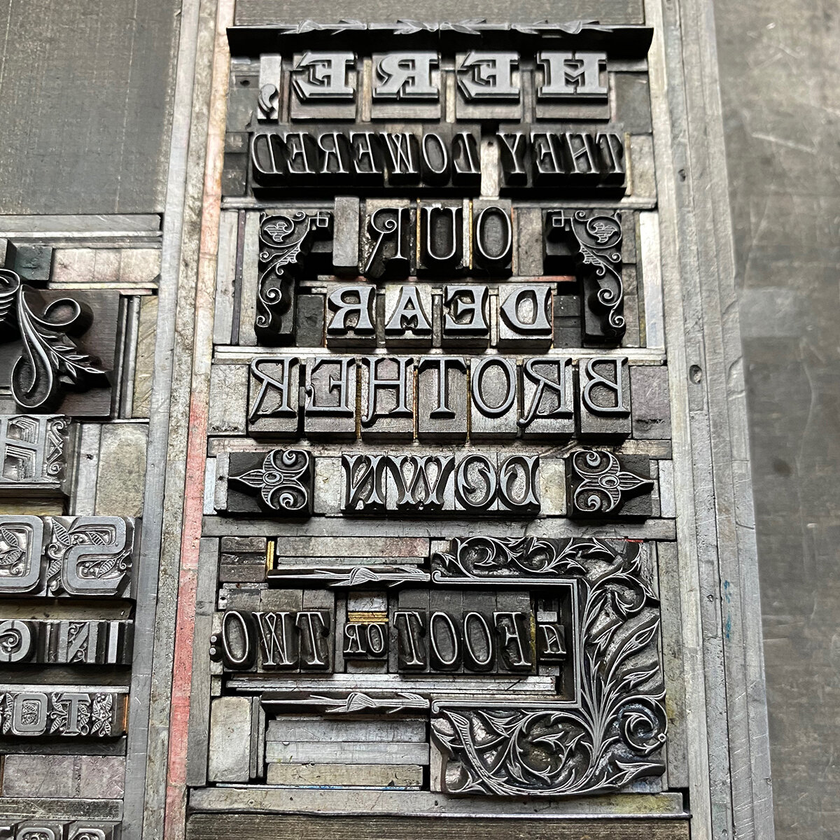
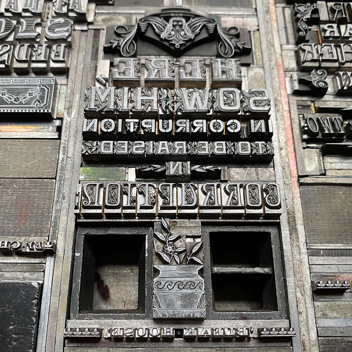
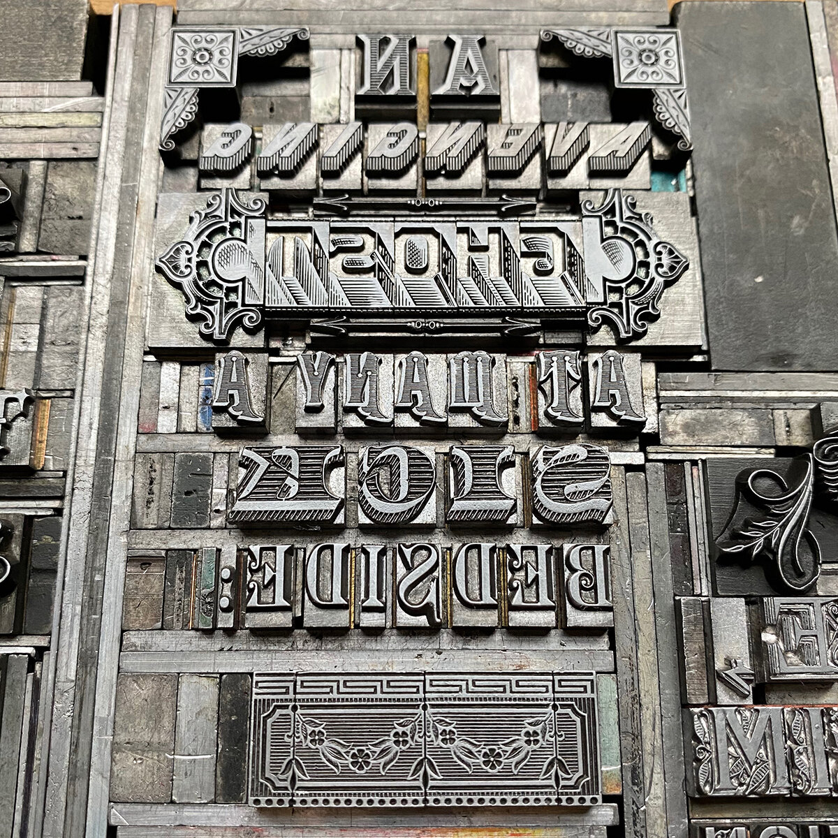
Death and the act of dying are such a huge component of living that it always surprises me when people deny it, refuse to discuss it or fear the fact that it will, indeed, happen to all of us. If anyone could write about death as a companion to life in all of its true and metaphorical senses, it was Charles Dickens. And of his novels, Bleak House remains my favorite. Death comes to its characters from all classes of life, from sources as simple as bad genes to the inequities of a ridiculous legal system.
Early on in the novel, the death and subsequent burial of a character known as Nemo (Latin for ‘no one’) is rendered poetically in a paragraph that describes this final act while, at the same time, pointing out we’re classless in death. It is only later, as the novel traipses on, that we see how this character was the artery tying together all of the remaining characters, from all stations in life. And so I chose this as the text for a new print, with the intention of alluding to the graveyard mentioned.

1sketch.jpg

It felt appropriate to dig into my 19th century type collection, some extant of that period with others cast in recent decades from historic matrices. The ornaments needed to have a stately feel that matched the type but also could have been carved on the headstones.

2carbonproof.jpg

Many of the ornaments used are the most beautiful in my shop in terms of their detail and complexity. The art of typecasting was definitely at its height in the late Victorian period in this respect. These collections come largely from Barnhart Brothers & Spindler and MacKellar, Smiths & Jordan.

metaltype.jpg

Nemo’s death in the novel casts a long shadow and sparks a series of events that lead to revelations and… you guessed it, more death. When another character hears of his passing after not knowing he had even been alive so recently, she asks at his burial site, in a lamenting tone, ‘Is this consecrated ground?’ It’s clear this knowledge would bring peace more to her than the deceased. I set this text in wood type to resemble a shadow stemming from the gravestones.

3carbonwithwood.jpg

To give structure to the gravestones, I carved a simple linoleum cut after tracing the shapes from the final print. I almost always print largely transparent color blocks after the darker type, knowing it won’t compete with the black ink. And the type, had it been printed over the transparent base, won’t pool on top of it at different rates given the various opacities of ink. Given the texture of the paper, I wanted the linoleum to print darker at the base of the gravestones and fade upward, both to allow the type to pop more and to tie the base of the stones to the shadow text.

4linocut.jpg
4linocutwithtext.jpg

Below is the final type form, followed by detailed shots of each grouping. I try to allow 19th century type to guide me, given that it was designed to create intricate forms.

5typeform.jpg

The final print is on Fabriano Tiziano Charcoal-colored paper to set the mood. The inconsistencies in the linoleum along with the subtle variation in ink tone created exactly the aged-stone look I was hoping for.

printdickens1b.jpg
printdickens5.jpg

‘Together’ is the only decidedly 21st century type, having been designed by Russell Maret and cast in 2016. But it fit the tone and is a stately end to the excerpt.
The print is now available here in a limited edition of 40 copies. 2020 marks the 150th anniversary of Dickens’ death and having a moment, in print, to honor this while contemplating those lost over the past few years is the perfect cap on the last decade.

The City Is My Religion — Invocation

On June 28th, 2016, I sped through the suburbs from the hospice where my husband would soon meet death. I’ve no memory of the exact location, only that it was in the vast all-cars-no-sidewalks suburban terrain I can’t stomach. Politely manicured lawns and strip malls on both sides, with no signs of live humans. I sobbed because my city-loving husband had to die there.
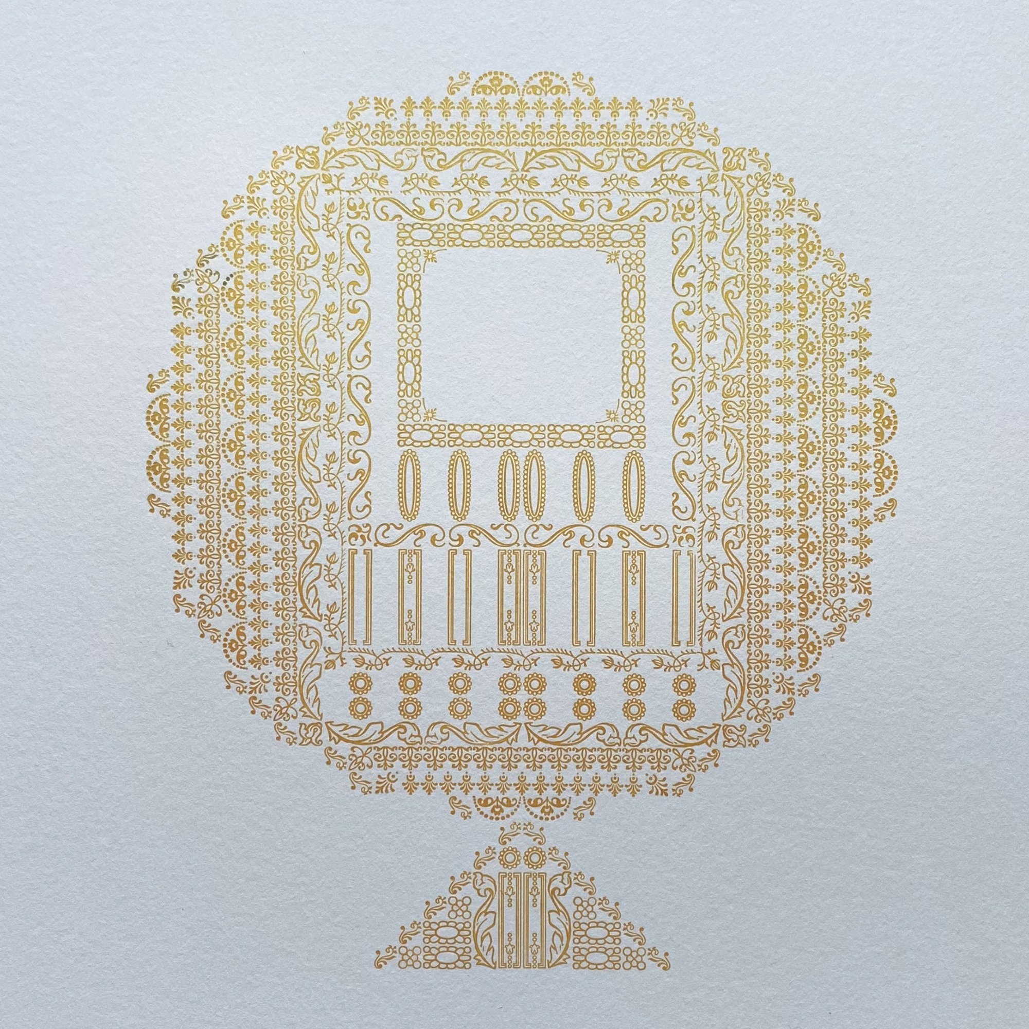
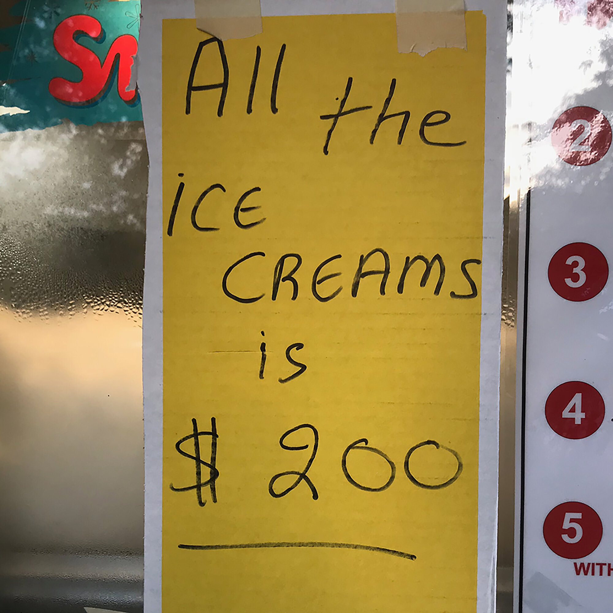
Maneuvering back into Chicago, I drove down Kedzie Avenue and immediately stopped at an intersection to allow a woman to cross while pulling a child’s wagon. It had a precariously balanced dresser sitting on top, with its normal occupant in the street behind it, pushing energetically as his mother heaved it through the crosswalk. I chuckled at this scene from my neighborhood. I was back where my environment glowed and all the ice creams is $200.

In the midst of end-of-life discussions involving religion to which I did not subscribe, I realized the city fulfilled that role for me. Pacing the streets, seeing my people at the shops and carrying on in an immediate, embracing environment provided the solace that many, I suppose, get from a religious life. Circumstance told me a page must be flipped to a new life chapter I wasn’t ready to read. Could I look to my first 20 years in Chicago, examine their foundational structure, then create a memoir in print to both honor the past and provide a scaffold for the future? The work of my hands is and always has been, free therapy.
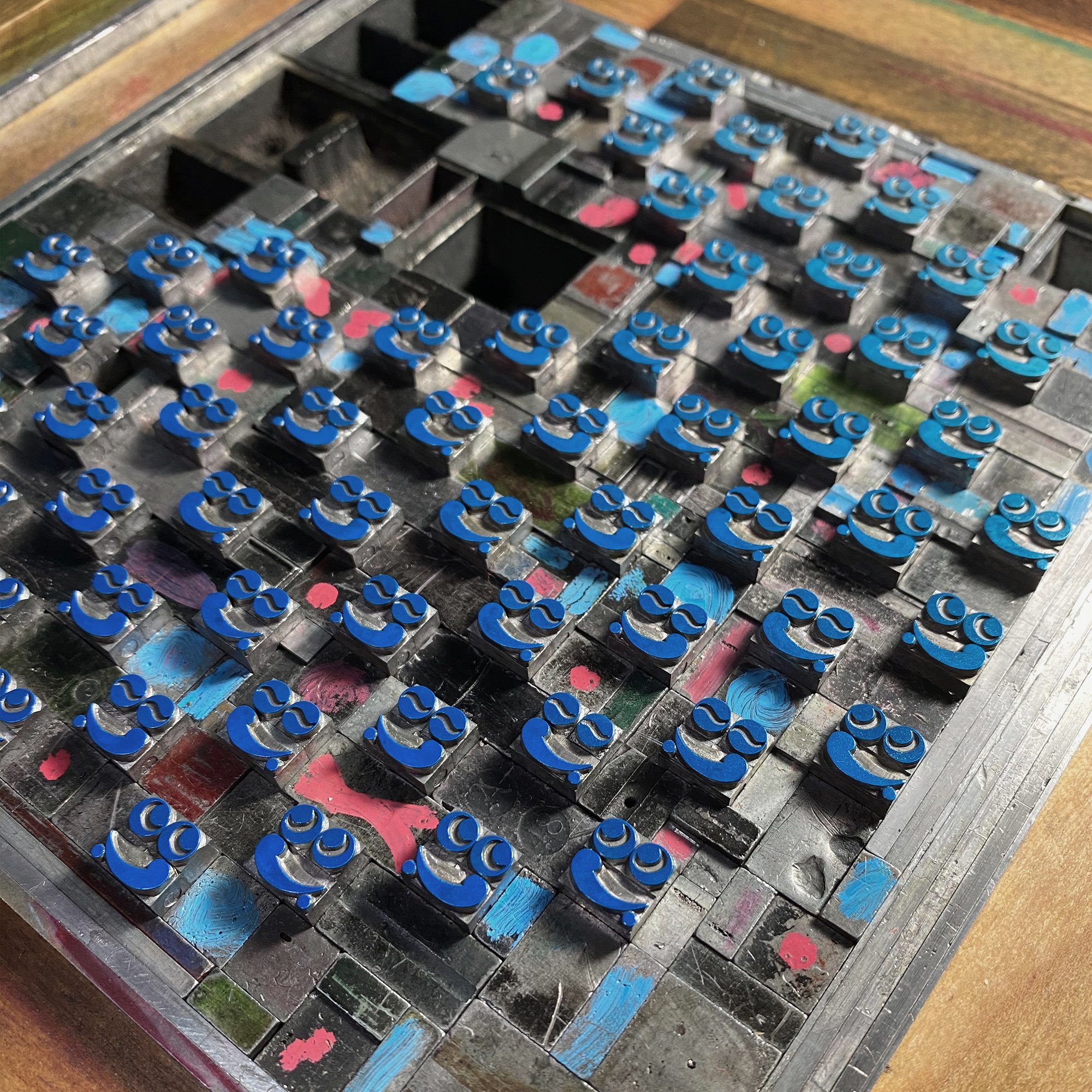
10religionform.jpg

I applied for and was granted the Arthur & Lila Weinberg Fellowship at the Newberry Library, for research to develop my idea of what this project could be. The steady rhythm of searching titles, laying out one’s pencils and notes, receiving beautiful objects on little cloth futons, then getting lost for hours in what is, for the bibliophile, consecrated ground, was both a balm and a directive.

I examined the definition of a type specimen book to explore if it could function as a memoir as opposed to its more traditional role either documenting type for sale or satisfying the vanity of a printer. Because I am not a foundry or reseller of type, and because my collection is anything but stagnant, a specimen could be freed to take on the life I choose to give it. As Russell Maret recently wrote, “In the absence of new types, then, a specimen book that fails to present old types in new ways brings its own existence into question. Why bother?” I couldn’t agree more.

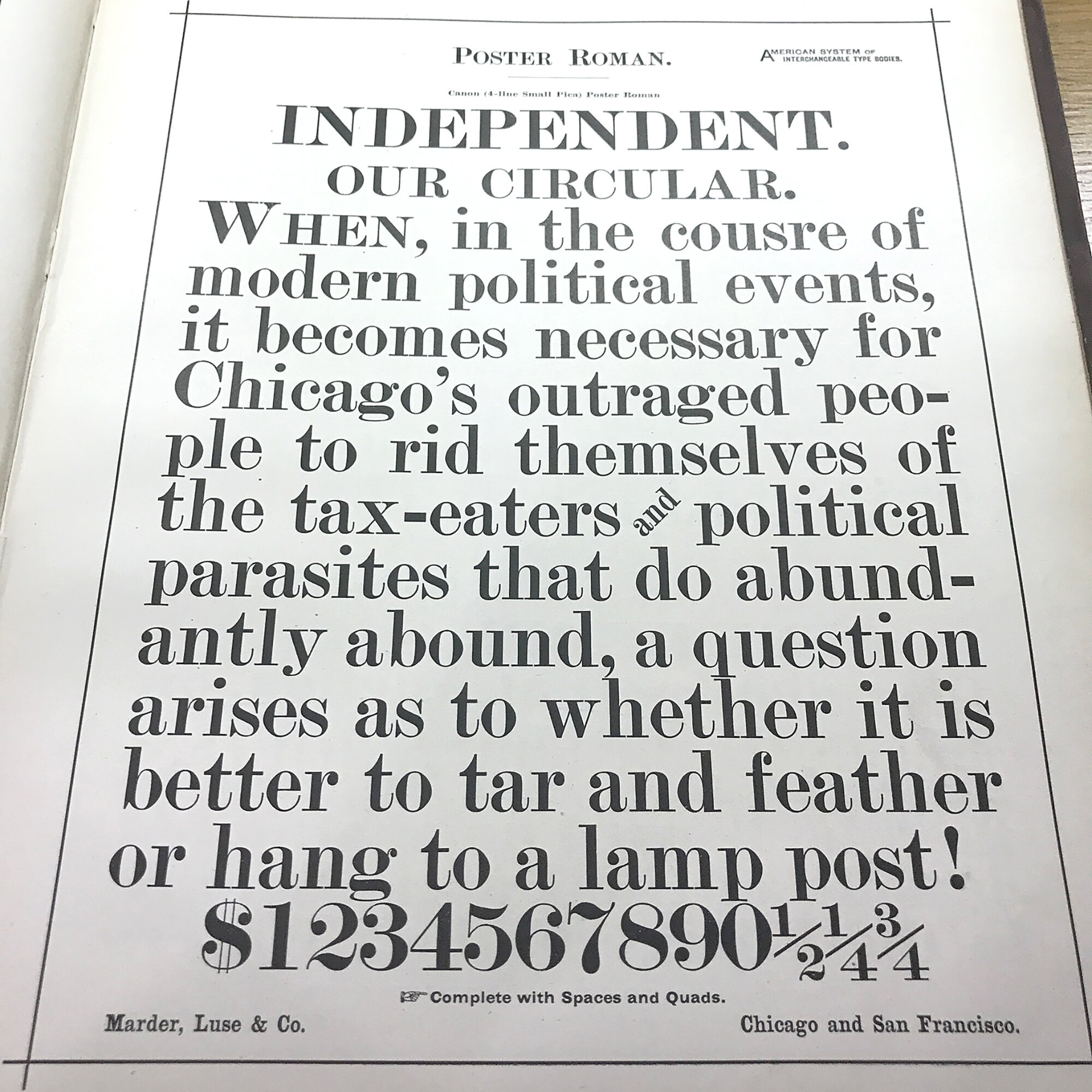
While perusing 100 year old specimens in the Library, I particularly enjoyed finding typos and mistakes as a reminder that a human hand built the form.

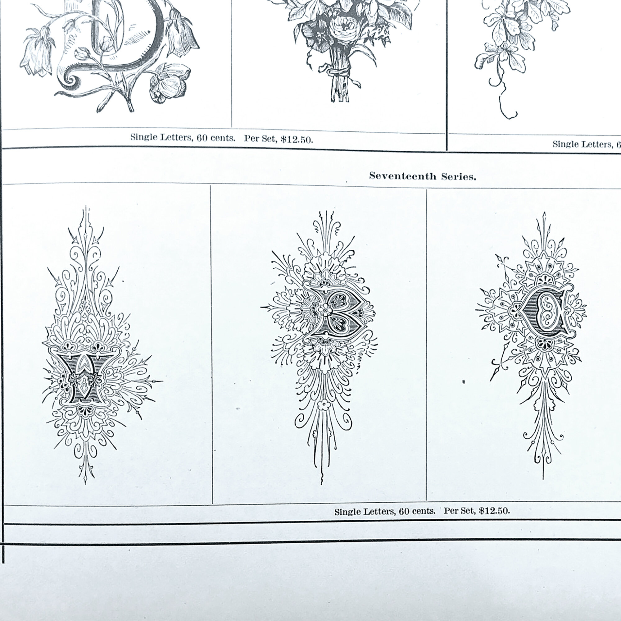
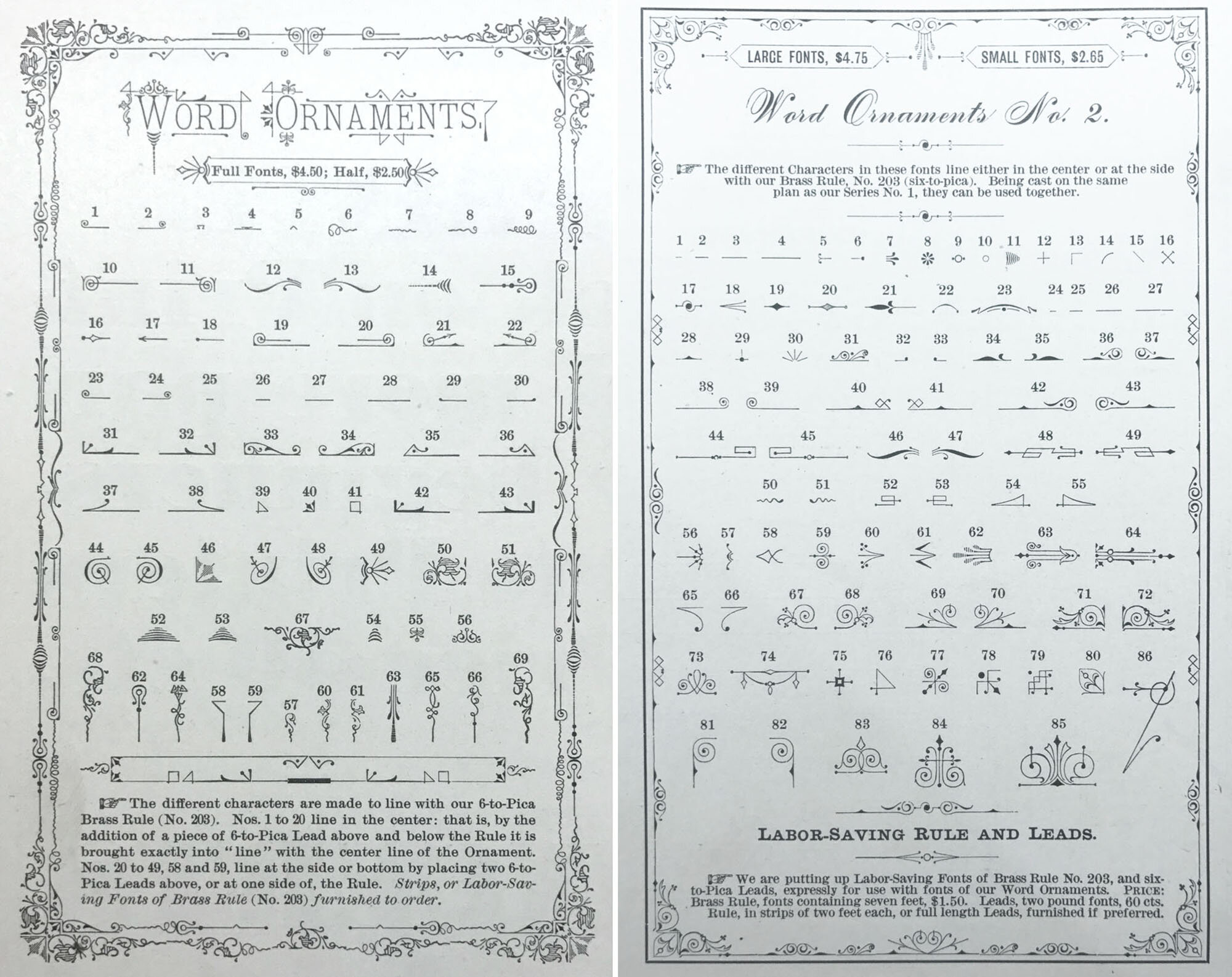
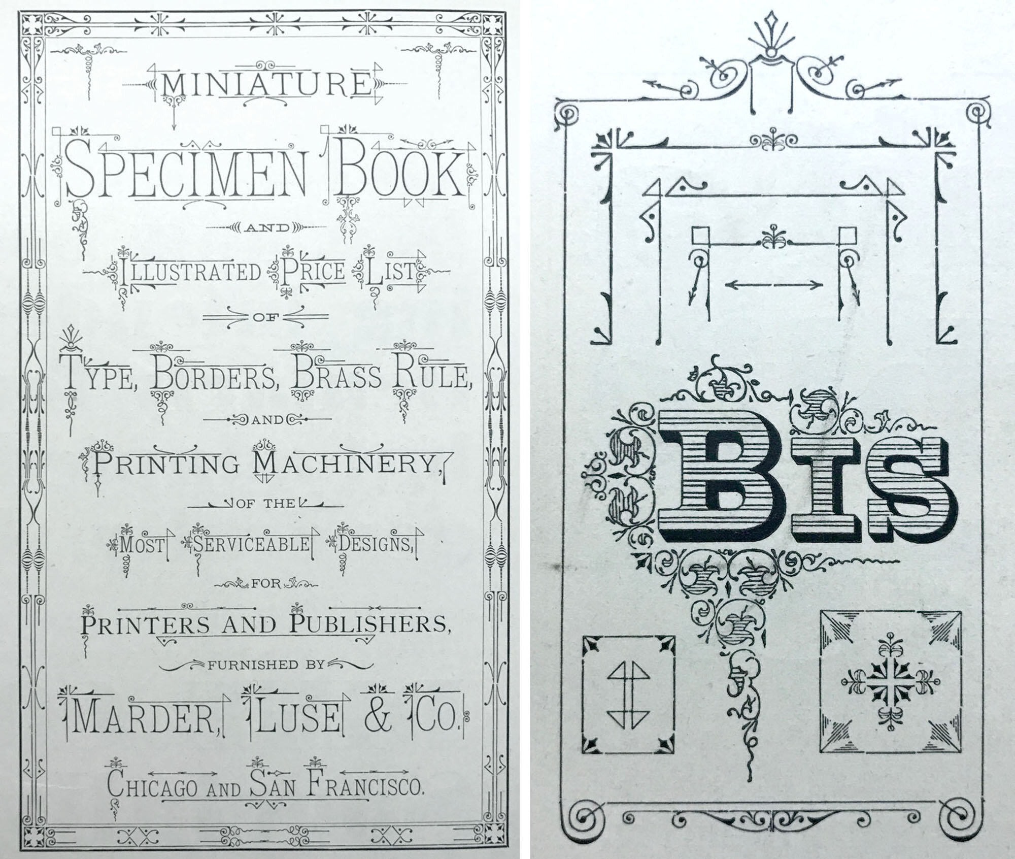
Of particular interest were these word ornaments from the Marder, Luse & Co. books, a Chicago-based foundry prior to 1900. This is because I own many of these sets but wasn’t sure how they were designed to work together.

Studying these helped flesh out what would be the first of 10 themed prints, this one focused on the definition of perseverance.

20PERSperseverewithtype2.jpg

The text for the print was pulled from diverse definitions of the word, from the dictionary itself to Curtis Mayfield and Sesame Street. The largest within it is my own; it is a nod to early morning sightings of bread trucks all over the city. This singular vision reminds me life is going on and that whatever happens that day, I can always get a hot dog at the end of it.

16PERSrosens.jpg

All of the typefaces used for this print are generally hated by both type enthusiasts and casual armchair designers. Let’s hear it for Murray Hill and Park Avenue! How ya doing, Brush Script and Typewriter? Never enough of you, Cheltenham, old friend. Groan all you want, few typefaces have persevered liked these champs.
With this print, I established the three design tenets each subsequent print would follow:

  • Typefaces grouped by theme of my choosing

  • Historical component connecting print to specimen books, printing, etc.

  • Personal story, reflection, connection to the city of Chicago

perseverewithtype.jpg
persevere1.jpg

The second print would ultimately become the cornerstone of the project as I compiled the tools to build a church. But this would be a monument to the places that shaped me into a Chicagoan and set me on a path to collecting a ridiculous amount of metal ornaments, many of which were designed, cast and used in Chicago for decades prior to my tenure as owner.

42CITYsettingup.jpg

While at the Newberry I studied a book on Chicago-based ecclesiastical architecture for stained glass palettes. Below is the direction I went in for my church, with solid and definitive black lines functioning as the key plate. The vibrancy of images from a French type specimen also resonated as color existed in this use of metal type in a way that it does not in early Chicago type specimens.

44CITYchurch2.jpg
45frenchspec.jpg

The final form is comprised of individual layers representing buildings, homes and locales in the city. While setting this I developed the second guiding principle of this project. For each of the 10 prints, or ‘elevations,’ there would also be 10 ‘construction drawings.’ Following the memoir theme of building a life that celebrates both the public and ‘pretty’ side alongside the mundane, this would allow me to present supporting information in the form of drafting, a skill I learned in the pre-CAD days. This part of the project, which will offer all the minutiae of my research and form development, will follow the completion of the prints.

41CITYFarrellCityIsMyReligion.jpg

After the black was printed, five more colors were added to build out a range of visual texture in the print.

cityismyreligion1.jpg

I printed a simple starter prospectus in order to share it with others and forward my internal dialog about what the project would be. There’s a shocking lack of organization going into it; I do not have all of the specs hammered out, don’t know exactly how it will be presented, not quite sure what each print will look like. This is scary for someone whose shop is organized with a precision that satisfies preservation librarians.
That said, when a print begins to take shape it is not unlike giving birth; I struggle to breathe, scream for an epidural, go to war with all of the little metal soldiers and when it is finished, I am exhausted, exhilarated and sad. I did not hit my initial deadline because of the emotional space needed between producing each print.

12prospectus.jpg

Brick is the foundation of Chicago. In the 1920’s, brick manufacturers were turning our clay into 700 million ‘Chicago Common’ bricks a year. This continued into the 70’s when EPA regulations would drastically alter manufacturing capabilities and the demand decreased. But the ubiquitous brick is everywhere, on the backsides of buildings and as a major component of construction you can’t see. This includes the below exposed bricks at the Newberry during the renovation of the Library’s first floor. These ones were obviously not meant to be seen.

22BRICKnewberrybrick.jpg

Years ago, there was a city initiative with accompanying signage that said ‘Rebuilding Chicago’ and it was posted at every construction site. For some reason, and I could conjecture over a Chicago Handshake with fellow citizens, these were changed to ‘Building a New Chicago.’ But prior to that change, the original campaign left an imprint on my thought pattern for a print.

27BRICKbuildinganew.jpg

I built a brick wall of type high wood scraps to serve as the backdrop for a collection of typefaces that I grouped because they best represented the kinds of handstyles I see scrawled in the alley.

23BRICKbricks.jpg

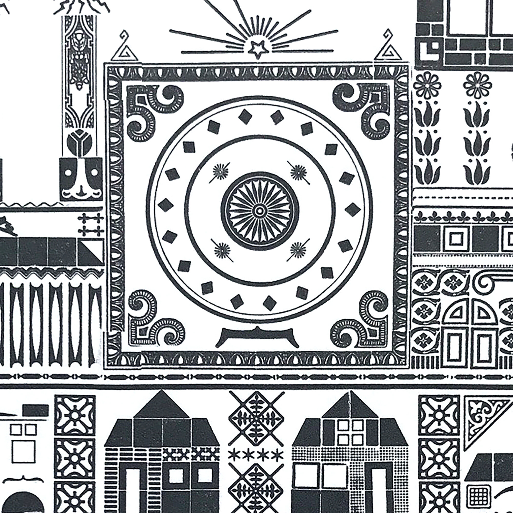
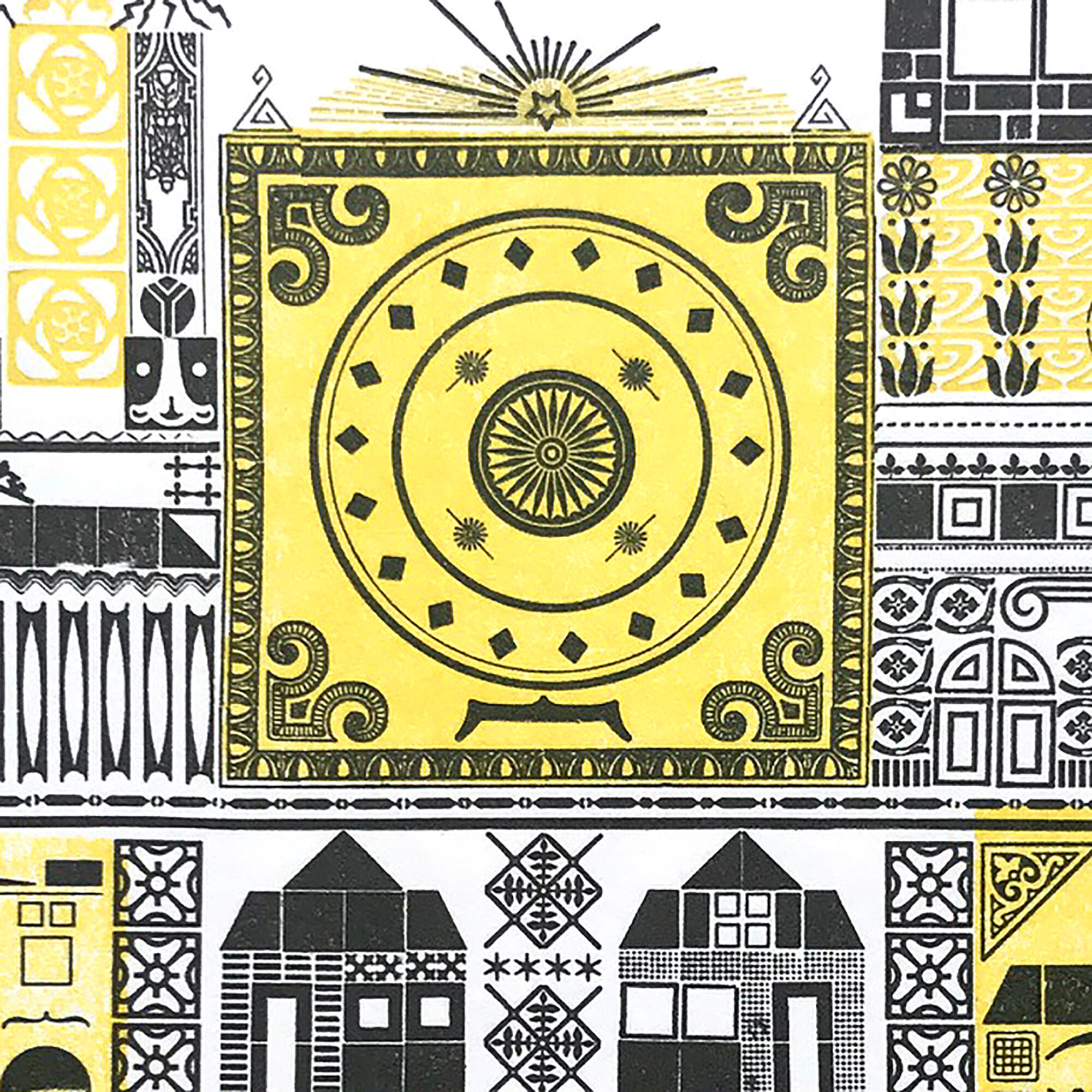
Chicago Commons fired to a range of yellows and pinks that made them unique in the world. To achieve this, I printed my wood bricks in three passes, altering which side of the wood printed and how they were inked.

I kept ‘Rebuilding Chicago’ after the signs disappeared because every time we saw one, Jo would exclaim ‘But I liked it the way it was!’ The irony of this is that my child hit on something key to construction in the city; it is largely focused on the areas of privilege that need it the least. Like our neighborhood.

28RICKrebuilding.jpg

The historical component of this print is the inclusion of clues about the development of the type measuring point system we use today. Chicago’s Marder, Luse & Co. took the lead role in this standardization.

29BRICKpointsystem1.jpg

The year mimics the way a cornerstone is engraved with the founding date of a building. And the names previously used to reference type sizes are also included, as they can appear as nonsensical to the uninitiated as graffiti writers’ tags.

rebuildingchicago1.jpg

As I dive into the final four prints of the series this fall and polish my thoughts and scribbles on the three that are the subject of my next post, I am cautiously optimistic about the direction of the project. The varsity team of printers, binders, thinkers, librarians, children and weirdos I have assembled for support have a shocking capacity for confidence in me to present something that feels representative of my life thus far.

More photos can be seen here and for all the ‘epidural!’ moments, follow me on instagram.