The use of line work, or in this case, rules, is a wonderful tool to have in your design arsenal. But it can be downright tricky to get these to print well and consistently so here are a few things to think about when you break into your rule case.
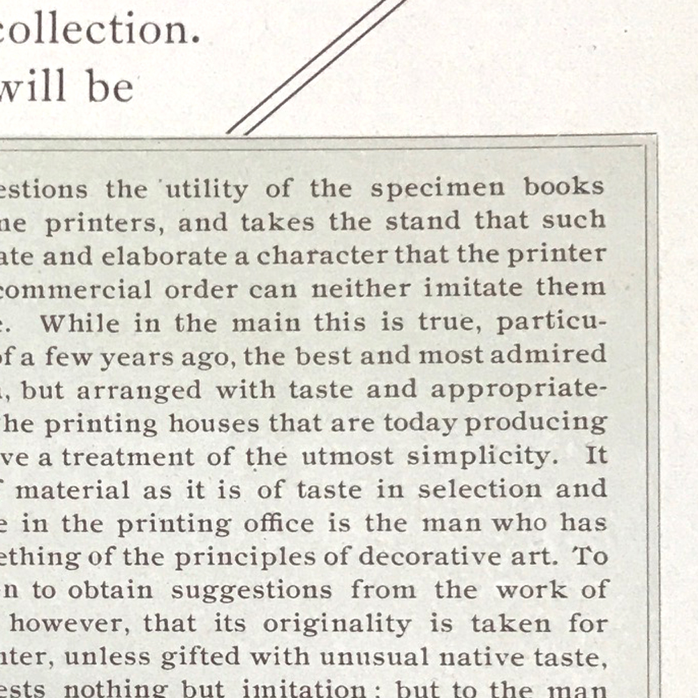
If you dig into the 19th century samples here, you'll notice the number of rules all coming together as well as how they don't always quite line up. I find this charming in the 'no computers were harmed in making this print' way.
Rules can be used to create design work and borders as above, but can be even simpler, like with the flowers below. Note how the lines forming boxes don't meet up in the corners. It's okay! I find that it's better to get the lines straight than perfectly matched up, i.e., no bends within the line length, which usually means the spacing is off.
There are a few little things that can help you set rules if you want to create a border, like these L-shaped corner pieces that make it easier to put two rules together. They are pretty unassuming and easy to miss at letterpress sales but are worth picking up.
These brass corners are also swell to combine with 2 pt brass or lead rules. This one is curved but you can find straight or decorative, too. There is mortised space below the printed area to butt furniture and slugs when setting.
Point is, don't overlook these little guys when you visit letterpress sales in person or online.
Rule is a really excellent design tool and is thankfully easy to find. Here are a few suggestions.
If using brass rule, a harder metal, you can achieve some debossing effects that you can't with softer metal rules (see back to this post for the differences in printing rule vs. scoring rule.)
Here I've used a few different thicknesses, combined with a few simple metal ornaments and a decorative slug cast on a linotype (at the bottom) to create the idea of the Brooklyn Bridge.
These two color monograms look swell with a piece of rule extended from the side. When setting like this, just do the math (I know, I harp on about it...) The monogram is 36pt. The rule is 2pt. That means you need 34pts of spacing (I prefer leads & slugs in this case) split above and below the piece of rule at the same length as the rule. The dot at the end is 6pt; again, do the math to see you need to split 30pts above and below it to even out the section.
I love finding linotype slugs that can be cut to any size on a slug cutter. This is a collection of some, meant to resemble a small cityscape. Some are capped with small ornaments.
With a little practice and math, it's easy to add rules to your work. They may never have the exact precision of digitally-set borders given their age and the fact that it's a modular process to assemble them, but that can add charm to your print, the way it did 80-100 years ago. And looking at old spec books to spot these can be fun. It also helps you discover how printers of the past built forms that combine rule and ornament, and that kind of archeological research gives your own typesetting a leg up.
We'll cover mitering rule in an upcoming post.


