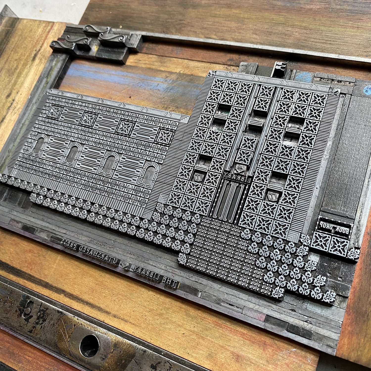
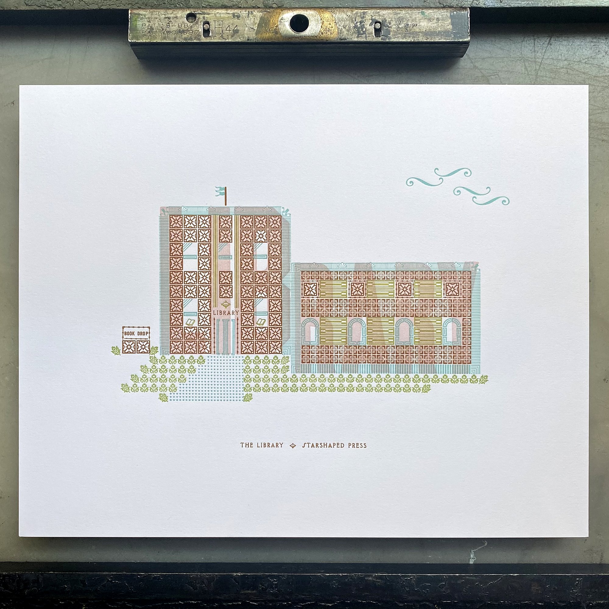
Building architectural forms is one of my favorite things to do with ornaments! There are so many potential options for designs and unique combinations to create everything from tiny homes to large skyscrapers. I want to highlight a few historical samples along with some tips for getting started with your own builds.
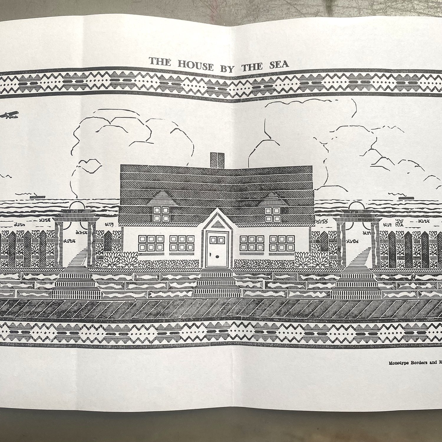
I found this piece at the Platen Press Museum that was built in the 50’s by a compositor at the Columbus Dispatch. I love how it uses a lot of linotype slides, mitered and altered to create textures and lines.
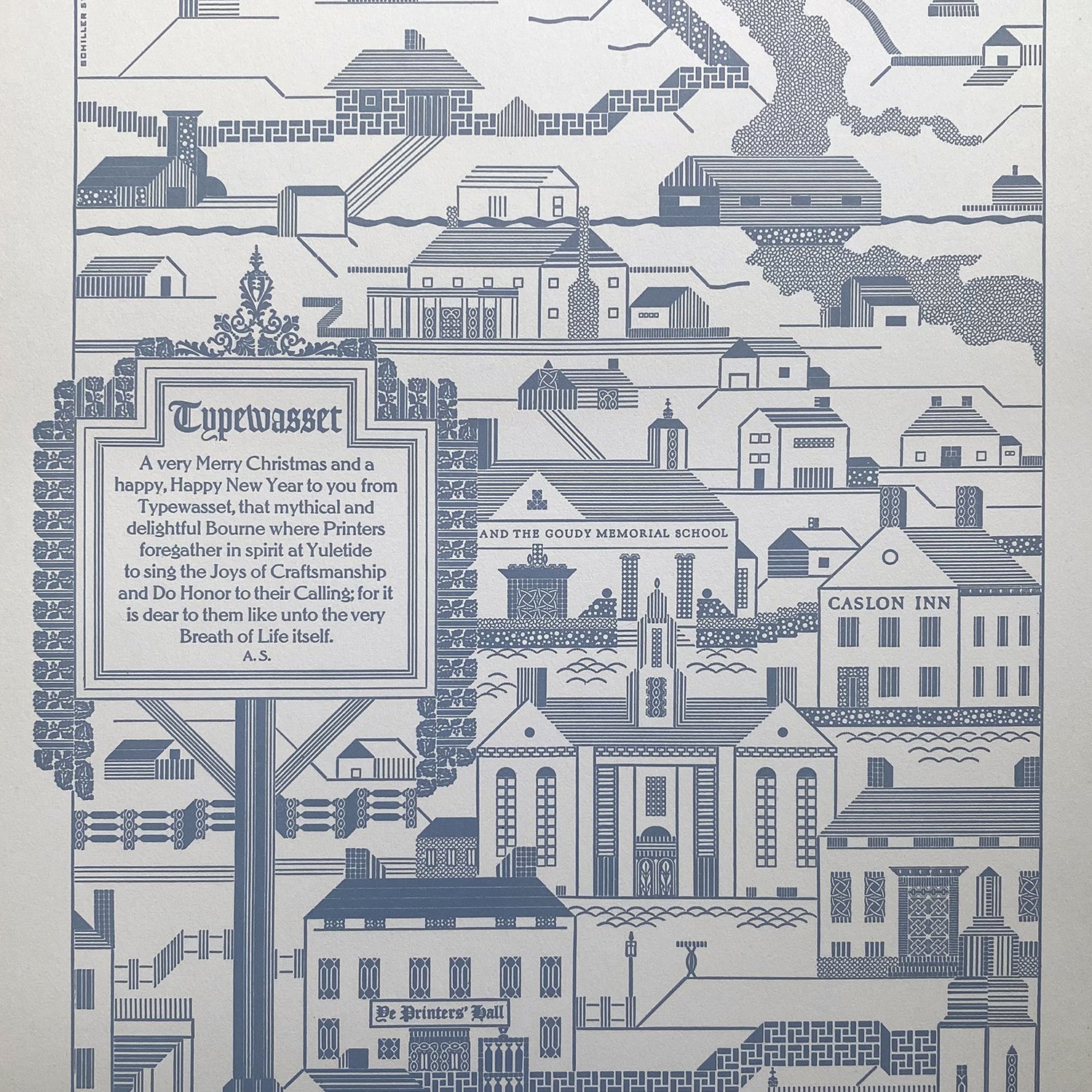
Albert Schiller was one of the premier ornamental builders and his pieces are an inspiration. Below is a great image that combines simple ornaments with rule. I encourage all beginners to look at these images as if they were on a grid. That helps to break down how they were pieced together. Sometimes I even lay a piece of pica paper over them to help discern how the ornaments are combined.
This black and white Schiller piece uses mostly rule of various thicknesses to create the idea of skyscrapers. I love how simple it is in terms of its stylization, if not in how it’s set.
When I start to get ideas for how to build something, I begin with pica paper and sketching ideas of what kinds of shapes and ornaments would work, as well as any potential roof lines and how to work with angles. This initial idea calls for both 12 and 24pt ornaments.
I often lay out more complex structures on a computer as most of my ornaments are proofed and scanned. I still set up a 6 pica grid to work from so that when I’m setting this I can measure it all out for faster setting.
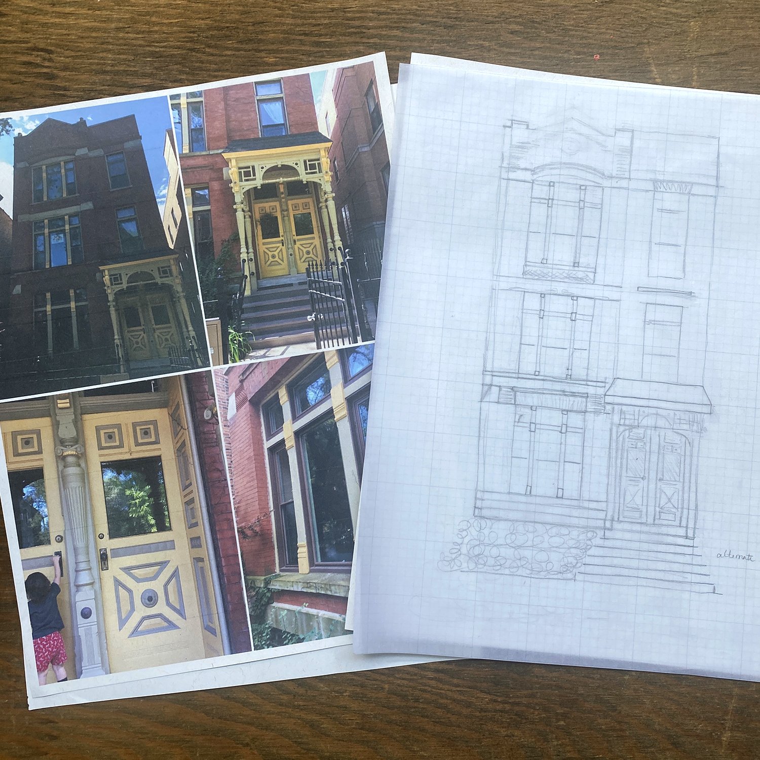
When attempting a recreation of an actual structure, I look at lots of images, both full shots and detailed ones. It’s important to remember to keep an open mind because you can’t achieve an exact replica of an existing building. It’s good to shoot for something that approximates the building, more like capturing its soul instead of a perfect image.
After studying images, I make a sketch that shows how it would work as a flat image, also on pica paper so it’s easier to match ornament sizes with various positions. Then I lay it out using scans of type on a computer, though this can also be achieved by doing it with your ornaments in front of you, built on top of your sketch (remember to reverse it if you’re working from an actual building!) After building the form, pull a proof to see if it feels like the structure you want.
This project is more complex and multi-colored; below there are some simpler ideas that are a great place to start.
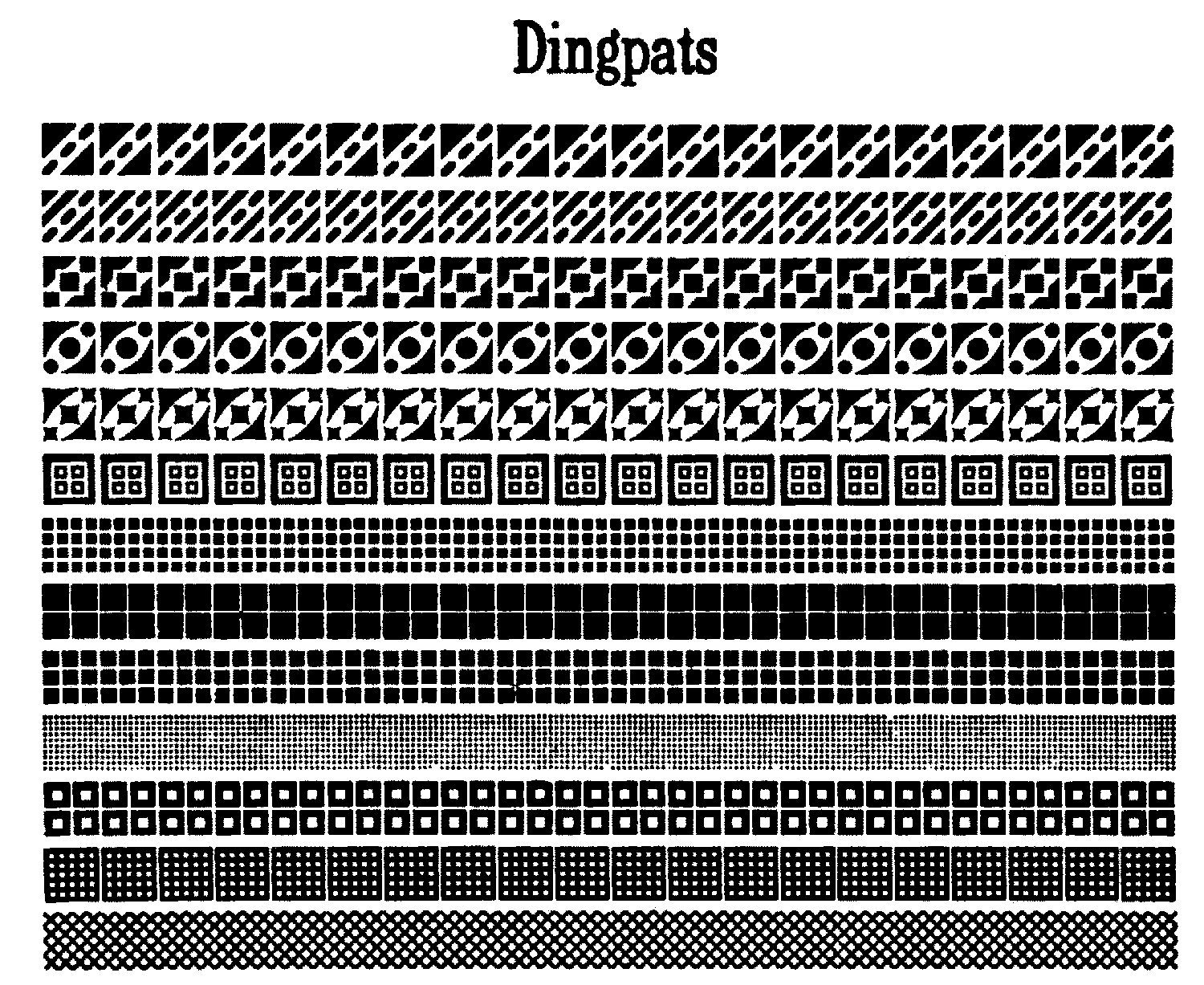
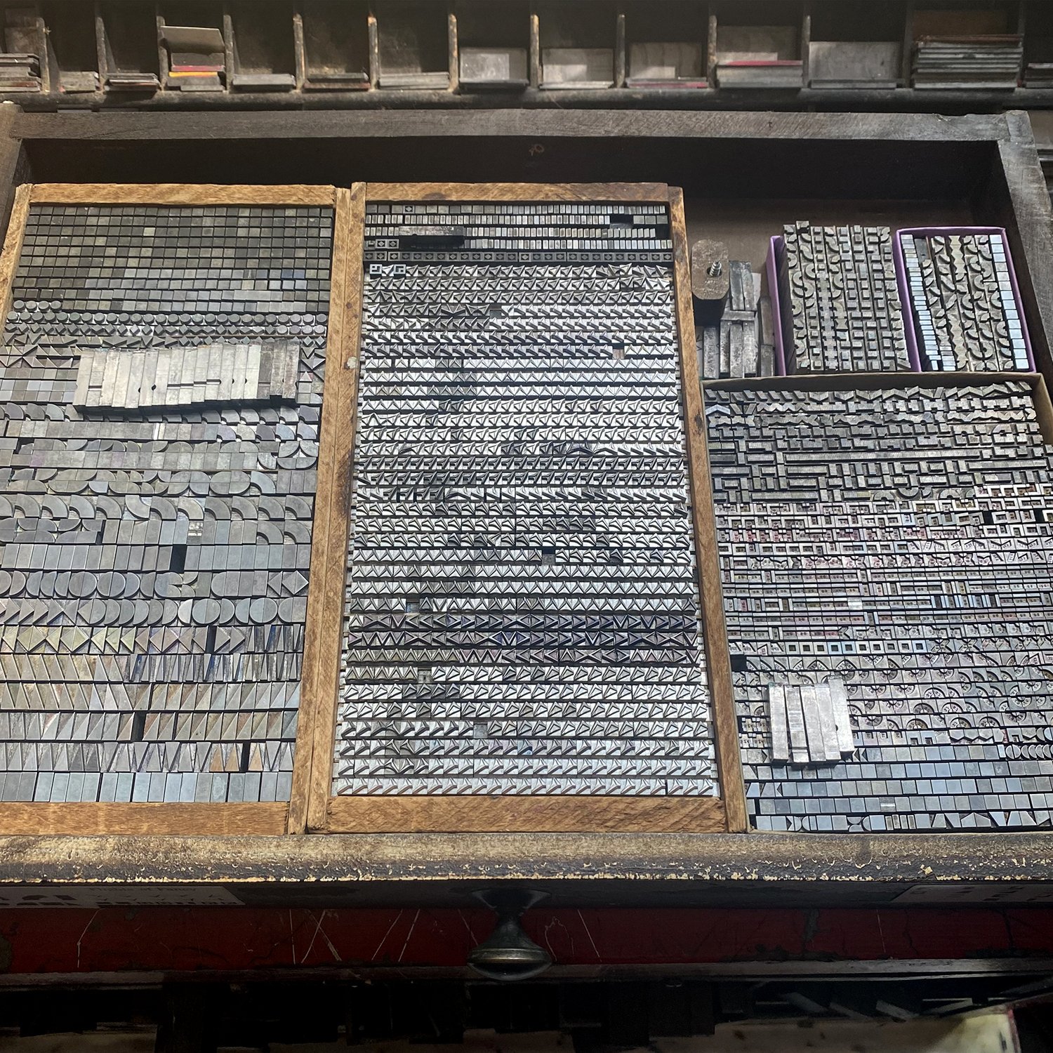
I look for ornaments that have strong, squarish forms that mimic actual building materials. Thankfully, Pat Reagh offers a ton of these great options in his Dingpat collection. I highly recommend stocking up on these if you want to do more architectural building.
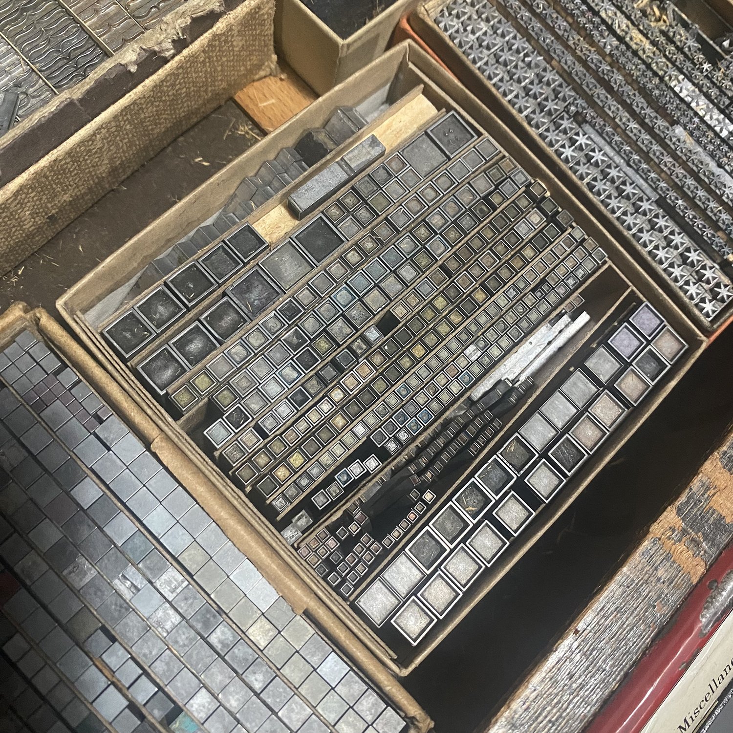
I like to collect as many simple shapes as possible, too, like these Mono and Alphablox. Open and solid squares are perfect for creating windows. Basic shapes often go overlooked at letterpress sales so I scoop them up when I find them. They are the most useful thing I own.
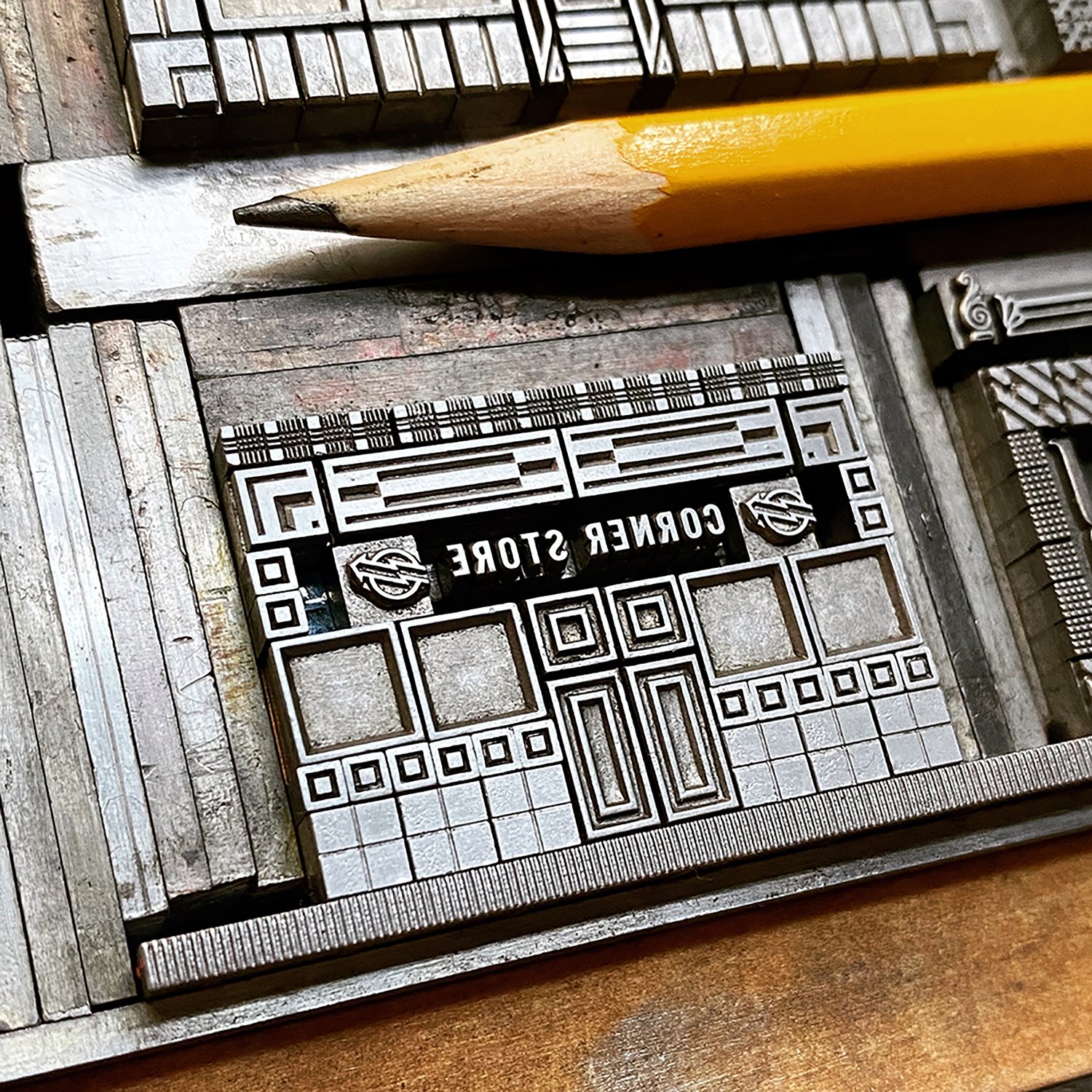
Here are two examples of basic building structures. The corner store uses simple, modular square ornaments to create what would be walls, windows and a door. The text above is where it might be placed on a real store.
The printed orange house is made from 7 different styles of ornaments within the Alphablox family. It wouldn’t be difficult to replicate this basic idea with other square ornaments, leaving the window areas as a blank space (in this case, it could be a 12pt em quad.) This also has a brass rule to create a more defined roof line. Rules are great ways to add a little extra dimension, whether brass or type metal. I usually recommend separating them from the rest of the ornaments by running a thin piece of cardstock or 1- or 2-point leads along each side. This little bit of distance usually makes both rule and ornament print better.
Another way to use rules is below, as a roof (the lighter gray is a linoleum cut to give it shape). They can give you a way to create structure without getting too elaborate with ornaments.
Another thing to consider is green space, if you’re creating an outdoor building. For this I look at organic ornaments instead of architectural ones, as this simple form change can help you delineate between the built world and the natural one, even if you’re printing in one color.
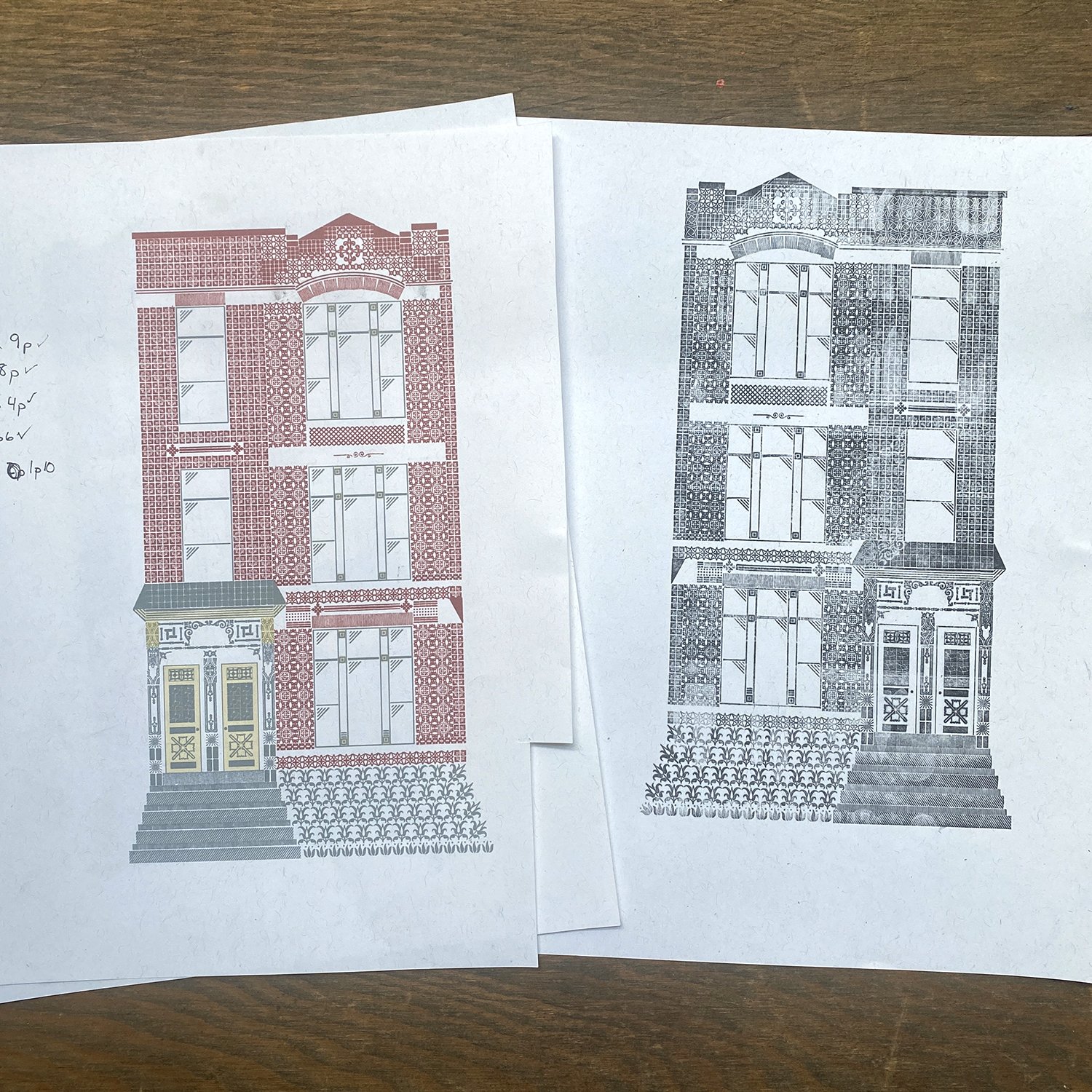
When you’re ready to upgrade to multiple colors, try to design something that can be built as one form. This way, you can proof the entire structure and make sure you like it. From there, check out this post on color separations (and another post about other ways to add color is coming soon!)
I’d also like to show an example of using inspirational images to create something architectural, but in a more abstracted way. For years I’ve designed and printed calendar covers for Brick of Chicago. Each time, Will gives me his photos of a particular building/style as inspiration, knowing the final design will be similar in spirit, given metal type is ultimately different than bricks and terracotta.
This year, I looked at his images to discern the dominant angles and simple brick patterns. Then I found ornaments that are indicative of this, though not exact. Sometimes you just need to get the idea across (and it took a few iterations for this project to be right) and that’s enough!
Have you tried architectural ornamental building? If so, please share! And remember that there are as many ways to create a form as there are evolving real-world architectural styles, so have some fun with it.

