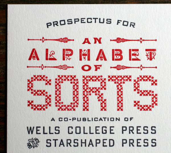
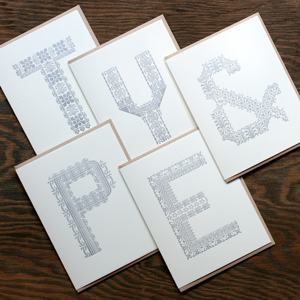
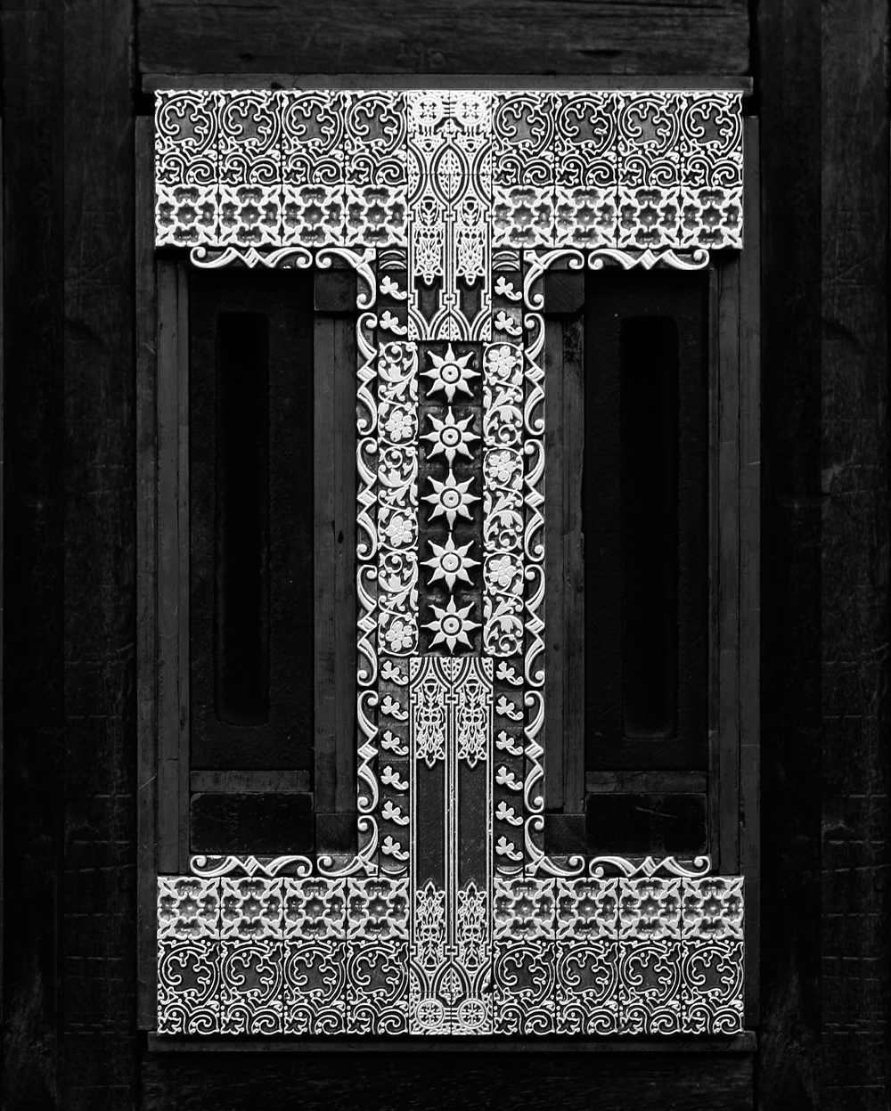
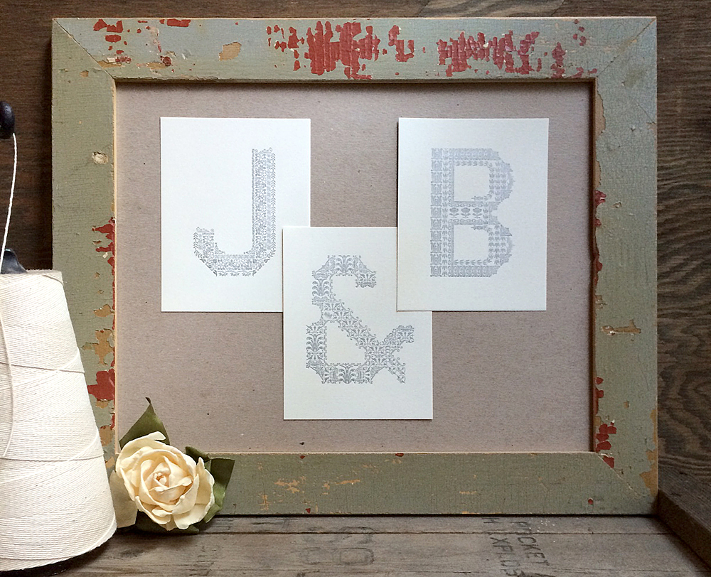
It's a pleasure to announce that the ornamental alphabet I built over the summer will soon get the royal treatment in book form. Co-published with Wells College Press, An Alphabet of Sorts is now available for presale, to be delivered in the Spring. To celebrate this collaboration, here is the Prospectus, which features all of the exciting details of what's to come.
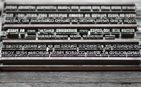
 All fitting within a 6x9" page size, this is one of the tightest and most elaborate forms I've built in a while. Given the amount of information that needed to be conveyed in a small space, the type is largely 8 point and under. The previously set ampersand makes another appearance here.
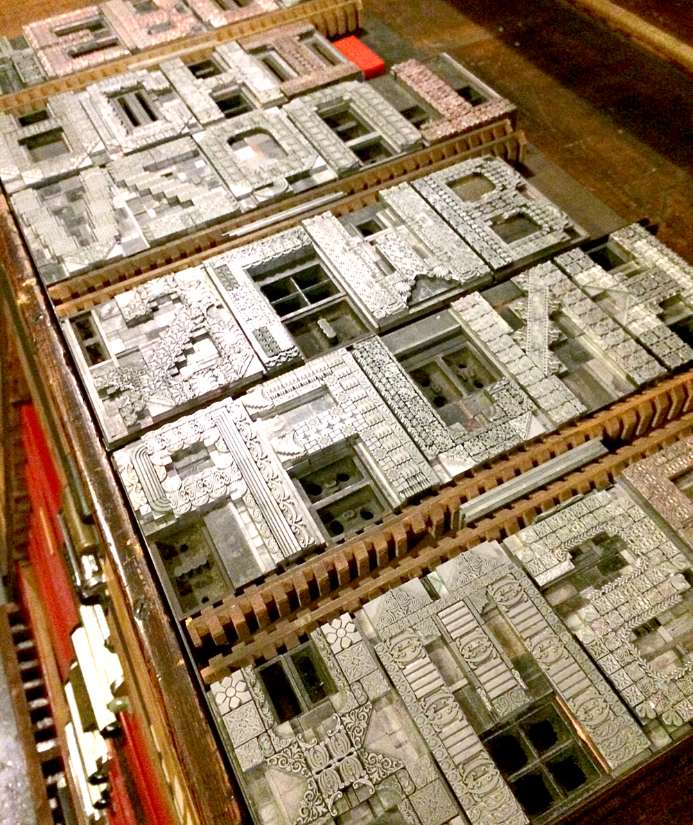
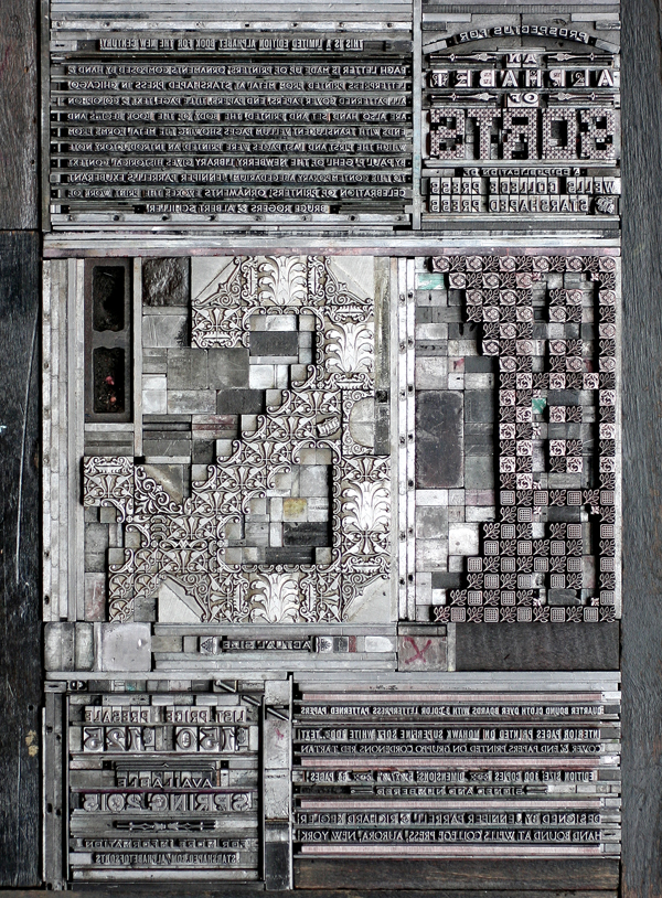 For the title, I set SORTS from 6 point square ornaments and added asterisks in some corners to soften what would normally be a smooth curve. ALPHABET is set in Cleft Gothic, a Chicago-based typeface designed about 120 years ago. I liked that it was small and gothic but had its own bit of ornamentation going on.
 The main paragraph was set in 6 point Bernhard Gothic, both Light and Medium, and gives an overview of the forthcoming book. I'm so pleased to have Paul F. Gehl of The Newberry Library on board to write the introductory note to this endeavor!
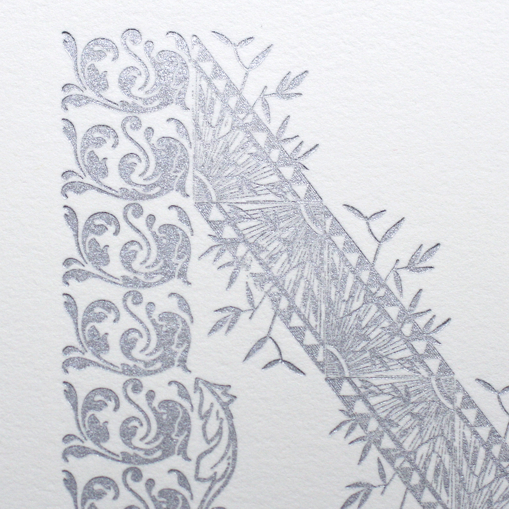
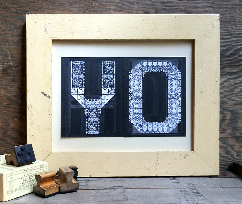
 Since I'll be printing the cover and end papers as well on gloriously red Italian paper, I've been experimenting with creating a smaller alphabet unique from the large one that will be featured inside. One idea is to reverse out an alphabet from ornaments on a smaller scale. This would be a nice juxtaposition to the main letters and present a new challenge to designing a set of letterforms.
 The bottom of the prospectus contains the nitty gritty details of the book. You may recognize the name of this guy listed here, now comfortably stationed at Wells.
Presales are going strong, and the edition is expected to sell out! I will be finishing the printing by the end of the year so that binding can begin. Books will be delivered around May Day, 2015. I'm happy to send the above Prospectus; just contact me with your address!

