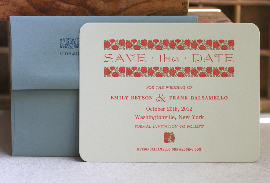
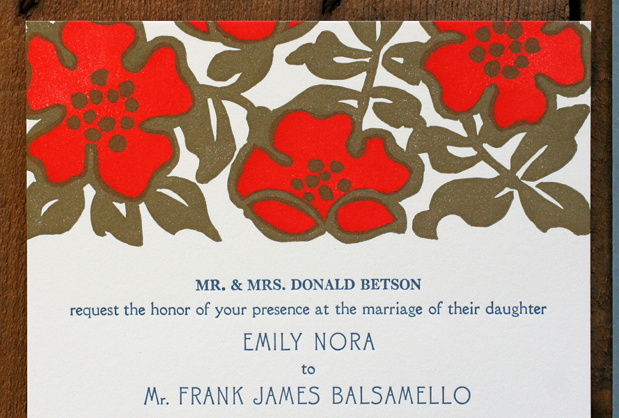
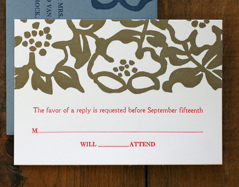
Every so often we get to pour a lot of effort into creating a single, special print, and it's usually commissioned as a gift from one spouse to another. In November I was approached for a project like this, using a poem that was read at the couple's wedding. The wife wanted something blocky, bold and straightforward with a little bit of ornamentation and ample white space. This is the result of the collaboration:
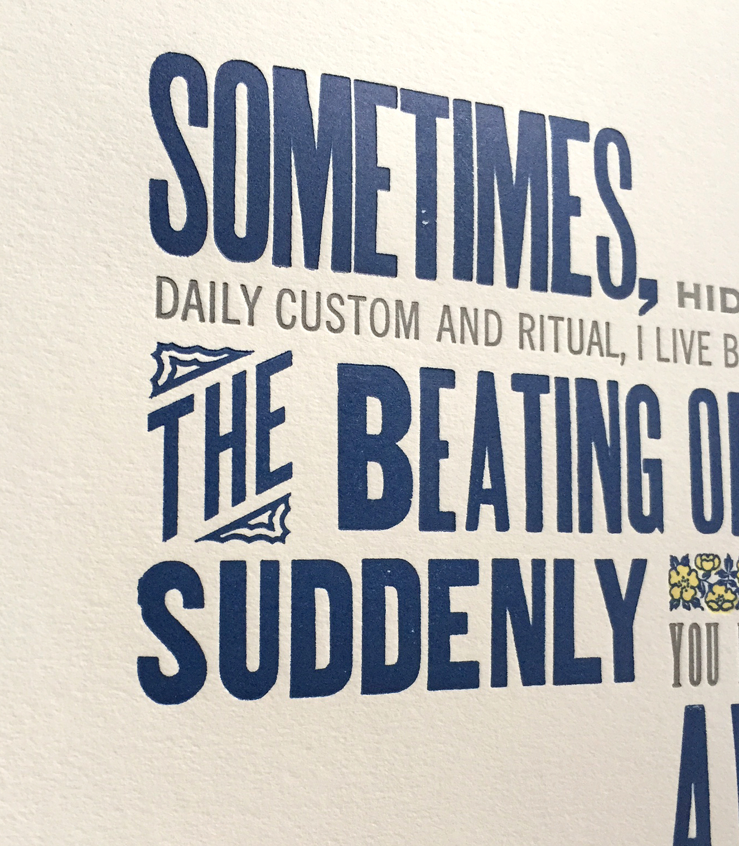
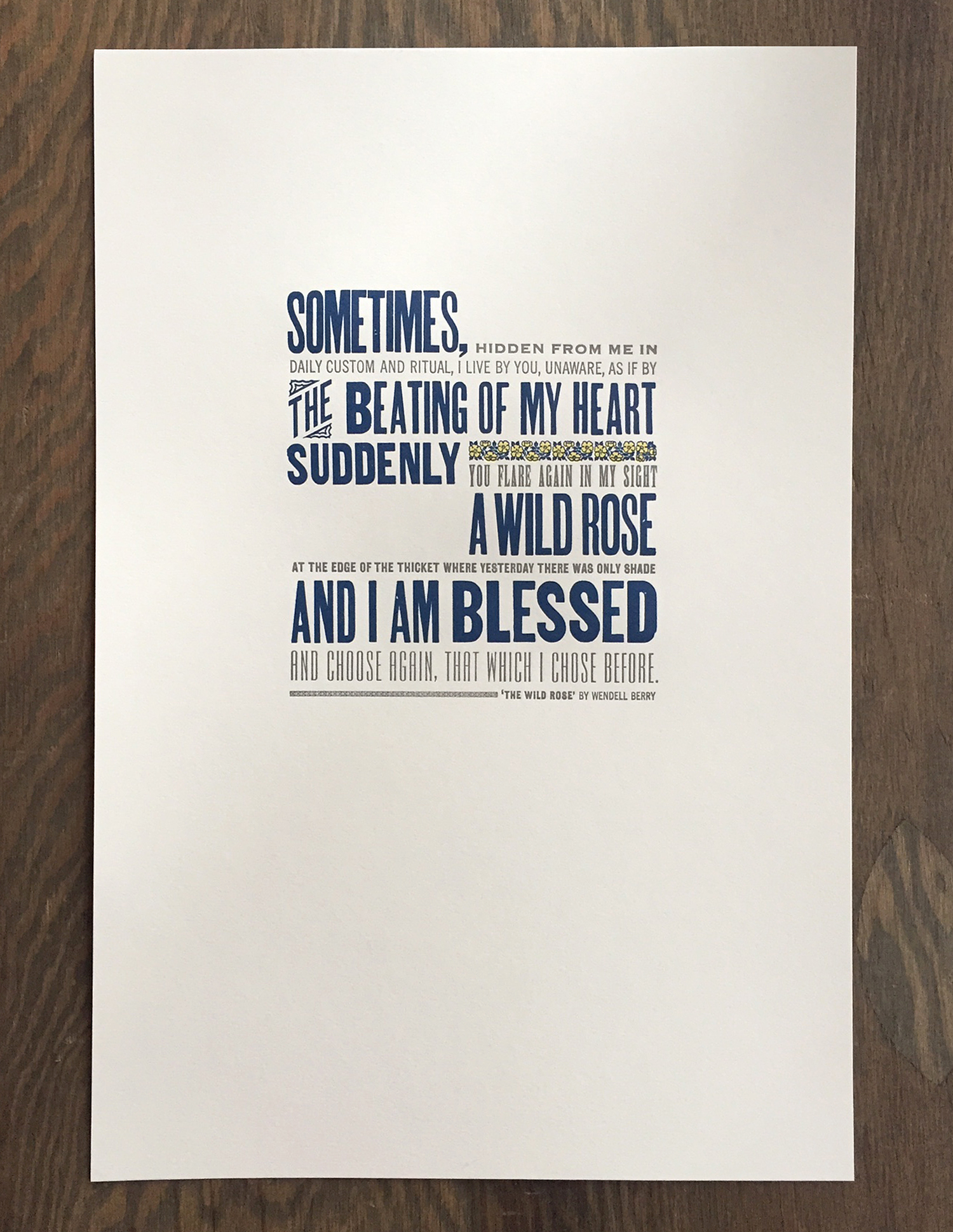 Here's a close up of the 12x18" print, done in 3 colors on soft white cotton paper. It's a nice mix of both metal and wood type that, while slightly beaten up and rustic, mostly keeps to a straightforward sans serif diet.
 The is the type in the final lock up. We usually set up the entire print if possible then pull a proof. If everything is spaced accordingly and looks well together, then we can go in and separate individual colors and print just one at a time.
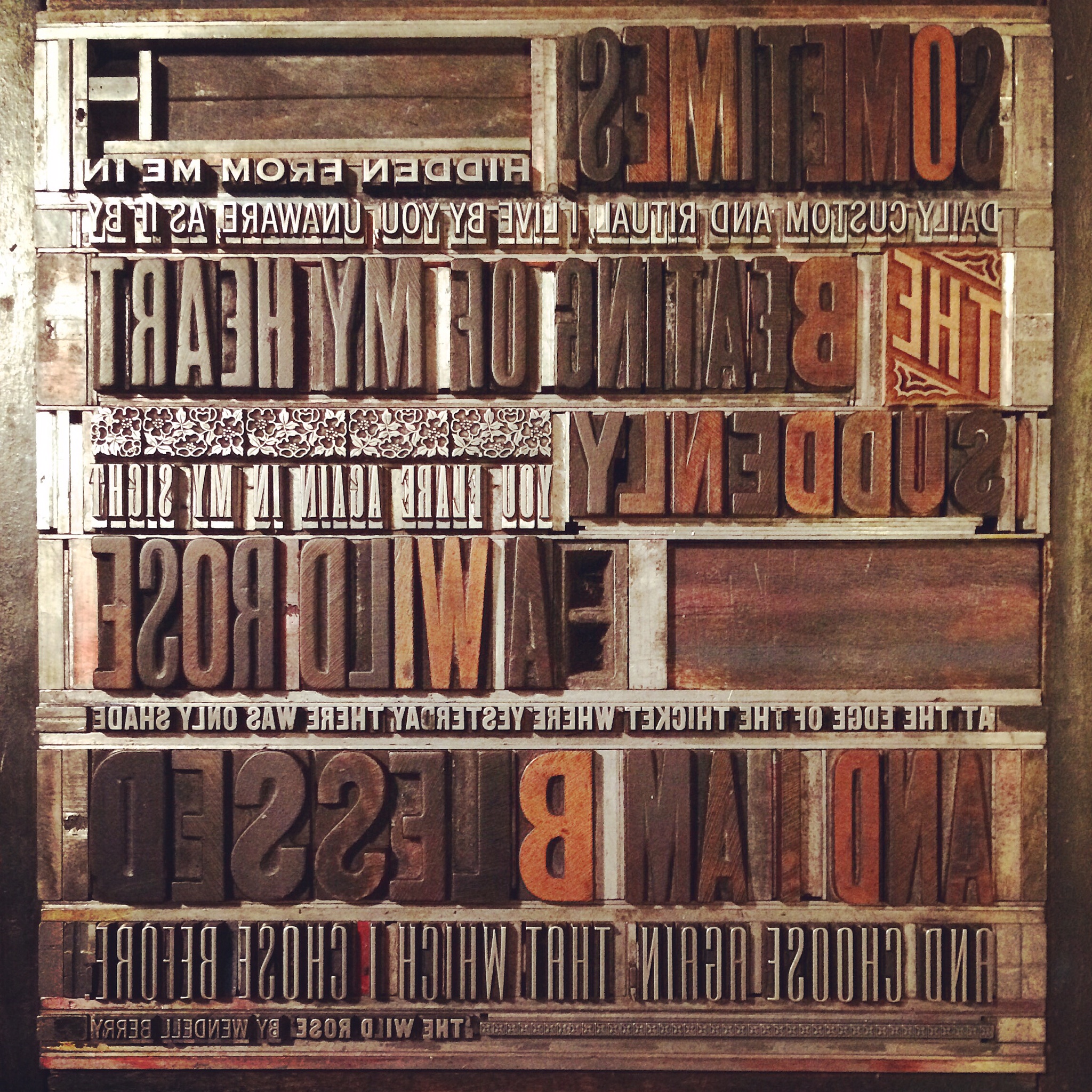 Some of the wood type for this piece is pretty rough, as noted in the uneven and speckled forms. The catchword 'THE' is new, however, and is one of Moore Wood Type's laser cut pieces.
 The print features two-color ornaments from the Keystone Type Foundry known as 'wild rose' ornaments. It's not every day that named ornaments tie in directly to the words being printing, but they sure did here. These are beautiful in their detail and include two different sized sorts, making it easier to fit them into any line length. I'm certain this charming print was a touching Christmas gift.


