I am not particularly well-traveled. I've never been out of the country (Toronto doesn't count when you grow up in Western New York), never had a passport, never studied abroad. This is largely due to lack of means; it was a stretch to move to Chicago for college and every spare penny earned from every part time job fed into my education and, well, maybe some records. And while folks will say 'there's always a way', the fact is, you still need to pay for tickets to get places even if you win a scholarship. That little extra was never available. To further the stationary trend, I started Starshaped at the tender age of 23 which necessitated extreme frugality in order to purchase equipment and establish a fledgling business with no investors or loans (1999? No kickstarter, folks). And so planning a summer trip with Jo these last two years is my effort to at least see parts of the country I haven't been to (which is pretty much most of it). When we were accepted into the Renegade Craft Fair in San Francisco it felt like a great opportunity to drive across the country and back, visiting friends and printers along the way. It timed out perfectly to take place before I was scheduled to teach at Wells College so we mapped it out... mostly. Of course the best laid plans have a way of going completely awry and the trip was much more physically and emotionally taxing than planned.
But not to worry, there's quite literally a Redemption Song at the end of this 3-part saga. Loud, thoughtful, ballsy or introspective music keeps me going on long trips and in life and for this one it was a critical crutch to keep me motivated and, well, awake. You can get our soundtrack here and all forthcoming song references are in italic. Follow along if you like!
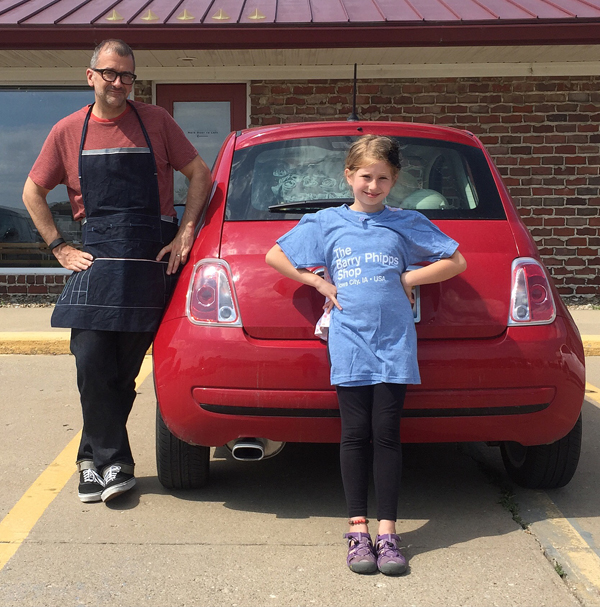
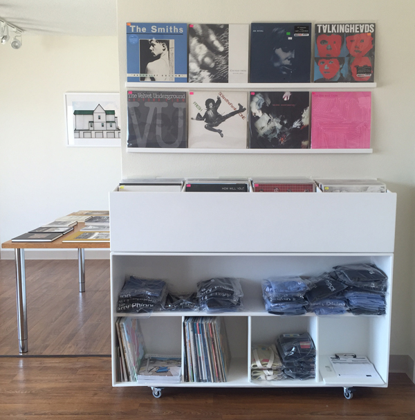
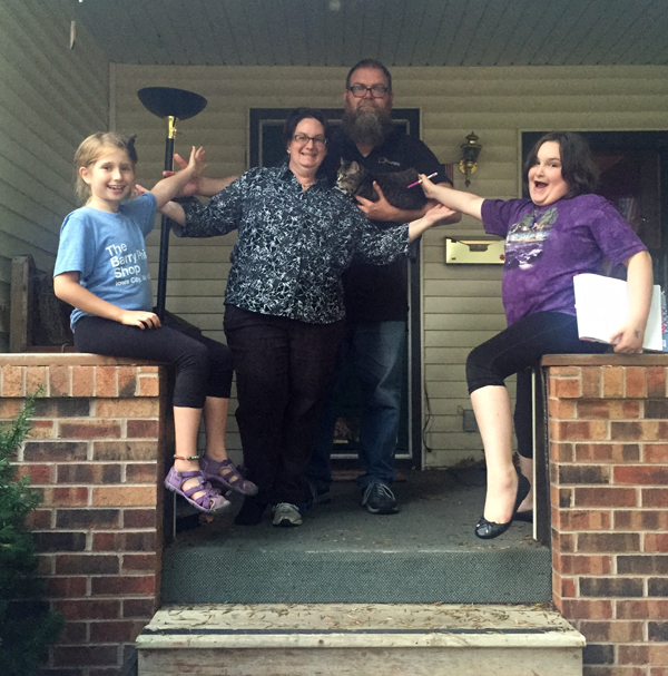
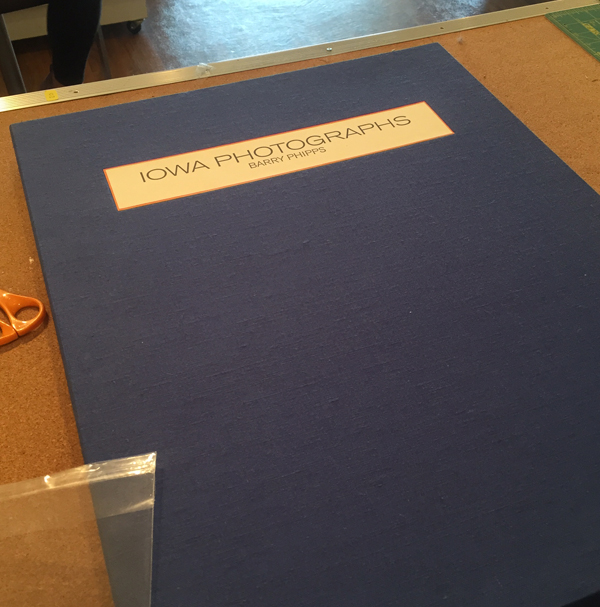
Scheduled to leave July 9th, I frantically worked to wrap up jobs, pack and prep for a craft fair. I finished the last job at about 4:30am Thursday, got an hour of sleep, then threw everything along with Jo into the car to hit the road to Iowa. Our first stop was to the Barry Phipps Shop in Iowa City. While not a printer, Barry is a former Coctail (I learned to print from another member of this seminal Chicago band) and he made my custom printing apron which accompanied us on the trip. His studio is part gallery, part workspace, part record shop, part dance party, and it sums up most of Barry's interests. Outfitted in new t-shirts we took off for stop number 2 in our packed-to-the-rafters 500.
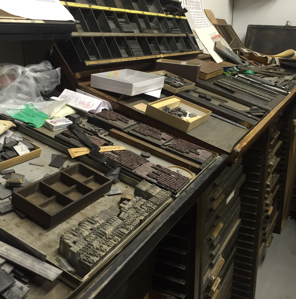
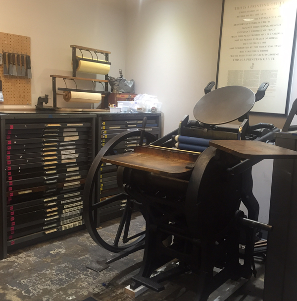
 Pure adrenalin pushed me onward and we enjoyed a visit with Caveworks Press, north of Iowa City. Julie has a great space in her garage for a large Vandercook and plenty of type to keep her busy for a while.
 Here are a few of Julie's projects, including broadsides, books and cards.
 This print is one of my favorites and lucky me got to take one home.
 We rolled out of Caveworks to head directly to Des Moines to spend the night with our pals Tammy and Adam Winn of The Red Door Press. Their entire garage is a print shop, chock full of letterpress awesomeness everywhere you turn. They were printing into the evening in preparation for an event.
 The next day we joined Tammy briefly at Domestica, a fabulous boutique, where she set up to print with any customers wandering in. Yes, corn husks were printed, too. It's Iowa, folks.
 This is one of Tammy's favorite red doors. Now Jo and I see red doors everywhere.
 We had a great time in Iowa over the 24 hours we had to look around. I'm glad this state is close to us as there's so much more to see. We'll be back.
DJ Jo's Musical Interlude: I'm a Cuckoo, Kiss Me Like You Mean It, Mt. Pleasant (Mom, you mean there's one in Iowa, too?!)
We moved on to Lincoln, Nebraska, to visit Porridge Papers and their glorious retail and papermaking shop. I was smitten.
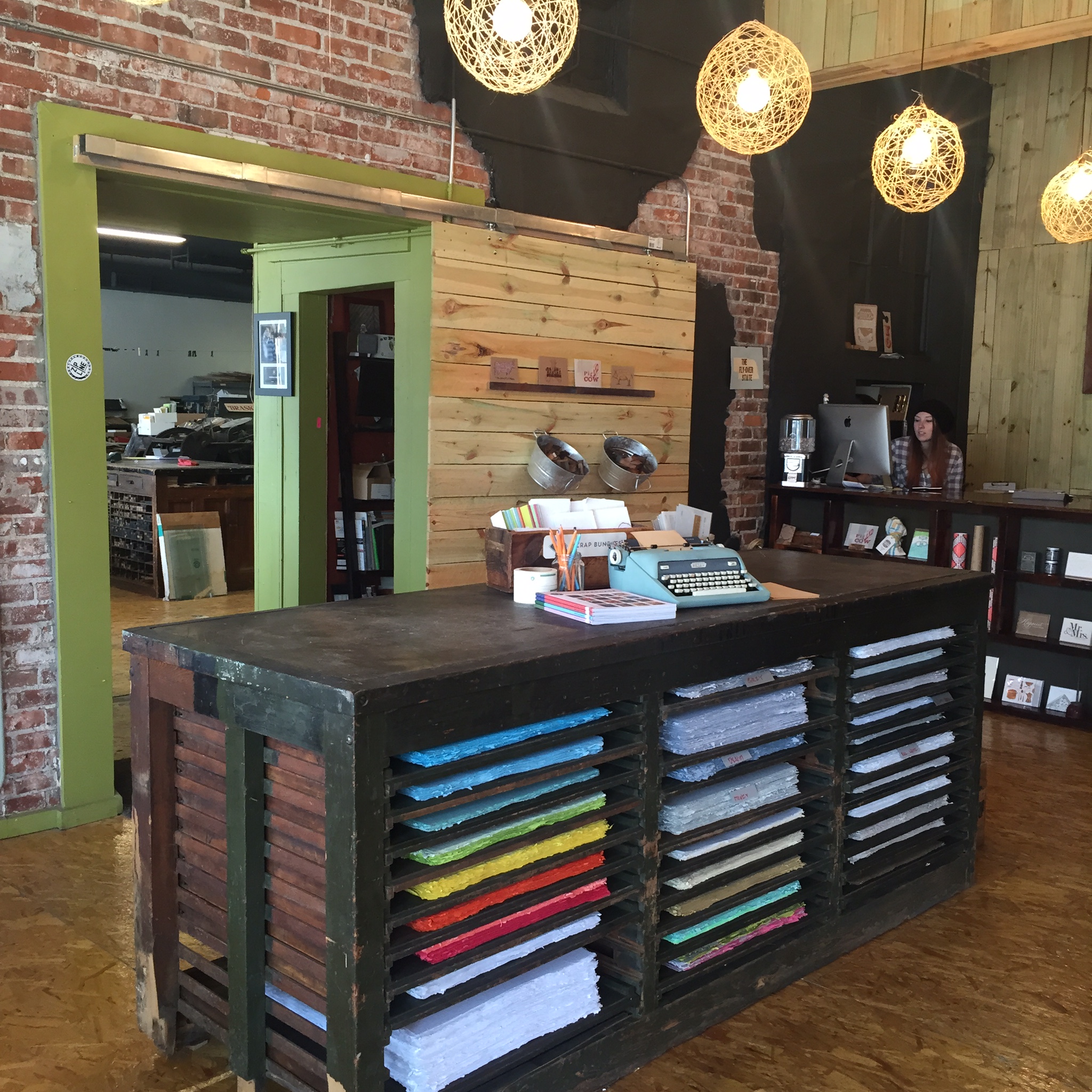 A rainbow of gorgeous handmade paper.
 Paper drying out. It's a long, tiring process, but the result is so fantastic and I'm thrilled to be working these papers into upcoming projects at Starshaped.
 Porridge also offers a Letterpress Bar, where, after a class, you can come and do your own printing. This is the perfect space for small projects, complete with type, tools and inspiration.
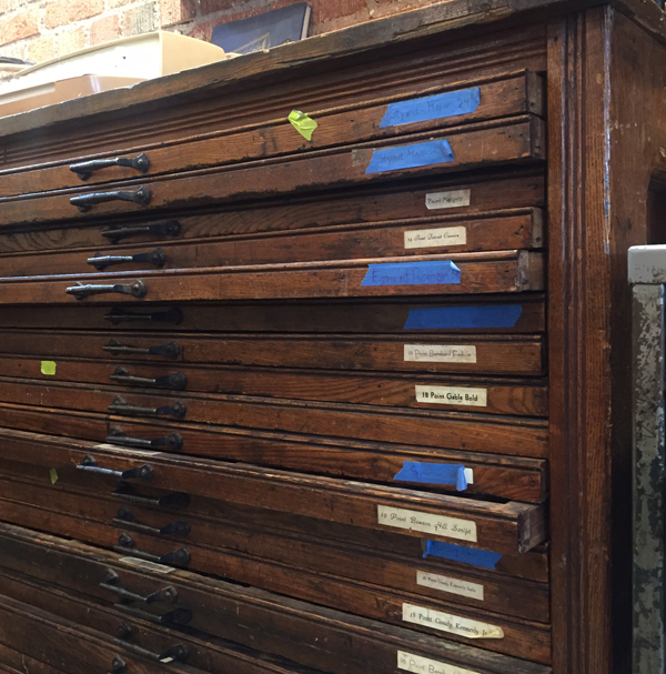 The print shop is shared with a bookbinder and his tools.
 Huge thanks to Chris for showing us around and graciously hosting us at his home for grilled pizzas and stimulating conversation. As far as Jo was concerned this house had it all: a 7-year-old, a dog, a cat, a turtle, fish.
 Right before we left Chicago, I lamented to Will at Beans and Bagels (our other home in the city) that I feared I wouldn't get a good cappuccino while on the road. He then emailed me a complete list of all the best coffee shops in every city we were scheduled to visit. Now we had a second map to follow that included Cultiva, where you can also get nutella crepes.
You're a long state, Nebraska, but we made it through. We stopped briefly in Rock Springs, Wyoming, to gas up and steal a glance at its charming features and 'town that type forgot' charm. There are a set of historic markers set up to check out so it didn't feel odd to take photos of its current state; more on this later.
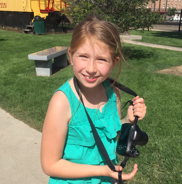 Then it was on to Laramie, our home for the night. We hit the kid jackpot and saw the bright lights that night as it was the last evening of a carnival celebrating the town's jubilee. I'm not a selfie person, but we really lived it up on those rickety rides.
 In Wyoming, the weather seems to change fast. The next frame would show a heavy downpour that dissipated just as quickly.
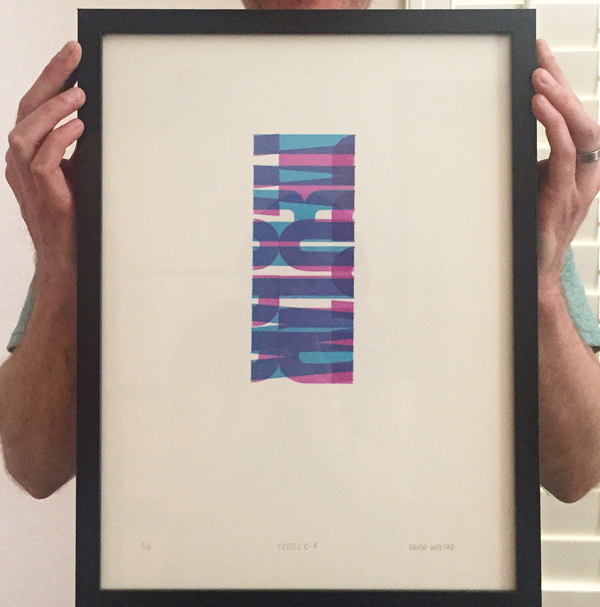
 Finally landing in Salt Lake City, a place we both enjoyed immensely, I was able to meet up with longtime printer friend David Wolske just days before he was scheduled to leave town to move back to Indiana (score a big one for the Midwest). I was treated to a private showing of his last series of prints, one of the few things not packed into the Uhaul.
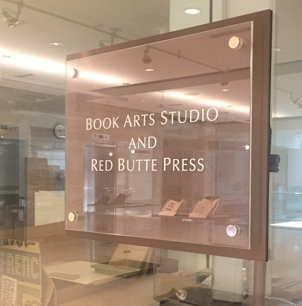
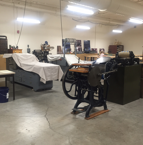
 David then took us over to the Red Butte Press at the University, his place of employment for one more day. What. A. Place.
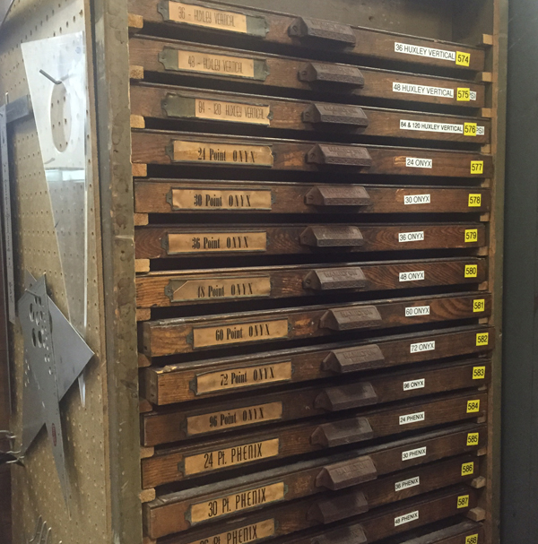
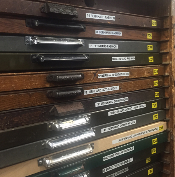
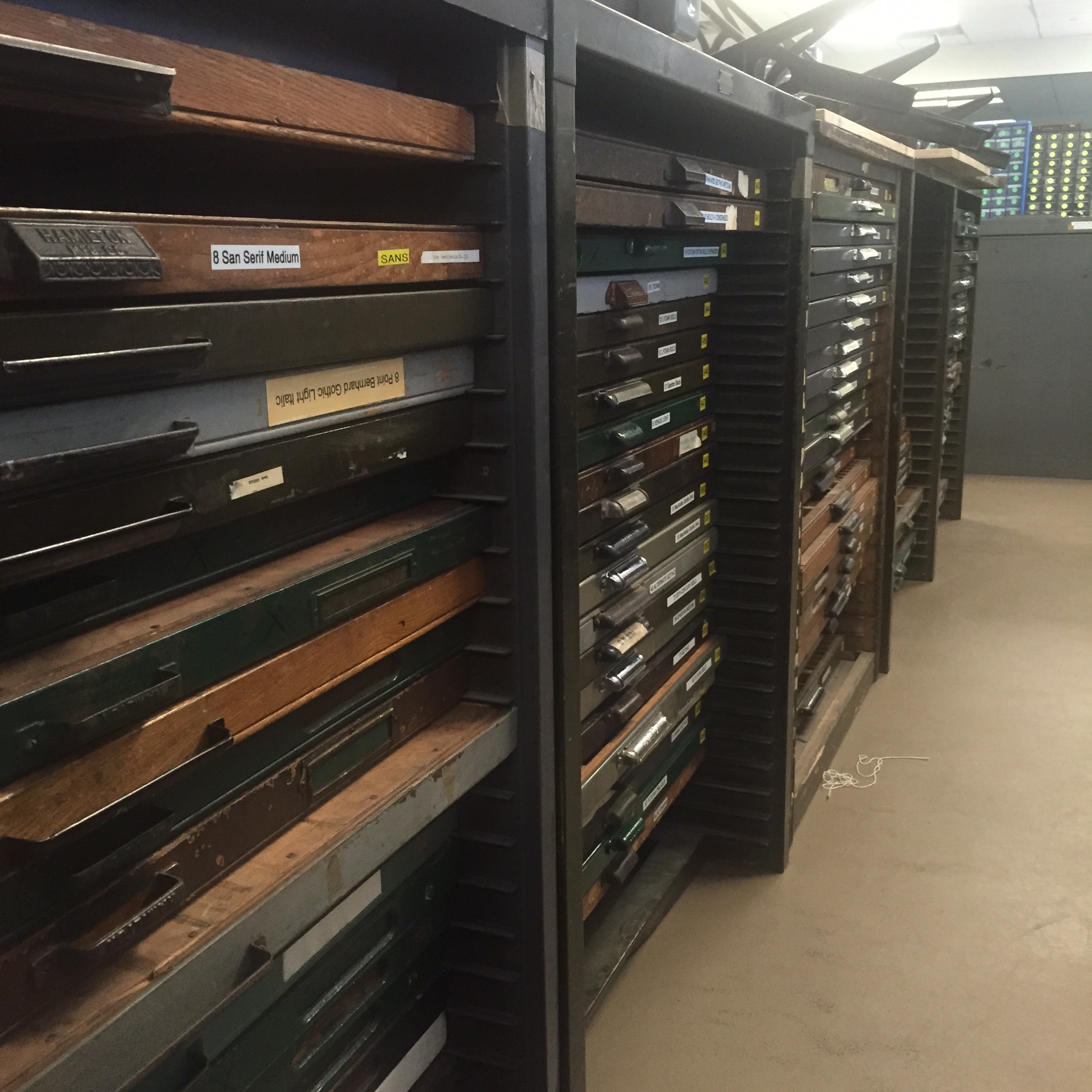
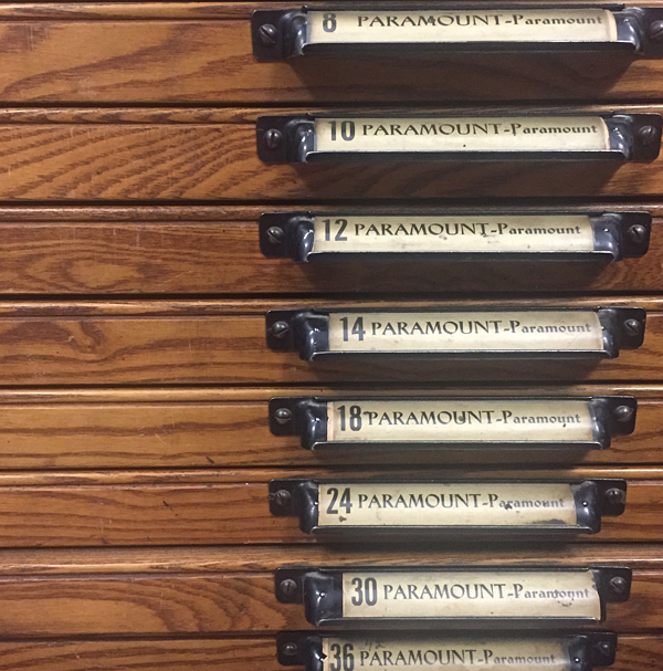
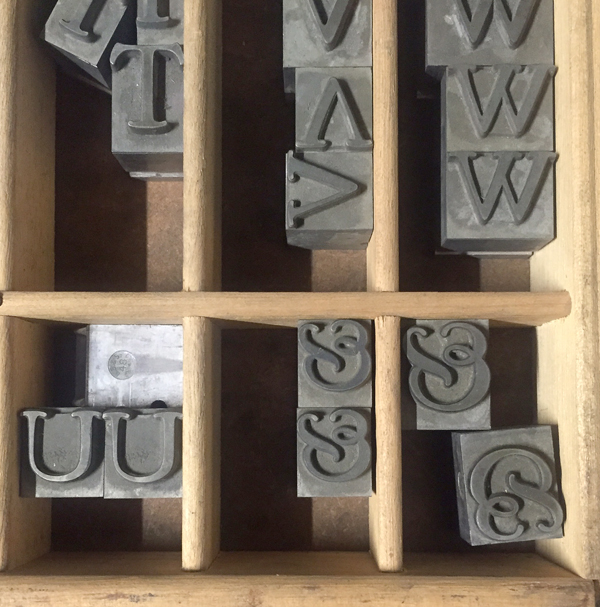
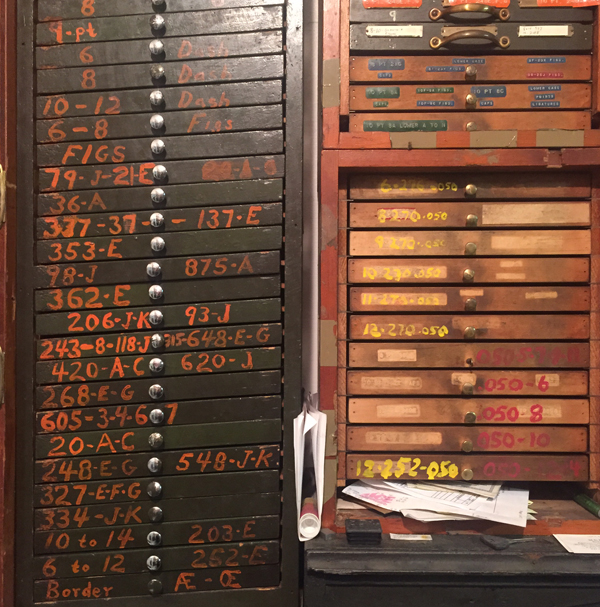
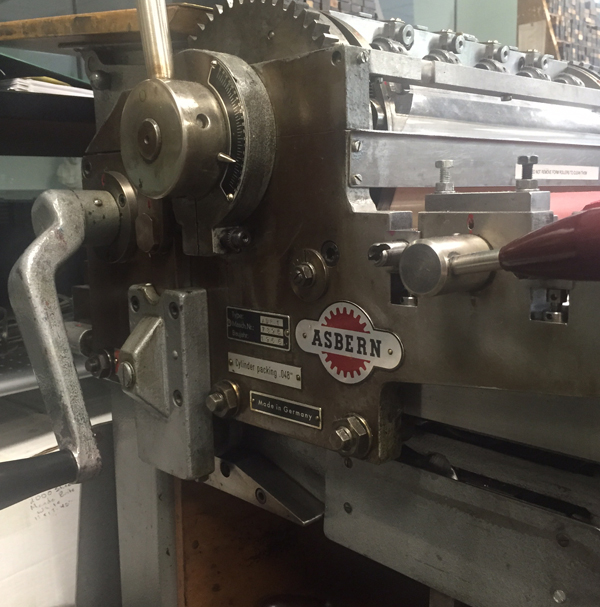 The type collection is very impressive and beautifully organized.
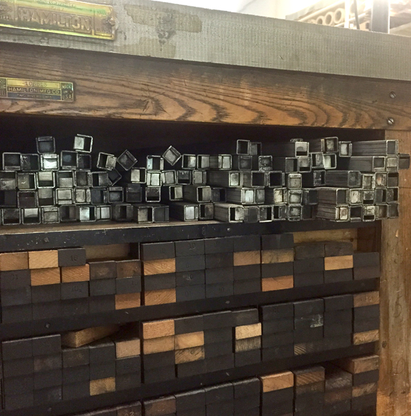
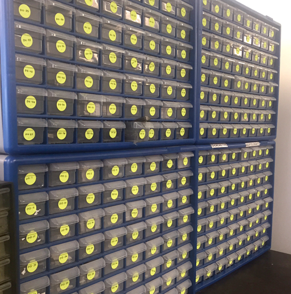
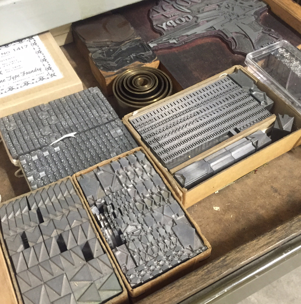
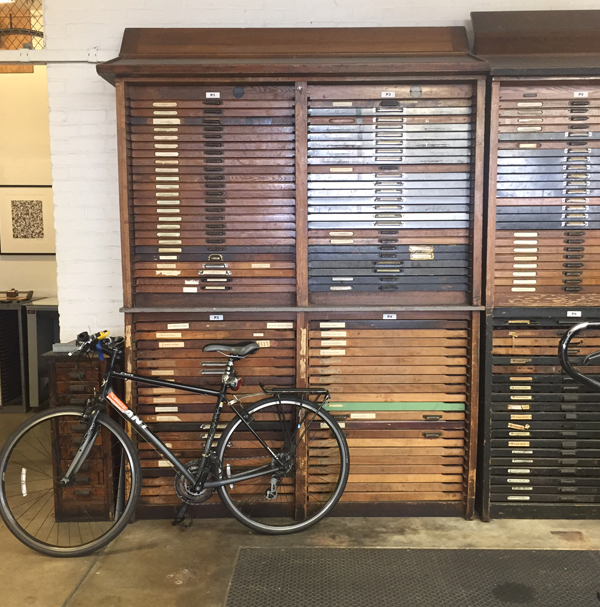
 Most of the ornament collection is kept in these hardware shelves and is in the process of being documented. Nice to see interns do the same kind of work in every shop.
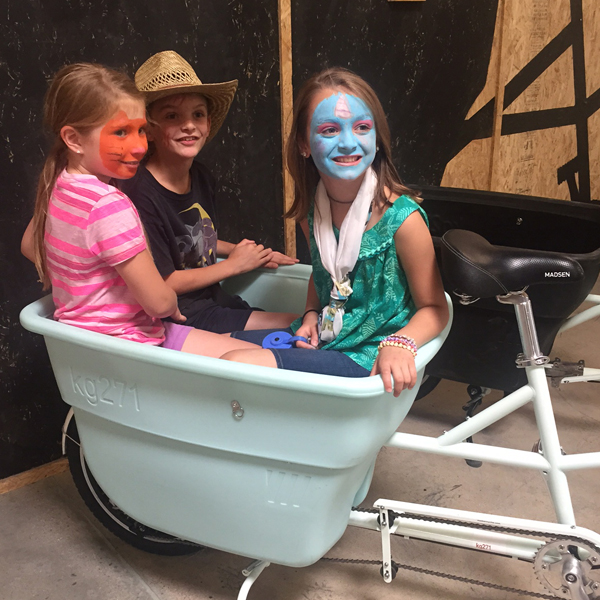
 Monday we took a non-printing side trip to visit Madsen Cycles, maker of our Press Bike. A well oiled shop of a different sort, it was exciting to see the design and development of these cargo bikes in person.
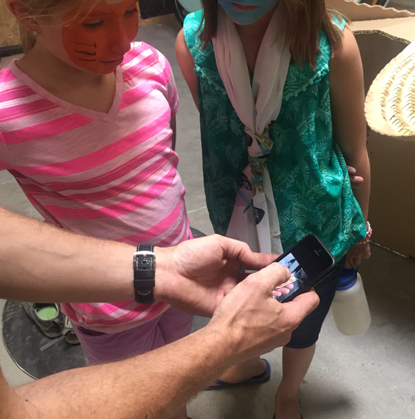
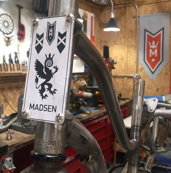 We stayed with a former Chicagoan while there who accompanied us with her stepchildren. The girls painted their faces right before we left so here you see a kitty-faced Jo explaining to Mr. Madsen her ideas for kid-sized cargo bike.
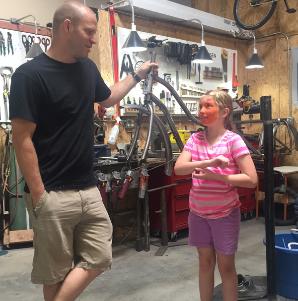 He wasn't one to disappoint and whipped out his phone to share secret images of a project in the works. Wait for it, folks.
 Salt Lake City is a place we'll definitely visit again someday. We had a day to unwind and Jo had new friends. I snuck out Monday night for a supportive and stimulating dinner with David and his wife, Lauren, that gave me much needed clarity on this trip. Their insight into following a non-traditional path in letterpress work is spot on and encouraging and David reminded me of where I was in 2003 when we first met. Sometimes you need to go back to your roots for a drink or two.
Grabbing good coffee at the Rose Establishment set us on the run Tuesday morning.
 At the urging of David, we were able to sneak in a brief visit to the Black Rock Press at the University of Nevada to meet Inge Bruggeman. The shop is large and offers a lot of typographic treats.
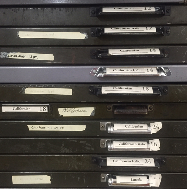 My first Californian sighting, something I was in tune to having just finished a print featuring this ampersand (next image... more on this series to come).
 A whole table of freshly cast Bixler Letterfoundry type!
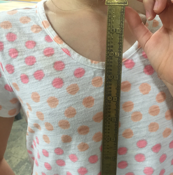
 Jo was enamored of this brass line gauge. Maybe she's cut from the same cloth as Scott Moore.
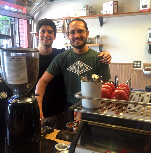
 I struggled with Nevada. It was my first moment of true homesickness and I had a near-panic attack while listening to Don't We Always Get There, wondering what the hell we were doing so far away from home. The gravity of the situation really sunk in, especially sitting in the hotel of a casino I hated, but Jo adored (kid midway, need I say more?). Then, following our coffee map, we found these guys pouring Blue Whale Coffee and all was well again. In a tiny place the size of our home office, there were two other Chicagoans there.
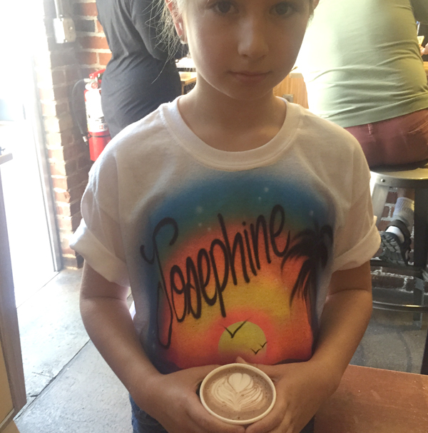
 Hot chocolate to go along with the obligatory casino t-shirt. That she loves, of course.
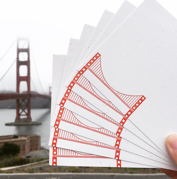
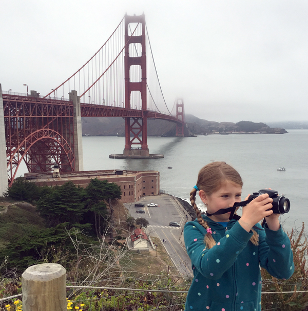
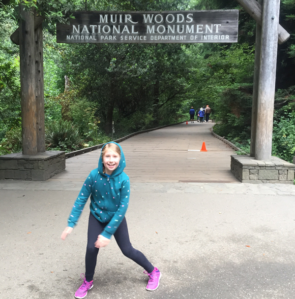
 California All The Way, indeed. We made it. The two things Jo wanted more than anything on this trip was to see the ocean and to hug a redwood. After our touristy jaunt to the Golden Gate Bridge we started Thursday morning communing with trees.
 The kid managed a 2-mile hike through the forest and loved it. We found a few clearings with tiny stone formations from past visitors and I couldn't help but giggle over what Julian Cope would make of these.
 After scaling redwoods we visited mountains of metal type at M&H.
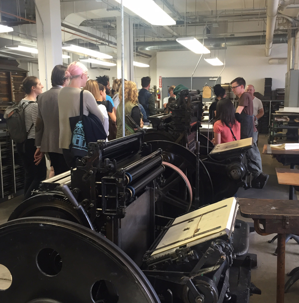
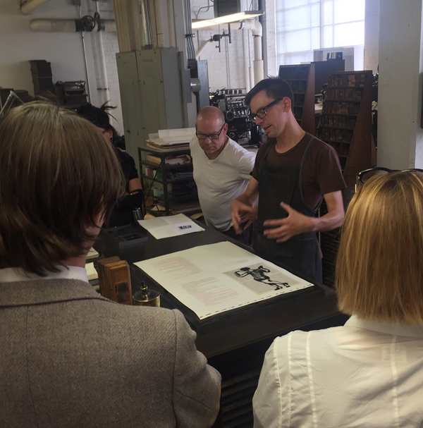
 Hopping in on a tour of the facility and Arion Press, it was great to see Brian again, doing what he does best, from describing the work to checking forms to wrangling a cranky two-color press.
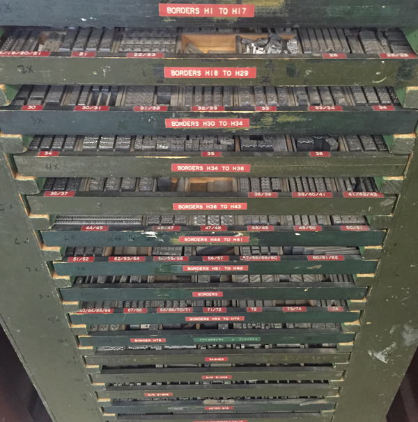
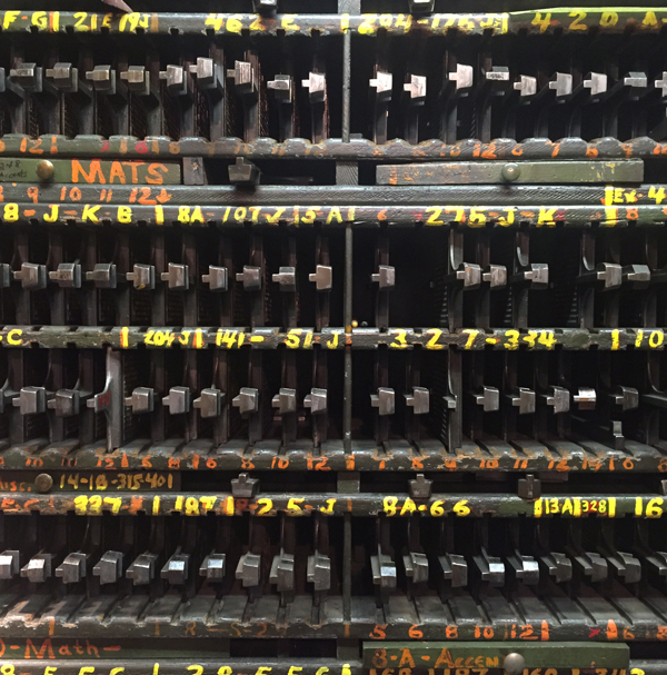
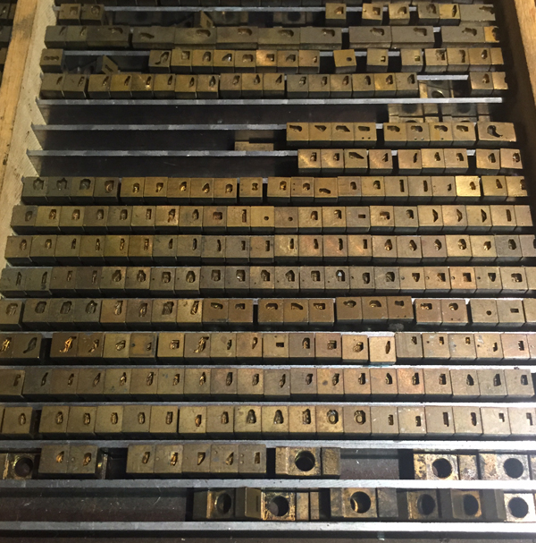
 They have a lot of metal type. I don't know how to describe how overwhelming it is... in cases like this to the substantial hallway full of fonted up, newly cast type. I died a little with the enormity of it.
 Brian pulled out some of the special treats to show me and I found more Californian.
 Chris explains the casting process.
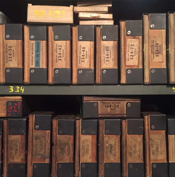
 And with that, here's some serious porn for Jessie at Punky Press, up and coming type caster. It's a room loaded down with matrices for casting, all in their tiny, organized boxes.
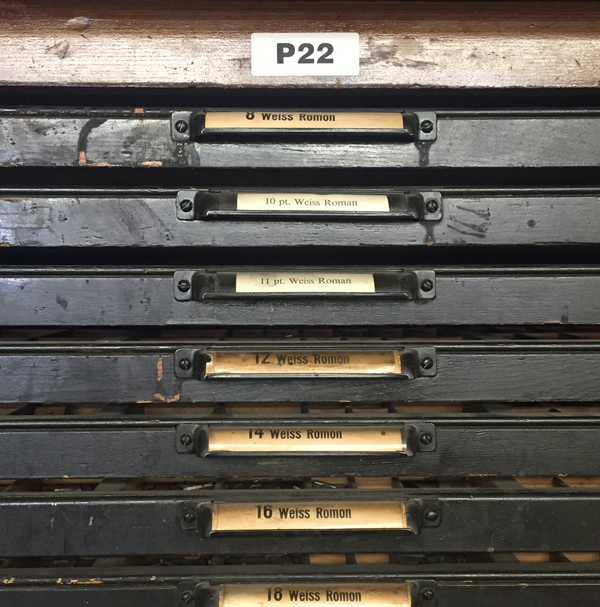
 Jo should really work for P22 Type Foundry because she's an expert spotter of their type. 'This must be Mr. Rich's type case' she said then walked away.
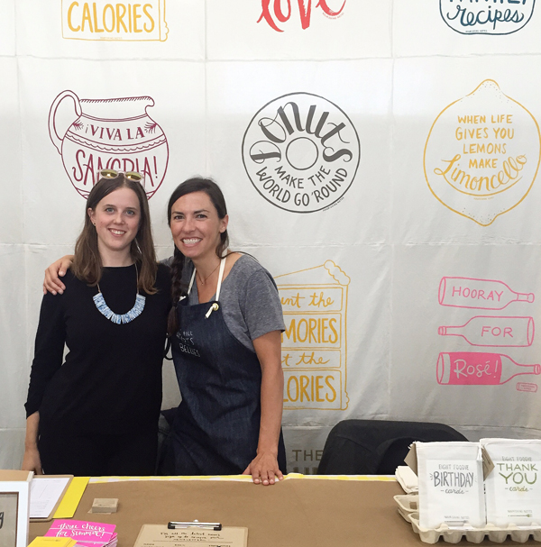
 Finally, we made it to the Renegade Craft Fair at Fort Mason Pavilion. Friday was open only to wholesale buyers and was very low key. We picked up a new account and chatted with many people about our custom capabilities. Mostly I was relieved to tears to see these two: Louisa, one half of Munie Designs (and former Starshaped intern) and Julie, one of half of Letterform and one whole of Nourishing Notes. My people. Hugs!
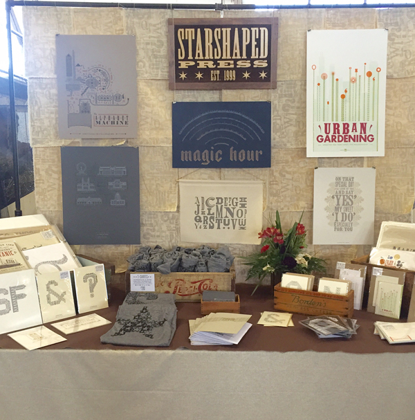
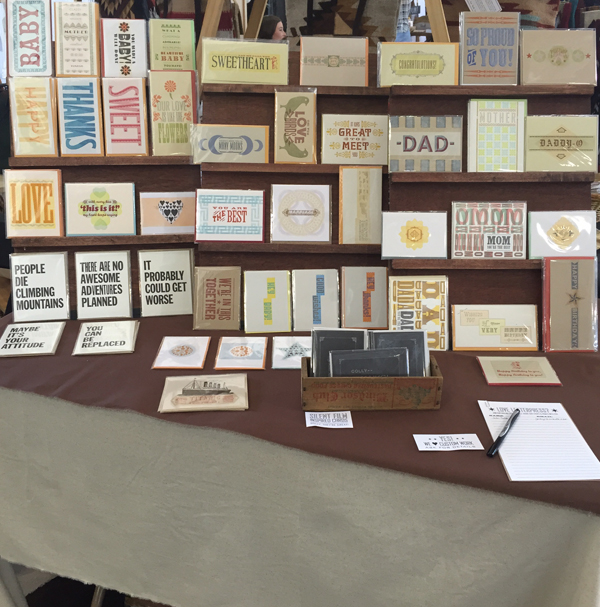
 I felt pretty good about our booth set up this time around, like I finally 'got' how to display things in a way that people can see detail up close. Huge thanks to Dan Grzeca for help on this front, and to Matt at Virgin Wood Type for making my card displays.
 And we broke out this new sign commissioned from Moore Wood Type.
 Friday felt pretty successful and we headed out to an envelope show at the San Francisco Center for the Book. The place was really hoppin' and everyone could make envelopes while there. If an even remotely crafty project is around, Jo will find it. She made a dozen or more envelopes from their diecut sheets while I poked around at the type.
 Louisa and Jeff joined us here as well and made their own envelopes.
We made it to the ocean. Do you remember your first time seeing it? Did it look like this? It was Friday, and I was In Love.
[wpvideo mC1KMcsB]
Before heading into Fort Mason Saturday morning for the fair, we made the obligatory stop at this dangerous place. So good. We also spent every morning at The Mill, enjoying Four Barrel coffee which was too good to be true. No pictures of that; the hipper than thou atmosphere would have given us the boot for sure.
 Optimistic! But it wasn't to be. This was one of the worst shows I have ever done. We were all but assured this was the craft fair version of The Sure Thing and the next best thing to the Chicago fair which we have been a part of for the last 5 years. But just before leaving town I found out Starshaped didn't make the cut for Renegade Chicago. I was very disappointed and questioned the reasoning but experience in San Francisco leads me to believe this is a blessing in disguise. Most vendors fared very poorly in San Fran and this may point to the fact that the size of the fair was doubled without vendors being aware of it. There were two buildings and 500 sellers (can't fully say 'makers' as there seemed to be a number of fair trade goods as well) which is completely overwhelming for shoppers. Renegade has never been the most vendor-friendly fair which is fine as long as sales are strong (and they always have been exceptionally strong). But Starshaped isn't looking for 'exposure'; the studio doesn't need to use Renegade as a marketing platform the way a new vendor might, one that is able to write off the loss in sales. We just need the sales. So it looks like we're breaking up with the Renegade gang and will be moving on.
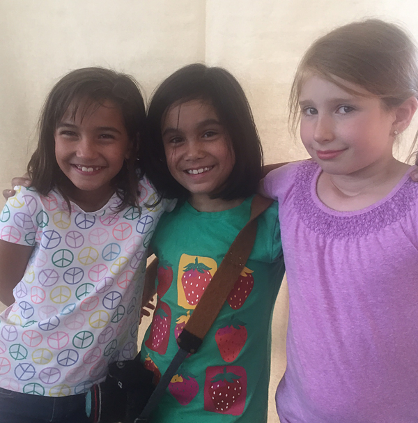
 I did manage to get a lot of thank you notes written and Jo made new friends who were also stuck in booths with their parents all weekend. They ran between all of our booths, ate together and schemed, and probably used the free photo booth too much. But hey, it was free, unlike the $3 Diet Coke in a Cup that I got.
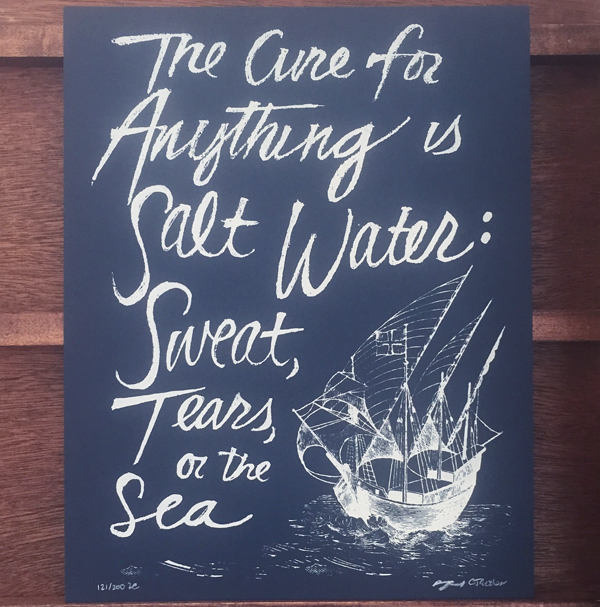
 And we did get to see our Detroit friends, Arsenal Handicraft, who had the perfect print for the weekend.
 One last romp in the ocean and we were on our way to Tahoe for about 8 hours to sleep before the longest part of our trip.


