Celebrating our Neighbors

Every once in a while, the stars align and we can sneak jobs on press during our busiest times. I was recently contacted by Sarah McGuire, a local jewelry artist, about her upcoming 10th anniversary open house, with the hope that we could come up with a great invitation in a short period of time. Yes! Here's what we did, photographed with one of Sarah's lovely necklaces. sarahmcquire1
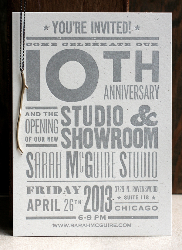
Sarah wanted a broadside-styled card with blocky, simple typefaces in various sizes, and definitely printed in silver.

sarahmcquire2

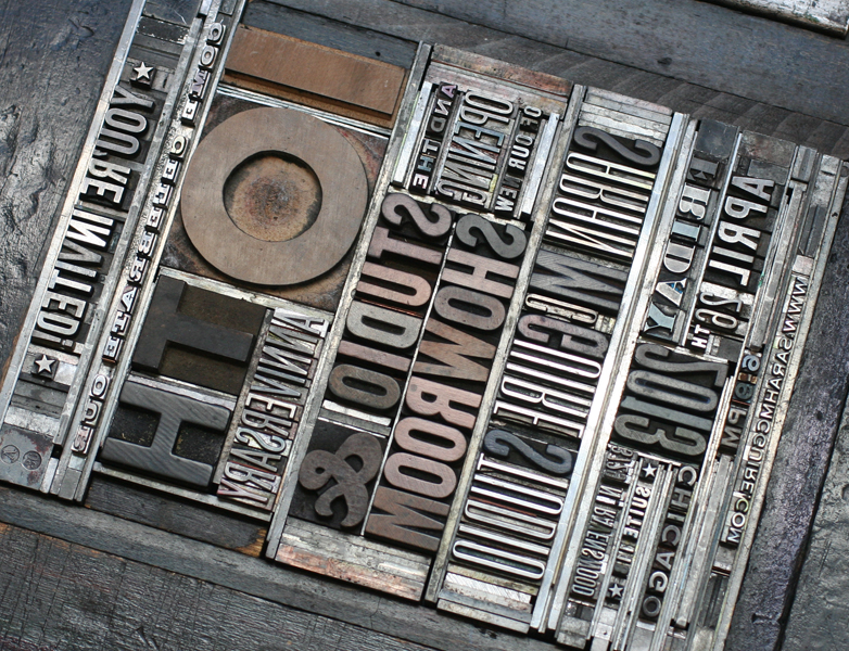
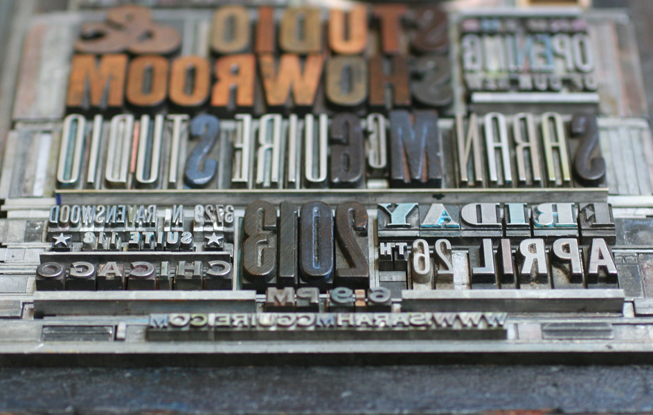
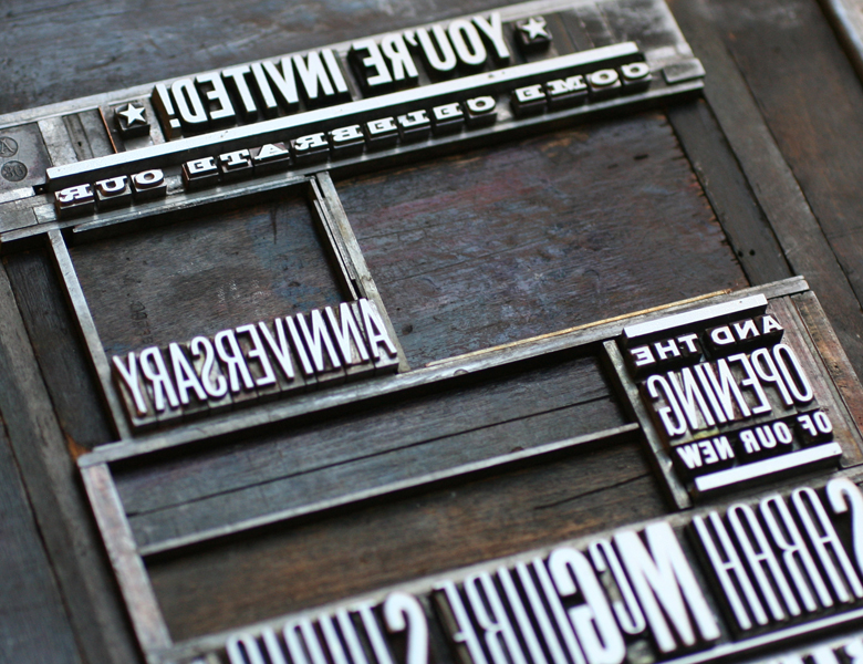
This is the form, showing the combination of metal type, wood type and rules (used for printing lines).

Tsarahmcquire

Tsarahmcquire3

Here's the form in the press, inked and ready to go.

sarahmcquirelockup

After the basic setup, I've found that large wood type often doesn't print as well combined with small type on a platen press. I took out the larger wood elements and filled them with spacing (called furniture) in order to run the small type first. After that, I put the wood back in and replaced the metal type with furniture. Two runs for one color seems like a pain, but the result is that much better and two runs on the platen are still faster than one on the Vandercook, where everything could be printed at the same time.

Tsarahmcquire5

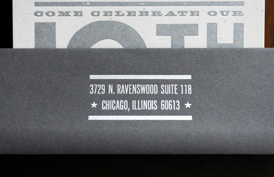
Here's the studio address, in our own lovely Ravenswood neighborhood! We will be celebrating with Sarah in her lovely new space on April 26th, and hope to see you there, too.

sarahmcquire5

Dennis and Marie at home

Back in November of 2012, I had the pleasure of meeting Dennis Gilliam at the Hamilton Wood Type Wayzgoose. As someone with a past in typographic arts, we had a lot in common when it came to our passion for antique type and typesetting. Apparently, I 'won him over' with Starshaped's commitment to only producing work with metal and wood type, and after traveling home to Portland after the 'Goose, he contacted me about creating calling cards for both himself and his wife. For his own card, he pulled heavily from the silent film/ragtime-inspired print in our self promotional packet and pieced together what he thought would look great on the card. Here's a shot of the form. It has a combination of mortised multi-line rules around the name, and a tricky set of rules to create a box around the main text.

Tdennis1
Tdennis1
Tdennis2
Tdennis2

And here's the final card:

dennis1
dennis1
dennis2
dennis2

And since we were already working on one card, Dennis also ordered cards for his wife, an avid bonsai tree admirer. They provided this image, which I cleaned up to make into a magnesium plate and then combined with type. These are printed on 100% recycled stock.

Tmarie1
Tmarie1
marie1
marie1

One of great perks of collaborating with Dennis? He's currently working with the fabulous Bob's Red Mill and sent coupons for their fabulous products! Granola? Flour for cookies or cakes? Any which way, the studio will be stacked with delicious treats.

Going to Tarrytown

Like Marissa and Ned, Sarv and Graig were keen on wedding invitations that would resemble mini posters and they had great inspiration in the form of this vintage book cover: ramona

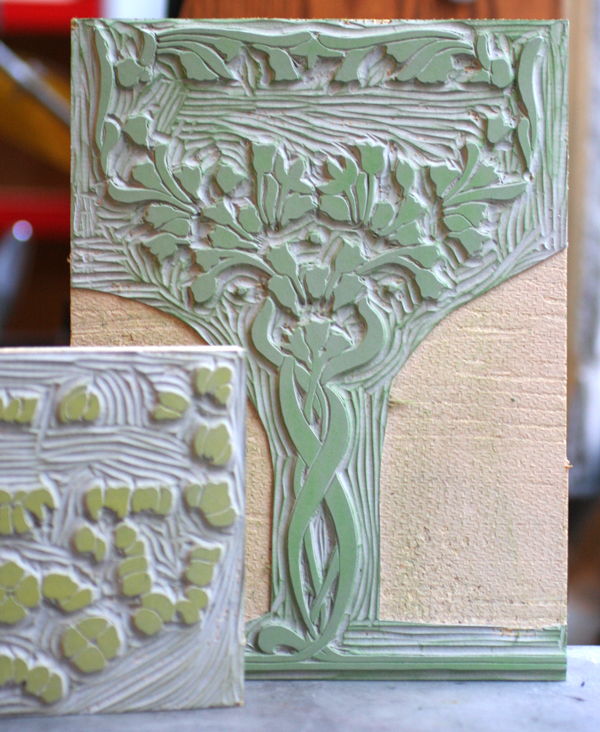
Given that letterpress printing doesn't have the opaque vibrancy of screen printing, we ran a few tests to see if we could successfully achieve two light colors on dark blue paper and were happy with the result; the colors were muted in a faded, old fashioned way. We decided on creating a piece that was 7x10", so that it would fold to 5x7" and mail in a standard A7 envelope. The image worked perfectly as a two-color linoleum cut after a little adjustment to the overall size and placement:

Tsarv6

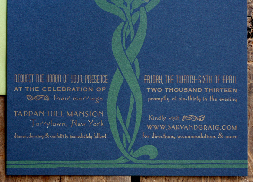
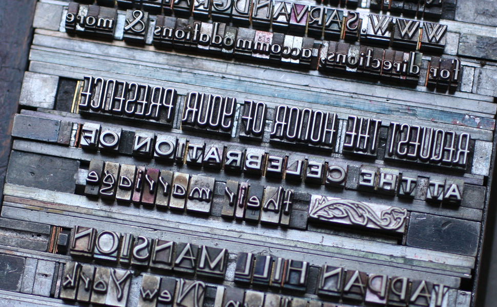
The type is set in a mix of deco-meets-nouveau styles to pull the overall design into a more cohesive and streamlined form. It is printed in gold to pop out from the navy paper. The typesetting was very particular to achieve a subtle curve along the artwork.

sarvgraig6

sarvgraig5

Tsarv4

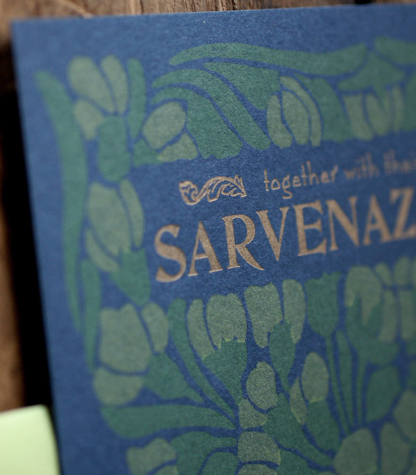
I loved having an opportunity to use our DeVinne type for their names; it's a lovely and quirky typeface from the turn of the century that sadly doesn't get enough play in the studio.
Tsarv3

sarvgraig3

The invitation folds in half, and on the front panel (what you see when you pull it out of the envelope) is a snippet of the overall artwork with their initials rendered in our mortised initial caps and an ampersand from the 19th century typeface, Dakota.

sarvgraig8

Tsarv1

The envelopes are sour apple green, and the reply cards are pale yellow to give a little pop to the color palette. We continued the abridged image on the envelopes in gold (the return address is on the back flap) and carried through the multiple typefaces on the reply.

sarvgraig4

sarvgraig7

Here's a shot of the final suite. I intentionally did not score a few so that Sarv and Graig would have some unfolded ones as keepsakes or to frame.

sarvgraig1

Abe's Peanut postcards

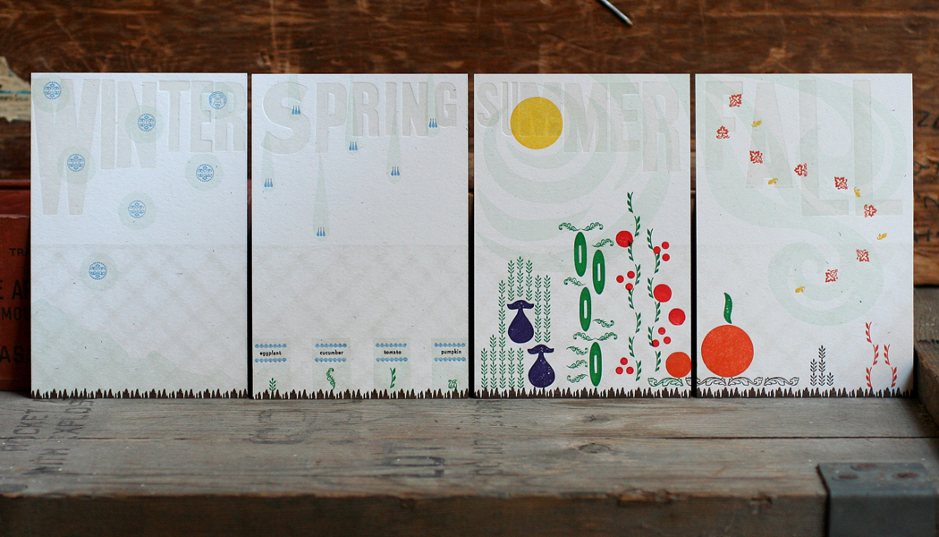
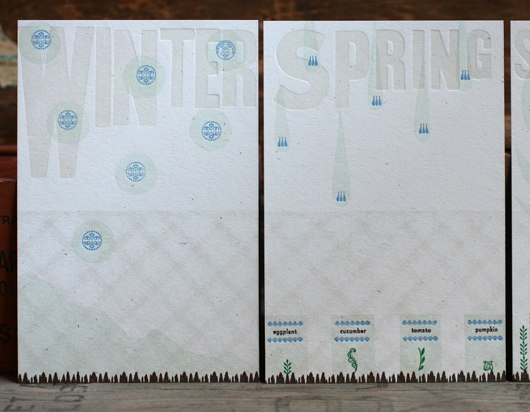
We've had a number of interesting projects this Fall, and this was a favorite. We were approached by Abe's Peanut, a postcard subscription series for children, about creating a set of cards. There are four cards in a series, and each has one part of a story that is completed when all four cards are received (one a week). Illustrators are teamed up with writers to create stories and images to engage children and excite them about getting their own special mail. Fortunately, I was able to work with one of my favorite writers, Julia Bryan, to put together a lovely little story about a girl, Daisy, growing up in a city and wishing for a tiny garden. She works with her parents to create a plot by their chain link fence, and to order seeds to be planted. She watches as the seasons change from winter to spring to the wonderful summer harvest. The cards were printed as one piece in seven colors and then trimmed.

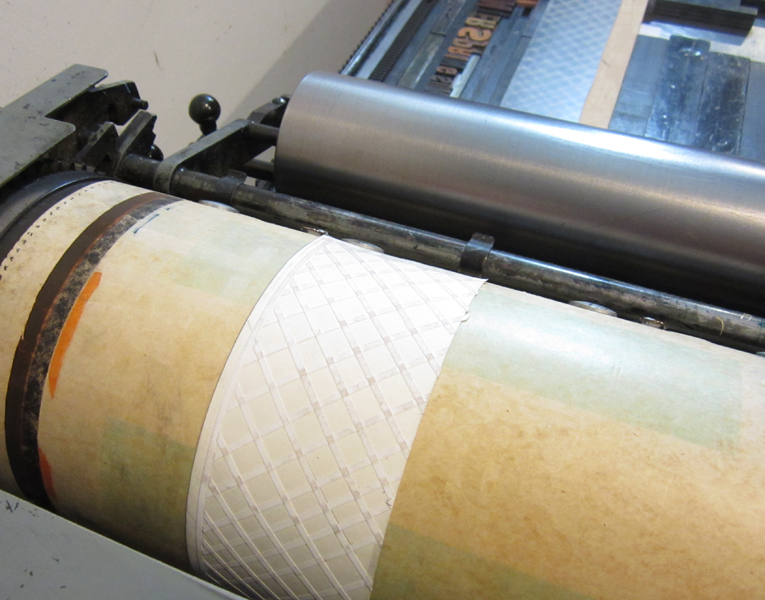
The seasons and representation of the chain link fence were printed first in a very pale gray. The fence is a pressure print; it is created by printing a solid object (in this case, a piece of linoleum) over a texture added to the press behind the paper being printed:

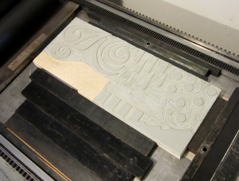
You can see the ghost of the texture left behind on the linoleum:

After the first color, a carved linoleum cut was printed in pale aqua to add 'weather' to each of the seasons.

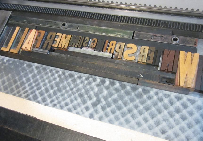
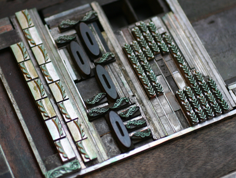
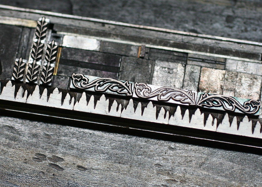
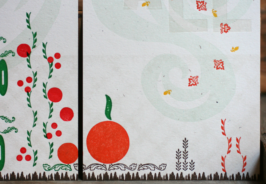
These runs were printed on a Vandercook press. For the details, it was easier to switch to the platen presses. All of the plants, seed packets, dirt and leaves were printed with ornaments, both wood and metal. This required a little careful planning to place everything in the right area to come together and make sense as a representational garden.

Love that little moon! The cards build layers of color as the seasons progress. From the little seed packets come eggplants, cucumbers, tomatoes and pumpkins, which carry into the fall.

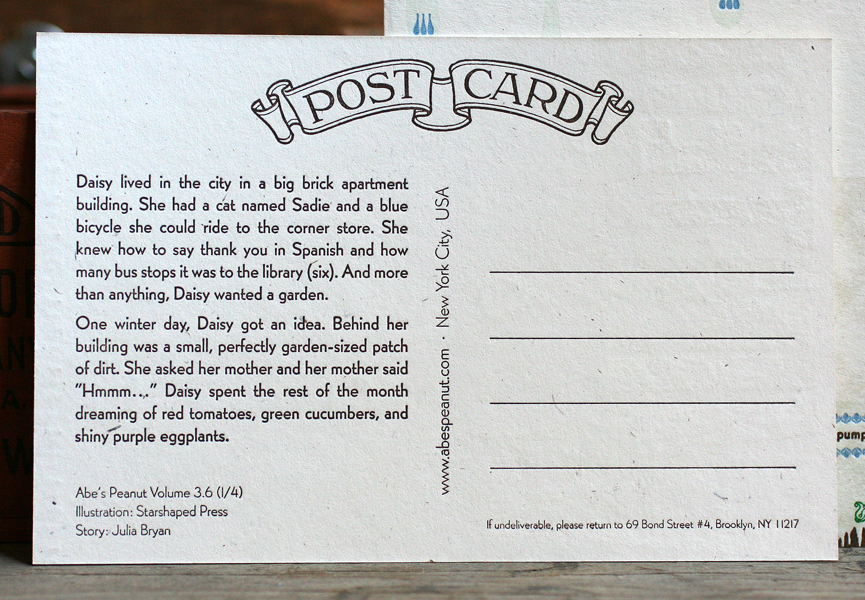
The back side of each card is the same overall layout, with just the story changing from season to season. Hopefully the kids receiving the cards enjoy the imagery and story as much as we did while creating it.

Emily + Frank

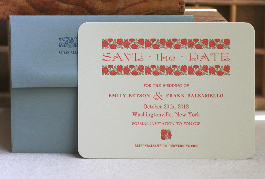
It's not every day that I get excited to print flowers, and our wedding invitation collections are decidedly devoid of them. But when Emily approached me about working from vintage Wizard of Oz book designs, these ones fell into place:

The flowers are actually from a border known as Wild Rose, which was originally produced by the Keystone Type Foundry around 1903. The studio has the two color variety, meaning that there are two sets of sorts, one for each color, in this case gold and warm red. With the success of the save the date cards, we moved on to the invitations. We tried options using the ornaments as is, and then considered enlarging the pattern to see how that would look. I would carve the two color image out of linoleum to give the invites a block printed feel.

The first set of linocuts went well, until I realized the trapping between the gold and red was sloppy. I carved the red color again to match it better, using a proof of the gold color as a stencil for this second set.

Then they were set to go, as was the type, a considerably simpler forme for us this time around!

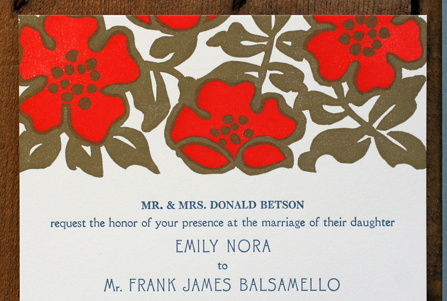
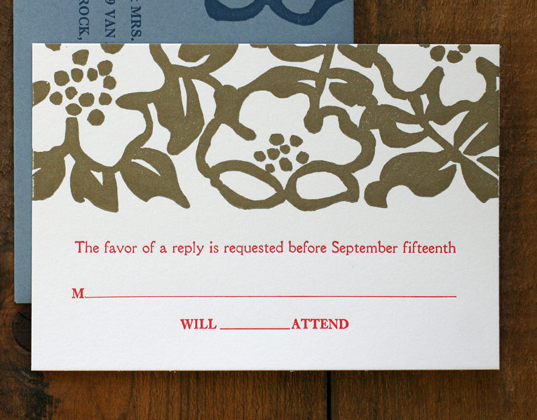
Here is the final set, continuing the theme of warm red, gold and muted blue. The type is Canterbury, Della Robbia and Caslon.

Congrats to Emily and Frank, and a big thanks for being open to experimenting with our vintage type and linoleum cutting!