Skirting the Issues

The League of Women Designers is a group I'm proud to be a part of in Chicago. Made up of product, furniture and home goods designers, the group meets regularly to discuss issues related to the field of design, and to help each other out in the interest of forwarding the prosperity of all members. The first LWD show is opening this weekend at Manifold, the beautiful studio and gallery of member Elizabeth Fiersten: skertThe theme, skirt, was meant to be taken in any definition of the word:

skirt (verb) 1: to form or run along the border or edge of : border 2: to furnish a border or shield for 3: to go around or keep away from in order to avoid danger or discovery 4: to avoid especially because of difficulty or fear of controversy

skirt (noun) 1: a separate free-hanging outer garment or undergarment usually worn by women and girls covering some or all of the body from the waist down 2: the rim, periphery, or environs of an area 3: slang: a girl or woman

I went with definition 4 of the verb form of the word for a series of simple prints. Inspirational artwork for home decor (such as the Keep Calm and Carry On variety of posters) are incredibly popular, especially those that are hand printed and simple in structure. However, many of the themes of these prints represent more of an idea of ourselves than the reality of everyday life. With that in mind, I put together a series of simple black and white prints that express the true fears we face as opposed to the image we project to the public.

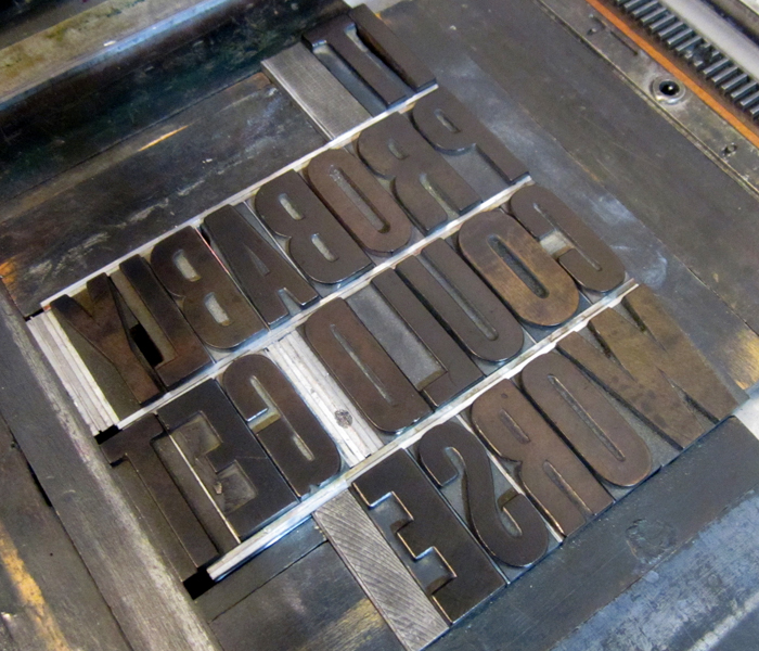
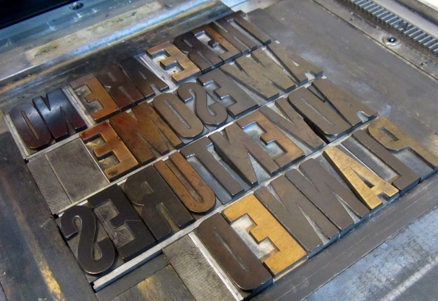
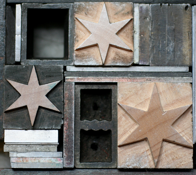
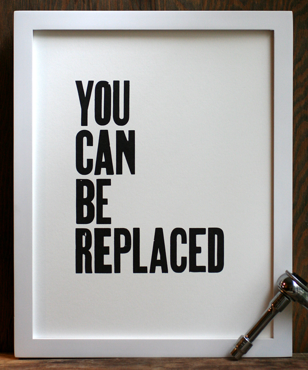
Here are the three prints done so far, along with the type forms for each.

LOyoucanbereplacedframed

replaced2

LOcouldgetworseframed

getworse1

LOawesomeadvframed

adventure3

We've done our fair share of inspirational prints at Starshaped, and they continue to be good sellers. That said, it was great fun to take a break from the sincerity of that style of print to poke fun at the genre. The framed prints will be available at the opening on Saturday, June 15th, and a limited edition of unframed prints will be sold on our etsy site.

A Calendar Year

Every year, Starshaped is asked to create a calendar in any form, and while we all love the idea of putting together such a piece, the timing has never gelled with the custom print schedule. This year we've done it ahead of schedule and have two great calendars to offer! I loved the idea of a wall calendar that can hang to display one large image throughout the year. One of the other driving forces for this decision was to be able to use a complete font of calendar type, purchased last year from Virgin Wood Type, meaning that even the individual pages of the calendar would be printed. Tcalendartype

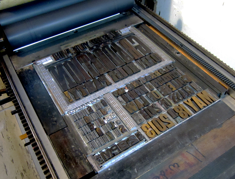
As you can see, each date is cut to be on the same size block of wood so that it's easy to interchange them and keep the same form when you move from one month to the next. Their beauty is that they aren't perfect; there are many quirks from the routing and carving process which gives them more character than if the pages were to be output digitally. I added the month and ornamentation at the top to round out the print, also leaving a bit of room at the bottom on which users could write notes.

One of our most popular prints has always been one titled The Stars All Lead Me Home, which is currently sold out with no plans for reprints. So I took that theme and recreated the city and stars for the first calendar which you can see here:starscalendar

Each calendar was printed in four colors. The first for this one was a white linoleum cut to provide a base for the rest of the colors. Then came the cityscape in a bright, happy blue.

Tstarscityscape

starsonpress

The star setup was a bit tricky; I had the drawing for the linoleum cut done, so I used that as a base for laying out the stars in their various size. Then spacing and leading needed to be filled in around them to keep the block solid and easily locked up for printing.

Tstarsetup

They are printed in a soft champagne metallic ink and finish off with a little moon in the corner.

starscalendar4

One of the hazards of the trade is the presence of work ups in a type form. You can see below that one of the thin spaces between the R and S has literally worked its way up to printing between the two letters. We all have to be vigilant in checking prints to keep this from happening on multiple prints.

workup

Here's that pesky little space:

stars1

Because one is never enough, there's a second calendar as well, in the same format as the first. This one is a mash up of various wood types to spell the months of the year, coupled with a beautiful '2014' and corner elements, all printed in four colors.

2014cal1

Here are the forms for the months as well as the '2014'. Some really incredible wood type all in one place!

calendarform4

calendarform1

2014b

The detail shows a little more of the great effects of overlapping and subtle colors. The corner pieces are printed in both dark brown and gold.

2014cal3

2014cal4

Printing the calendar pages was no small task, given that we did an initial run of 100 of each calendar and there are 12 months in the year (you do the math, and allow for the overrun of misprints!). These were done on the platen press for speed and the corners were rounded afterwards.

presscalendar2

calendarpages

The final step is collating the months and assembling them with padding compound at the top. Then they are attached to the calendar and are set to go! If you're feeling like an early bird this year, we've got them for sale on our etsy site now: here for The Stars All Lead Me Home and here for 2014. And cheers to a new year!

starscalendar5

All Aboard!

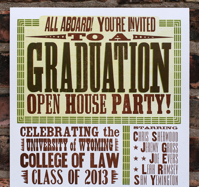
This past winter, I had the pleasure of printing graduation announcements/party invitations for the University of Wyoming College of Law graduates. They celebrated in style at the charming Laramie Depot Museum, a must see for vintage train enthusiasts. The location drove the direction of the design, right down to the muted color palette, as you can see here: wyoming1

This poster was a long one, at 12x22", a bit long for our press to print comfortably, and so it was done in separate passes for the top and bottom. The top went first as you can see here, followed by the bottom section for each color (three altogether).

Twyoming1

I thought it would be fun to throw a curve into the layout to break it up a bit and mimic some of the vintage train posters in the Starshaped collection. This involved a little creativity in the form, as you can see from the diagonal leads and furniture. The small train is a copper cut I found years ago.

Twyoming2

One of my favorite bits is the Ombree border around the reply and contact info. It requires a bit of tricky manipulation but with a little effort you can come up with all sorts of combinations to create square and curved corners as well as 'dips' in the middle of any line. Sadly, my collection of Ombree has seen a lot of love in its lifetime and has many damaged spots. However, I recently tracked down a brand new set (well, not new, but never used), so it'll be making many more appearances in the near future.

Twyoming3

Here you can see both the curved type and the beaten up Ombree border:

wyoming3

I also found a new cast of this track-like border that seemed perfect for the occasion. Graduation is printed in both the brown and green to give it a little more emphasis. The All Aboard type is actually cut on a diagonal and has it's own spacing to make it gel with everything else. There's always a lot of improvising going into posters; there is no N to fit with Invited, so I had to find a smaller one that would work. These are the joys of working with hand set type as opposed to digital; problems you never imagined pop up and need to be solved, which keeps the process from getting stale and takes the design in a direction that you may not have anticipated in the thumbnail sketching phase.

wyoming2

Congrats to the Class of 2013! Hope the party was as swingin' as the poster.

City of Wind

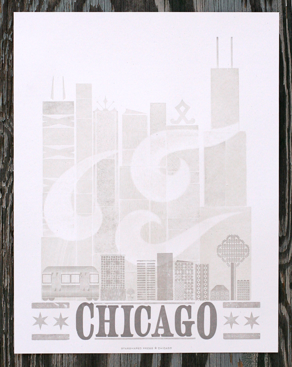
If you want to get an idea of what's going on in gig posters, urban prints and street art, head straight to Logan Square and Galerie F. I was pleased to be invited to contribute to their collection of exclusive prints, and the poster is now available on their site. Here it is: chicago1

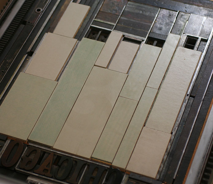
Chicago is always a popular theme and one I love. For this one, I wanted to create a large cityscape to represent downtown, but also something that was indicative of the smaller skylines of the neighborhoods. The first two layers were printed with wood type (and the back side of wood type), and linoleum blocks in very pale dirty gray to give depth and texture to the image. The wind image is a pressure print, which is created by adding a shape or cutout to the makeready of the press which affects how evenly the paper will roll over type.
Here's a shot of the wood type as well as the linoleum blocks.

Tchicago1

Tchicago2

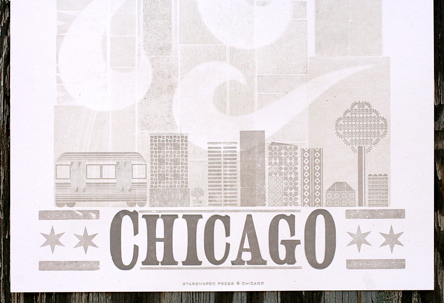
You can see the texture created by multiple layers, as well as the hints that came through the pressure print to keep the wind shapes subtle and soft.

chicago4

After those two runs, it was time for the type and the small cityscape. To create the type with a larger first and last letter, you actually have to have two separate fonts of the same thing. This also features the Chicago wood stars we commissioned from Moore Wood Type. There's a small representation of a CTA train car, as well as an ash tree, in defiance of the emerald ash borers that are destroying the ash trees of the city.

Tchicago5

chicago2

You can get a copy of the print directly from Galerie F for the next month, as well as a number of our other prints if you pop by the gallery. It's definitely worth a stop if you're in the neighborhood... so much great stuff to look at and take home with you!

Holiday Sneak Peek

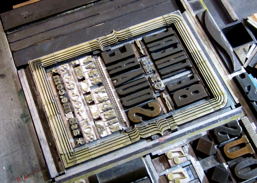
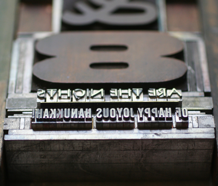
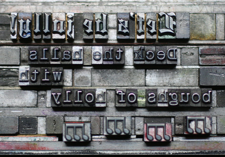
Sure, it's May, but on the stationery calendar, that means it's time to present the year's holiday offerings. We've been busy designing, setting and printing fresh new cards and will be showcasing them very soon. This year we're featuring a number of hand carved multi-colored linoleum cuts, as well as intricate and layered patterns. We've also got two fabulous 2014 calendars which we can't wait to share. In the meantime, enjoy a sneak peek of some of the fabulous type and ornaments used for our new collection. Both single cards and boxed sets will be available this Fall... we don't blame you if you want to wait until then!

Tcheerstoyou

Teightaredays

Tletsbejolly2

Tletsbejolly

Thohoho

Tnoplacelikehome

Tohstarrynight

Tseasonsgreetings